Nishe Branding: Building the Foundation for Product Growth
Andrija Prelec (Sharc)
Branding for Nishe
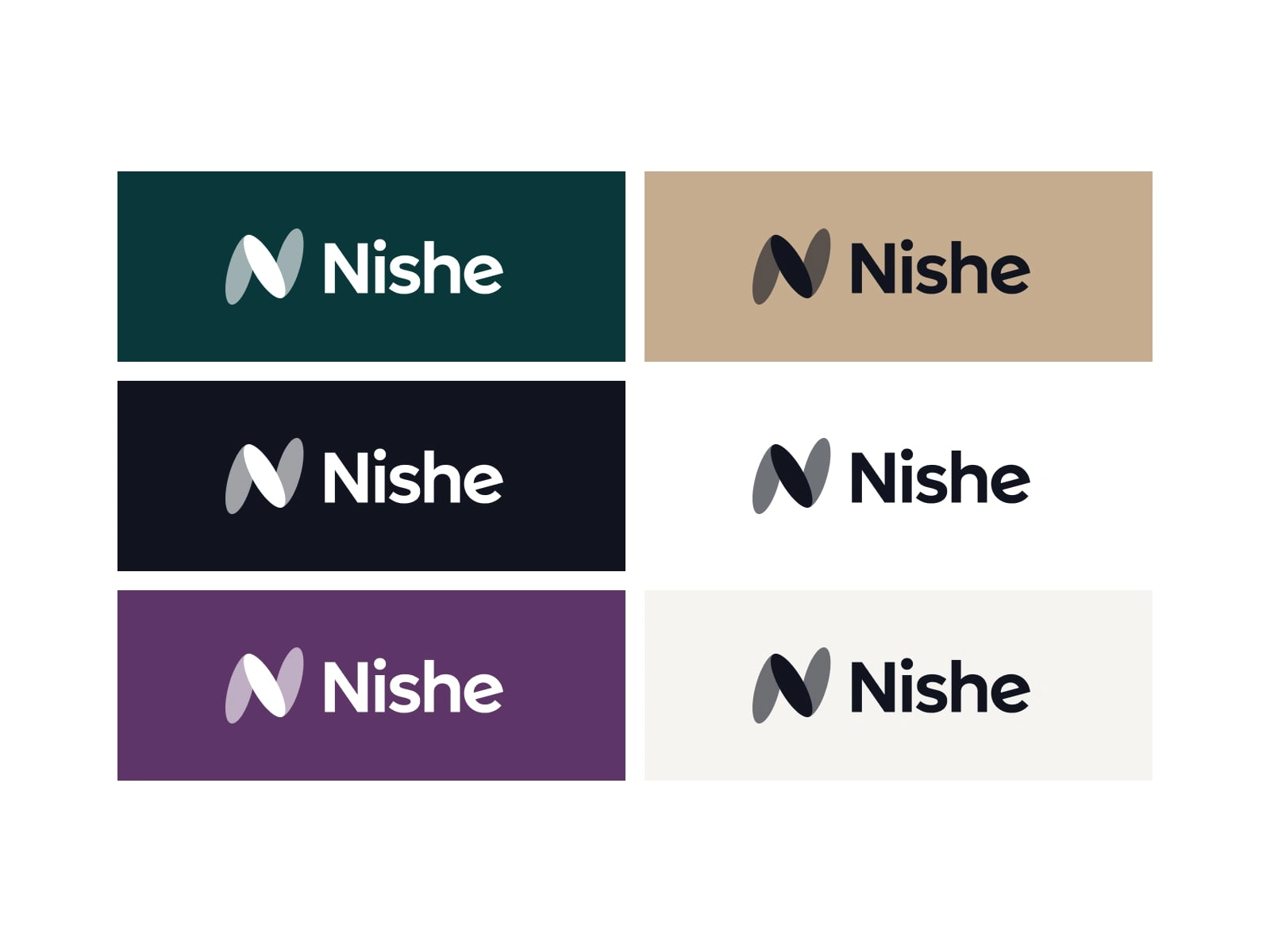
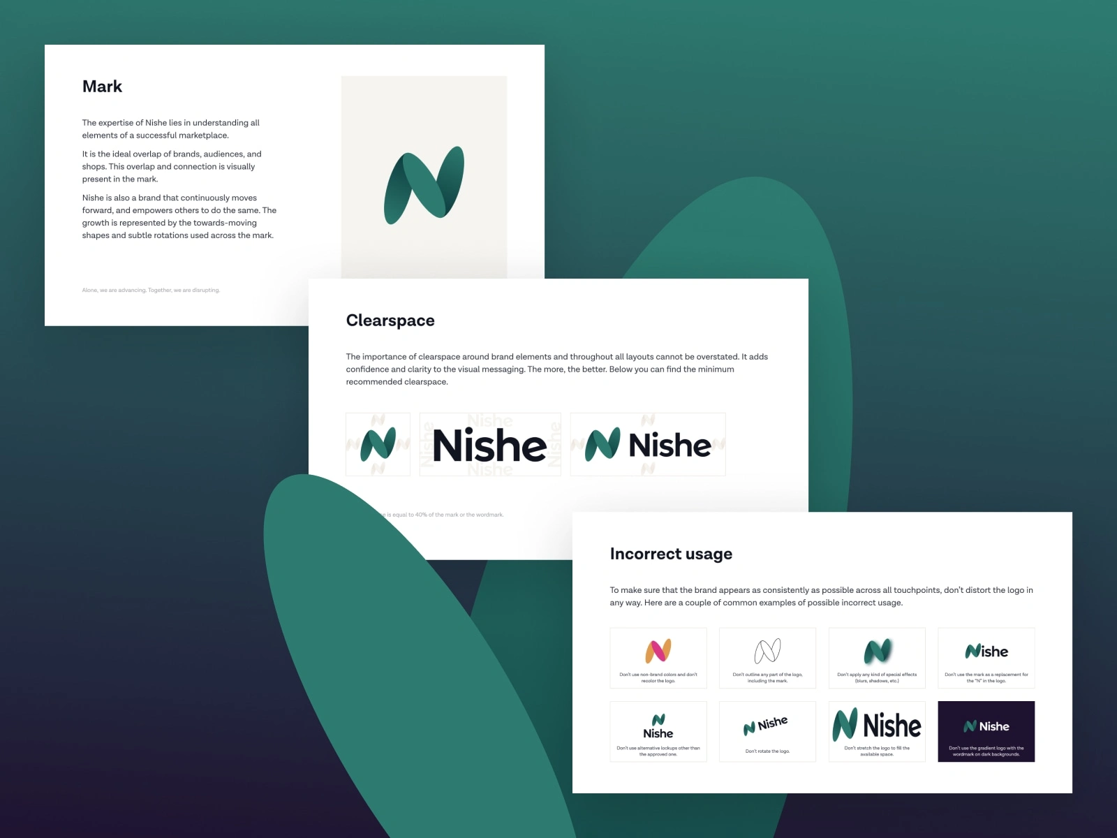
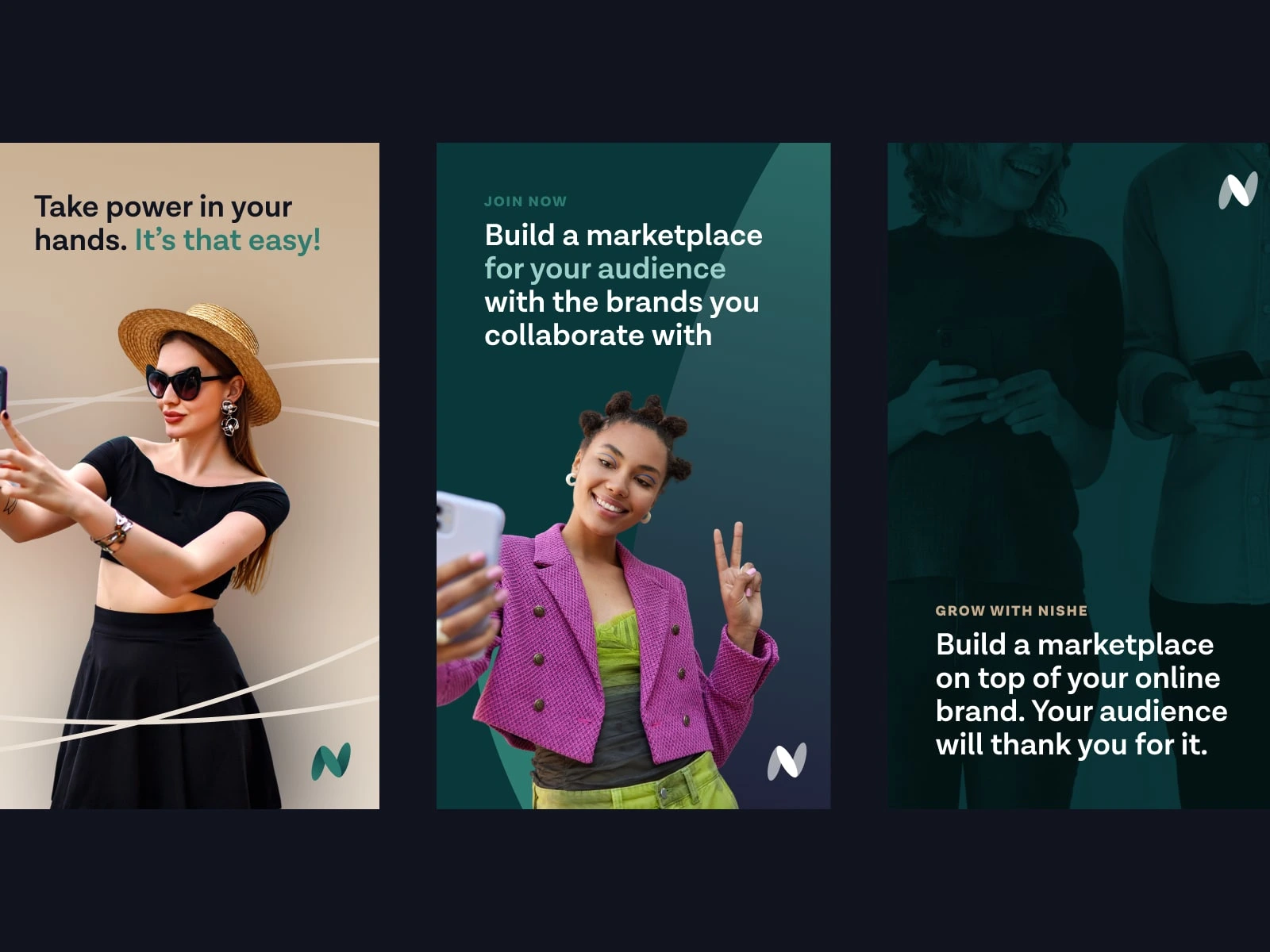
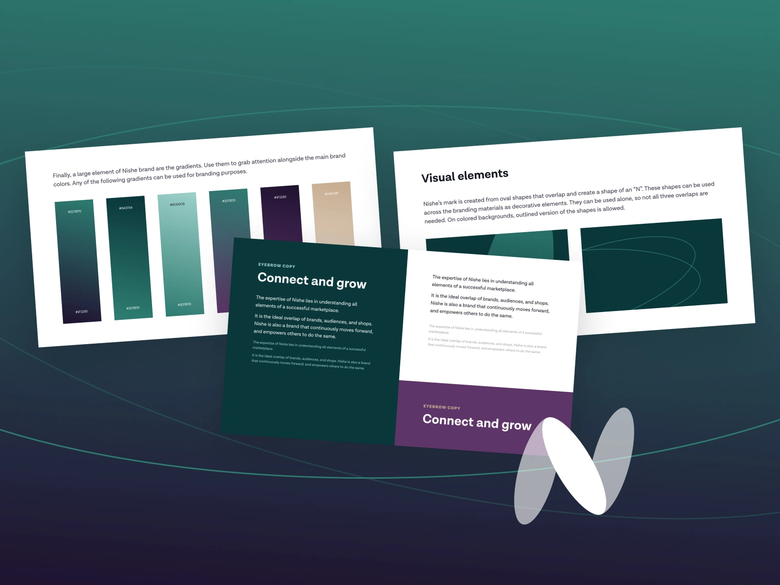
For Nishe, we created a brand identity built around the idea of connection—between brands, audiences, and shops. The visual system centers on a distinctive abstract N mark, formed through overlapping shapes that communicate movement, collaboration, and growth. This gave the brand a recognizable symbol that feels both modern and flexible across digital and marketing touchpoints.
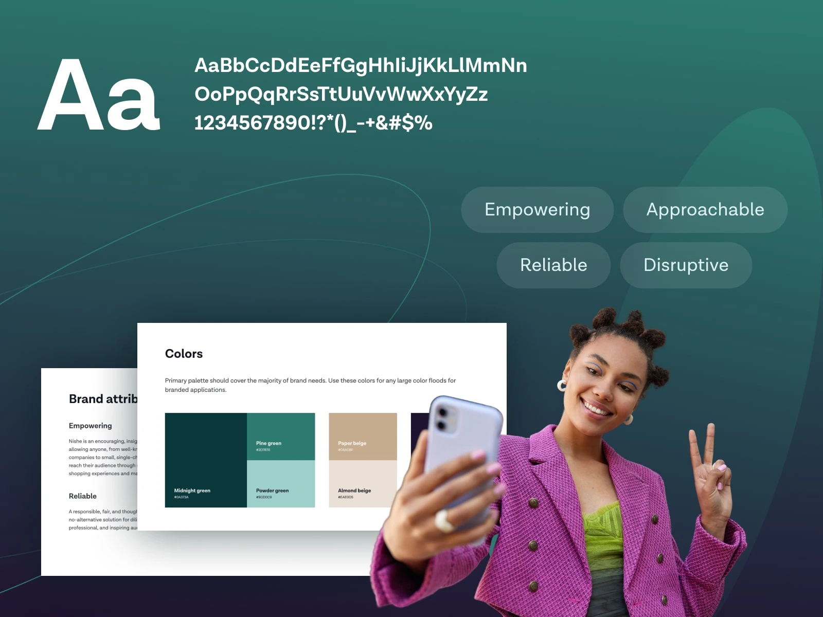
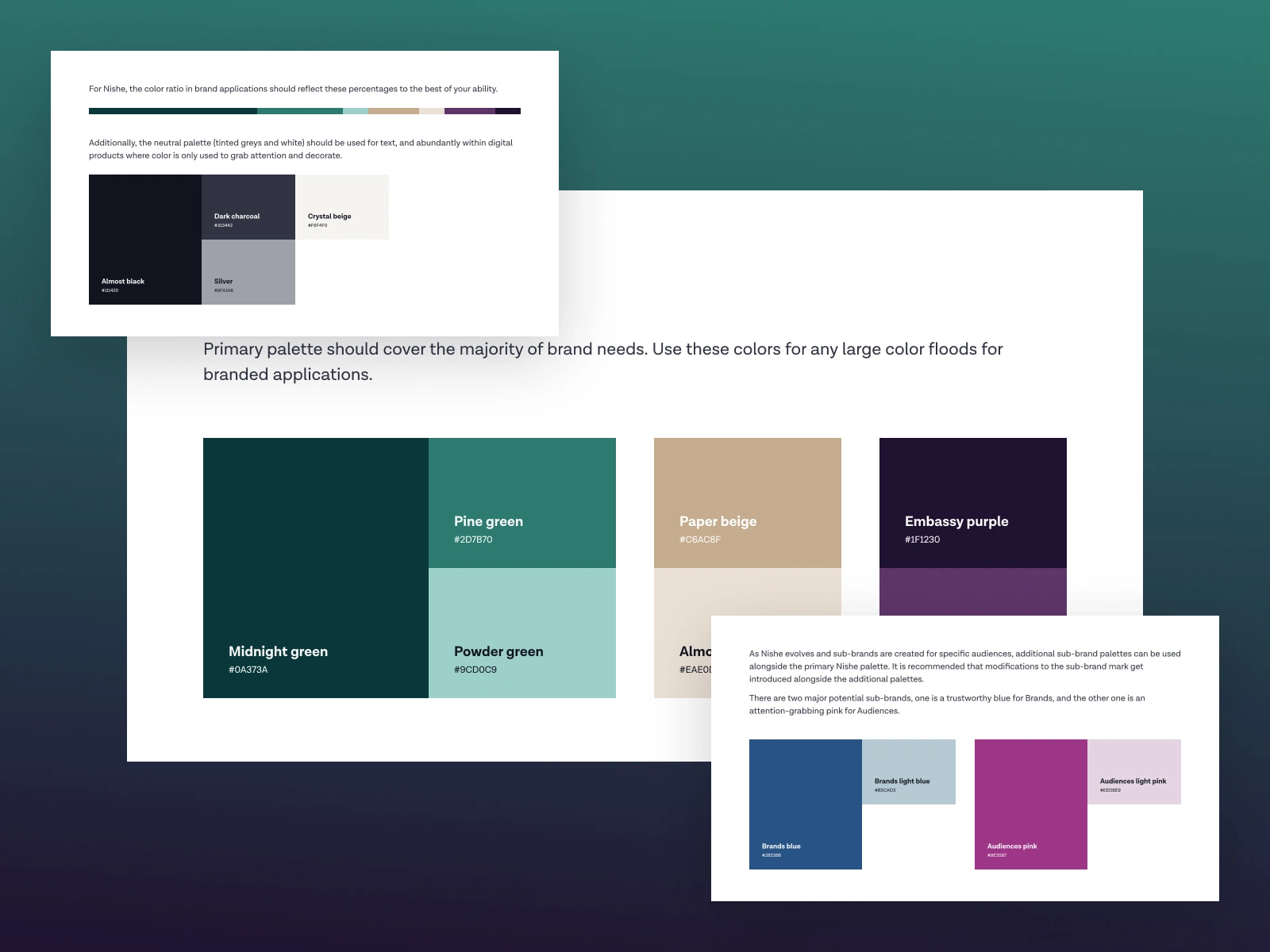
The broader identity system was designed to feel empowering, reliable, approachable, and slightly disruptive. We paired a clean, confident wordmark with a rich palette of deep greens, neutrals, and accent tones, then extended it through gradients, supportive graphic elements, photography direction, and typography rules. The result is a brand that feels polished and professional, while still having enough personality to stand out in a crowded digital space.
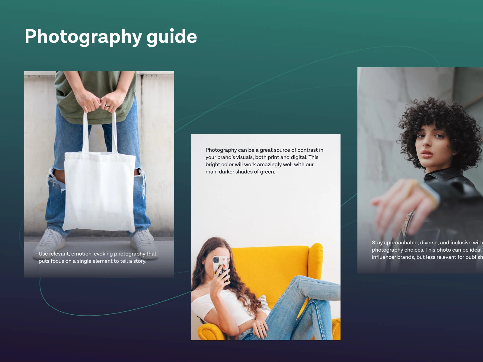
Beyond the logo itself, we developed a full brand foundation—including color usage, visual elements, brand attributes, photography guidance, and clear application rules. This helped turn the identity into a practical system rather than just a logo, making it easier for Nishe to stay consistent across presentations, campaigns, social media, and future product experiences.
Overall, the goal was to build a brand that could scale with the business—one that looks credible from day one, but also has enough flexibility to grow into a larger marketplace ecosystem over time.
Like this project
Posted May 8, 2026
For Nishe, I developed a brand foundation that made the product feel more cohesive, recognizable, and ready to grow.