Built with Bolt
Crafting Digital Atmospheres: Inspired by Belle Epoque France
Andres Sepulveda Morales
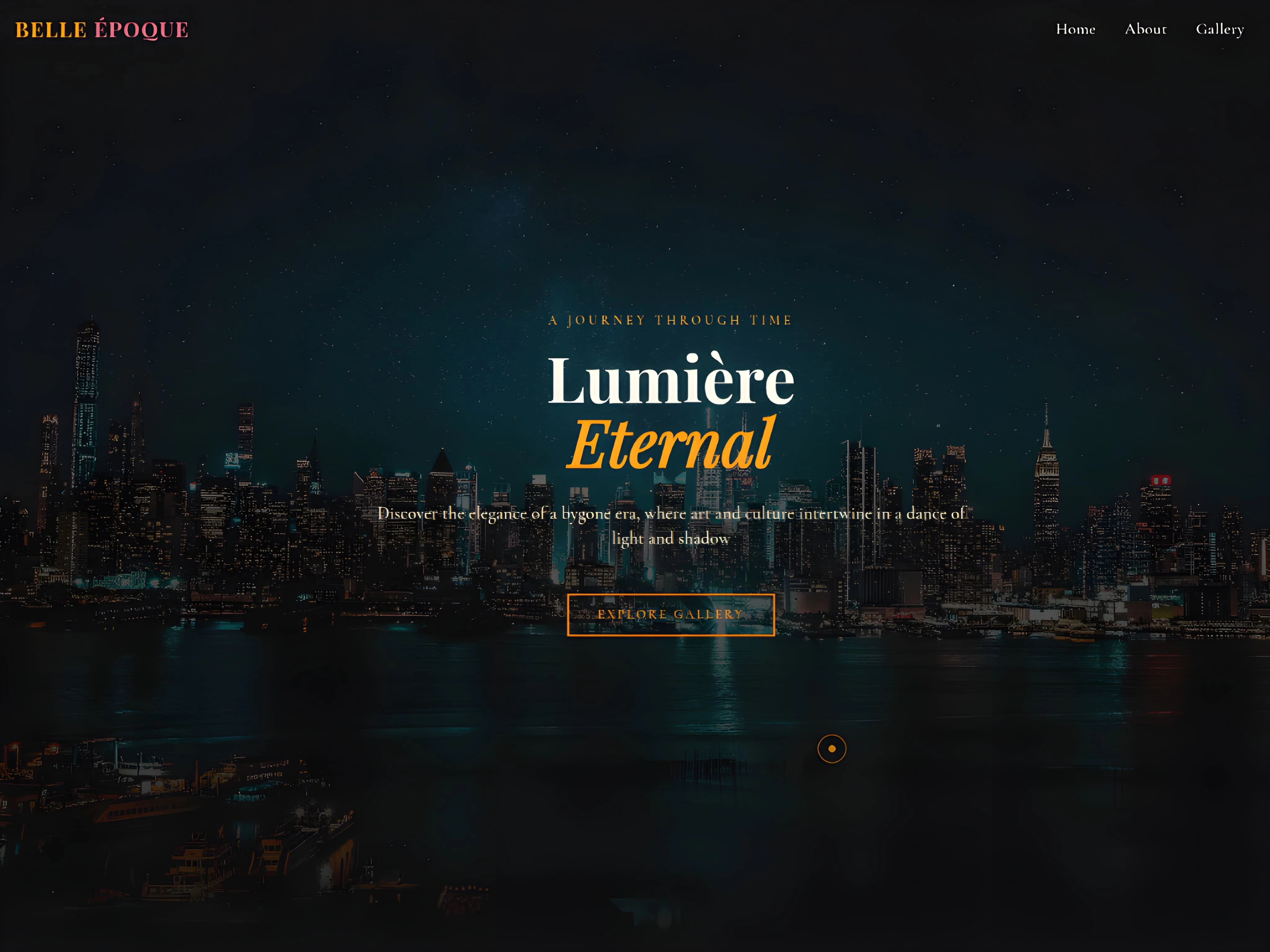
Crafting Digital Atmospheres: A Proof of Concept Inspired by Belle Epoque and Clair Obscur: Expedition 33
This proof of concept project, hosted at https://jovial-cupcake-e7ad8f.netlify.app/, was a thrilling opportunity to explore the power of translating specific artistic eras and game aesthetics into a unique web experience.
The inspiration came from two complementary sources: the elegance and artistic flourish of Belle Epoque France and the intriguing, atmospheric world of the game Clair Obscur: Expedition 33 (https://expedition33.com) .
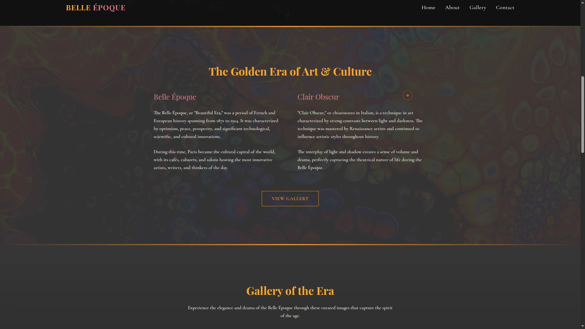
My goal was to move beyond standard web templates and demonstrate the ability to build a site where the design itself tells a story and evokes a strong feeling. This proof of concept showcases how we can draw inspiration from existing art styles and visual narratives to create something truly distinctive online.
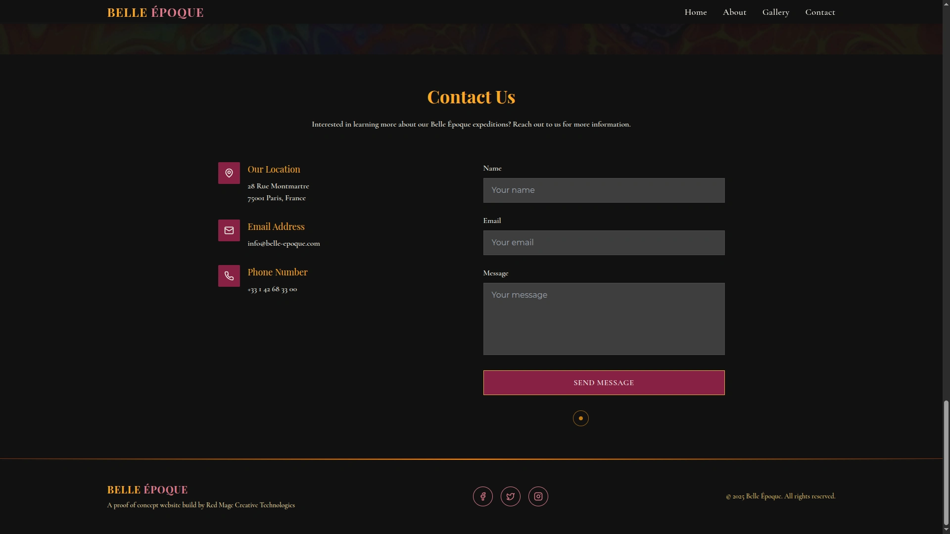
The Contact Form at the End of the Page
The development process involved carefully selecting color palettes, typography, and layout elements that capture the essence of these inspirations. We experimented with deeper, richer tones reminiscent of Belle Epoque interiors and the atmospheric visuals seen in Clair Obscur. Typography was chosen to lend a touch of classical elegance or intriguing mystery, depending on the section. The structure and flow of the site were designed to feel intentional and immersive, much like exploring a carefully crafted world.
This project highlights my ability to:
Understand and translate complex visual aesthetics into functional web design.
Create unique, concept-driven websites that stand out.
Pay meticulous attention to detail in typography, color, and layout to build a specific atmosphere.
Building this site was a rewarding exercise in demonstrating how web development can be an art form. If you have a strong vision for your brand or project and want a website that goes beyond the ordinary to truly embody your unique style and tell your story, I'd love to help you bring it to life. Let's build something inspired.
Like this project
Posted May 13, 2025
Created a web experience inspired by Belle Epoque and Clair Obscur aesthetics. A proof of concept build using Bolt.new!