Figma Redesign to Enhance AGexpress
Prabin Buddhacharya
AGexpress Landing Page Redesign: Figma Design Enhancement
Role: UX/UI Designer
Timeline: 1 week (Design Refinement & Handoff)
Tools: Figma, Loom
Platform: NEXT JS(Final implementation)
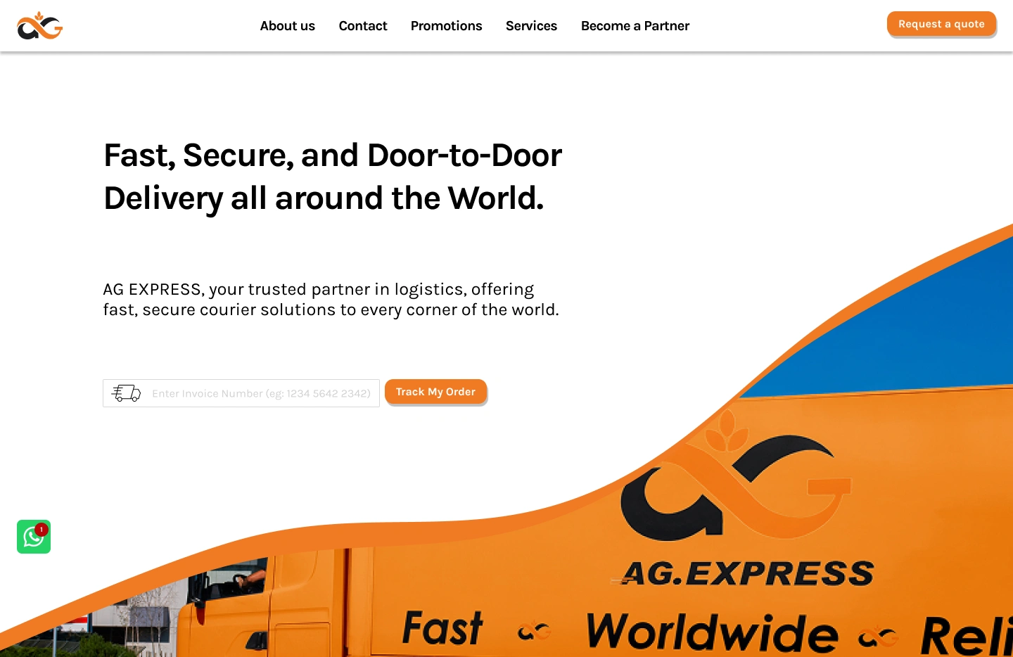
Current Landing page
The Problem
The current logistics and courier company website was hard to navigate, outdated, and not mobile-friendly. Customers struggle to book shipments, track parcels, and find information quickly.
A redesign is needed to make the website clear, easy to use, and accessible on all devices.
The Ask
Refine the Homepage, About, and Contact pages.
Improve layout structure, alignment, and spacing.
Elevate visual hierarchy while keeping things clean and expressive.
Support developer handoff with clear documentation.
Ensure the final experience felt polished, modern, and conversion-oriented.
My Approach
Discovery + Design Audit
Before starting the ag.express redesign, I reviewed the existing website, design files, and user flows. I also asked questions about the platform’s future plans and goals to make sure the redesign would work both now and in the long term. This helped guide my design choices for better usability, brand consistency, and conversions.
Desktop First
I began by improving the desktop Homepage in a new Figma file, setting clear spacing, layout and hierarchy. I made the design consistent across key pages like Services, About and Contact, with clearer navigation, stronger calls-to-action, and simpler content. The goal was to keep ag.express’s professional look while making the site easier to use and more engaging.
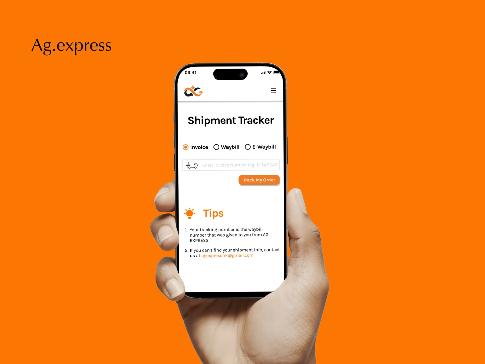
Added new page to track the order and shipment process
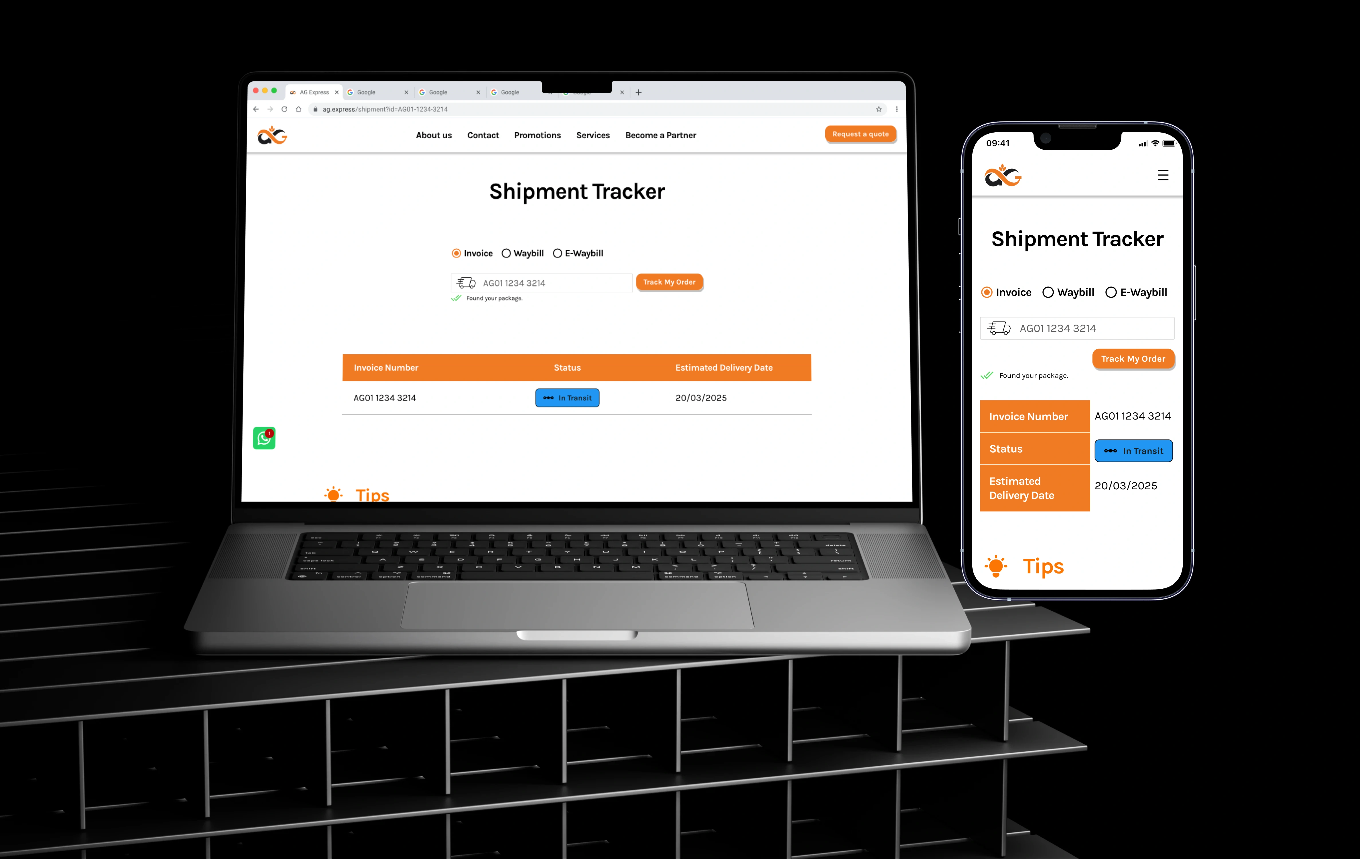
Shipment
Collaborative Review Loops
I used Loom videos to explain my design decisions, and we worked asynchronously through Figma comments. This made feedback clear and easy for the client.
Dev Handoff Documentation
For a smooth move to NEXT JS, I added notes on implementation, responsiveness, and animations to the final designs. Everything was fully documented for handoff.
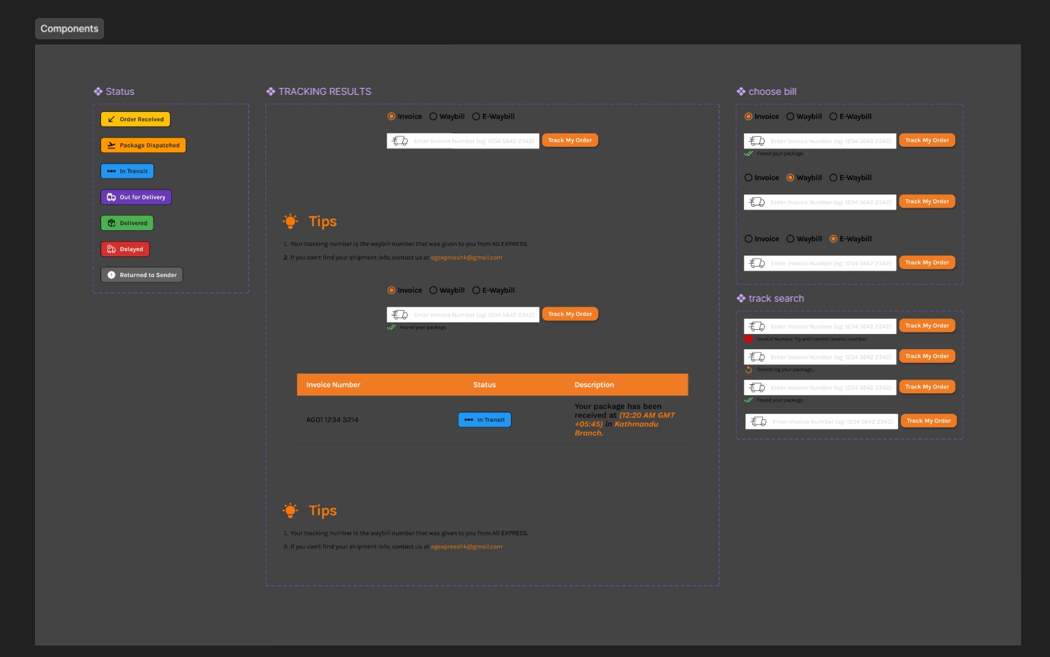
Screenshot of Components Used
The Impact
A clear, confident homepage design that feels modern and easy to understand.
Responsive layouts that work well on all devices.
Stronger call-to-action visibility with less visual clutter.
Smooth developer handoff with full notes for animations.
Like this project
Posted Jan 23, 2025
This project focused on redesigning the website based on user feedback and creating a new page for tracking orders and shipments.
Likes
0
Views
11
Timeline
Mar 30, 2025 - Apr 12, 2025