Modern Poker Experience for Mobile

Monodeep Samanta


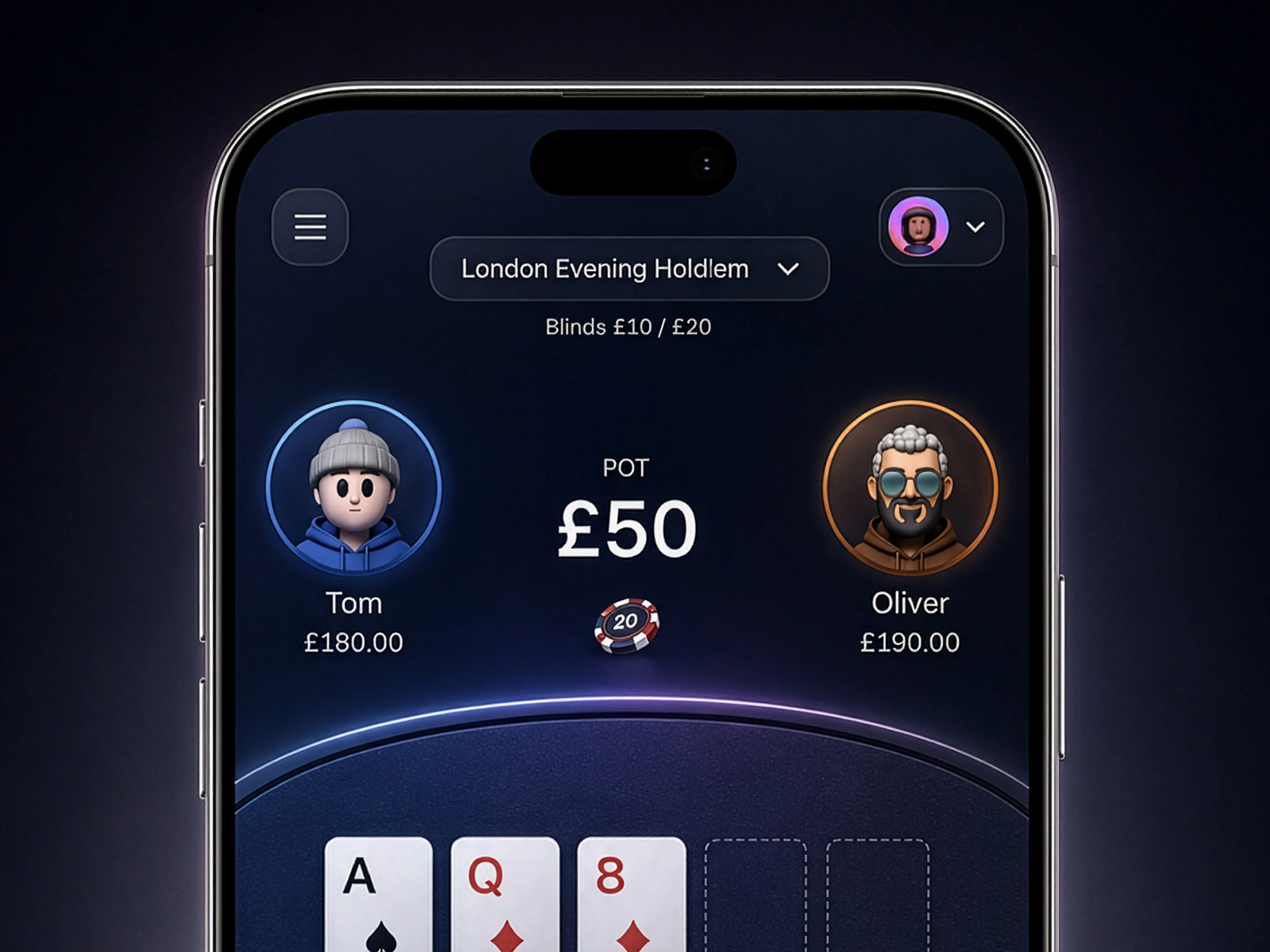
Minimal Apple-Inspired UI
The interface uses principles closer to a premium iOS product than a traditional casino website.
Large typography communicates important numbers immediately. Controls use generous touch targets, restrained corner radii and subtle translucent surfaces.
Dark navy replaces pure black, while carefully controlled blue, violet, orange and green highlights establish meaning without turning every component into a glowing element.
The Challenge
Most poker interfaces try to display too much information at once. Player statistics, chips, controls, wallet information, timers and decorative gaming graphics often compete for attention.
For mobile, this creates three problems:
The actual poker table becomes secondary.
Important actions such as Fold, Call, Raise and Check are harder to scan.
Heavy casino graphics can make the experience feel dated rather than premium.
The design challenge was therefore simple: How can we make poker feel immersive without making the interface feel busy?
Design Strategy
Gameplay First
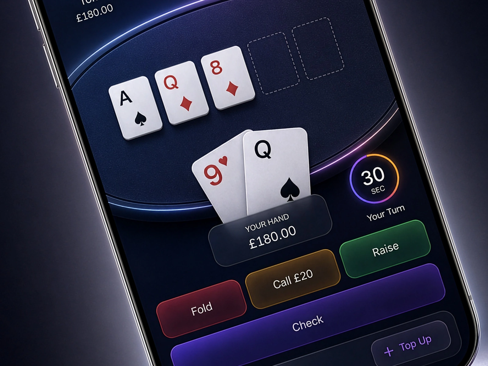
The poker table occupies the majority of the screen because that is where the user's attention naturally belongs.
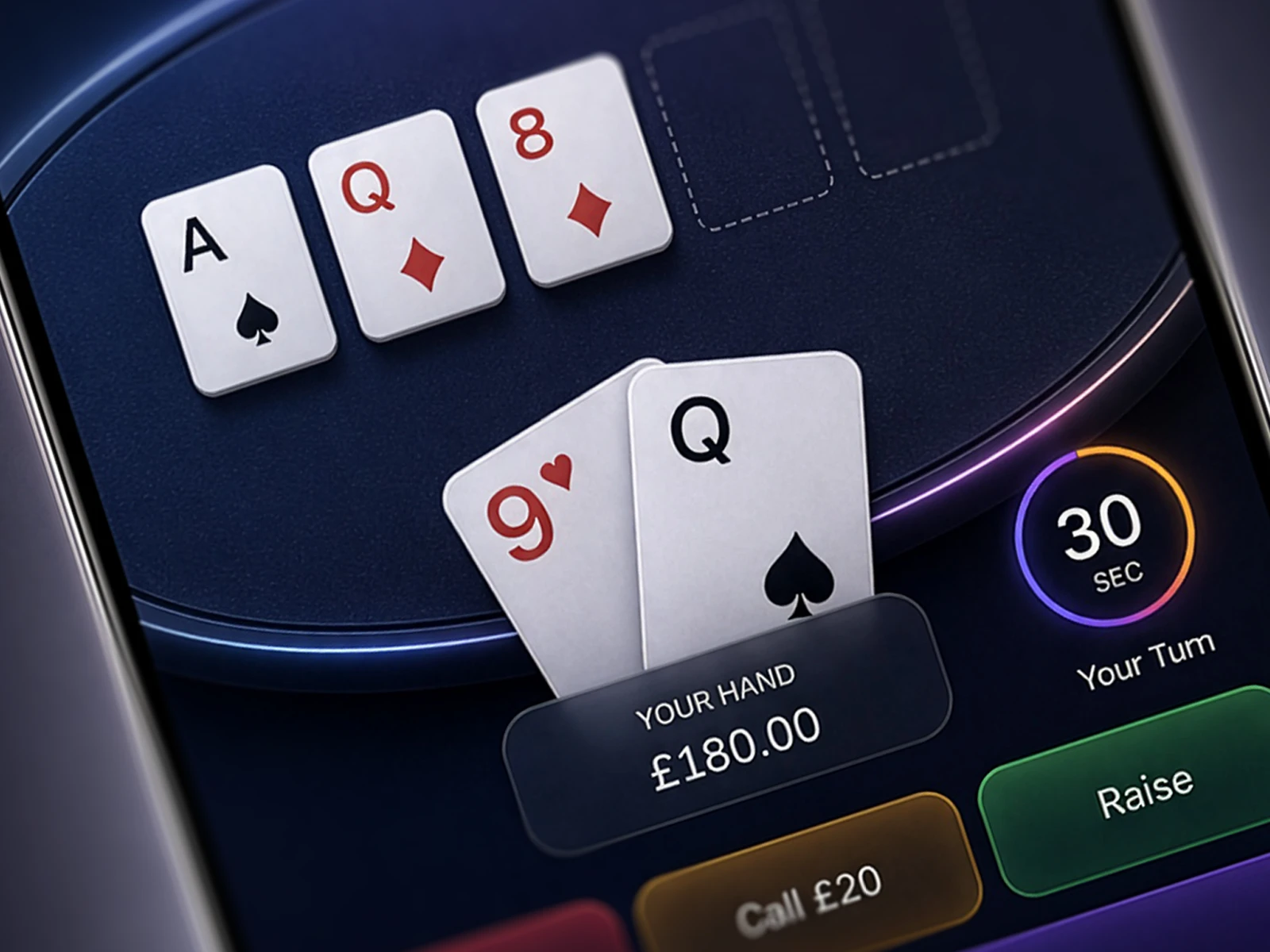
Community cards sit directly within the table while the player's cards visually overlap the lower edge. This creates depth without requiring unnecessary 3D decoration.
The hierarchy becomes:
Pot → Players → Community Cards → Your Hand → Timer → Actions
Everything else remains visually quieter.
Like this project
Posted Aug 29, 2026
Decorating every area, the interface gives the poker table, cards, pot value and player decisions the strongest visual priority.
Likes
0
Views
2