Designing Solar Energy for Every

Monodeep Samanta

Designing Solar Energy for Every Screen
Solar energy data is often complex, technical, and difficult to understand quickly. This concept explores how that information can become simple, visual, and useful across both mobile and Apple Watch.
The iPhone experience gives users the complete picture. They can track solar output, monitor energy value, sell or buy energy, manage contributions, and follow sustainability goals.
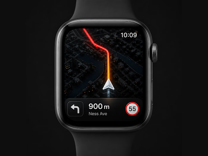
The Apple Watch version focuses only on what matters in the moment. Users can check their balance, view goal progress, monitor performance, and take quick actions without opening the full app.
The visual system uses a dark interface with lime, yellow, cyan, purple, and orange accents. Each colour has a purpose, helping users separate energy production, transactions, progress, and community activity without making the interface feel overwhelming.
The main UX principle was simple:
The phone is for understanding and management.
The watch is for awareness and quick action.
This creates a connected experience where renewable energy feels less technical, more personal, and easier to engage with every day.
#UIDesign #UXDesign #ProductDesign #AppleWatch #WatchOS #MobileAppDesign #SolarEnergy #Sustainability #CleanEnergy #Figma #InteractionDesign
Like this project
Posted Jul 30, 2026
Designing Solar Energy for Every Screen Solar energy data is often complex, technical, and difficult to understand quickly. This concept explores how that i...
Likes
0
Views
2