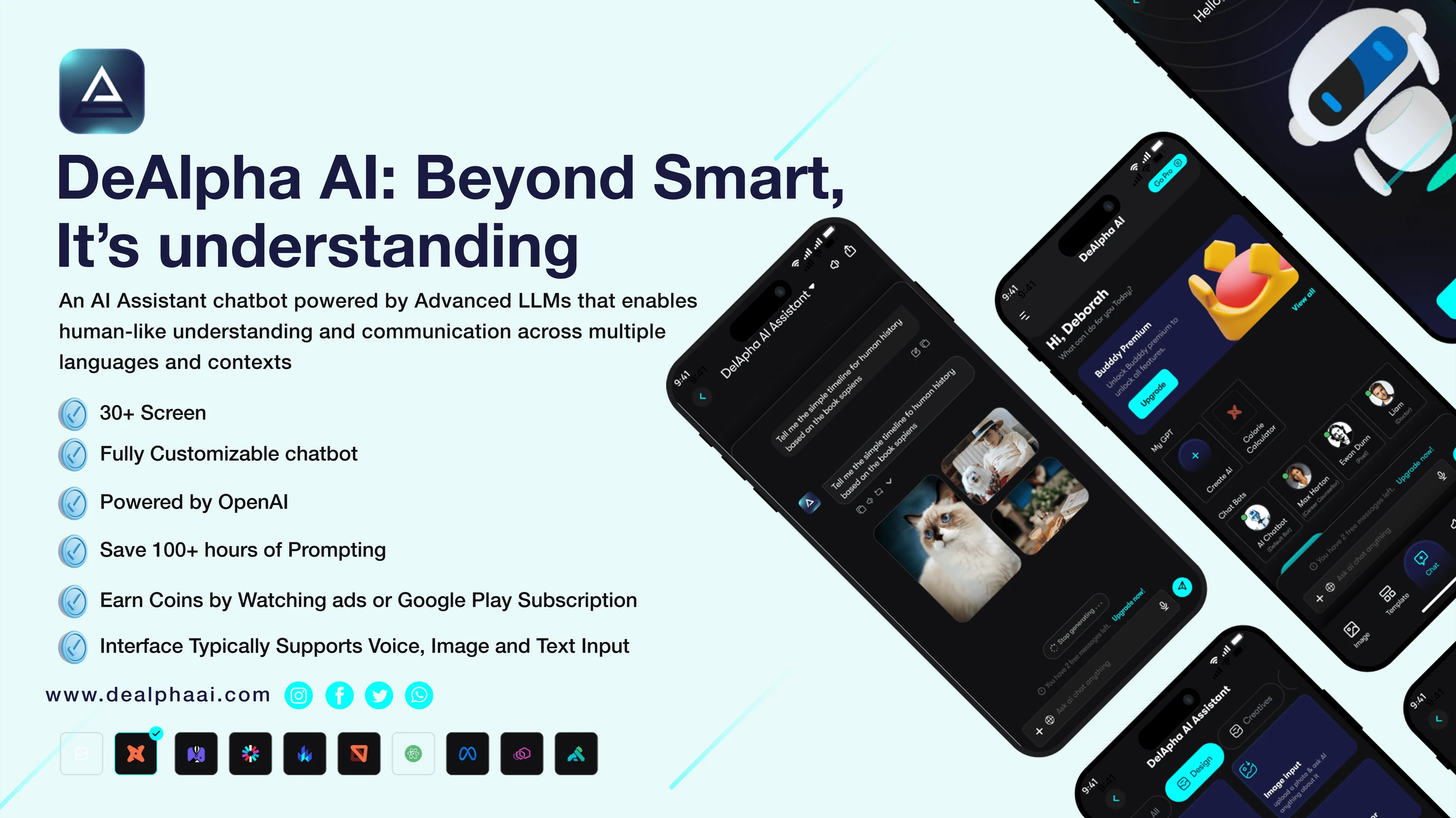
AI Assistant ChatBot
Deborah Adepoju
I was tasked with completely redesigning a mobile application to enhance the user experience, modernize the interface, and integrate new premium features while maintaining the existing backend functionality. My goal was to create a cohesive design system that would work seamlessly across both mobile and tablet form factors, ensuring consistency and improved usability
Project Goals
Introducing DelApha- your AI companion that fits in your pocket. With a sleek, minimalist interface featuring a calming gradient and floating celestial animations, DelApha is more than just another AI assistant. The app uniquely adapts to your daily rhythm, showing a dynamic interface, while intelligent gestures let you simply swipe to switch between chat, voice, and camera modes. What sets DelApha apart is its emotional intelligence system that reads your tone and mood, adjusting its responses and even the UI's color temperature to match your emotional state - creating a truly personalized experience that grows more intuitive with every interaction.
To modernize the visual design of the application while preserving its established brand identity. I also sought to integrate innovative premium features, such as chatbot creation and a voice assistant, to expand functionality. Improving the overall user experience and navigation was essential, alongside ensuring accessibility compliance to meet diverse user needs. Ultimately, I aimed to provide a consistent and reliable experience across all devices.
Discovery Phase
Problem Statement
The existing application, while functional, required a significant refresh to align with modern design standards and support new premium features. Key challenges identified included:
The outdated visual design did not reflect the brand’s current identity, and there was limited infrastructure to support the planned premium features. The user experience across devices lacked consistency, and accessibility enhancements were urgently needed to ensure inclusivity for all users.
User Research
To gain insights into the existing application and identify areas for improvement, I undertook a comprehensive user research phase. This involved analyzing user feedback and usage patterns to understand real-world issues, conducting a competitive analysis of similar applications to benchmark the redesign, and interviewing stakeholders to align business goals with user needs. I also conducted user interviews to uncover pain points and potential opportunities for improvement.
Key Insights
My research revealed several critical insights:
Users expressed a strong desire for more intuitive navigation, particularly for complex features.
The premium features required a clear value proposition to encourage adoption.
The voice assistant functionality needed greater visibility and usability improvements.
The subscription process was overly complicated and needed simplification.
Design Process
Information Architecture
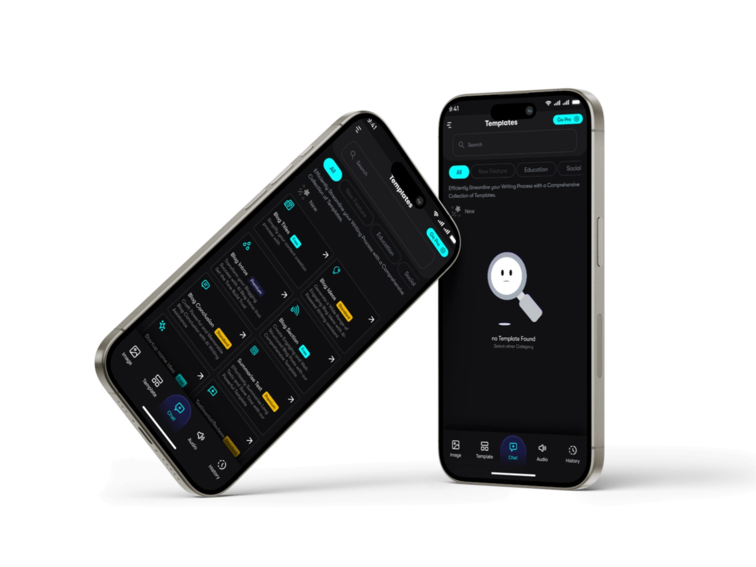
I started by mapping out the application’s structure to establish a robust foundation. This process involved creating detailed user flow diagrams for key interactions, which ensured a seamless experience for all use cases. I developed a screen hierarchy that encompassed over 15 screens, mapped relationships between different features, and established consistent navigation patterns to support user journeys effectively.
Brand Guide/Design System Development
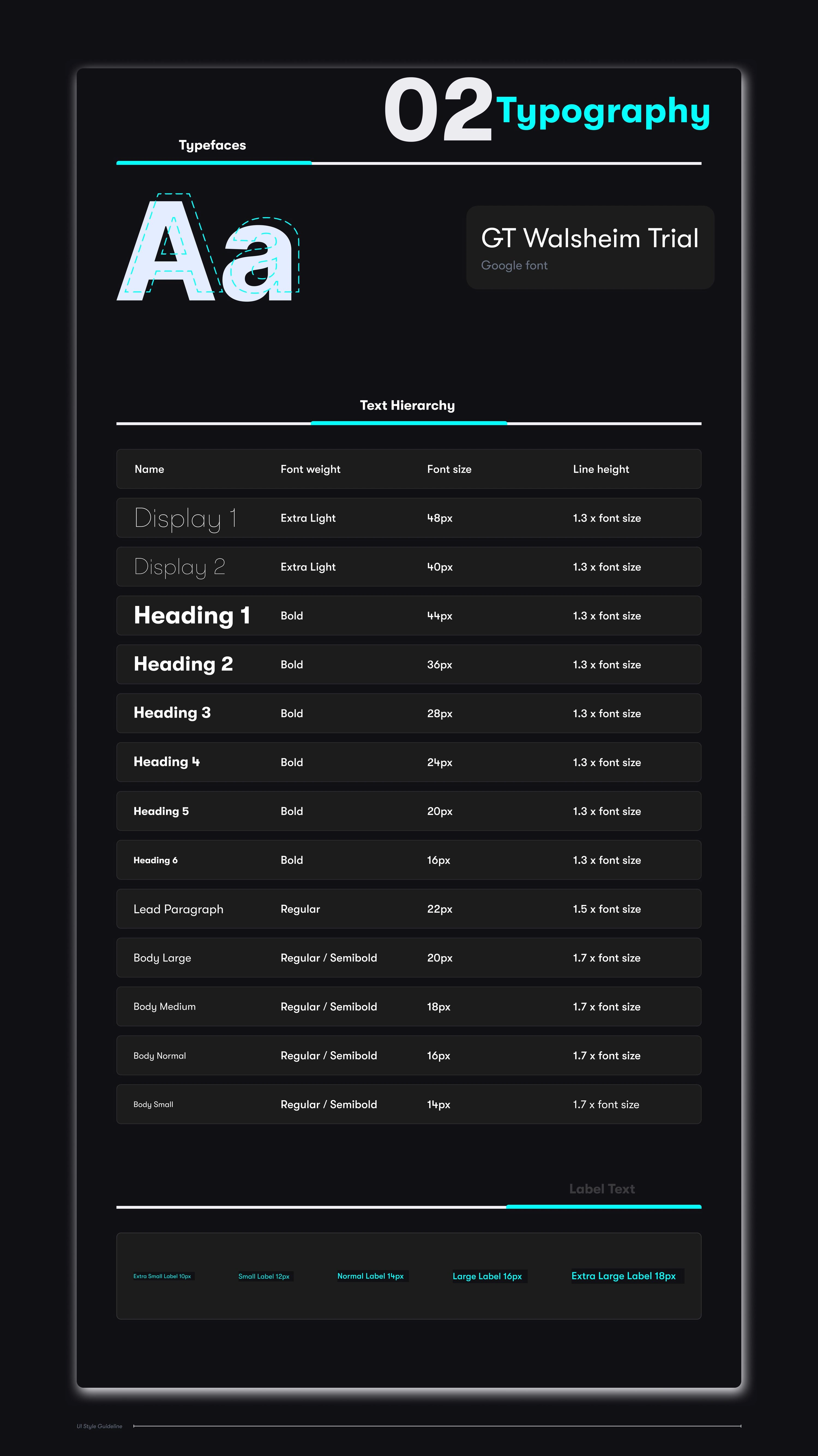
Typography
The primary typeface chosen for this project was GT Walsheim Trial. This font was selected for its clean and modern appearance, which aligns with the brand’s identity. It was used consistently across headings, body text, and interactive elements to ensure a cohesive and professional look. The color palette featured a well-balanced mix of primary and secondary colors, with careful consideration for accessibility requirements. I built a component library containing reusable elements like buttons, cards, and input fields to promote consistency. I also established a responsive grid system to ensure layouts adapted seamlessly to various devices and defined standard interaction patterns to provide predictable behaviors for common user actions
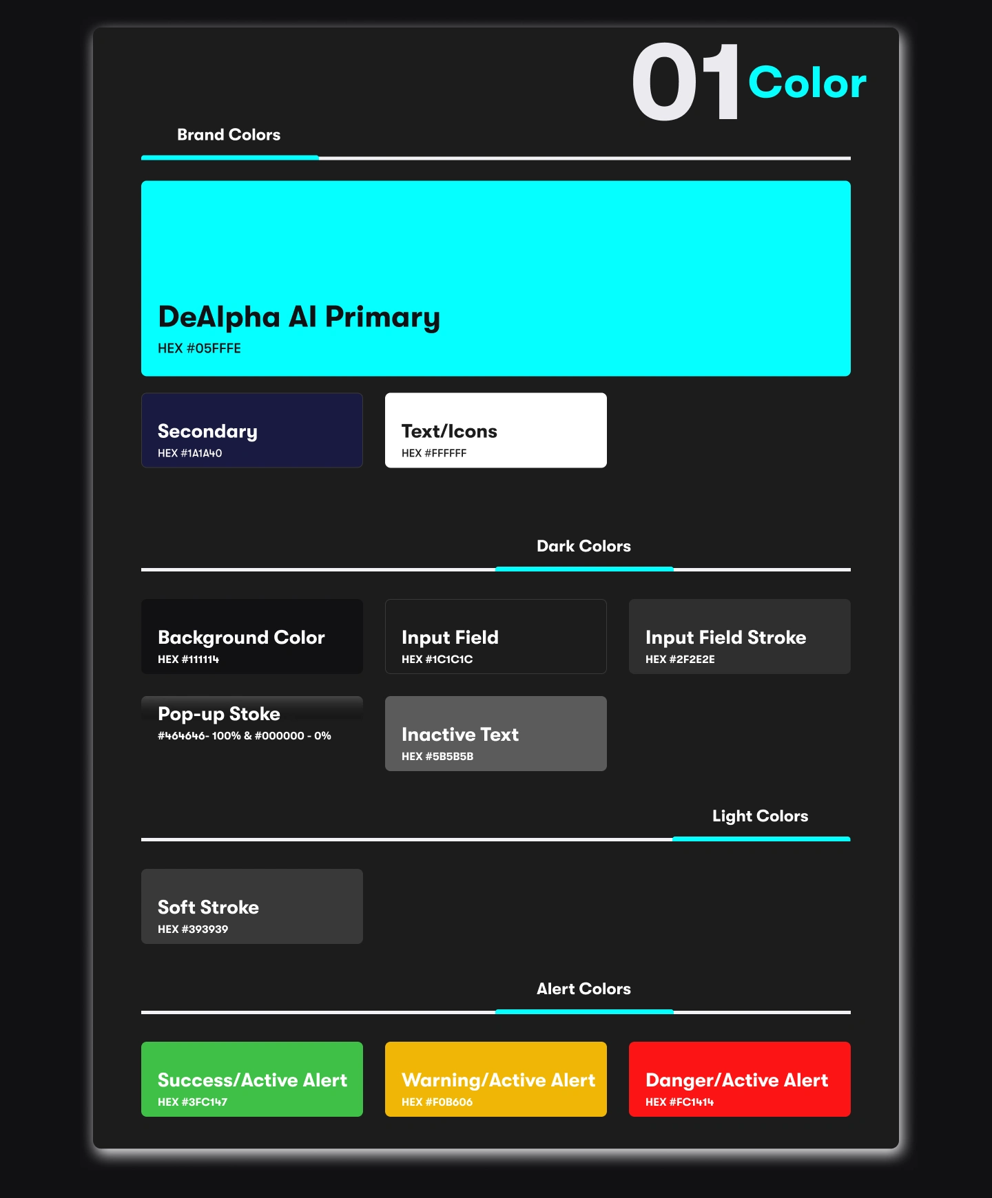
Color Palette
The color palette was designed to balance aesthetic appeal and accessibility. The primary colors included vibrant shades that resonate with the brand’s personality, while the secondary colors provided complementary tones for accents and subtle highlights. All colors were tested for contrast ratios to meet accessibility standards.
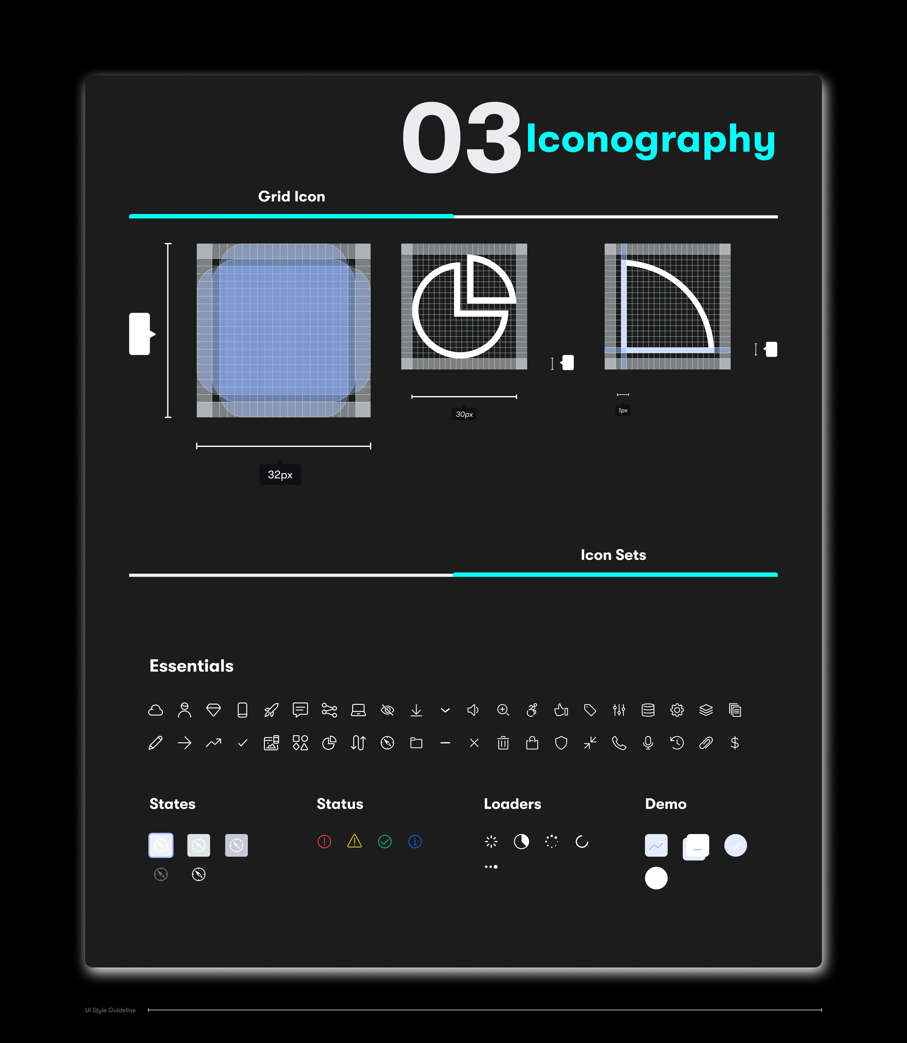
Iconography and Imagery
Icons were created using a minimalist approach to match the overall design language. Each icon was carefully crafted to ensure clarity and recognition at various sizes. Imagery focused on high-quality, relatable visuals that enhanced the user’s experience and reinforced brand messaging.
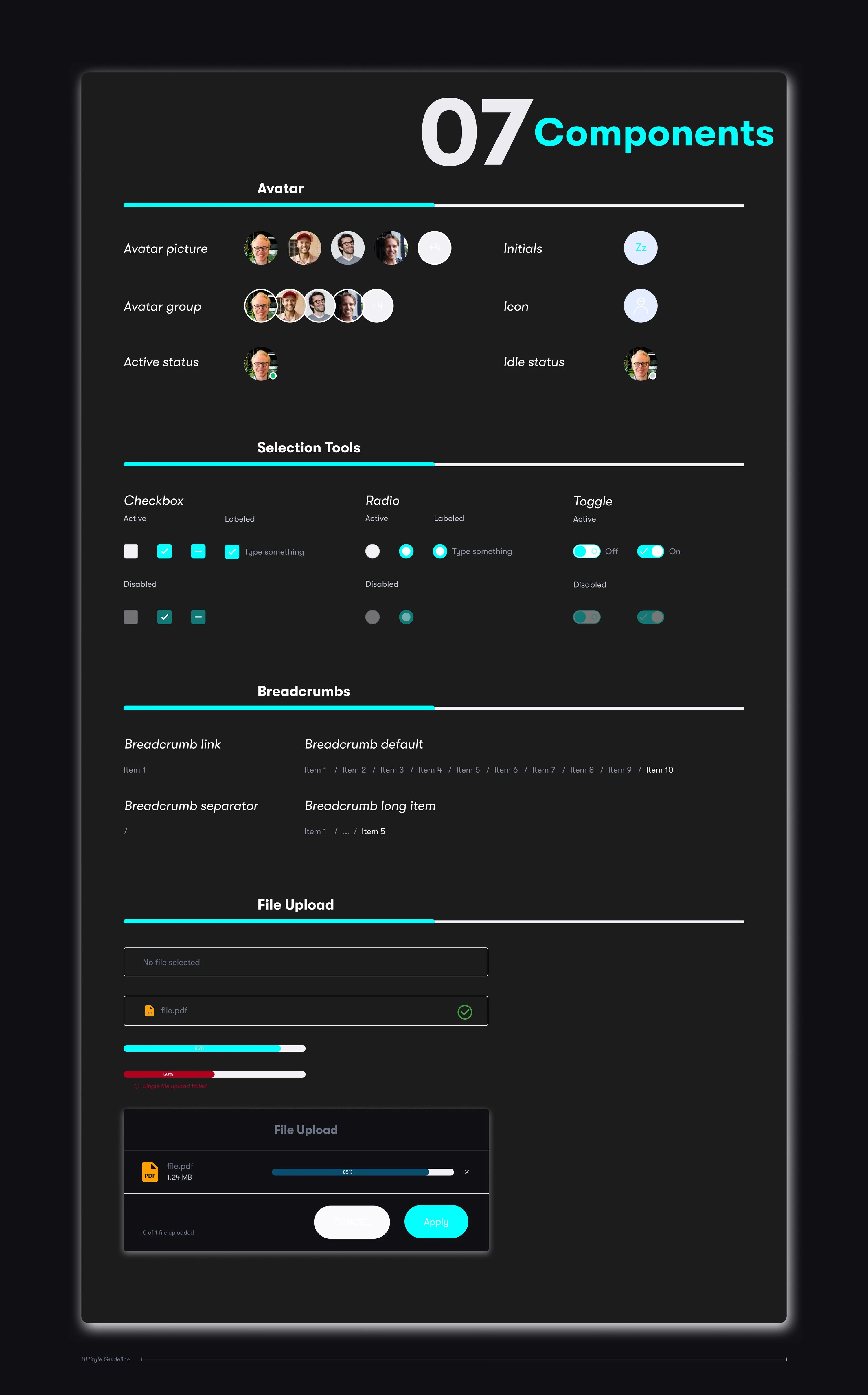
Component Library
The component library featured reusable elements like buttons, cards, modals, and inputs. These components were designed with flexibility in mind, allowing for consistent application across different screens and devices. States such as hover, active, and disabled were defined for each component to maintain interaction consistency.
Prototyping
Iterative prototypes were instrumental in refining the design. I focused on developing prototypes for key areas, such as the main navigation flows, the chatbot creation wizard, the voice assistant interface, subscription management, and responsive layouts optimized for tablets. These prototypes helped validate design decisions and provided a tangible reference for stakeholders and developers.
Key Features Design
Premium Chatbot Creation
I implemented a step-by-step wizard interface for the chatbot creation feature. This design approach provided users with clear guidance through each step of the process. I introduced a strong visual hierarchy to prioritize options effectively, added progress indicators to keep users informed, included a preview functionality for real-time feedback, and designed error states alongside contextual help systems to address potential user challenges.
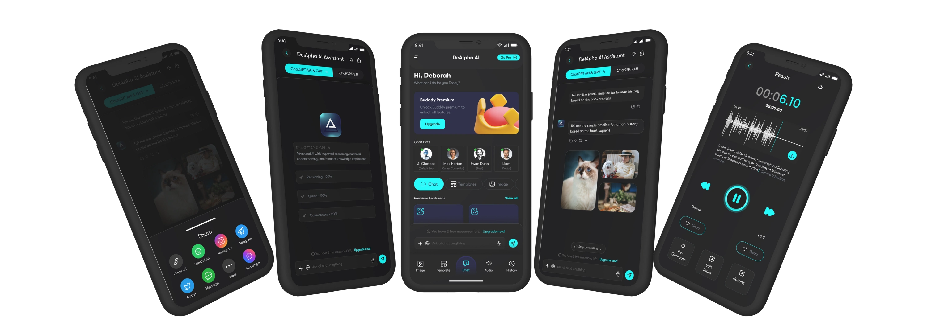
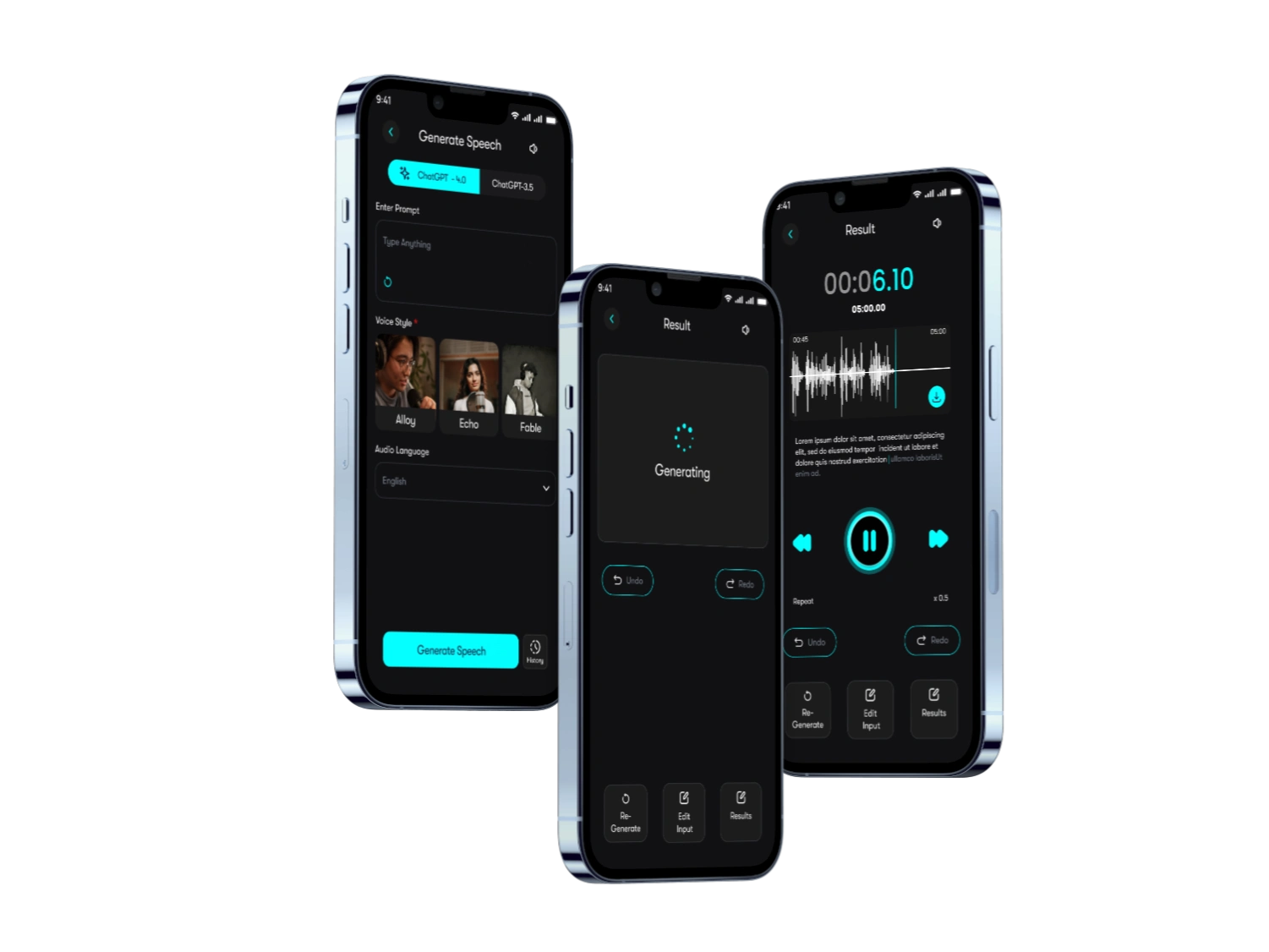
Voice Assistant Interface
For the voice assistant, I developed a minimal, focused interface that enhanced usability. Clear visual feedback was implemented to guide users during voice interactions, and accessible alternatives were included to accommodate diverse user needs. The design accounted for different states, such as listening, processing, and responding, ensuring a seamless user experience.
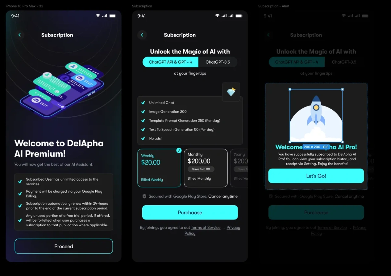
Subscription Management
The subscription management feature underwent significant simplification. I redesigned the pricing display to be more straightforward and created clear feature comparison charts to assist decision-making. Integration with Google subscriptions was made seamless, and I implemented user-friendly flows for upgrading and downgrading subscription plans.
Implementation
Design Handoff
To ensure a smooth transition from design to development, I provided detailed specifications to the development team. These included component documentation, optimized assets for Flutter, interaction specifications, and documentation of accessibility requirements. This comprehensive handoff minimized ambiguity and streamlined the development process.
Quality Assurance
I conducted rigorous usability testing using prototypes to validate design decisions. Accessibility compliance was verified to meet WCAG 2.1 standards, and responsive behavior was tested to ensure consistency across devices. Cross-device consistency checks further ensured a uniform user experience.
Results and Impact
The redesign delivered significant improvements, including:
Increased user satisfaction scores, attributed to enhanced usability and modern aesthetics. Users completed key tasks more efficiently, and adoption rates for premium features saw a notable rise. Additionally, the application achieved better accessibility compliance scores, reflecting the inclusive design approach.
Lessons Learned
This project offered valuable insights:
Collaborating with developers early in the design phase proved crucial for realistic design decisions. Maintaining a consistent component library facilitated efficiency and scalability. Iterative prototyping allowed for effective testing and feedback incorporation. Clear documentation was vital for seamless communication between design and development teams.
Future Considerations
Looking ahead, I plan to:
Continuously monitor user feedback to identify areas for improvement. Regularly update the design system to keep pace with evolving requirements. Expand the component library to support future enhancements. Explore opportunities for performance optimization to further enhance the user experience.
Technical Specifications
Design Tools
I used the following tools and frameworks:
The design frame was optimized for iPhone 16 Pro Max. GT Walsheim Trial served as the primary font. Figma was my primary Design Tool and Protopie for the Final Prototype Handover. Accessibility compliance adhered to WCAG 2.1 standards.
Deliverables
The final deliverables included:
High-fidelity mockups for all screens, interactive prototypes, a comprehensive style guide, an asset package optimized for Flutter, and detailed technical documentation for the development team.
Personal Reflection:
🔑
This project highlighted the complexity of Standardized interaction patterns ensuring predictable behaviors for common actions, such as tapping buttons, swiping through carousels, and interacting with form fields. These patterns contributed to a seamless and intuitive user experience, reducing cognitive load for users. Accessibility was a core focus in this project. The typography and color palette were carefully chosen to ensure readability and visual clarity for users with visual impairments. Interactive elements were designed to be keyboard-navigable and compatible with screen readers, ensuring inclusivity for all users.
ℹ️
This project is not live
Like this project
Posted Jan 29, 2025
Introducing DelApha- your AI companion that fits in your pocket. With a sleek, minimalist interface featuring a calming gradient and floating celestial animati…
Likes
0
Views
17