Built with Framer
Landing page redesign for AI Voice Agent Platform

Fawaz Ahamed


Overview
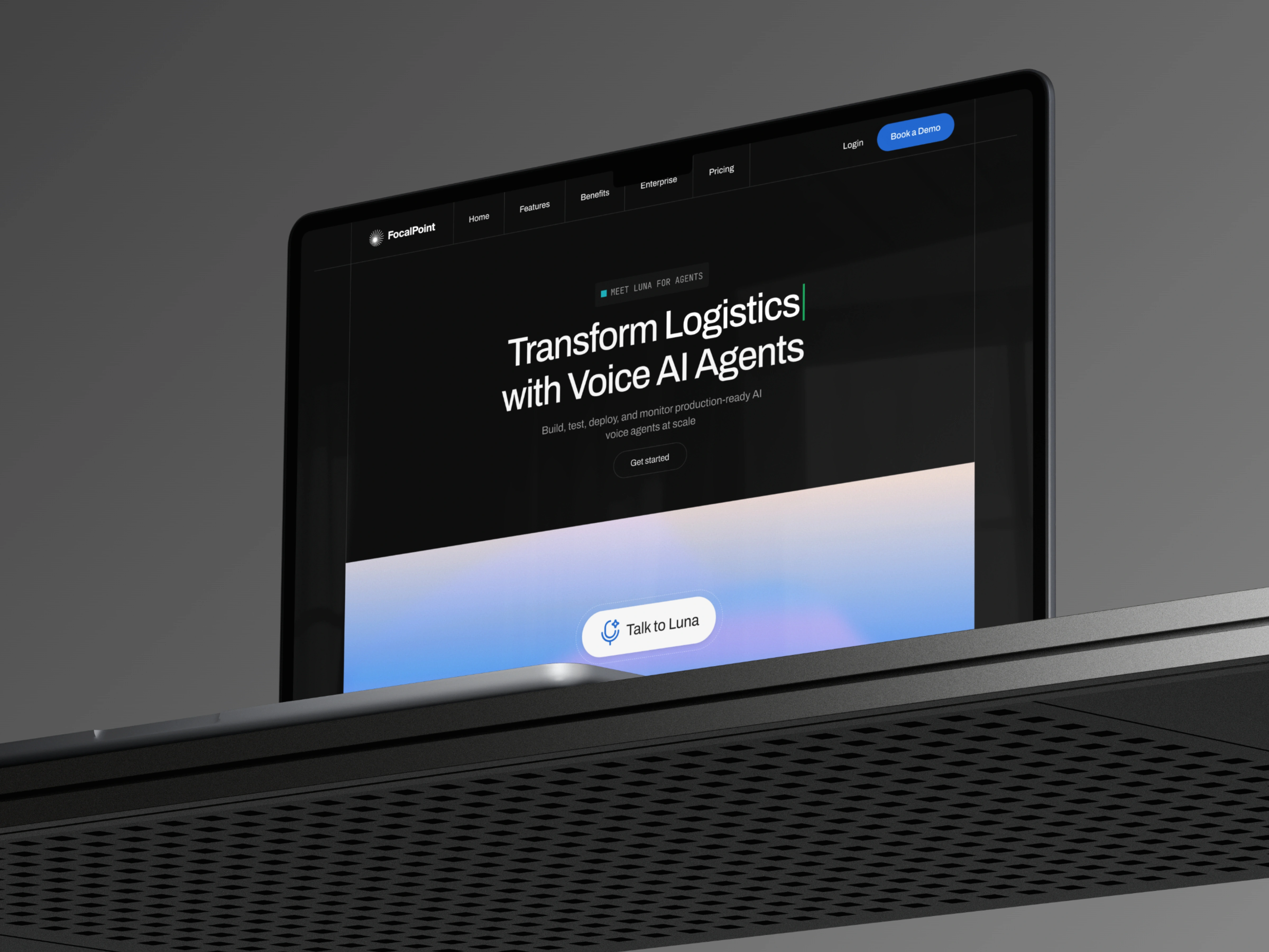
Focalpoint is a call analytics and call management platform designed to help businesses better understand and manage their conversations.
I redesigned the Focalpoint website and landing page with a focus on clearer positioning, stronger visual hierarchy, and a more intuitive user experience.
The goal was to make the product easier to understand at a glance while creating a more structured journey from awareness → understanding → trust → action.
Problem
The original landing page communicated a lot of product information, but the overall experience made it difficult for visitors to quickly understand the product's value.
The key challenges were:
Unclear product positioning above the fold
Feature-heavy content with limited user context
Weak visual hierarchy that diluted important CTAs
Limited trust signals for first-time visitors
Content that required too much effort to scan and understand
The core UX problem was simple:
Visitors should be able to understand what Focalpoint does, who it is for, and why it matters within seconds.
The Process
I approached the redesign as a UX and communication problem, rather than simply giving the existing website a new visual style.
01 - Clarify the Value Proposition
I reworked the above-the-fold experience to make the product's core value immediately understandable.
The hero section was structured around:
What it does → Who it's for → Why it matters → What to do next
This gave users a clear starting point and reduced ambiguity from the first interaction.
02 - Restructure the Content
Instead of presenting features as isolated capabilities, I reorganized the landing page around the user's journey.
The content flow moves from:
Problem → Solution → Product capabilities → Use cases → Trust → CTA
This creates a more natural progression and allows users to understand the product before being asked to take action.
03 - Improve Scannability
For the UI/UX design, I simplified the information architecture and introduced stronger visual hierarchy.
I used clear headings, concise content blocks, whitespace, and supporting visuals to make the website easier to scan.
The objective was to help visitors find the information they need without reading every section in detail.
04 - Strengthen Conversion Paths
I reviewed the placement and hierarchy of CTAs throughout the landing page design.
Rather than allowing calls to action to compete with surrounding content, I created clearer visual emphasis and positioned CTAs around key decision points in the user journey.
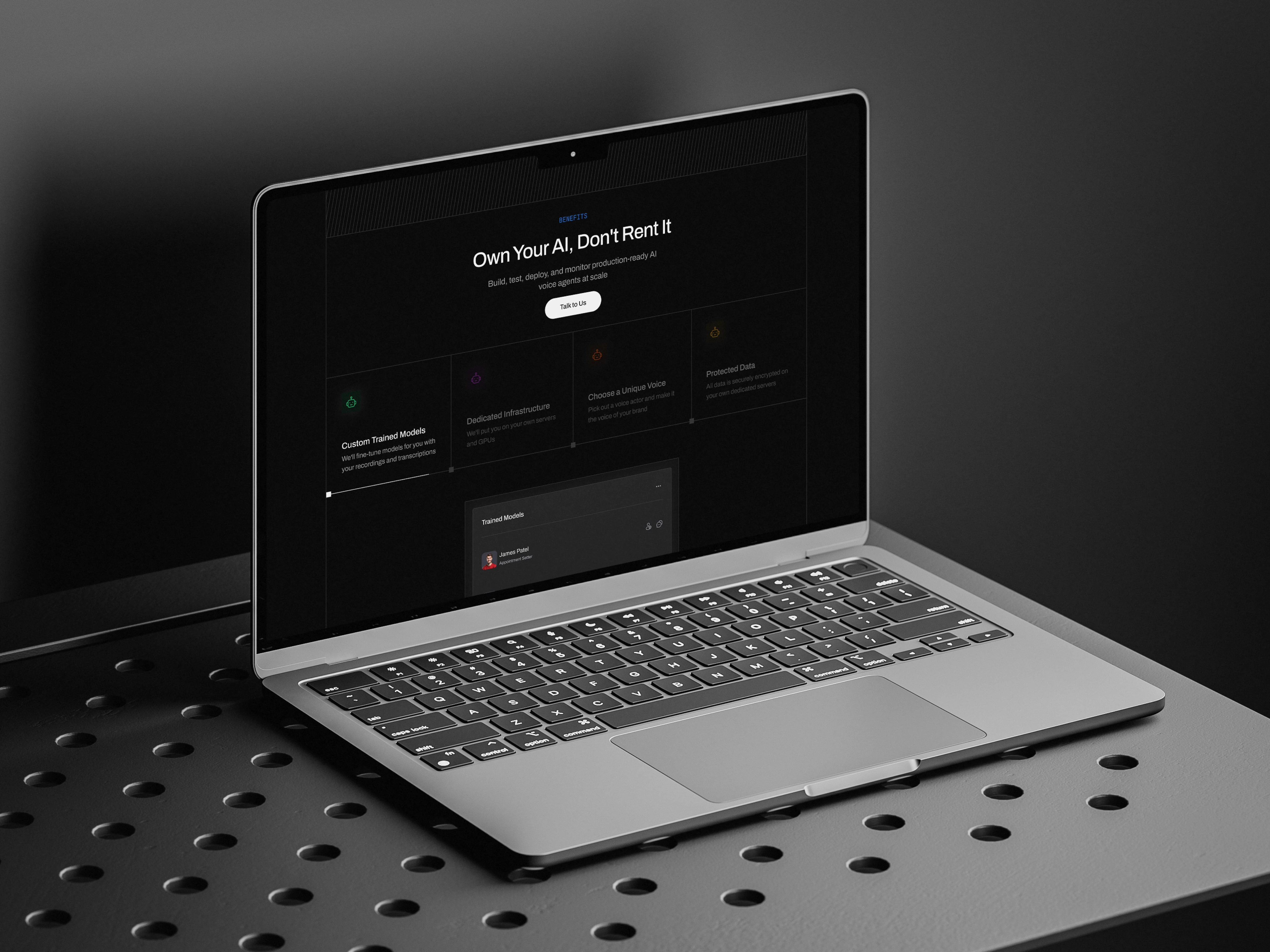
Key Design Decisions
Clearer Hero Section
The hero became the primary communication point for the product, with a stronger relationship between headline, supporting copy, product visual, and CTA.
Feature-to-Value Storytelling
I shifted the focus from simply showing what the platform has to communicating what users can achieve with it.
This helped make complex call analytics capabilities easier to understand.
Stronger Visual Hierarchy
Typography, spacing, section structure, and UI components were refined to establish a clear hierarchy across the website.
Important information gets attention first, while secondary content remains accessible without competing for attention.
Product-Focused Visuals
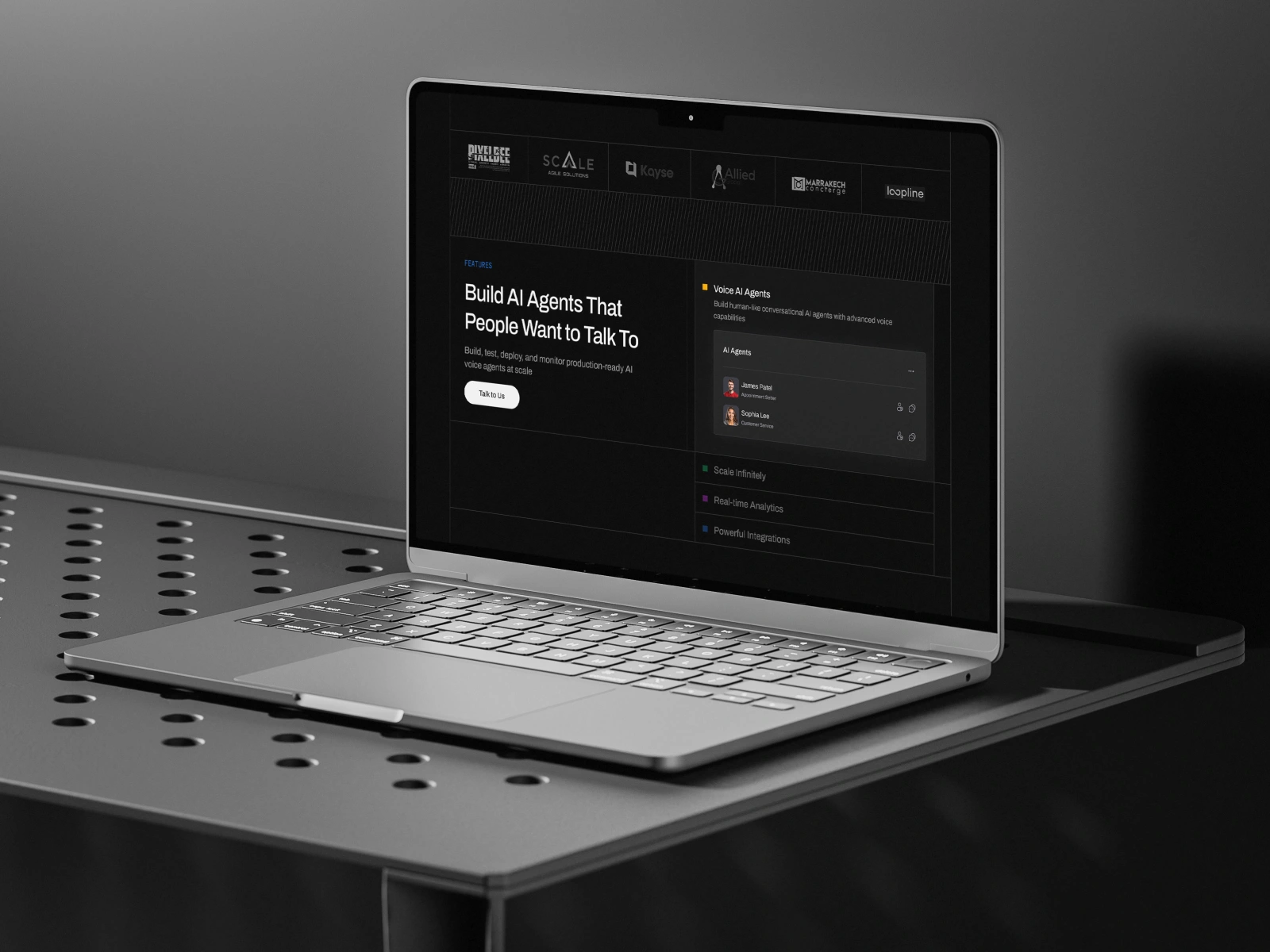
I used product UI and interface elements to give visitors a clearer understanding of how Focalpoint works in practice.
This makes the abstract value of call analytics more tangible.
Trust & Validation
Trust-focused sections were introduced into the page structure to help reduce uncertainty for first-time visitors and support the decision-making process.
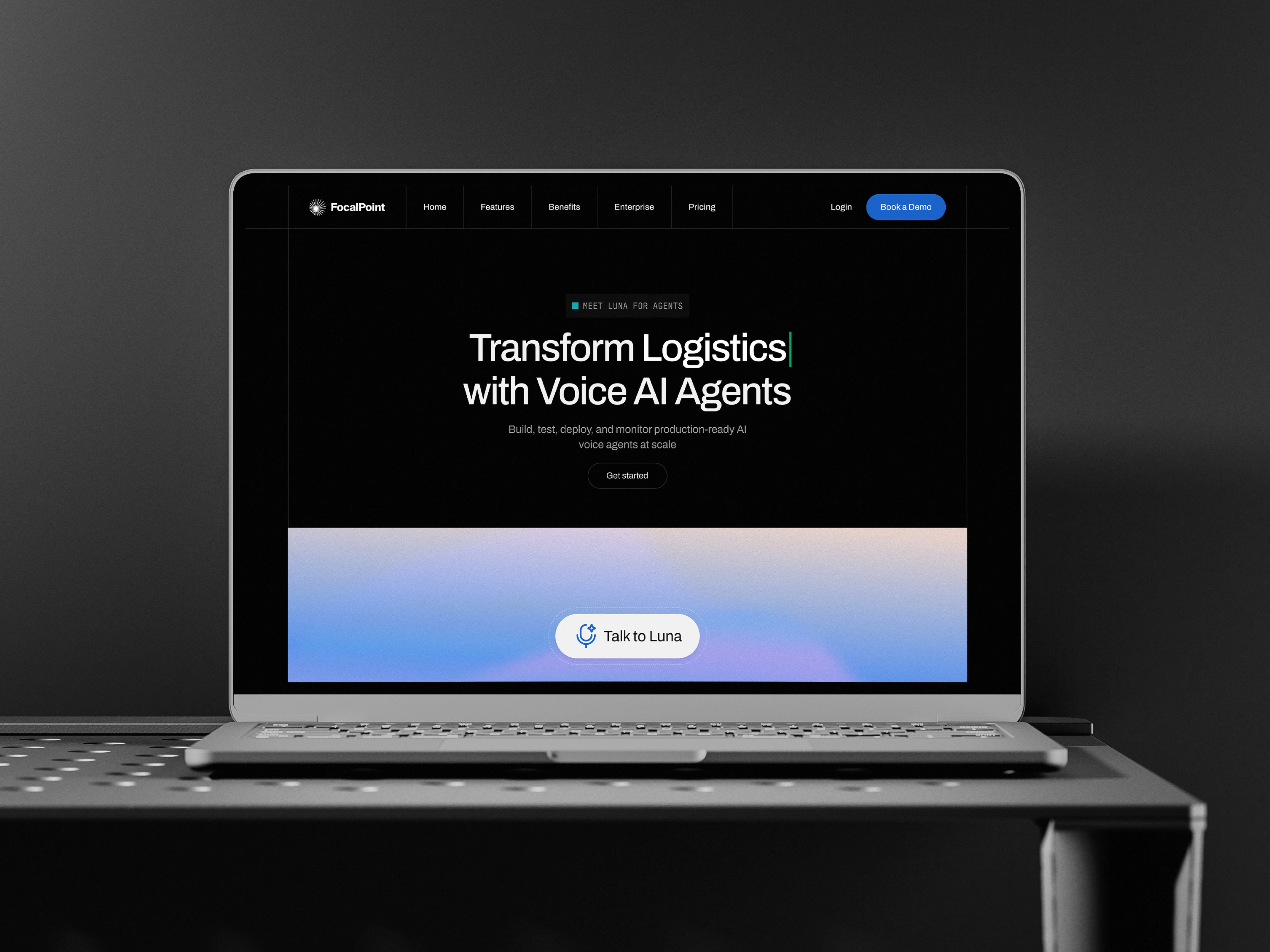
Final Product
The final web design presents Focalpoint as a clearer and more approachable call analytics platform.
The redesigned website combines strategic content structure with a modern UI design system to create a more cohesive experience across the landing page.
The interface was designed around three principles:
Clarity - Make the product easy to understand.
Hierarchy - Make important information easy to find.
Conversion - Guide users toward meaningful actions.
The result is a landing page experience that balances product storytelling, visual design, and usability.
Outcome
The redesign transformed the landing page from a feature-heavy experience into a more structured product story.
The new experience makes it easier for visitors to:
Understand Focalpoint's core value
Identify relevant product capabilities
Explore the platform through real product visuals
Build confidence through trust-focused content
Navigate toward the next action
Overall, the project demonstrates how landing page design, web design, UI design, and UI/UX strategy can work together to communicate a complex SaaS product more effectively.
Thanks for taking the time to explore this project.
A well-designed digital experience can do more than create a great first impression it can improve conversions, build customer trust, and strengthen how your brand is perceived. If your current design isn’t doing that, it might be time to rethink your design strategy.
I’d love to help you turn your next idea into a clear, engaging, and conversion-focused experience. Feel free to message me here on Contra and let’s get started.
Like this project
Posted Sep 18, 2026
Landing page redesign for an autonomous AI voice platform, using UI/UX and purposeful motion to make complex technology feel simple.