Pitch Deck for Dark Comedy Series in Development
Created a detailed and visually appealing pitch deck for a dark comedy series seeking developmental funding from grants, private investors, and brands. (This is my own series! If you have any questions regarding indie filmmaking or the project in general, don't hesitate to reach out!)
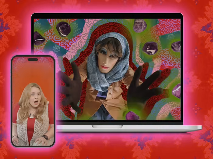
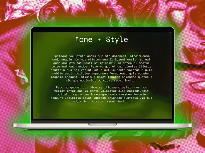
To counter the idea that espionage is classy, to some degree I made every visual feel dated. Whether that be turning up the noise or adding some miscellaneous scribbles, anything to differentiate these b-rated spies from Bond.
*An updated version of this deck featuring logo designs by Mythus Studio will be uploaded as a separate project soon!
Spies & Nostalgia
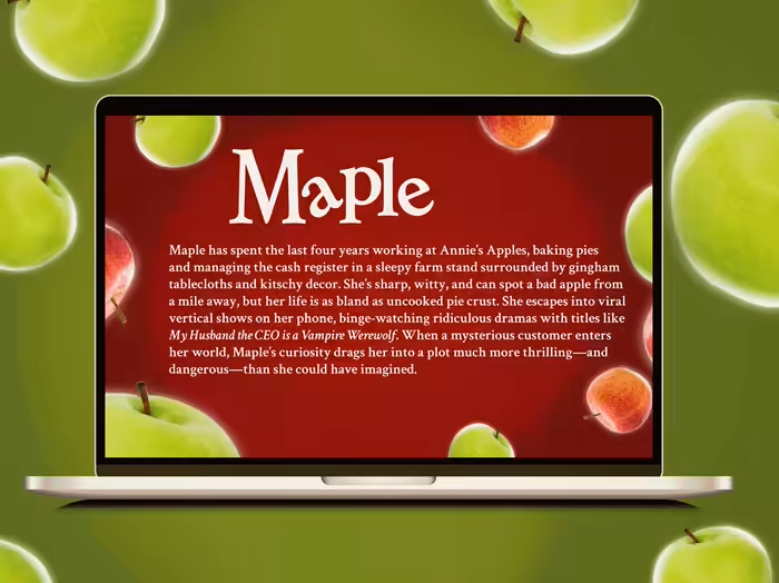
In this version of the pitch deck I dove into the cozy nostalgia of shows like The X-Files and Scooby Doo. Muted tones; dilapidated design; and PNW scenery make up the small town of Sporks, W.A., the fictional setting for the series.
In this angsty teen spy comedy there's a lot of odd characters up to odd espionage. I wanted the eerie nature of Sporks' residents to be echoed in the design. This shouldn't feel like MI-6's best, rather these stumbling spies leave much to be desired. To counter the idea that espionage is classy, to some degree I made every visual feel dated. Whether that be turning up the noise or adding some miscellaneous scribbles, anything to differentiate these b-rated spies from Bond.
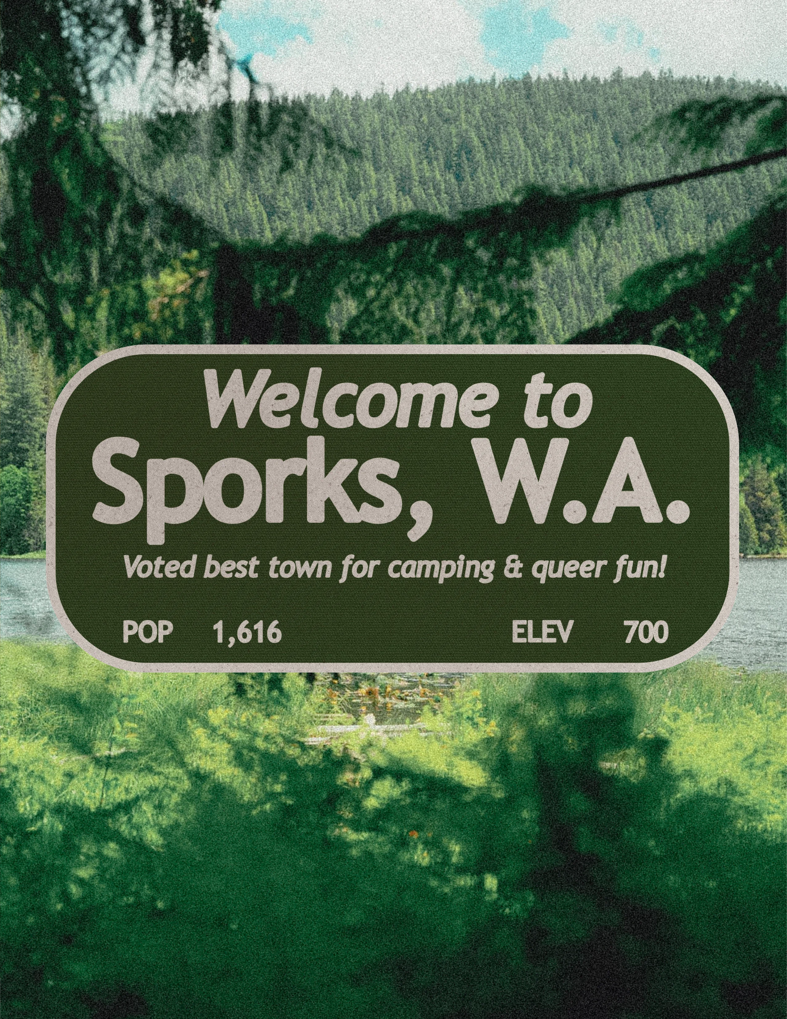
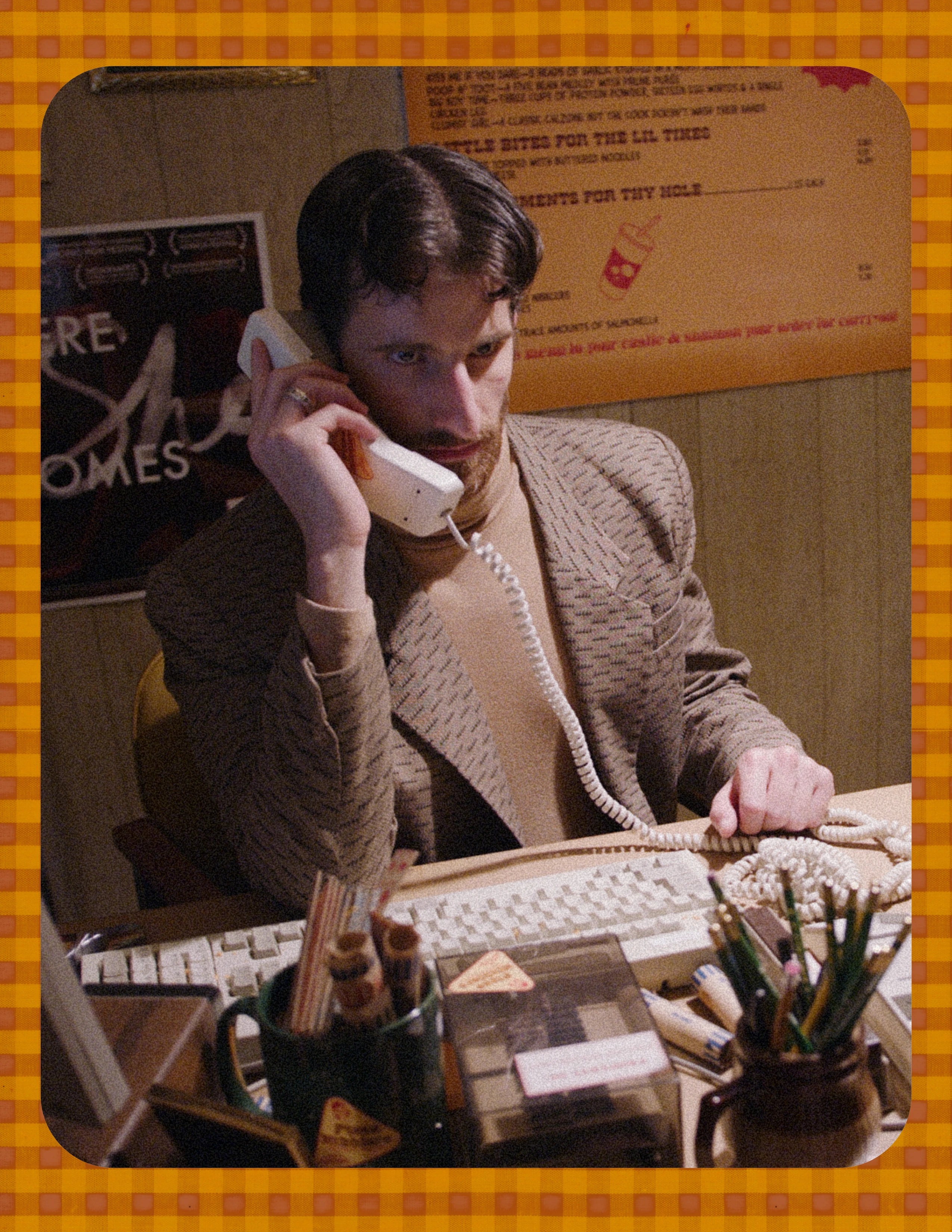
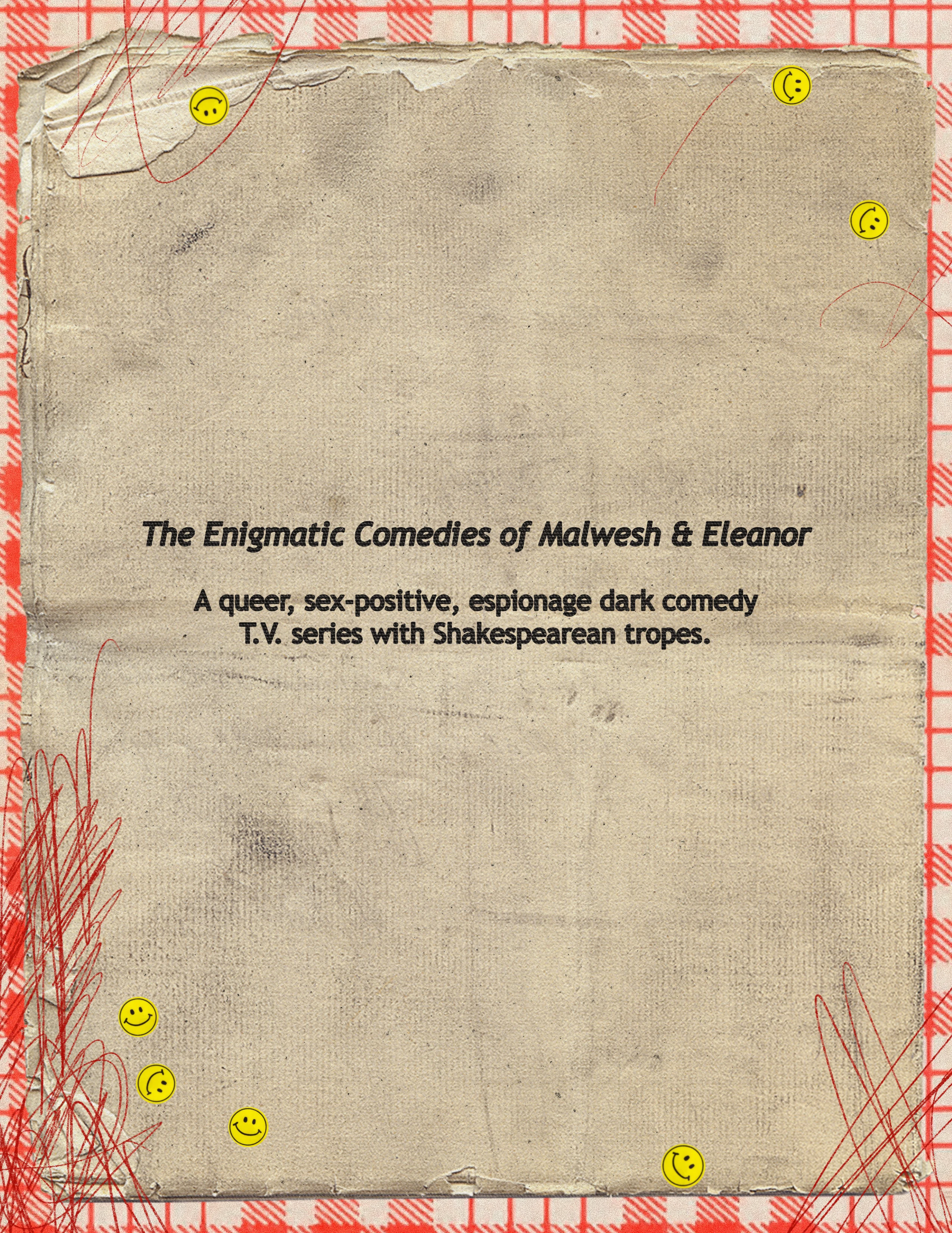
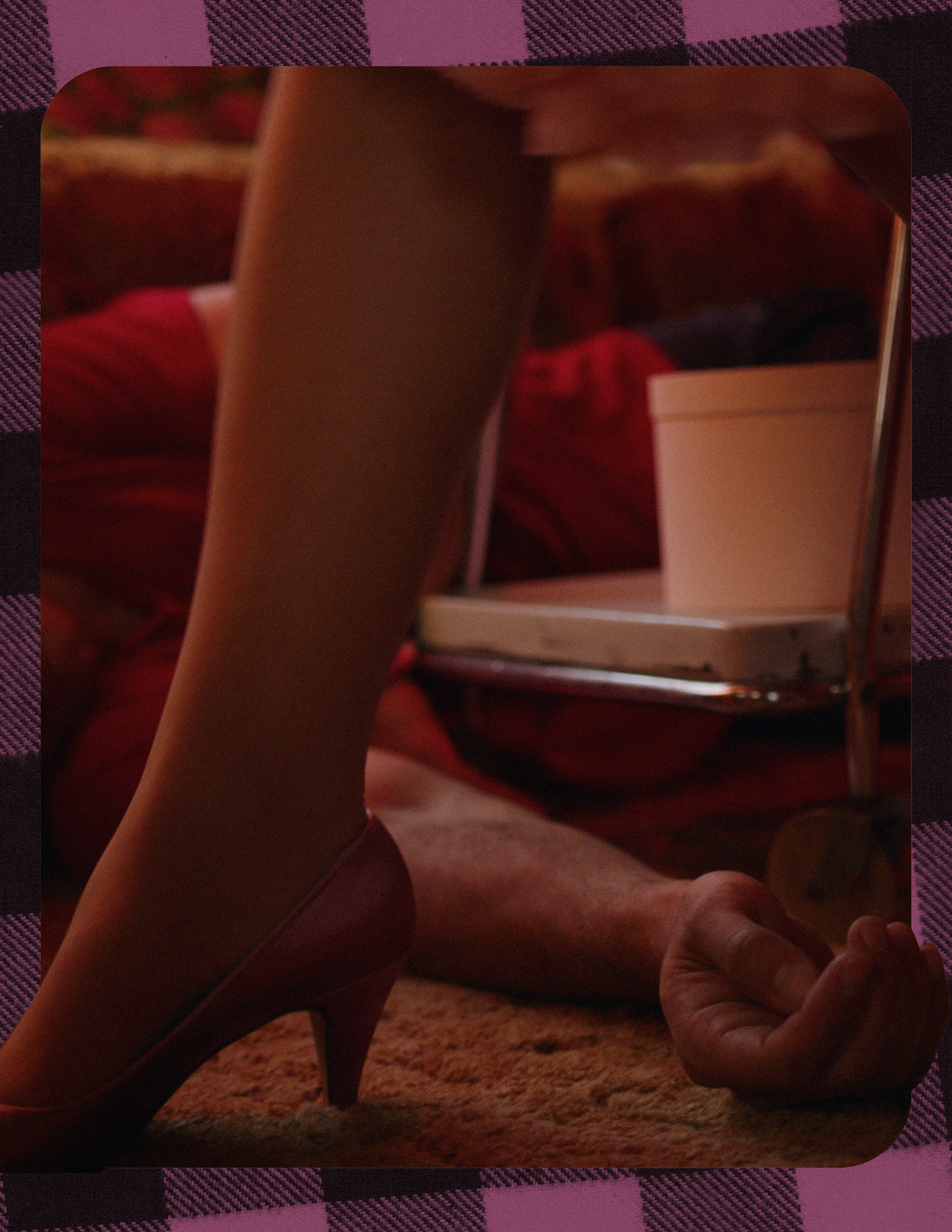
Teenage Angst
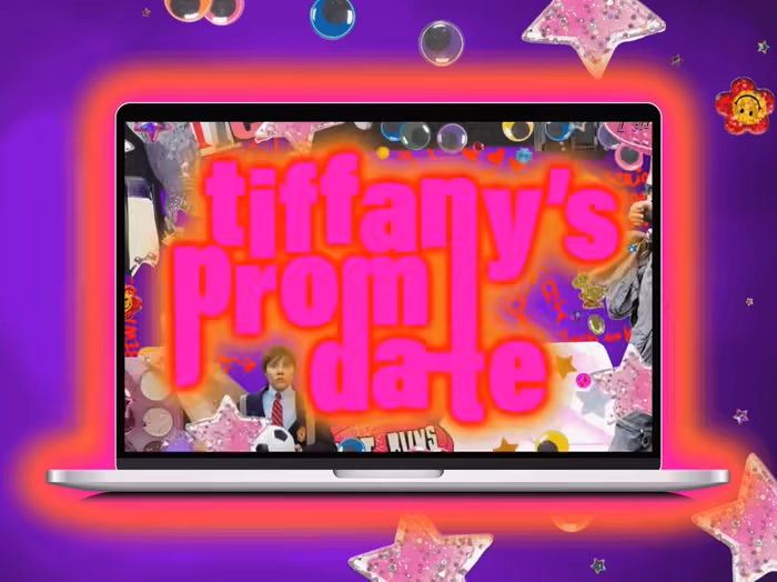
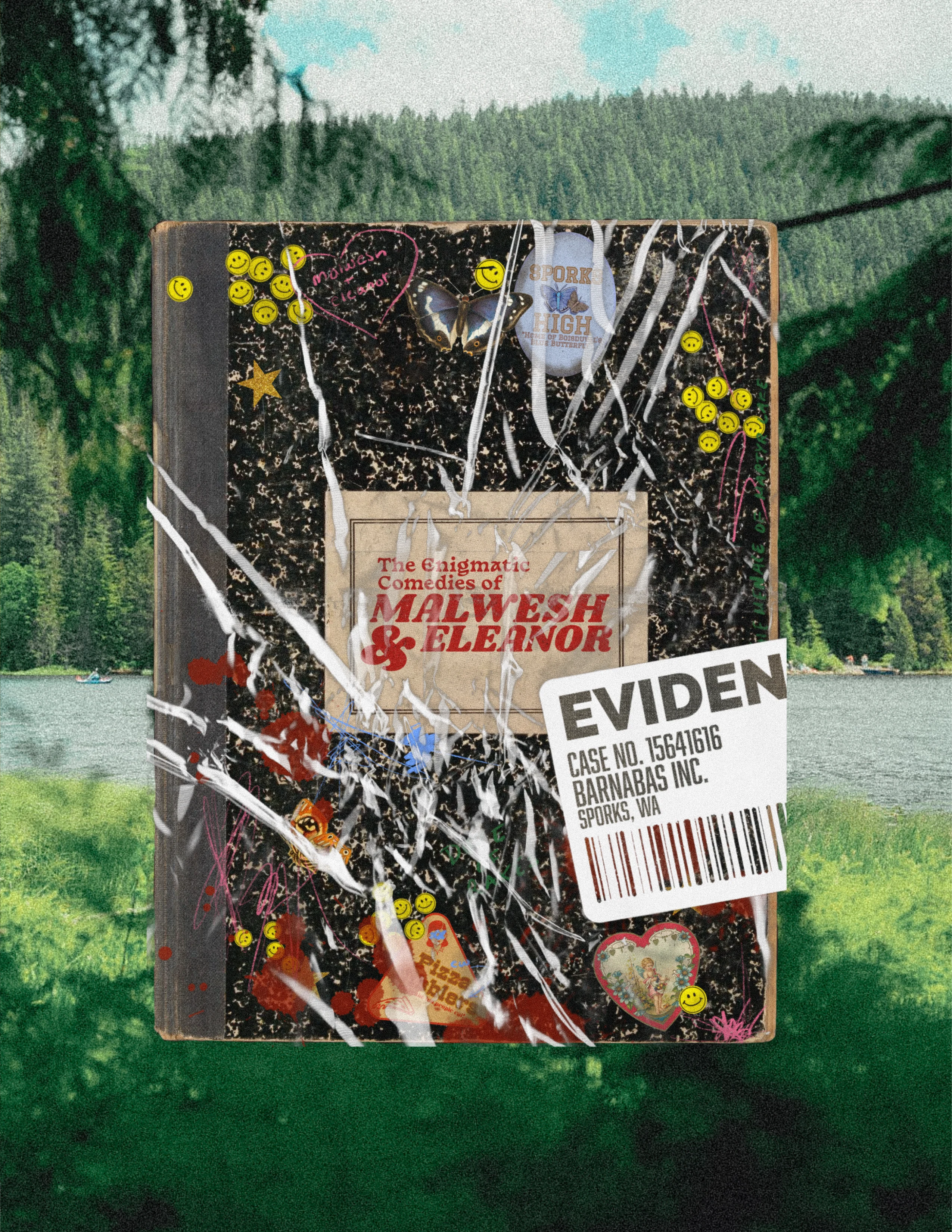
The series begins in the thick of autumn. School is back in session for our high school seniors, and yet the academic year seems to be ending sooner than expected for the intrepid teens. To showcase the young mentality (and perhaps naivety) of this group of characters I designed the title page to be a composition book in an evidence bag of some mysterious spy agency that will surely be important to the story ;).
Social Media Influence
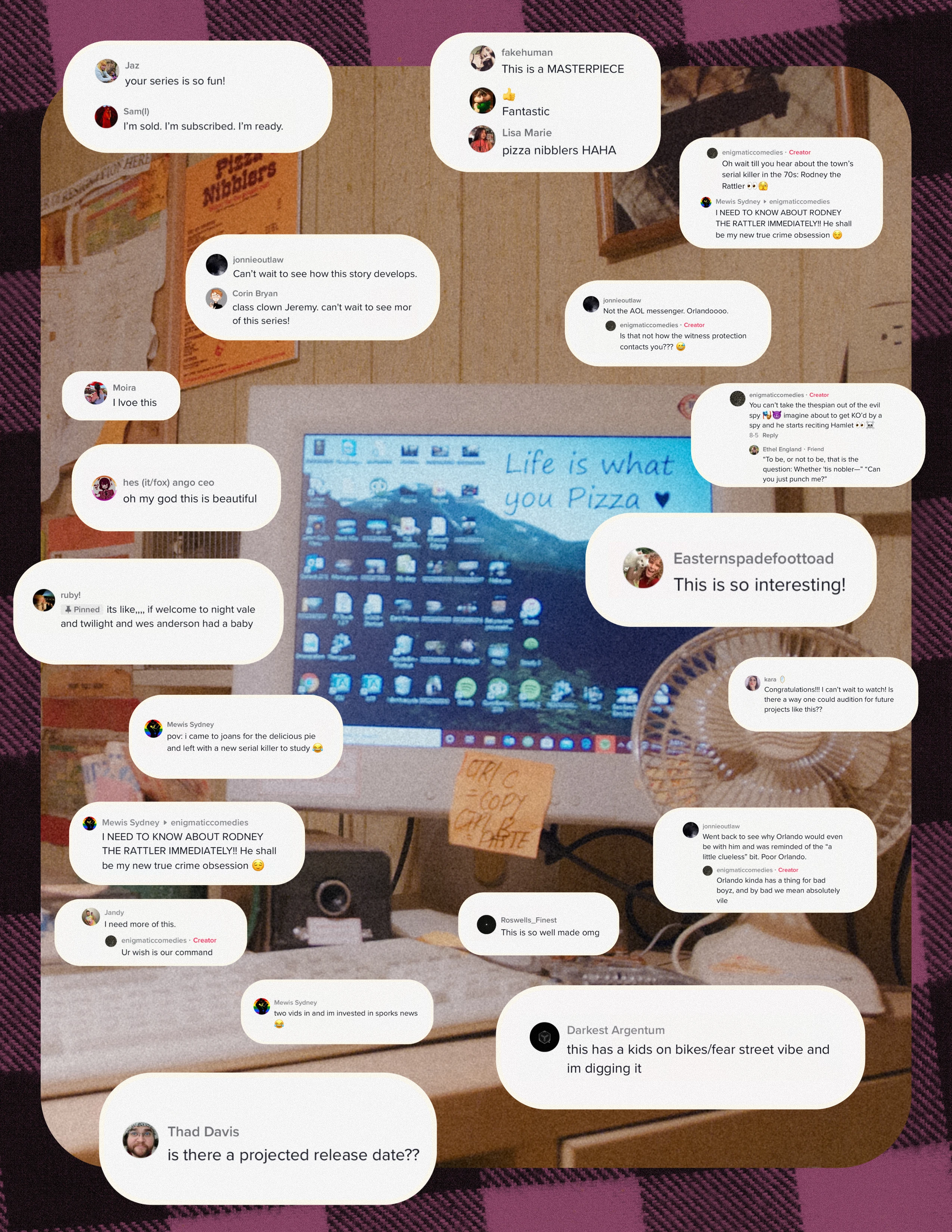
When applying to grants for preliminary funds I wanted to illustrate the support we have from our burgeoning online audience. I picked several comments we received on our TikToks and included them in our deck:
The Road to TECoME
This series has continued to evolve, and with it so does the pitch deck. Leaning more towards the Shakespearean aspect of the show, the newer deck features more of the Bard's influence with a sleeker design than decks past. This deck will be uploaded in a separate project.
Deliverables
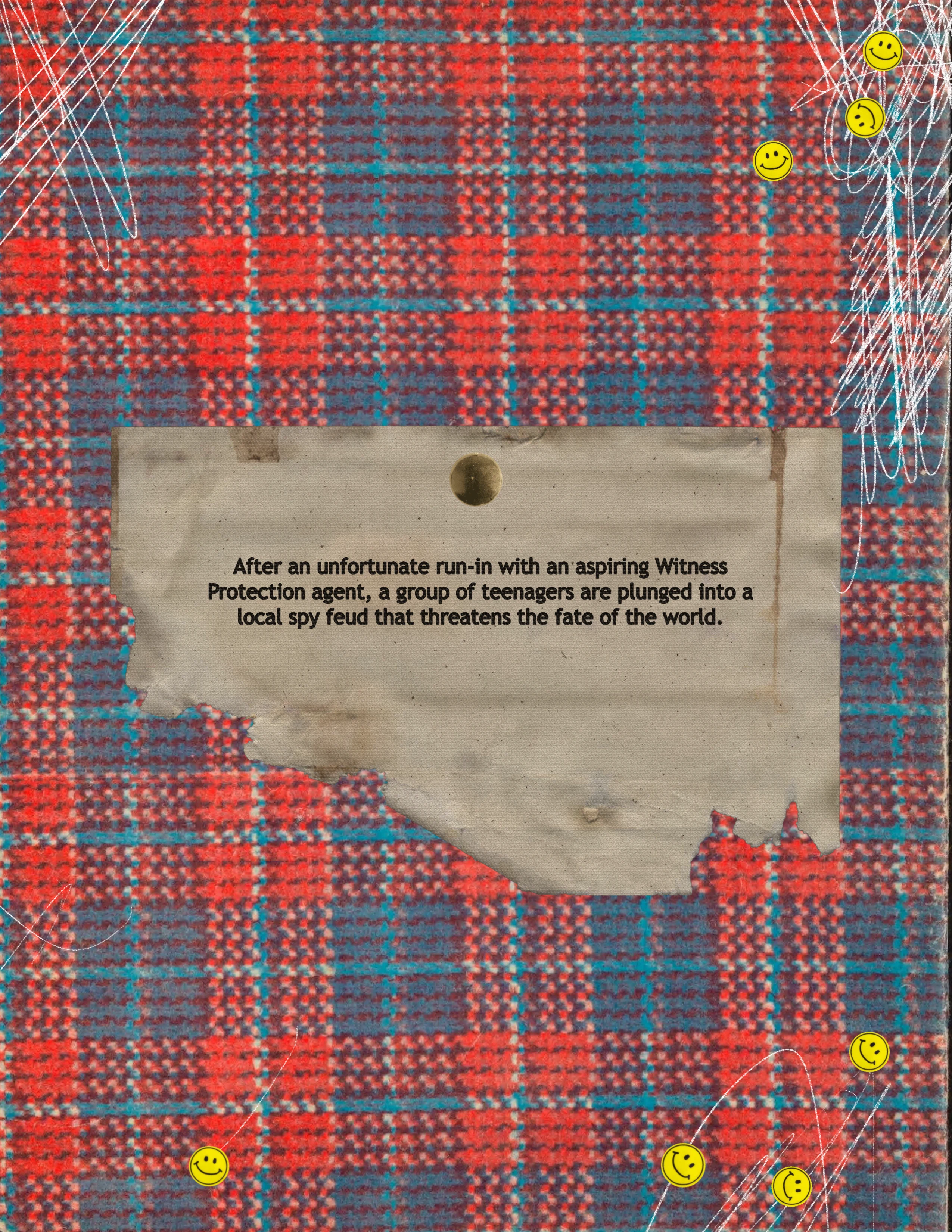
This particular deck was 23 pages, exported in high resolution and low resolution versions. The deck was often trimmed when applying to grants, and had received high praise from industry professionals for its immersive design.
Like this project
Posted Apr 8, 2023
Created a unique pitch deck for a spy series seeking developmental funds from brands, grants and private investors.
Likes
0
Views
207
Clients
Alchemist Drafts
