UI/UX Redesign and Product Animation for ChromaAI
Alexander Cillan
Verified
ChromaAI – From Prototype to Polished Product
UI/UX design + motion graphics for a creative AI platform
Overview
ChromaAI is a platform that helps users generate AI images, videos, subtitles, and more through a suite of creative tools. When they reached out, the features were there, but the experience felt like a functional MVP. Our goal was to elevate the entire interface and make the product feel as powerful as it truly is.
The goal we are building towards is that anyone will be able to turn themselves into a professional content creator with this tool.
The Problem
Despite its technical strength, the platform suffered from:
Poor layout and vertical rhythm
Confusing button logic and inconsistent states
Visual dissonance between modules
Navigation that lacked structure and priority
Typography that didn’t scale or guide the eye
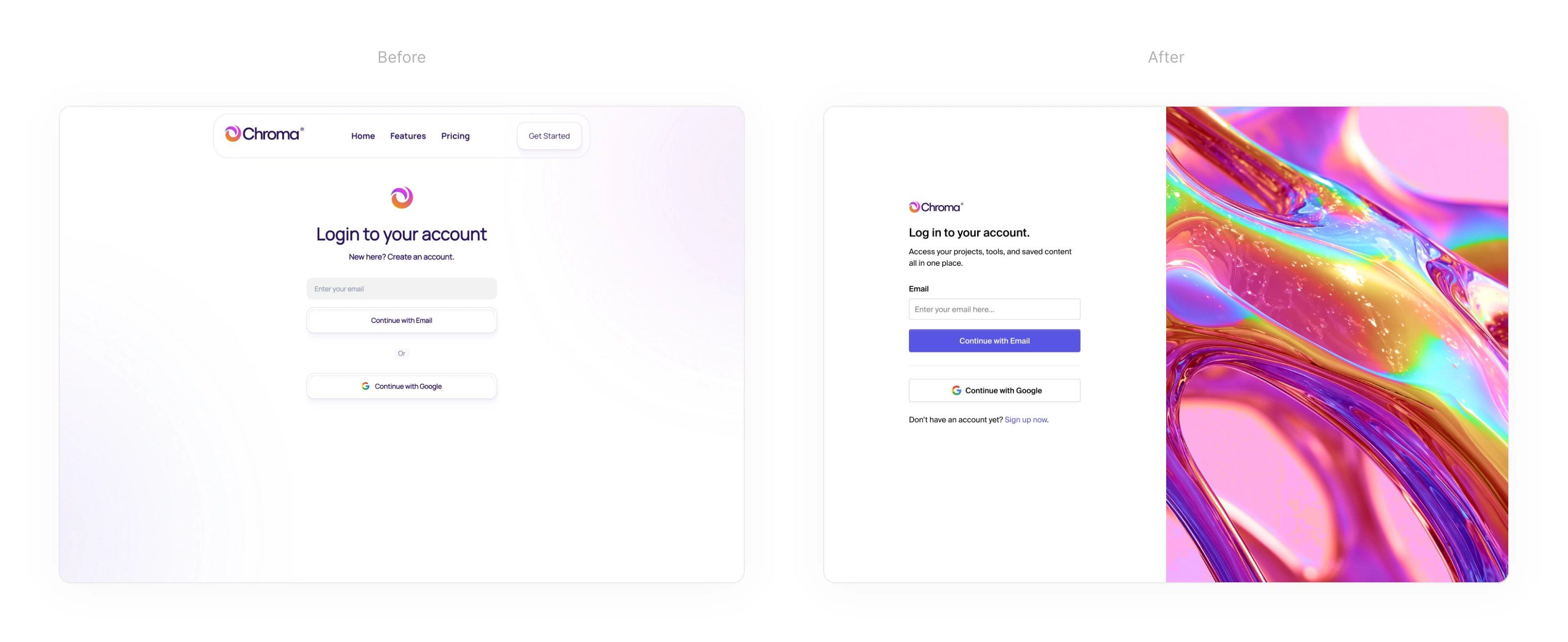
Login screens. Access to the ChromaAI dashboard. Left image is the original concept. Right image is the redesigned version.
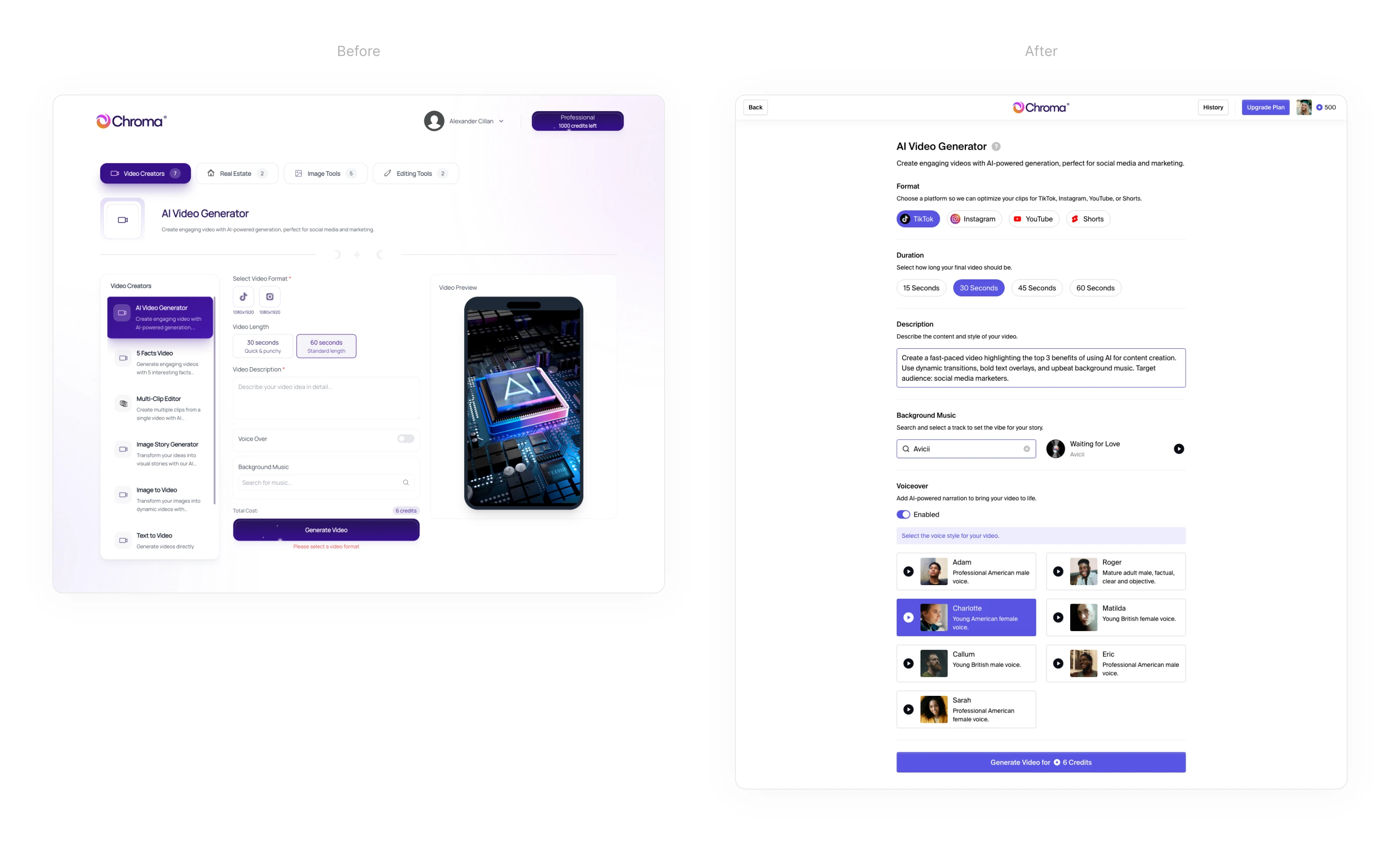
AI Video Generator screen. Left image is the original concept. Right image is the redesigned version.
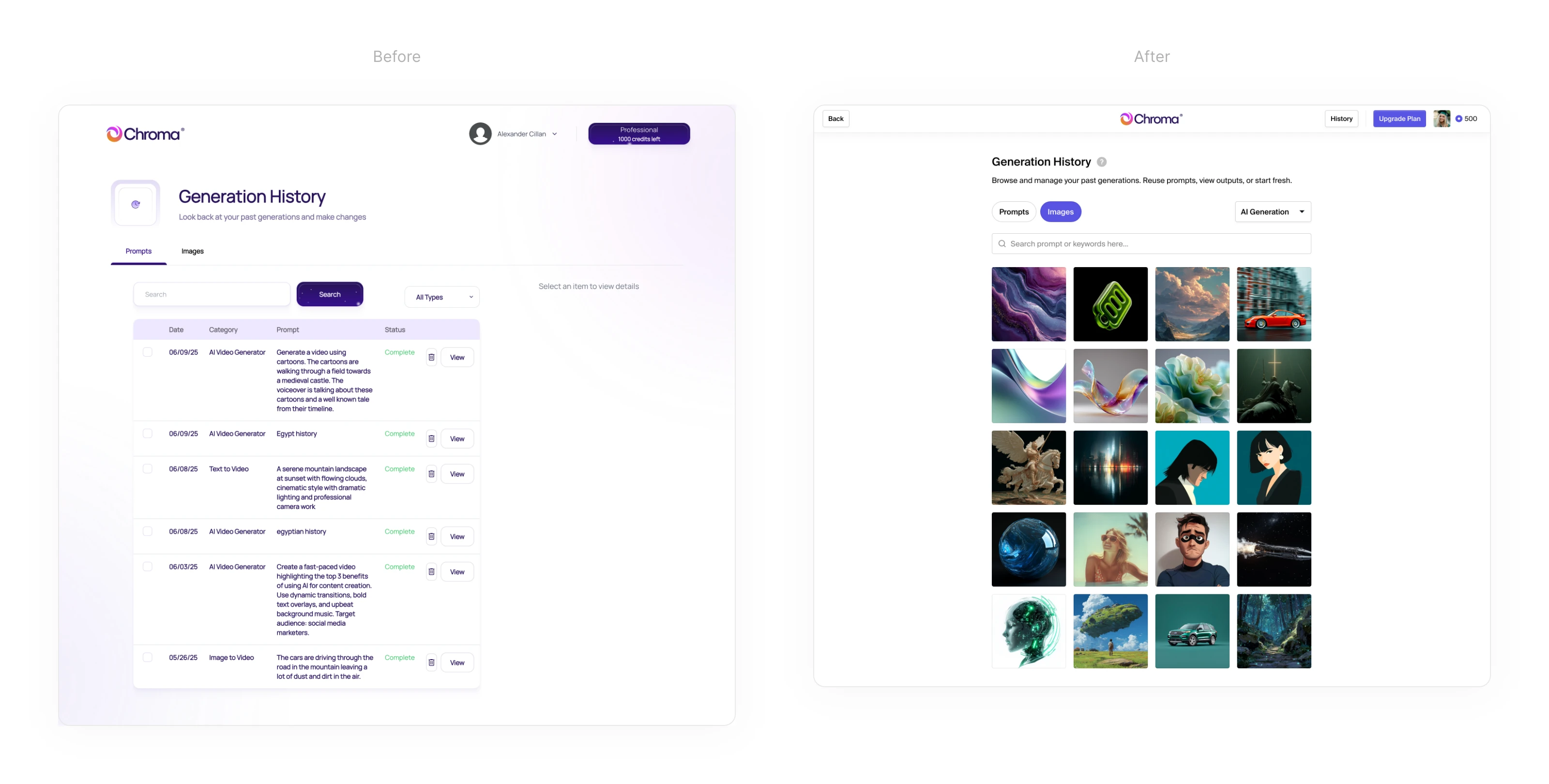
Generation History screen. Left image is the original concept. Right image is the redesigned version.
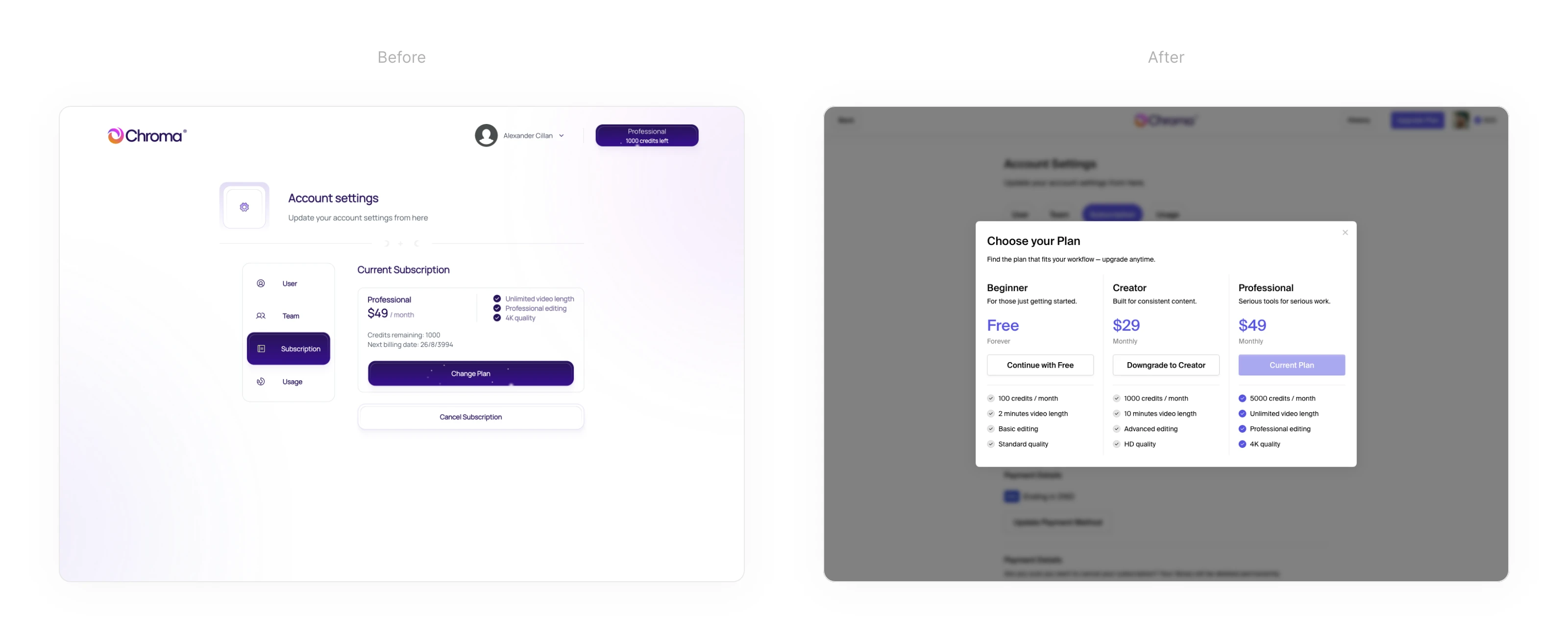
Subscription screen. Left image is the original concept. Right image is the redesigned version.
Each tool felt disconnected from the next. There was no shared logic or structure tying things together. Users had to reorient themselves with every screen, which made the experience feel scattered and slow.
We set out to fix that by creating a cohesive system that would scale well across all screens. The goal was to build a unified structure that made the entire UI feel like one connected product, not a collection of isolated features.
The Solution
Over 100 new screens later, we rebuilt Chroma into a cohesive, fast, and beautiful platform.
1. Clearer structure and flow
We cleaned up the vertical layout with stronger grid alignment and a clear reading path. Every tool now shares the same layout language, making the experience smoother and more predictable.
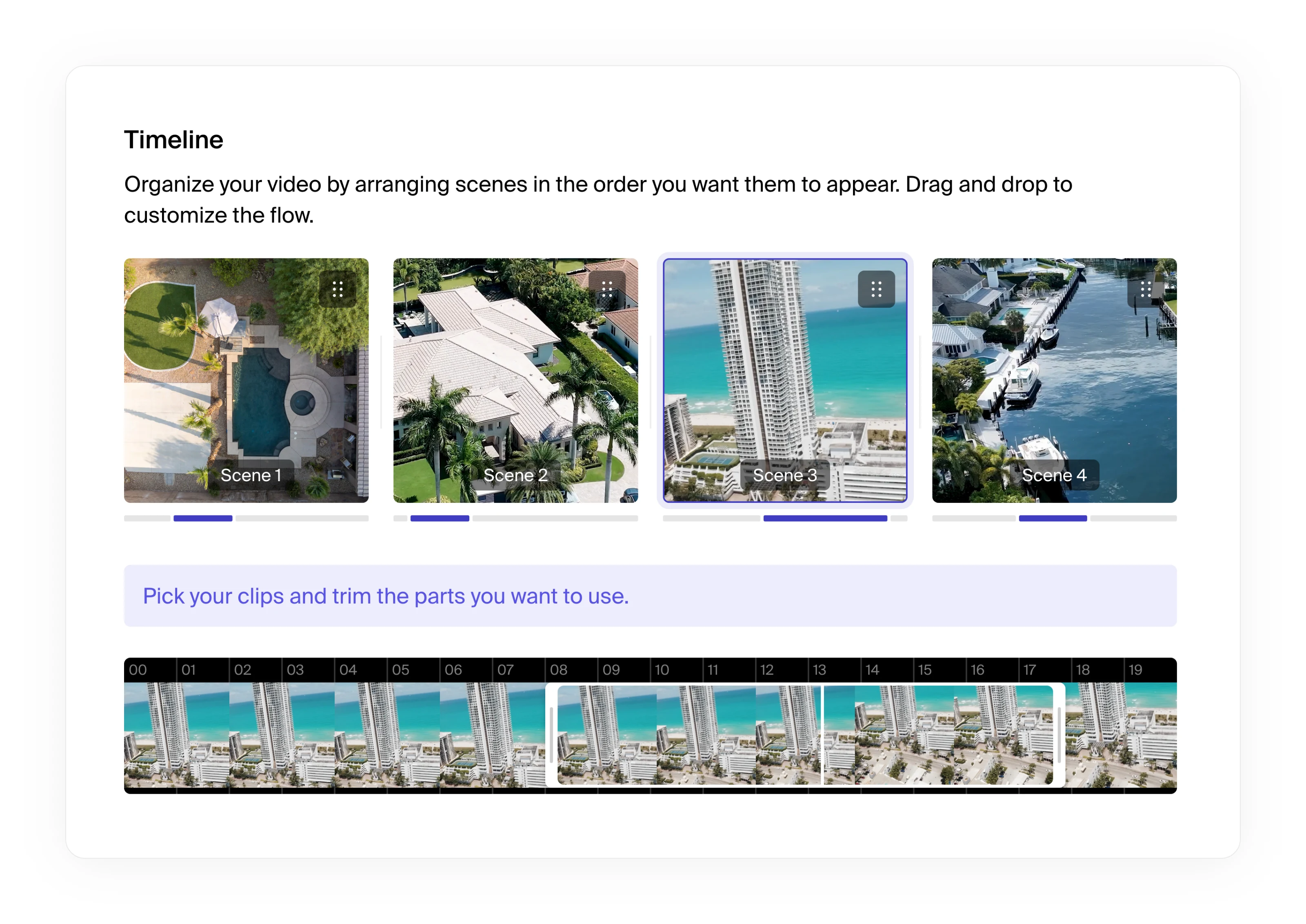
Timeline feature with media cropping and positioning, part of ChromaAI's Multi-Clip Editor tool.
2. Navigation and hierarchy
The old nav system felt lost. We introduced a fixed sidebar where relevant, with a simplified top bar for page-level actions. Tool names are clear and persistent. The user always knows where they are and what’s next.
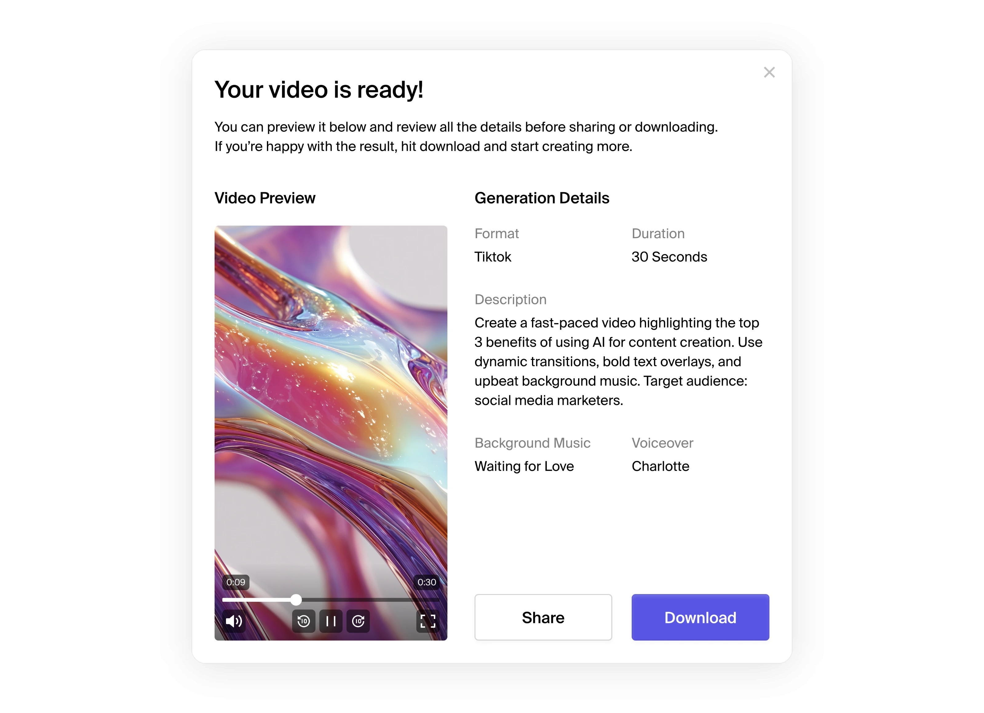
Modal with preview of AI-generated content.
3. Buttons, CTAs, and feedback
We unified buttons across all tools. Primary actions use bold color and consistent sizing. Hover states, loading indicators, and tooltips are now baked into the system for clear feedback.
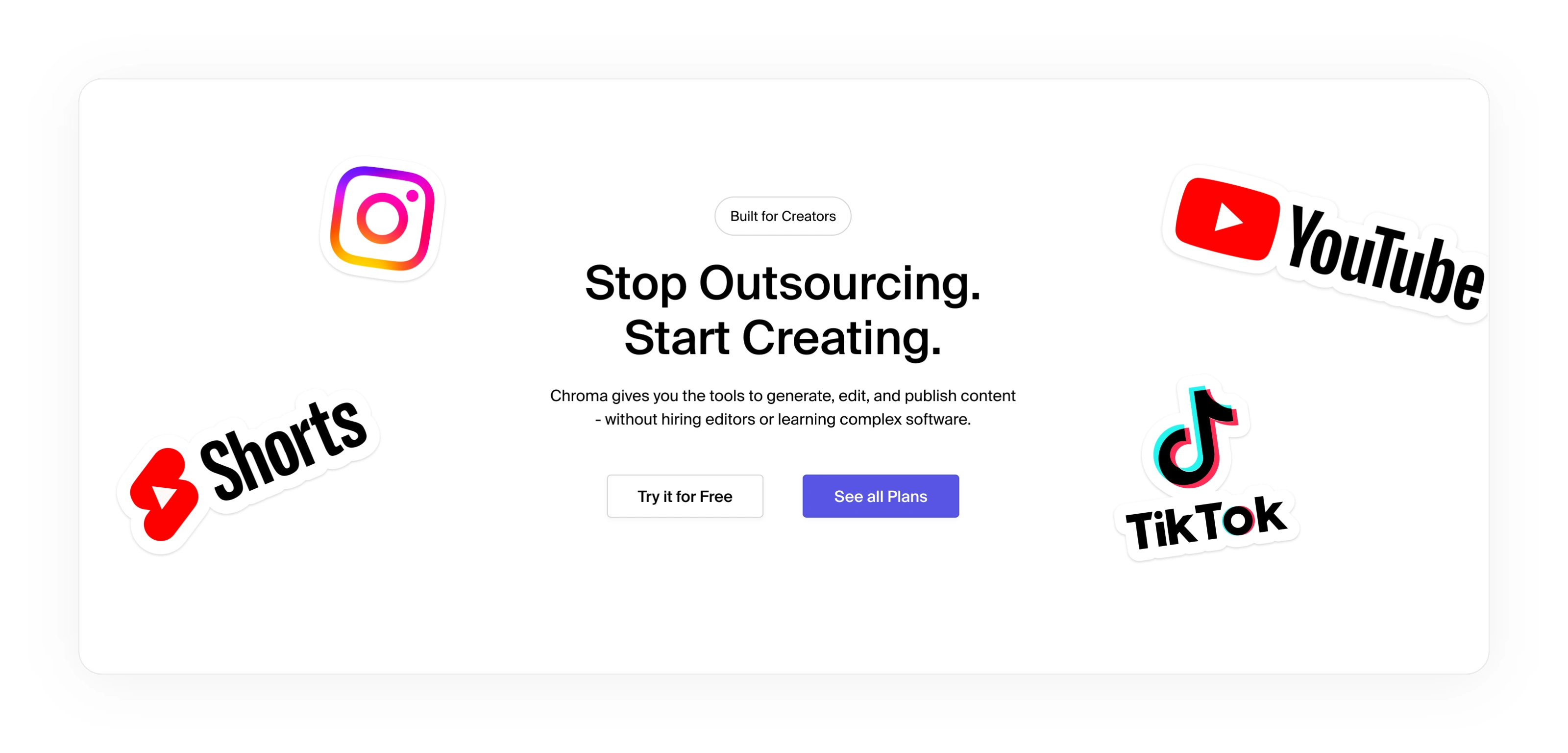
CTA section part of the ChromaAI landing page.
4. Visual consistency
Every module, from Image Generator to Templates, follows a shared design system. We introduced a component library to streamline cards, dropdowns, inputs, sliders, and file uploaders.
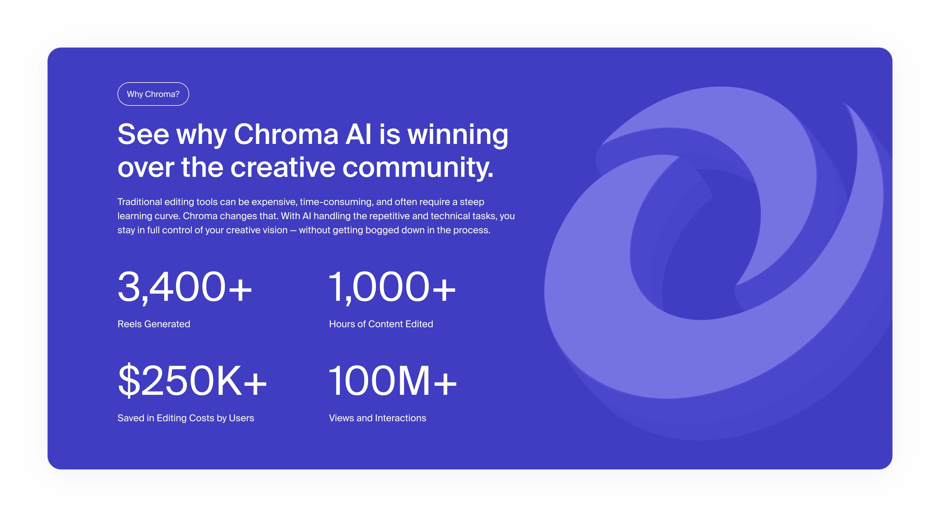
Analytics section part of the ChromaAI landing page.
The Promo Video
30 second promo video showcasing the main features and goals of ChromaAI.
We created a short animated video to help users understand what Chroma does in a simple, engaging way. Instead of using abstract visuals, we showed the real interface and how someone would actually use the platform.
The video starts with a quick prompt input or file upload. From there, it walks through each major tool step by step. It highlights how easy it is to generate a video, apply subtitles, or create a social-ready post without needing editing skills.
All animations were built using real UI components to keep everything consistent with the product. We added just a bit of depth using soft lighting and 3D structure, but kept it subtle so it still felt like the Chroma dashboard. The video has no voiceover. It relies entirely on clear visuals, snappy motion, and bold text overlays to tell the story.
Now the video works as a quick preview for anyone landing on the site. It shows what Chroma can do in under a minute without needing to explain a single feature.
Final Results
We redesigned the entire product experience from the ground up, covering the marketing site, the full dashboard, and more than 100 screens across different tools. Alongside that, we created a short launch video to introduce the platform and visually explain how it works. The result is a consistent, scalable system that feels clean, modern, and creator-first.
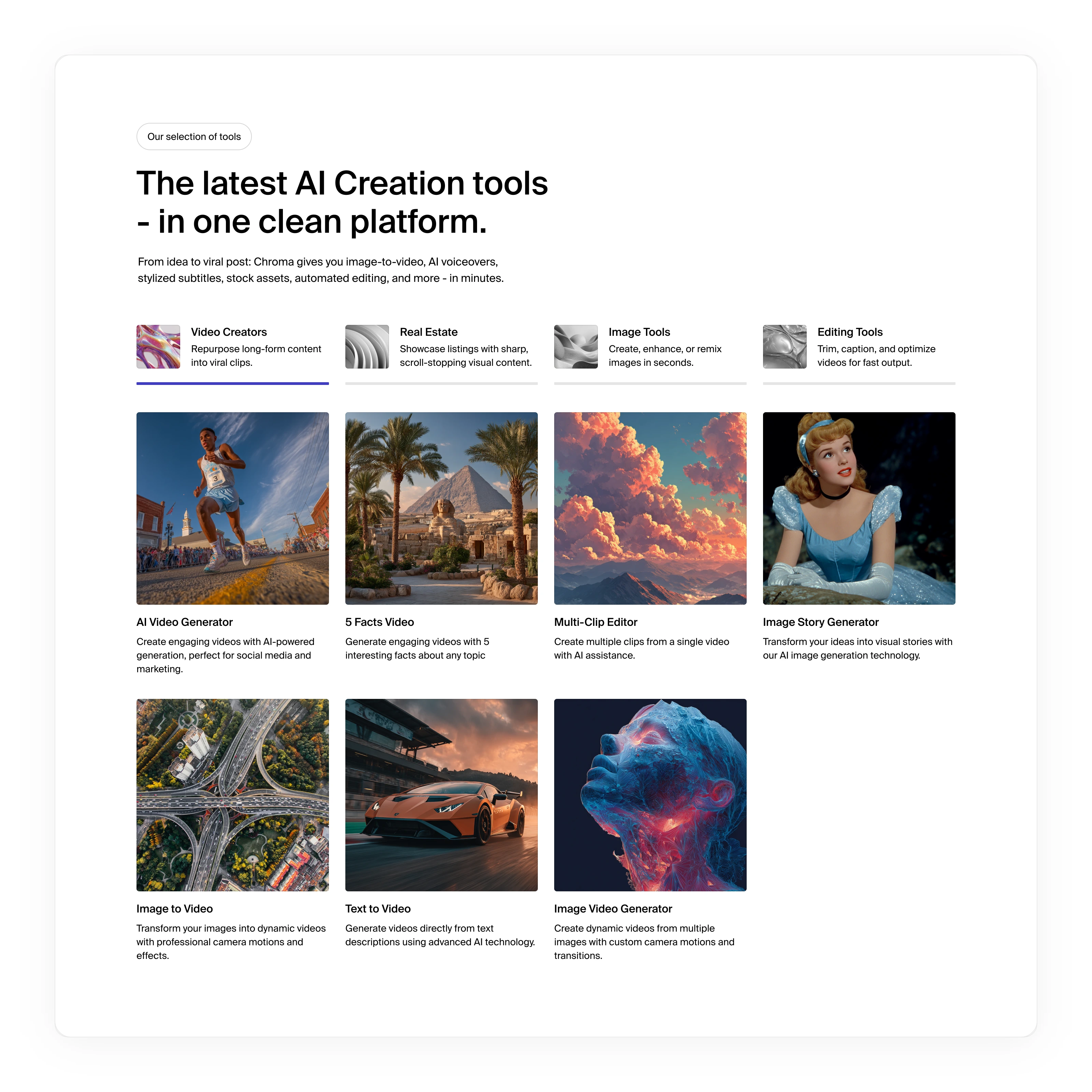
Tools section part of the ChromaAI landing page.
100+ redesigned screens
A scalable UI system used across 10+ tools
A subtle but elegant visual identity
A clear path from landing to creation
A launch-ready product that now looks as good as it works
Thanks for Reading
If you made it this far, thank you. I appreciate you taking the time to explore the full scope of this project. A lot of thought went into every screen, every animation, and every detail. Projects like Chroma are a reminder of what good design can unlock when it’s built with clarity and consistency in mind.
If you’re working on something exciting and think I could help, feel free to reach out.
Like this project
Posted Jul 28, 2025
Redesigned an AI content platform with 100+ new UI/UX screens, a scalable design system, and a motion-driven video to showcase the full product experience.
Likes
10
Views
62
Timeline
May 29, 2025 - Jul 25, 2025