Built with Framer
Pagedeck.com — Website Design + Logo Design
Great.co Studio
Verified
Live: Pagedeck.com Brand and website designed and developed by Great.co
—
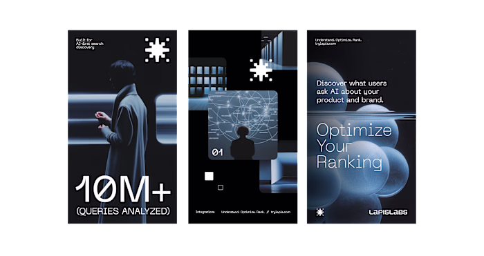
Pagedeck was building a solid product, but the brand was holding it back. It felt generic, tactical, and interchangeable in a space where speed and confidence matter.
We redesigned the brand and website to match how Pagedeck actually wins, clarity, momentum, and conversion focus.
The new identity sharpens positioning around rapid experimentation and performance, not templates.
Visually, we stripped away noise, introduced a stronger custom-made typographic system, and built a site that feels fast before you even scroll. The result is a brand that looks credible to serious eCommerce teams and converts attention into action.

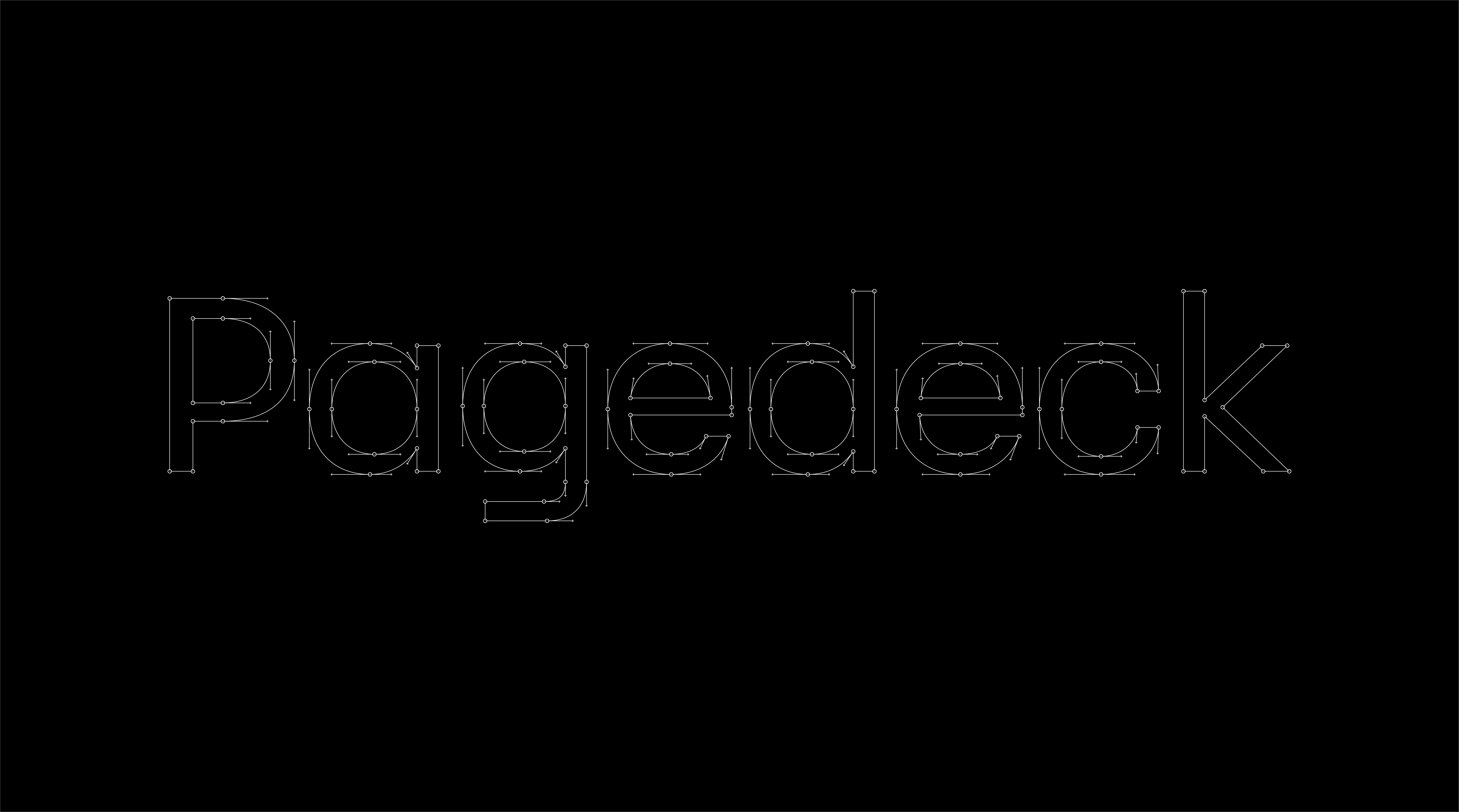
A hand-crafted typographic system designed by Branding & Co.
We repositioned the brand around how Pagedeck actually wins: speed, iteration, and performance. Not “build pages faster”, but test, learn, and convert faster than your competitors.
That shift sounds subtle, but it completely changes the narrative. You’re no longer selling convenience, you’re selling leverage.
Everything from messaging to structure was rebuilt around that idea. Shorter claims, sharper language, and a clear emphasis on outcomes instead of features.

Visually, we removed anything that didn’t support that positioning.
The old system relied on familiar SaaS patterns, soft colors, generic layouts, predictable hierarchy. It blended in because it was built to feel safe.
We replaced it with a custom typographic system that does most of the heavy lifting. Tighter spacing, stronger contrast, and deliberate rhythm create a sense of speed and control without relying on gimmicks.
No decorative noise, no over-illustration, no unnecessary motion. Every element is there to move the user forward.
The interface feels fast before you even interact with it. That’s not aesthetic, that’s strategy.
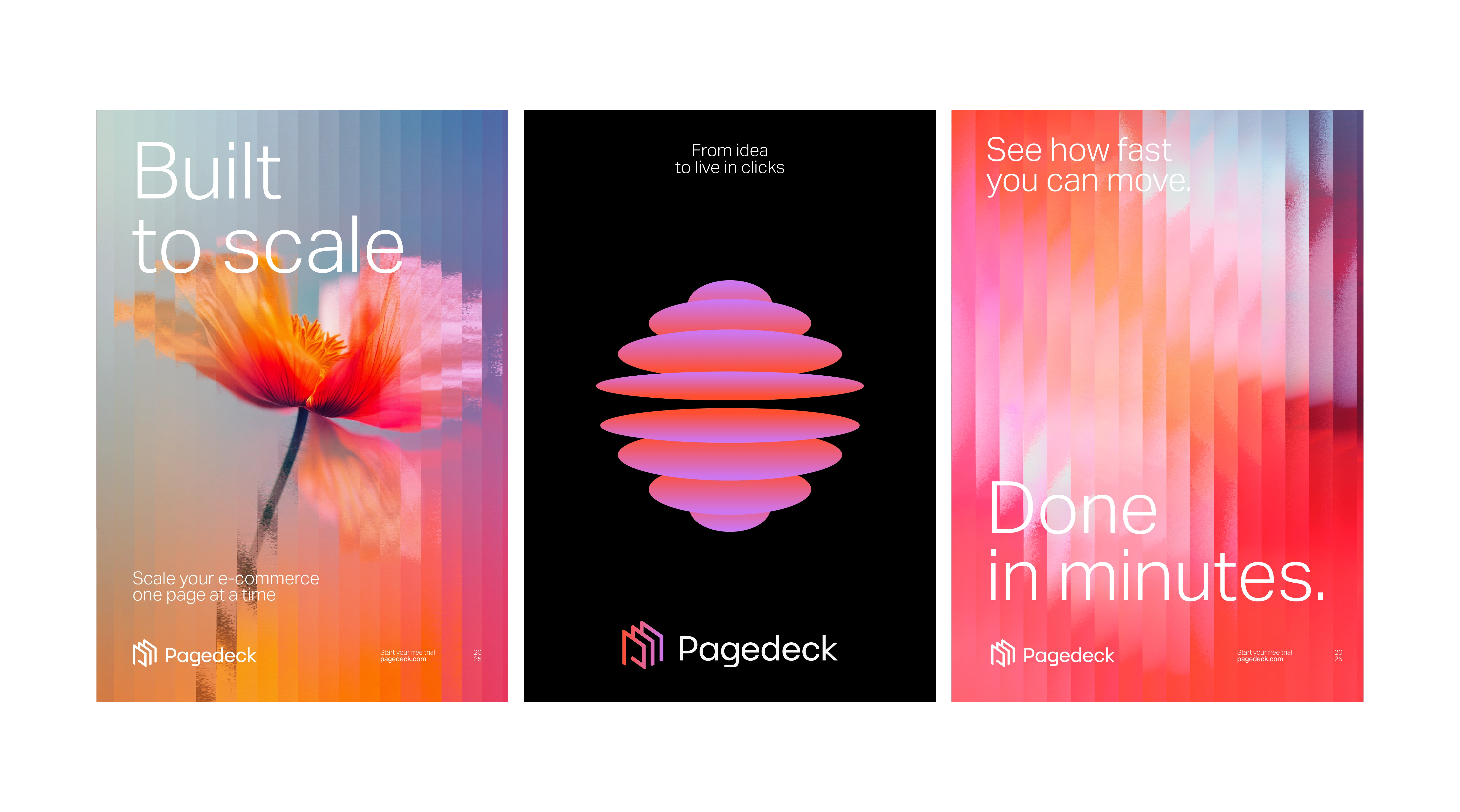
Pagedeck art direction by Branding & Co.
See it live at Pagedeck.com
Brand and website designed and developed by Great.co
Like this project
Posted Jan 27, 2026
Designed the full Pagedeck.com logo and website, improving conversion rates and creating a smoother user experience that drives growth and momentum.
Likes
3
Views
233
Timeline
Oct 21, 2025 - Dec 2, 2025
Clients
Pagedeck