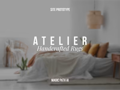
Shopify Site Development for Inner Glö Apparel

KAIT 👩🏼💻
Verified


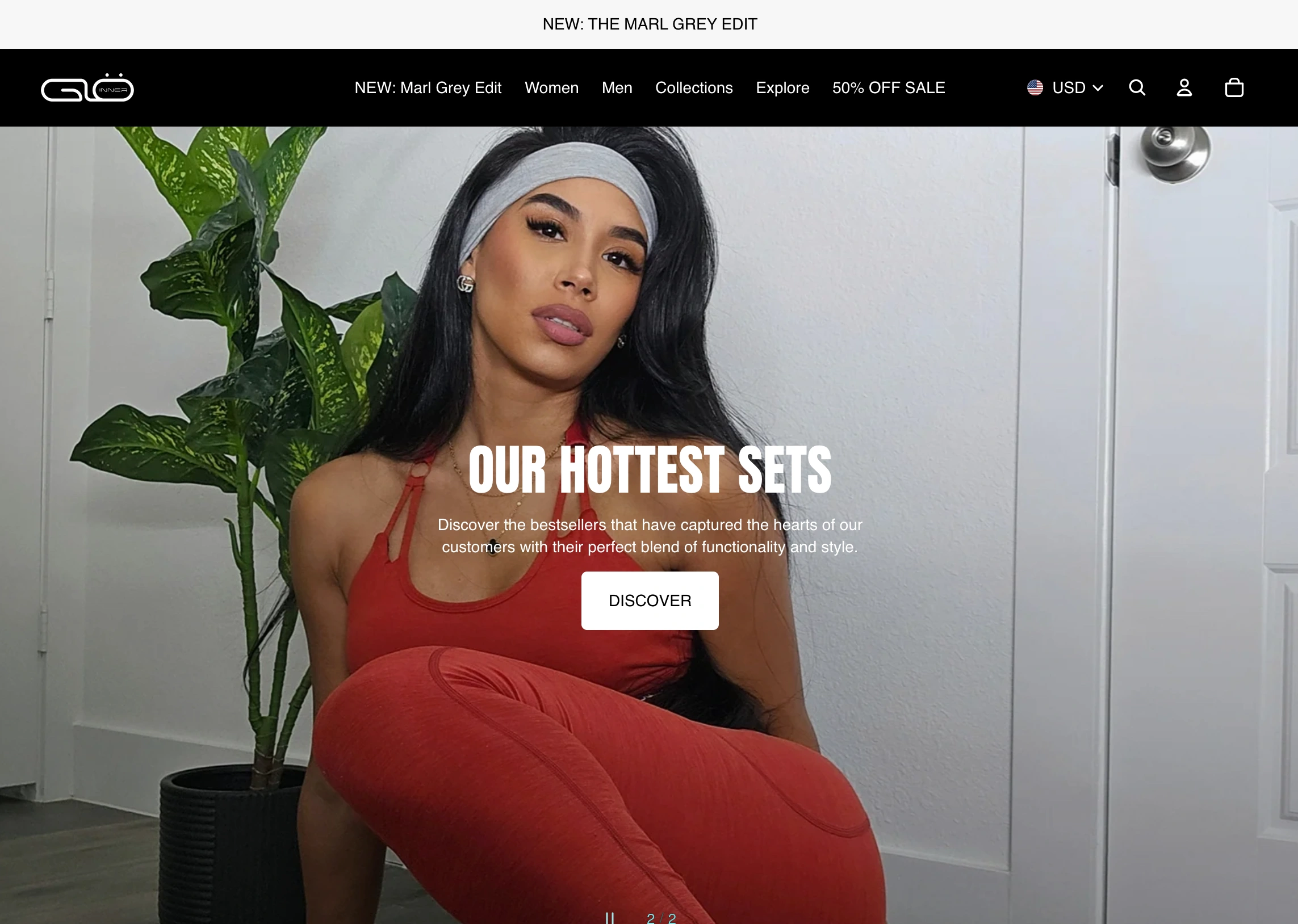
INNER GLÖ APPAREL
This is a woman owned athletic apparel company whose priority is creating athletic gear that moves with you. This site is created with Shopify with Klayvio, social media, and affiliate integrations.
MY ROLE
I designed and developed site using Tinker template as based. I manage product collections [uploading,editing,sorting], 3rd party integrations [klayvio, collabs], and any custom section/page for the site.
TOOLS
SITE
OVERVIEW
This Shopify store is integrated with Klayvio, FD product groups, Collabs, and connected across social medias for integrated shopping experiences. Products are sorted/managed through manual and smart collection lists. The site template is based on Tinker with custom sections, pages, and more.
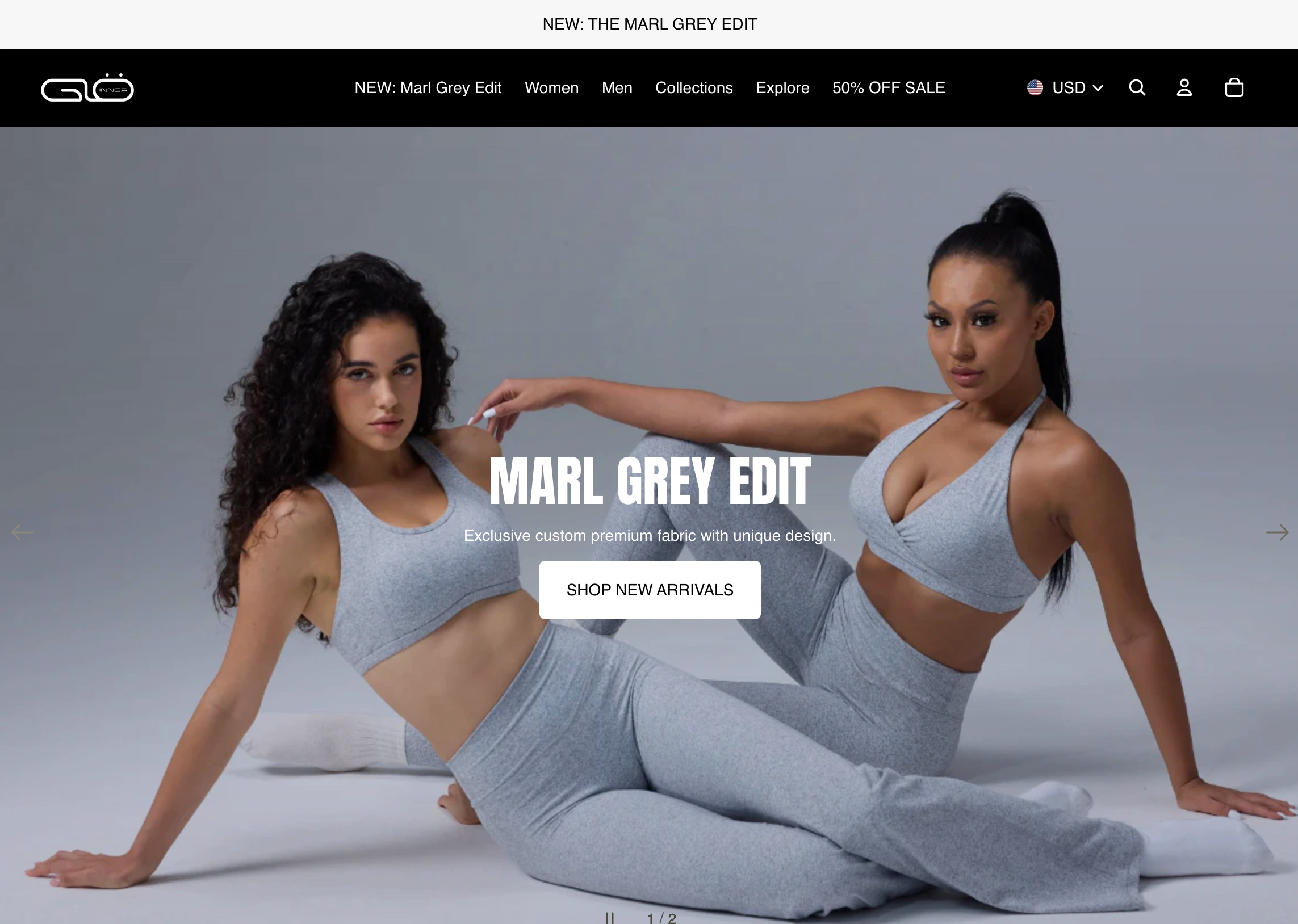
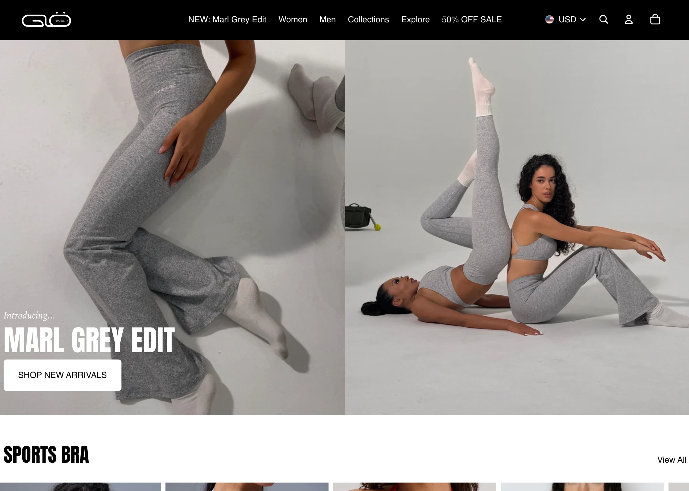
HERO
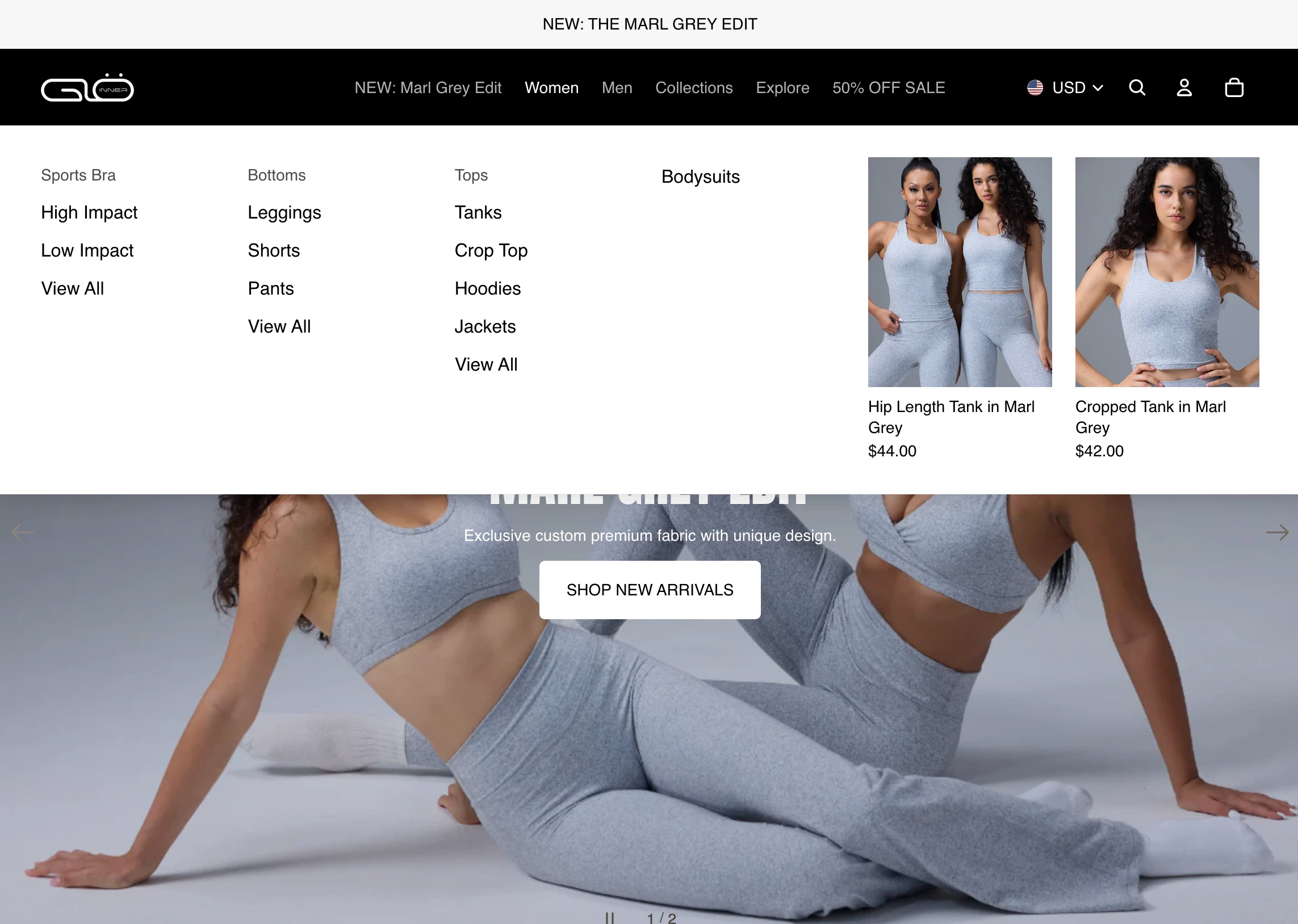
DROP DOWN MENU
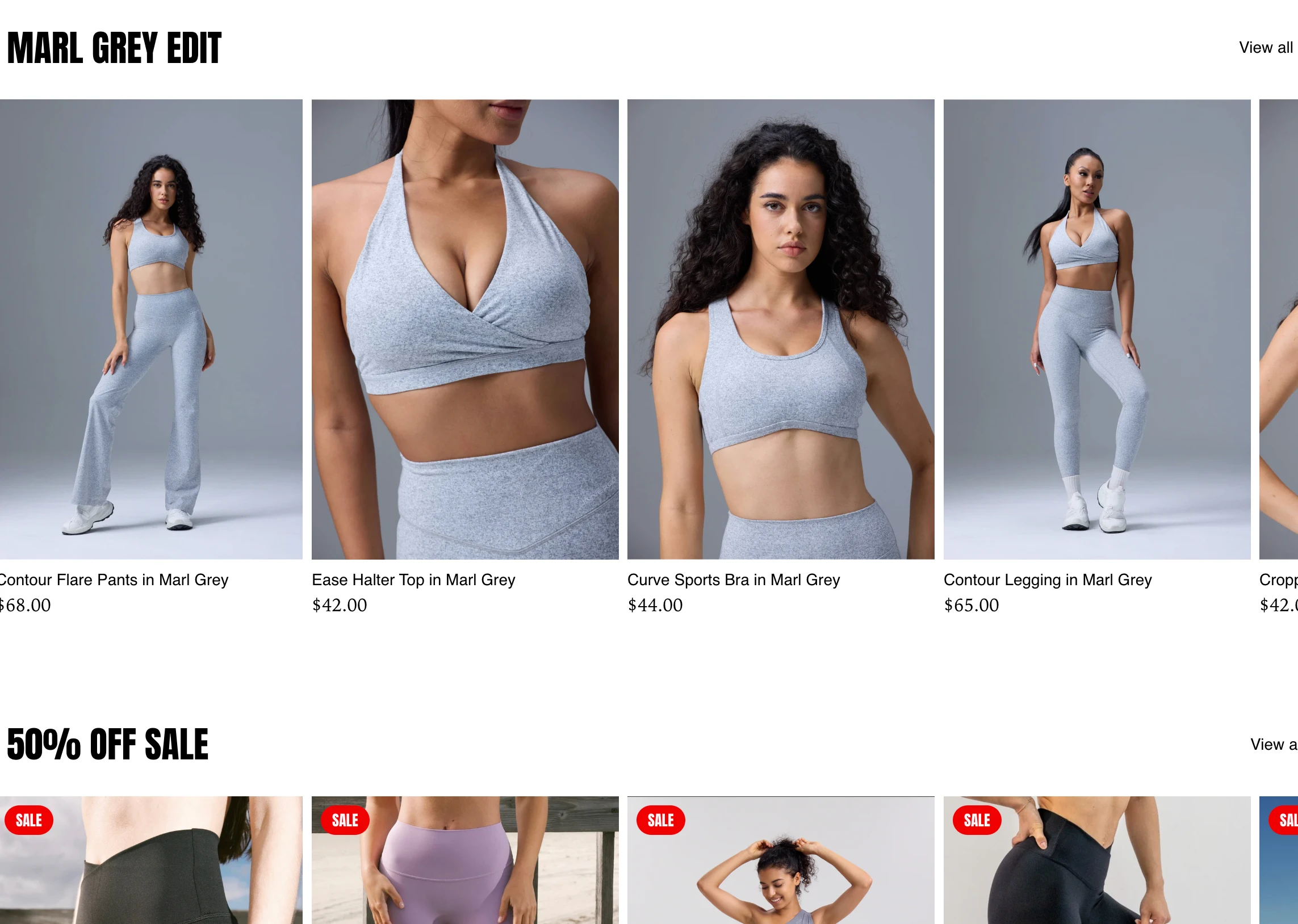
PRODUCT COLLECTIONS
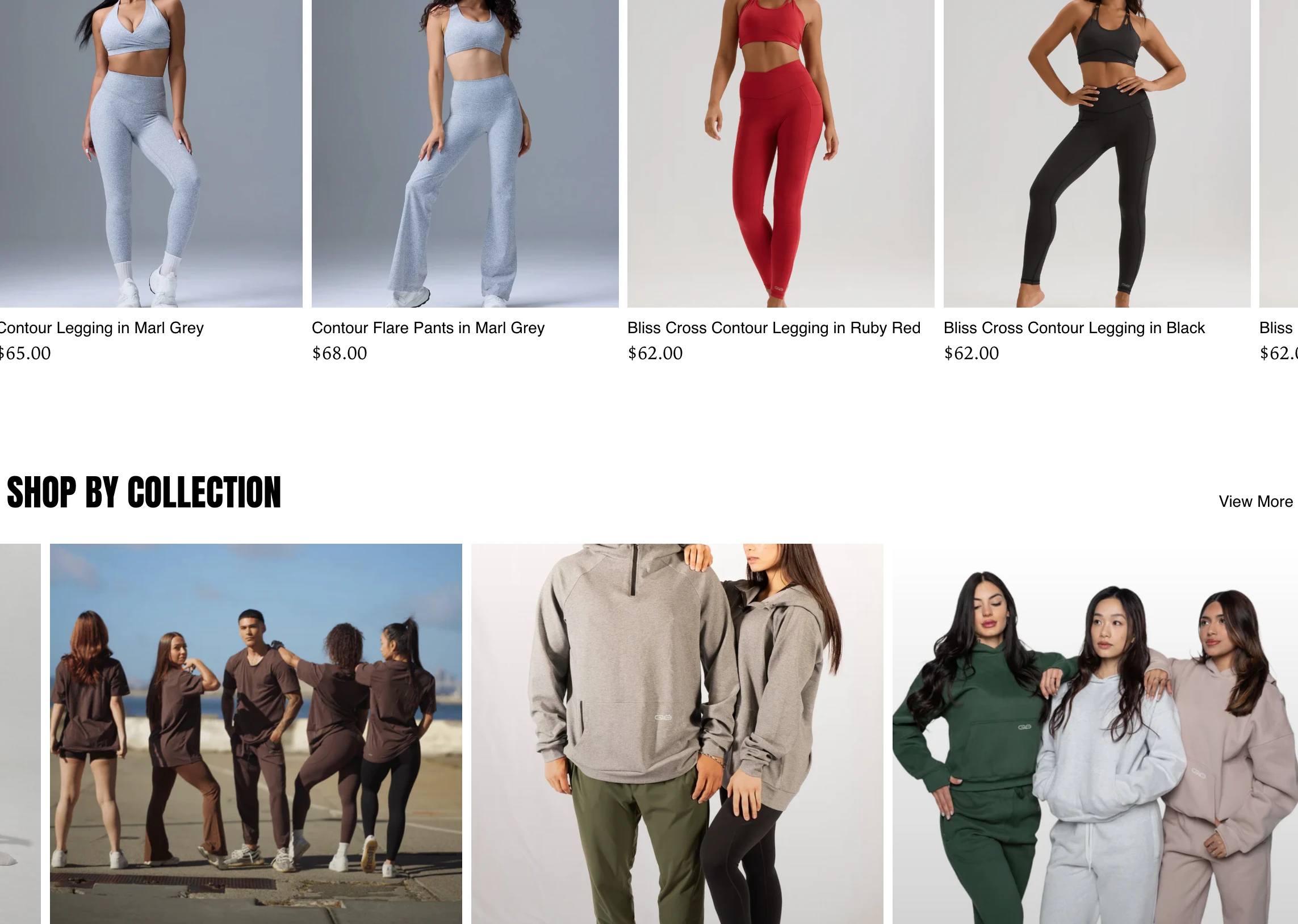
COLLECTIONS
PROMO SECTION

PROMO SECTION
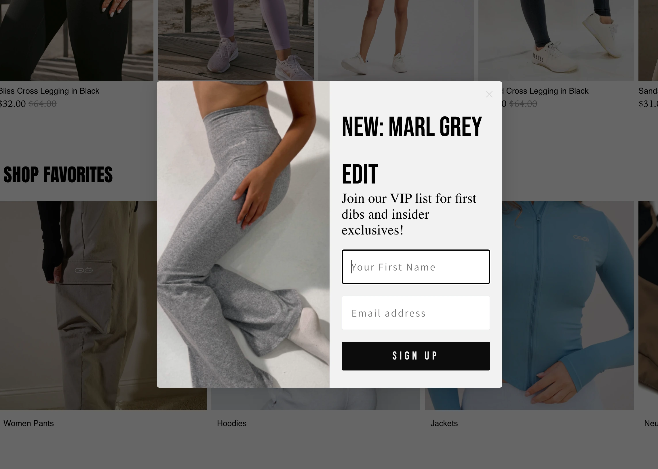
KLAYVIO
VIEW SITE
CUSTOM LIQUID CODE
*I no longer use these custom sections, however, they were original created for Shopify Dawn theme. Product cards were adjusted to enhance these experiences. May need updates to work with current Dawn update. Happy to help.
Shop The Look
{% comment %}
  Shop the Look Section (Collection Slider with Header, Body, Text Alignment, and Slider Buttons Below Products)

  Usage:
  {% section 'shop-the-look' %}
{% endcomment %}

{{ 'component-card.css' | asset_url | stylesheet_tag }}
{{ 'component-price.css' | asset_url | stylesheet_tag }}
{{ 'component-slider.css' | asset_url | stylesheet_tag }}
{{ 'template-collection.css' | asset_url | stylesheet_tag }}

{%- style -%}
  .section-{{ section.id }}-padding {
    padding-top: {{ section.settings.padding_top | times: 0.75 | round: 0 }}px;
    padding-bottom: {{ section.settings.padding_bottom | times: 0.75 | round: 0 }}px;
  }

  @media screen and (min-width: 750px) {
    .section-{{ section.id }}-padding {
      padding-top: {{ section.settings.padding_top }}px;
      padding-bottom: {{ section.settings.padding_bottom }}px;
    }
  }

  .shop-the-look__title-{{ section.id }} {
    text-align: {{ section.settings.text_alignment }};
    margin-bottom: 20px;
    max-width: 1600px;
    margin-left: auto;
    margin-right: auto;
    padding-left: 20px;
    padding-right: 20px;
    {% if section.settings.full_width %}
      max-width: none;
      width: 100%;
      padding-left: 40px;
      padding-right: 40px;
    {% endif %}
  }
  .shop-the-look__title-{{ section.id }} .title,
  .shop-the-look__title-{{ section.id }} .shop-the-look__description {
    text-align: inherit;
  }
{%- endstyle -%}

<style>
  .shop-the-look {
    position: relative;
    overflow: hidden;
  }
  .shop-the-look__container {
    max-width: 1600px;
    margin: 0 auto;
    display: flex;
    align-items: center;
    position: relative;
    {% if section.settings.image_position == 'left' %}
      flex-direction: row;
    {% else %}
      flex-direction: row-reverse;
    {% endif %}
    {% if section.settings.full_width %}
      max-width: none;
      width: 100%;
    {% endif %}
  }
  .shop-the-look__image {
    flex: 0 0 50%;
    max-width: 50%;
    position: relative;
    z-index: 1; /* Image layer */
  }
  .shop-the-look__image img {
    width: 100%;
    height: auto;
    object-fit: cover;
    border-radius: 0px;
  }
  .shop-the-look__products {
    flex: 0 0 50%;
    position: relative;
    z-index: 2; /* Products above image */
    padding: 20px;
    display: flex;
    flex-direction: column;
    align-items: center;
    {% if section.settings.full_width %}
      max-width: none;
      width: 50%;
    {% endif %}
  }
  .shop-the-look__slider {
    position: relative;
    width: 100%; /* Ensure full width within container */
    {% if section.settings.full_width %}
      max-width: none;
    {% endif %}
  }
  .shop-the-look__track {
    display: flex;
    list-style: none;
    padding: 0;
    margin: 0 auto; /* Center the track */
  }
  .shop-the-look__card {
    flex: 0 0 calc(100% / {{ section.settings.columns_desktop }});
    padding: 0 10px;
    box-sizing: border-box;
    max-width: 200px; /* Default size */
    {% if section.settings.full_width %}
      max-width: 300px; /* Larger size in full-width mode */
    {% endif %}
  }
  .shop-the-look__card .card-wrapper {
    transform: scale(0.8); /* Default scaling */
    transform-origin: center;
    {% if section.settings.full_width %}
      transform: scale(1); /* No scaling in full-width mode */
    {% endif %}
  }

  /* Slider button styles */
  .slider-buttons {
    display: flex;
    justify-content: center;
    gap: 20px;
    margin-top: 20px;
    z-index: 3; /* Above products */
    pointer-events: none; /* Allow clicks to pass through container */
  }
  .slider-button {
    background: rgba(0, 0, 0, 0.7);
    color: #fff;
    border: none;
    border-radius: 50%;
    width: 40px;
    height: 40px;
    display: flex;
    align-items: center;
    justify-content: center;
    cursor: pointer;
    font-size: 20px;
    transition: background 0.2s ease;
    pointer-events: auto; /* Enable clicks on buttons */
  }
  .slider-button:hover {
    background: #e5e5e5; /* Off-white grey for hover */
  }
  .slider-button:disabled {
    opacity: 0.3;
    cursor: not-allowed;
  }

  @media (max-width: 749px) {
    .shop-the-look__container {
      flex-direction: column;
      padding: 0;
      {% if section.settings.full_width %}
        max-width: none;
        width: 100%;
      {% endif %}
    }
    .shop-the-look__image {
      max-width: 100%;
      margin-bottom: -30px;
      z-index: 1; /* Image behind on mobile */
    }
    .shop-the-look__products {
      position: relative;
      top: -30px;
      width: 100%;
      background: rgba(255, 255, 255, 0.95);
      padding: 10px;
      margin: 0;
      z-index: 2; /* Products in front on mobile */
      {% if section.settings.full_width %}
        max-width: none;
      {% endif %}
    }
    .shop-the-look__card {
      flex: 0 0 calc(100% / {{ section.settings.columns_mobile }});
      max-width: 180px; /* Default mobile size */
      {% if section.settings.full_width %}
        max-width: 250px; /* Slightly larger on mobile in full-width mode */
      {% endif %}
    }
    .shop-the-look__card .card-wrapper {
      transform: scale(0.9); /* Default mobile scaling */
      {% if section.settings.full_width %}
        transform: scale(1); /* No scaling on mobile in full-width mode */
      {% endif %}
    }
    /* Hide slider buttons on mobile by default, as swipe is preferred */
    .slider-buttons {
      display: none;
    }
  }

  @media (min-width: 750px) {
    /* Show buttons only if enabled */
    .slider-buttons {
      display: {% if section.settings.show_slider_nav %}flex{% else %}none{% endif %};
    }
  }
</style>

{%- liquid
  assign products_to_display = section.settings.max_products
  if section.settings.collection.all_products_count < products_to_display
    assign products_to_display = section.settings.collection.all_products_count
  endif
  assign columns_mobile_int = section.settings.columns_mobile | plus: 0
  assign show_mobile_slider = false
  if section.settings.swipe_on_mobile and products_to_display > columns_mobile_int
    assign show_mobile_slider = true
  endif
  assign show_desktop_slider = true
-%}

<div class="shop-the-look section-{{ section.id }}-padding{% if section.settings.full_width %} collection--full-width{% endif %}">
  <div class="shop-the-look__title-{{ section.id }} title-wrapper title-wrapper--no-top-margin{% if show_mobile_slider %} title-wrapper--self-padded-tablet-down{% endif %}{% if show_desktop_slider %} shop-the-look__title--desktop-slider{% endif %}">
    {%- if section.settings.title != blank -%}
      <h2 class="title inline-richtext {{ section.settings.heading_size }}{% if settings.animations_reveal_on_scroll %} scroll-trigger animate--slide-in{% endif %}">
        {{ section.settings.title }}
      </h2>
    {%- endif -%}
    {%- if section.settings.description != blank or section.settings.show_description and section.settings.collection.description != empty -%}
      <div class="shop-the-look__description collection__description {{ section.settings.description_style }} rte{% if settings.animations_reveal_on_scroll %} scroll-trigger animate--slide-in{% endif %}">
        {%- if section.settings.show_description -%}
          {{ section.settings.collection.description }}
        {%- else -%}
          {{ section.settings.description -}}
        {%- endif %}
      </div>
    {%- endif -%}
  </div>

  <div class="shop-the-look__container">
    <div class="shop-the-look__image">
      {% if section.settings.image != blank %}
        {{ section.settings.image | image_url: width: 600 | image_tag: loading: 'lazy', alt: section.settings.title }}
      {% else %}
        {{ 'lifestyle-1' | placeholder_svg_tag: 'placeholder-svg' }}
      {% endif %}
    </div>
    <div class="shop-the-look__products">
      <slider-component class="shop-the-look__slider slider-mobile-gutter{% if section.settings.full_width %} slider-component-full-width{% endif %}{% if show_mobile_slider == false and section.settings.full_width == false %} page-width{% endif %}{% if show_desktop_slider %} slider-component-desktop{% endif %}">
        <ul
          id="Slider-{{ section.id }}"
          class="shop-the-look__track grid product-grid contains-card contains-card--product{% if settings.card_style == 'standard' %} contains-card--standard{% endif %} grid--{{ section.settings.columns_desktop }}-col-desktop grid--{{ section.settings.columns_mobile }}-col-tablet-down{% if show_mobile_slider or show_desktop_slider %} slider{% if show_desktop_slider %} slider--desktop{% endif %}{% if show_mobile_slider %} slider--tablet grid--peek{% endif %}{% endif %}"
          role="list"
          aria-label="{{ 'general.slider.name' | t }}"
        >
          {% if section.settings.collection != blank %}
            {% for product in section.settings.collection.products limit: section.settings.max_products %}
              <li
                id="Slide-{{ section.id }}-{{ forloop.index }}"
                class="shop-the-look__card grid__item slider__slide"
              >
                {% render 'card-product',
                  card_product: product,
                  media_aspect_ratio: 'portrait',
                  show_secondary_image: true,
                  show_vendor: false,
                  show_rating: false,
                  lazy_load: true,
                  section_id: section.id
                %}
              </li>
            {% endfor %}
          {% else %}
            <li class="grid__item slider__slide">
              <p>No collection selected.</p>
            </li>
          {% endif %}
        </ul>
        {% if section.settings.show_slider_nav %}
          <div class="slider-buttons">
            <button
              type="button"
              class="slider-button slider-button--prev"
              name="previous"
              aria-label="{{ 'general.slider.previous_slide' | t }}"
            >
              <svg aria-hidden="true" focusable="false" class="icon icon-caret" viewBox="0 0 10 6">
                <path fill-rule="evenodd" clip-rule="evenodd" d="M9.354.646a.5.5 0 00-.708 0L5 4.293 1.354.646a.5.5 0 00-.708.708l4 4a.5.5 0 00.708 0l4-4a.5.5 0 000-.708z" fill="currentColor"></path>
              </svg>
            </button>
            <button
              type="button"
              class="slider-button slider-button--next"
              name="next"
              aria-label="{{ 'general.slider.next_slide' | t }}"
            >
              <svg aria-hidden="true" focusable="false" class="icon icon-caret" viewBox="0 0 10 6">
                <path fill-rule="evenodd" clip-rule="evenodd" d="M9.354.646a.5.5 0 00-.708 0L5 4.293 1.354.646a.5.5 0 00-.708.708l4 4a.5.5 0 00.708 0l4-4a.5.5 0 000-.708z" fill="currentColor"></path>
              </svg>
            </button>
          </div>
        {% endif %}
      </slider-component>
    </div>
  </div>
</div>

{% schema %}
{
  "name": "Shop the Look",
  "tag": "section",
  "class": "section",
  "settings": [
    {
      "type": "inline_richtext",
      "id": "title",
      "default": "Shop the Look",
      "label": "Heading"
    },
    {
      "type": "select",
      "id": "heading_size",
      "options": [
        {
          "value": "h2",
          "label": "Small"
        },
        {
          "value": "h1",
          "label": "Medium"
        },
        {
          "value": "h0",
          "label": "Large"
        },
        {
          "value": "hxl",
          "label": "Extra Large"
        },
        {
          "value": "hxxl",
          "label": "Extra Extra Large"
        }
      ],
      "default": "h1",
      "label": "Heading size"
    },
    {
      "type": "richtext",
      "id": "description",
      "label": "Description",
      "default": "<p>Add a description for your Shop the Look section here.</p>"
    },
    {
      "type": "checkbox",
      "id": "show_description",
      "label": "Show collection description instead",
      "default": false
    },
    {
      "type": "select",
      "id": "description_style",
      "label": "Description style",
      "options": [
        {
          "value": "body",
          "label": "Body"
        },
        {
          "value": "subtitle",
          "label": "Subtitle"
        },
        {
          "value": "uppercase",
          "label": "Uppercase"
        }
      ],
      "default": "body"
    },
    {
      "type": "select",
      "id": "text_alignment",
      "label": "Text alignment",
      "options": [
        {
          "value": "left",
          "label": "Left"
        },
        {
          "value": "center",
          "label": "Center"
        },
        {
          "value": "right",
          "label": "Right"
        }
      ],
      "default": "center"
    },
    {
      "type": "image_picker",
      "id": "image",
      "label": "Look Image"
    },
    {
      "type": "select",
      "id": "image_position",
      "label": "Image Position",
      "options": [
        { "value": "left", "label": "Left" },
        { "value": "right", "label": "Right" }
      ],
      "default": "left"
    },
    {
      "type": "collection",
      "id": "collection",
      "label": "Collection"
    },
    {
      "type": "range",
      "id": "max_products",
      "min": 1,
      "max": 20,
      "step": 1,
      "default": 4,
      "label": "Maximum Products to Show"
    },
    {
      "type": "checkbox",
      "id": "full_width",
      "label": "Make section full width",
      "default": false
    },
    {
      "type": "range",
      "id": "columns_desktop",
      "min": 1,
      "max": 6,
      "step": 1,
      "default": 2,
      "label": "Number of columns on desktop"
    },
    {
      "type": "select",
      "id": "columns_mobile",
      "default": "1",
      "label": "Number of columns on mobile",
      "options": [
        { "value": "1", "label": "1 column" },
        { "value": "2", "label": "2 columns" }
      ]
    },
    {
      "type": "checkbox",
      "id": "swipe_on_mobile",
      "default": true,
      "label": "Enable swipe on mobile"
    },
    {
      "type": "checkbox",
      "id": "show_slider_nav",
      "default": true,
      "label": "Show slider navigation buttons"
    },
    {
      "type": "range",
      "id": "padding_top",
      "min": 0,
      "max": 100,
      "step": 4,
      "unit": "px",
      "label": "Padding Top",
      "default": 40
    },
    {
      "type": "range",
      "id": "padding_bottom",
      "min": 0,
      "max": 100,
      "step": 4,
      "unit": "px",
      "label": "Padding Bottom",
      "default": 40
    }
  ],
  "presets": [
    {
      "name": "Shop the Look"
    }
  ]
}
{% endschema %}
Shoppable Image
{% comment %}
  Shoppable Image Section (Enhanced with Swatches & Animations)
{% endcomment %}

{{ 'component-card.css' | asset_url | stylesheet_tag }}
{{ 'component-price.css' | asset_url | stylesheet_tag }}

<style>
  .content-for-layout, .page-width, main#MainContent, .shoppable-image-wrapper {
    max-width: none !important;
    width: 100vw !important;
    padding: 0 !important;
    margin: 0 !important;
    overflow: visible !important;
  }

  .shoppable-image-wrapper {
    position: relative;
    z-index: 2;
  }

  .shoppable-image {
    padding: {{ section.settings.padding_top }}px 0 {{ section.settings.padding_bottom }}px;
  }

  .shoppable-image__container {
    position: relative;
    width: 100vw;
    margin-left: calc(50% - 50vw);
    max-height: 800px;
    min-height: 200px;
  }

  .shoppable-image__image {
    width: 100vw;
    height: auto;
    object-fit: cover;
    max-height: 800px;
    display: block;
    transition: filter 0.3s ease; /* Alo-style dim on hover */
  }

  .shoppable-image__hotspot {
    position: absolute;
    width: 25px;
    height: 25px;
    background: var(--color-accent, #ff1493); /* Buff Bunny pop */
    border: 2px solid #fff;
    border-radius: 50%;
    cursor: pointer;
    transform: translate(-50%, -50%);
    z-index: 20;
    transition: transform 0.3s ease; /* Smooth scale */
  }

  .shoppable-image__hotspot:hover {
    transform: translate(-50%, -50%) scale(1.3); /* Bold hover */
  }

  .shoppable-image__tooltip {
    display: none;
    position: absolute;
    top: calc(100% + 10px);
    left: 50%;
    transform: translateX(-50%);
    background: #fff;
    padding: 15px;
    border: 1px solid #ccc;
    box-shadow: 0 2px 10px rgba(0,0,0,0.2);
    z-index: 30;
    min-width: 250px;
    text-align: center;
    pointer-events: auto;
    opacity: 0;
    transition: opacity 0.3s ease; /* Skims-like fade */
  }

  .shoppable-image__hotspot.active .shoppable-image__tooltip {
    display: block;
    opacity: 1;
  }

  .shoppable-image__tooltip .card-wrapper {
    transform: scale(0.85);
  }

  .shoppable-image__tooltip .price, .shoppable-image__tooltip select {
    margin: 10px 0;
  }

  .shoppable-image__tooltip button {
    background: var(--color-accent, #ff1493);
    color: #fff;
    padding: 8px 16px;
    border: none;
    pointer-events: auto;
  }

  @media (max-width: 749px) {
    .shoppable-image__hotspot {
      width: 20px;
      height: 20px;
    }
    .shoppable-image__tooltip {
      min-width: 180px;
      top: calc(100% + 5px);
    }
    .shoppable-image__image {
      max-height: 600px;
    }
  }
</style>

<div class="shoppable-image-wrapper">
  <div class="shoppable-image section-{{ section.id }}-padding">
    <div class="shoppable-image__container">
      {% if section.settings.image != blank %}
        {% assign image = section.settings.image %}
        {% assign srcset = '' %}
        {% assign widths = '375,550,750,1100,1500,1780,2000,3000,3840' | split: ',' %}
        {% for width in widths %}
          {% assign srcset_item = image | image_url: width: width | append: ' ' | append: width | append: 'w' %}
          {% assign srcset = srcset | append: srcset_item %}
          {% unless forloop.last %}, {% endunless %}
        {% endfor %}
        {{ image | image_url: width: 3840 | image_tag:
          loading: 'lazy',
          class: 'shoppable-image__image',
          sizes: '100vw',
          srcset: srcset,
          fetchpriority: 'high'
        }}
      {% else %}
        {{ 'lifestyle-1' | placeholder_svg_tag: 'placeholder-svg shoppable-image__image' }}
      {% endif %}

      {% for block in section.blocks %}
        {% if block.type == 'hotspot' and block.settings.product != blank %}
          {% assign product = block.settings.product %}
          <div
            class="shoppable-image__hotspot"
            style="left: {{ block.settings.x_position }}%; top: {{ block.settings.y_position }}%;"
            {{ block.shopify_attributes }}
            data-product-id="{{ product.id }}"
          >
            <div class="shoppable-image__tooltip">
              {% render 'card-product',
                card_product: product,
                media_aspect_ratio: 'portrait',
                show_secondary_image: true,
                show_vendor: false,
                show_rating: false,
                lazy_load: true,
                section_id: section.id
              %}
              <!-- Swatch Selector for FD Products -->
              {% if product.variants.size > 1 %}
                <div class="swatch-selector">
                  <select name="id" class="variant-select" data-product-id="{{ product.id }}">
                    {% for variant in product.variants %}
                      <option value="{{ variant.id }}" data-image="{{ variant.image | image_url: width: 200 }}">{{ variant.title }}</option>
                    {% endfor %}
                  </select>
                </div>
              {% endif %}
              <form action="/cart/add" method="post">
                <input type="hidden" name="id" value="{{ product.variants.first.id }}">
                <button type="submit" class="btn">Add to Cart</button>
              </form>
            </div>
          </div>
        {% endif %}
      {% endfor %}
    </div>
  </div>
</div>

<script>
  document.addEventListener('DOMContentLoaded', () => {
    const hotspots = document.querySelectorAll('.shoppable-image__hotspot');
    const image = document.querySelector('.shoppable-image__image');

    // Responsive hotspot scaling
    function adjustHotspotPositions() {
      if (!image) return;
      const renderedWidth = image.offsetWidth;
      const imgWidth = image.naturalWidth || renderedWidth;
      const scaleFactor = renderedWidth / imgWidth;

      hotspots.forEach(hotspot => {
        const leftPercent = parseFloat(hotspot.style.left) / 100;
        const topPercent = parseFloat(hotspot.style.top) / 100;
        hotspot.style.left = `${leftPercent * 100 * scaleFactor}%`;
        hotspot.style.top = `${topPercent * 100}%`;
      });
    }

    adjustHotspotPositions();
    window.addEventListener('resize', adjustHotspotPositions);

    // Hotspot toggle
    hotspots.forEach(hotspot => {
      hotspot.addEventListener('click', (e) => {
        const isActive = hotspot.classList.contains('active');
        hotspots.forEach(h => h.classList.remove('active'));
        if (!isActive && e.target === hotspot) {
          hotspot.classList.add('active');
        }
        e.stopPropagation();
      });
    });

    // Close tooltips on outside click
    document.addEventListener('click', (e) => {
      if (!e.target.closest('.shoppable-image__hotspot')) {
        hotspots.forEach(hotspot => hotspot.classList.remove('active'));
      }
    });

    // Swatch image swap for FD products
    const variantSelects = document.querySelectorAll('.variant-select');
    variantSelects.forEach(select => {
      select.addEventListener('change', (e) => {
        const variantId = e.target.value;
        const productId = e.target.dataset.productId;
        const selectedOption = e.target.selectedOptions[0];
        const newImage = selectedOption.dataset.image;
        const cardImage = e.target.closest('.shoppable-image__tooltip').querySelector('.card__media img');
        if (newImage && cardImage) {
          cardImage.src = newImage;
        }
        const form = e.target.closest('form');
        if (form) {
          form.querySelector('input[name="id"]').value = variantId;
        }
      });
    });
  });
</script>

{% schema %}
{
  "name": "Shoppable Image",
  "tag": "section",
  "class": "section",
  "settings": [
    {
      "type": "image_picker",
      "id": "image",
      "label": "Lookbook Image"
    },
    {
      "type": "range",
      "id": "padding_top",
      "min": 0,
      "max": 100,
      "step": 4,
      "unit": "px",
      "label": "Padding Top",
      "default": 40
    },
    {
      "type": "range",
      "id": "padding_bottom",
      "min": 0,
      "max": 100,
      "step": 4,
      "unit": "px",
      "label": "Padding Bottom",
      "default": 40
    }
  ],
  "blocks": [
    {
      "type": "hotspot",
      "name": "Hotspot",
      "settings": [
        {
          "type": "product",
          "id": "product",
          "label": "Select Product"
        },
        {
          "type": "range",
          "id": "x_position",
          "min": 0,
          "max": 100,
          "step": 1,
          "unit": "%",
          "label": "Horizontal Position",
          "default": 50
        },
        {
          "type": "range",
          "id": "y_position",
          "min": 0,
          "max": 100,
          "step": 1,
          "unit": "%",
          "label": "Vertical Position",
          "default": 50
        }
      ]
    }
  ],
  "presets": [
    {
      "name": "Shoppable Image",
      "blocks": []
    }
  ]
}
{% endschema %}
Like this project
Posted Nov 5, 2025
Shopify site design and development integrated with Klayvio, Social Media, and collabs for affiliates. This site built with Tinker template.
Likes
3
Views
14
Timeline
Nov 13, 2024 - Ongoing
Clients
Inner Glo Apparel