Finora: SaaS Finance Dashboard
Daniel Joseph

Finora: SaaS Finance Dashboard
Role: Product Designer Lead (end-to-end)
Team: Founder, Backend engineer, Frontend devs, Financial advisor
Timeline: March 2024 – May 2024
Platforms: Web (Desktop-first)
My Responsibility
Research
Information Architecture
Cross-functional Collaboration
Design System
UI Design
Handoff
Context & Problem
Small to medium businesses struggle with fragmented financial data across spreadsheets, accounting software, and invoicing tools. Finance teams waste hours reconciling data, and decision-makers lack real-time visibility into company health. The result? Delayed decisions, missed insights, and endless data entry.
Opportunity
Create a unified dashboard where financial health is visible at a glance, KPIs are tracked effortlessly, and teams collaborate on one source of truth.
Product Goals
Instant clarity: Show key metrics (cashflow, P&L, balance sheet) in under 5 seconds
Actionable insights: Surface trends and anomalies through smart data visualization
Flexible access: Role-based permissions for finance teams, executives, and stakeholders
Integration-ready: Connect with DATEV, Amazon, and other third-party systems
Scalable structure: Support multiple products, warehouses, and supply chains as companies grow
Key Success Metrics
Time-to-insight (dashboard load → first actionable metric)
Easy third-party integration.
Data accuracy rate across integrations
User adoption across different roles
Task completion rate for common workflows (creating invoices, reviewing KPIs, comparing periods)
Web App Image
Pain Points Discovered
Too many clicks to get to critical information; users abandon complex financial tools
Generic dashboards don't match actual workflows; one size fits nobody
Sankey diagrams and data viz are often decorative, not functional
Role management is binary (admin/user) instead of granular
Comparing time periods requires exports and manual calculations
Design Principles
Numbers tell stories: Every chart and metric should answer a business question
Hierarchy matters: Primary actions take 1-2 clicks; secondary features are discoverable but not intrusive
Trust through clarity: Show data sources, update timestamps, and calculation methods
Respectful of expertise: Don't oversimplify for power users; don't overwhelm beginners
Core Experience
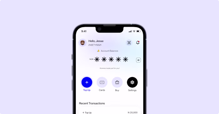
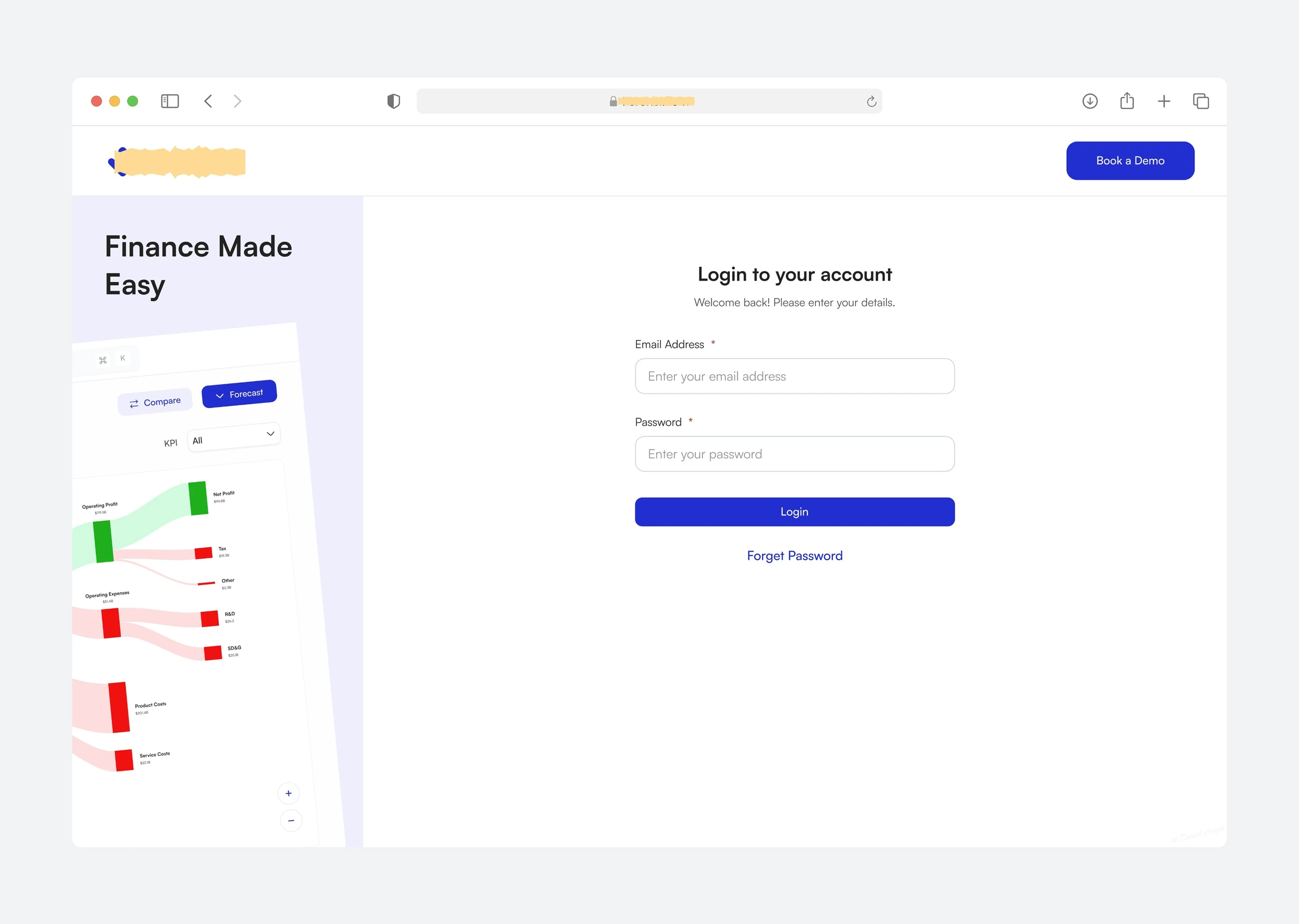
Authentication
Streamlined login process. The experience prioritizes getting users to value quickly while maintaining enterprise-grade security.
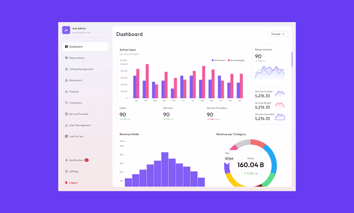
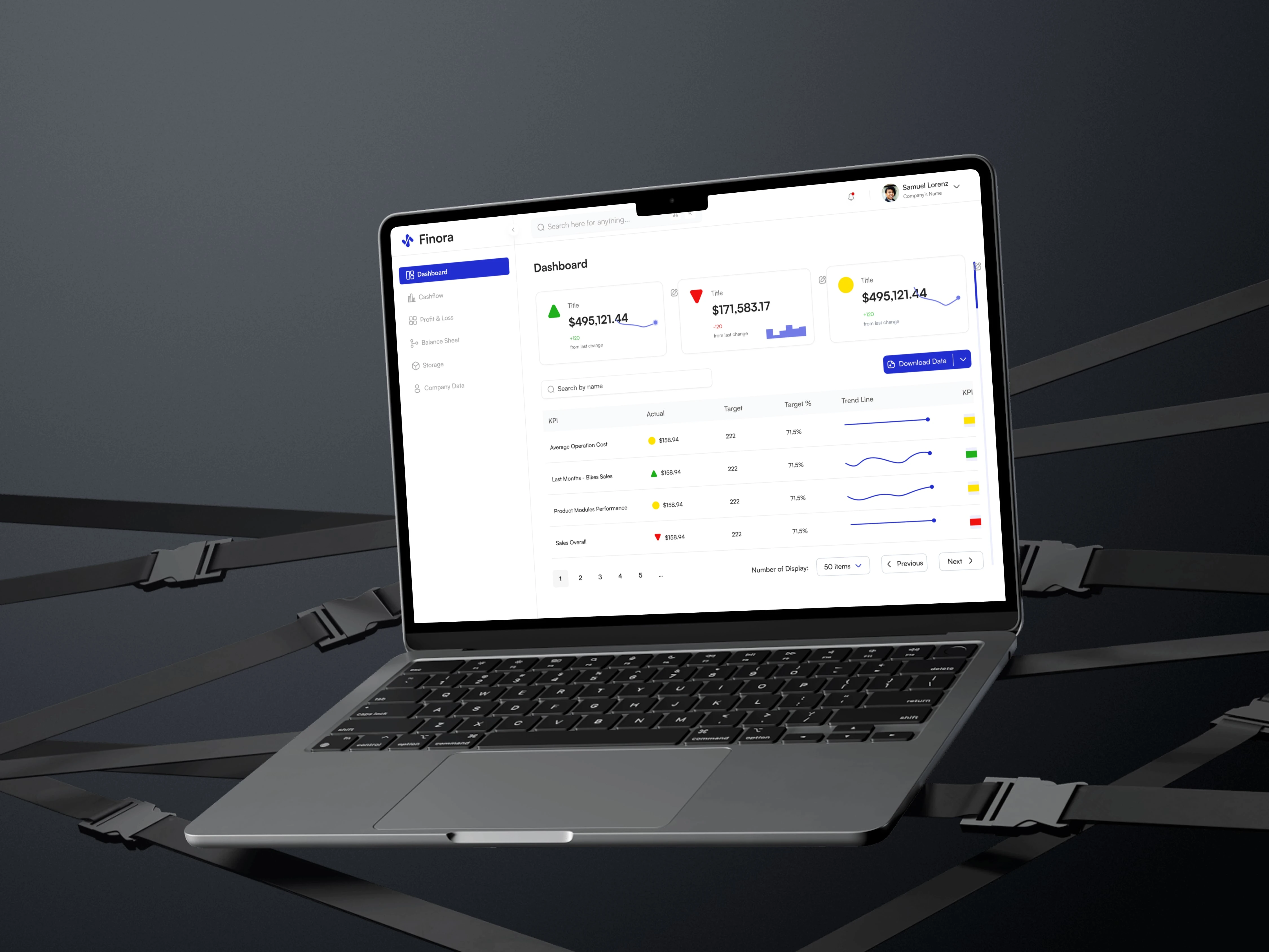
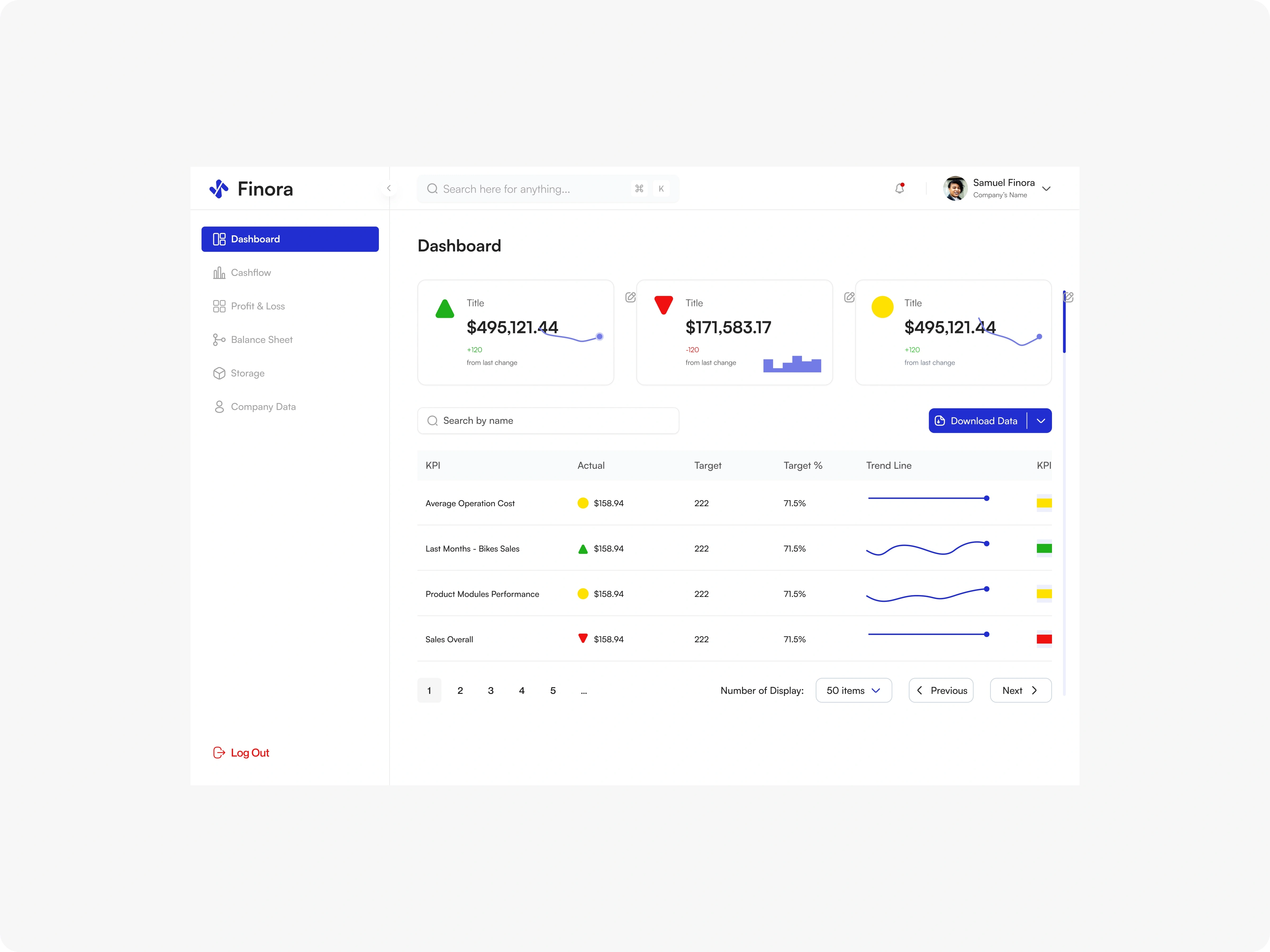
Dashboard (Overview)
Clean metric cards showing revenue, costs, and changes from previous periods. Mini trend charts give context at a glance. Color-coded indicators (green/red/yellow) use semantic meaning consistently. The KPI table lets users track custom metrics with actual vs. target comparisons and visual trend lines.
Dashboard
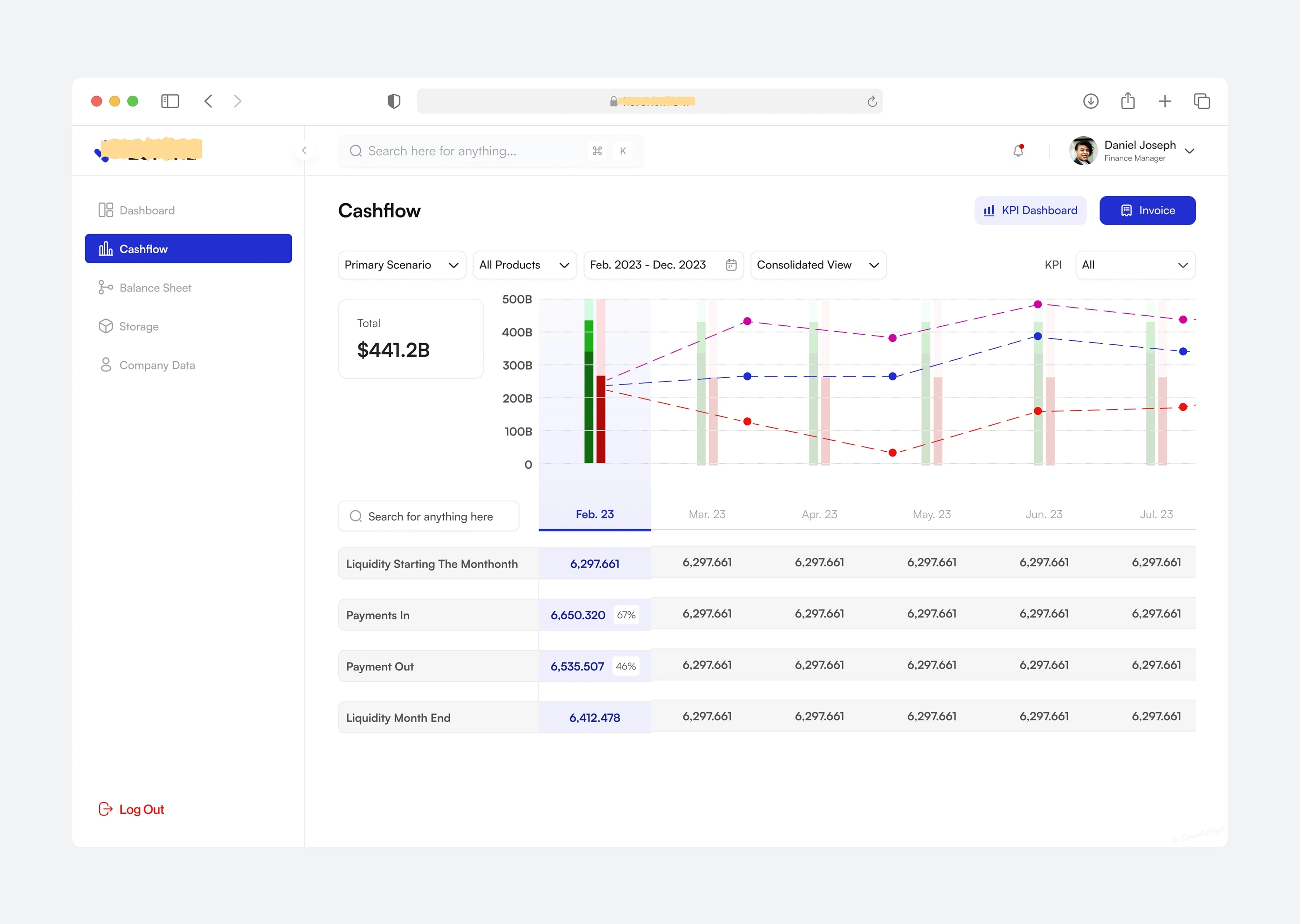
Cashflow
Multi-scenario planning view with a prominent chart showing liquidity over time. Users can switch between consolidated and product-specific views. The table below breaks down payment inflows, outflows, and month-end positions. One-click access to invoices for detailed review.
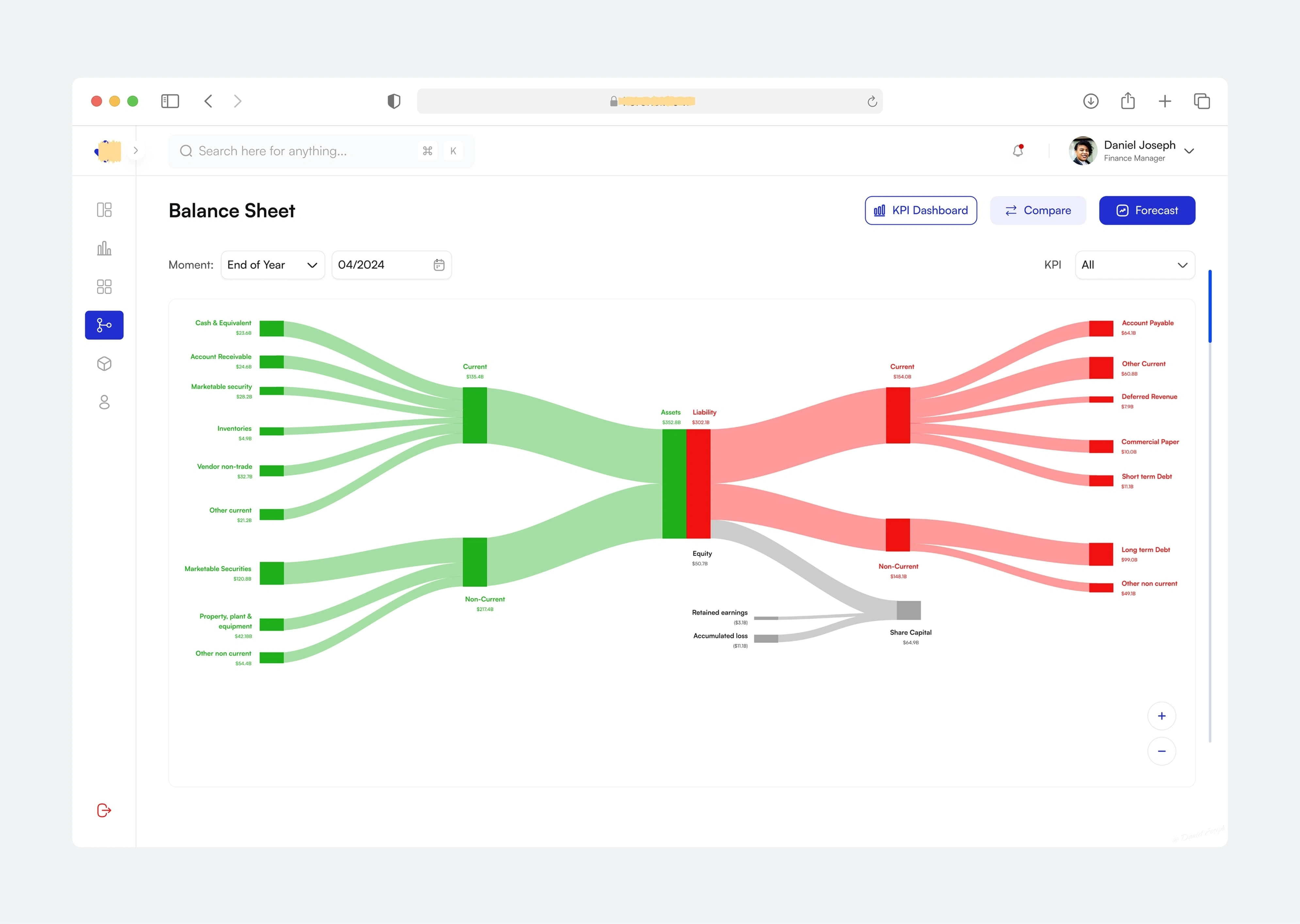
Balance Sheet
An interactive Sankey diagram visualizing asset and liability flows from high-level categories to granular accounts. Users can select specific time periods and toggle between KPI and full accounting views. The compare mode displays two periods side by side with absolute and relative change calculations. Drill-down reveals line-item details with transaction-level breakdowns.
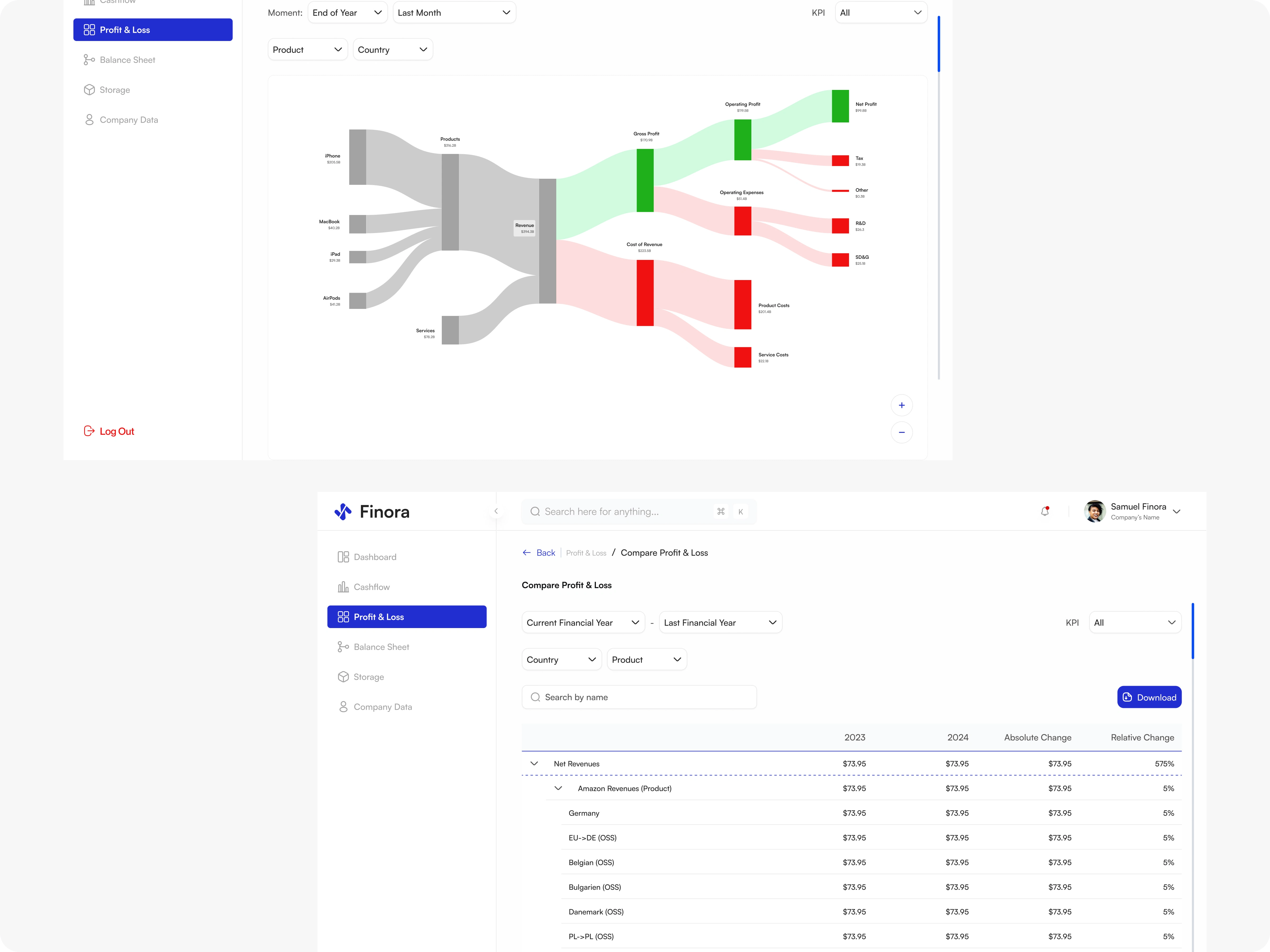
Profit & Loss
Product and geography-based Sankey showing how revenue flows through costs to net profit. Filters let users isolate products, countries, or time ranges. Visual emphasis on key thresholds (gross profit, operating profit, net profit) with labeled segments. The chart becomes a storytelling tool, not just a data dump.
Storage & Inventory
Dual view: Warehouse cards for location-based overview, and product table for SKU-level tracking. Search and version controls help users find specific items quickly. Stock status labels (in-stock/out-of-stock) with quantity indicators. Product detail pages show full specifications, pricing tiers, and restock dates.
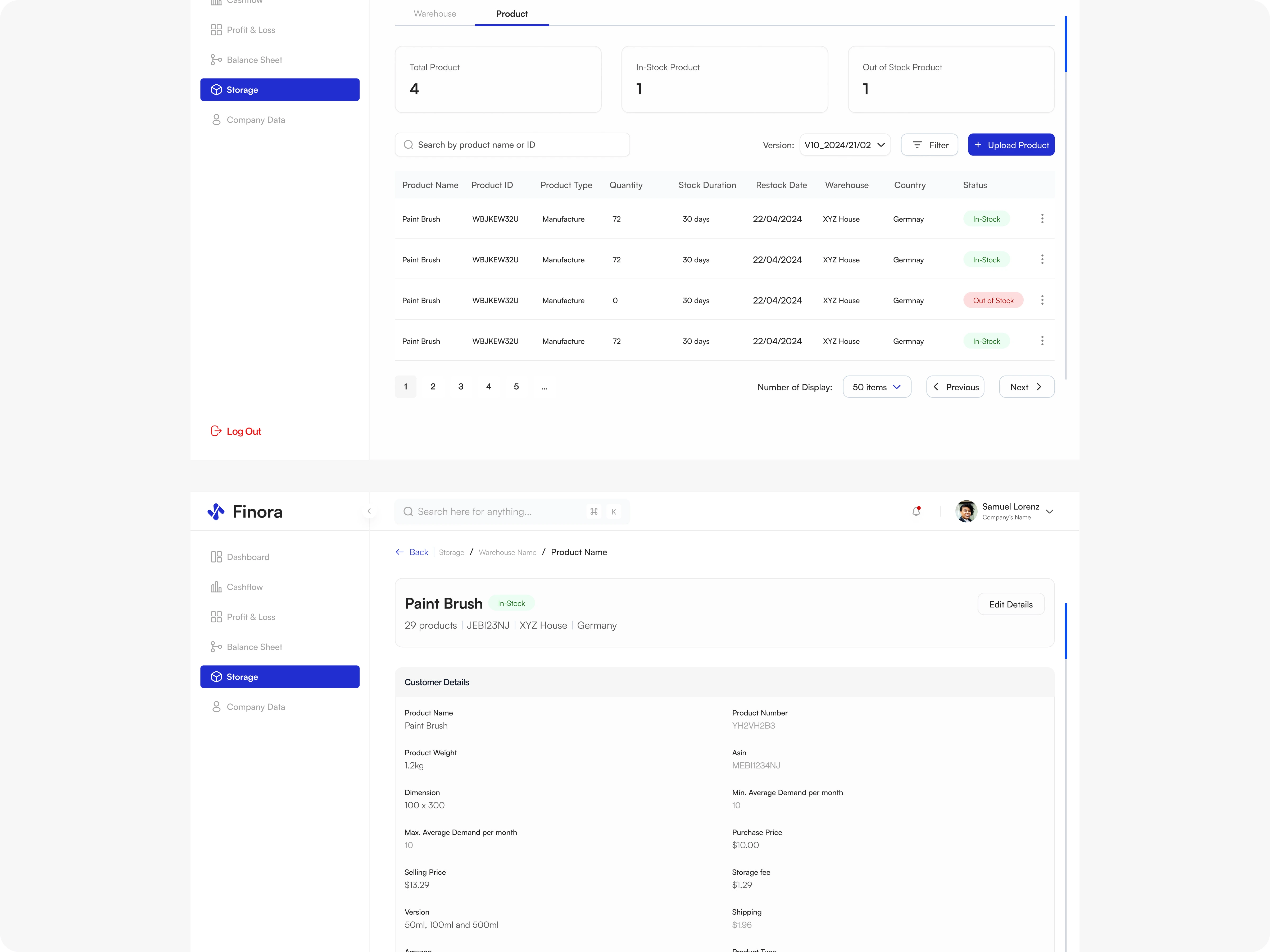
Storage
Settings
Theme customization (light/dark/device default) with accent color options. API integration toggles for DATEV and Amazon, with clear descriptions of what data each connection fetches. KPI configuration page for defining custom metrics, formulas, and targets. Chart of accounts management for accounting structure customization. Role-based access control with granular permissions and user status management.
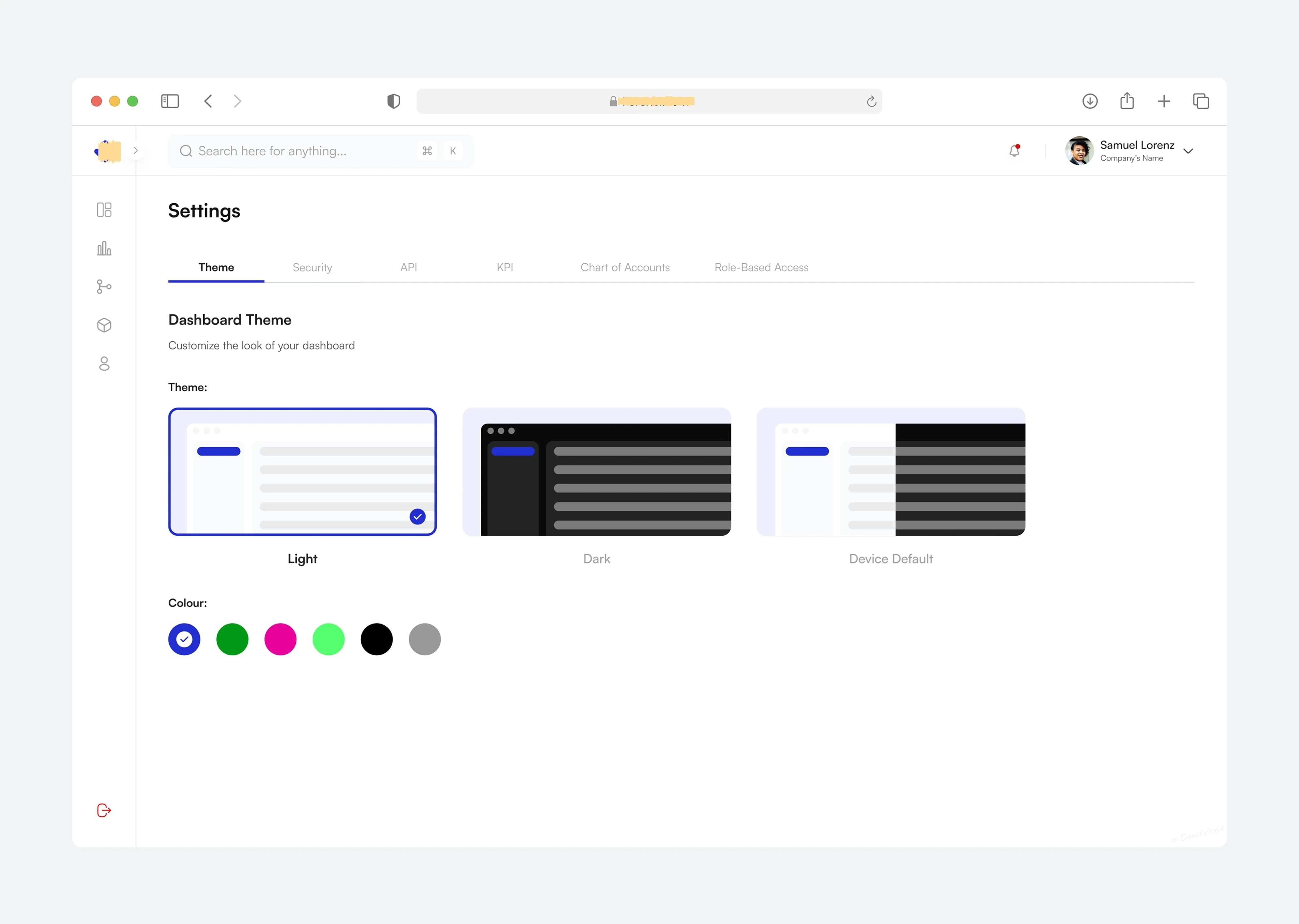
Customize Theme
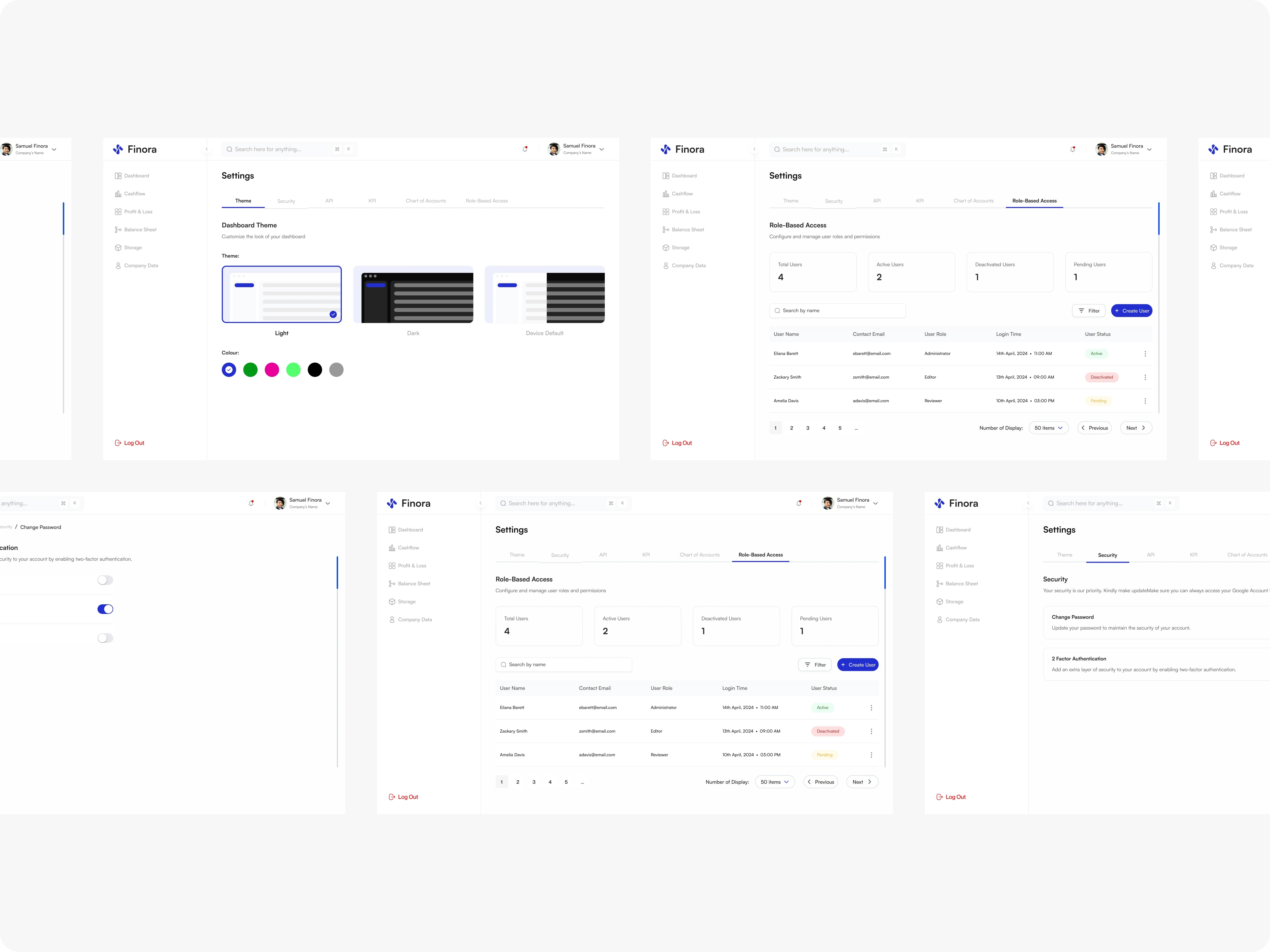
All Settings Page
Design System
To maintain consistency across the entire platform and speed up development, I built a focused design system tailored to Finora's needs. Rather than adopting a heavy, generic framework, I crafted a lean system that addressed our specific use cases—financial dashboards, data-heavy interfaces, and role-based views.
The system ensured every designer and developer could work from the same foundation, reducing decision fatigue and maintaining visual coherence as new features shipped.
Key UX Decisions & Iterations
Sankey as a storytelling tool: Traditional P&L and balance sheet formats are tables. We used Sankey diagrams to show flow and relationships, making financial cause-and-effect visible.
Contextual drill-downs: Clicking any chart segment or metric opens a focused detail view instead of navigating away.
Comparison as a first-class feature: Rather than exporting data to compare periods, we built side-by-side views with calculated change columns directly into the interface.
Role-based UI adaptation: Different user roles see tailored dashboards.
Outcomes
A cohesive financial command center covering dashboard → cashflow → balance sheet → P&L → inventory → settings.
High-fidelity UI
Interactive prototype with realistic data flows and interaction patterns
Comprehensive design system ready for developer handoff with component specs.
Role-based access framework supporting multi-user environments without friction.
Reflection
Finora's strength lies in making complex financial data approachable. By treating the dashboard as a narrative tool—not just a data repository—we helped users move from "what are the numbers?" to "what should I do next?" Financial tools don't have to be boring—clarity and beauty can coexist.
Like this project
Posted May 25, 2025
Designed a SaaS platform for financial insights using modern design and tools.