HeyBrandee (SaaS) Website Redesign & Build

📌 Project Overview
For this project, I partnered with HeyBrandee, an AI‑powered SaaS platform that helps small and medium businesses take the guesswork out of branding—messaging, content creation, competitor insights, and overall brand strategy. HeyBrandee’s promise is not just automation, but intelligent brand partnership that feels strategic and human.
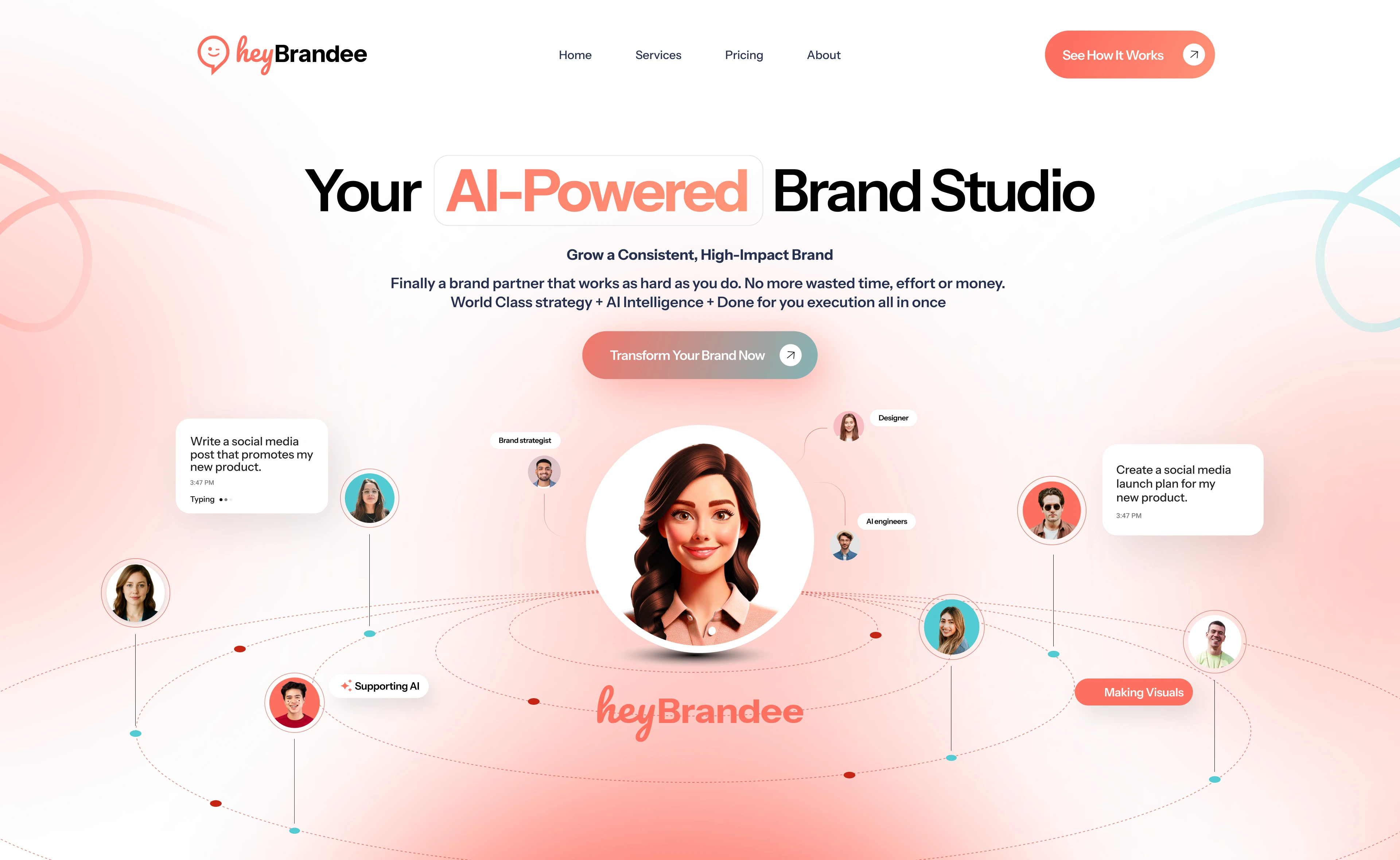
At the start of the engagement, the team already had a powerful product vision and early branding, but the public‑facing site was not reflecting the brand’s value, credibility, and SaaS positioning they needed to attract demo requests and early adopters. My goal was to deliver a full redesign and build on Framer that communicated HeyBrandee’s unique value, clarified the product story, and supported scalable marketing growth—all while delivering a smooth, conversion‑focused experience.
✨ My Role & Responsibilities
I handled the entire visual and technical transformation of the HeyBrandee website from start to finish:
Brand & Identity Refinement: Worked with existing brand assets and elevated them into a cohesive visual language for web.
UX/UI Design: Built user flows, sitemap, high‑fidelity layouts and interactive prototypes in Figma, with a strong emphasis on clarity and conversion.
Full Framer Redesign & Development: Took the final designs and implemented them end‑to‑end in Framer, using advanced layout features, scroll interactions, and optimized responsive design.
Content Strategy Support: Collaborated on messaging hierarchy and layout structure to ensure every section communicated value and encouraged demo requests or sign‑ups.
Tools I used included Figma, Framer, and design apps like Photoshop for visual assets and Canva as needed for quick asset production.
🧠 Problem Statement
The original HeyBrandee landing experience had three core issues:
✨ It wasn’t strategically positioned for SaaS audiences—value propositions were buried and unclear.
📐 The visual hierarchy didn’t guide visitors toward key conversion actions like “Book Your Demo” or “Start Free Trial.”
📱 The site lacked a modern, fluid design system that conveyed both professional credibility and approachable personality.
In a crowded SaaS space, first impressions matter. The goal was to create a site that didn’t just look good, it performed well—capturing demo sign‑ups and increasing user trust.
🧩 Design Process
I approached the redesign in structured, intentional stages:
🔍 Discovery & Audit
I began with an in‑depth analysis of the existing site, competitor SaaS platforms, and user goals. Mapping out where conversions were dropping off helped me define the layout strategy.
✏️ Wireframes & Flow
Next, I sketched out low‑fidelity wireframes in Figma to establish a clear user journey—landing messaging first, followed by problem framing, solution highlights, and strong calls‑to‑action.
🎨 Visual Identity Integration
While the brand already had a personality, I refined the color palette, typography, iconography and spacing rules to enhance readability and visual coherence throughout the design.
🧪 Interactive Prototypes
Before development, I built clickable prototypes in Figma to test interactions and gather feedback from the HeyBrandee team. This ensured alignment on transitions, animations, and content placement.
🔄 Iteration
Based on client feedback and usability concerns, I refined layouts, re‑prioritized sections for clarity, and improved interaction cues that increased visitor engagement.
This thoughtful design process helped the final product feel polished, purposeful, and intuitive. 🧠✨
💻 Development Process
Turning the Figma designs into a live site on Framer involved:
📱 Responsive Layouts: Framer’s flexible canvas allowed me to build fluid layouts that work beautifully across mobile, tablet, and desktop without losing structure or hierarchy.
🚀 Performance & Interactions: I added subtle scroll animations, micro‑interactions, and visual cues to guide users without overwhelming them. These interactions helped communicate credibility and engagement.
🔧 Framer CMS & Content Blocks: I structured reusable components and content collections so the HeyBrandee team can update headlines, testimonials, and hero sections without developer help.
🌍 SEO & Accessibility: Built with semantic structure, proper heading hierarchy, and ALT tags to support organic visibility and inclusive design.
📊 Testing & Fixes: Conducted cross‑browser testing and optimized based on performance measurements—ensuring load speed stayed tight and UX stayed smooth.
⭐ Solutions & Key Features
Here’s what the new HeyBrandee site now includes:
🧠 Clear SaaS Positioning: Above‑the‑fold messaging that explains what HeyBrandee does and who it helps.
🎯 Conversion‑Focused Design: Multiple, visually distinct CTA zones like “Book Your Demo” and “Join Beta” placed throughout the page.
📈 Structured UX Flow: Logical progression from problem → solution → benefits → social proof.
🖼️ Visual Brand System: Harmonized typography, icons, colors, and imagery that reinforce HeyBrandee’s personality.
💬 Responsive Interactions: Smooth scroll transitions and hover behaviors built natively in Framer.
📑 CMS‑Ready Content Blocks: Empowered the client to update sections like features and FAQs easily.
📈 Results & Impact
The redesigned site has had a measurable impact on how HeyBrandee is perceived and interacted with:
✔️ Visitors immediately understand the value of the product within seconds of landing, thanks to clearer messaging and layout.
✔️ CTA visibility and placement helps drive more qualified demo bookings and waitlist sign‑ups.
✔️ The sleek Framer build now looks modern, polished, and fully on‑brand—elevating trust with potential users.
The client reported that the new design helps them close demos faster and convert visitors who might have otherwise bounced due to unclear messaging.
💡 Takeaways & Lessons Learned
This project reinforced a few critical insights:
🎯 Every SaaS site needs a narrative: Users should understand value within 5 seconds. If they don’t, they bounce.
🛠️ Design + development alignment matters: Building directly in Framer allowed me to iterate faster and maintain design fidelity.
📱 Responsiveness isn’t optional: Mobile experiences must be not just scaled but re‑thought for touch and attention patterns.
Tips for fellow designers: Prioritize clarity before creativity. A visually stunning site that confuses users will always underperform.
Like this project
Posted Dec 1, 2025
Transformed HeyBrandee’s website with a full redesign and Framer development, boosting branding, clarity, and user conversions.
Likes
2
Views
48
Timeline
Sep 16, 2025 - Nov 26, 2025
Clients

HeyBrandee


