Prospeer - Visual Identity Design
Prospeer is an AI-driven qualitative hiring platform designed to revolutionize the hiring process for both companies and candidates. Founded in India, their mission is to empower businesses to hire better and faster while providing relevant job opportunities for young talents seeking growth and success.
Prospeer wanted us to translate their vision into a brand identity that tells their story loud and clear. Additionally, they sought a website and web app that would make it a breeze for users to navigate and experience Prospeer.

VERBAL IDENTITY
BRAND STORY
Prospeer was born from a simple yet powerful idea - to level the playing field for freshers in the job market. It's a challenge many of us face - graduating with dreams but struggling to find the right opportunities.
Our founders, fresh out of college themselves, recognized that good companies rarely visited smaller campuses, leaving young talents feeling overlooked. So, they set out to change the game.
BRAND VOICE
Prospeer's brand voice is a blend of professionalism, approachability, and optimism. It communicates with clarity and authority while maintaining a friendly and encouraging tone. It seeks to establish trust with its audience and inspire confidence in its solutions.

VISUAL IDENTITY
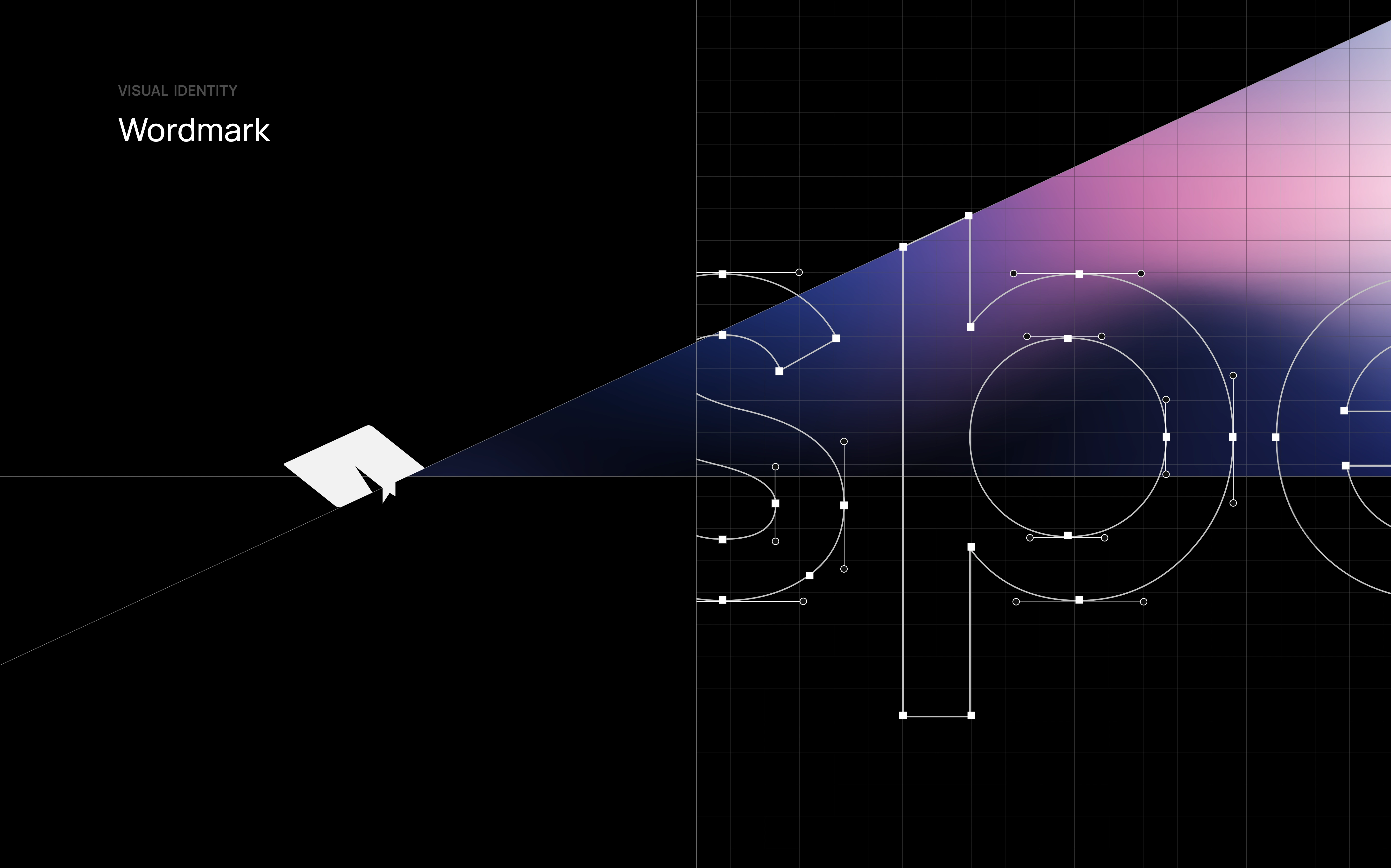
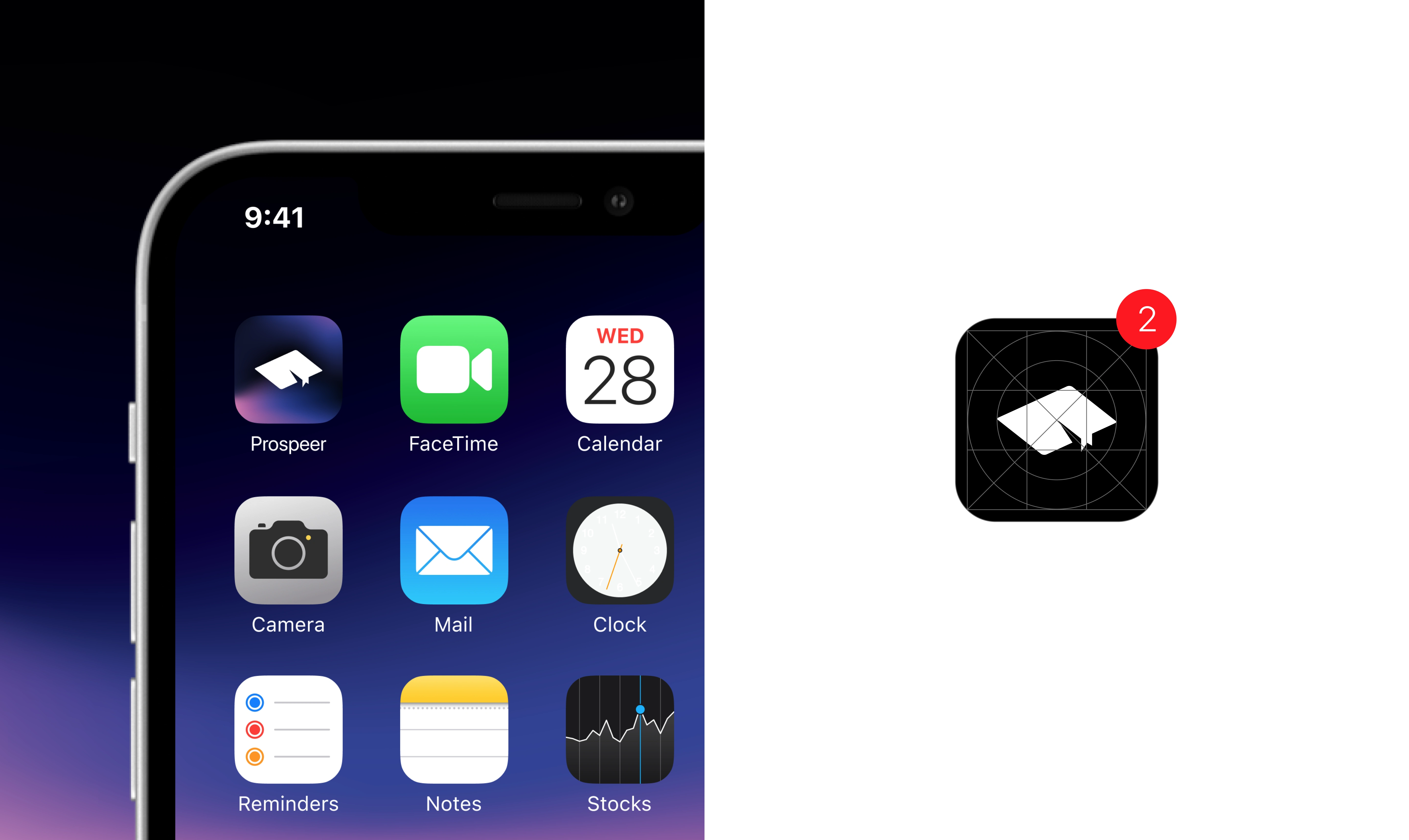
MARK CONSTRUCTION
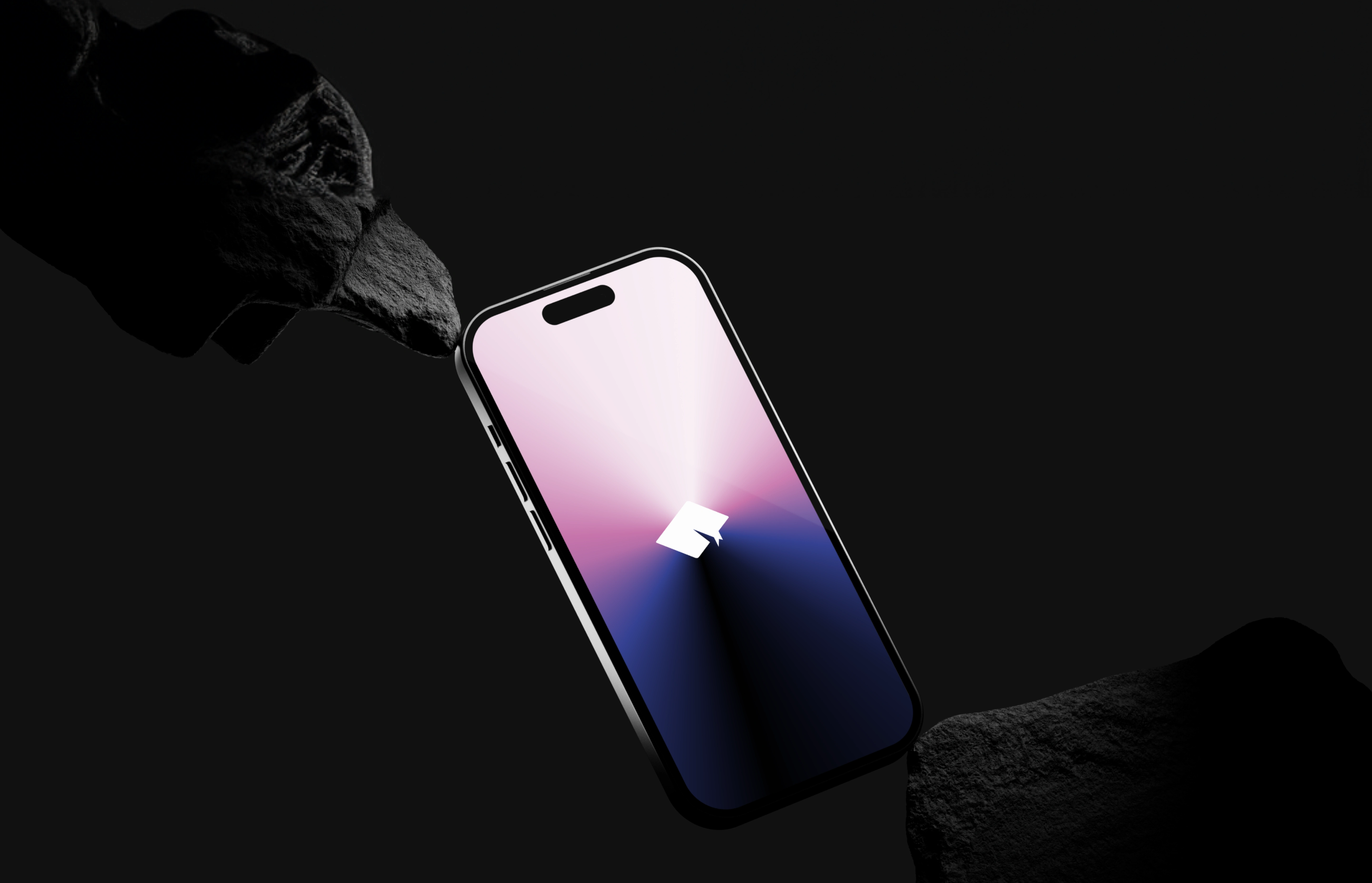
The mark is thoughtfully crafted to convey the essence of Prospeer. It represents a graduate’s hat, symbolizing the aspiration and potential of fresh talent embarking on their professional journey. The logo elegantly captures the essence of growth and progress.

TYPOGRAPHY
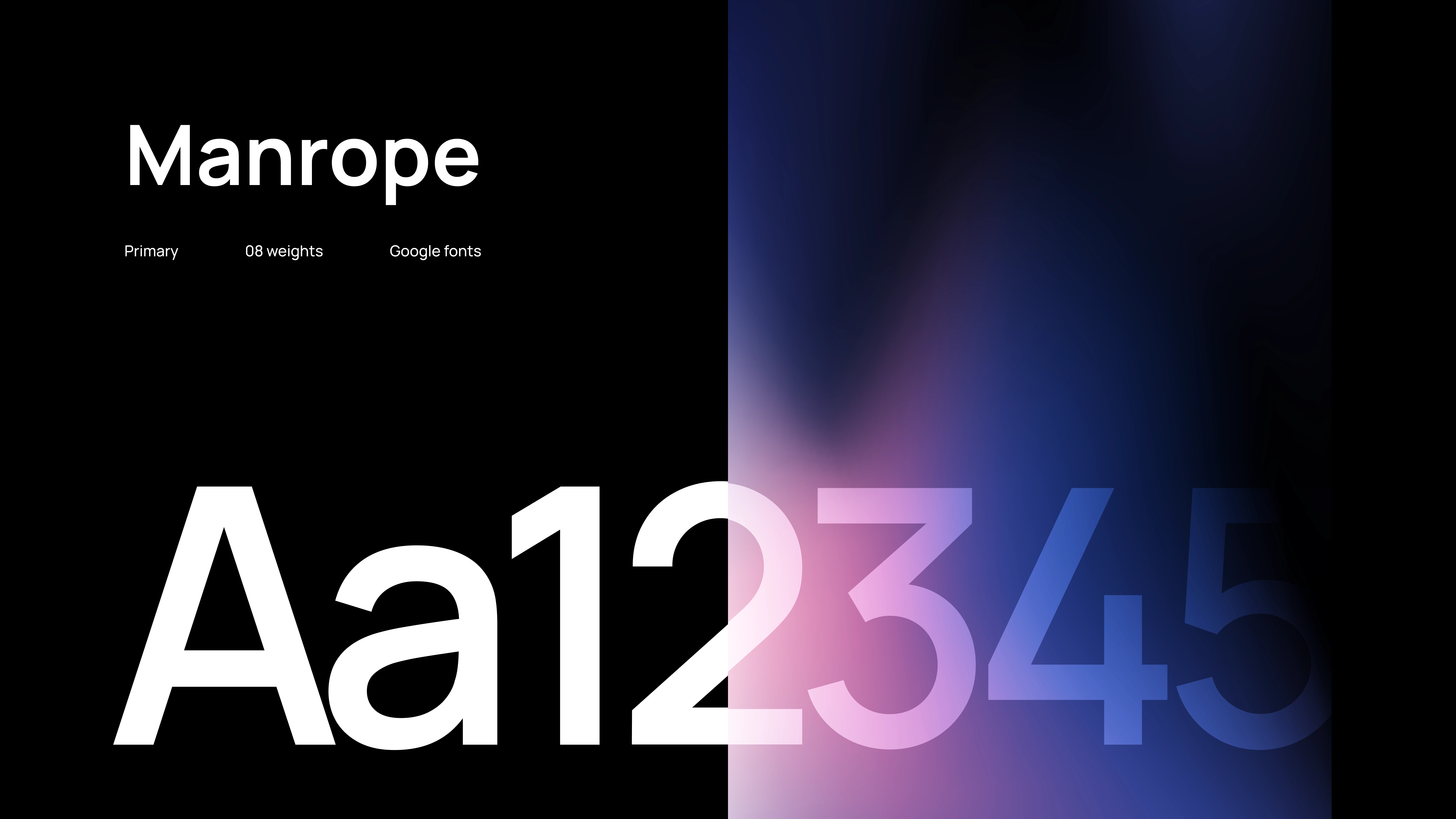
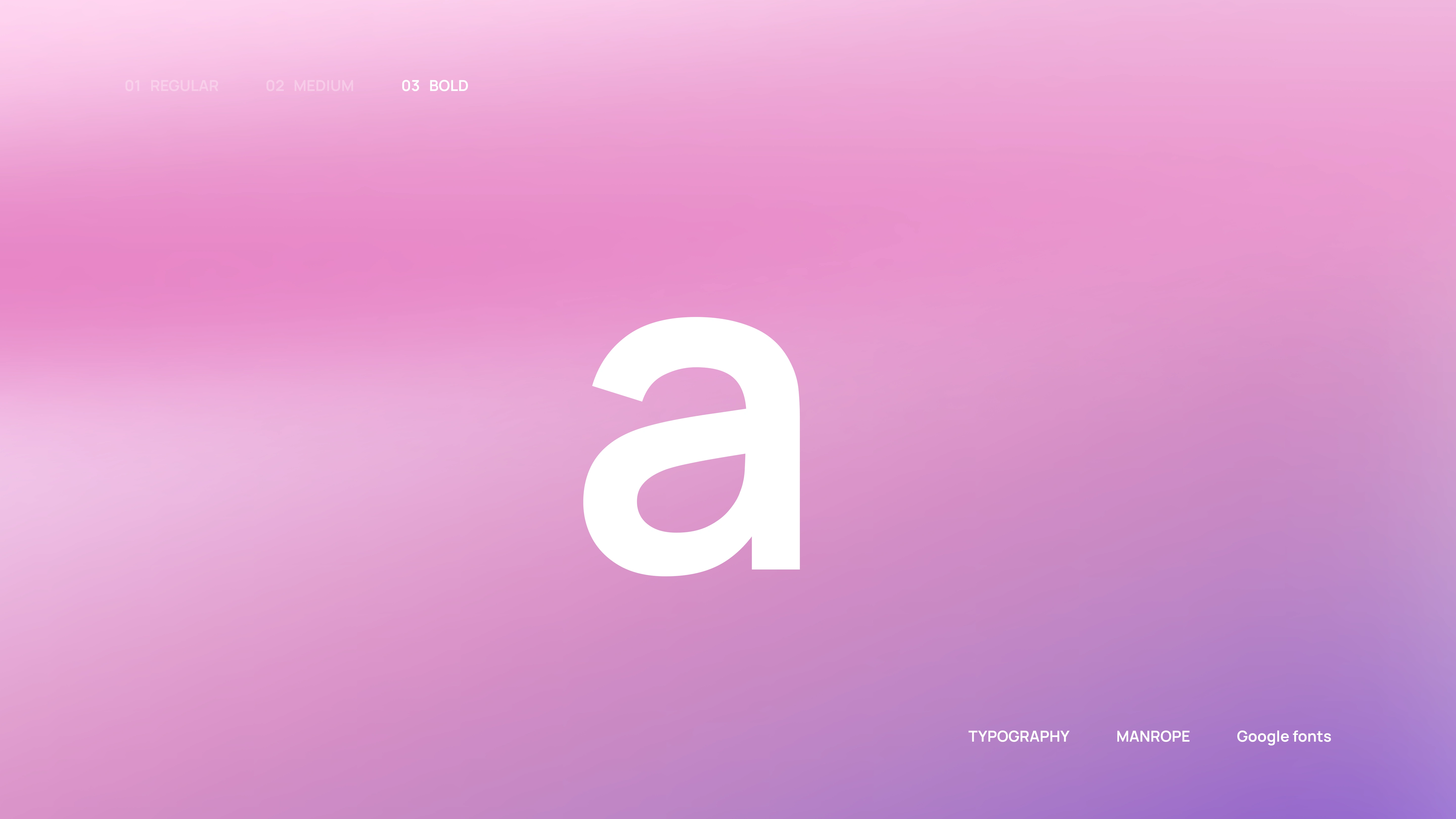
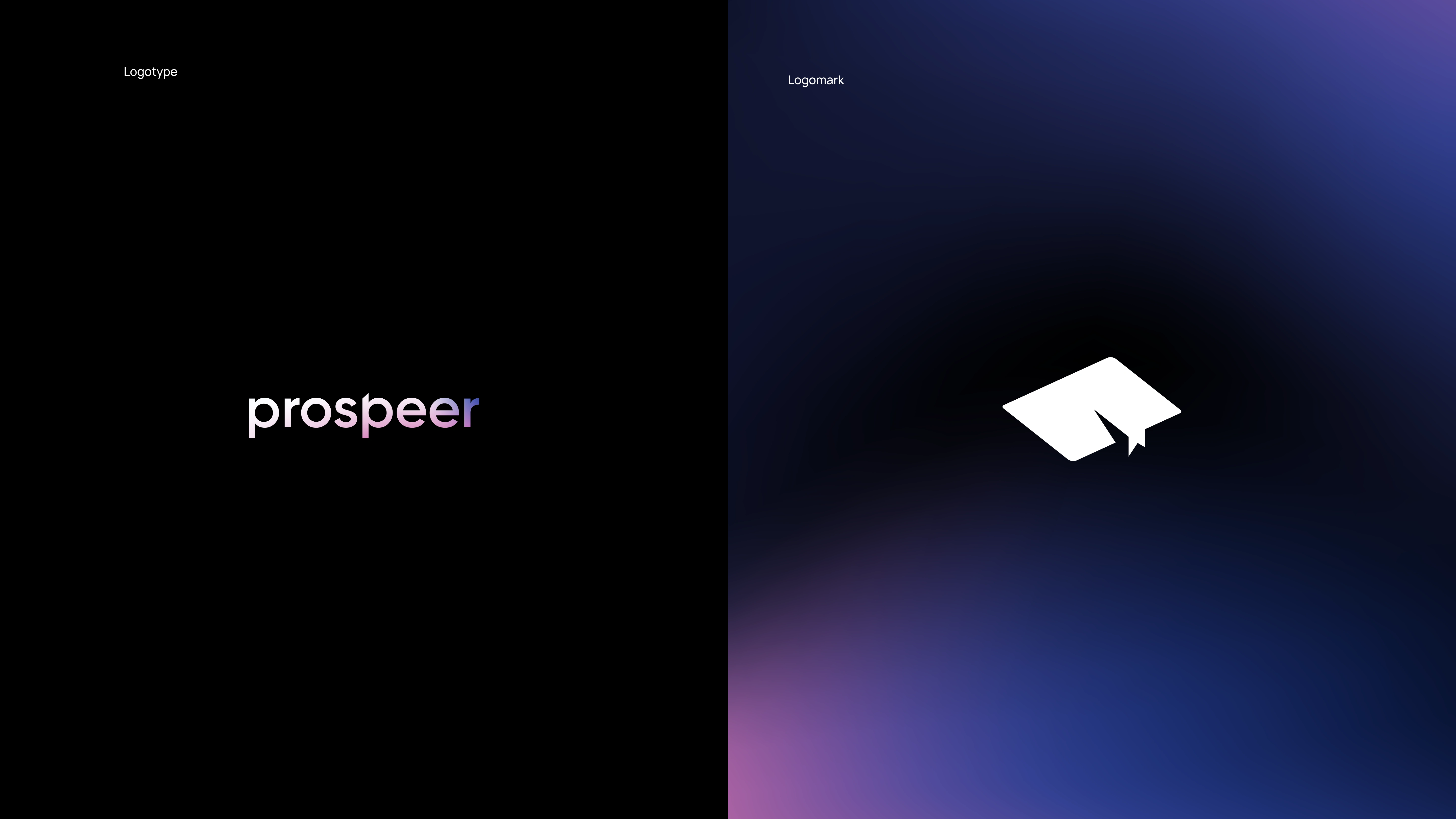
Manrope is a modern sans serif typeface ideally designed as a crossover of different font types. It employs minimal stoke thickness variations and a semi-closed aperture.
Prospeer condenses the type usage to 3 weights to ideally define the font usage.

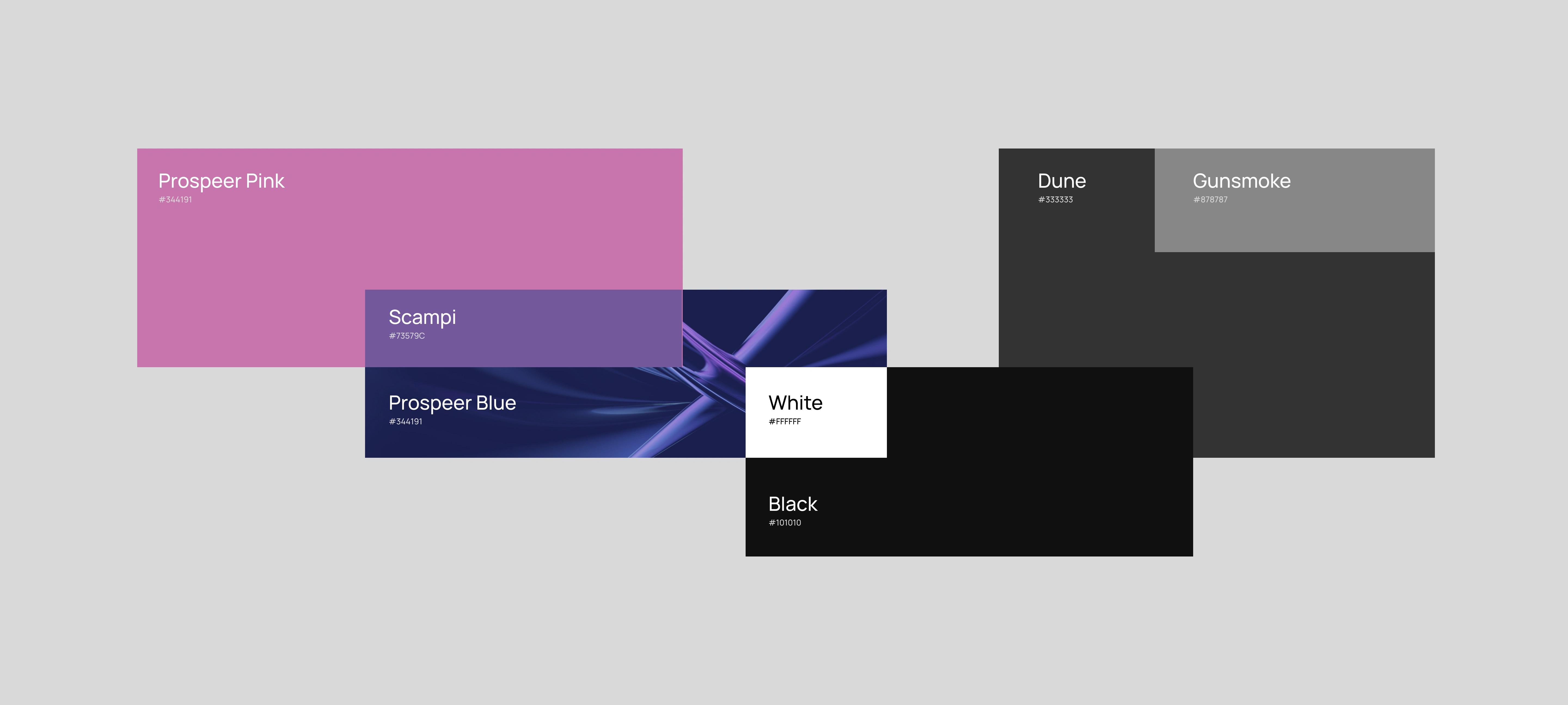
COLOR PALETTE
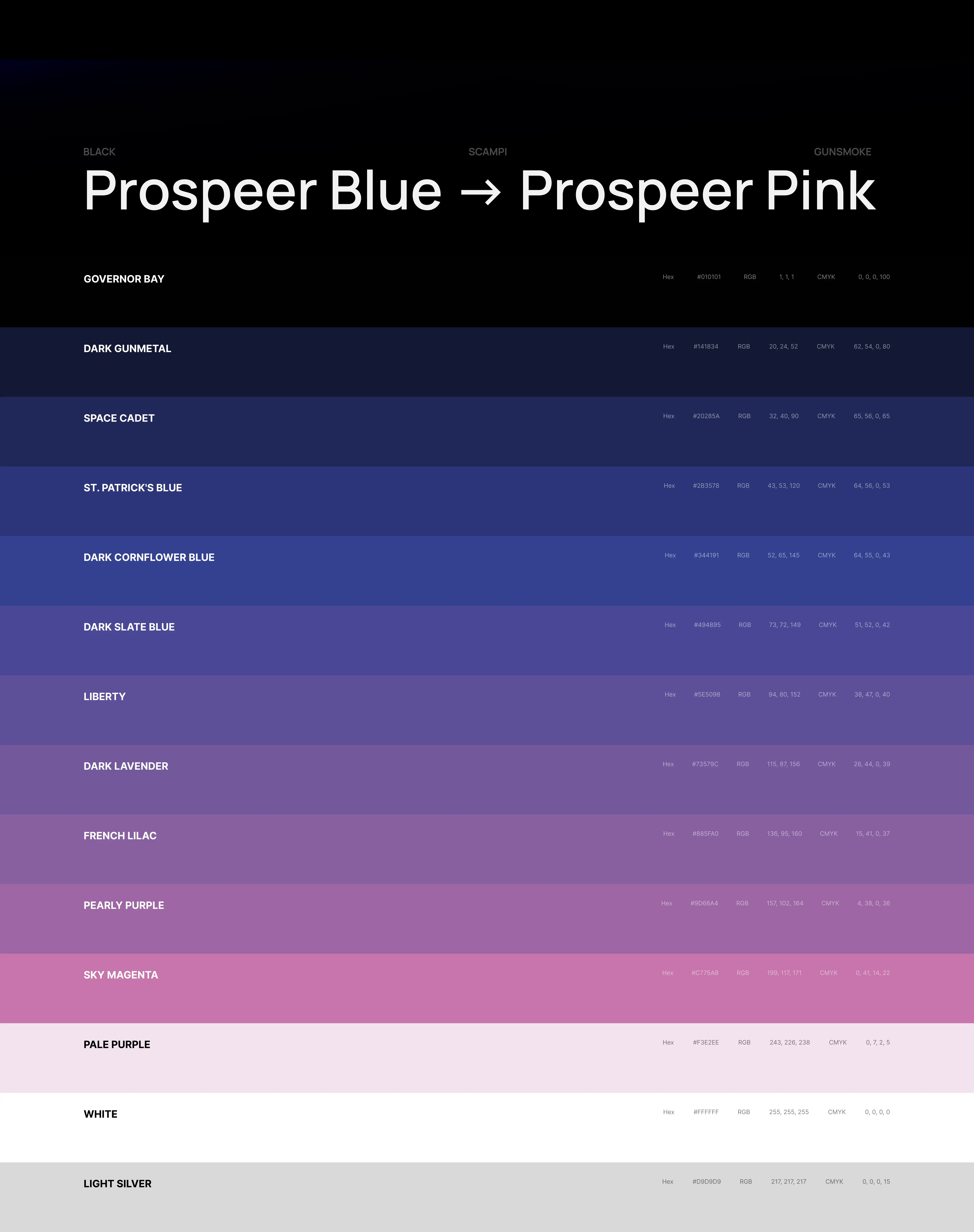
The spectrum of colors, ranging from blue to pink, was carefully chosen to give the brand a more fun and accessible appearance for our target audience of recent graduates. We aimed to move away from a corporate aesthetic and make the job-seeking experience more enjoyable.
PALETTE DESIGN
Additionally, by using black as our base color combined with complementary monotones in black, grey, and white, we enhanced the brand's sophistication.
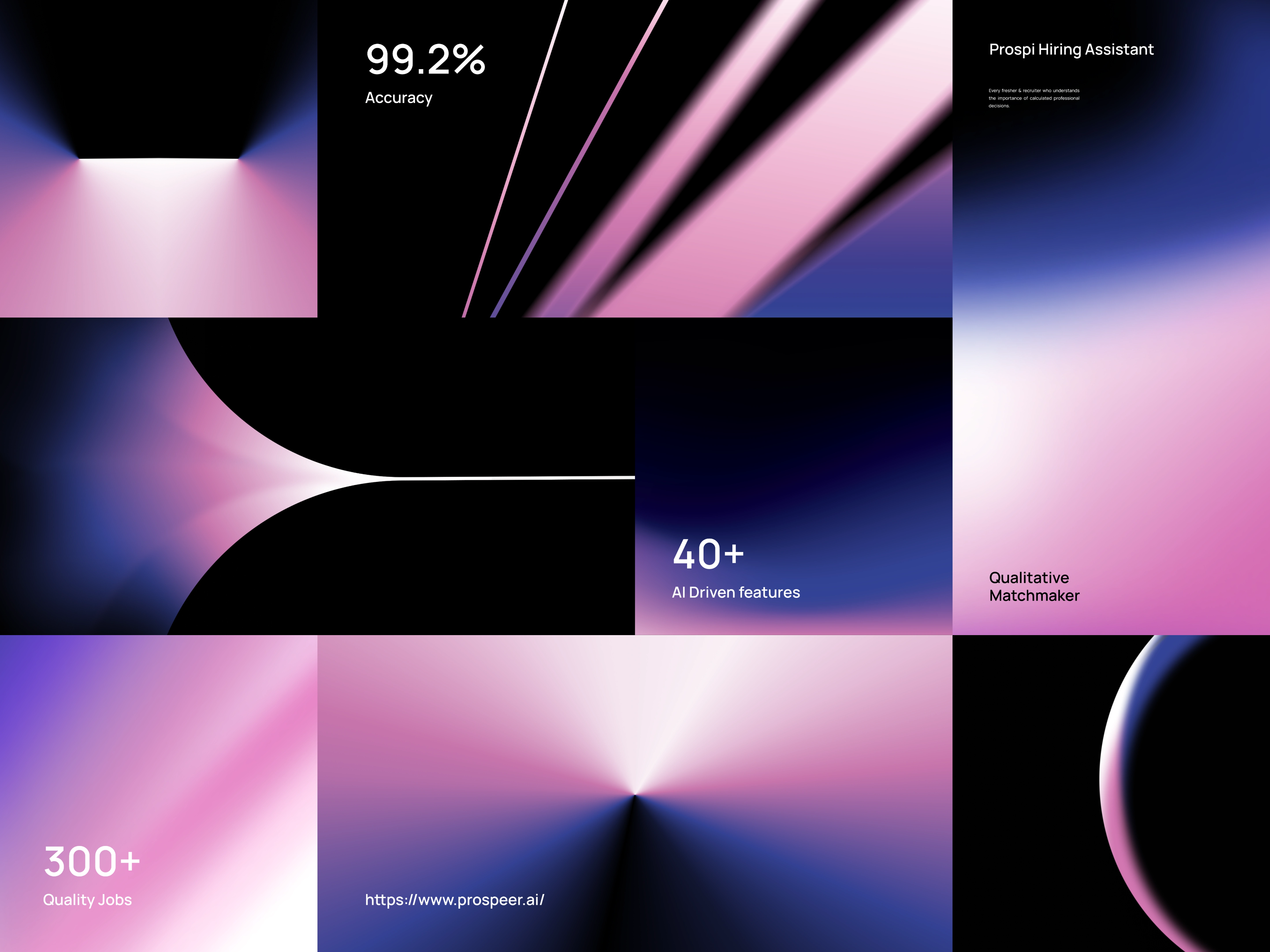
GRADIENT SET
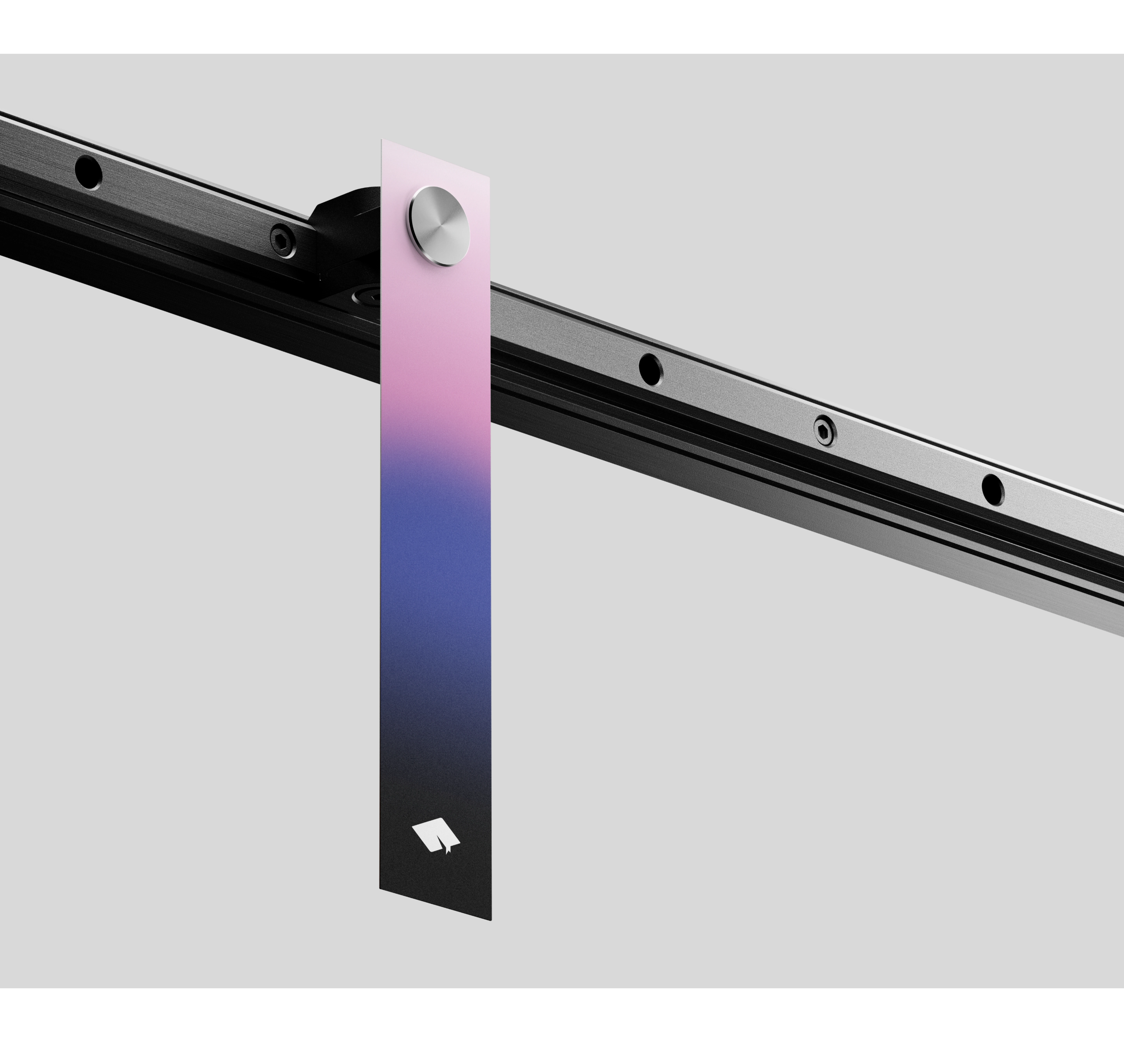
Given that AI plays a pivotal role in our brand, we sought to imbue it with a modern and tech-oriented look. These gradients allowed us to achieve this goal.

BRAND IMPLEMENTATION
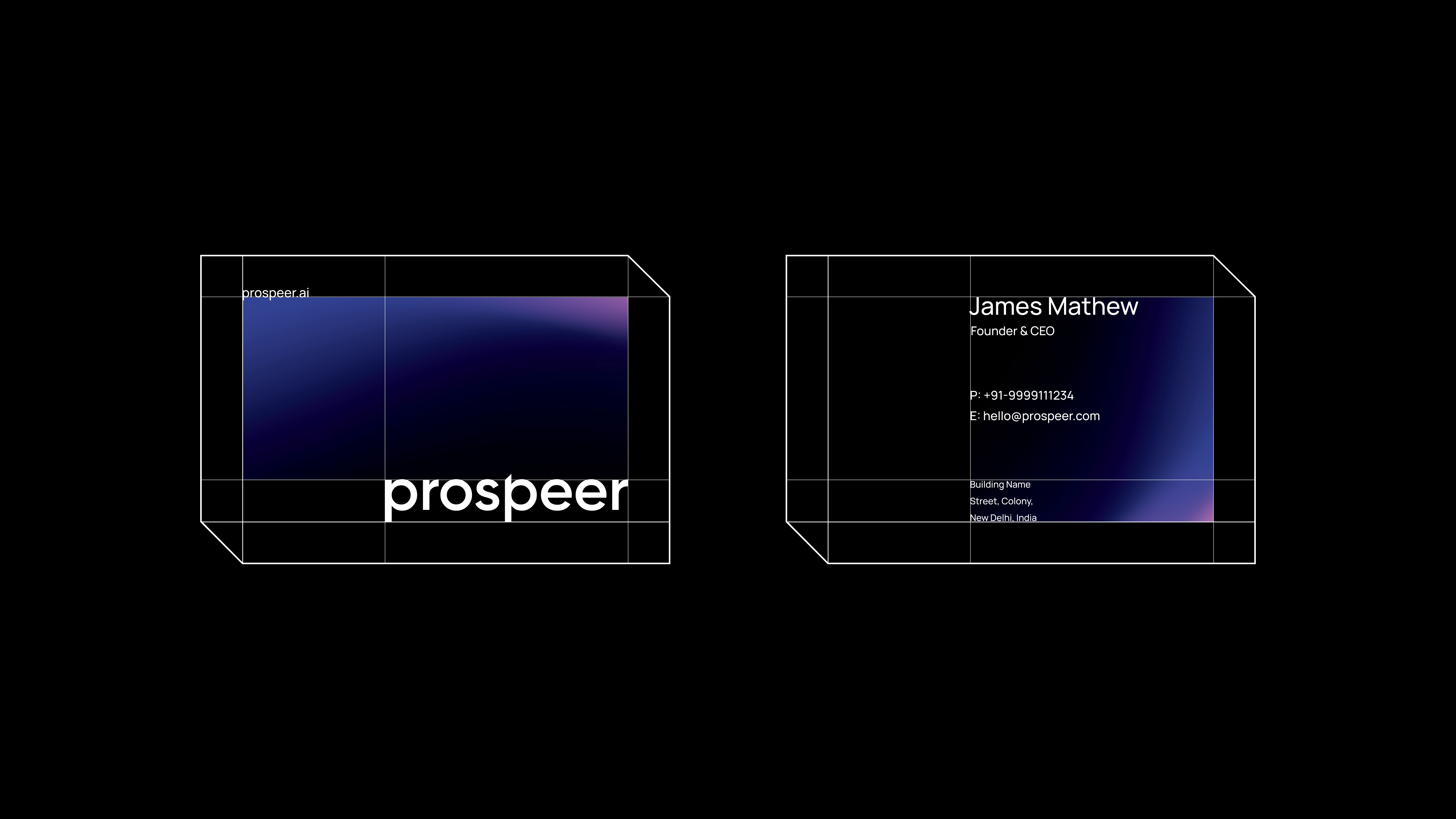
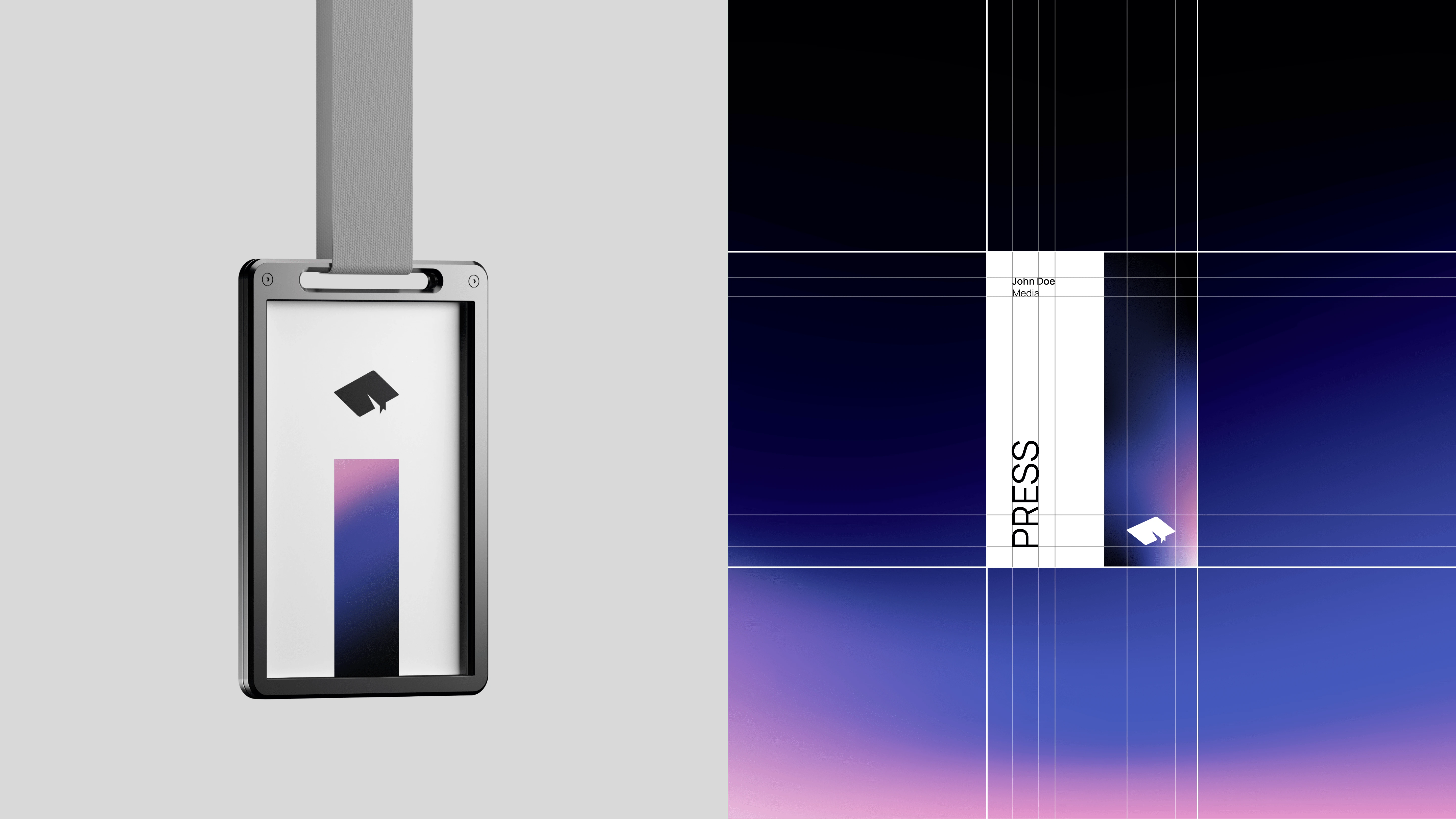
STATIONARIES

SOCIAL MEDIA
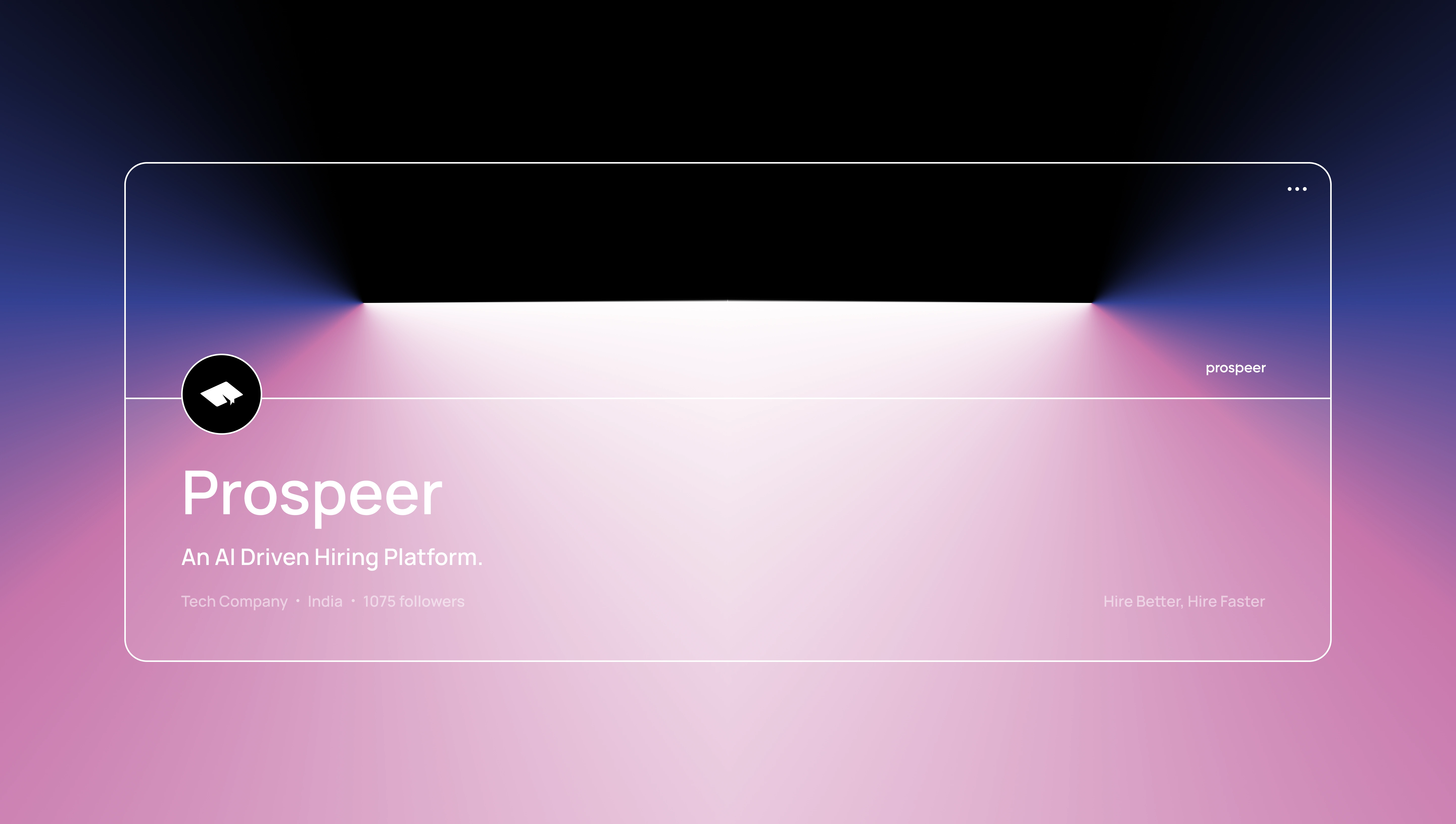
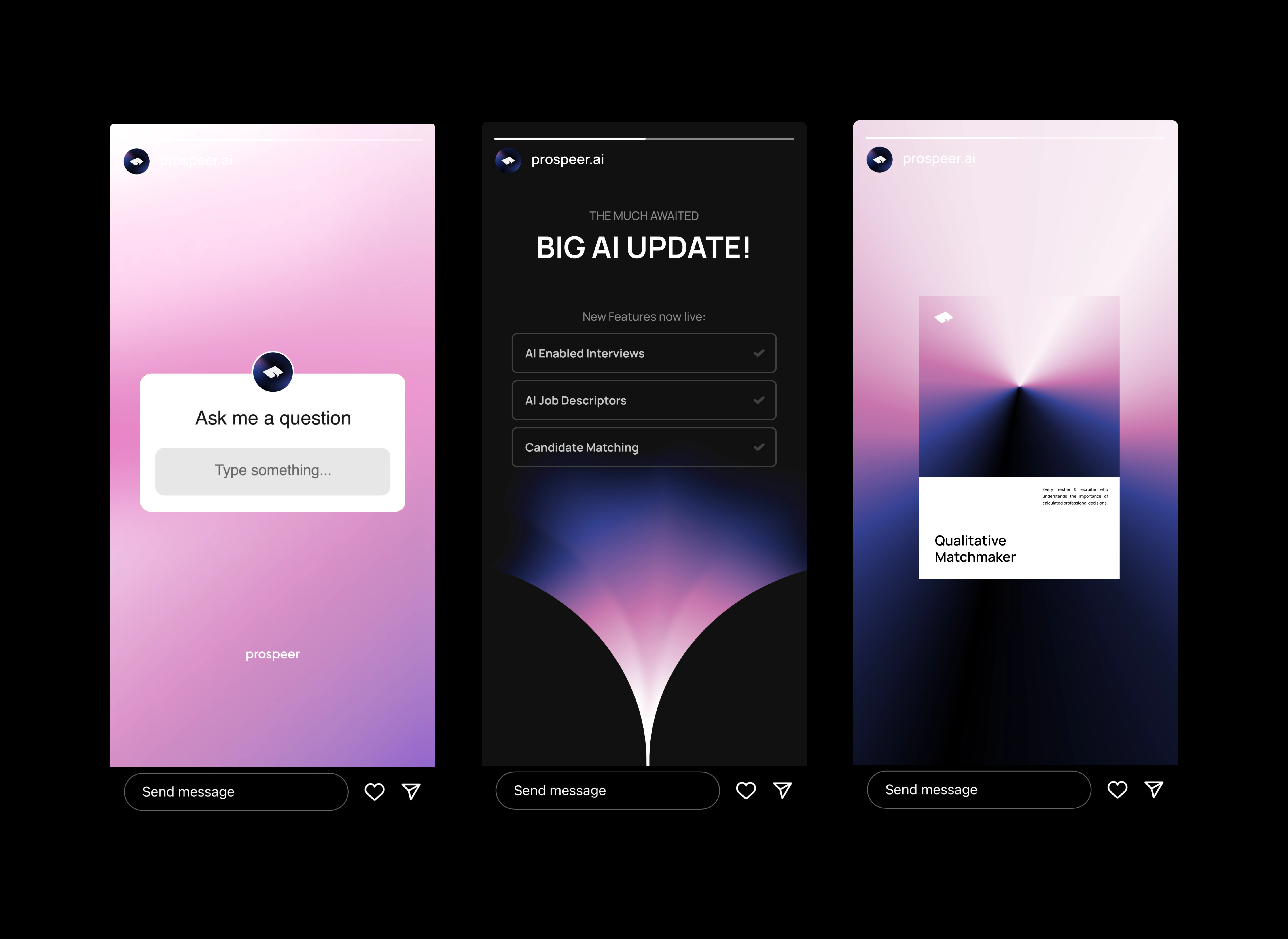
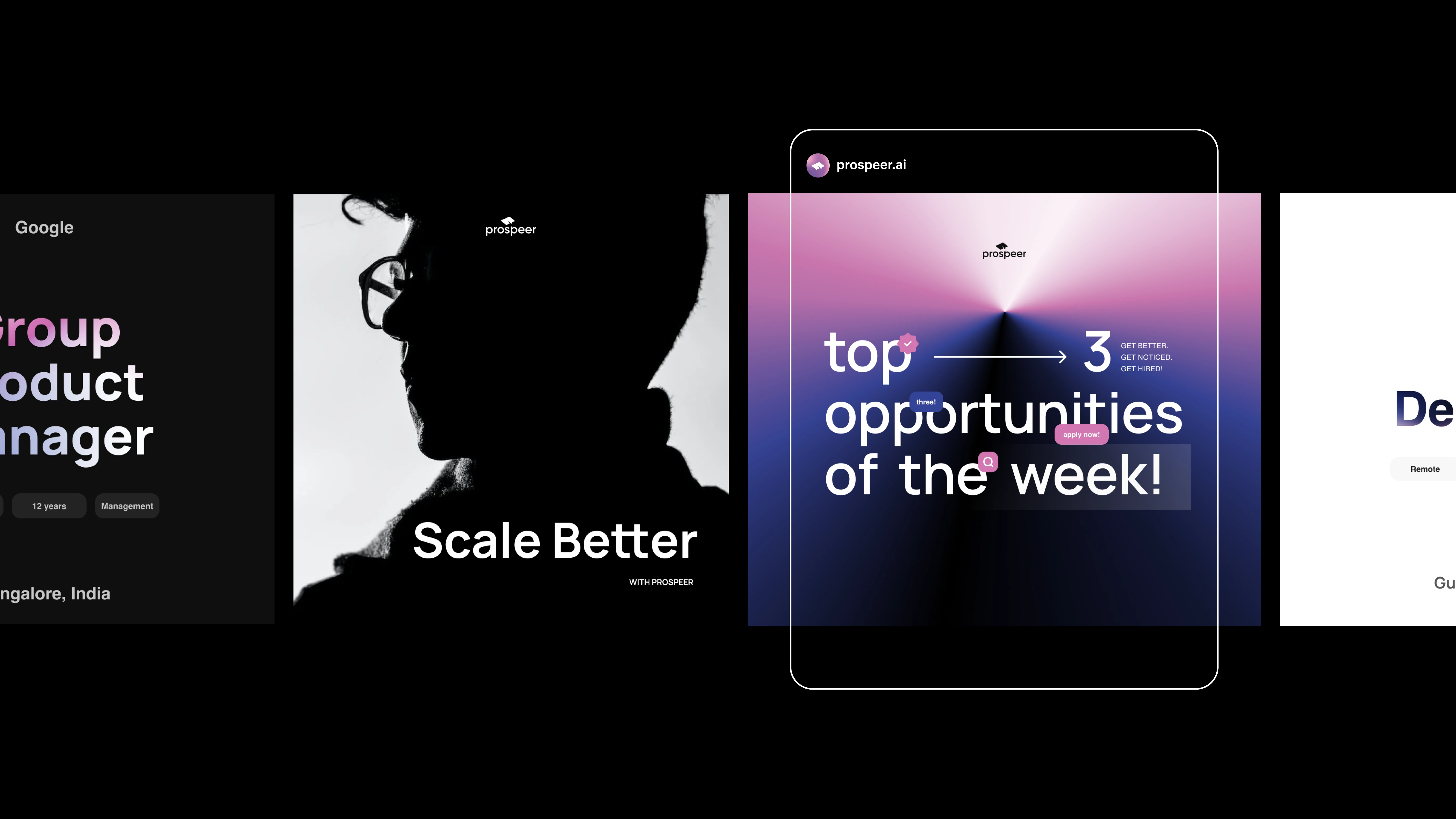
At the heart of our digital presence lies our social media strategy and designs. Through our social platforms, we communicate a wide range of valuable content to our audience.
This includes job postings, ensuring that our followers have access to exciting career opportunities. Additionally, we use social media to unveil the latest features and updates of our platform. We also regularly share career tips and tricks to help our community make the most of our services.
But it's not just about functionality; we've aimed to craft a feed that inspires and motivates, embodying those powerful, aspirational concepts that drive us forward.

This case study was originally published on Behance. Check it out below:
Like this project
Posted Dec 6, 2023
Prospeer is an AI-driven qualitative hiring platform designed to revolutionize the hiring process for both companies and candidates.
Likes
16
Views
804
Collaborators
