GOT TEA Menu Design: UX Case Study

Background
This case study discusses the redesign of the menu card for Got Tea, a boba tea cafe based in Delhi, India.
Objective
The objective of the redesign was to improve the user experience and alleviate overcrowding at the counter, as the previous menu suffered from various issues such as poor image usage, constant changes to the menu, and inadequate product recommendations.
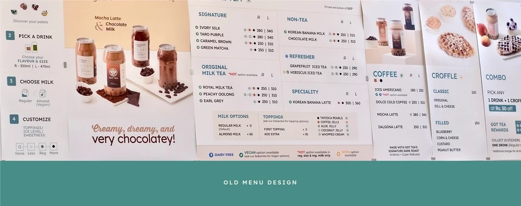
Old Menu Design at Got Tea
Solution
The redesign aimed to streamline the ordering process, enhance the user experience, strengthen brand identity, and increase customer engagement. The new design incorporated standardized high-quality photographs, replaced topping icons with photographs and text, improved iconography, introduced a grid design, and improved content alignment.
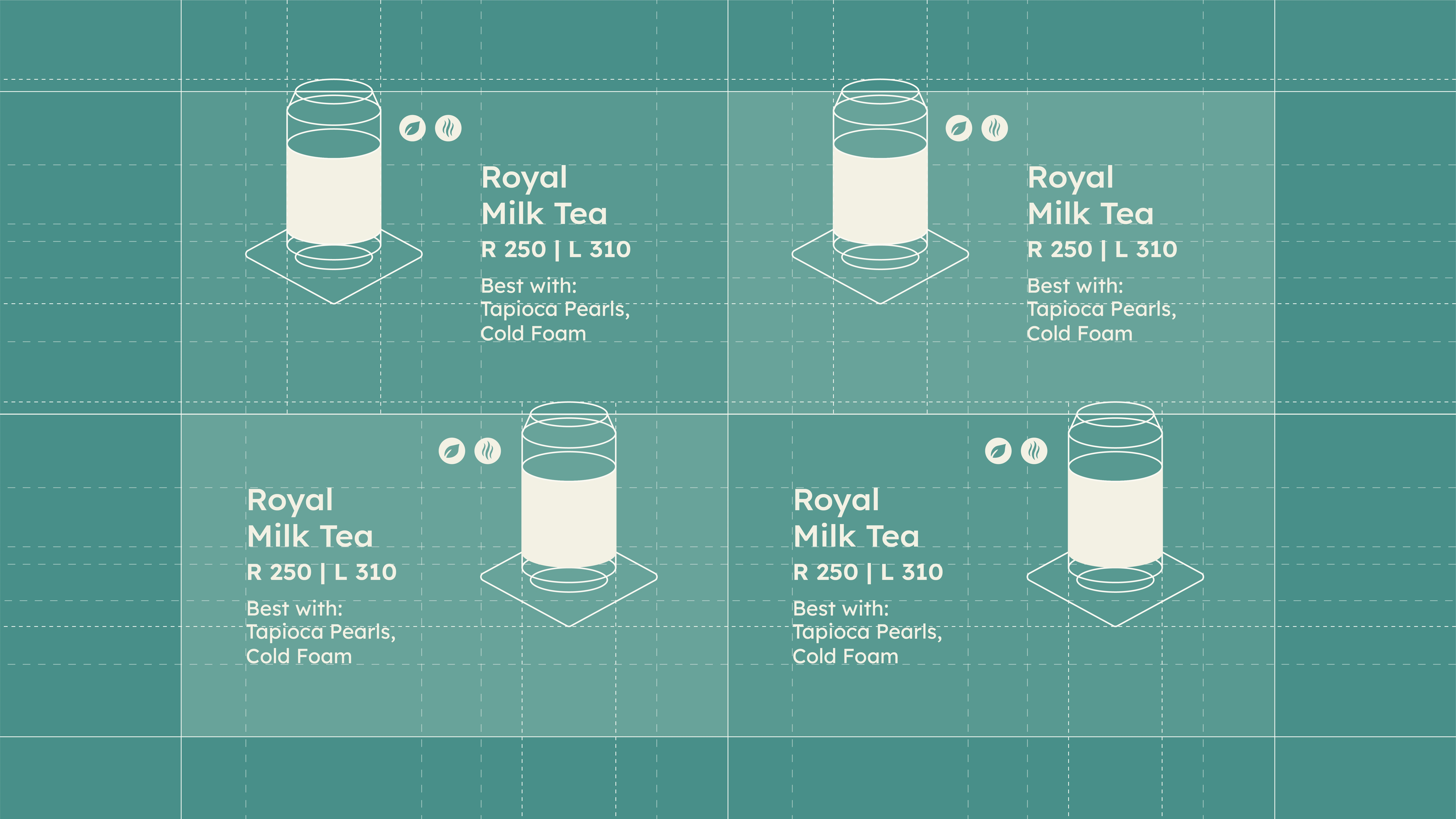
Grid Design System for the Counter Menu
Results
The redesign improved the flow of the menu, resulting in enhanced user experience, reduced wait time, and increased customer satisfaction and engagement.
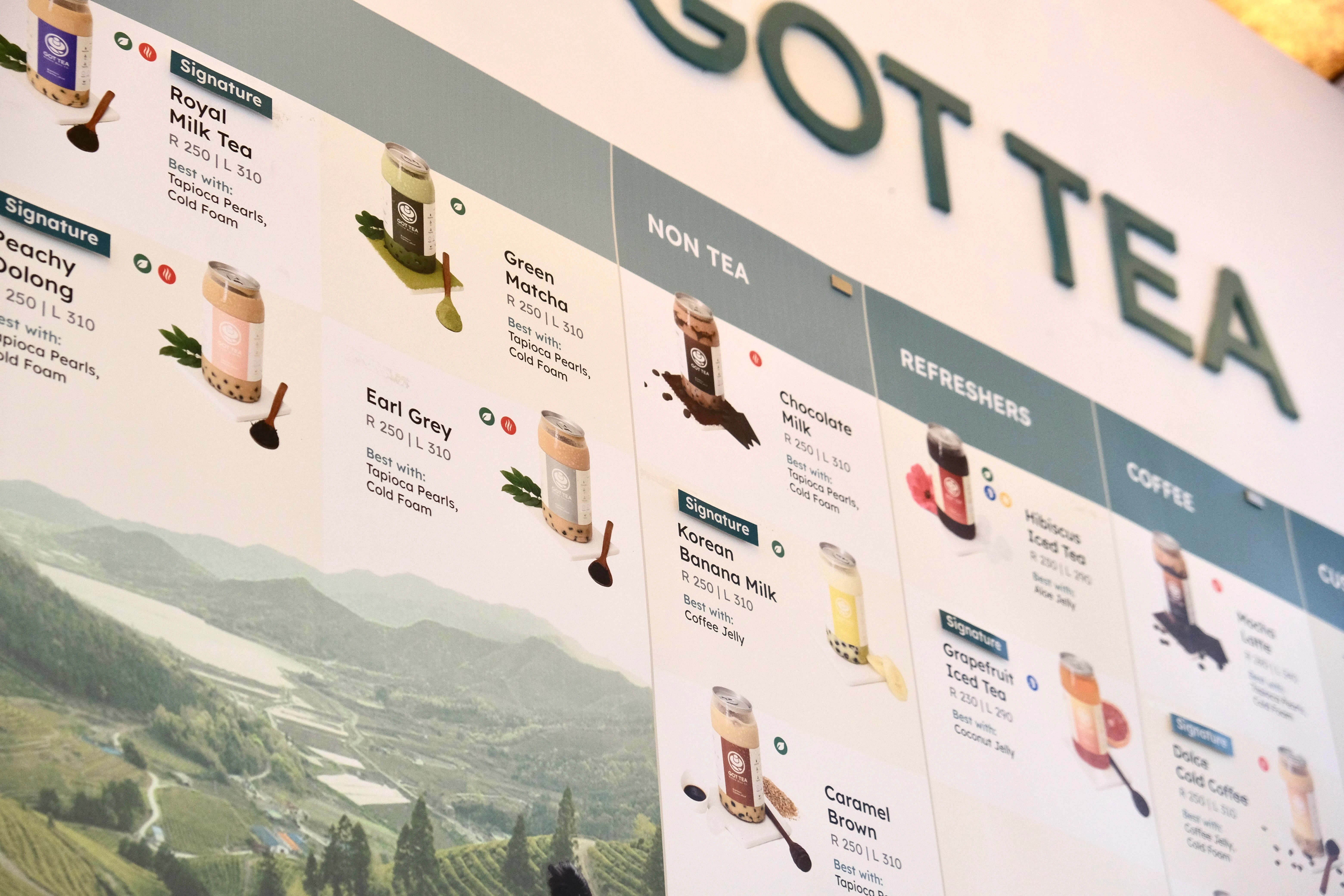
Final Menu Design at the Got Tea Store
Full Case Study
Like this project
Posted Mar 26, 2023
Enhanced user experience by redesigning their menu to address issues such as overcrowding, poor product recommendations, and confusing visuals.
Likes
5
Views
498


