Kom Boo Cha - Brand Identity Design
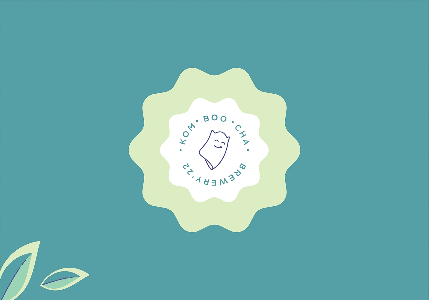
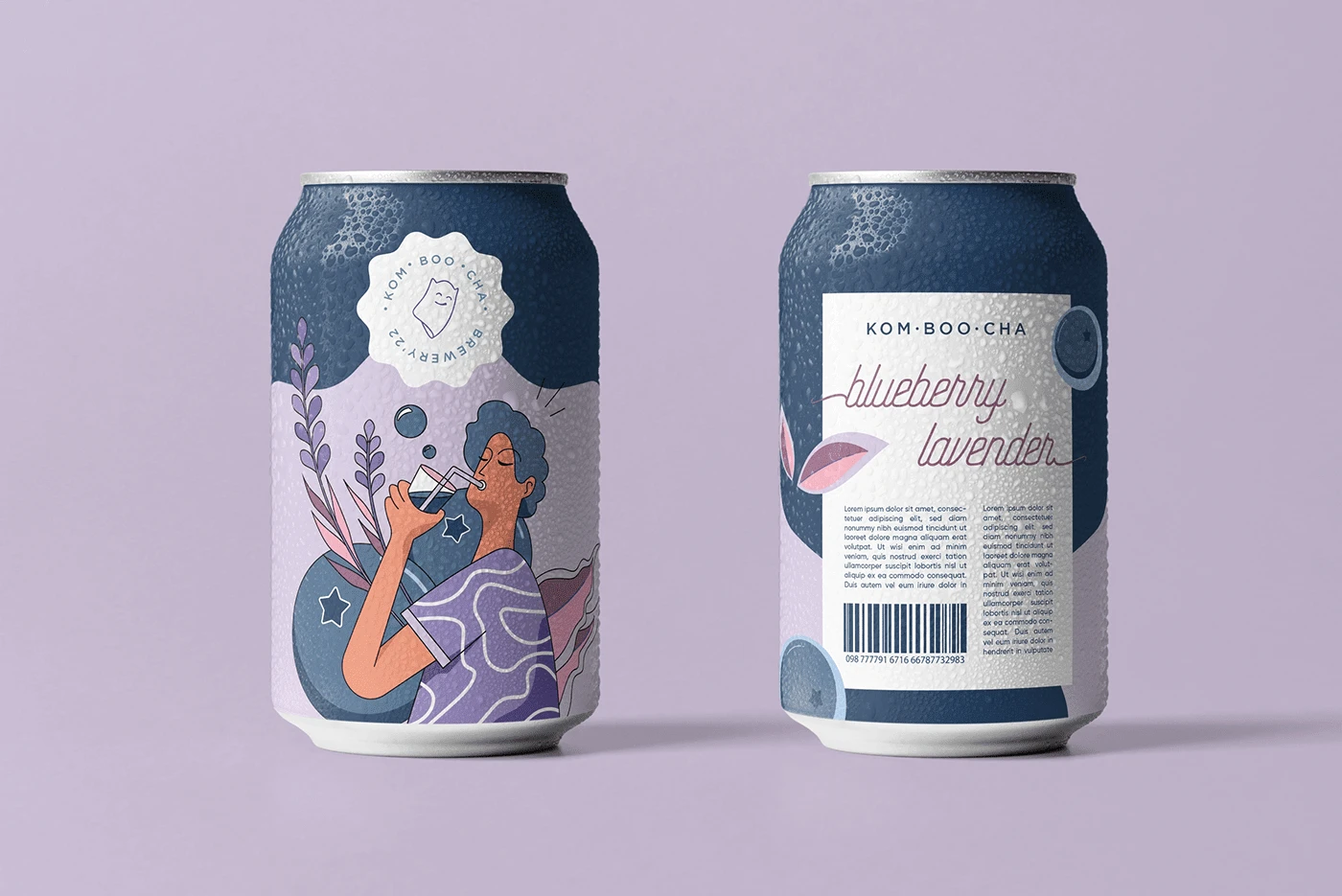
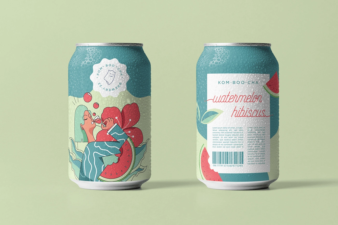
Last year, while working on one of my YouTube videos, I felt the need to add a new project to my portfolio. So, I decided to work on a passion project—a case study centered around a fictitious kombucha brand called "Kom Boo Cha." I designed a brand identity for the brand along with the packaging for two flavors – watermelon and blueberry
BRAND IDENTITY
To kickstart the project, I established an extensive brand identity for the brand to guide my design process.
I created a brand story for Kom Boo Cha, which is positioned as a provider of quality non-alcoholic beverages for social gatherings. The brand originated in the UK with aspirations to expand globally. The brand's purpose is to catalyze a shift for customers seeking an alternative to traditional social drinking, while the vision aims to create a culture of healthier get-togethers. The target audience comprises Gen Z and millennials.
If you're interested in learning how to establish a brand identity, feel free to reference this template here.
VISUAL IDENTITY
LOGO DESIGN PROCESS
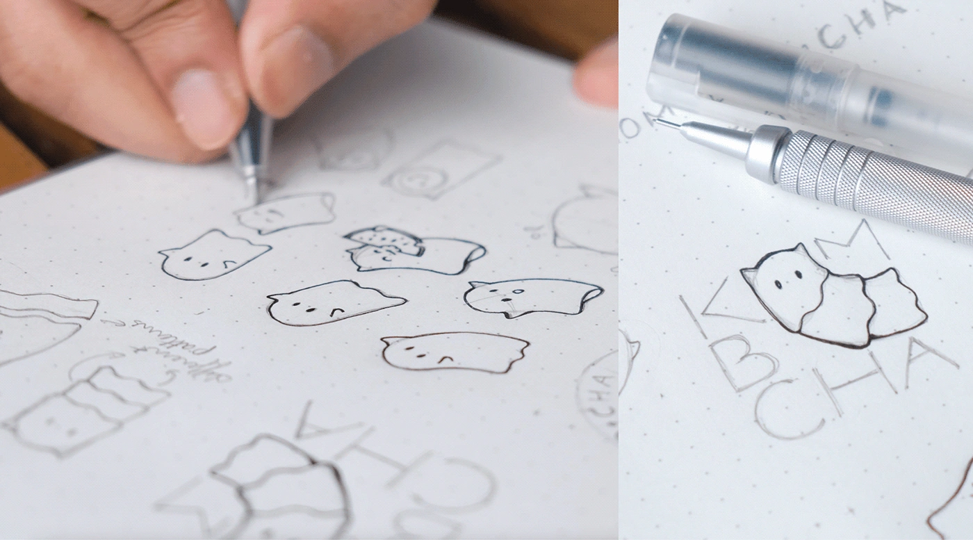
With the brand strategy in place, I began sketching the logo concept for the brand.
To add charm and character to the logo sketches, I utilized the word "BOO" in Kom Boo Cha to allude to the presence of a ghostly mascot in the logo design.
The ghost mascot is a perfect fit for the Kom Boo Cha brand. It is friendly and inviting, just like the kombucha drink itself. It embodies a friendly and spirited persona that creates a memorable and distinctive visual identity for the brand.
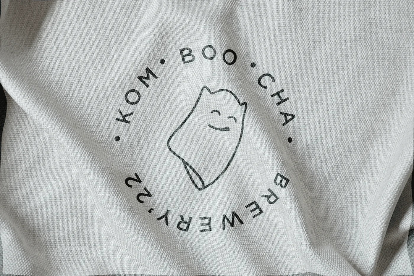
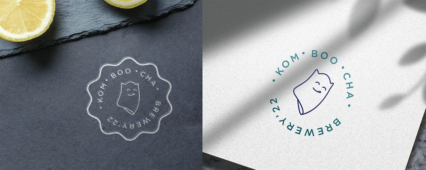
LOGO MOCKUPS
CHARACTER ILLUSTRATIONS
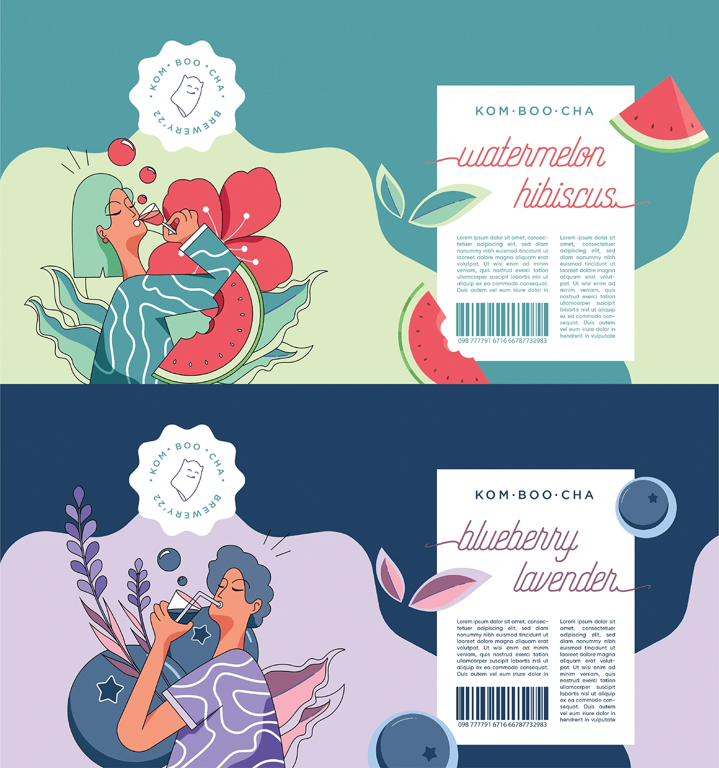
The illustrations for the kombucha drink packaging are inspired by characters from the popular video game Genshin Impact.
I had the opportunity to collaborate with the talented artist Maitreyee, who brought these characters to life through her vibrant and dynamic illustrations. She was able to capture the essence of the characters while also adding her own unique flair to the designs.
The illustrations are both visually appealing and capture the energy and excitement of the drink.
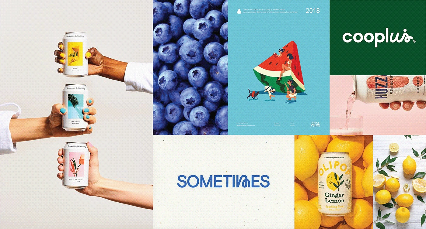
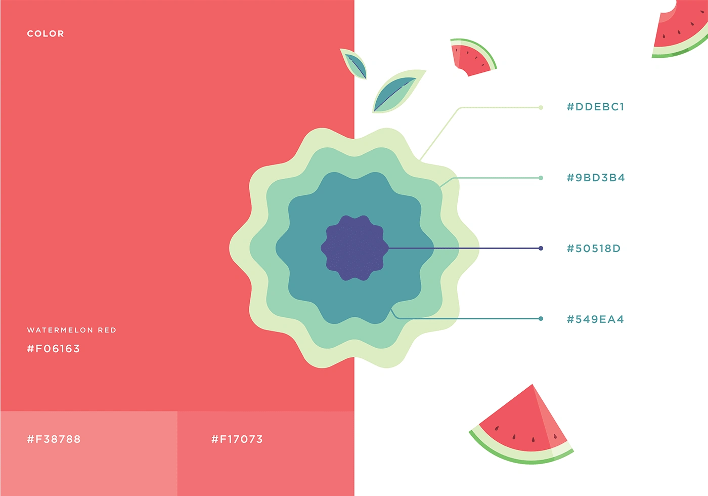
COLOR SCHEME
In order to maintain cohesiveness between the character illustrations and the overall theme, I referred to the original banner art of the characters and incorporated colors from the artwork into the packaging design. I experimented with various color combinations to enhance the visual impact and create a harmonious blend that complemented the character illustrations, resonated with the brand's theme, and maintained a cohesive aesthetic.
TYPOGRAPHY
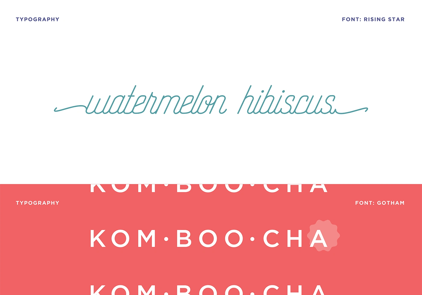
With the logo and color schemes finalized, I proceeded to select fonts that harmonized with the overall brand identity. As packaging played a significant role in the brand's interactions, I chose fonts that stood out and complemented the illustrations
I ultimately selected Rising Sun and Gotham, two fonts that are both modern and elegant. Rising Sun has a bold yet playful character, while Gotham is more sophisticated and refined.
FINAL RESULTS
The final packaging design for the Kombucha beverage aimed to convey a sense of natural energy and goodness.
You can refer to my two-part Youtube video 👇 for an entire project rundown.
This case study was originally published on Behance. Check it out below:
Like this project
Posted Aug 1, 2023
This case study on "Kom Boo Cha," a fictitious brand that started as a passion project, includes a well-defined brand identity and packaging design.
Likes
12
Views
546
