Responsive Web Development & Brand Design For A Mining Startup
Task
Develop a brand identity for a new Canadian based gold mining company, along with an investor presentation that outlines brand language and elements.
AuRista Exploration is a gold mining company that operates out of the Urban Barry land plot in Quebec that strives to acquire, explore, and develop world class precious metal assets. Their recent creation and lofty goals required a professional logo and brand design that puts them shoulder to shoulder with some of the biggest Canadian mining companies.
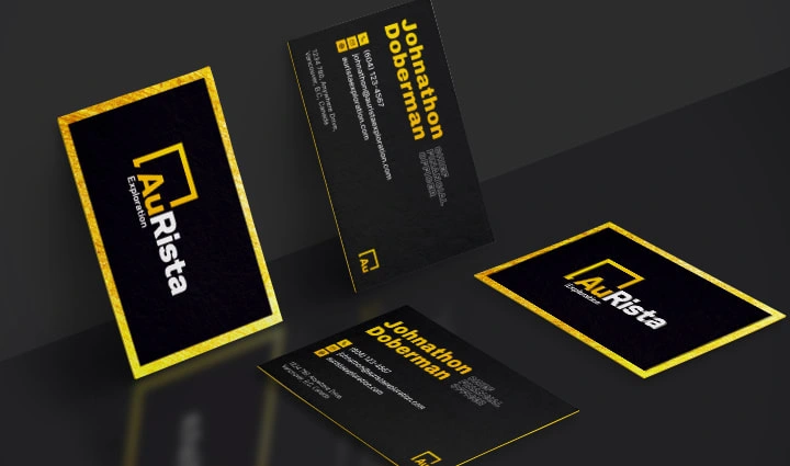
Business Cards
Brand Design
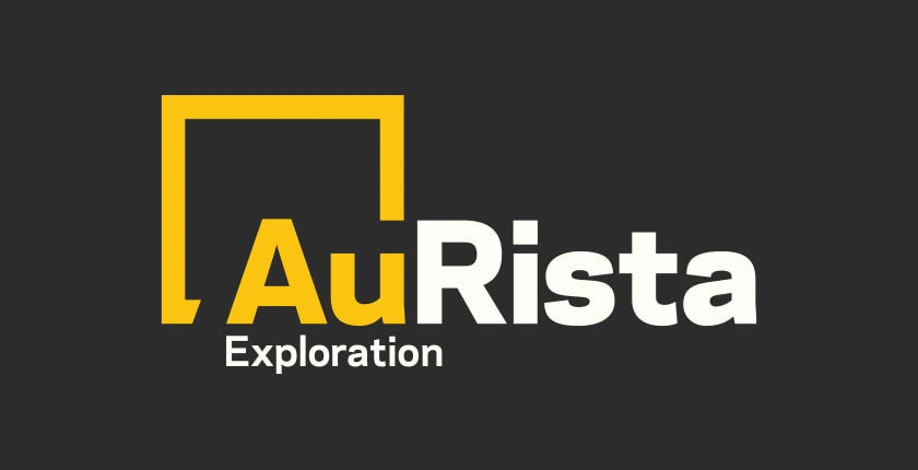
Modern logos need to be as scalable as they are functional, and this was at the forefront of the AuRista Exploration logo design. The logo is comprised of an icon and wordmark, with the “Au” being able to exist on its own when necessary. Conceptually, I leaned into the “Au” of the company name relating to the periodic symbol for gold and selected a colour palette based on this.
Brand Design
Bringing Digital Life To AuRista Exploration Through Responsive Website Design
A few months after the brand had been completed and AuRista secured some raises, they were ready to move forward with a full website build. What started as a one page plan evolved into a multi-page site with interactive gold futures charts and detailed share structure tables.
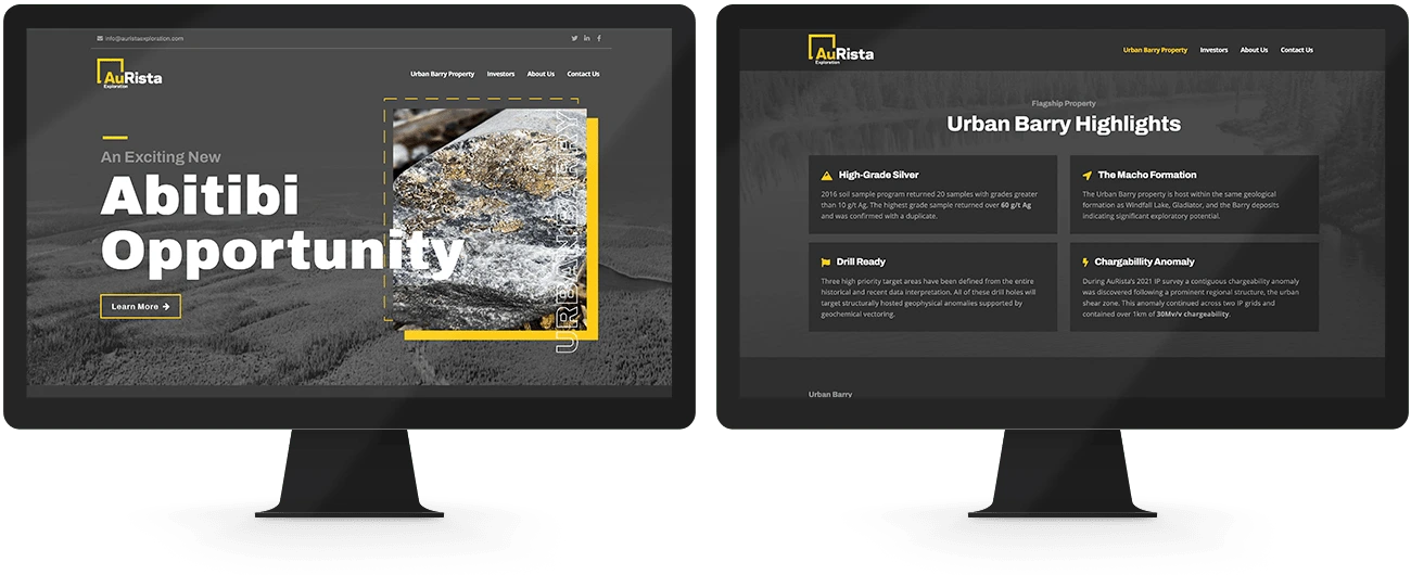
AuRista responsive website design
Designing A Professional Presentation That Inspires Confidence
As AuRista Exploration was looking for further funding and high-tier investors, they need a presentation that not only looks professional and trustworthy, but one that contains enough information to expand on physically as well as convince prospective investors if they were to read through it separately. This deck helped to solidify the extended brand language of the company, and was frankly a joy to create. It helped secure them over $1M in funding.
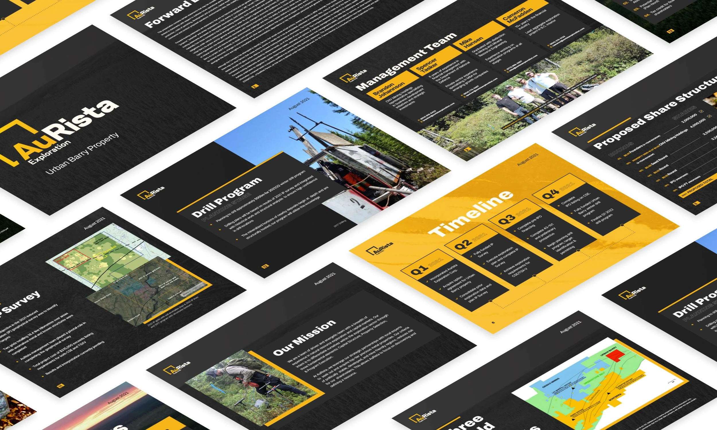
Investor deck presentation design
Like this project
Posted Nov 17, 2023
I was tasked with developing a brand identity for a Canadian based gold mining startup, along with an investor presentation and responsive website.

