Cureskin
Cureskin was a rebranding project I was a part of with Studio Glyph in 2022.Cureskin is a Dermatologists backed & ledSkin Solutions Expertise Platform.
They have personalised skincare routines combining data-driven diagnosis, prescription solutions and dermatologist advice that goes beyond skincare to identify and solve the root cause of the problem. Cures, corrects and provides long-term care for even the most intense skin issues and yields lasting results.
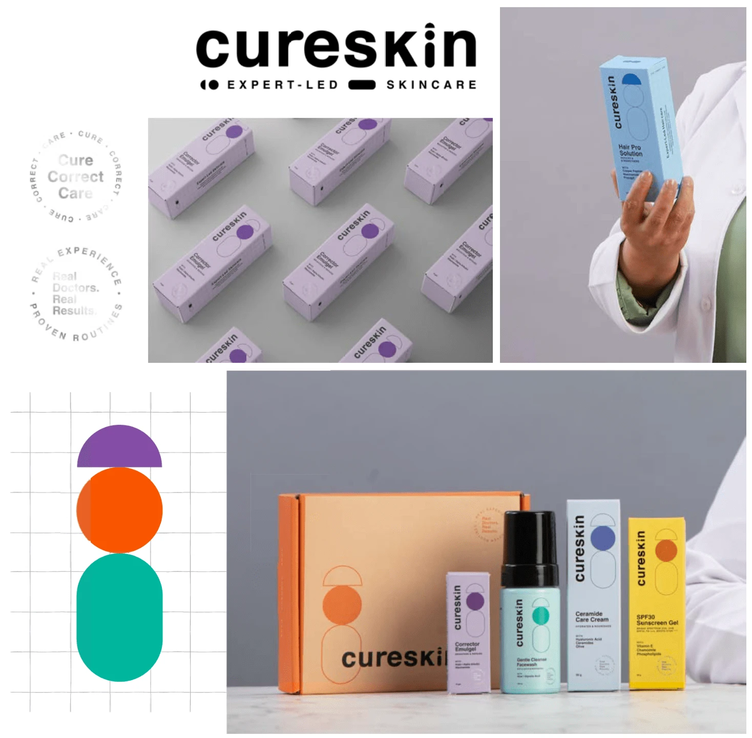
Cureskin doesn’t just customised for your skin type, but personalized based on virtual diagnosis and / or dermatologist consultation. They believe that better skin each day leads to great skin for life.
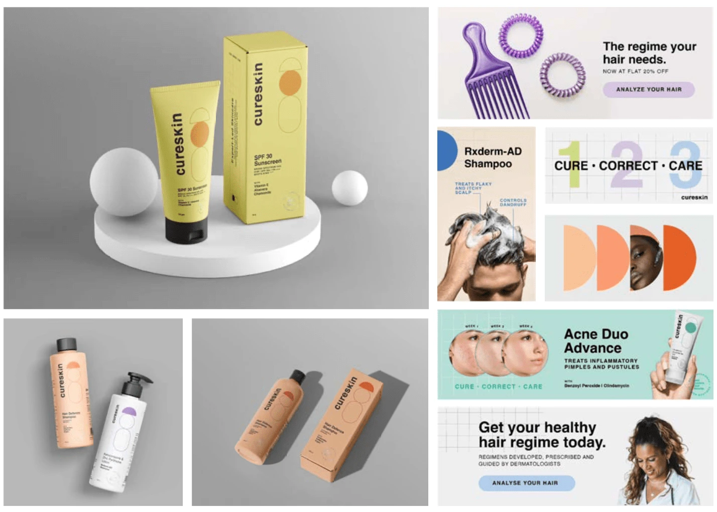
The monogram represents the three product categories, i.e. hair, face and body. We use the monogram on the packaging along with a grid to tie in the expertise that the brand brings in. We wanted to give the brand a clean and clinical look, and used a pop colour palette to make the brand seem more warm and approchable compared to how they were percieved before.

Using Regional Typefaces as a part of the brand language
Since the brand mainly functions in Tier 2 and Tier 3 cities in India, we made sure to include regional typeface options in our brand guide for brand communication.
Made in 2022
(Part of my work while I was at at Studio Glyph in Mumbai, India).
Like this project
Posted Jan 11, 2024
Identity, Packaging and Overall Look & Feel for the brand
