Product Redesign: AGRIS Sales App
Iegor Gutyria
Case study banner.
What is AGRIS Sales?
AGRIS Sales is a B2B2C product that focuses on the fast-paced agronomy industry where salespeople are required to travel frequently. This mobile and web solution is designed to enable the generation of AG commitments on the go.
The AGRIS Sales app allows the sales team to quickly generate sales, quotes, and prepays. The app improves efficiency for the sales team by reducing paperwork and improving automation.
My contributions
I worked closely with the Product Manager and Development team to create experiences from ideation to execution. I designed user flows, wireframes, and high-fidelity mockups.
Being the sole designer for this project, my collaboration with the Project Manager, Stakeholders, and Development team was crucial to the success of the product. Effective communication was essential in advocating for the end user’s seamless experience.
Business goals
Feedback, Reviews & Users - increase customer satisfaction through informative feedback and support from users. Gain more clients through positive reviews.
User goals
Speed & Ease - Quickly log into the app without setbacks. Keep the user logged in to avoid extra entries.
Understanding login issues
As I was reviewing the HotJar Recordings (user interaction recordings) of our previous design, I noticed the following issues:
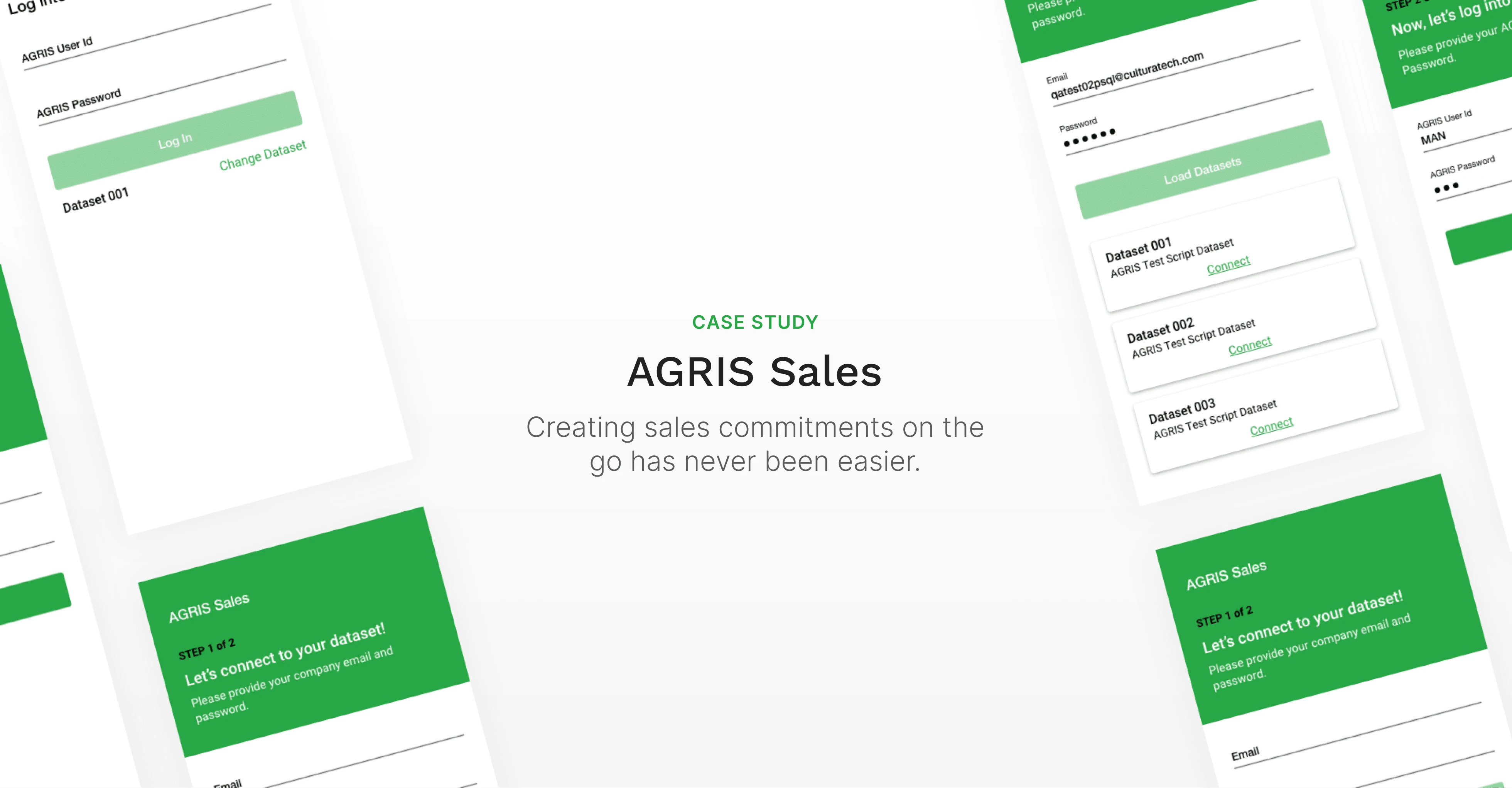
1. Too confusing & not enough guidance - The AGRIS Sales app has two login screens. The first login allows the user to connect to a local server, while the second allows different users to log in under one system. The two options were too similar in design and caused confusion among users.
2. Inefficient user flows - On the web version, an error occurred during login. While the web app should remember the user, I found that user authentication only occurred in one login screen rather than all of them. This slowed down the user.
3. Differentiation - The two login options were too similar in design, confusing the user and leading to the use of incorrect credentials.
AGRIS Sales app login screens prior to a full re-design
Understanding our users
The users are salespeople who travel frequently, using their mobile phones to conduct a majority of their business. Because they are traveling from office to farm regularly, efficiency in the app is necessary.
Reviewing the existing flow and building a new one
I began reviewing the existing design and all relevant systems. I found the user’s confusion at the entry points and used this information to refine the existing experience. I developed a new user flow that provided a clear direction to the login process.
Prototyping the wireframes
During the wireframe process, I presented my ideas to the team. We agreed on a process that would guide the user through our unique login. Due to back-end constraints, we were unable to accomplish a single sign-on.
Jumping into high-fidelity prototypes
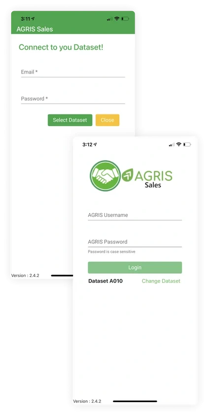
1. Taller header & guiding info - The header is now taller, a guiding signifier that informs the user which step they are on and which login credentials they need to provide.
2. Input field with a hint - When the input field is selected it shows the user an example of an email or a username. This gives the user another clue as to which credentials need to be provided.
3. New button on the first login screen - The button now states exactly what action is going to happen after pressing it.
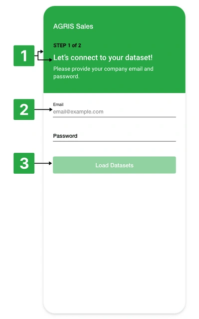
The new login screen for AGRIS Sales app.
Takeaways
It’s important as a UX designer to understand development constraints, on the front-end and back-end, and how to work with the development team around them.
Quickly adapting and designing a great user experience with front-end setbacks is a challenge. Taking a step back and understanding the challenges early helps focus on the right solutions for the user.
Like this project
Posted May 11, 2024
Improved login success rate by 30% with usability heuristics and redesign.