Page Redesign: The Right Counselor
Iegor Gutyria
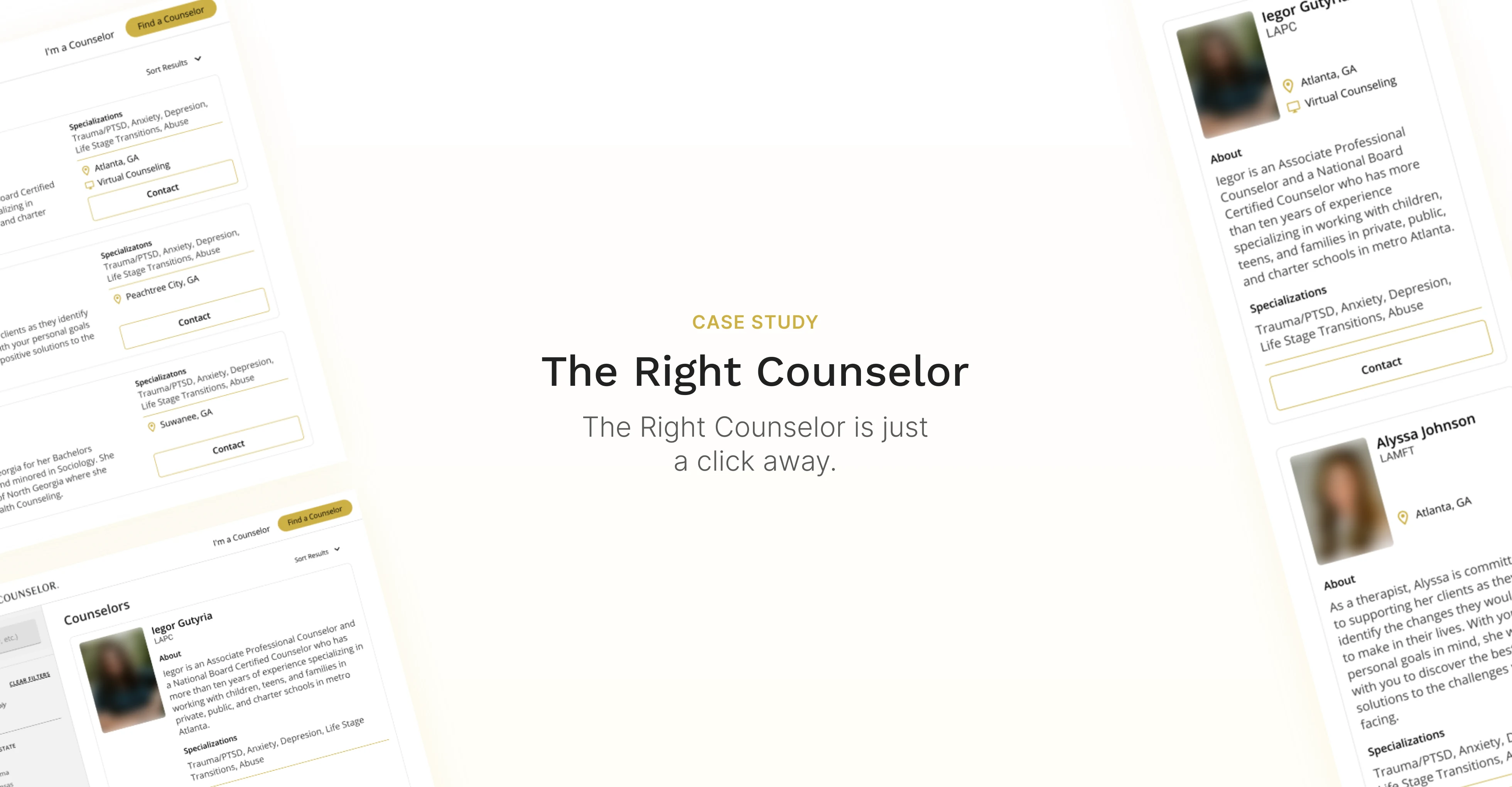
Case study banner
What is The Right Counselor?
The Right Counselor connects users with skilled counselors near them. This is a web-based product with a fluid design compatible with web, tablet, and mobile.
My contributions
Given a tight deadline, I quickly wireframes and began work on the high-fidelity prototypes. I conducted a brief interview with a participant to better understand the possible user. I re-designed two screens - the counselor’s list view and the counselor detail page.
Business goals
Increase user retention on the website.
User goals
Quickly find the counselor that best fits their needs.
Understanding the existing challenges
The Right Counselor provided me with their research and informed me of the current challenges:
The counselor list view
Not informative - The counselor list view page was showing secondary information to the user. This made their decision-making process complicated and overwhelming.
Confusing - Certain items on the screen appeared to the user like buttons but did not operate as such. The page interaction was unclear.
No hierarchy of content - The content for each counselor was not cohesive nor organized in a relevant manner.
The counselor's details
No hierarchy of content - the primary content was mixed with secondary content which causes a lot of back and forth scrolling.
Understanding the users through subject matter experts
I conducted 3 interviews with different participants who have sought counseling services previously. Thanks to their feedback, I found that an important factor when searching for a counselor online is the user’s subconscious reaction to the counselor’s profile image. The participants noted that the initial reaction to the person’s picture guided them in their decision-making. Additionally, the participants preferred a quick glimpse of the counselor’s details. This would determine whether the user would like to learn more or not.
Designing the prototype
The counselor's list view
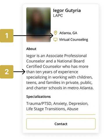
Location & online therapy - are now displayed options on the quick glance card. With Covid-19, an increasing number of people prefer staying at home. Showing this information right away makes the decision-making process easier for the user.
Brief about - The user can briefly learn about the counselor before reviewing detailed information.
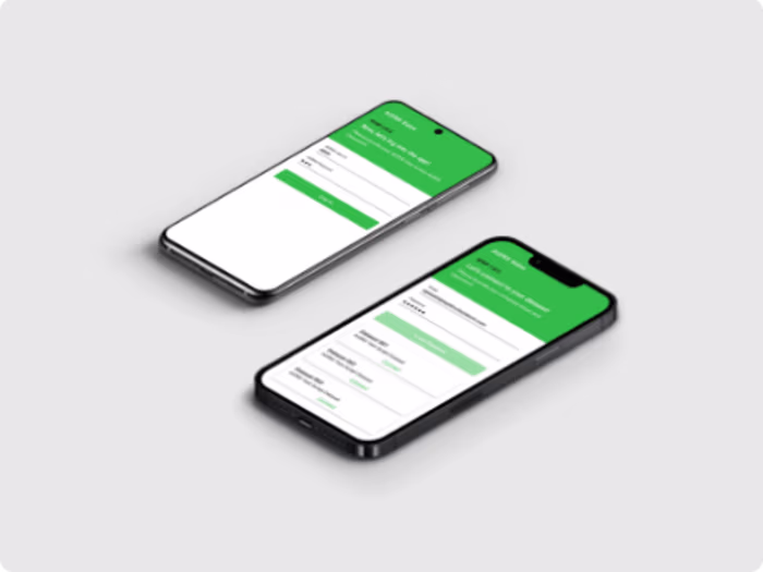
New mobile design for The Right Counselor
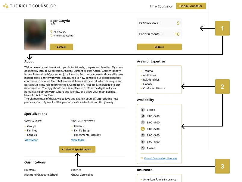
The counselor's details
Hierarchy - The peer reviews and endorsement cards are no longer the first items that a user sees. I have moved them to the right side of the site so that the user can focus on the about content and the counselor’s specializations.
Secondary content - The less important content is now shifted to the right side of the page to help the user maintain focus on the more relevant content on the left. It also provides a great visual separation of content that will help the user quickly differentiate the types of content.
New web design for The Right Counselor
Takeaways
I feel honored to work with The Right Counselor on this project and believe in their mission wholeheartedly. Despite tight deadlines, effective design was not sacrificed and I believe the UI implemented will improve their user retention and counselor-matching success rate.
Like this project
Posted May 11, 2024
Introduced a new design that helps users discover The Right Counselor more efficiently.
Likes
0
Views
7