Improved search and discovery features

Maryna Lytvyn

Client: Service marketplace platform
Role: Product Designer, UX Researcher
Goal: Make it easy and intuitive for customers to find the right services in just a few clicks.
In a service marketplace, the search experience sets the tone. But the original flow felt clunky – too many clicks, unclear filters, and a disconnect between what users needed and what they saw. Conversion rates reflected that friction.
To change this, I started with a deep dive into competitor platforms. What layouts worked? What didn’t? I mapped patterns, user flows, and pain points to uncover opportunities we could build on.
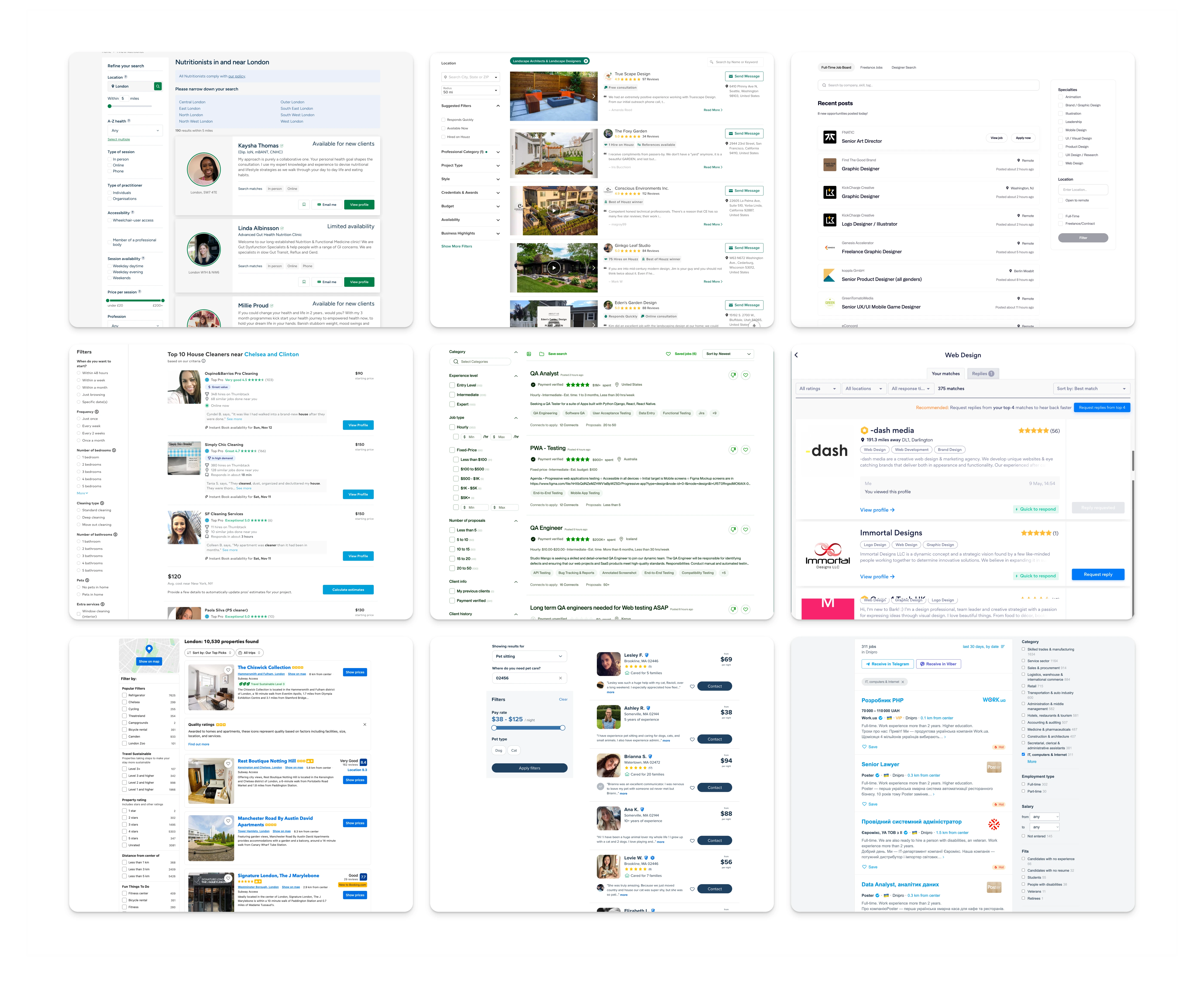
Exploring the competitors' layout and functionality
Simplifying Search
The first design move was to combine service and location inputs into a single search, reducing cognitive load and helping users get started faster.
Rethinking Filters
Filters were moved to the left (aligning with natural reading habits) and restructured based on user feedback. The most-used filters surfaced first, and a quick toggle system allowed users to easily refine or reset their choices.
Filters and Sorting
Cleaning Up the Cards
I refined the service listing cards to keep them visually clean. Duplicate CTAs were hidden until hover, keeping focus where it mattered without overwhelming the interface.
Interaction for the card
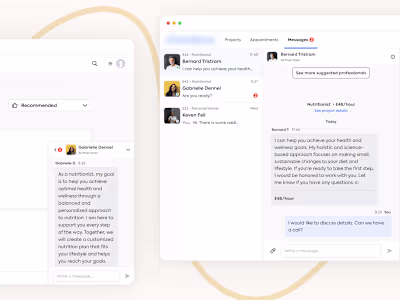
Nudging with Email
To re-engage users who dropped off, we introduced smart email reminders – lightly nudging them about services they had browsed.
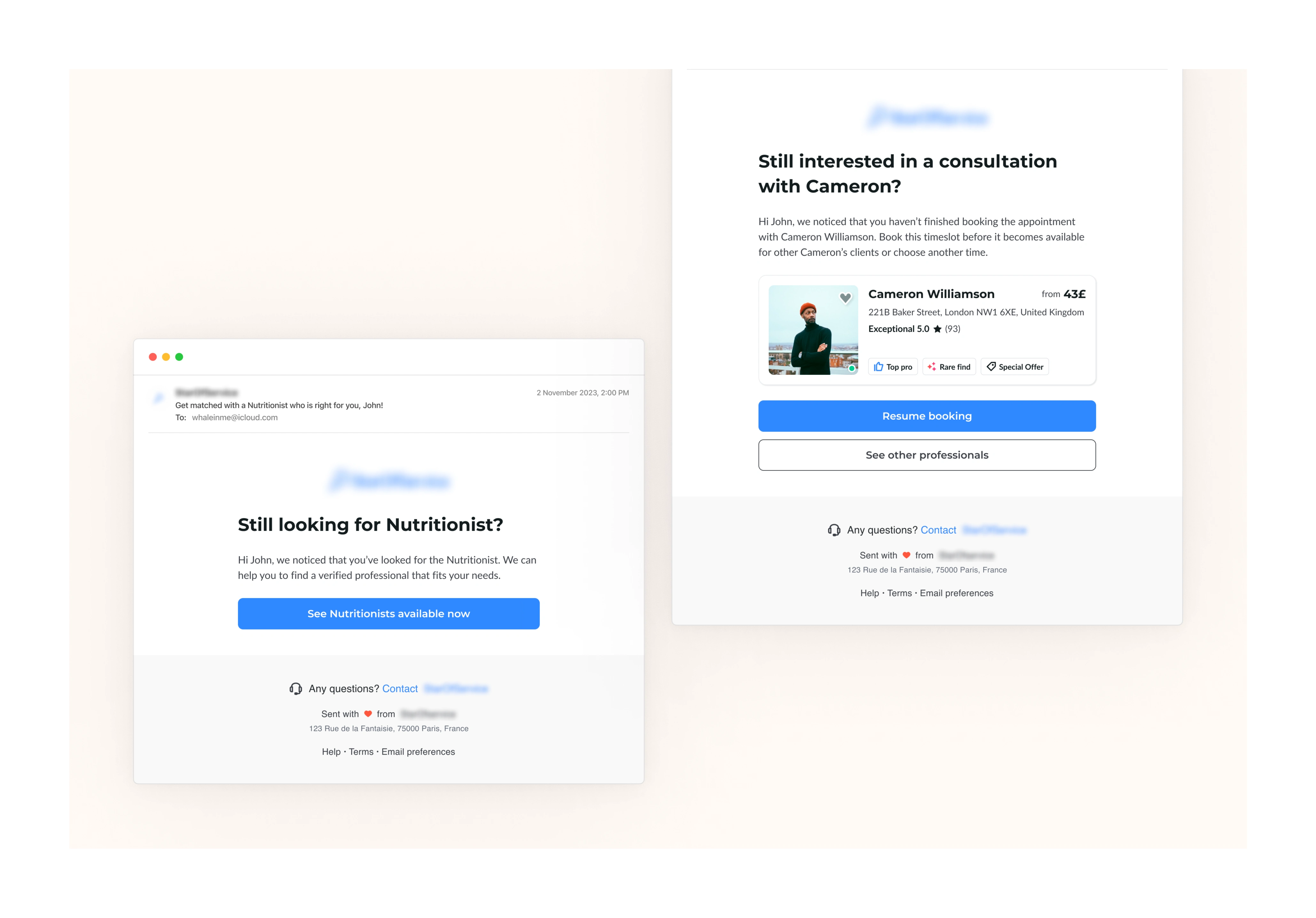
Email reminders
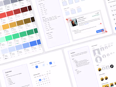
End-to-End Involvement
From initial concept to QA testing, I was involved throughout, ensuring consistency and attention to detail at every step.
Impact:
✅ +30% conversion rate
✅ 2x increase in professional bookings
Key Takeaways
A clear, intuitive search drives early engagement
Smart filter design makes discovery feel personal
Gentle reminders keep users connected and coming back
Like this project
Posted Aug 6, 2025
Efficient and effective UI/UX design for a leading service marketplace platform. Improved search and discovery features, increasing conversion rates by 30%.
Likes
0
Views
8