Messenger revival: boosting engagement, retention, and revenue

Maryna Lytvyn


Client: Service Marketplace Platform
Role: Product Designer
Goal: Improve messaging experience to drive better engagement, retention, and MRR
The client came to me with a challenge: users weren’t engaging with the platform’s messenger. This lack of interaction was directly impacting customer retention and monthly recurring revenue.
It was clear that we needed to rethink the messaging experience from the ground up.
Research – Understanding the gap
My first step was to investigate how users currently interacted with the messenger. I quickly found a core issue: messages didn’t load in real time. Users either had to refresh the page or rely on email notifications.
To dig deeper, I launched a survey and conducted moderated user testing sessions (via UserTesting) to explore user habits and expectations around messaging. We focused on discovering which platforms users trusted daily and what features made them stick around.
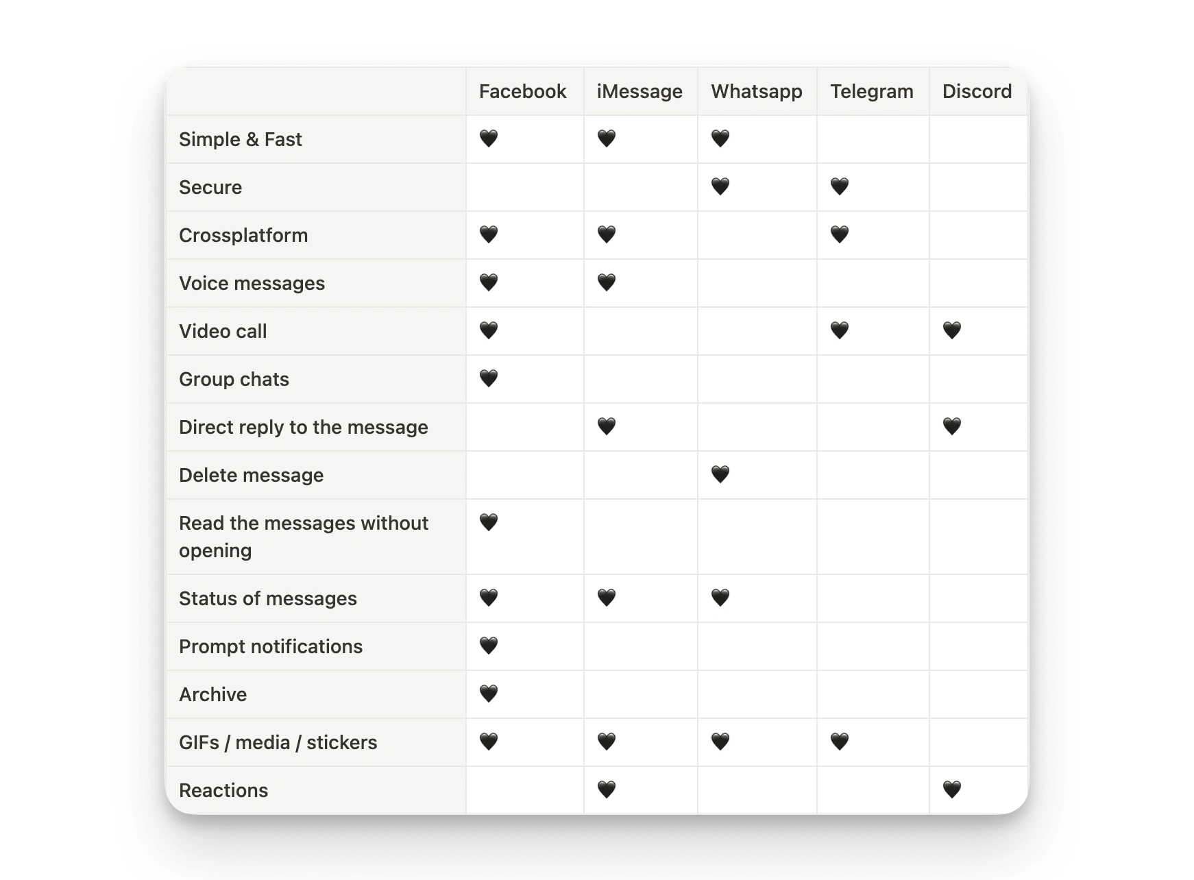
What messengers users use and why
Ideation – Messenger that works as users expect
Armed with insights, I began designing a modern, responsive messenger interface with a real-time chat experience. The goal: keep things intuitive, familiar, and distraction-free.
I crafted high-fidelity components, simulating real-life interactions within a clickable prototype. These components were integrated into the ready-to-use pages to assemble the prototype for the upcoming Usability Testing phase.
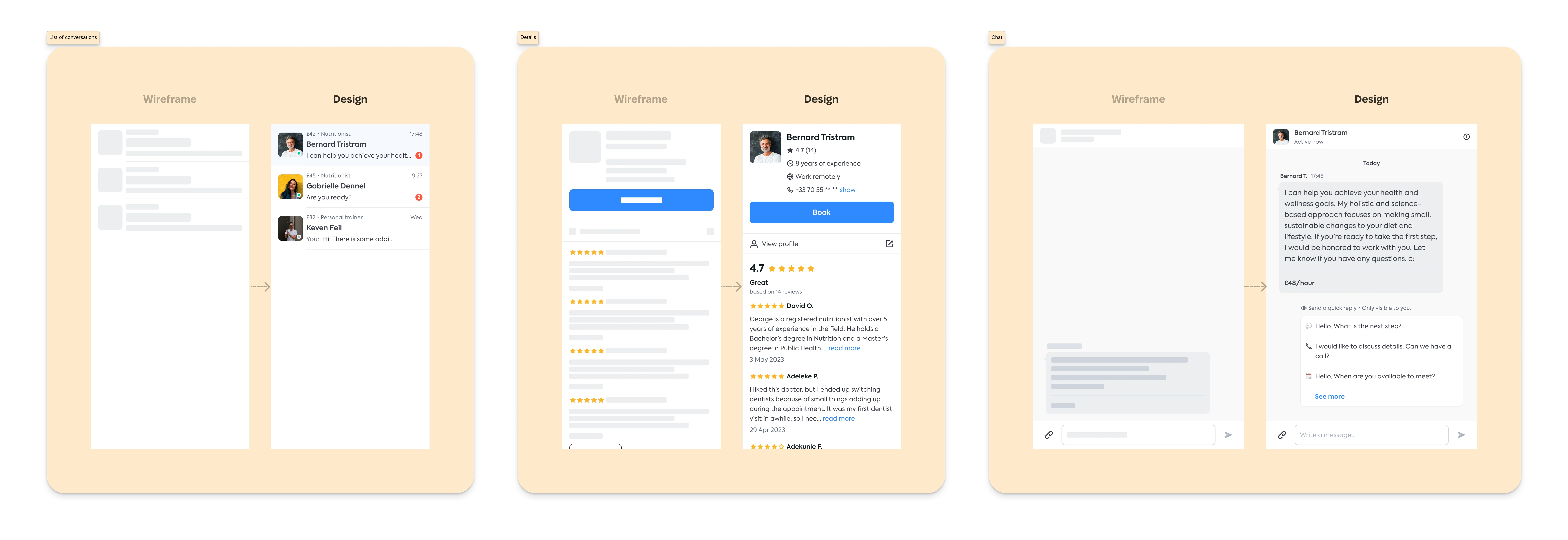
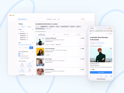
Messenger layout – conversation list, details of the Service providers, and chat
Usability Testing – Pop-up vs full-screen view
I wanted to see how users responded to two formats:
A small in-app pop-up
A full-screen dedicated messenger
Through usability sessions, I observed how people searched for and contacted Nutritionists – testing whether they could navigate easily, understand key info, and initiate a chat confidently.
Feedback was clear: users preferred the full-screen version. They valued being able to focus on one task, view service provider info without leaving the chat, and access all conversations in one place.
Final Solution – Simple, focused, real-time
With direct feedback in hand, we made a strategic call: drop the pop-up version and move forward with the full-screen messenger only. This avoided building redundant features and helped us focus on what users actually needed.
The new design introduces:
Real-time messaging
Cleaner, distraction-free layout
Combined view of chat, provider info, and conversation history
By focusing on clarity and simplicity, we created a messaging experience that feels intuitive – and aligns with how users expect communication to work.
Key Takeaways
Real-time interaction is non-negotiable in modern messaging
Usability testing helped avoid unnecessary development
Design choices rooted in user behaviour lead to stronger engagement and retention
Like this project
Posted Aug 6, 2025
Through UX research and data-driven insights, identify and address key pain points that have hindered messenger usage.