König Pilsener Microsite Design
Hannah Marleen Teichert

Interaction Designer
Visual Designer
UI Designer
Abstract
Invision
Sketch
Duration: 2019 – 2020
Agency: Deepblue Networks AG (Hamburg, GER)
Role: UI Design

Introduction

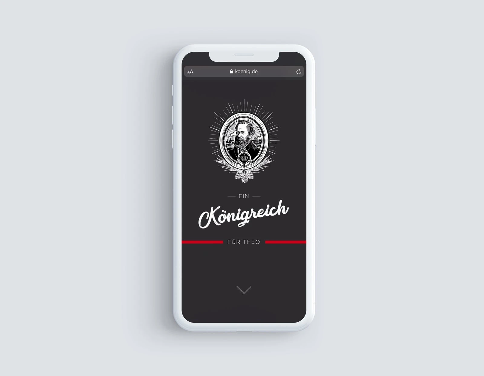
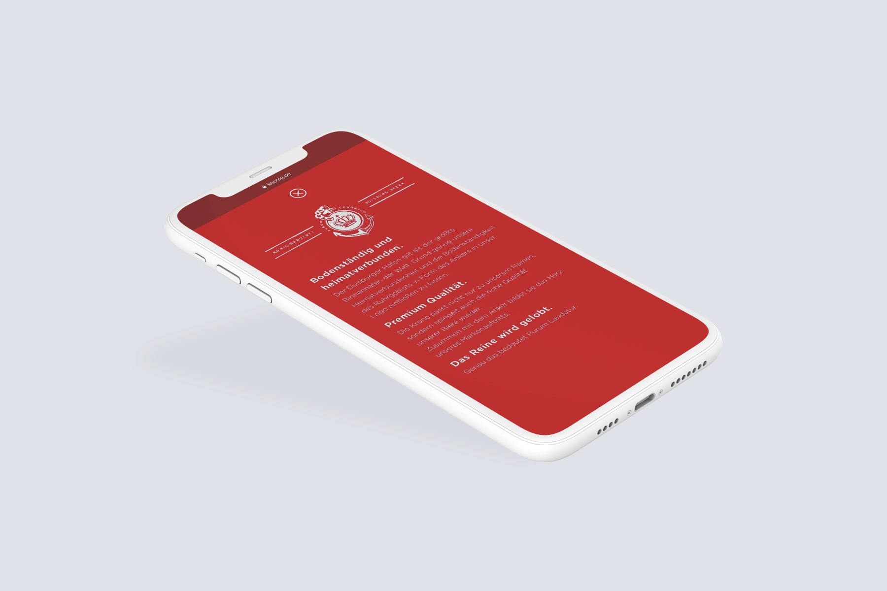
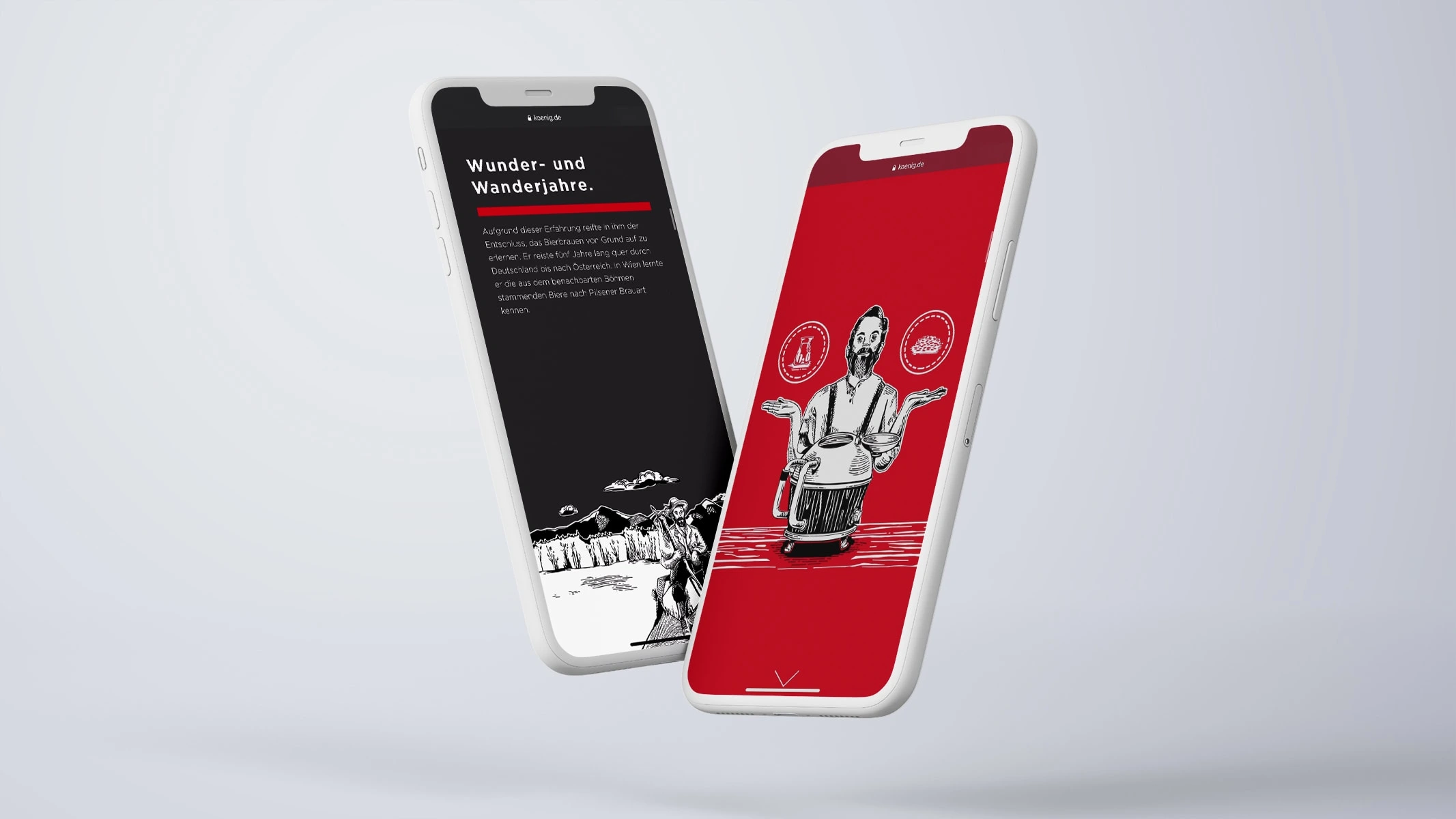
König Pilsener, a renowned German beer brand steeped in history, sought to enhance its digital presence by creating an engaging microsite. As a UX/UI designer, I collaborated with a multi-disciplinary team to craft a mobile-first experience that narrated the brand's founding journey and brewing process. Our approach involved leveraging illustrations, animations, and interactive elements to captivate the audience while ensuring clarity and entertainment.

Phase 1: Understanding the Challenge

The project began with a comprehensive review of the client's documentation describing the brand's heritage and brewing techniques. Our team analysed this information to identify the key narratives and thematic elements. We developed a strategy to tell the founding story of the brand and the brewing process separately, allowing users in the beginning to choose their preferred path.

Phase 2: Conceptualisation and Wireframing

Collaborating closely with the team's copywriter, we translated the planned content into a cohesive structure. Simultaneously, my focus shifted towards exploring various presentation styles and creating preliminary wireframes. Given the emphasis on mobile-first design, our wireframes prioritized intuitive navigation and readability on smaller screens.
You can see a page from the handover file which contains instructions for the developers.

Phase 3: UI Design and Graphics Development

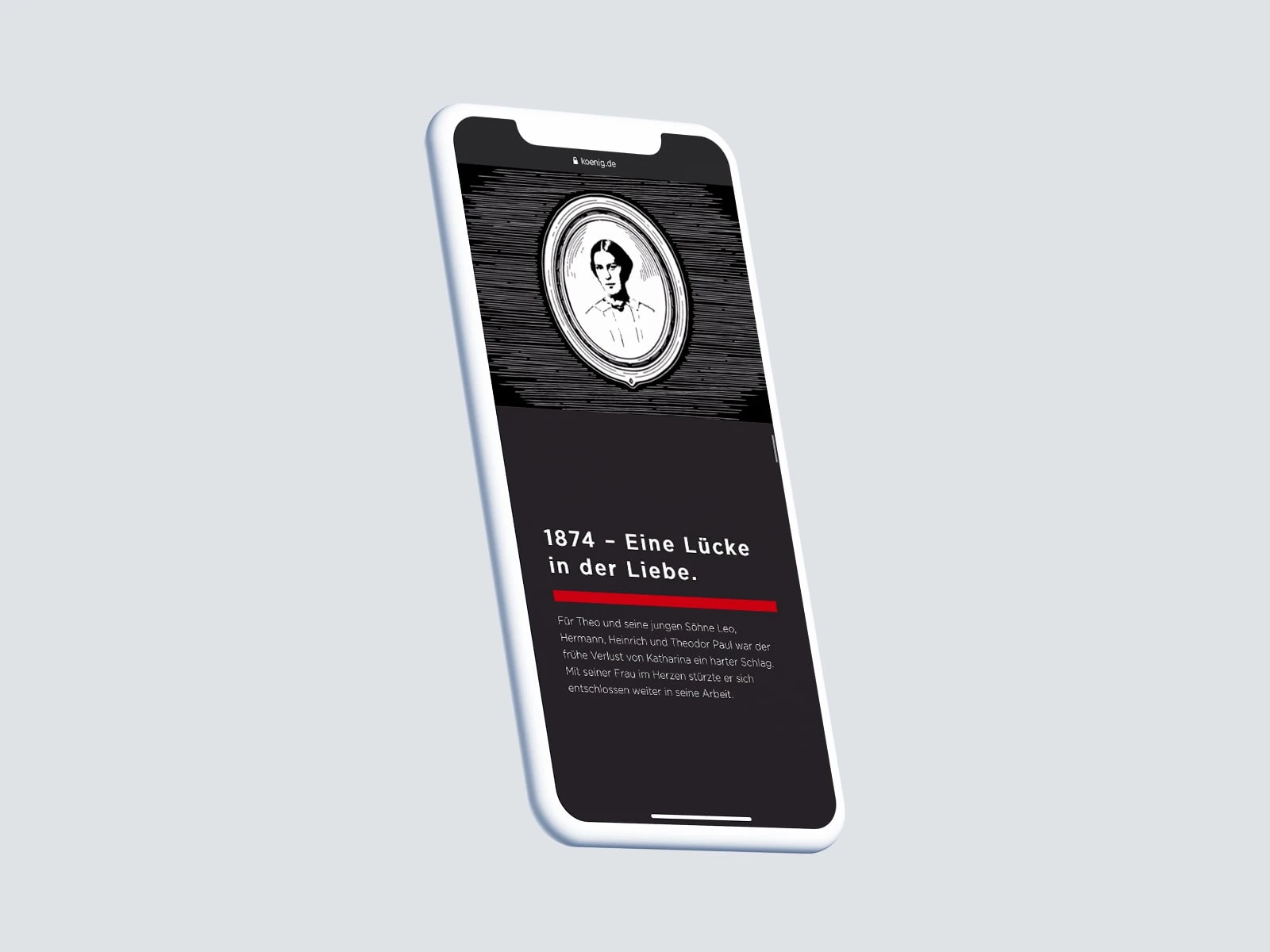
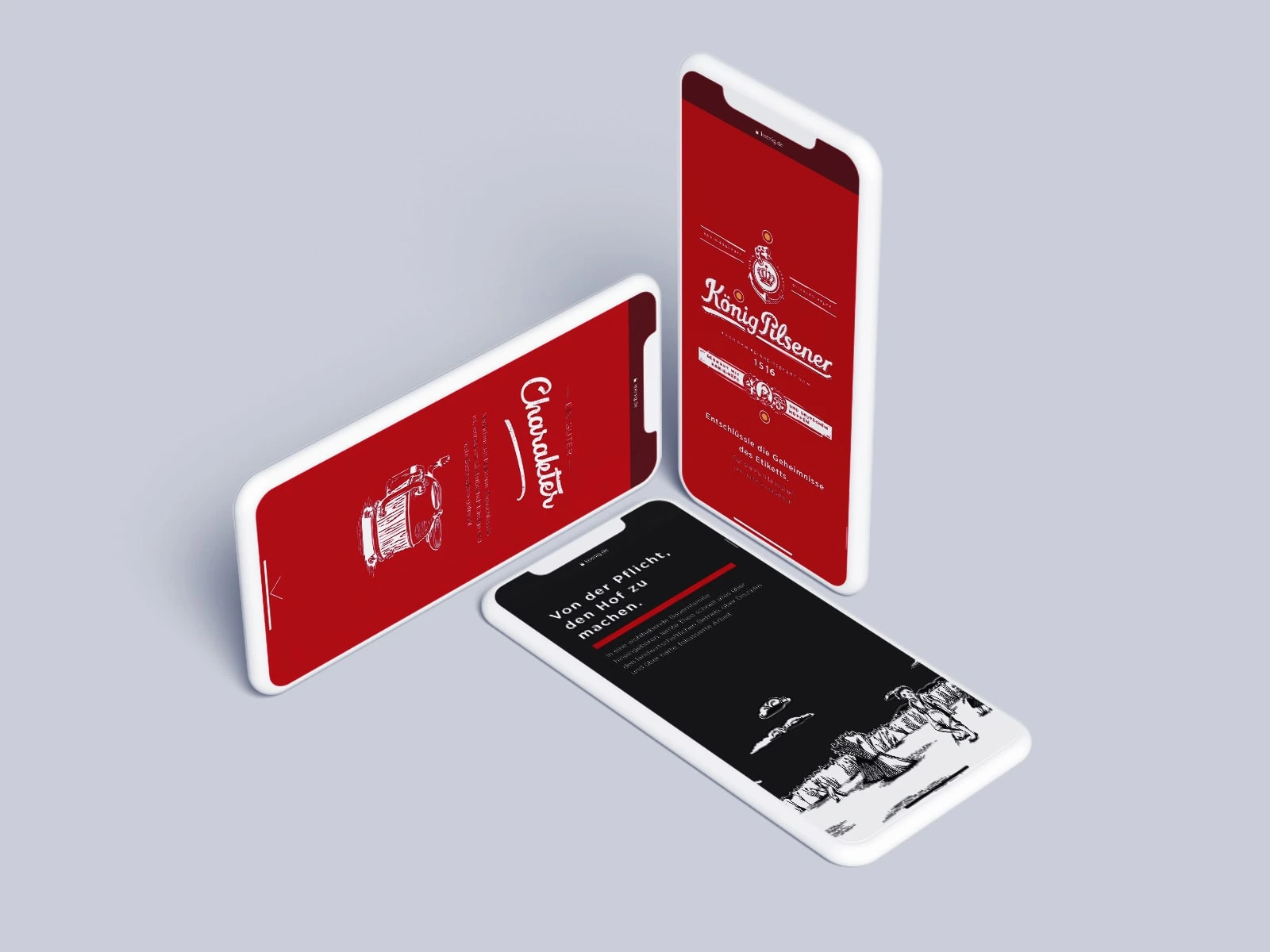
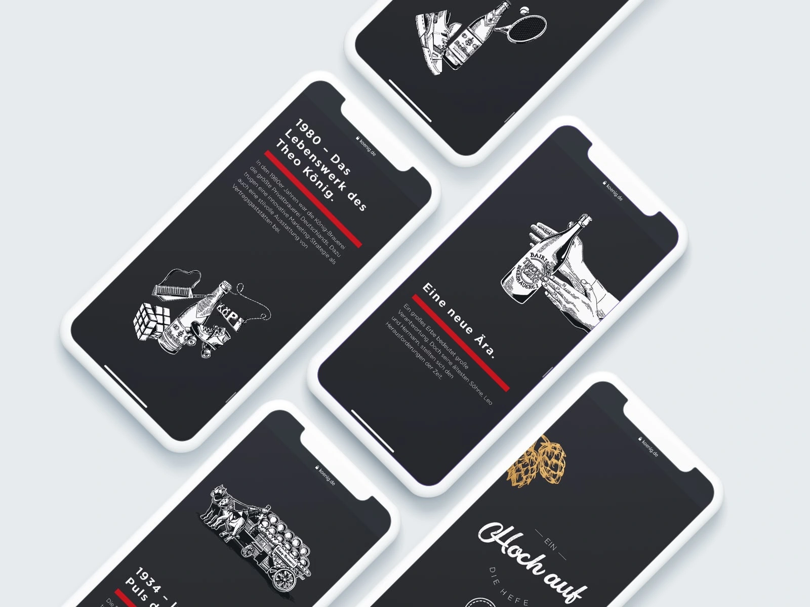
Following discussions with both the client and development team, I transitioned to the UI design phase. Drawing inspiration from fairy tales, we envisioned a whimsical aesthetic characterized by playful fonts and woodcut-style illustrations. Working closely with an illustrator, we brought this vision to life, crafting visually compelling graphics that complemented the narrative.

Challenges and Decisions

One of the primary challenges was determining the optimal balance between clarity and entertainment. We needed to ensure that the microsite remained informative while incorporating playful elements. To address this, we opted for a narrative-driven approach, intertwining factual information with engaging visuals and interactions.
A significant decision involved integrating interactive elements seamlessly into the design. We devised mechanisms where user actions — such as scrolling and clicking—triggered animations and revealed additional content.

Conclusion

The König Pilsener microsite stands as a testament to effective collaboration and creative problem-solving. By blending storytelling with interactive design, we succeeded in delivering a captivating digital experience that honours the brand's legacy while resonating with modern audiences.

Reflection

Throughout the project, we remained mindful of balancing creativity with usability, ensuring that each design element served a purpose in enhancing user engagement. By embracing feedback and iterating on our concepts, we overcame challenges and ultimately achieved a successful outcome that exceeded the client's expectations.

Key Takeaways:

Seamless integration of storytelling and interactive design enhances user engagement.
Mobile-first approach prioritizes accessibility and usability in digital experiences.
Collaboration between design, content, and development teams is essential for cohesive project execution.

View the Project

Partner With Hannah Marleen
View Services

More Projects by Hannah Marleen