Jobcenter Dortmund Web App
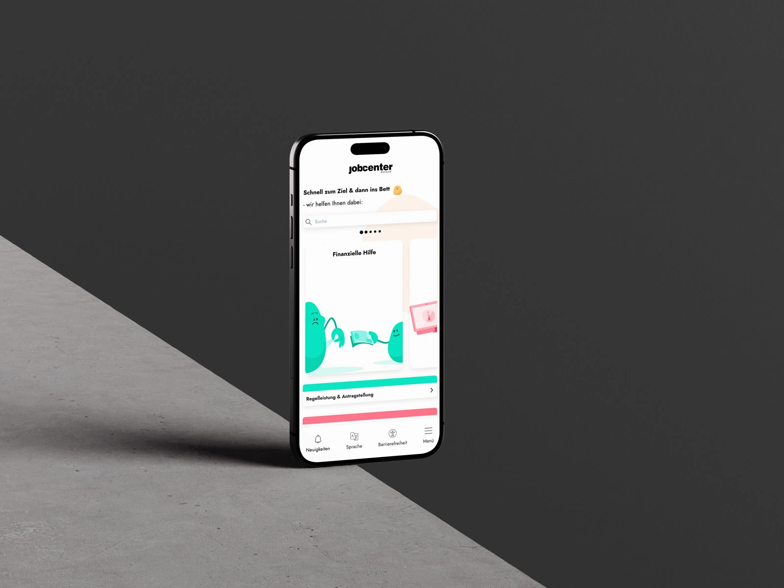
Home Screen Mobile
Overview
The Jobcenter Dortmund web app redesign aimed to modernize and simplify access to essential services. With a mobile-first approach, I focused on improving information architecture and user journeys, while emphasizing accessibility and service usability.
Project Brief
The goal was to transform a complex public service site into a user-centered, service-oriented platform. The key objectives included restructuring content so that users can quickly find help for job search, financial support, office locations, and contact options. Stakeholders included the Jobcenter team, developers, and accessibility consultants. I led the UX redesign, coordinating between clients and developers and ensuring every decision enhanced clarity, usability, and inclusivity.
Role
UX Designer
Methods
• Refined the information architecture and created mobile-first wireframes.
• Designed a foldable bottom navigation to access major service categories efficiently.
• Conducted accessibility research and worked with developers to implement high-contrast colors, readable typography, and screen-reader-friendly elements.
• Collaborated on documentation with the team using Google Docs to maintain transparency and alignment.
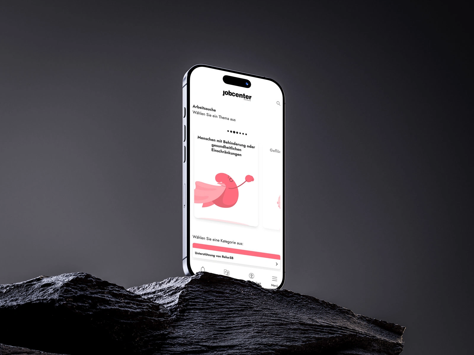
Services Page
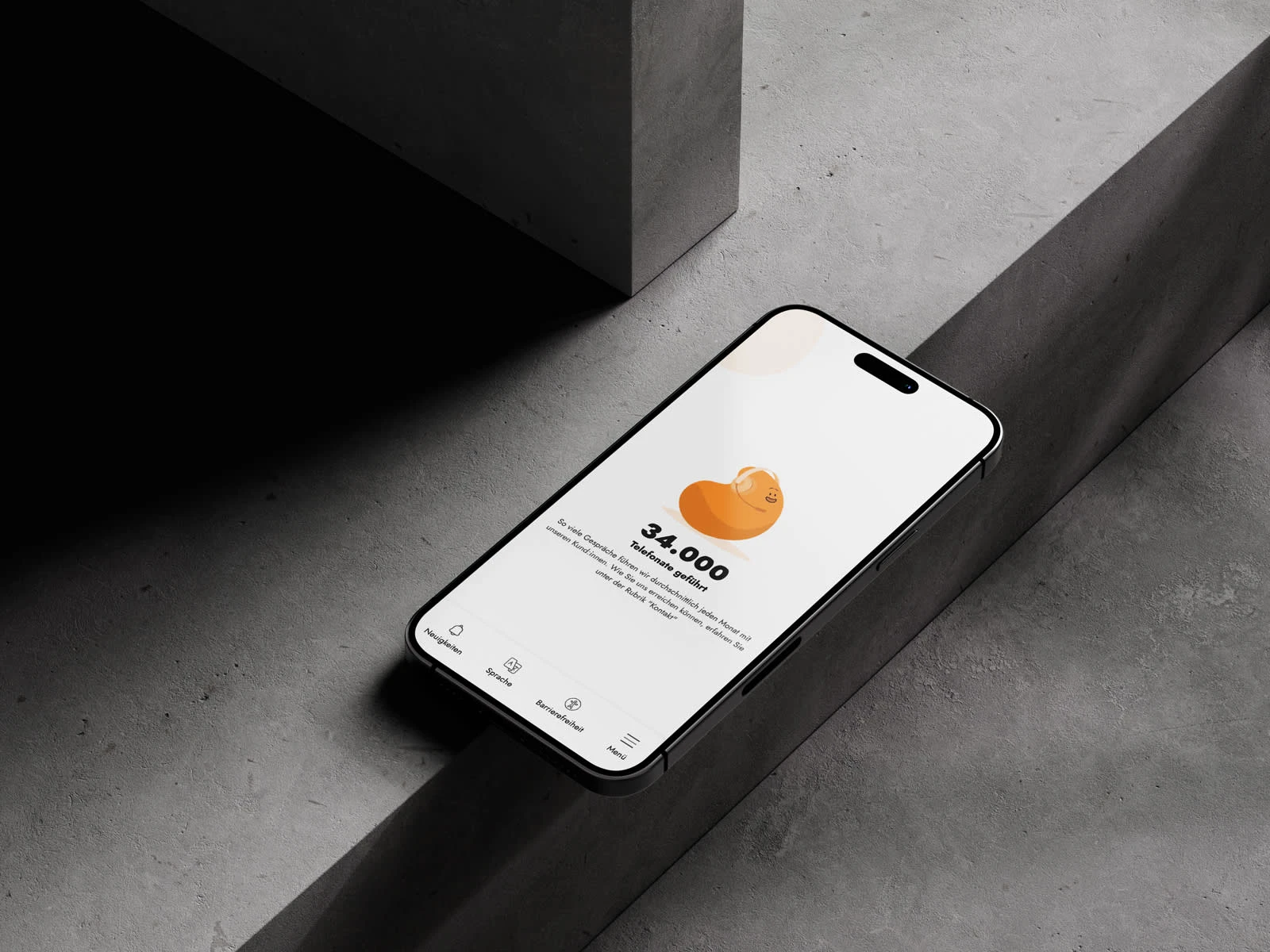
About Us Page
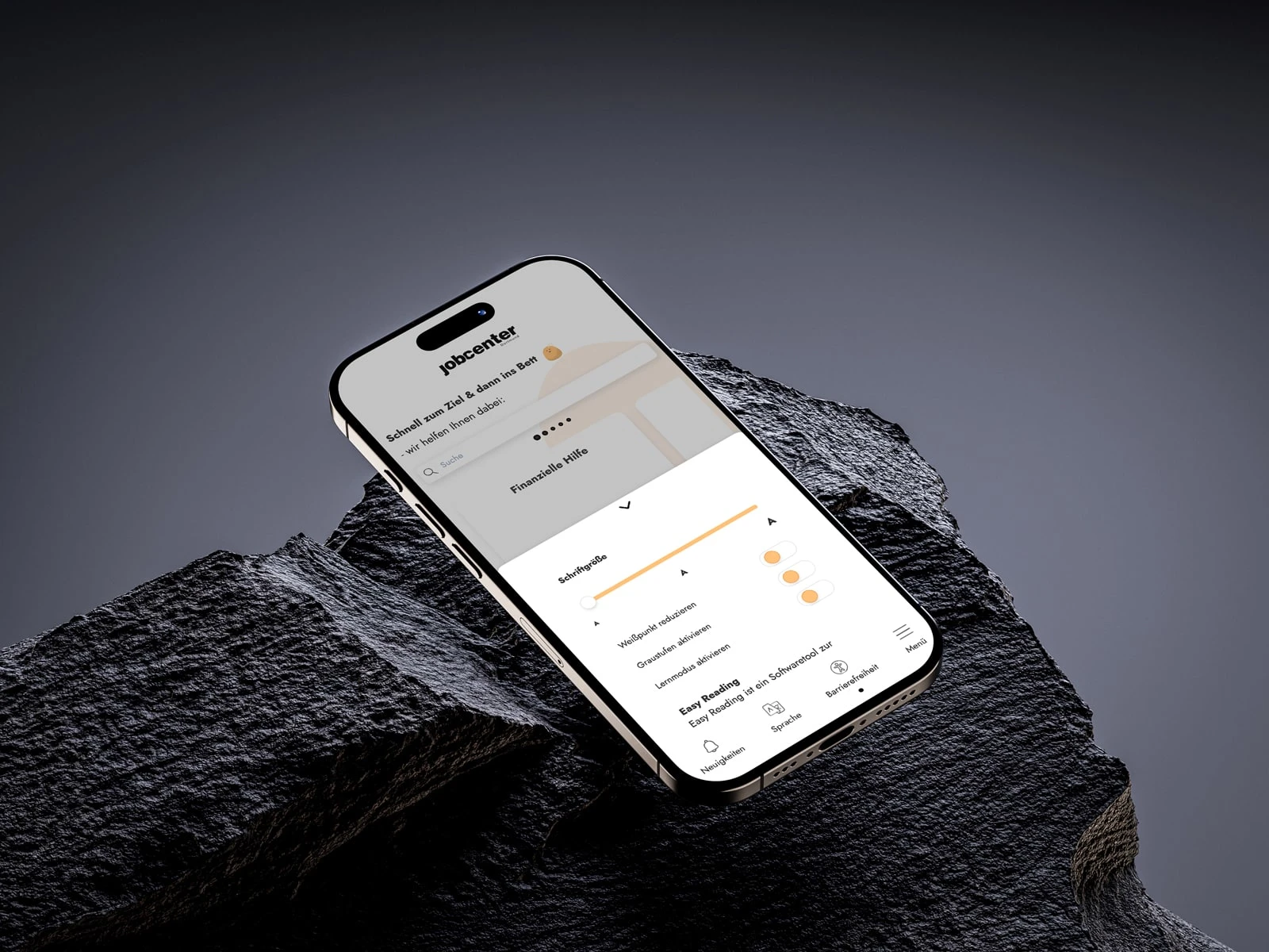
Accessibility Menu
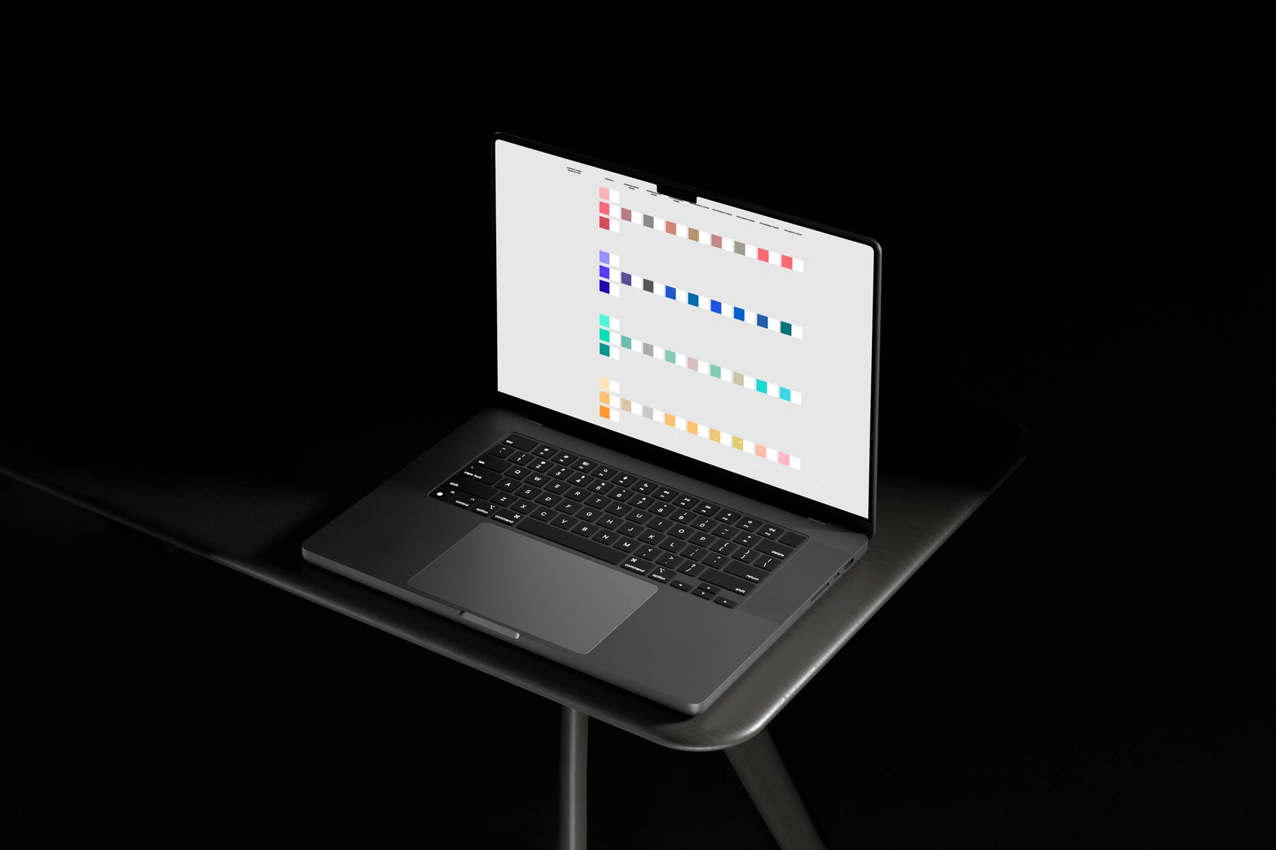
Improving Colour Palette for Accessibility
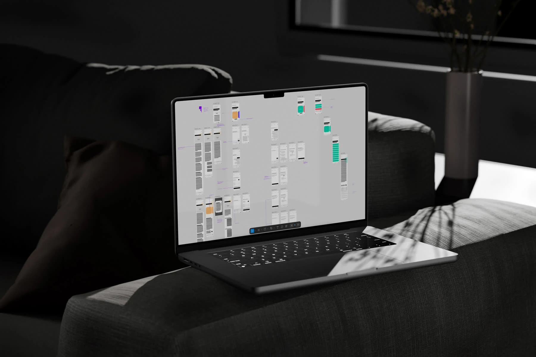
Wireframes Mobile
Like this project
Posted Mar 17, 2023
Optimised Jobcenter Dortmund's web app, focusing on mobile-first design and accessibility features.
Likes
0
Views
36

