C.O.X. Steuerberatung UI Upgrade
Duration: 2021
Agency: jut-so (Berlin, GER)
Role: UI Design
Introduction
In collaboration with the agency jut-so for the client C.O.X. Steuerberatung, a leading tax consultancy firm, I spearheaded the creation of a cohesive design system and UI design for their new website. The primary objective was to ensure consistency across multiple devices while prioritizing user-friendly navigation and clarity in presenting complex content.
Phase 1: Wireframe Optimization
The project commenced with a thorough review and optimization of the existing wireframes. By scrutinizing the wireframes, I identified areas for improvement and refinement to enhance usability and alignment with the client's objectives.
Phase 2: Design System Development
Building upon the chosen aesthetic, I developed a comprehensive UI design system that would ensure consistency and coherence across various screen sizes — from mobile to desktop. Emphasis was placed on clarity and ease of navigation, particularly given the extensive content present on the site.
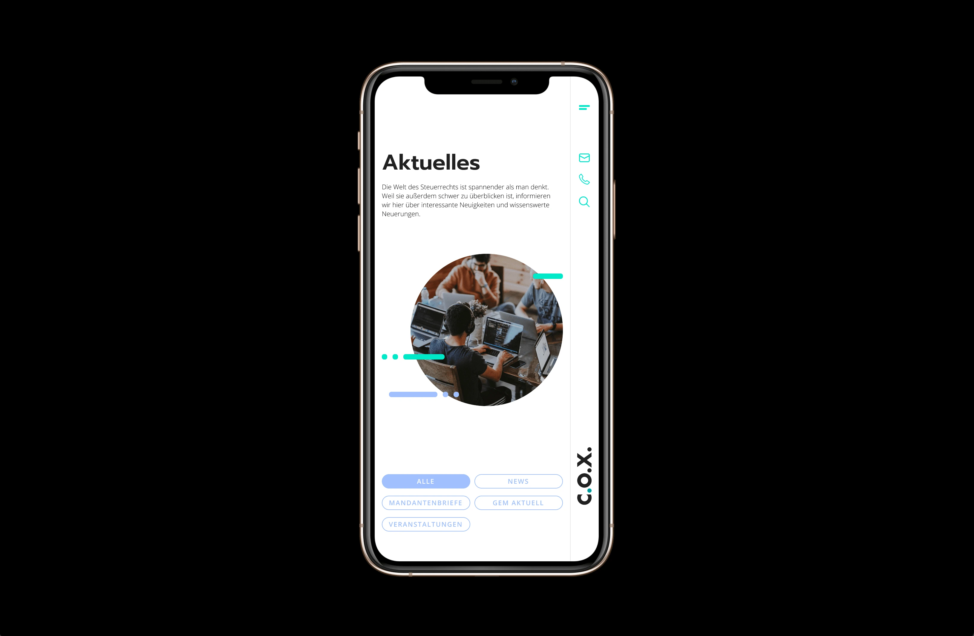
Mobile View
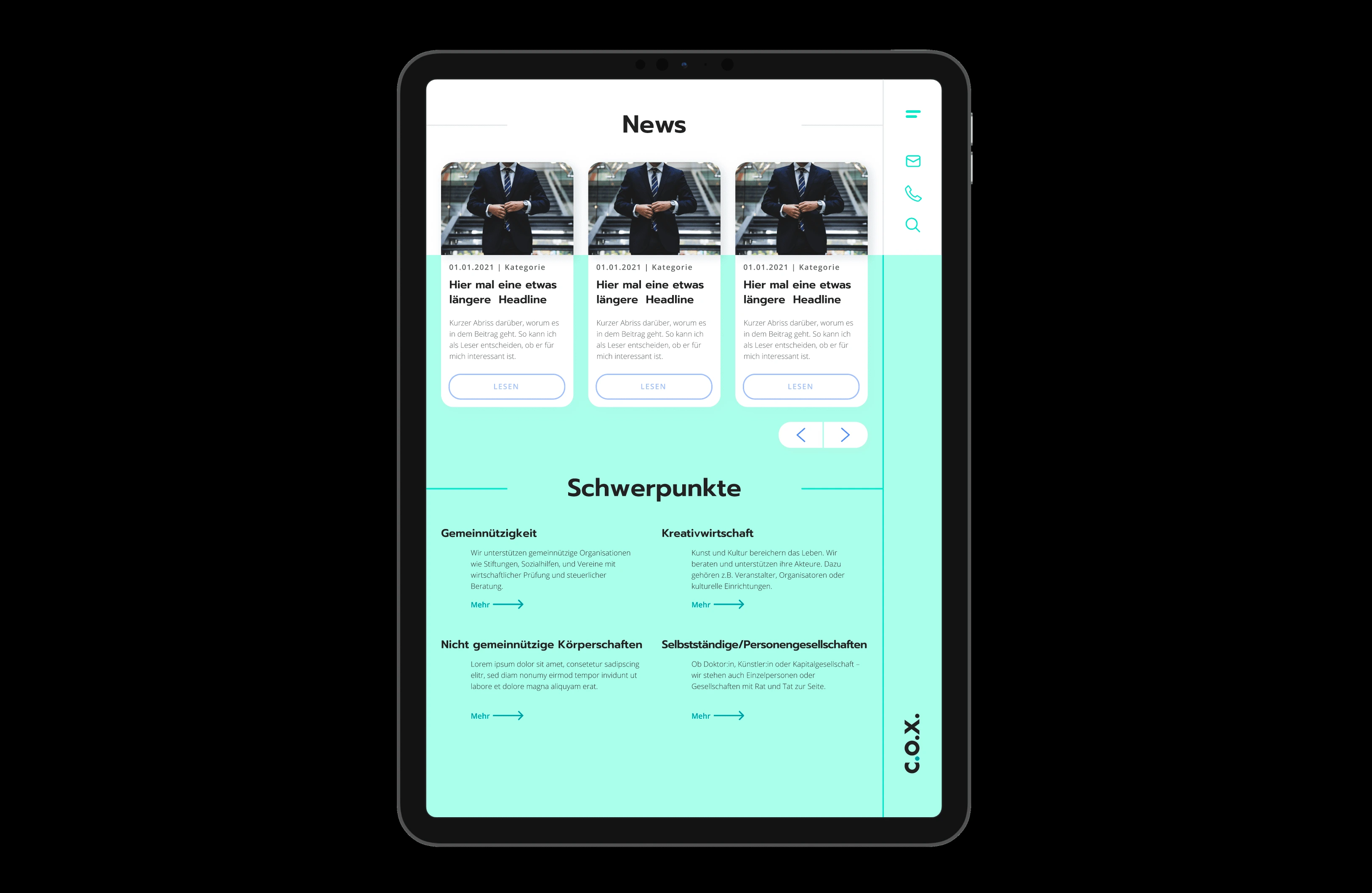
Tablet View
Phase 3: Interface Presentation and Handoff
The final phase involved presenting the interface design to the client for review and subsequent handoff to the development team. Clear communication and collaboration ensured that the design vision was effectively translated into a functional website.
Challenges and Decisions
Navigating the complexities of tax consultancy content required careful consideration of information hierarchy and user flow. Through iterative discussions with the client, I gleaned insights into their aesthetic preferences and strategic direction. Opting for a FinTech-inspired look characterized by clean lines, bold typography, and cold, bright colors, I established the visual direction for the website.
Crafting a design system that effectively communicated the intricacies of tax consultancy services posed a challenge. To address this, I employed a combination of tiles and tags to signify content categories and facilitate easy access to relevant information. Iterative refinement was crucial to strike a balance between aesthetic appeal and functional clarity.
Conclusion
The C.O.X. Steuerberatung website design project underscores the importance of user-centric design and seamless collaboration in delivering a compelling digital experience. By prioritizing clarity, consistency, and usability, we created a platform that not only reflects the client's brand identity but also facilitates intuitive navigation for users.
Reflection
Throughout the project, maintaining open channels of communication with the client and development team was paramount. By soliciting feedback and iteratively refining our designs, we were able to overcome challenges and ultimately deliver a solution that met — and exceeded — the client's expectations.
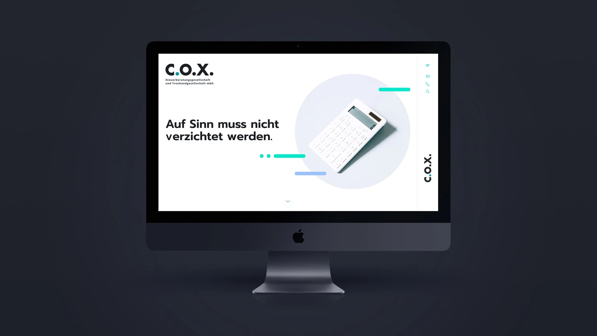
Desktop View
Key Takeaways:
Thorough wireframe optimization lays the foundation for an effective UI design.
Clear communication with clients facilitates alignment on aesthetic preferences and strategic direction.
Iterative refinement is essential to strike a balance between aesthetic appeal and functional clarity in complex content presentations.
View the Project
Like this project
Posted Mar 17, 2023
Designed C.O.X. Steuerberatung's website, focusing on consistency, clarity, and user-friendly navigation.
Likes
0
Views
83


