Panora Dashboard Design
Ryan Almeida
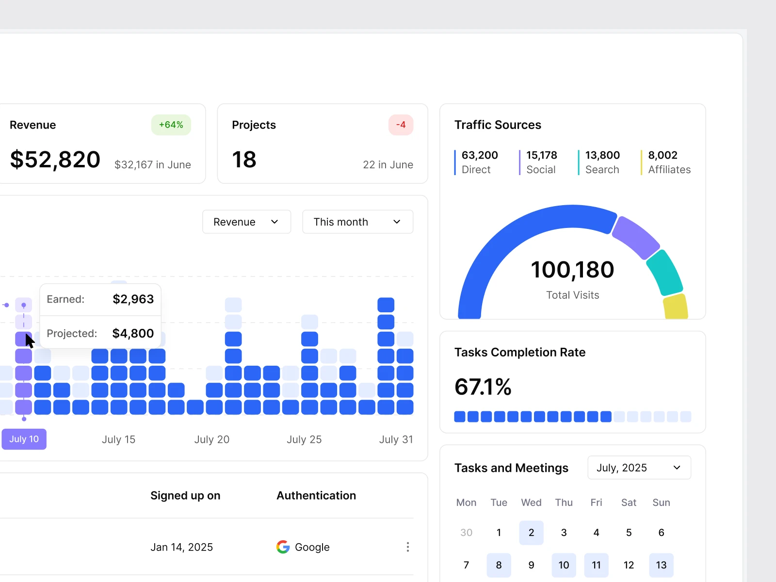
Panora Dashboard – Sneak Peak
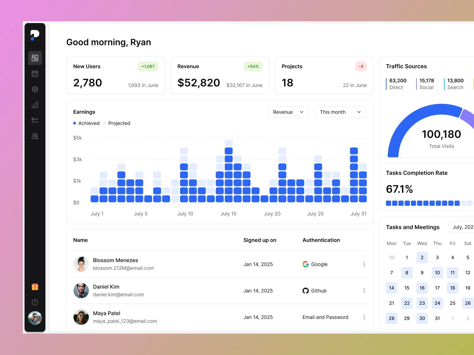
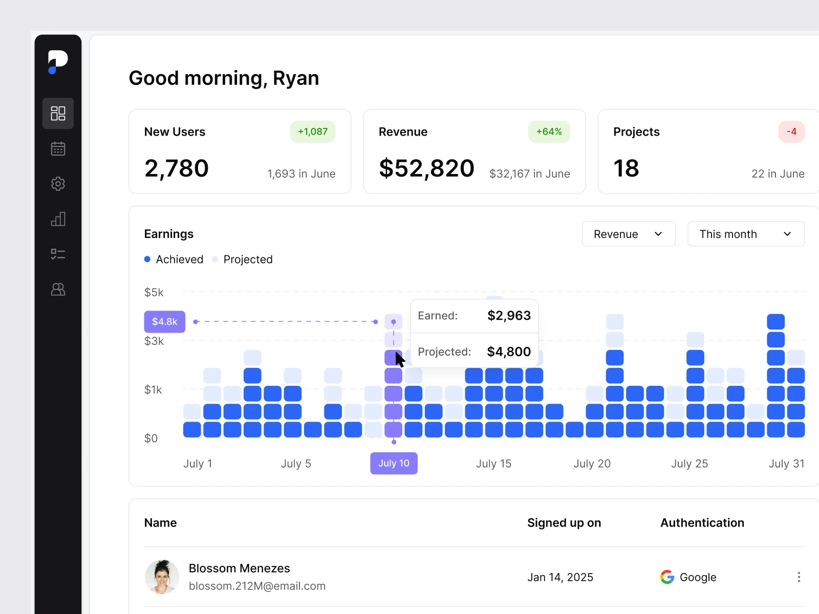
I designed this dashboard with one goal in mind: show the most important business metrics at a glance — clearly, without noise, and in a layout that feels light but powerful. Everything is built around clean typography, balanced spacing, and small visual cues rather than heavy UI elements.
Design Approach
Minimal Layout: Plenty of white space, clean grid, distraction-free typography.
Consistent Iconography: Subtle line icons to support visual recognition.
Color with Purpose: Only used to highlight key numbers, statuses, or chart segments — not as decoration.
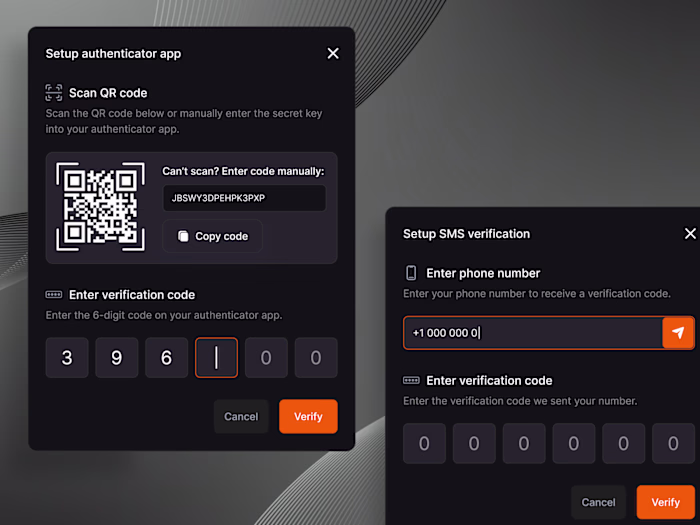
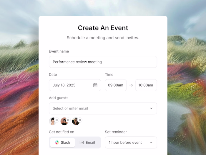
Microinteractions: Hover effects, card shadows, tooltips, and smooth transitions enhance usability without adding noise.
Panora Dashboard
Panora Dashboard
Like this project
Posted Oct 27, 2025
Designed a clear, minimal dashboard for key business metrics.
Likes
0
Views
4
Timeline
Mar 5, 2025 - Mar 13, 2025