MyAmber Brand Expansion
Jeni Ball

MyAmber Brand Expansion
2024—Brand Expansion & Iconography
Creative Direction: Super Creative Co.
Wordmark Design: Super Creative Co.
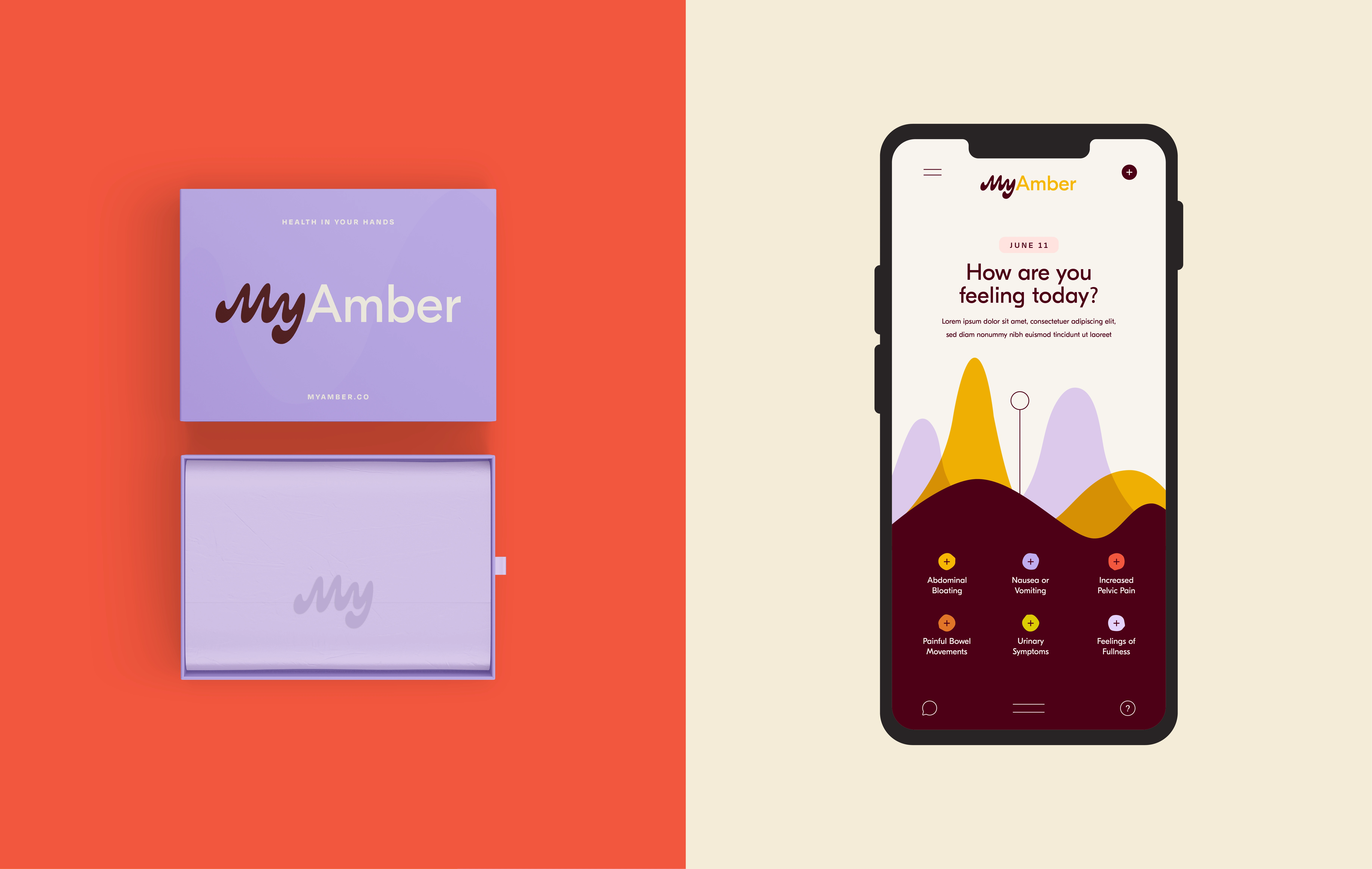
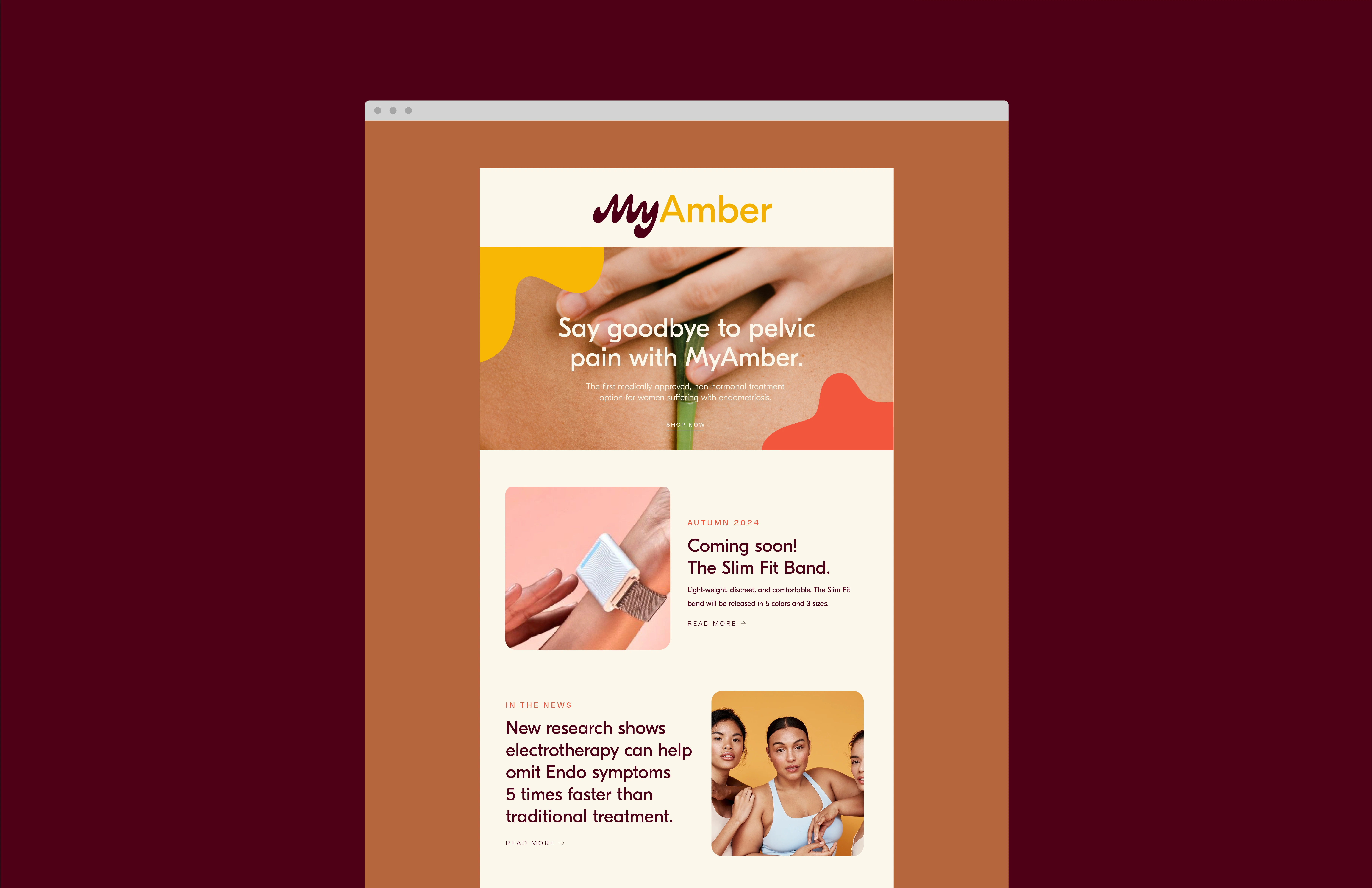
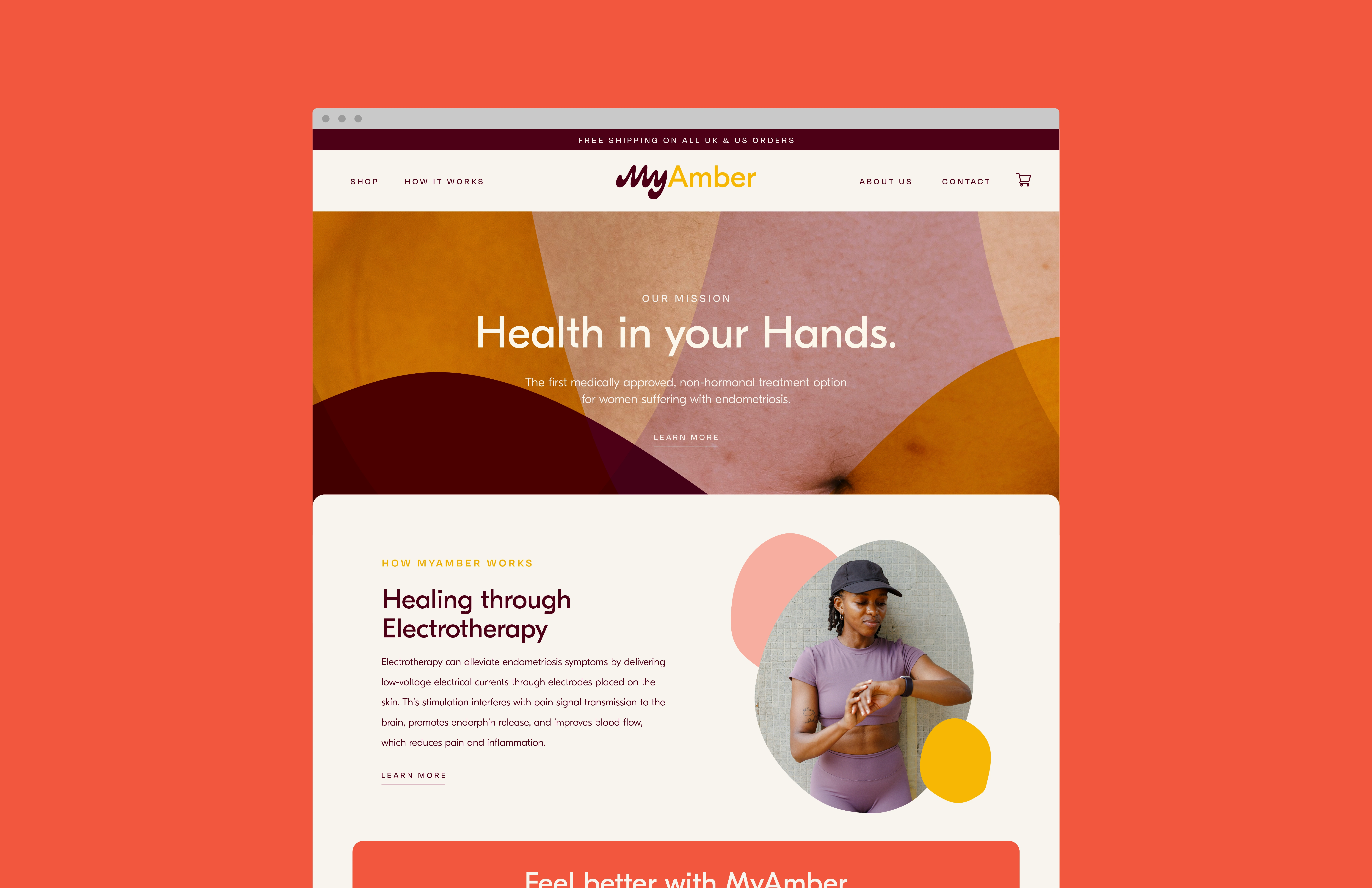
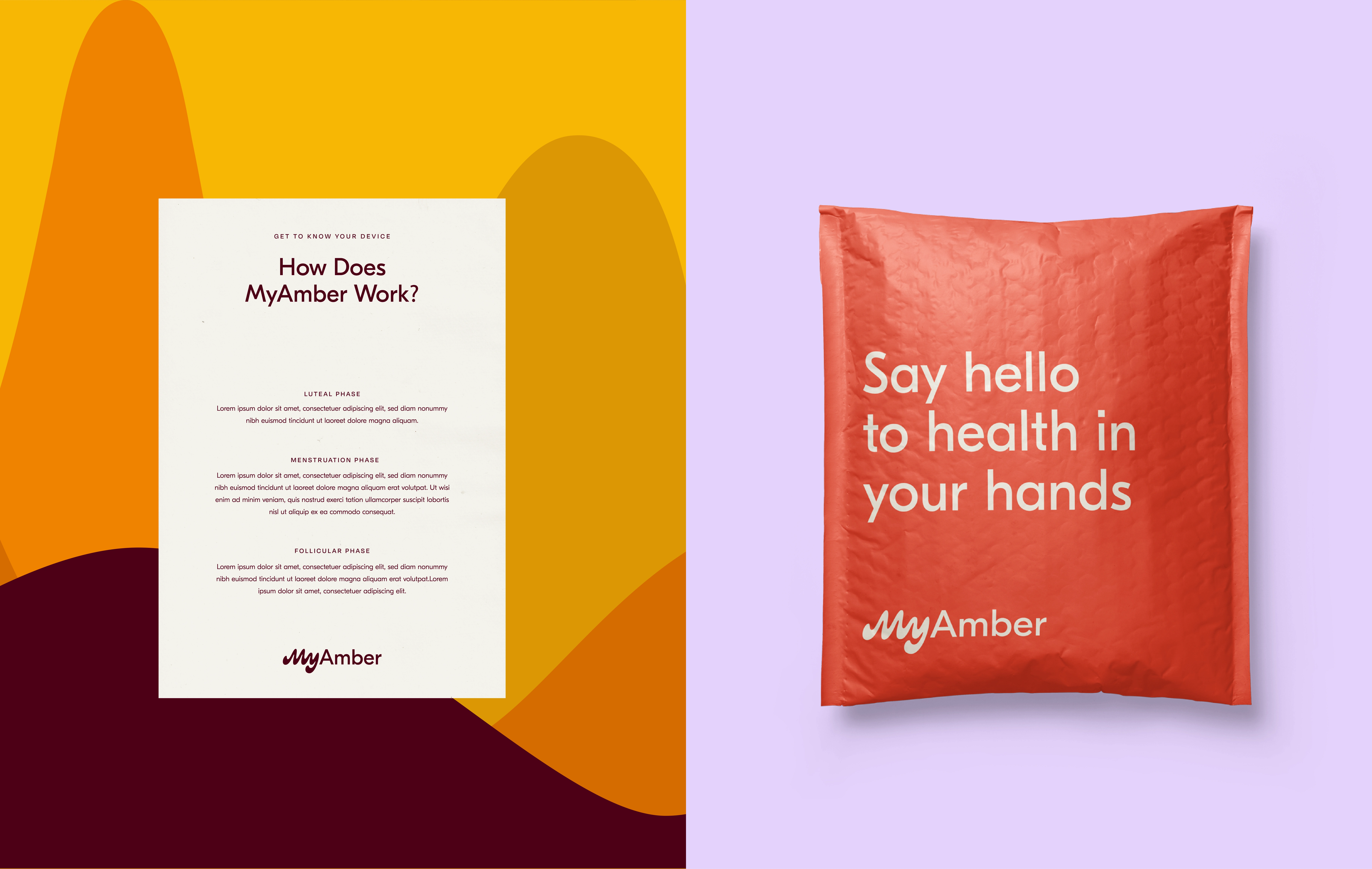
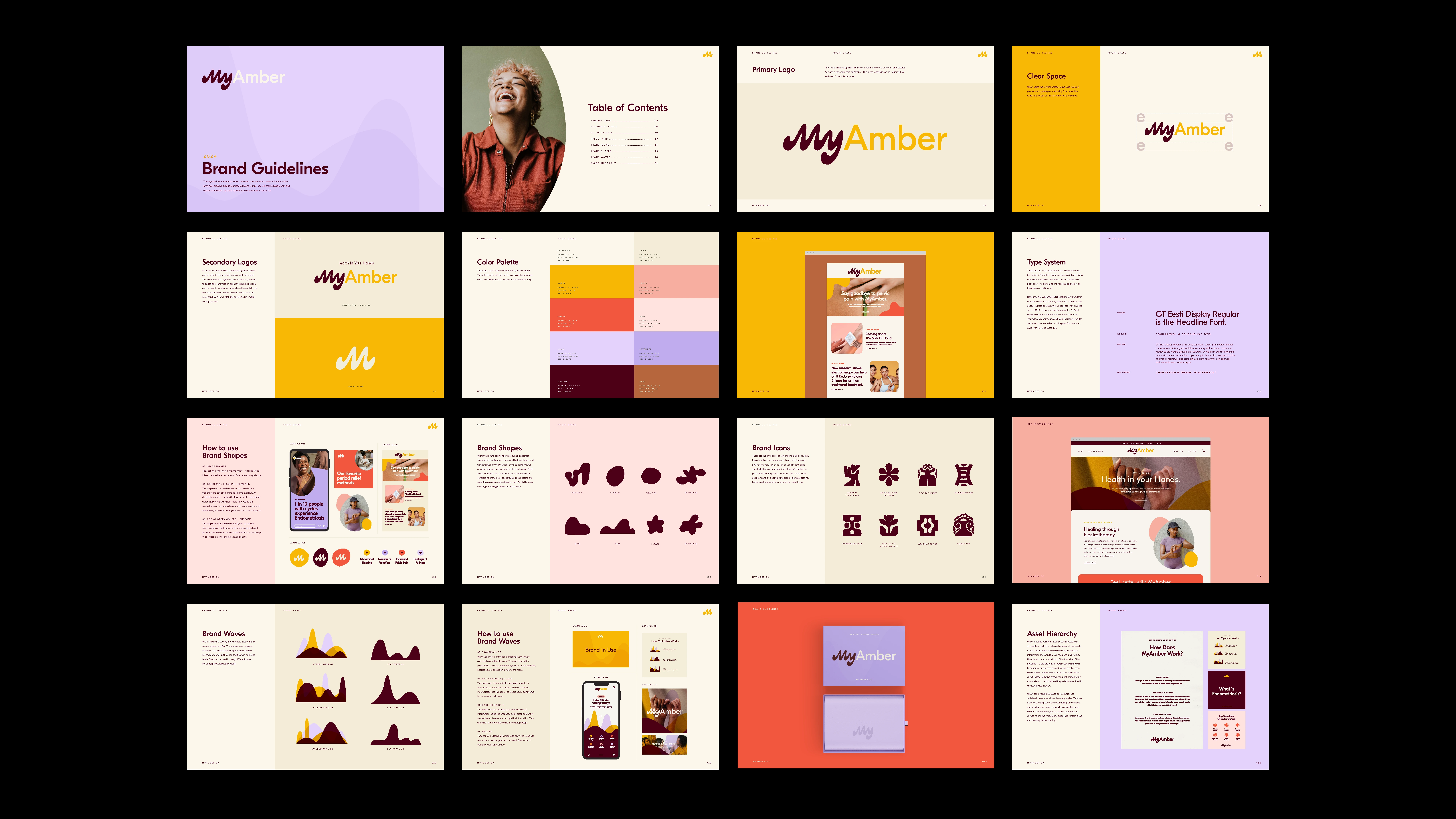
MyAmber is a pioneering wellness brand offering the first medically approved, non-hormonal device for endometriosis pain relief.
Working alongside Sydney from Super Creative Co., who developed the wordmark and brand icon, I was brought on to expand the visual identity and build a cohesive, expressive system across touch points. To support the brand’s mission of empowering people with cycles to feel seen, supported, and in control of their health, I developed a versatile colour palette inspired by warmth, softness, and body positivity featuring amber hues, vibrant corals, and grounded naturals. I paired this with a thoughtful typography system that balances modern clarity with an inviting, approachable tone.
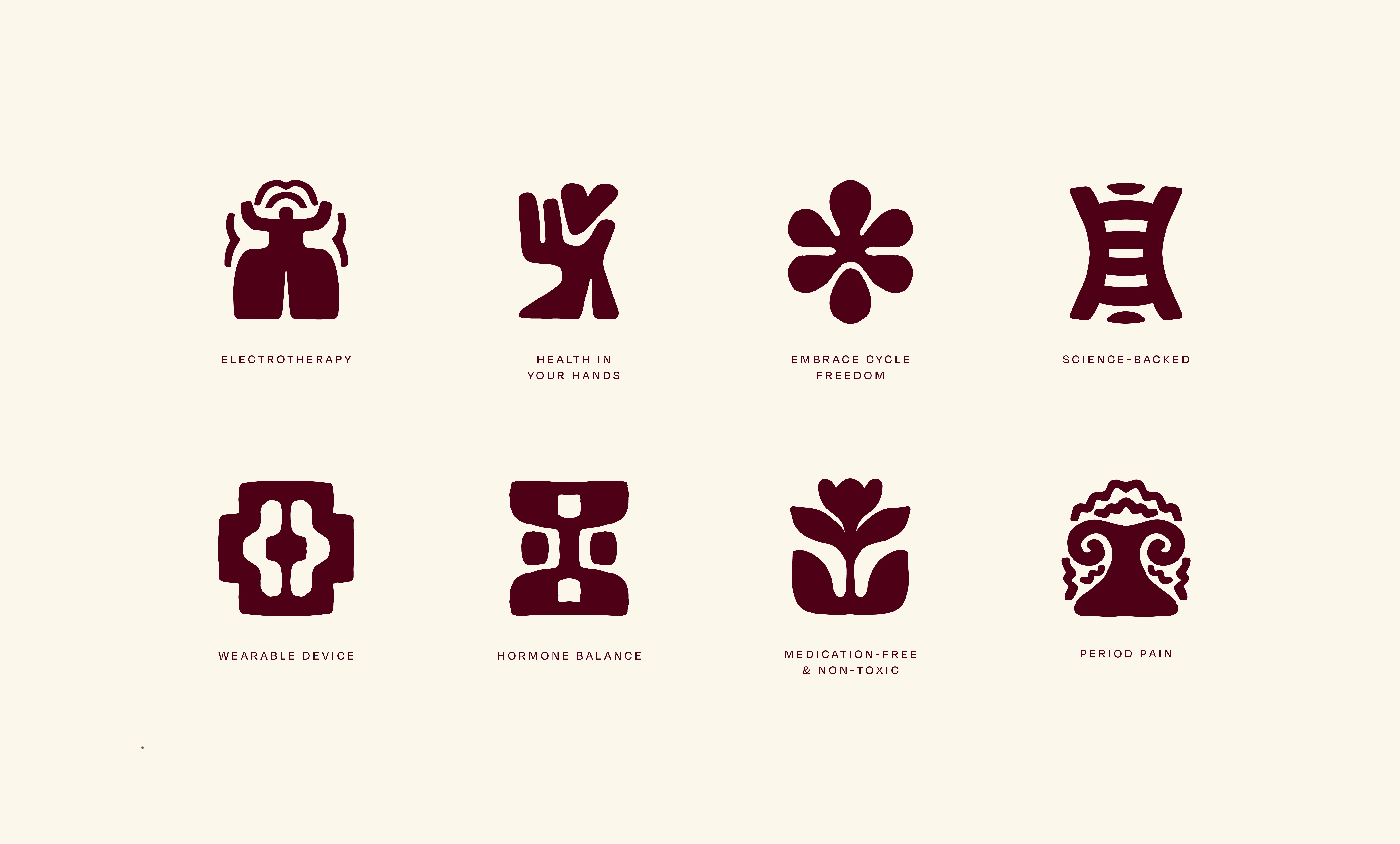
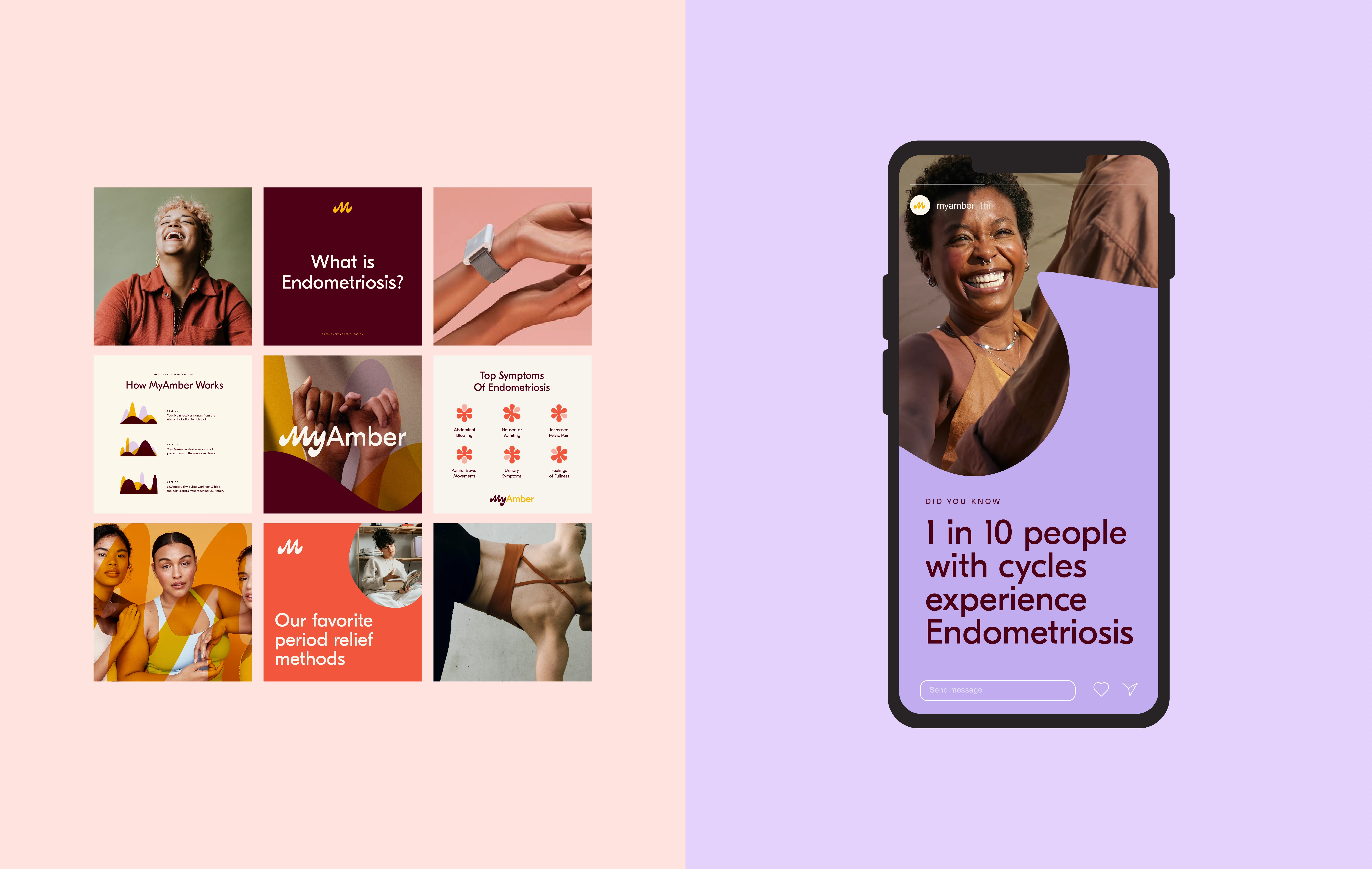
A core part of my contribution was designing a suite of custom illustrated icons to visually communicate MyAmber’s key features, including electrotherapy, hormone balance, and cycle tracking. These illustrations were crafted to be informative, friendly, and distinctly ownable, giving the brand a unique visual language in a category often dominated by sterile or overly clinical design.
Like this project
Posted Sep 3, 2025
MyAmber is a pioneering wellness brand offering a medically approved, non-hormonal device for endometriosis pain relief. Created with Super Creative Co.