Built with Jitter
Brinq AI Brand Identity Development
From scattered ideas to a unified industrial AI identity.
Brinq AI came to us in the middle of a transition. They were spinning out of their parent company and stepping into the world under their own name for the first time. The tech was brilliant edge-based computer vision that helps factories stay safe, efficient, and predictive but the brand had no center, no voice, no structure.
They didn’t just need visuals.
They needed clarity.

Main Logo
01 — Alignment
The process began with understanding the tension at the heart of Brinq:
They operate in messy, high-stakes industrial environments…
but their product is calm, precise, and intelligent.
So the brand needed to balance two forces:
engineering structure and quiet confidence.
From early conversations, two big ideas emerged:
A brand rooted in connection, pattern-recognition, and system awareness
A brand that communicates clarity, reliability, and trust without looking like every other “AI startup”
This became our northern star.
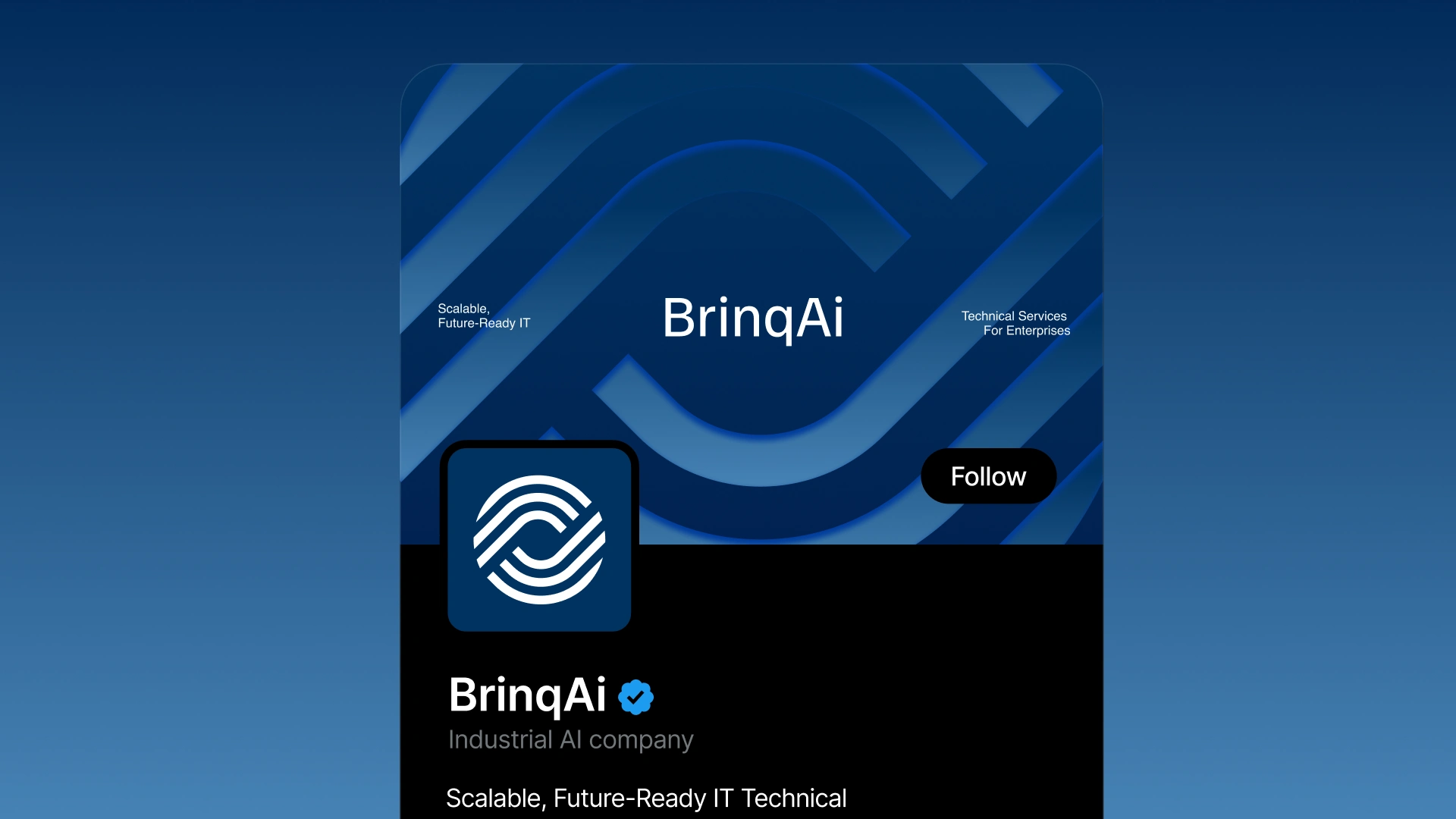
Social Media Design
02 — Exploration
We started wide.
The first direction leaned into connectivity lines, dots, and subtle systems that mimic how Brinq sees and interprets industrial environments.
The second direction was minimal and geometric refined shapes, clean rhythm, enterprise-level restraint.
Both were strong. Both revealed something true.
The hardest part wasn’t designing it was choosing.
The client saw value in both directions, and the feedback evolved over several rounds. Instead of forcing an artificial decision, I chose the strategic path:
Combine the strengths.
Remove the noise.
Keep only what matters.
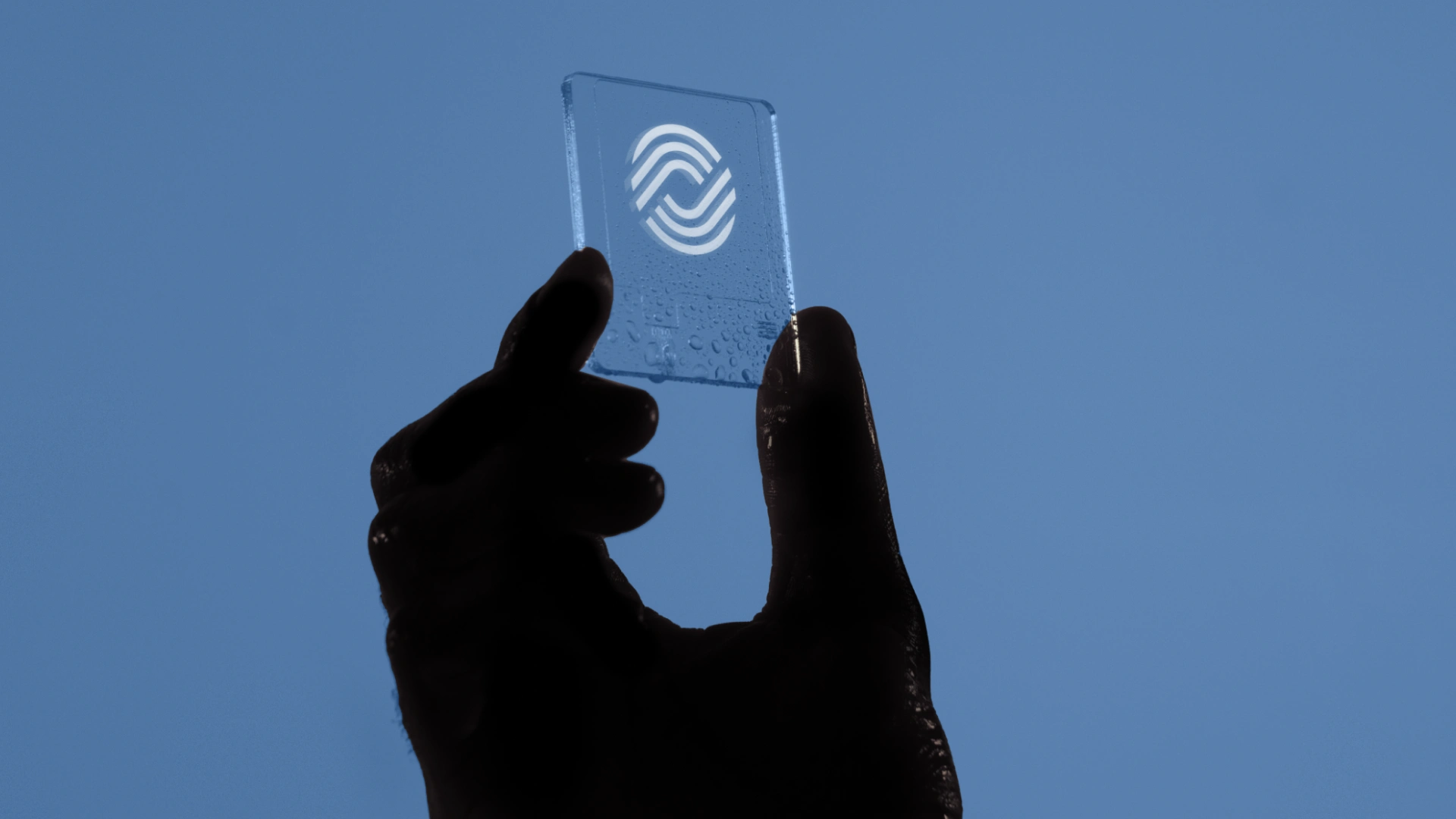
3D Card
03 — Refinement
This is where the brand found its voice.
We took the structure from Concept 1 — the feeling of “intelligent connectivity.”
Then we paired it with the precision and elegance of Concept 2.
Every decision became intentional:
Making the mark feel engineered, but not over-designed
Creating motion without cliché
Using Geist for a modern technical tone
Building a palette that feels industrial yet warm
Designing a logo that scales cleanly on hardware, dashboards, and documentation
The identity became systemic, not decorative.
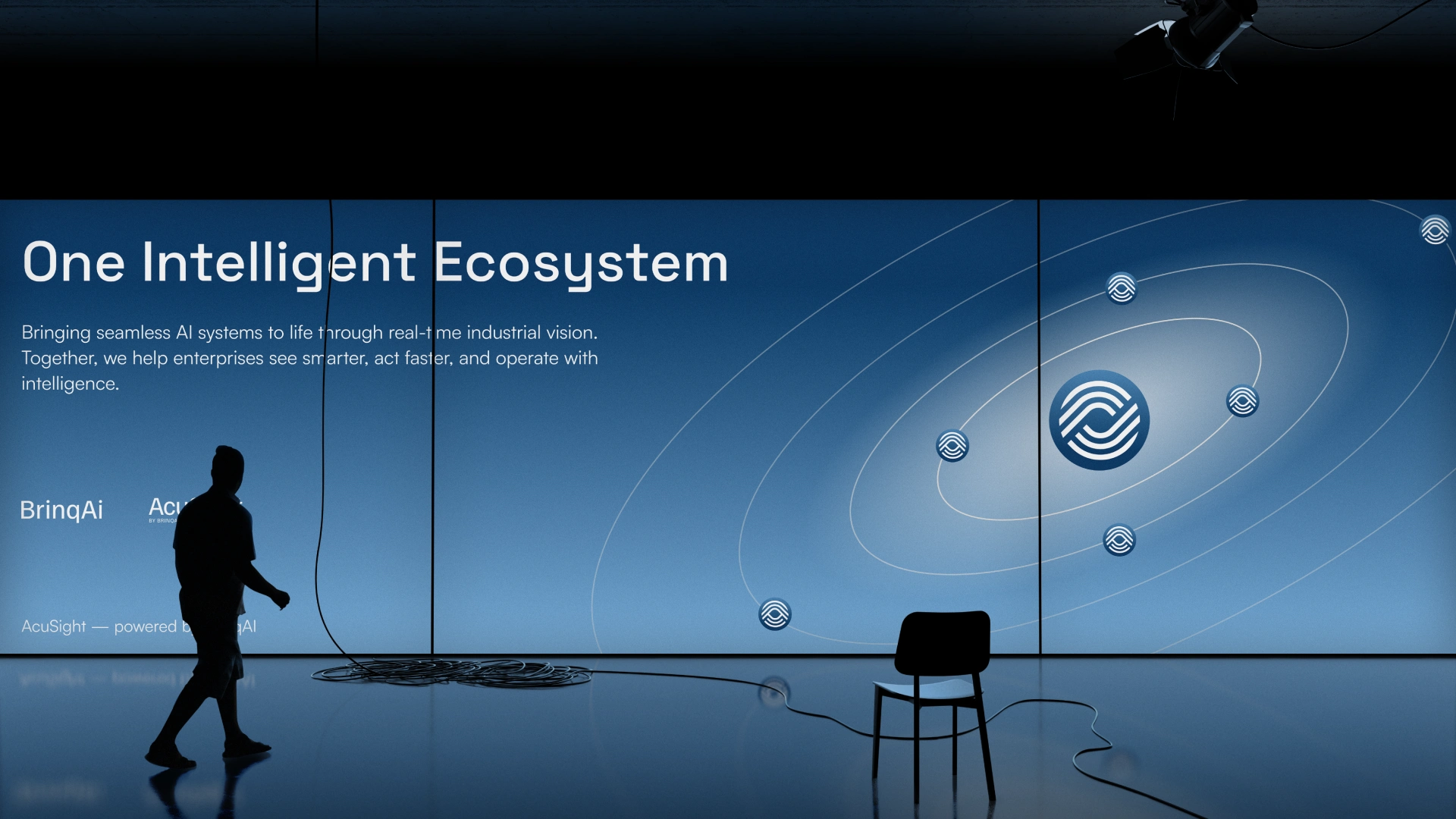
Event Banner
04 — Final Identity
The final brand expresses what Brinq truly is:
A calm intelligence operating inside industrial complexity.
The symbol is geometric and confident.
The typography is clear and modern.
The system is flexible enough to house future product brands — including AcuSight.
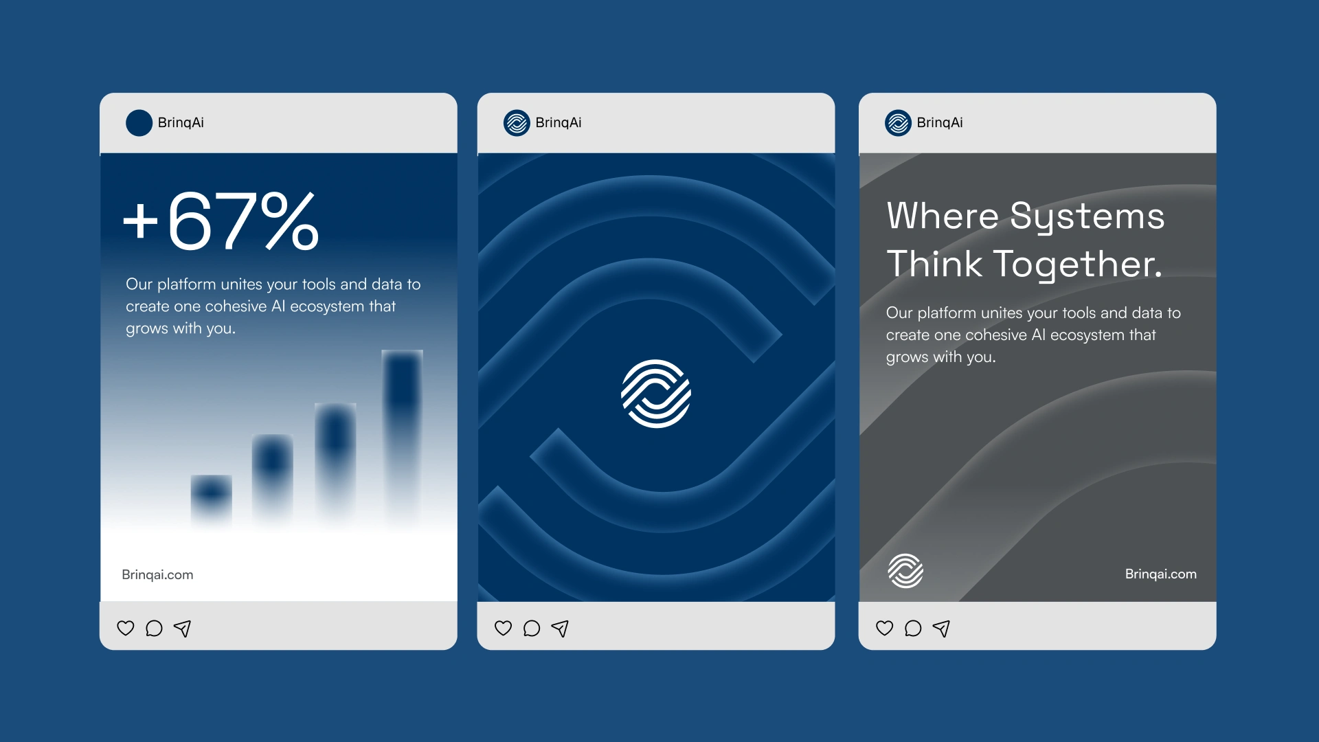
Social Media Posts
Like this project
What the client had to say
Really great experience and top quality work, thank you very much!


Chris Marsh, Sprucehill Capital Inc.
Nov 13, 2025, Client
Posted Nov 16, 2025
Created a unified brand identity for Brinq AI, balancing engineering and confidence.
Likes
4
Views
185
Timeline
Oct 14, 2025 - Nov 11, 2025
Clients

Sprucehill Capital Inc.


