CORNER PHOTO LAB | Brand Identity & Strategy
Kateryna Patsiuk
CASE
Alright, here’s the deal. Corner Photo Lab isn’t just another place to develop your film and peace out. Nope! We’re a whole vibe. The mission was clear: create an identity that’s fun, bold, and, most importantly, NOT boring. Think bright colors, playful yet professional, and definitely none of those typical yawn-inducing logos like cameras or film rolls. We needed something that says, “Yeah, this is a film lab, but we’re here to make your memories pop!”
The idea? Let’s make a photo lab feel like a creative playground where nostalgia meets the present day. It’s like film got a 2024 makeover. The client was over the standard stuff—no obvious camera icons, no clichés—just pure creative decisions. So, we went for a retro-cool, Gen Z-friendly aesthetic with a modern twist. We mixed vibrant colors and added fun, engaging texts to keep things playful yet easy to understand. And yes, we kept it professional but not boring—because who wants that?
SOLUTION
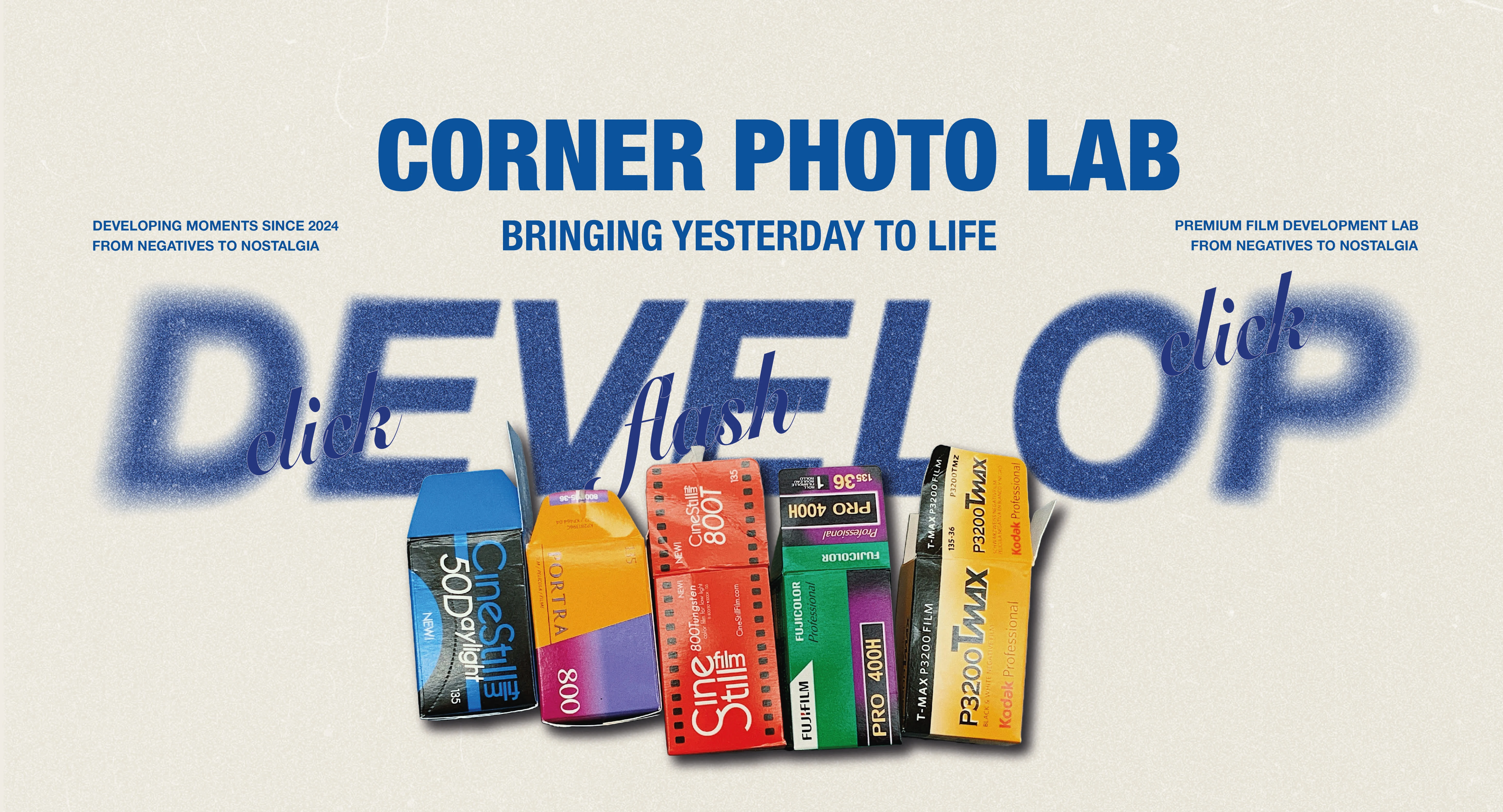
I chose a color palette that pops: Cold Foam, Blue Bonnet, Bokara Grey, and Energized. Why? These colors bring that retro energy while still looking fresh. They blend that old-school film vibe with a modern twist. Oh, and that starburst symbol? It’s a playful nod to the flash of an old-school camera. See? We’re keeping it nostalgic but cool.
The design didn’t stop at colors. I created packaging that makes customers want to take their photos home—cool envelopes for developed film, a packaging box for cameras, and even staff uniforms with custom T-shirts that are anything but your average merch. And don’t forget the business cards! They double as stamp cards because who doesn’t love a freebie for being loyal? The stamp card adds a fun, interactive touch to the customer experience.
The story behind the logo concept 🧩
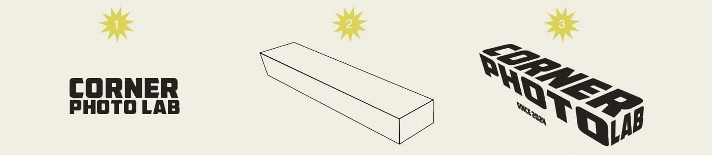
FONT HUNTING
Goal: To find a font that captures the essence of film photography.
Why this font? It has a bold, blocky look, kind of like the labels you’d see on an old film camera or box. The font choice plays on the retro aesthetic while still looking modern enough for today’s audience. It feels tactile, like something you could hold in your hands, just like a film strip.
2. CORNER CONCEPT
Goal: Incorporate the store’s name, Corner, in a way that feels visually connected.
Why the corner shape? I sketched out a corner (it’s a 3D isometric shape, like the edge of a building), symbolizing not just the store’s physical location but also how we’re on the corner of creativity and nostalgia. It gives the logo a dynamic shape that’s not just flat—it’s going places.
3. FINAL ASSEMBLY
Goal: Blend the font and the corner shape into a cohesive logo.
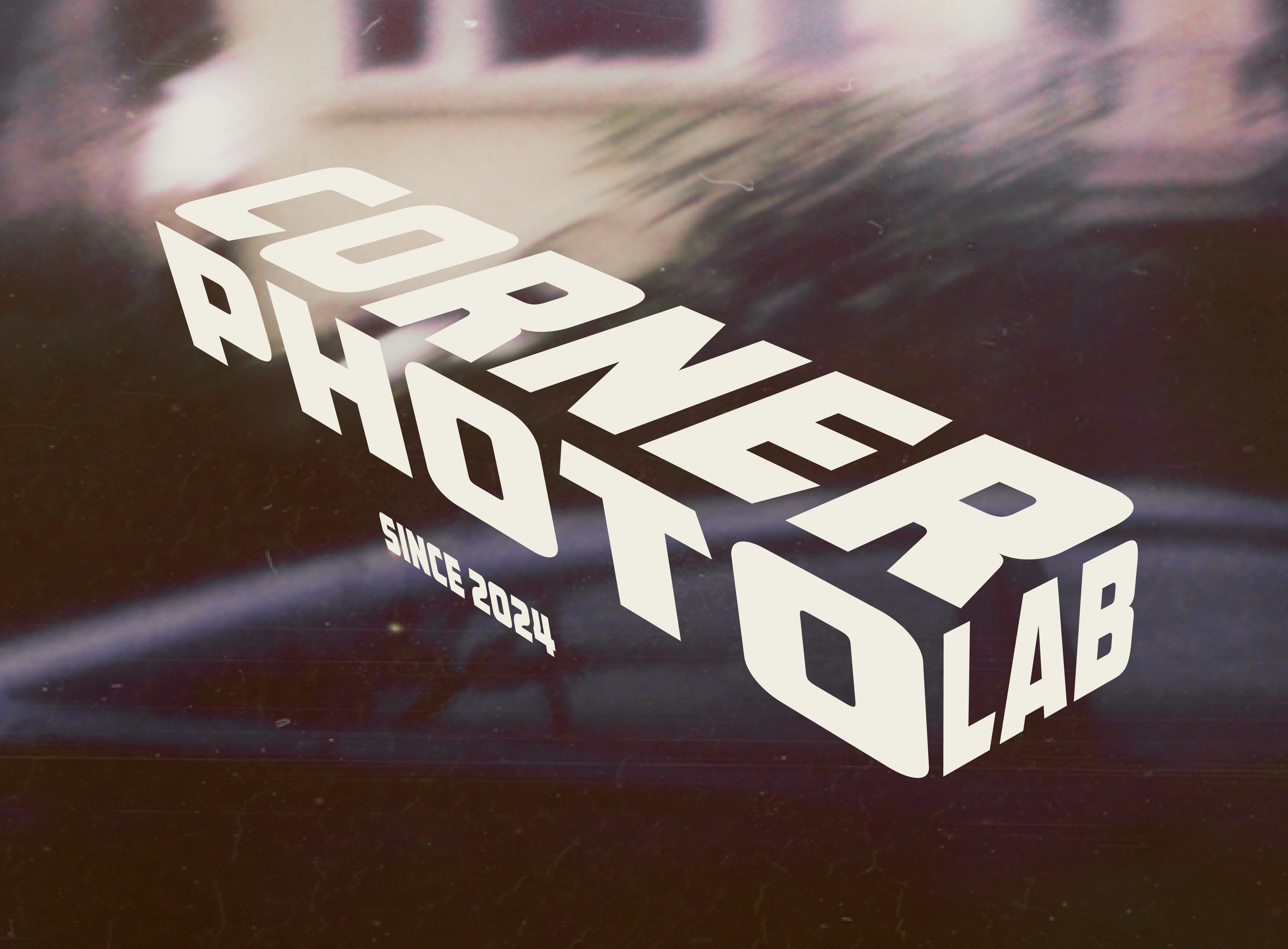
Why it’s cool? By aligning the name and the shape, the logo looks like an actual corner of a building—a nod to the store’s location and its unique vibe. The logo doesn’t just say “photo lab,” it feels like a physical space, like stepping into a creative hub. It’s clean, bold, and stands out without trying too hard.
When creating the logo for Corner Photo Lab, the mission was clear: avoid the overdone film rolls and camera icons. I wanted to steer away from the typical "photo lab" vibe that feels stuck in the past. Instead, I aimed for something modern, simple, and fresh, letting the name itself take center stage.
Rather than relying on the usual photography symbols, I focused on typography, allowing the store name to do all the talking. The design is clean, bold, and creates a much more current vibe. The three-dimensional effect was all about pushing boundaries—both literally and creatively. It shows how Corner Photo Lab is stepping into the future of analog photography while staying rooted in the classics.
In short, I didn’t just create a logo—I made a statement. It’s sleek, minimal, and stands out by being different without trying too hard. The goal? A logo that says, “we’re not your typical photo lab,” while staying cool, modern, and totally unforgettable.
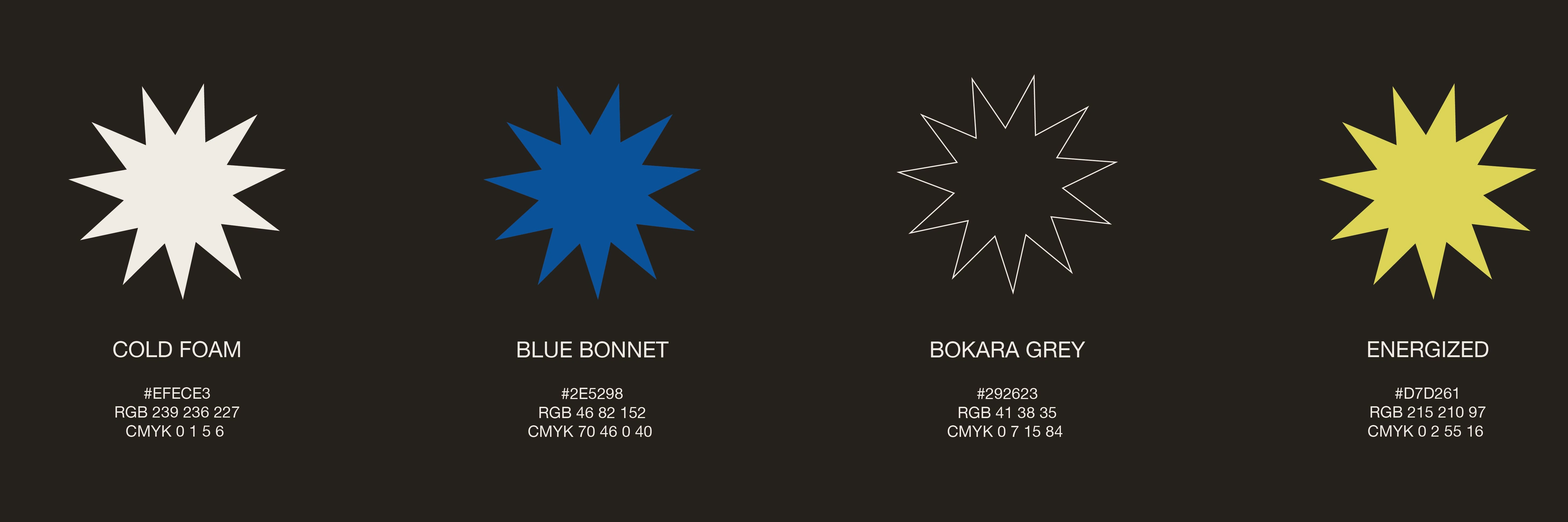
This color palette was chosen for its balance of retro vibe and modern pop, adding depth and energy to the design.
More than just a design choice, the star is a nod to the classic film camera flash—bold, bright, and instantly memorable. It’s a reminder of every brilliant moment worth capturing, bringing a spark of nostalgia and purpose to each shot. This little symbol is here to light up your memories, one flash at a time.
For Corner Photo Lab, I extended the brand identity into staff uniforms: versatile black and white tees for daily wear and hoodies to keep warm. This design choice adds continuity and strengthens brand presence.
Bringing memories to life is a team effort. Each staff T-shirt and hoodie includes a sewn-in label with the team member’s name and the slogan 'TIME RETURNER, MEMORY KEEPER' This unique touch makes each team member feel like a part of something bigger, a reminder that their work brings memories back to life.
This envelope was designed to be both functional and nostalgic. By including all essential information directly on the package—like film type, format, and special instructions—I ensured that every detail stays connected to the photos. It’s a practical design that eliminates extra tags and paperwork and I also adding value to the unboxing experience.
For ‘Memory Makers’ I designed a packaging experience that does more than hold a camera. It includes tips for sunny shots, a discount scratch-off, and a bold color palette, making it as practical as it is eye-catching. It’s a kit that invites users into the world of analog.
See it from every angle 📦🔍. Dive into the 3D view of package—click below to explore! ⬇️
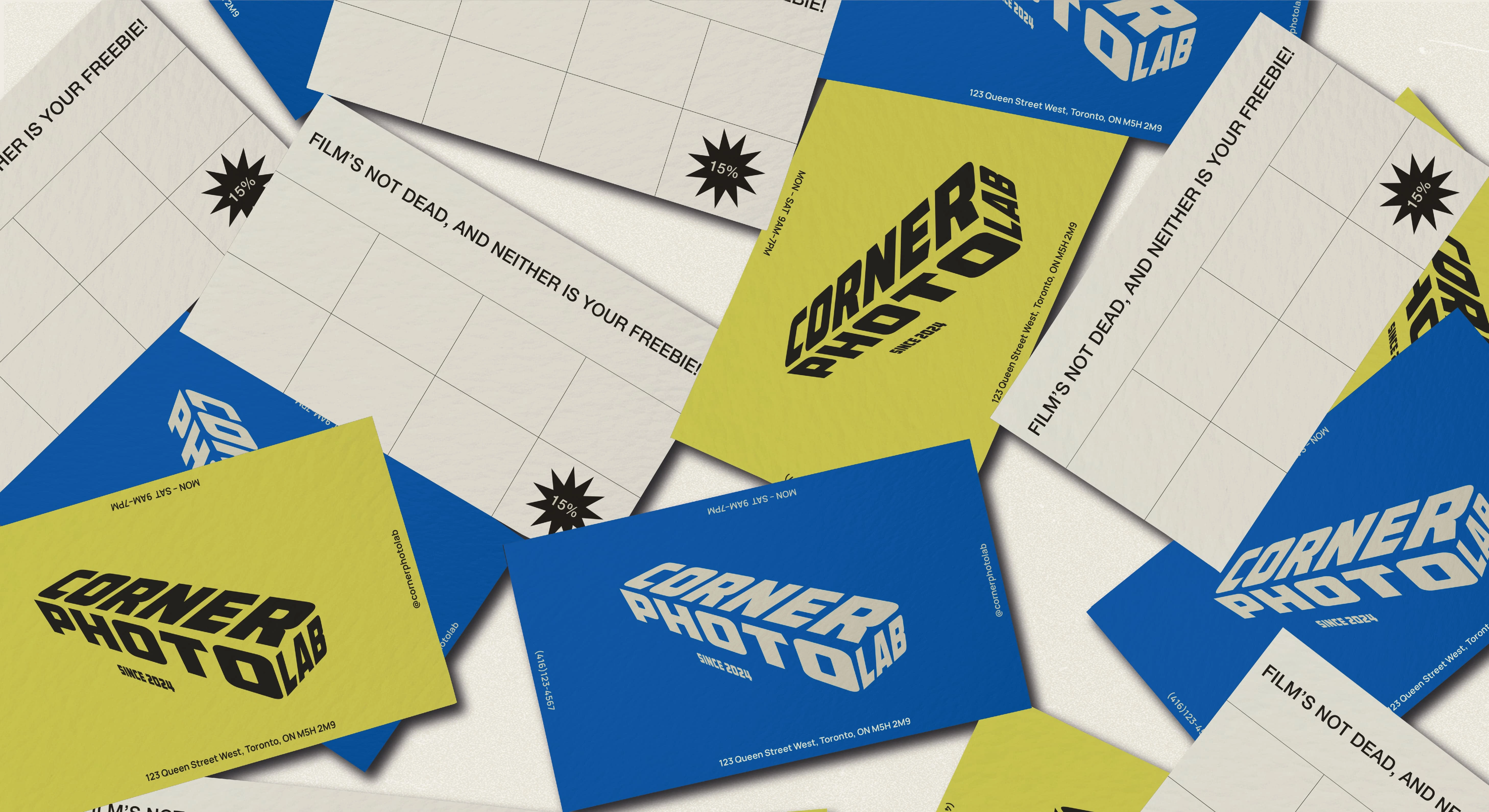
This business card is all about connection and engagement. One side provides all the important info like location, hours, and social media. Flip it over, and you’ve got a stamp collection zone, encouraging repeat visits and rewarding loyalty. It’s a business card with a purpose: keeping customers coming back! ✨

More than just a design choice, the star is a nod to the classic film camera flash—bold, bright, and instantly memorable. It’s a reminder of every brilliant moment worth capturing, bringing a spark of nostalgia and purpose to each shot. This little symbol is here to light up your memories, one flash at a time.
Like this project
Posted Nov 10, 2024
Designed a complete brand experience for this photo lab, covering strategy, visual identity, and custom packaging.