TOMATO TALK | Logo & Visual Identity
Kateryna Patsiuk
CASE
Tomato Talk is a charming Spanish restaurant nestled in the heart of Barcelona. It was born out of a love for Spain's vibrant culture and delectable cuisine. The café's main focus is gazpacho, a traditional Spanish dish served in various delightful recipes. Tomato Talk stands by values of freshness, authenticity, community, warmth, artisanal craftsmanship, and fun. Fresh, quality ingredients are at the heart of every dish, sourced locally to support small farmers and ensure bursts of flavor.
The restaurant offers an authentic Spanish culinary experience, with dishes crafted with care and attention to detail. Tomato Talk is more than just a place to eat; it's a community hub where guests can gather, share stories, and enjoy delicious food together.
The concept behind Tomato Talk was to create a restaurant that not only serves authentic Spanish dishes but also fosters a sense of community and warmth. This led to the creation of a brand that merges traditional Spanish elements with a modern, inviting twist.
SOLUTION
The creative process led to the selection of a font that perfectly captures the atmosphere of the lively streets of Spain. The font chosen for the branding of "Tomato Talk" is "Copperplate Gothic." This classic typeface evokes the essence of traditional Spanish typography, adding a touch of elegance to the logo design.
The chosen font, "Copperplate Gothic," was selected for its ability to create negative space between letters. This negative space allows for the inclusion of the tomato symbol within the logo, while also creating an impression reminiscent of the bull symbol, known as one of the iconic symbols of Spain.
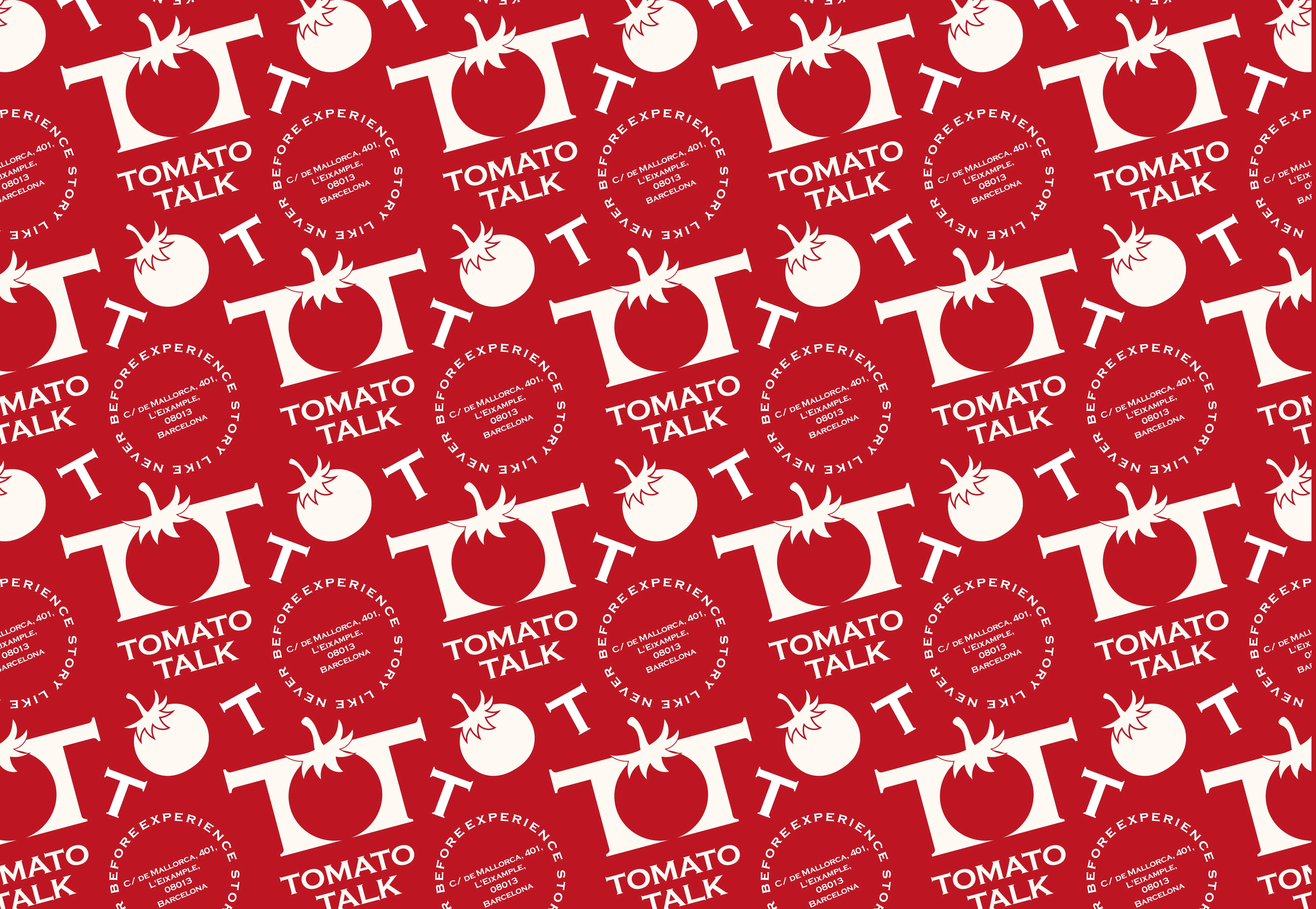
The brand mark consists of a tomato, symbolizing the main focus dish of the café, which is gazpacho.
Flexible logo options for all branding needs.
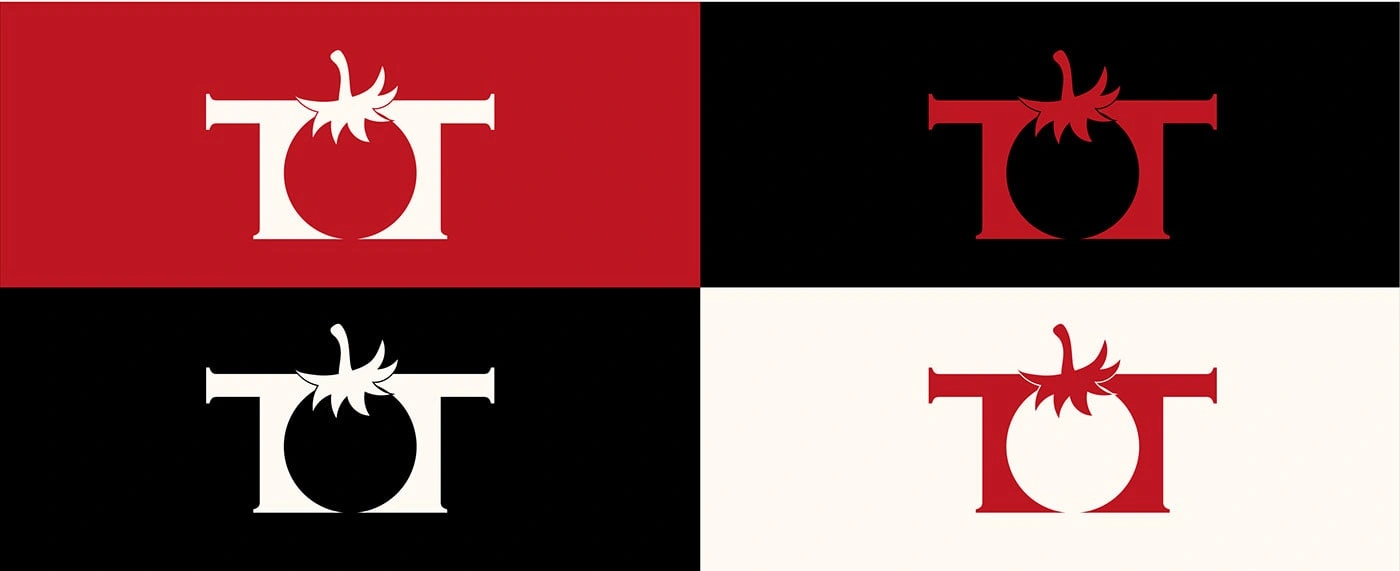
A palette that’s fresh and full of flavor 🎨🍅
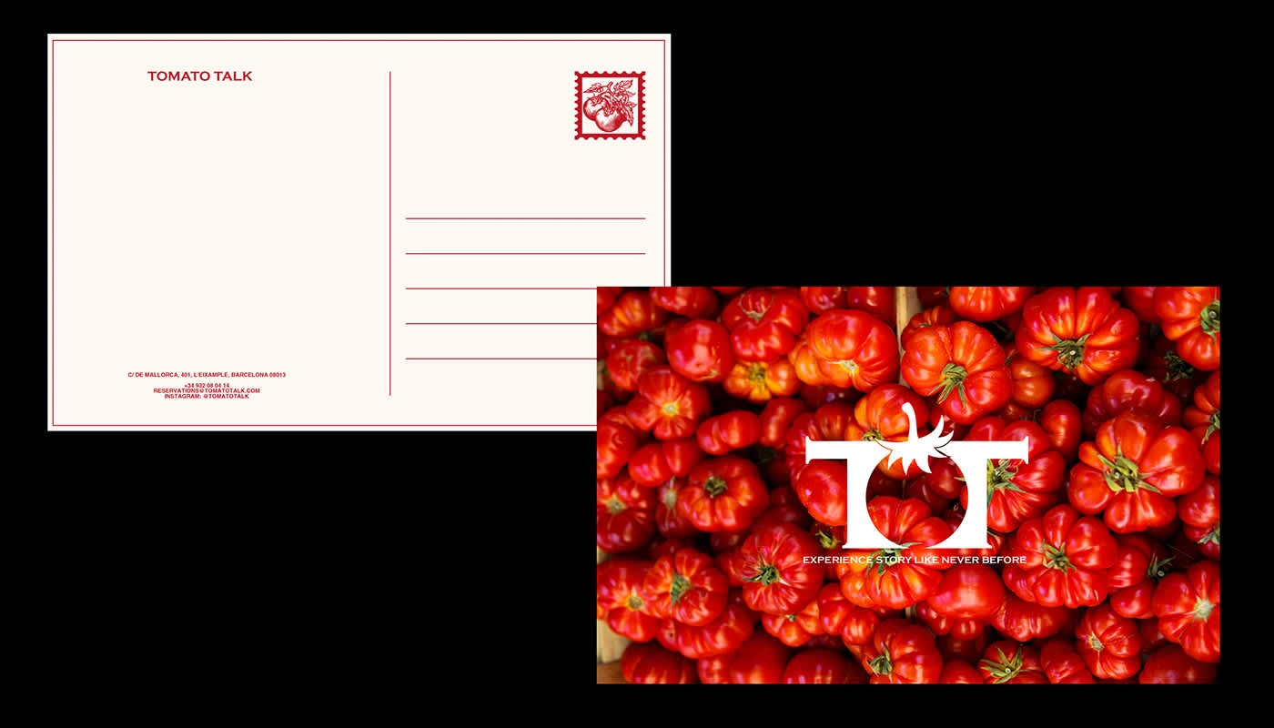
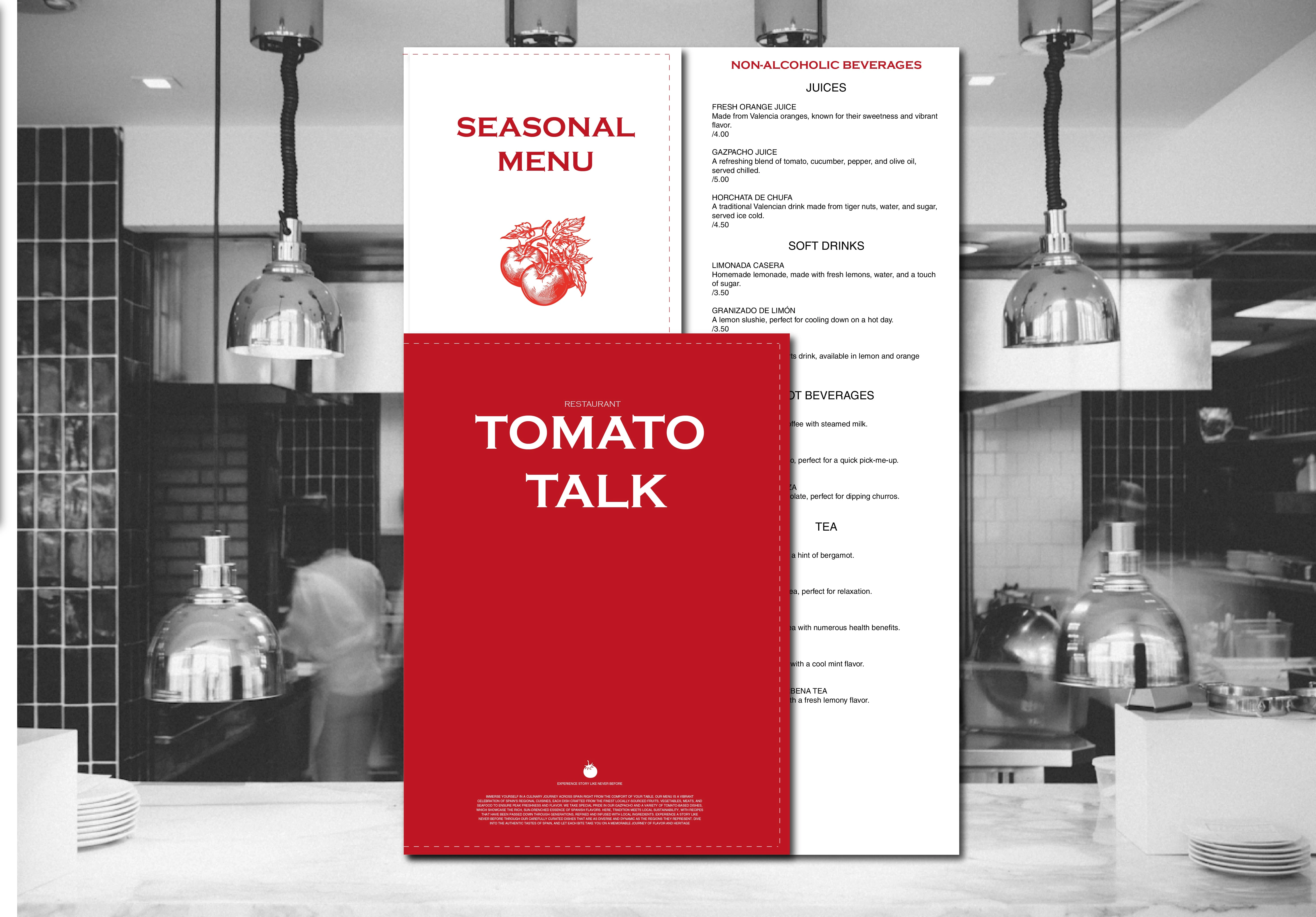
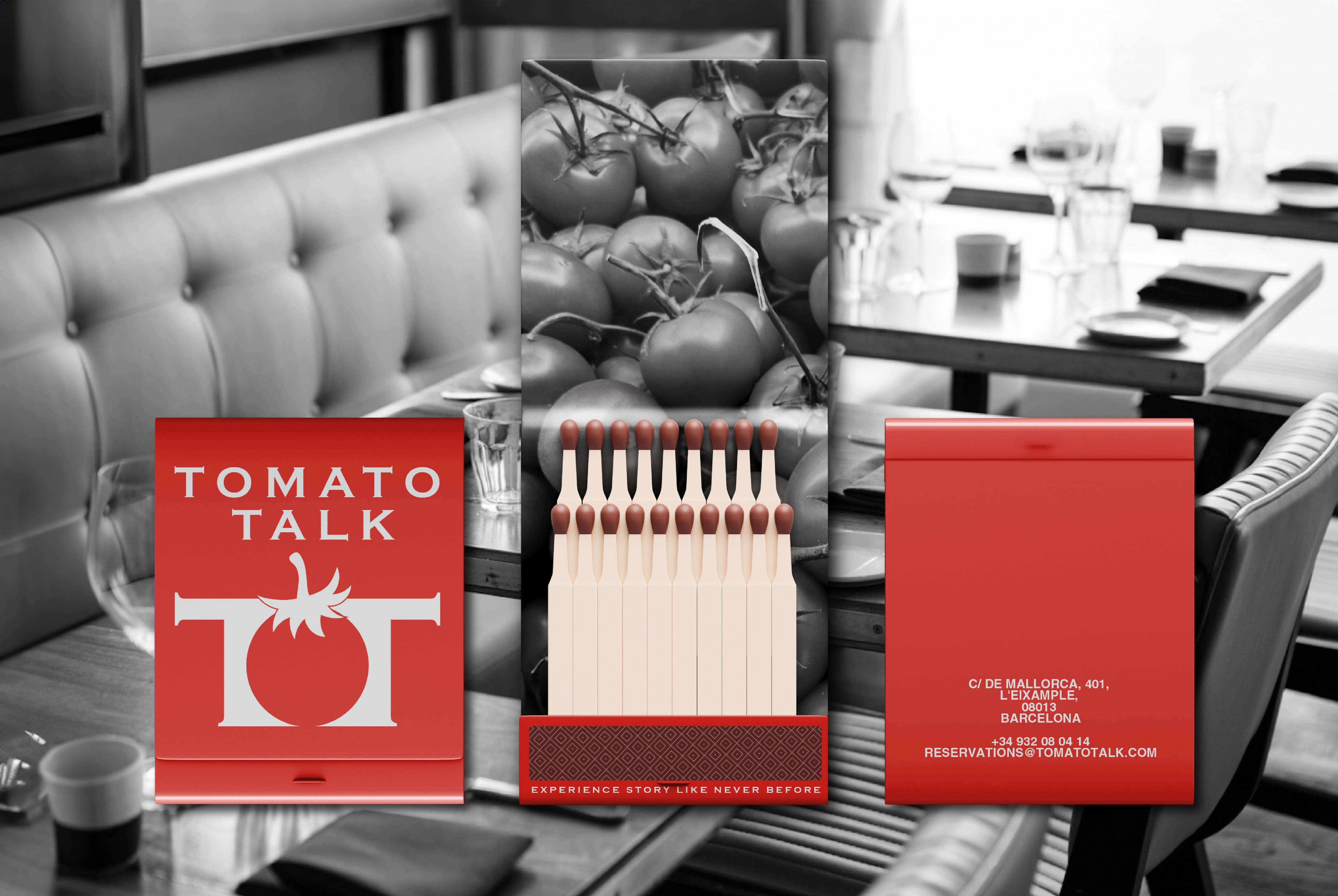
I also designed essential print materials like posters menu cards, postcards, and a packaging pattern that perfectly complements the food packaging, adding a cohesive and professional touch to the brand identity.
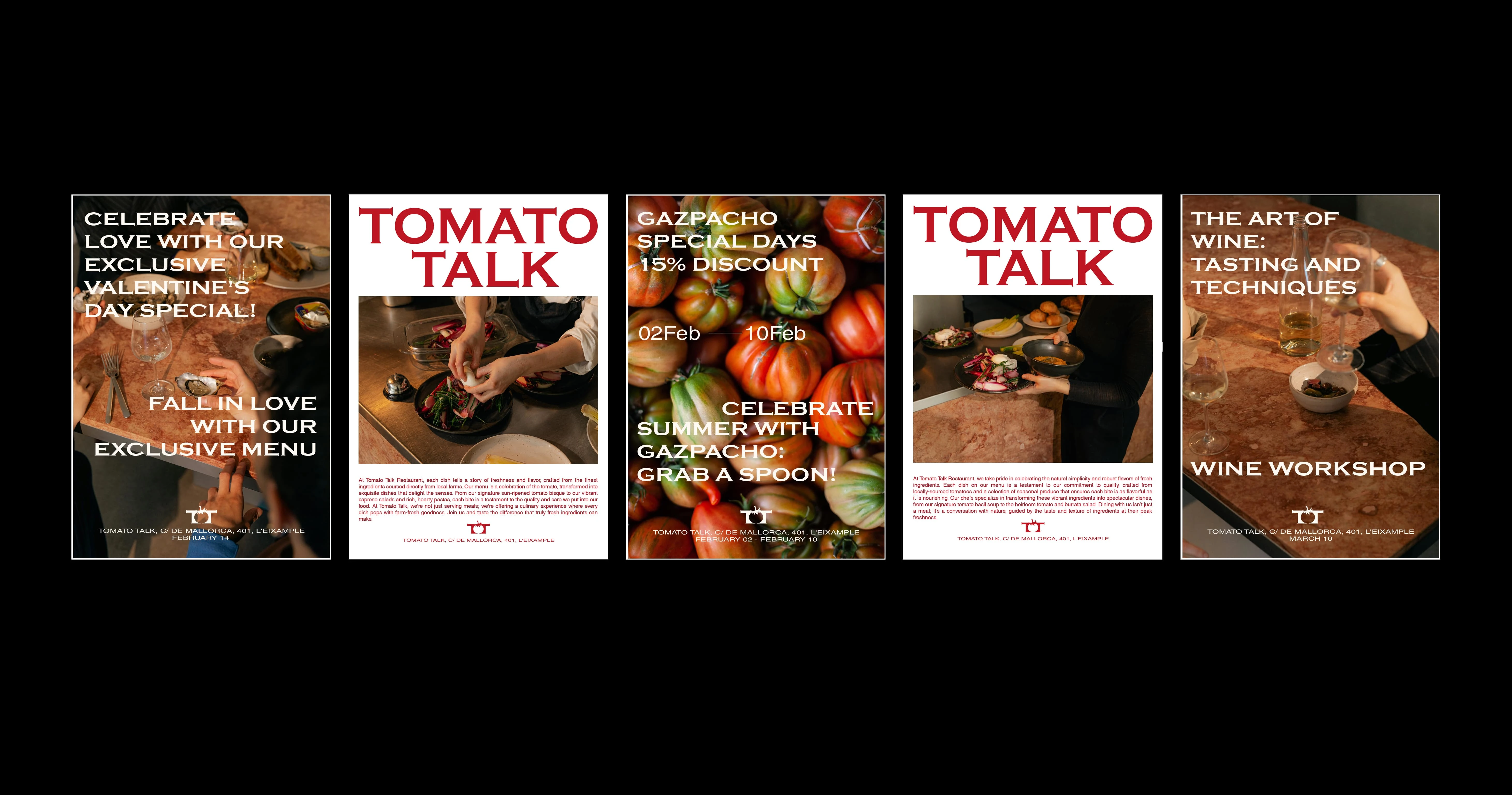
Creative posters concepts for promotions, workshops, and more ⚡
🍅🍅🍅
Ready to see it all? The full project’s just a click away! 🚀 ⬇️
Like this project
Posted Dec 29, 2024
Crafted a standout logo and essential brand print materials for a vibrant Spanish café.