Upward Church Website & Mobile App
Case Study
The Product
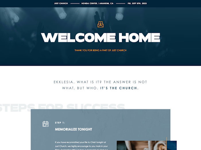
A website and mobile app that includes giving, events, media, and live streaming.
Project Duration: 90 Days
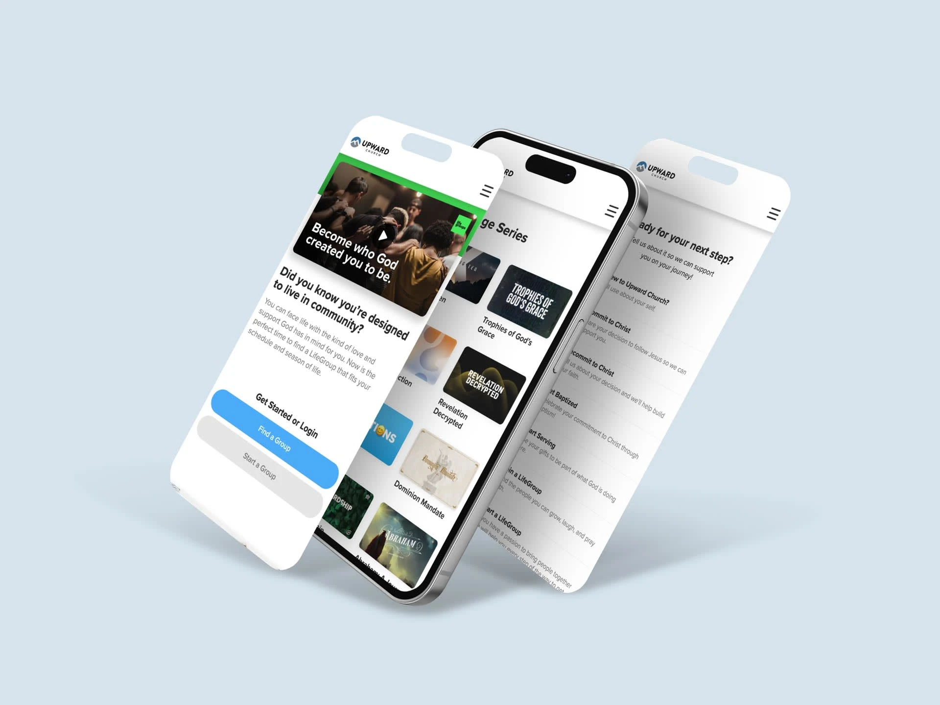
Project Overview
The Problem
Upward church was using multiple platforms and needed to integrate some of these platforms together as one cohesive solution.
The Goal
Design a website and mobile app that meets the week-to-week needs of the church. And improve the UI for a better user experience.
My Role
Lead UX/UI designer, UX researcher & Webflow developer.
Responsibilities
Design of the responsive website and front-end development.
User Research
We researched the different platforms the church was using and other church websites that had features the church was requesting.
Pain Points
Slow load times
The current platforms they were using need to be optimized to increase the performance on mobile devices which made up over 60% of the website's traffic.
Unfriendly User Interface
Navigation was unclear and confusing for some users when signing up for events.
Limited features
The church needs a more streamlined way to capture and process forms with its church management system.
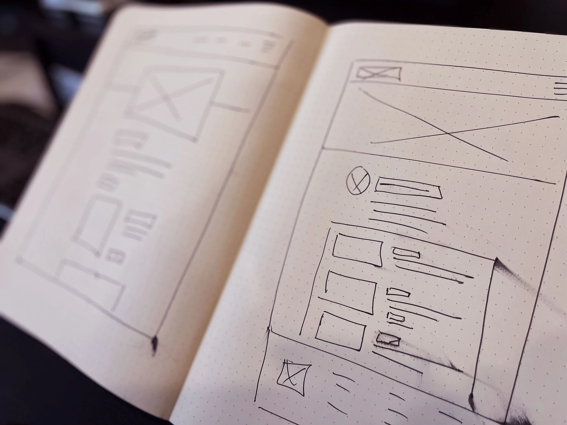
Starting The Design
Starting the design process with paper and digital wireframes, we can begin to see our application or website come to life with the necessary structure, features, and user flows. This will allow us to build a lo-fi prototype of the design for usability testing and additional research.
Usability Study
We conducted a usability study with 15 users current with the lo-fi prototype. Some of the users were volunteers and first-time users.
Finding a Campus
(13 out of 15) were able to find their campuses' information easily.
Layout and Structure
(15 out of 15) found the app and website structure easy to navigate.
Messaging
(10 out of 15) found the app and website to provide clear and concise information about the ministries it provided.
Completing a Task
(12 out of 15) were able to sign up for an event very quickly.
Refining the Design
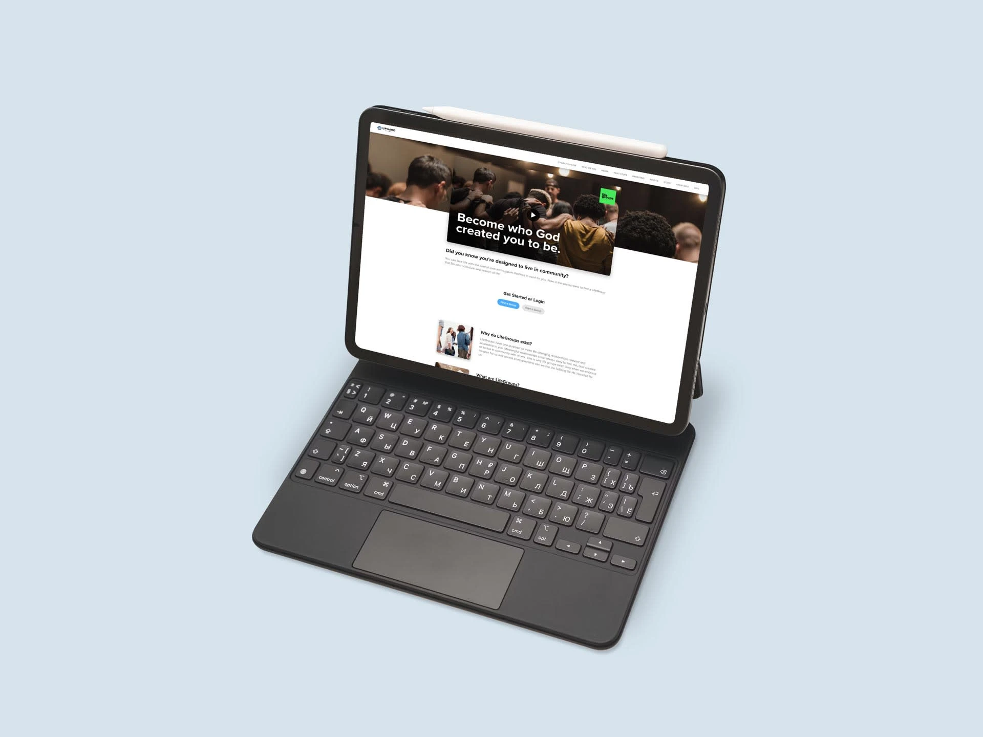
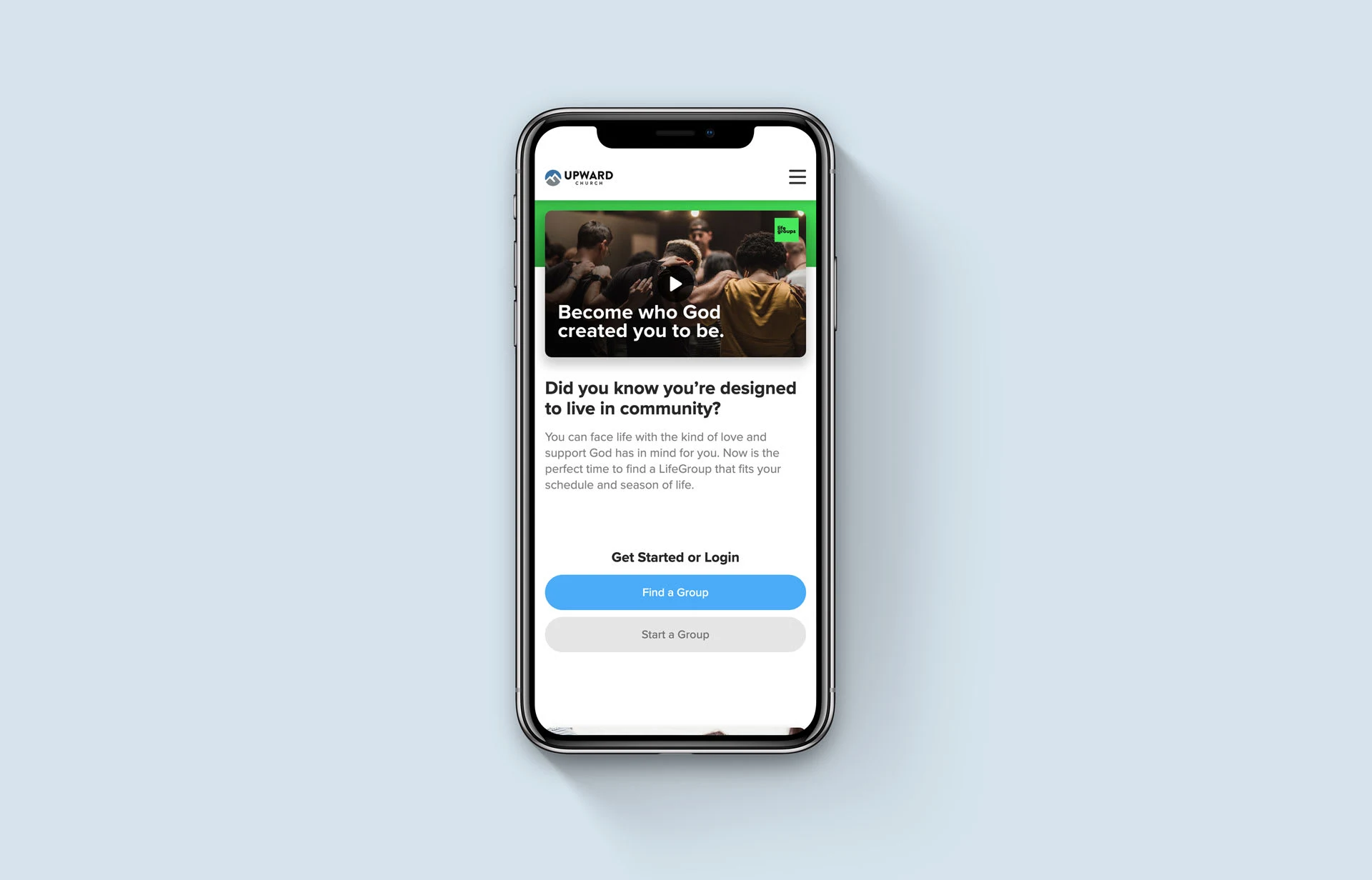
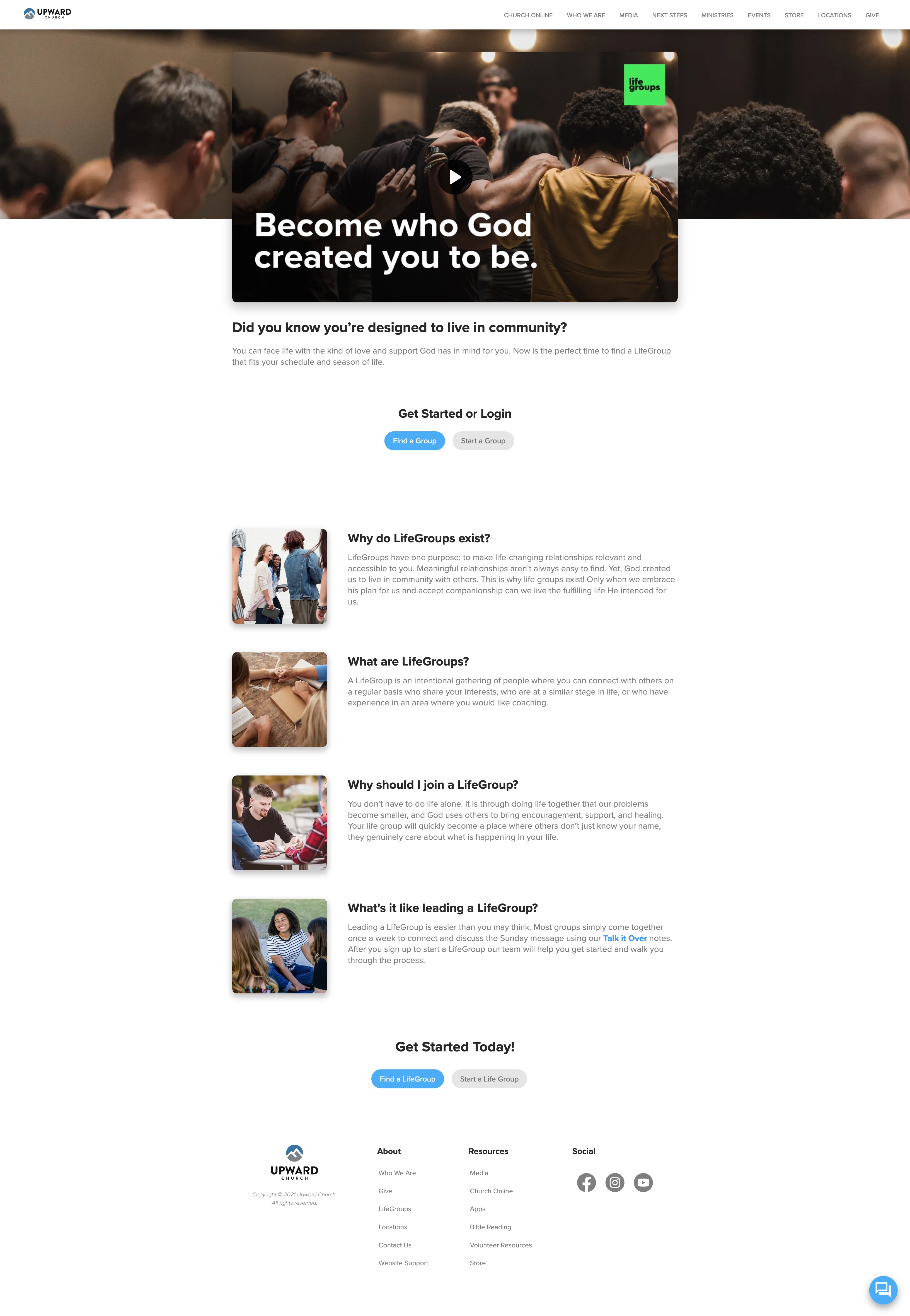
The wireframe was used for the usability study to find the best use cases and layout for the user. High-fidelity mockups and prototypes are then designed.
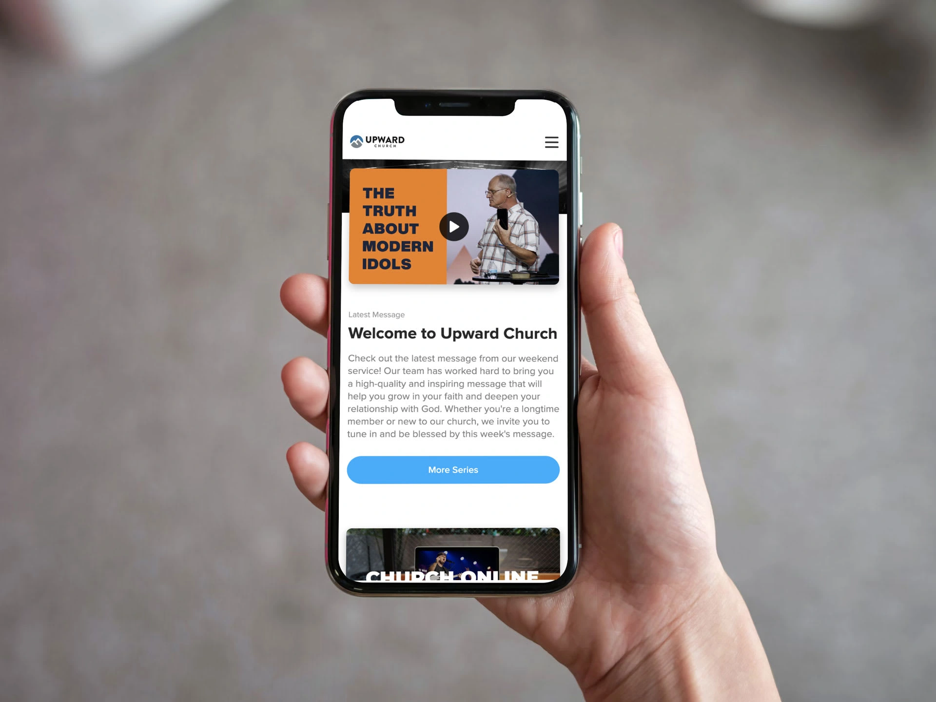
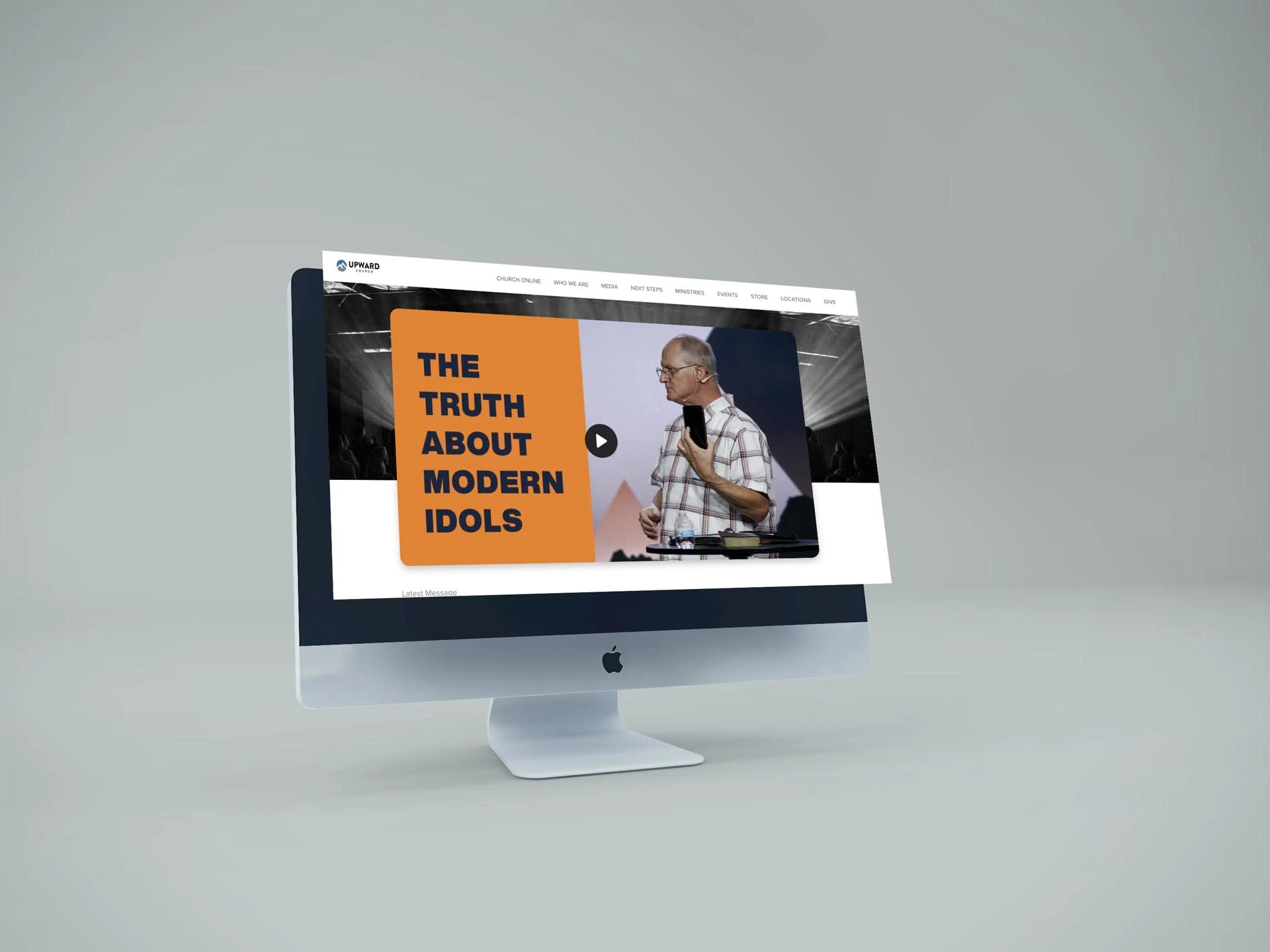
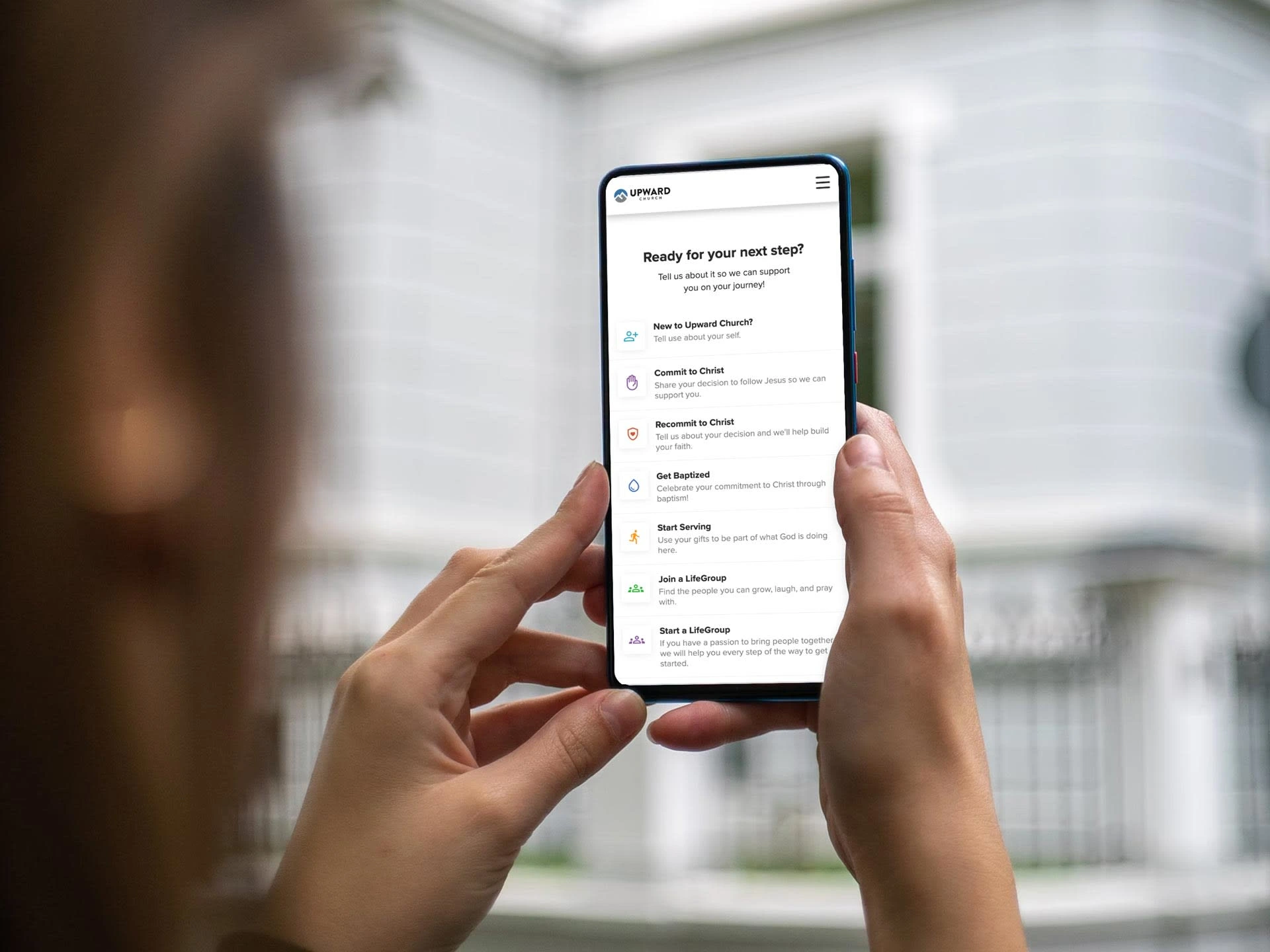
Accessibility
Accessibility was an important factor for users. Many users need to know what accessibility accommodations where available at each location.
Typography
Displayed accessibility options for each campus. and made typography easier to read.
Screen Readers
Formatted the website and app to ensure that screen readers could properly navigate for the user.
Navigation
Made call-to-action buttons bigger to accommodate one-handed navigation.
Like this project
Posted Jul 8, 2024
A website and mobile app that includes giving, events, media, and live streaming for a Multicampus Church.

