Brand Identity and Menu System for Amoretti’s
Arturo Castaneda
Overview
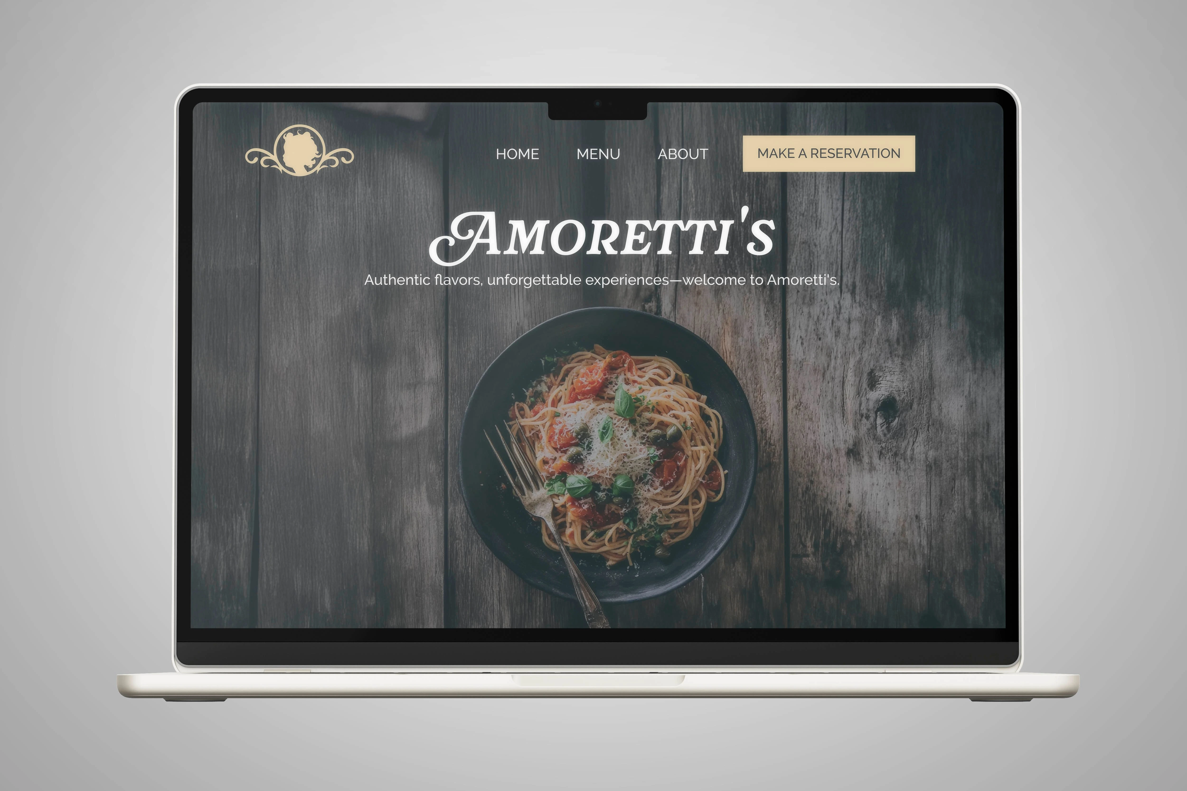
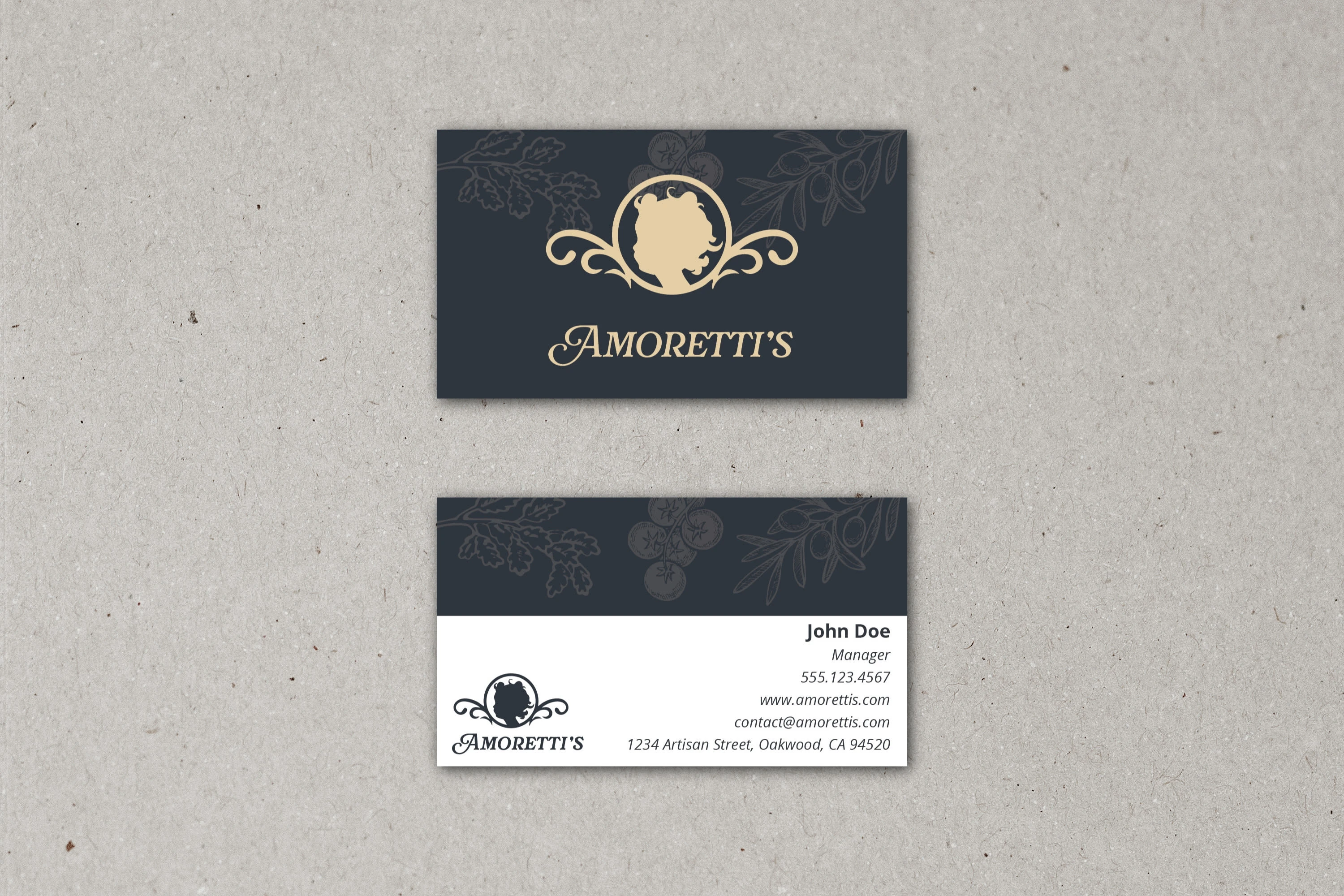
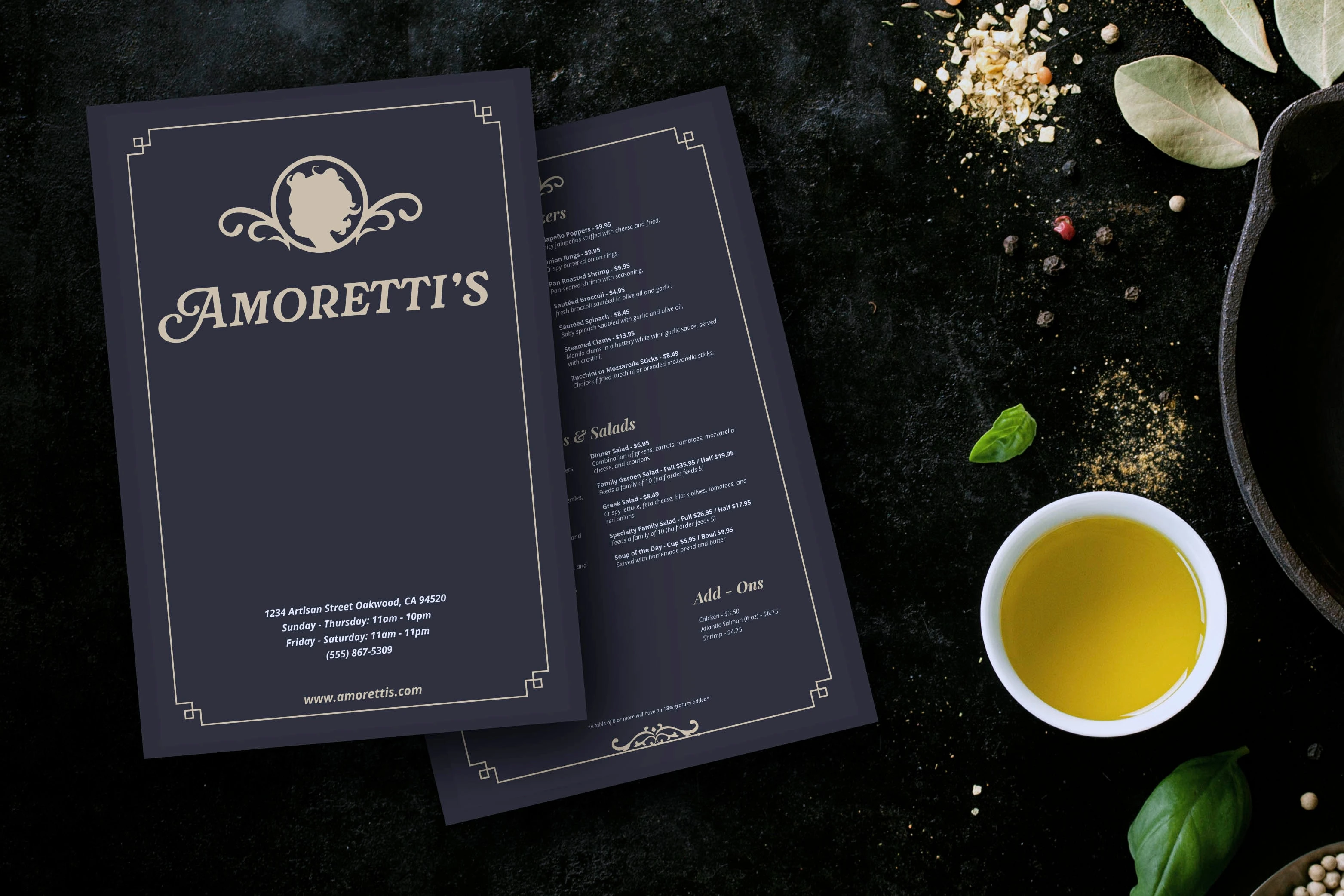
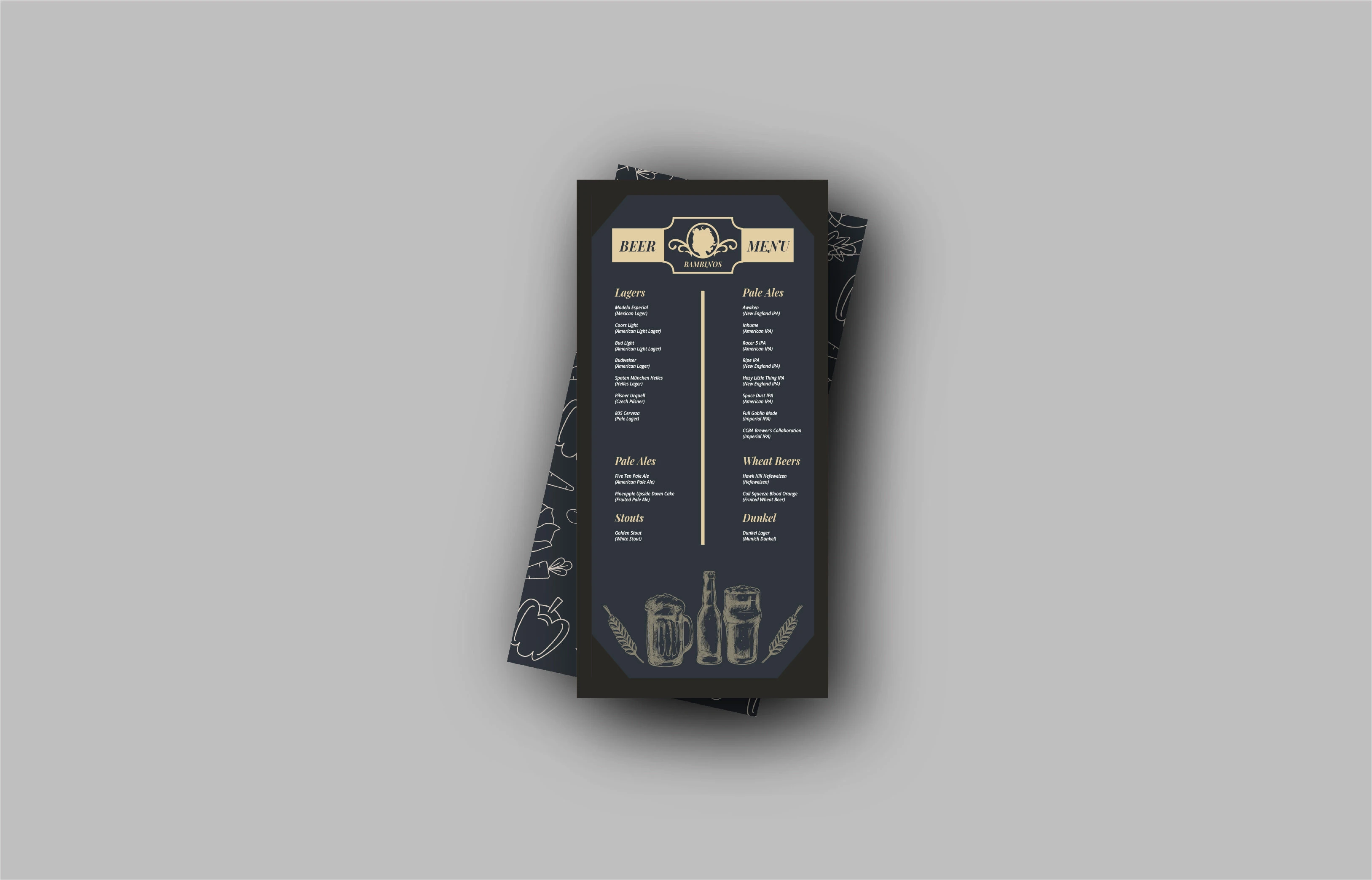
Amoretti’s is a fictional Italian restaurant concept built to explore a refined hospitality-focused brand identity system. The goal was to create a timeless visual language that feels warm, elegant, and grounded in classic Italian dining. The project includes the core brand identity, a full website homepage design, business cards, a dinner menu, and a specialty drink menu.
The Challenge
The challenge was to create a cohesive brand system that communicated comfort, quality, and tradition without relying on clichés. The brand needed to feel elevated for a sit-down dining experience while remaining approachable. Consistency across digital and print materials was essential.
The Solution
I developed a sophisticated identity centered around a cameo-style emblem and a custom serif wordmark. A navy and gold palette forms the foundation of the visual system, paired with subtle botanical illustrations that add texture and personality. Structured layouts, balanced spacing, and classic typography create a polished and memorable experience across every touchpoint.
Menu Design Showcase
Design Objectives
01. Establish a timeless brand identity
A visual system that feels classic and confident while rooted in Italian dining culture.
02. Build cohesion across digital and print
Ensure the website, menus, and business cards feel connected to a single personality.
03. Communicate warmth and quality
Use color, typography, and illustration to create an elevated but welcoming atmosphere.
04. Support scalability
Design assets that adapt easily to signage, packaging, promotions, and future menu materials.
Approach
The direction leaned into heritage cues such as classic serif typography, gold accents, and ornamental framing. The cameo emblem sets the tone with a recognizable focal point. For print pieces, readability and hierarchy were priorities while introducing decorative linework and subtle food-inspired illustrations.
Secondary Menu Showcase
Process
Concept Exploration
Sketches focused on balancing elegance and approachability while exploring variations of the cameo emblem.
Visual Language Development
Once the emblem and wordmark were finalized, I built the supporting palette, typography system, and illustrations.
Application Across Touchpoints
The website page, business cards, dinner menu, and drink menu were designed as a unified visual system. Each asset reinforces the brand narrative through consistent layout and styling.
Final Design
The final identity represents a refined and cohesive brand system that elevates the dining experience. From the website preview to the printed menus, every asset reflects the charm and quality of Amoretti’s. The system sets up the brand for future expansion into signage, packaging, promotions, and additional menus.
Like this project
Posted Dec 16, 2025
Developed a full brand identity and menu system for Amoretti’s, including logo design, website layout, business cards, and printed menus.