User Activation Enhancement for Znany Lekarz
Gleb Sapronov
What is ZnanyLekarz?
ZnanyLekarz.pl is a widely used online platform in Poland that connects patients with healthcare professionals. It enables users to search for and book appointments with doctors, dentists, and other specialists. The site offers detailed profiles of healthcare providers, showcasing their qualifications, specialties, patient reviews, and availability, helping patients make well-informed decisions when selecting a healthcare provider.
1. User activation
For ZnanyLekarz, user activation happens when a new user successfully books their first appointment with a healthcare professional. This moment shows that the user has grasped the platform's value and has navigated through the process of finding a doctor and scheduling a visit.
User journey
The user journey on ZnanyLekarz.pl begins with two primary entry points:
Via Search Engine: The user searches for a specific doctor (e.g., "dermatolog Warszawa") on a search engine and clicks on the ZnanyLekarz link.
Direct Website Visit: The user directly visits the ZnanyLekarz homepage and begins searching for a specific doctor from there.
From this point, positive scenario of the user journey follows the same steps for both entry points:
1. Viewing Search Results: The user sees a list of doctors in their specified area, with clear and comprehensive profiles, ratings, and available appointment times.
2. Exploring Options: The user browses through the list, using advanced search filters to narrow down choices by specialties, availability, and location.
3. Reading Reviews: Optionally, the user reads patient reviews to gather more information about potential doctors.
4. Selecting an Appointment: The user chooses a doctor, selects an available date and time, and clicks on the appointment option.
5. Confirming the Appointment: The user confirms the appointment details and proceeds to the payment stage, if applicable.
6. Receiving Confirmation: The user receives a confirmation email with the appointment details.
7. Attending the Appointment: The user attends the appointment at the scheduled time.
8. Providing Feedback: After the appointment, the user is invited to leave a review of their experience.
This user journey highlights the streamlined and user-friendly process on ZnanyLekarz.pl, from initial search to post-appointment feedback, ensuring a positive and efficient experience for all users.
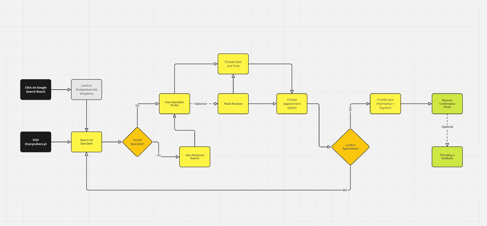
User journey was made in Miro
2. Research
The goal of this research is to identify and address usability issues on ZnanyLekarz.pl, enhancing the user experience by implementing targeted improvements.
Qualitative research
After researching the user journey of ZnanyLekarz, I decided to conduct qualitative research with five respondents to gather their opinions on the service. I began by seeking respondents among my friends, posting an inquiry on my Instagram story to find those who had used ZnanyLekarz or frequently book appointments with similar services like Luxmed and Enelmed. My aim was to evaluate the service from the perspectives of both new users and experienced ones.
I used a tool called Lookback to capture real-time user experiences.
By asking my respondents open-ended questions, I aimed to understand their perspectives and identify any pain points.
Instructions for participants:
1. Scenario: Imagine you have a severe toothache and urgently need to book a dentist appointment in Warsaw. Your friends have recommended [ZnanyLekarz.pl](http://znanylekarz.pl/) as a reliable service for finding doctors. Try to book an appointment for yourself, starting from your browser's homepage.
2. Verbalize Your Thoughts: As you navigate through ZnanyLekarz.pl, please share all your thoughts out loud. Explain why you are choosing specific buttons, links, or actions on the website. Describe what you find easy or difficult, and mention any features you find particularly helpful or confusing.
3. Be Honest: Your honest feedback is crucial. There are no right or wrong answers, and every detail you provide will help us improve the website for all users.
4. Ask Questions: If you encounter any issues or have any questions during the process, don't hesitate to ask. We are here to listen and learn from your experience.
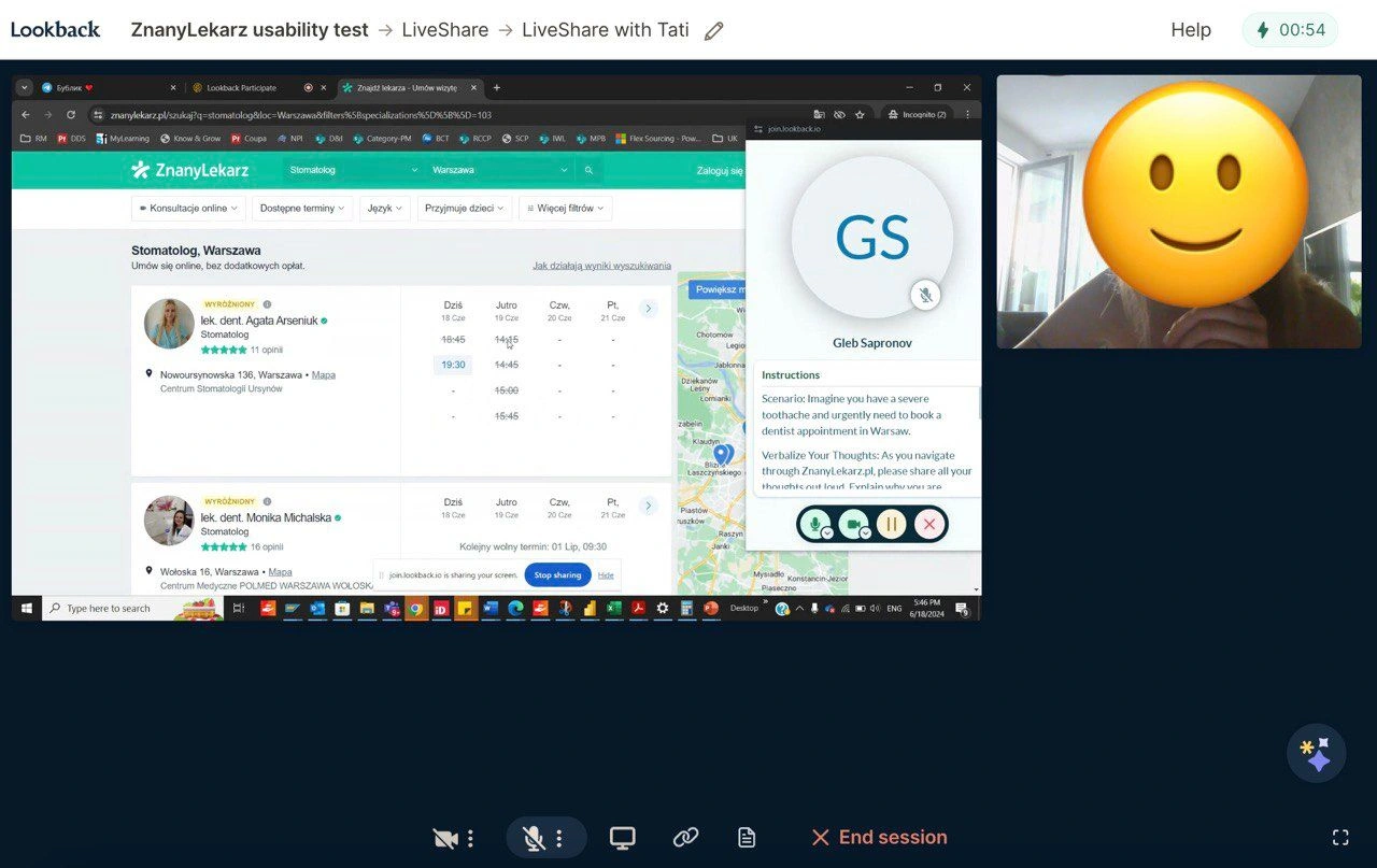
Lookback session with one of the participants
Results
Most respondents highlighted the absence of a direct option to change the language of the page, with only a Google Translate feature available.
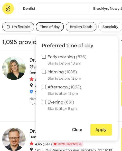
Respondents found it challenging to use the provided "time filters" as there is no option to select specific times like morning or evening. They need to manually check availability using the calendar near the doctor's section.
Many respondents suggested the need for a concise form that could filter all doctor options to find the "perfect fit."
All respondents noted confusion about how doctors are sorted, emphasizing the lack of options to sort them by highest ranking or other useful filters.
I also conducted a Yes/No analysis during my sessions with the participants. I examined which starting points my respondents used, whether they utilized the map, reviews tab, and appointments, and if they changed the language settings.
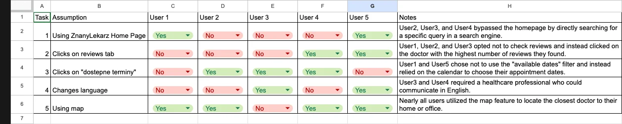
In summary, respondents identified several usability challenges with ZnanyLekarz.pl. They unanimously noted the absence of a direct language change option, relying solely on Google Translate. Users also found the "time filters" cumbersome, requiring manual checking of availability. Many suggested a streamlined form for doctor selection. Additionally, all respondents expressed confusion over how doctors are sorted without options to sort by ranking. Furthermore, they observed that the homepage appears cluttered with text, though they recognized its sole purpose is for searching doctors.
In my opinion, the homepage is overloaded with information, likely due to its design to maximize SEO opportunities.
Desk research
After completing the qualitative research, I decided to conduct a brief desk research focusing on competitors in various markets.
My goal was to investigate how these competitors address the pain points identified in my previous research.
To identify competitors of Docplanner Group (owner of ZnanyLekarz.pl), I visited CB Insights website and selected competitors with similar page structures based on my assessment.
You can find the chosen competitors here: [CB Insights - Docplanner Competitors](https://www.cbinsights.com/company/docplanner/alternatives-competitors)
Zocdoc https://www.zocdoc.com/
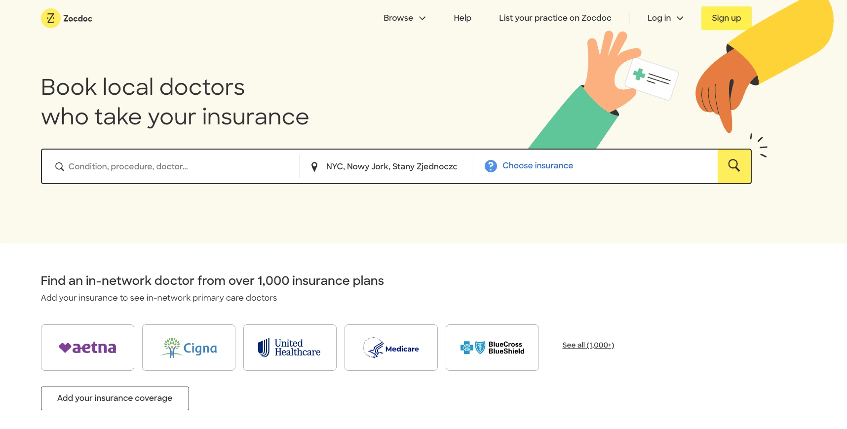
Zocdoc is an online platform and app widely used in the United States, designed to simplify the process of finding and scheduling medical appointments with healthcare providers. It allows users to search for doctors based on specialty, location, accepted insurance plans, and available appointment times. Patients can also read reviews and ratings from others to help them choose the right healthcare provider.
Zocdoc aims to make booking appointments easy and convenient, offering a user-friendly experience both on desktop and mobile devices.
After you begin searching for a dentist appointment, the service will prompt you to select from several options regarding the type of care and specify the nature of your dental issue.
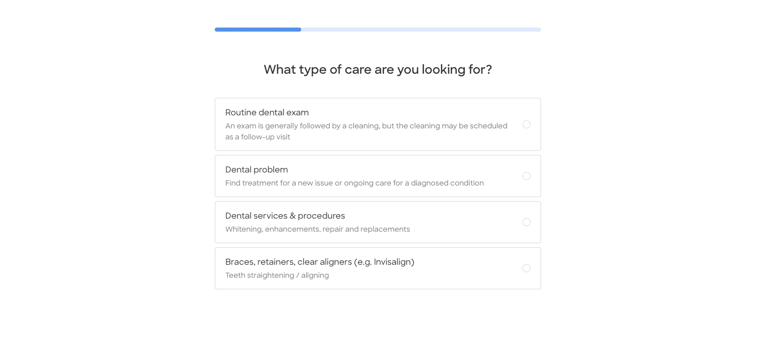
💡This feature ensures a perfect match for the user by sorting the best-matching doctors from the full list of available options based on your specified type of care and health issue.
After completing the short form, the user lands on a full list of healthcare providers. One notable difference compared to ZnanyLekarz.pl is the abundance of filter options.
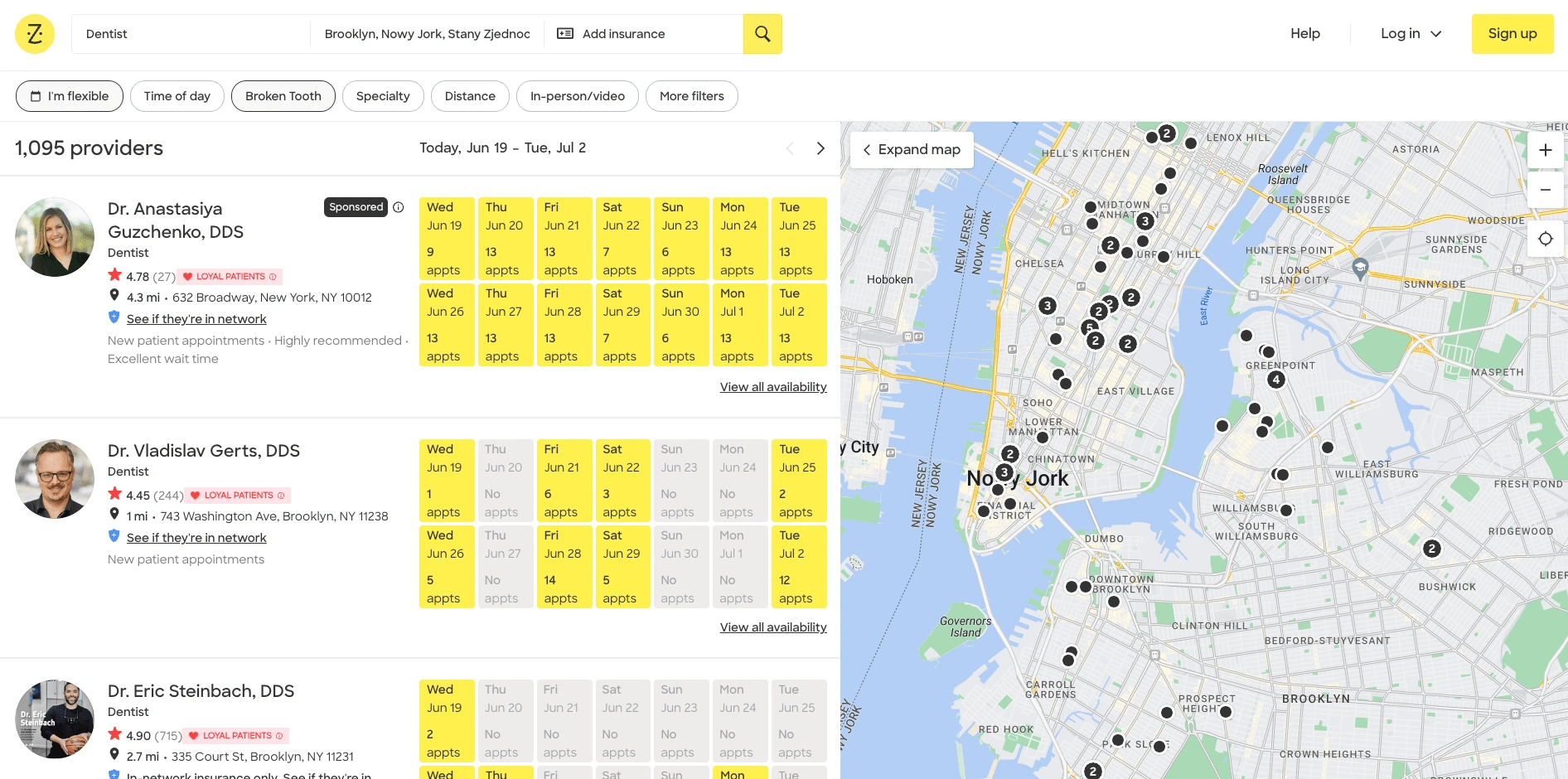
💡For instance, there is a time-of-day filter, which was highly requested by respondents during my research sessions.
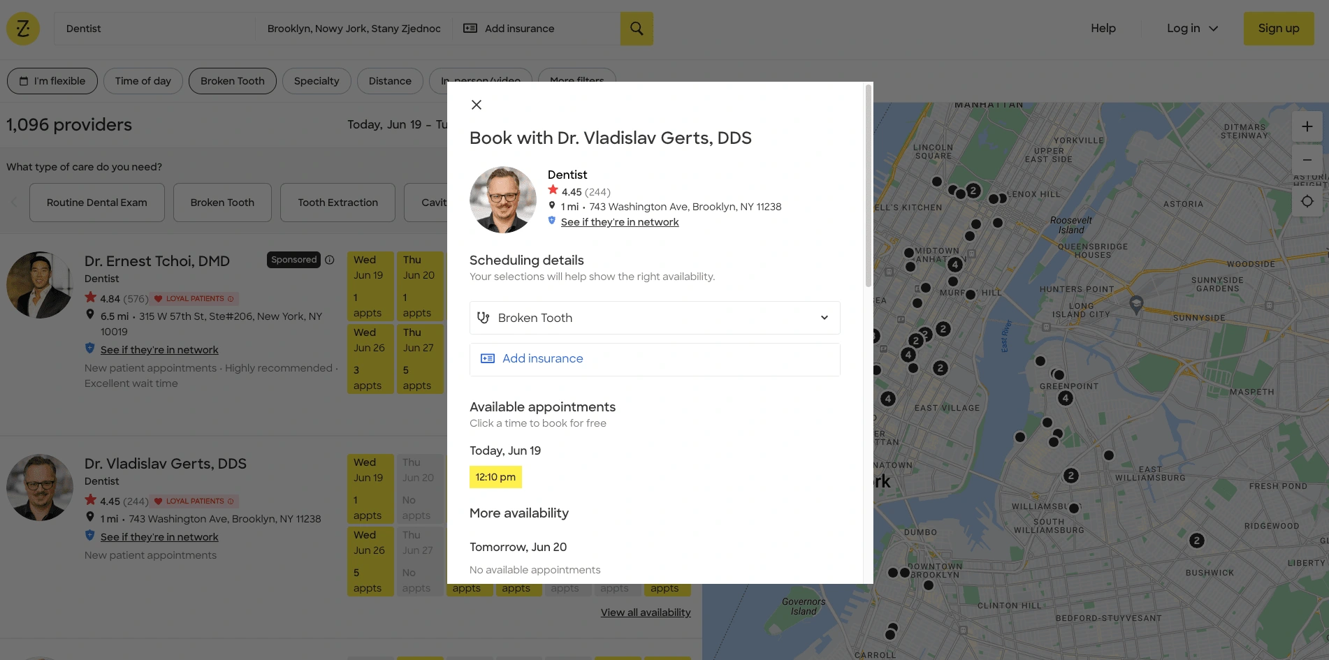
💡 Additionally, when the user selects a doctor, the appointment options open in the same window, making it easy for users to navigate back to the list if they choose to do so.
3. Identifying opportunities
Based on the feedback and observations from my research sessions, several key opportunities have been identified to enhance the user experience on ZnanyLekarz.pl:
1. Time-of-Day Filter: Adding a filter for specific times of the day (morning, afternoon, evening) would streamline appointment booking based on user preferences.
2. In-Window Appointment Options: Implementing appointment options within the same window simplifies navigation, allowing users to seamlessly return to the doctor list without losing their place.
3. Customized Doctor Sorting: Enhancing sorting capabilities based on user-specified care types and health issues ensures a more personalized and efficient experience in finding the most suitable doctors.
4. Multi-Language Support: Providing a direct language change option enhances accessibility for international users, moving beyond reliance on Google Translate.
5. Streamlined Doctor Selection Form: Simplifying the selection process with intuitive filters and sorting options helps users quickly find their ideal healthcare provider.
6. Enhanced Sorting Mechanism: Introducing sorting options by criteria such as highest ranking or user reviews improves decision-making clarity and user satisfaction.
By addressing these opportunities, [ZnanyLekarz.pl](http://znanylekarz.pl/) can significantly enhance its user experience, making it easier, more efficient, and more satisfying for users to find and book healthcare appointments.
4. Wireframes + UI Screens
Key Focus Points for Wireframing
Language Options: Add a prominent language icon on the homepage to improve accessibility.
Opinions Section: Revamp the opinions section on the homepage, inspired by ZocDoc's design for better user experience.
Questionnaire Screen: Introduce a short questionnaire screen after the homepage to filter and match users with the best-suited doctors.
New Filter Options: Add additional filters on the doctor’s list page, including a "time of the day" filter, which was identified as crucial during user research.
Considering the importance of this project and the need to keep it concise, I've created a wireframe sketch in my notebook using just a pen and paper 😊
Once the wireframes were complete, I began working on UI prototypes. To expedite the process, I used the Figma plugin 'HTML to Figma' to quickly import the original ZnanyLekarz website, saving significant time. With the HTML transformed, I started implementing the website updates, which you can see below:
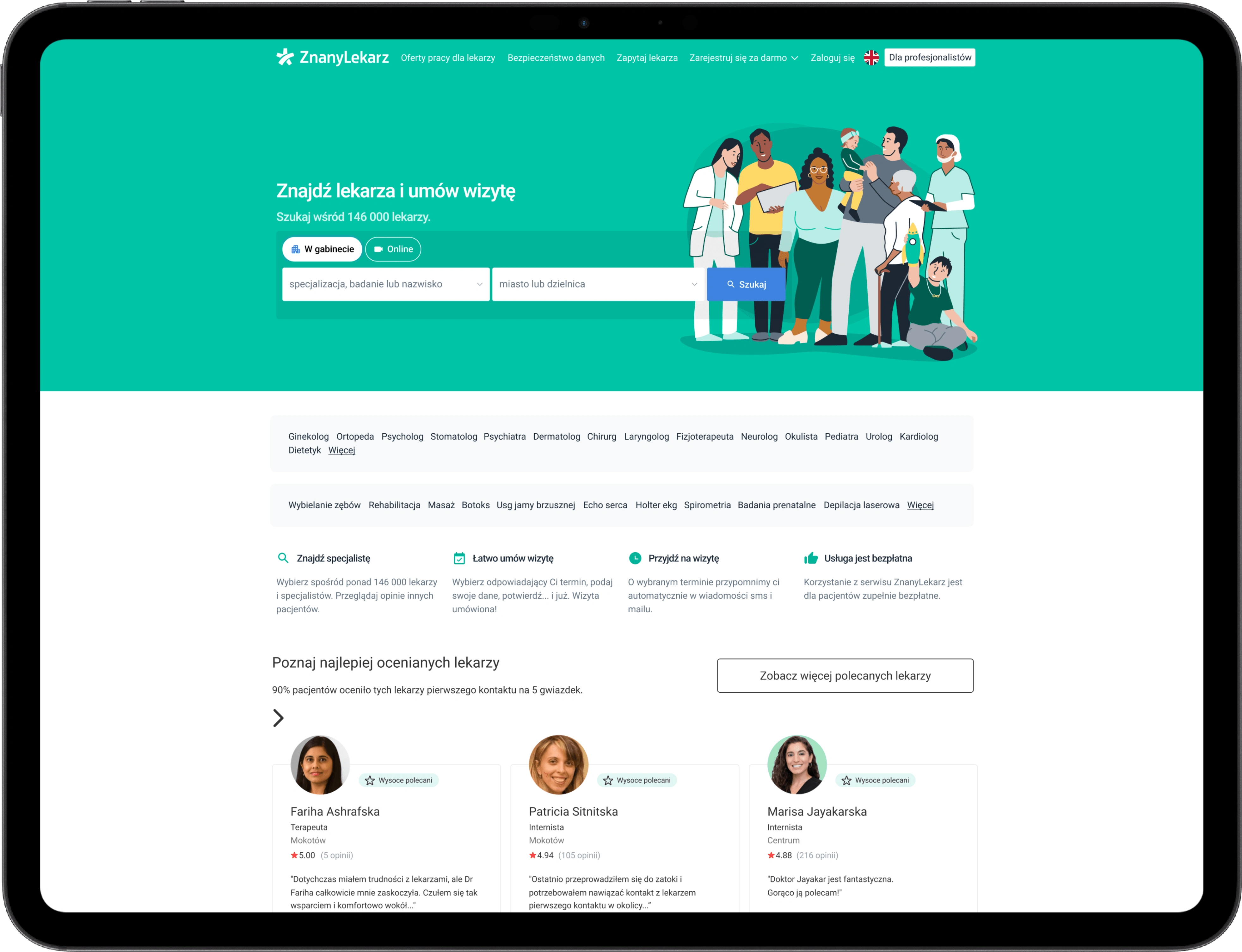
After identifying several pain points, I've decided to include language options prominently on the home screen, represented by bright flags. This design choice ensures that users can quickly and easily recognize and access language preferences.
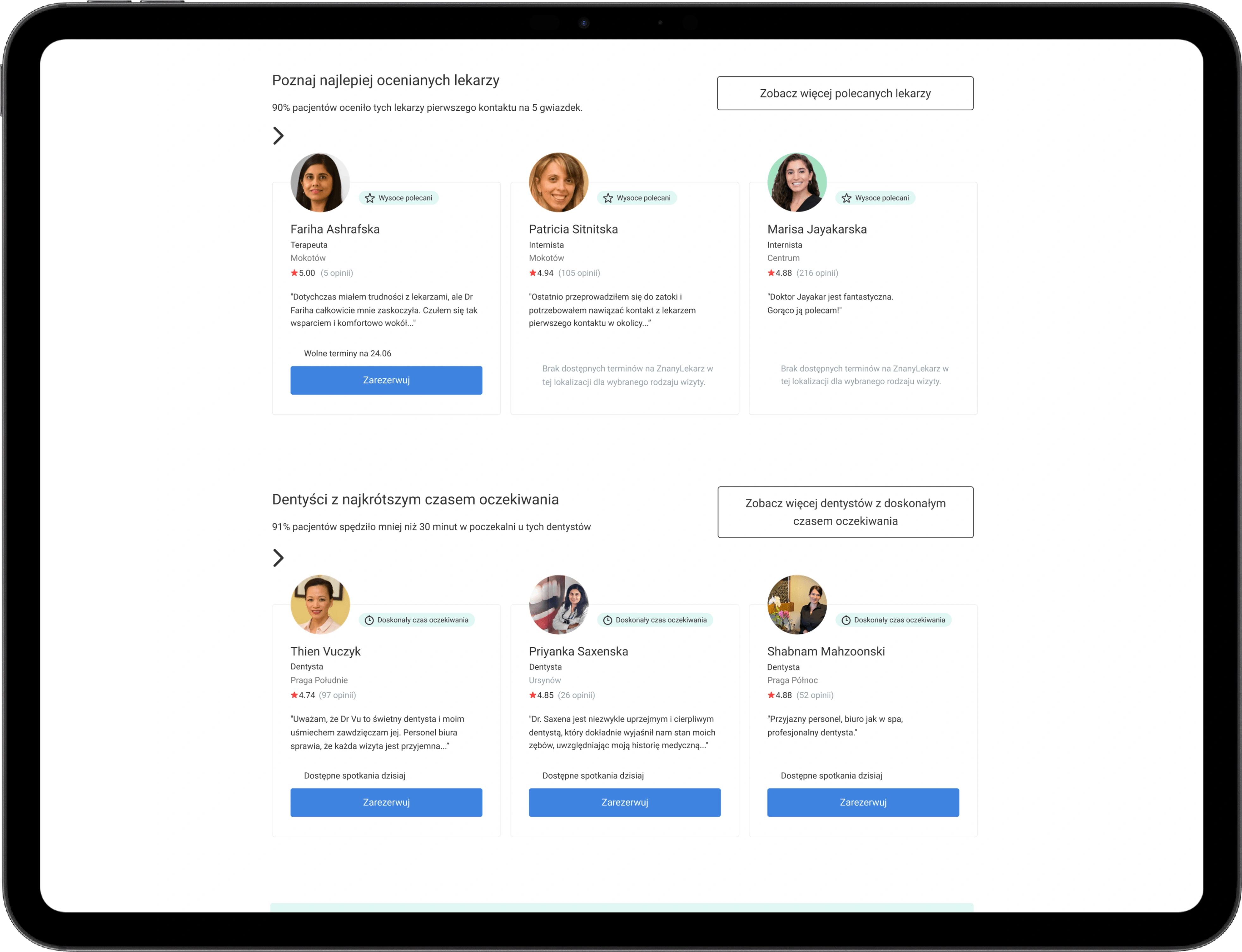
On the same page, I've decided to streamline the reviews section and incorporate scrollable doctor profiles. This decision draws inspiration from features found on the ZocDoc web application.
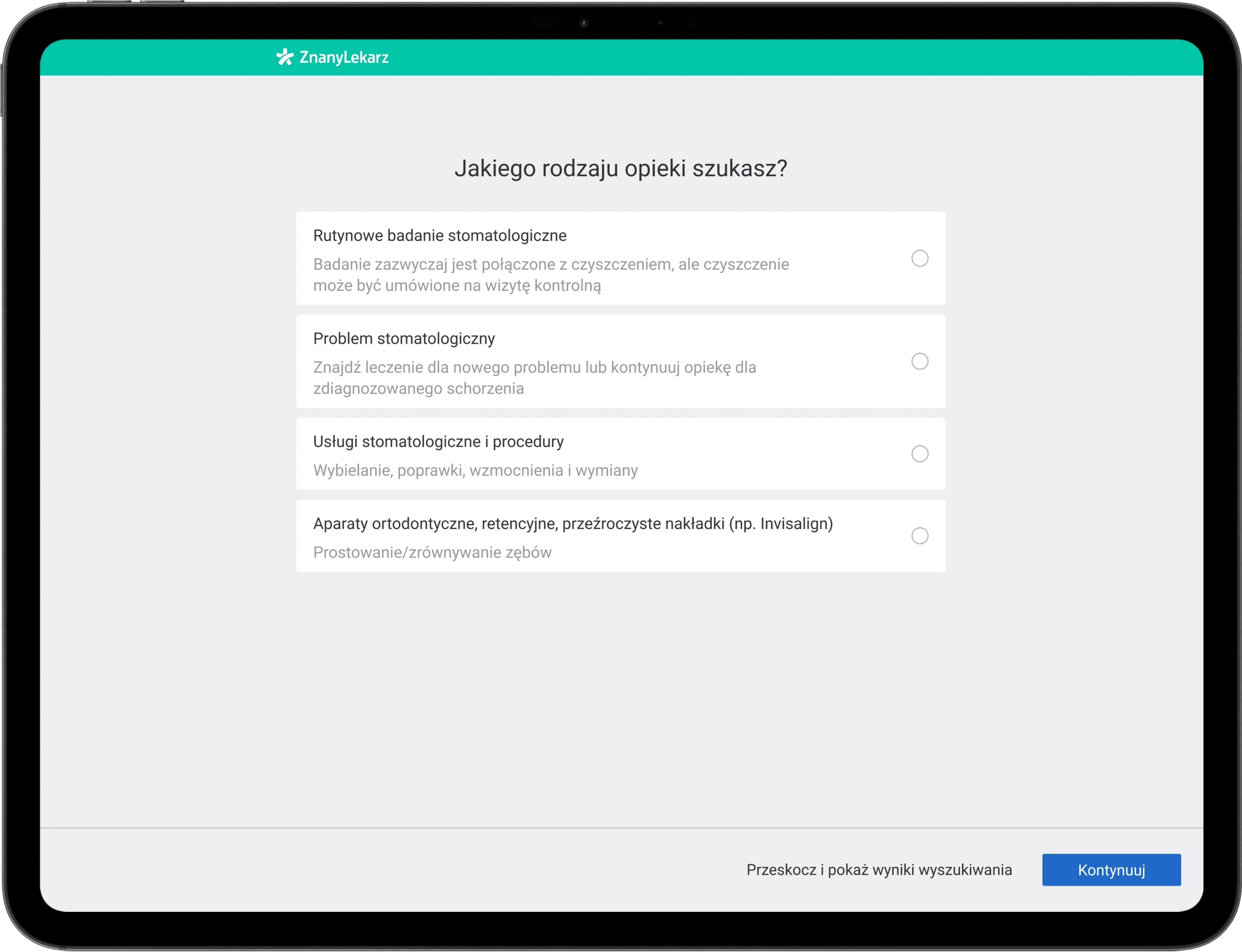
The third screen I've designed serves as an information clarification tool for users. Once fully completed, it acts as a filter that directs the user to a page displaying doctors that perfectly match their criteria. This eliminates the need for further searching, providing users with tailored results efficiently.
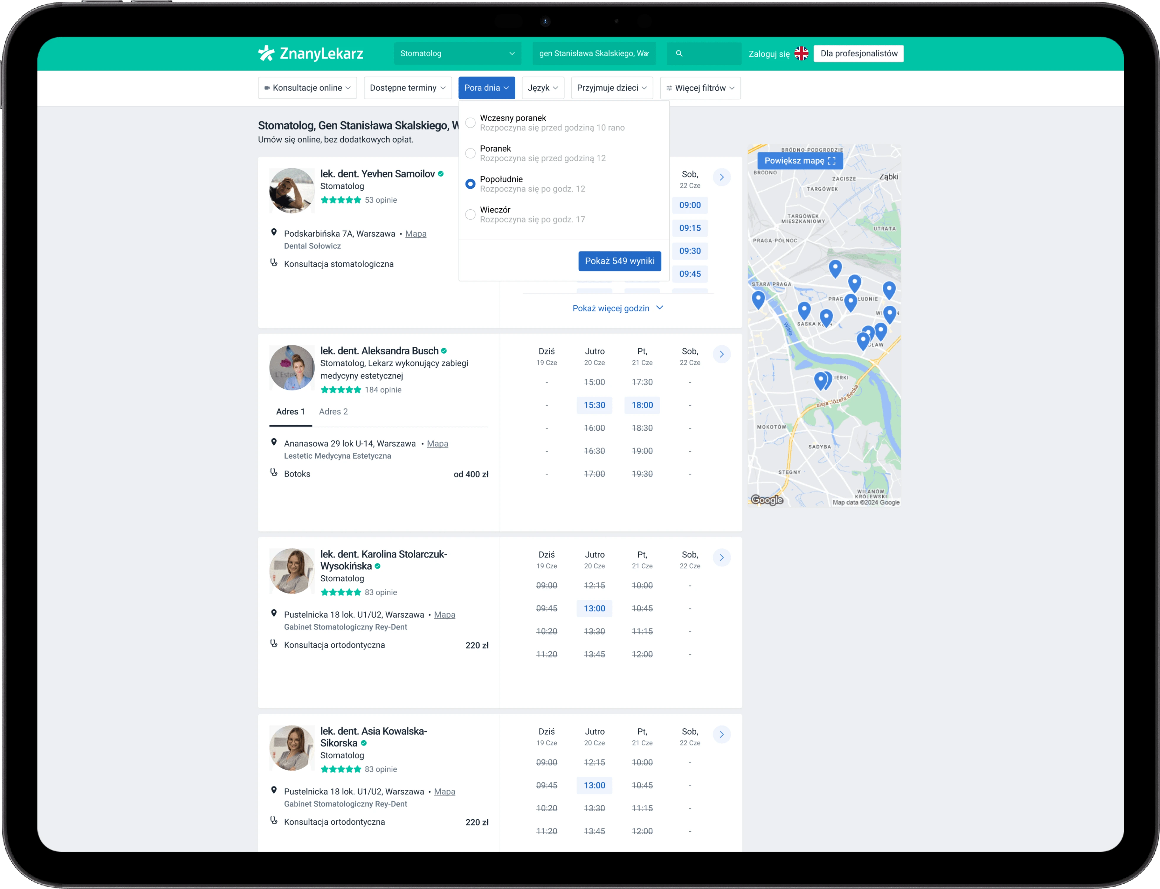
The last screen I worked on is a list of doctors, and my focus was on enhancing it with additional fitting filters, such as a "time of day" filter. This feature allows users to schedule appointments during the most convenient time slots for them.
5. Conclusion
To validate the proposed enhancements, I would conduct rigorous A/B testing. For instance, adding a "time of the day" filter assumes more users will find suitable slots and book appointments. The A/B test will compare the current website (control) with the updated version featuring the new filters (test). Key metrics include activation rate, user satisfaction, and time to book.
Through research and user feedback, several insights have emerged about ZnanyLekarz.pl:
Usability Challenges: Users face issues such as the lack of direct language change options and cumbersome time filters.
Enhancement Opportunities: There is a demand for improved filtering options, a more intuitive doctor selection process, and better language accessibility.
Comparison with Competitors: Competitors offer advanced filtering and streamlined booking, indicating areas for improvement.
User Experience Enhancements: Features like in-window appointments, customized doctor sorting, and a clearer homepage can boost satisfaction and usability.
Addressing these insights through targeted improvements will enhance the user experience on ZnanyLekarz.pl and better meet user needs.
Thanks for watching!
Like this project
Posted Jul 8, 2024
Conducted research for ZnanyLekarz.pl, identifying usability issues and proposing improvements in filtering, booking processes, and overall interface design.