UX Audit - GeoIQ
🚀 My Process
I will follow this iterative process for auditing a product:
Evaluating the UX and UI
Redesign

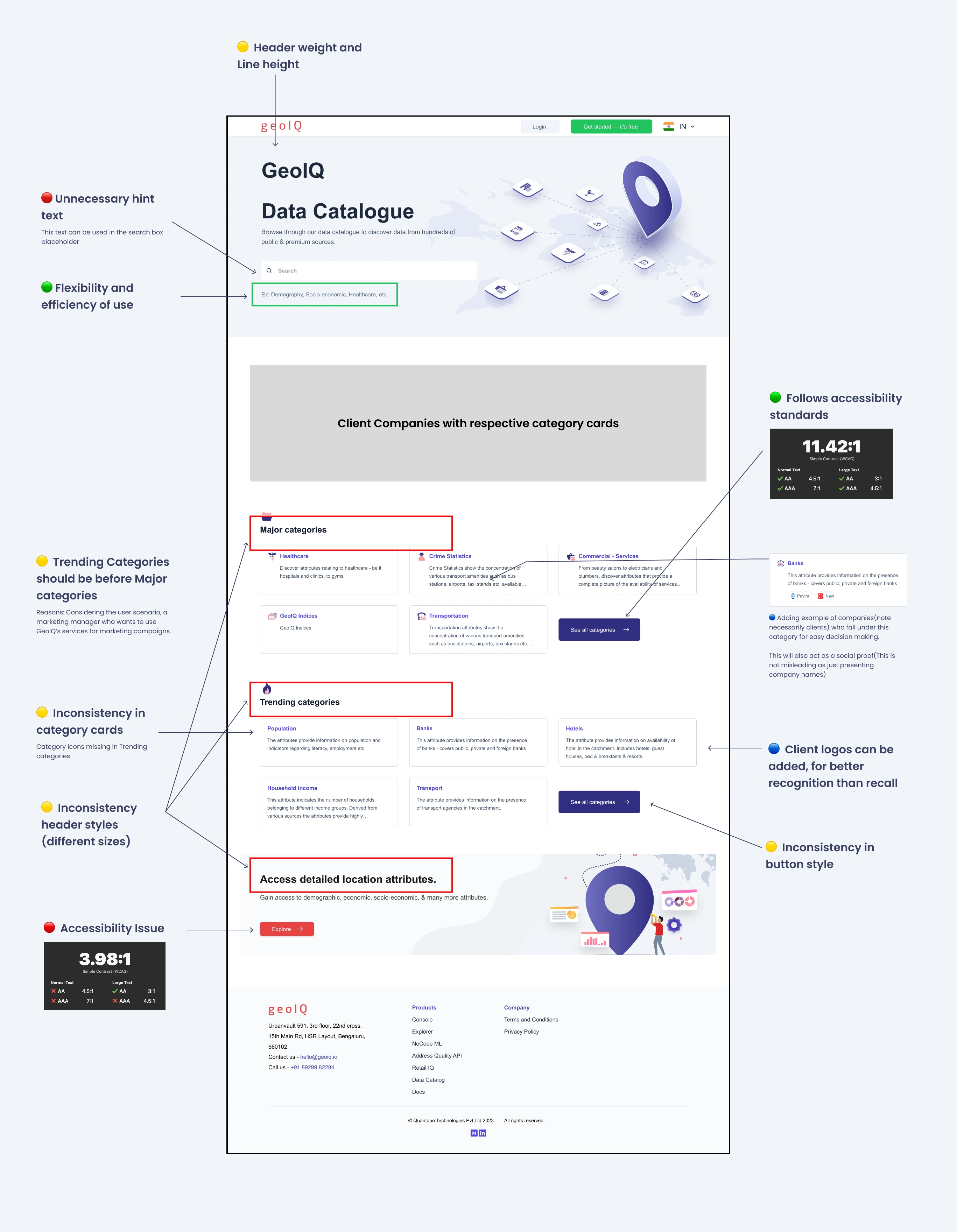
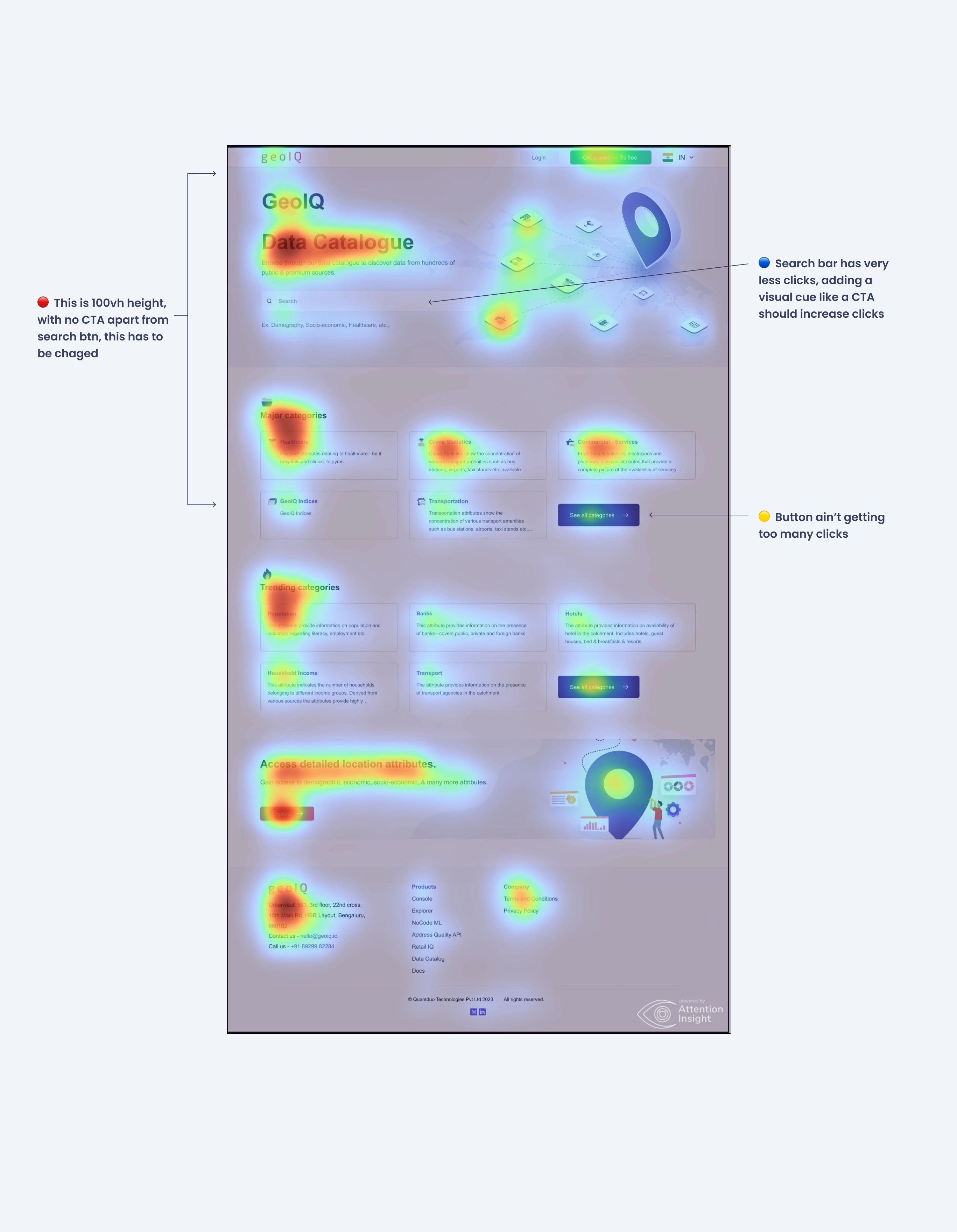
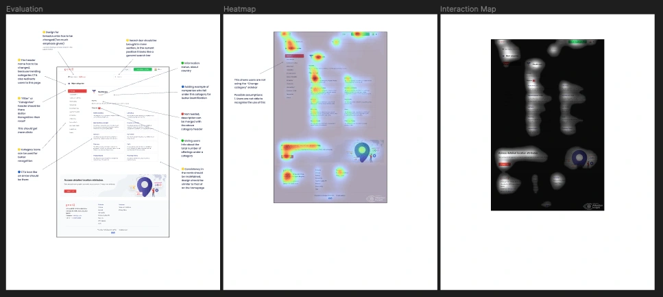
🛠️ UX and UI Evaluation
🟢 Green - It is good, keeping it as is.
🟡 Yellow - Small changes required.
🔴 Red - Removing element or changing fully.
🔵 blue - Adding new elements
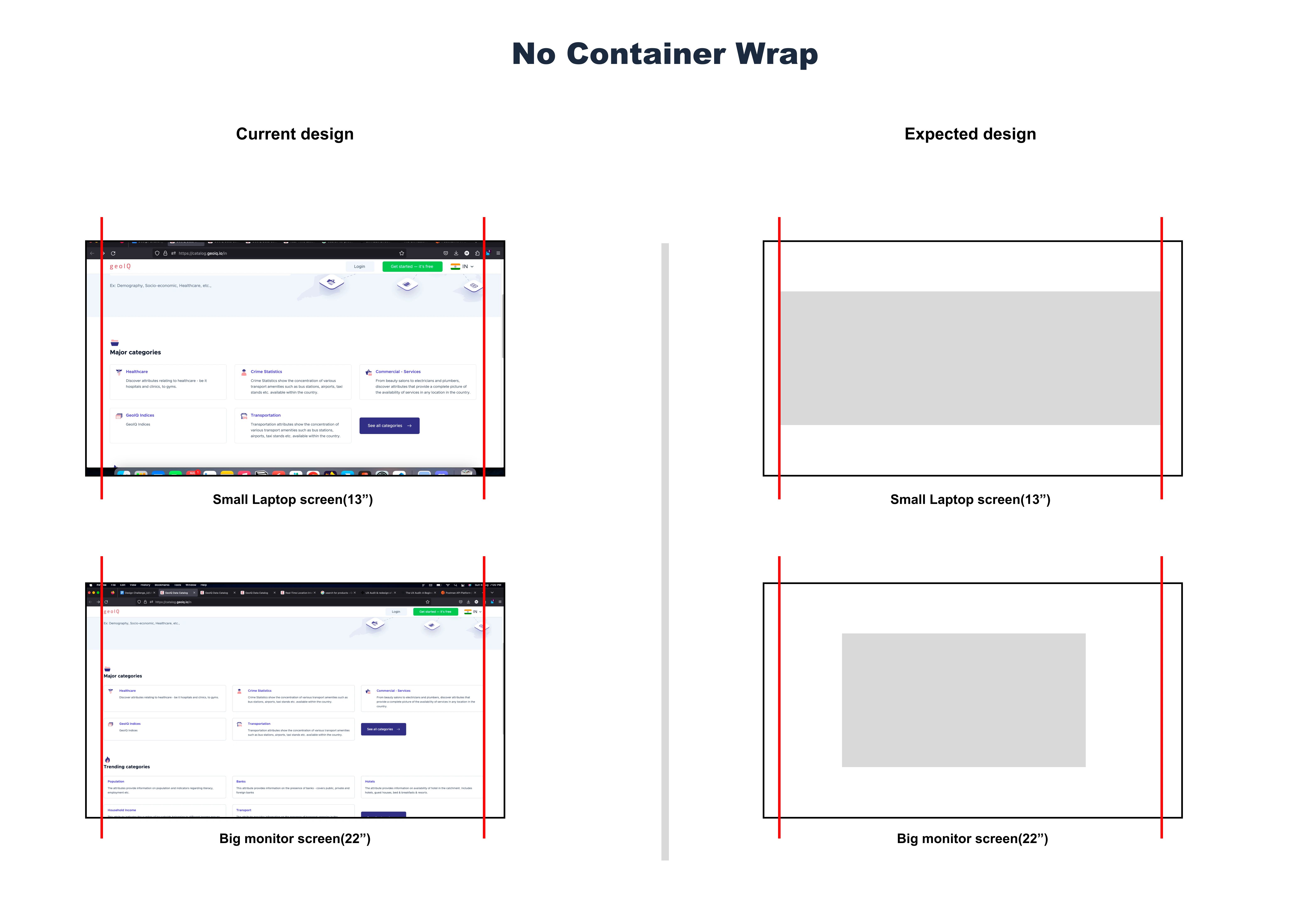
🪜 Some Layout Fixtures

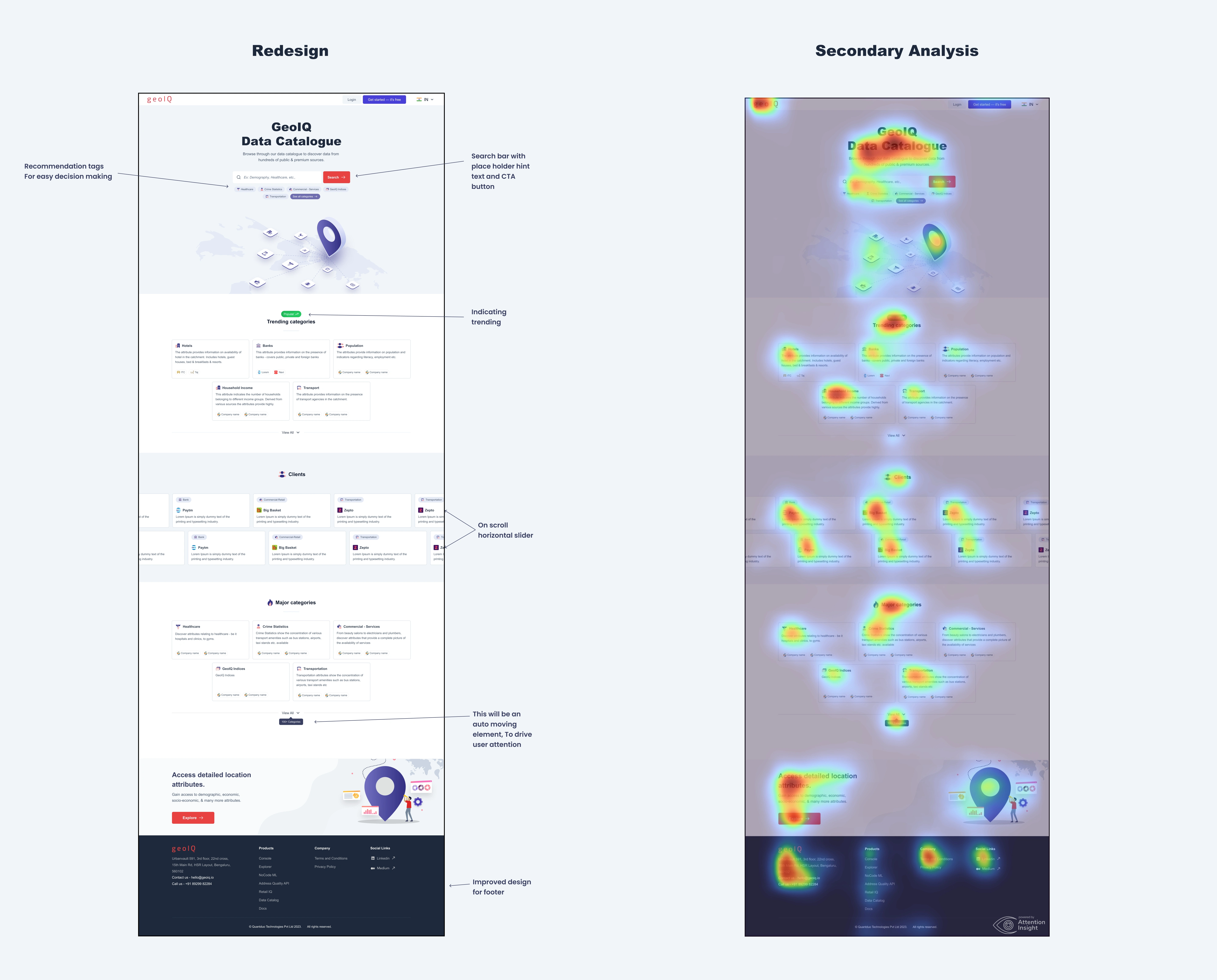
🎨 Redesign - Along with Secondary Analaysis
The new design incorporates all the changes and recommendation I suggested above in the evaluation, used and cleaned up the components of the existing website.
At the end of the redesign I have achieved:
Matched AA-AAA contrast standard for all text on the page.
Redesigned the Hero section to be cleaner.
Enhanced sub-category/attribute section design in the Detail page
Improved table design in Detail page
Assumption: Increase credibility by including value propositions
Enhanced UX by improve user control(eg: recommendation tags in hero section)
Drew attention to the category side bar for easy navigation and also enhanced the designs
Improved sub-category card designs in the Major Category page
Improved responsiveness across different pages
Improve Typography styles(Font color, font weight and line height) to ultimately improve information hierarchy
Home Page
Want to checkout the redesigns for other pages: Click here

Timeline & Details 📅
Auditing the website for GeoIQ took me
5 daysUX Audit timeline de
Landing page (one page):
1 weekMulti page website (3+ pages):
2 weeks and more, depending on the amount of pagesConclusion 💥
I was successful in improving the designs for core GeoIQ website pages as seen from the Interaction heat maps.
If your product needs auditing and redesigning, you know whom to contact: Click here
Like this project
Posted Aug 29, 2023
I conducted a detailed UX audit of the website, considering usability, accessibility & information architecture and redesigned it according to brand guidelines

