Saborit™— NOW Duquesas 🍰
Sol Maite — S997S™
Verified
Welcome to the new vision of Saborit.
Saborit returns to where it has always called home, Venezuela. It brings new proposals, aiming to change the game and innovate, from the selection of authentic flavors to the way it presents itself to its new audience.
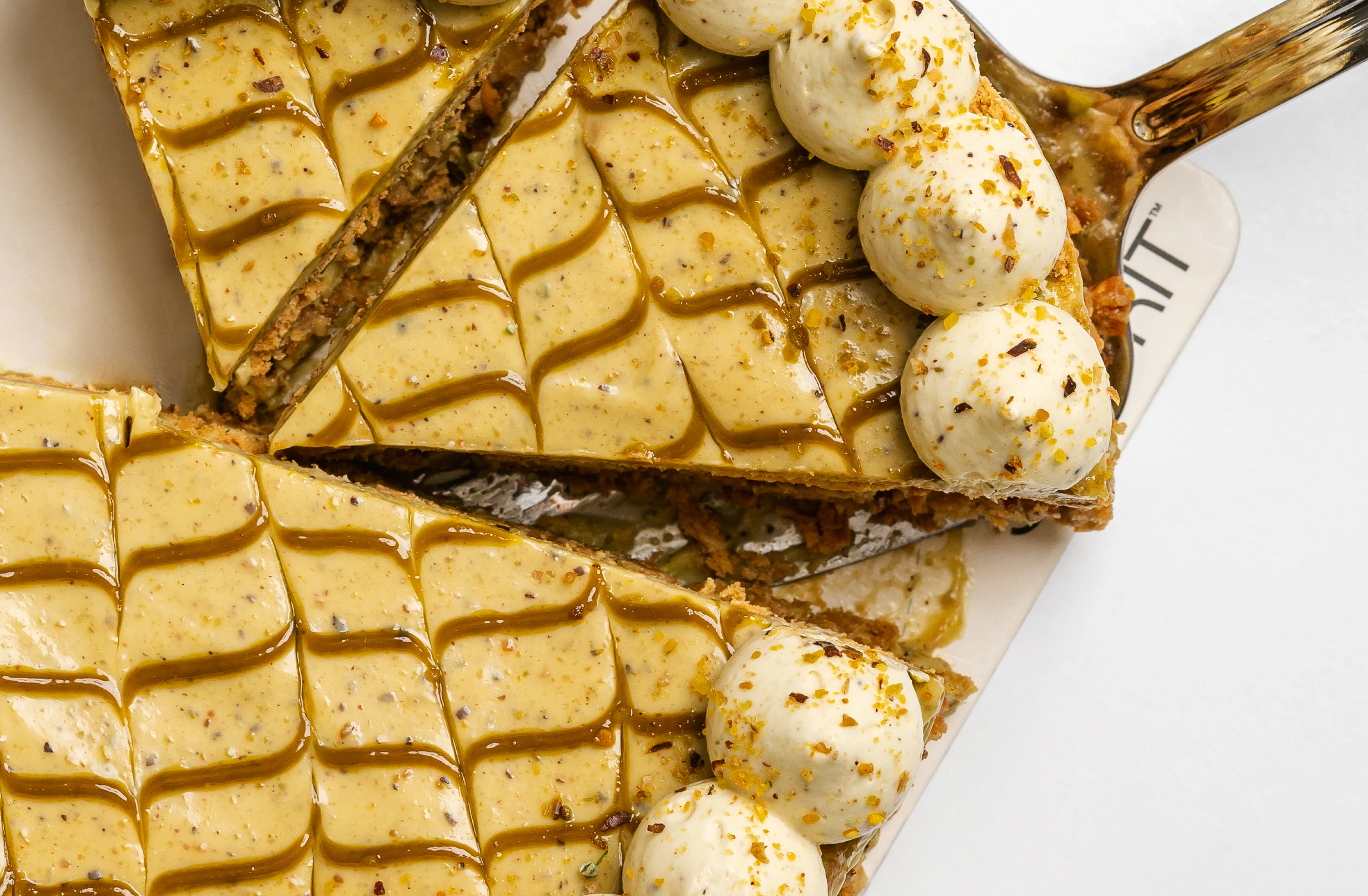
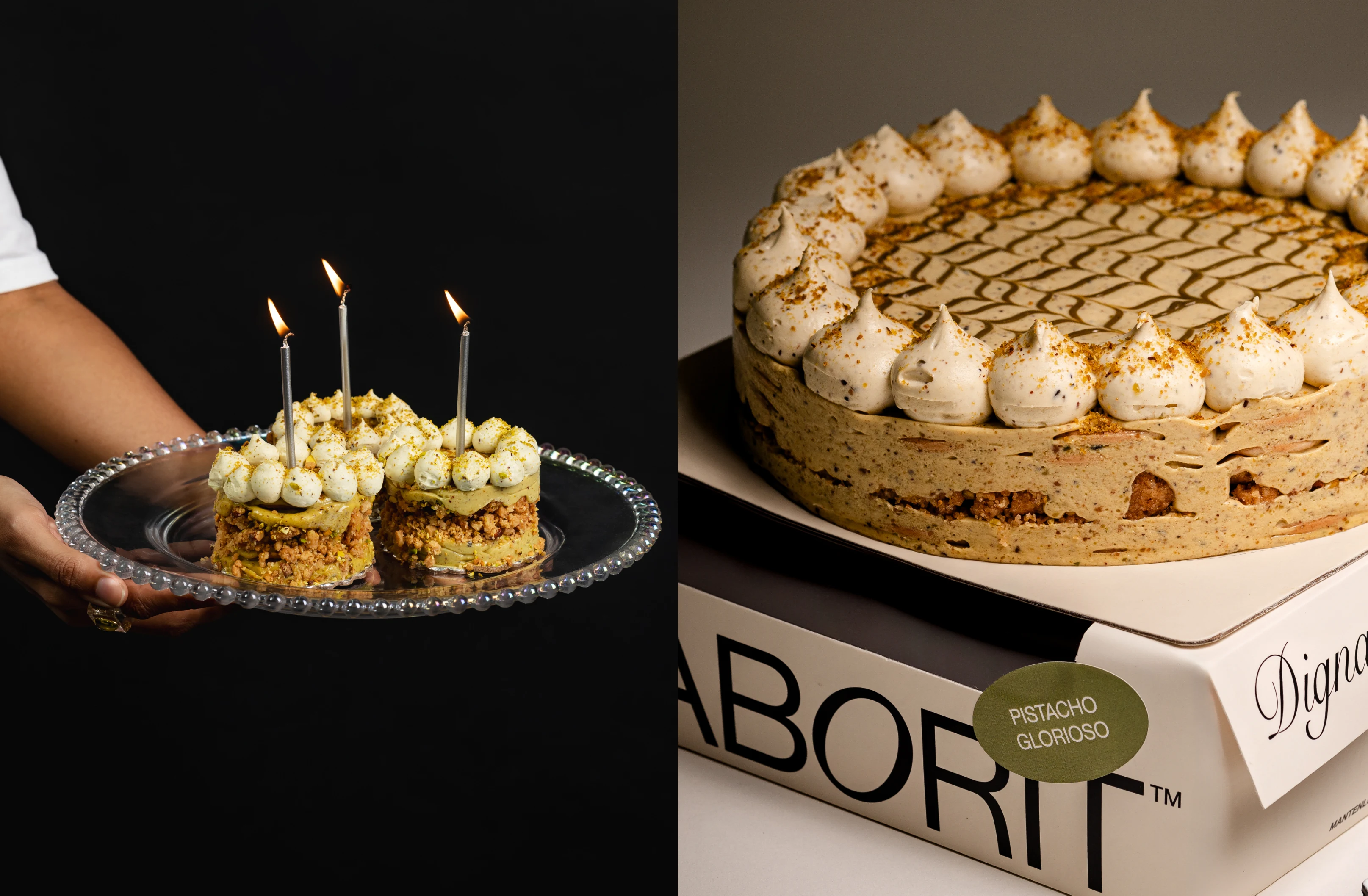
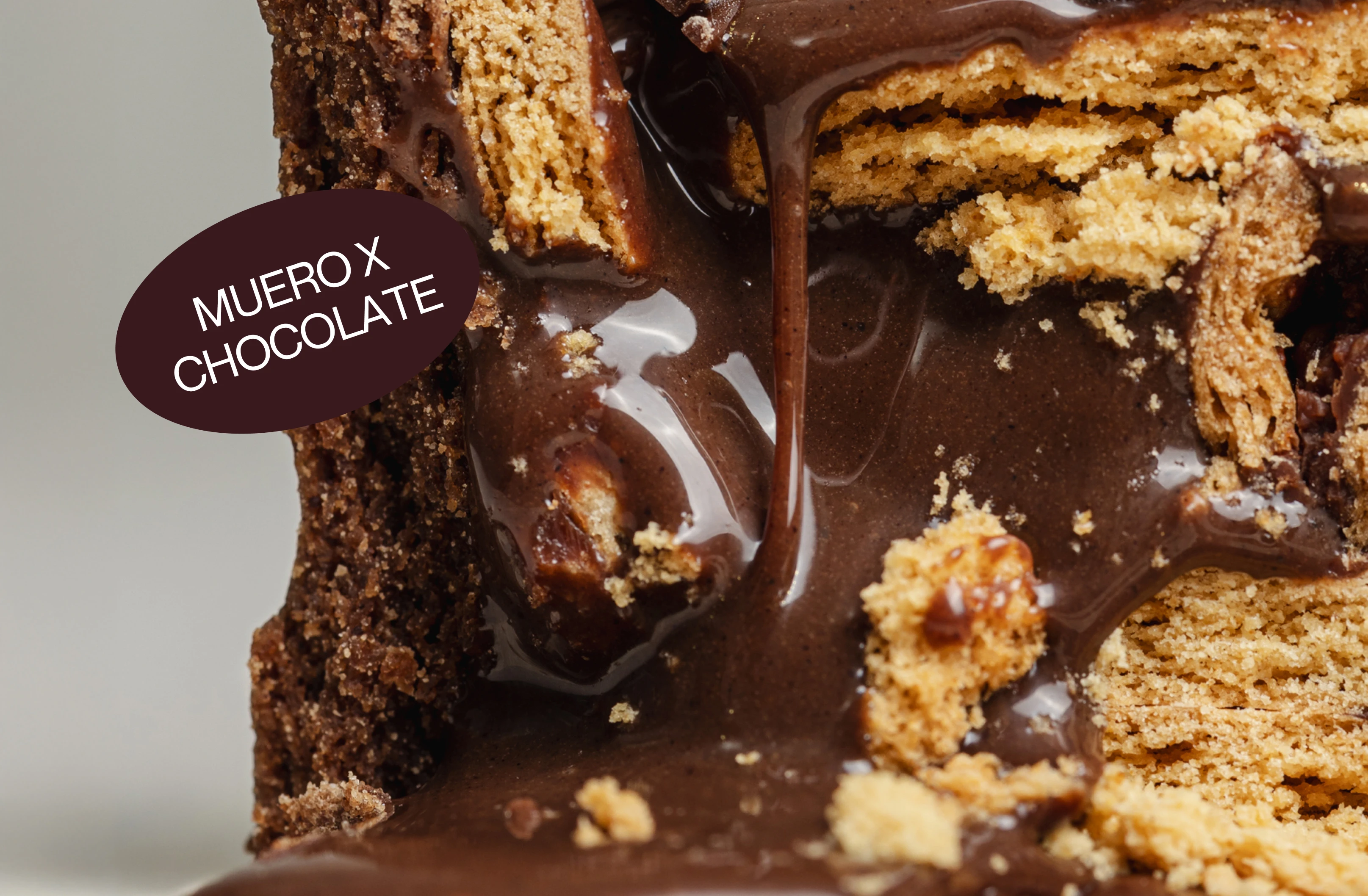
This time, it starts with frozen cakes, offering the market greater impact, height, and presence. And why not, a new way to share and celebrate life, whether with family, friends, or anyone you choose, even a moment just for yourself.
Servicies
Brand Strategy
Brand Identity and Design
Creative and Art Direction
Packaging
Client — saborit.us
And now, why Duquesa?
Why not? We are a dessert made from carefully selected ingredients, authentic in flavors, defined by the act of choosing differently—without having to say the classic phrase, “I’m going to buy a cake for …’s birthday” or “I’ll have a marquesa today because it’s someone’s birthday.” To us, that’s irrelevant. We simply want it to be, first and foremost, for you—just because. And then, for all the reasons, excuses, motives, justifications, and celebrations you can think of.
We’re shifting the perspective for everyone who used to wait for the right moment or a “justified” reason. Duquesa is here to tell you that there’s no longer a specific date or occasion required to enjoy our dessert. Eat it whenever you truly feel like it, at any time, in any place.
We’ve reinvented the classic marquesa into a blissful Duquesa—a "new classic," elegant, contemporary, and a dessert crafted in our own way and style. It doesn’t follow rules or impositions; it stays true to itself.
But if they're looking for a shorter answer, I’d say something like:
"Life is too short to settle and only indulge others. Staying true to yourself is the most honorable thing you can do."
We love reinventing ourselves, challenging the norm, and seeking new experiences that keep us alive—because that’s how life is better.
Simply put, a dessert worth trying.
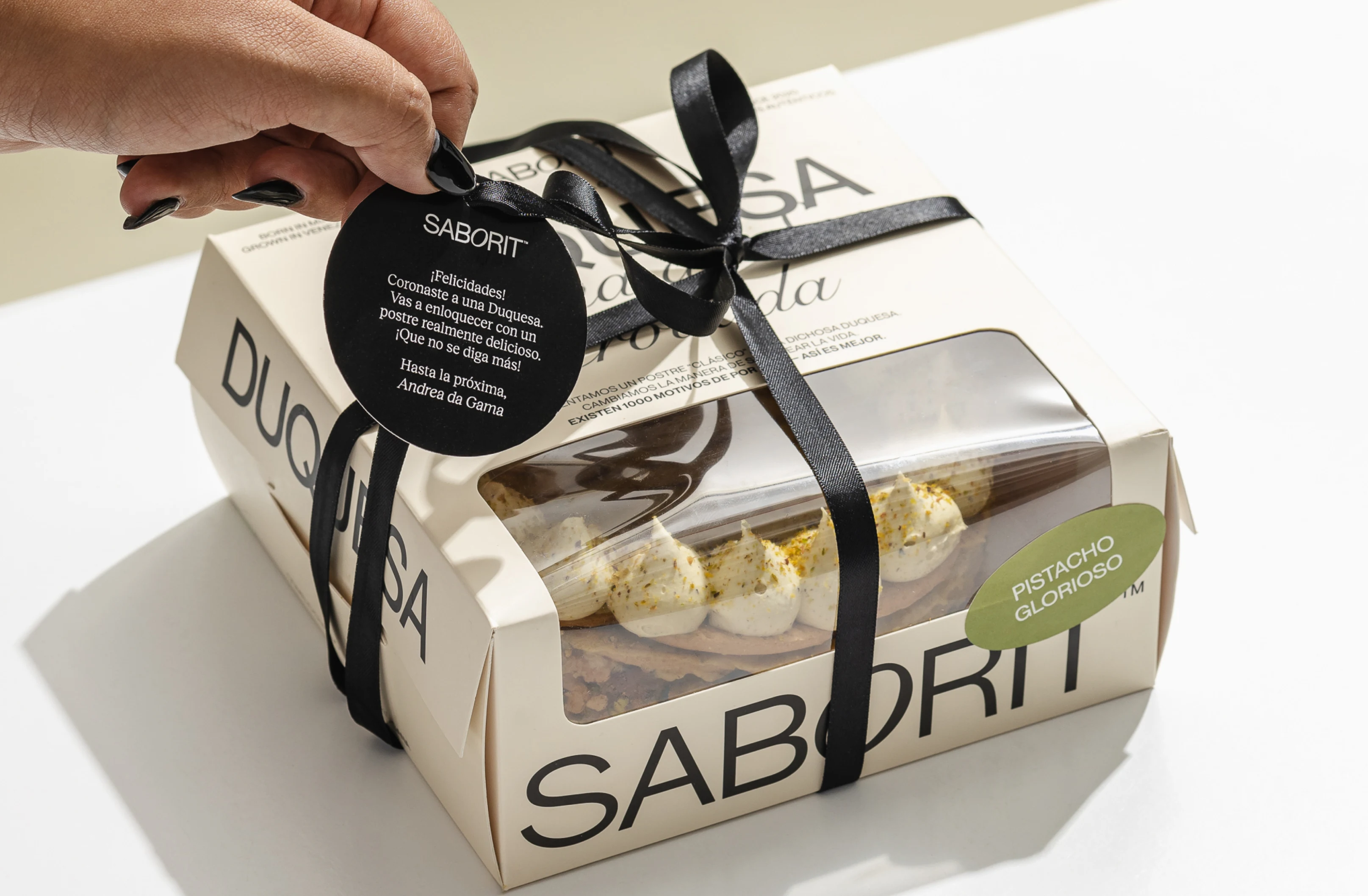
Reinventamos un postre “clásico” x una dichosa Duquesa. Cambiamos la manera de saborear la vida. Existen 1000 motivos de por qué — Así es mejor.
Concept and Purpose
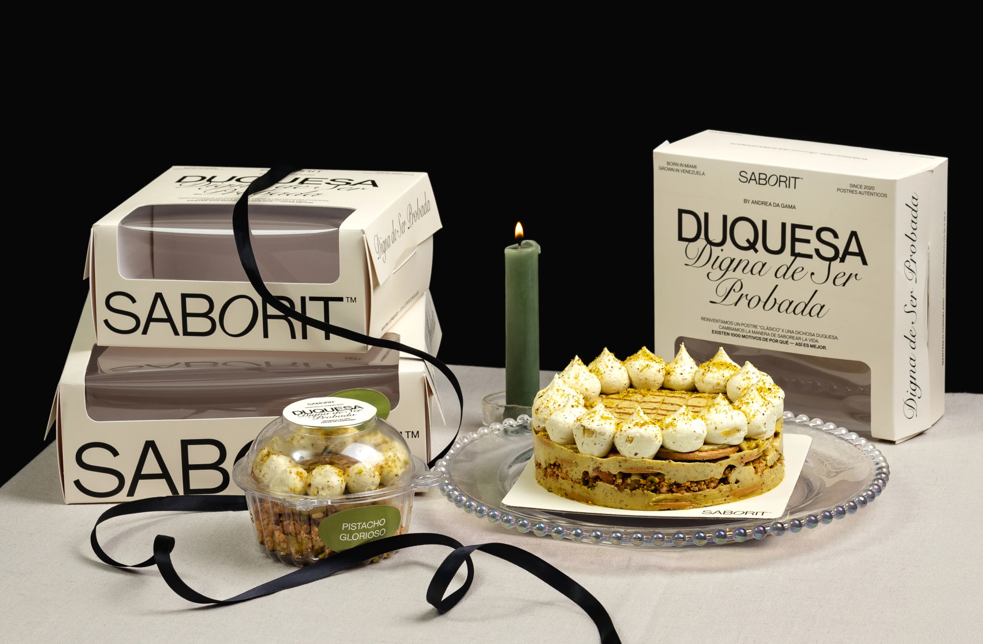
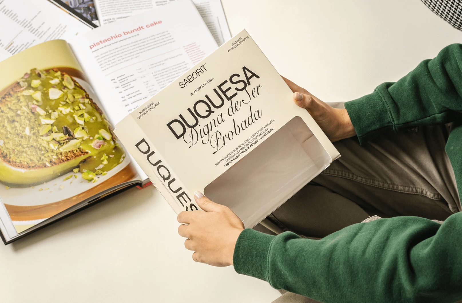
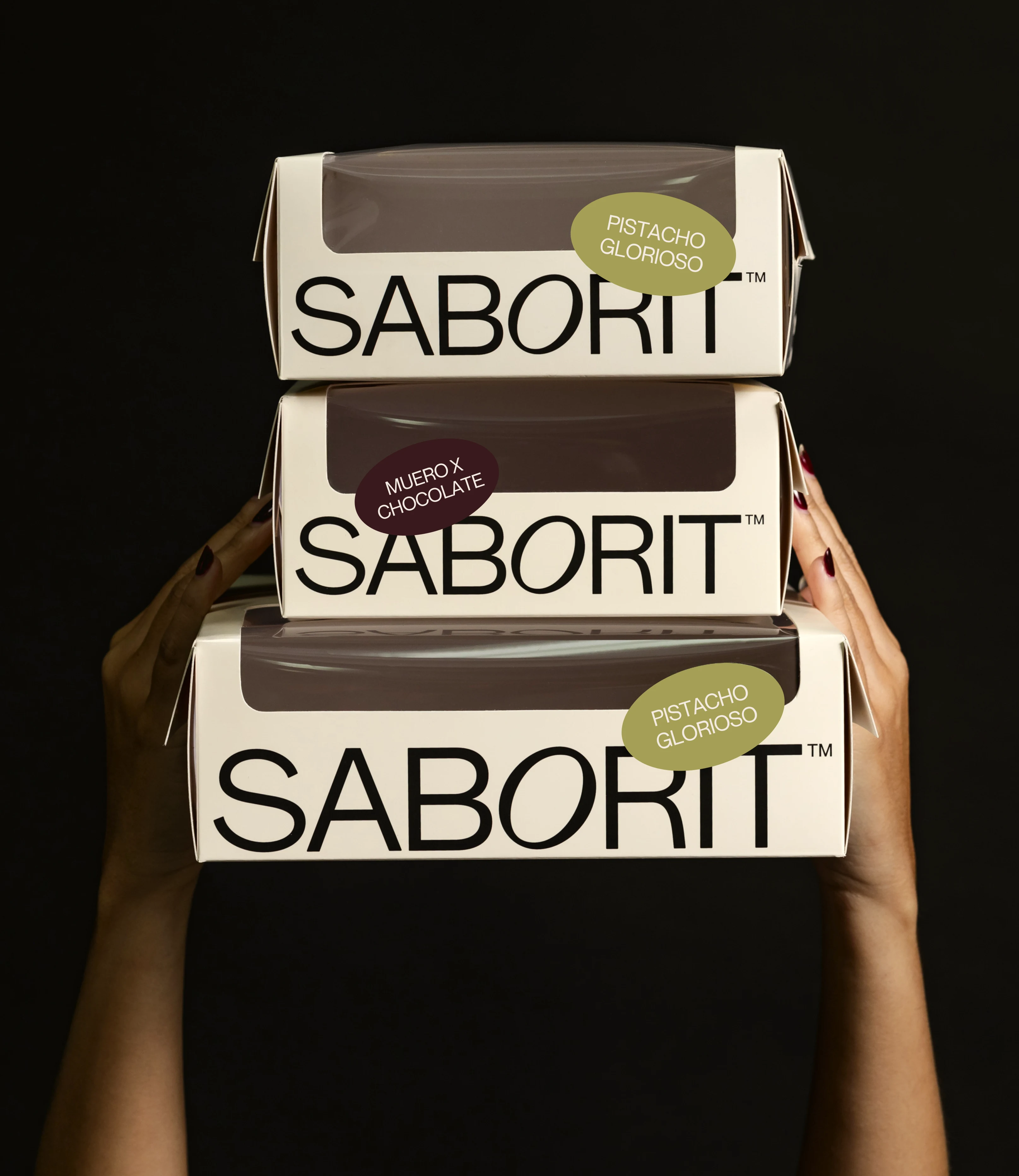
The packaging is much more than just a container: it is the first interaction between the consumer and the brand. For Saborit, the design of the packaging for its frozen cakes not only aims to protect the product but to turn it into a sensory and visual experience that communicates quality, freshness, and trust from the first glance. Every detail has been designed to optimize presentation in vertical freezers, ensuring an immediate and effective visual impact at the point of sale.
Functionality, Materiality and Design
The packaging is made from high-quality 16-point sulfate board, aiming for a balance between strength, cost, and sustainability without sacrificing accessibility. The printing uses two inks: Pantone 9043 U for the base, conveying elegance and sobriety, and Black CMYK for details and typography, ensuring contrast and readability.
The design is clean and minimalist, with a balanced visual hierarchy. Strategic windows, such as the angled cut-out and side window, allow the dessert to be seen without opening the package, reinforcing authenticity and building trust. The color-coded labels for each flavor offer clarity and dynamism, while the typography is subtly integrated, ensuring visibility without competing with the product.
Functionally, the design facilitates handling and storage, maintaining the integrity of the packaging during prolonged freezing. Its structure is ergonomic, ideal for displaying in Saborit’s freezers and for easy handling by the consumer.
You can see its displays at various points in supermarkets in Caracas, Venezuela. Here’s one for you.
In the world, there are those who follow the established rules, those who settle for the usual, those who choose the common. But at Saborit, we are not like the others.
Packaging Design
Saborit's packaging redefines the presentation of frozen desserts through a design that balances aesthetics, functionality, and commercial strategy. The inclusion of windows, the careful selection of materials, and the integration of an intuitive color system turn each box into a visual testament to quality and transparency, elevating the product's perception and creating an immediate connection with the consumer.
Thanks for watching
S997S™ Creative Studio
Follow us on IG: symbiosis____997
Like this project
Posted Dec 31, 2024
Art Direction / Packaging / Consulting. Duquesas are for real moments—not just everyday treats. We redefine tradition, staying true to who we are.
Likes
12
Views
61
Timeline
May 23, 2024 - Jun 19, 2024
Clients
Saborit