Sign-up form redesign for Airtable
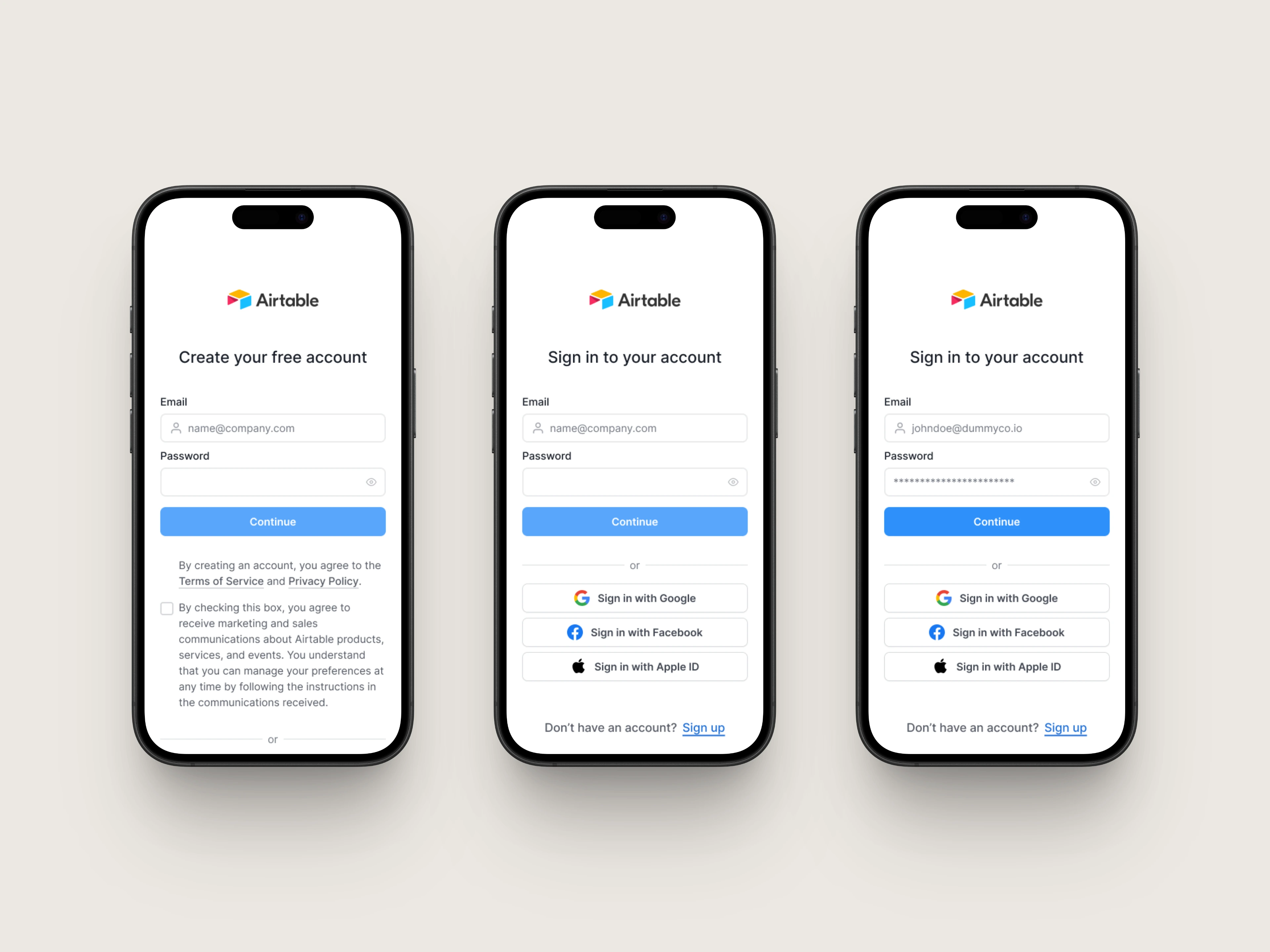
I came across Airtable while searching for a SaaS platform to conduct a UI audit. While many well-known platforms feature highly optimized signup flows backed by extensive research, my goal was to find a popular platform with room for improvement.
Overall, I appreciate Airtable's minimal design. However, closer inspection revealed several usability and accessibility issues that could be addressed. Through this conceptual redesign, I aim to create a more accessible and visually cohesive signup experience that enhances usability for all users.
Like this project
Posted Mar 30, 2025
By addressing the issues in the current design, I aim to create a more accessible and visually cohesive signup experience that improves usability for all users.
Likes
0
Views
5


