Redesigning muunai webapp interface

Thy Nguyen

muunai: AI-powered medical documentation
Redesigning a med-tech web application to streamline medical documentation workflows, reduce cognitive load for doctors, and improve onboarding for new users.
Role: UX/UI Designer
Team size: 3 Members
Timeline: Oct 24 — Jan 25
Introduction
muunai’s web application enables doctors to generate medical documentation using voice recordings and Smart Editing features. However, the existing interface was difficult to navigate and posed barriers to adoption, especially for new users.
Our challenge was to redesign the experience to be more intuitive, efficient, and trustworthy, so that doctors could focus less on screens and more on patients.
As the UX/UI designer on a 3-person team, I owned the end-to-end design process, from research and ideation to prototyping and final design. This project was part of a 2-month active engagement with muunai, a med-tech startup focused on enhancing clinical workflows through AI in Munich.
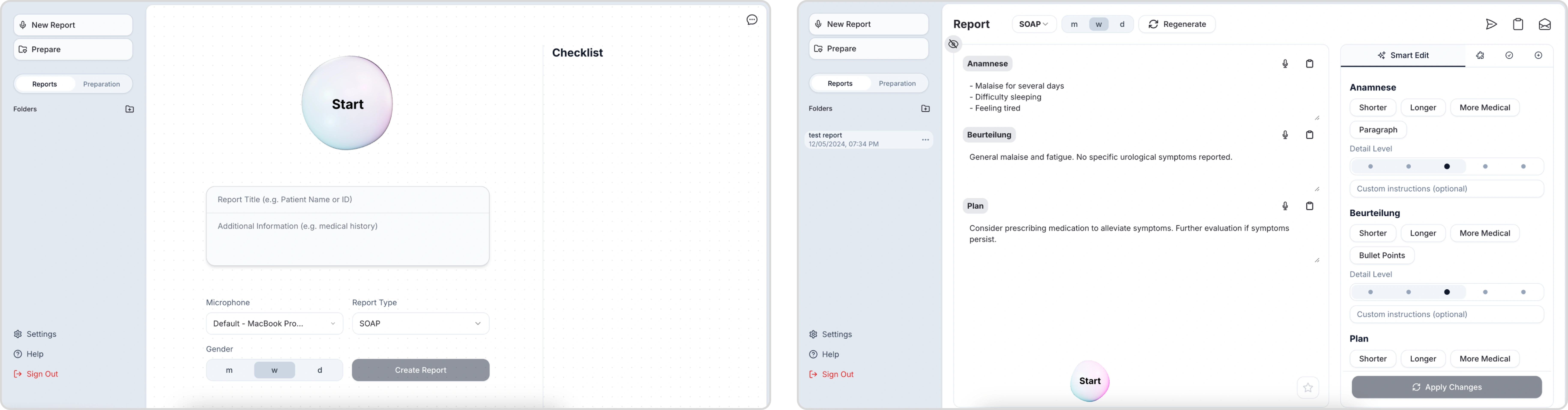
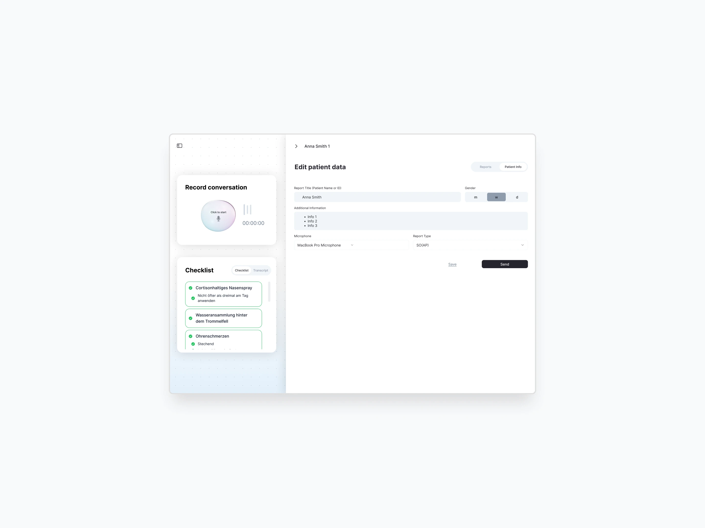
The orginal design
Problem
To understand behavior and usability blind spots, we recruited three medical students as our proxy users. We then conducted 1-on-1 usability tests with them to uncover their points of friction
In our interviews, we asked participants to perform these tasks:
✺ Create a new patient report
✺ Edit a section of an existing report
✺ Finalize and send the report
We discovered recurring usability issues that impacted user confidence and onboarding:
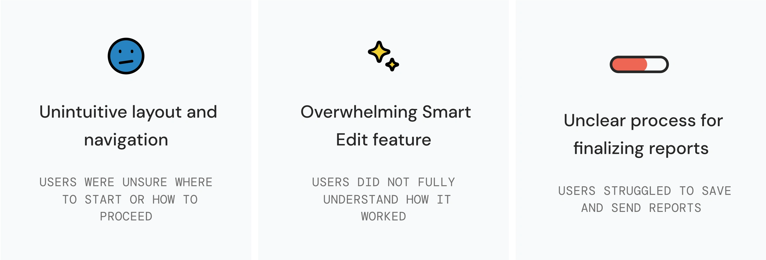
Solving these issues would not only streamline the workflow for busy doctors but also increase adoption, improve trust in the system, and reduce friction for new users.
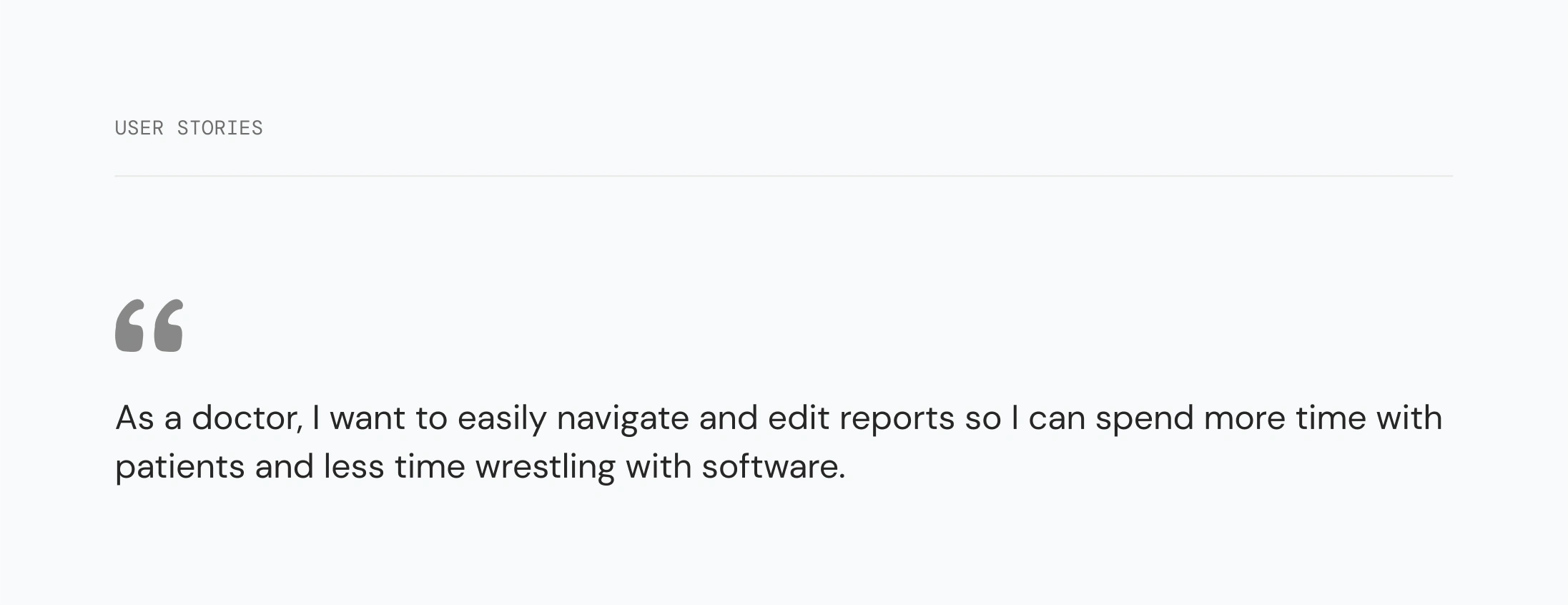
Framing the problem
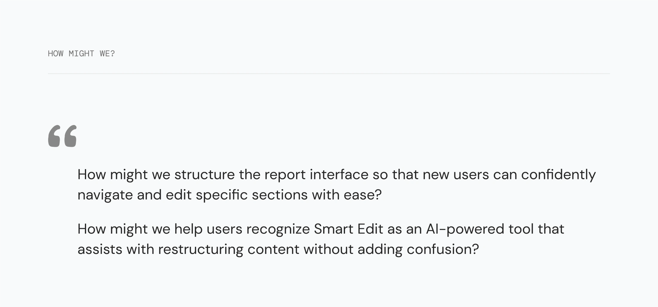
To focus our redesign, I developed a user story to reflect our target users’ goals:
I also framed our approach with “How Might We” statements to guide my design decisions
This included adding dedicated pages for events and contact, and consolidating the About and Members content into a single, streamlined page.
Wireframes
I created low-fidelity wireframes to explore layout changes, focusing on:
✺ Reducing visual clutter by collapsing menus
✺ Introducing progressive disclosure (only show what’s relevant per step)
✺ Creating clearer report input-output separation
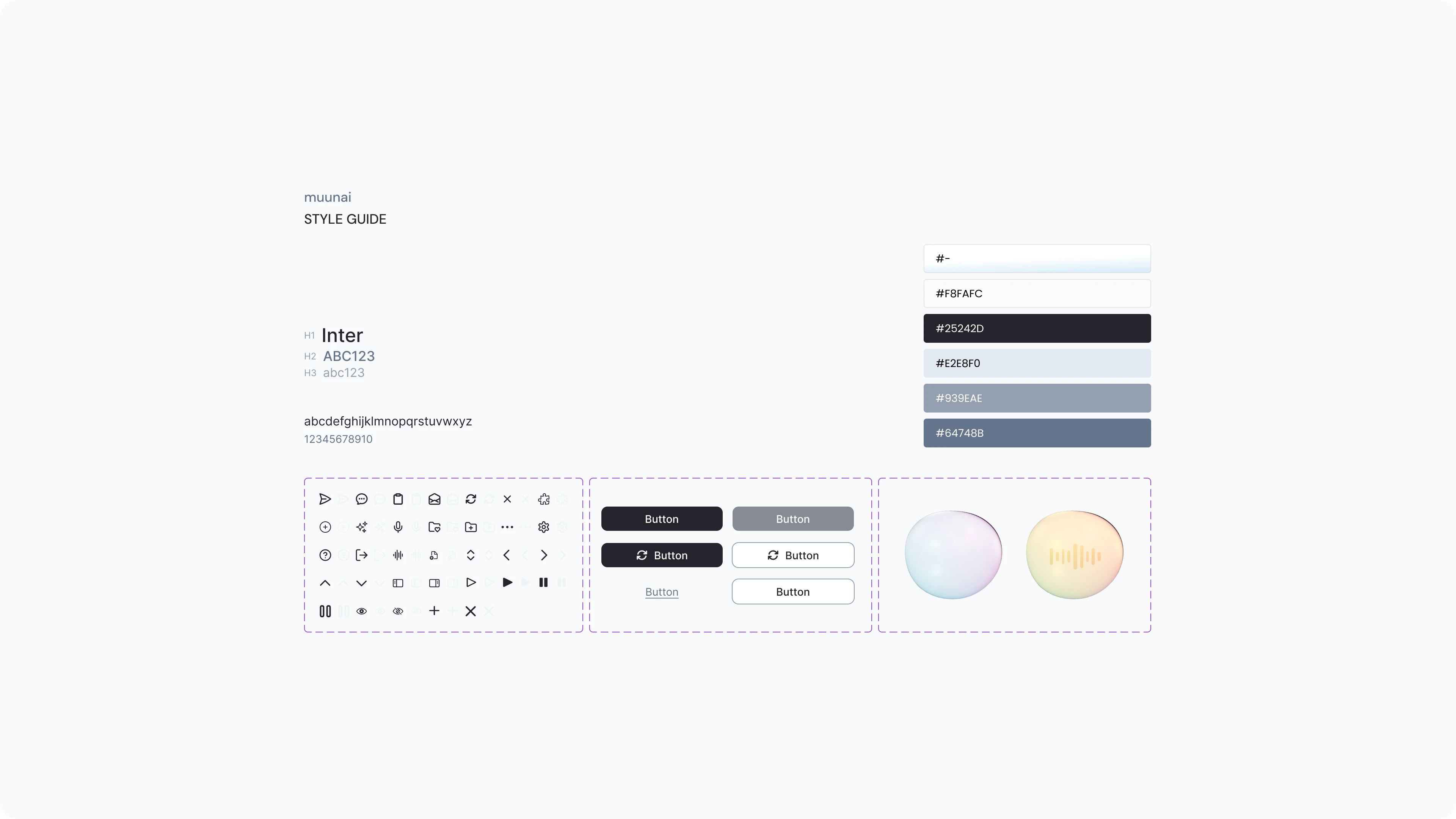
Visual identity
muunai didn’t have a formal design system
So I took initiative to create a basic component library, including button states, card styles, and form layouts, while keeping consistency with their existing color palette and typography.
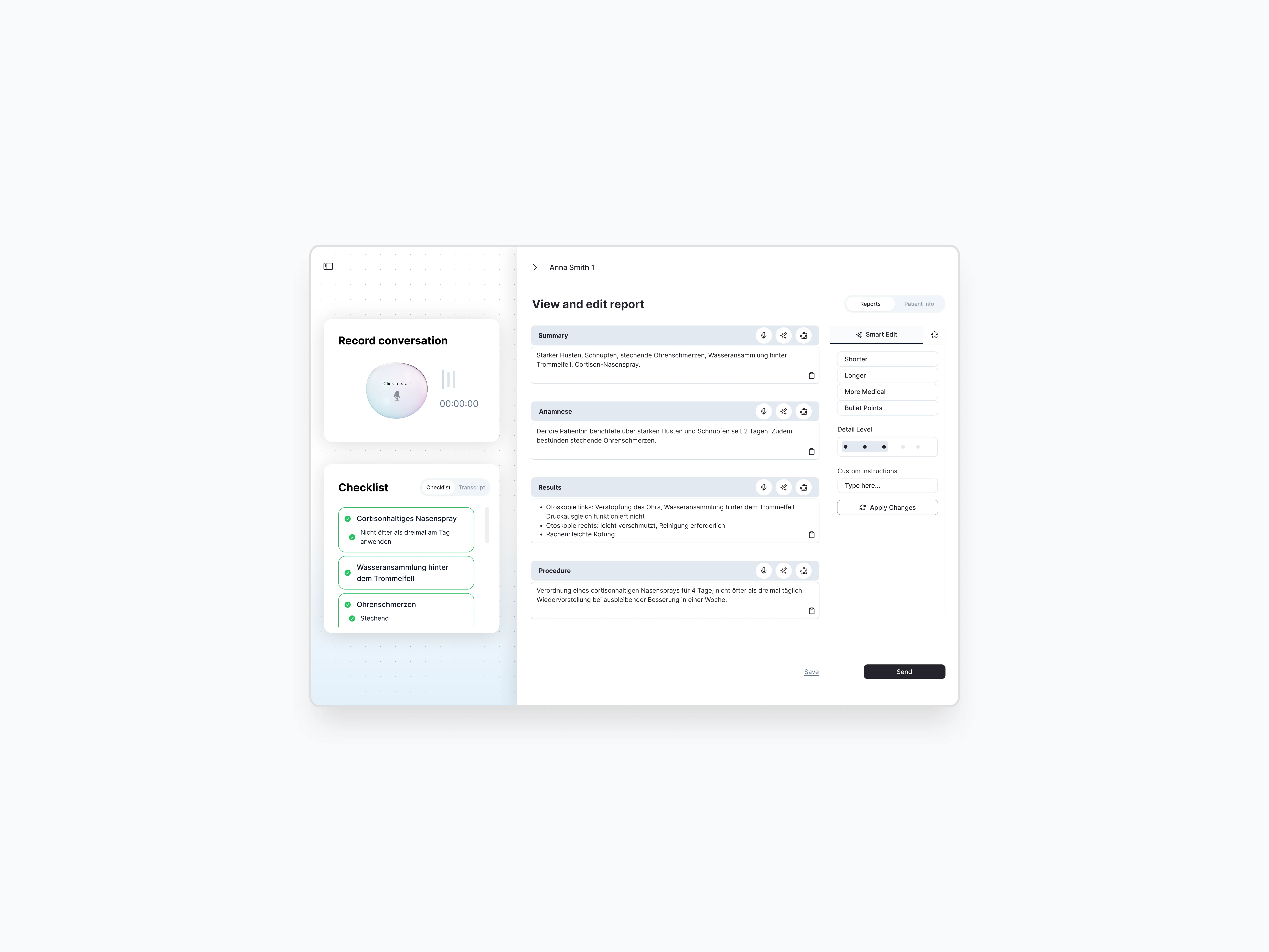
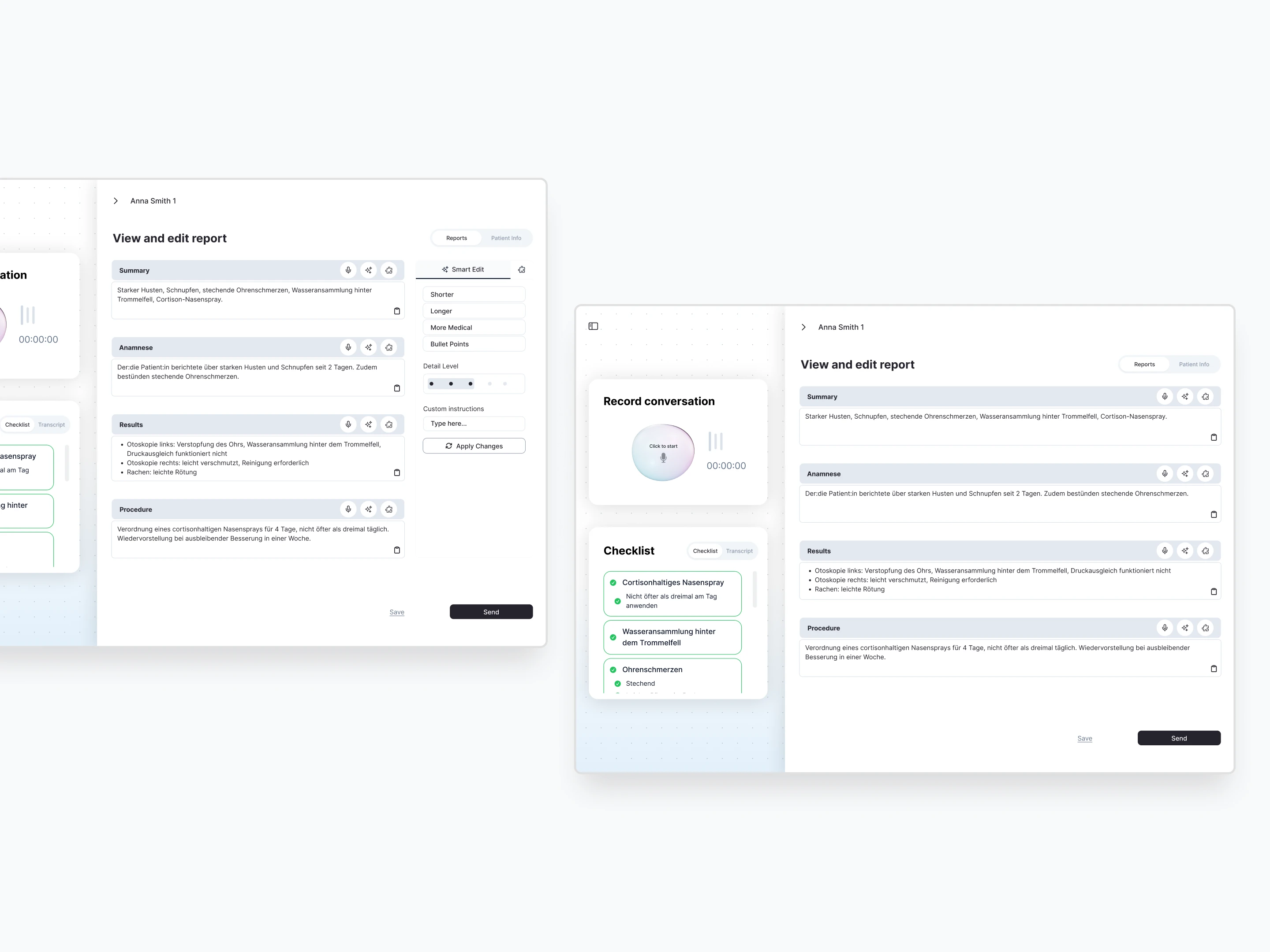
Solution
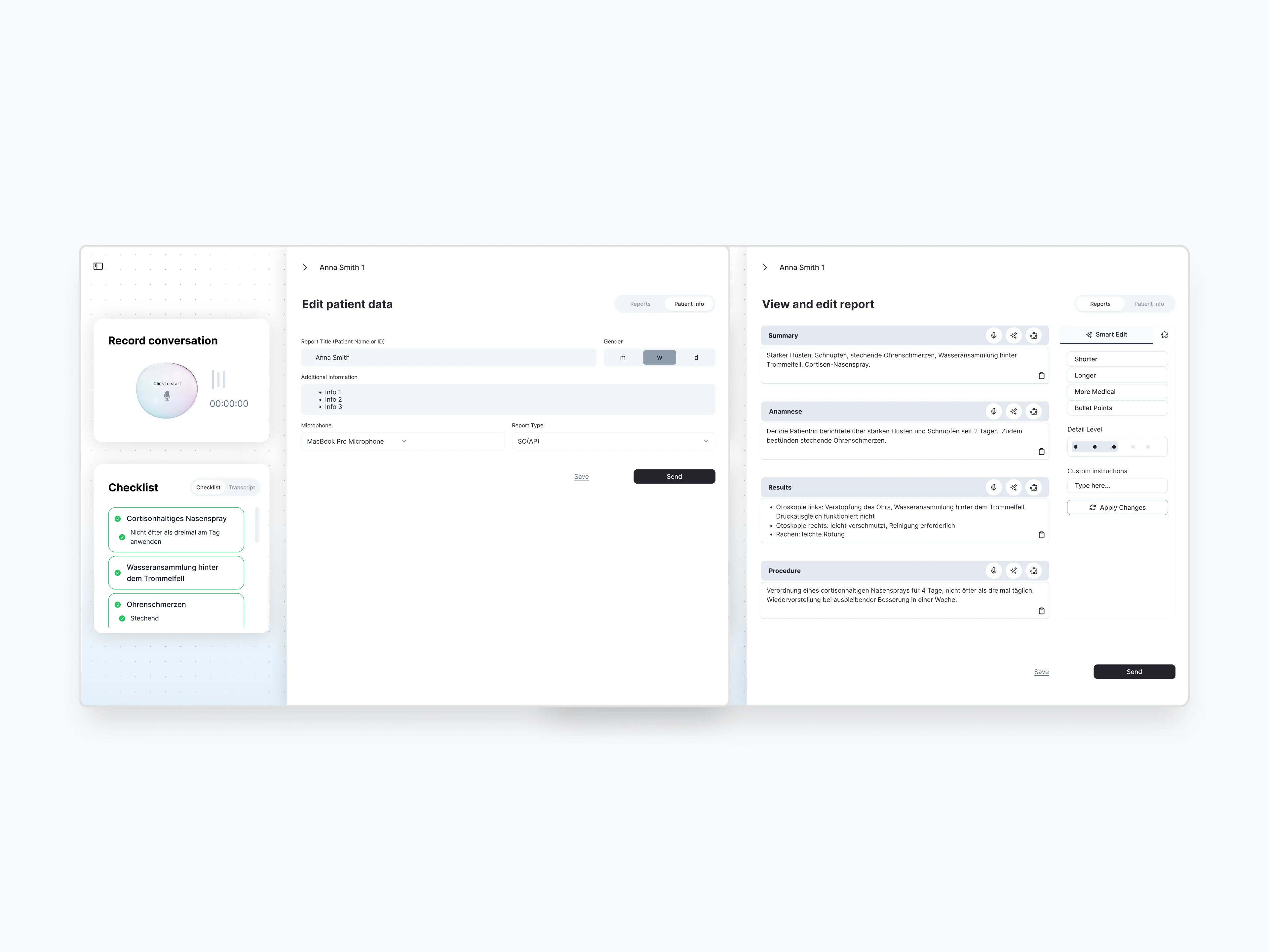
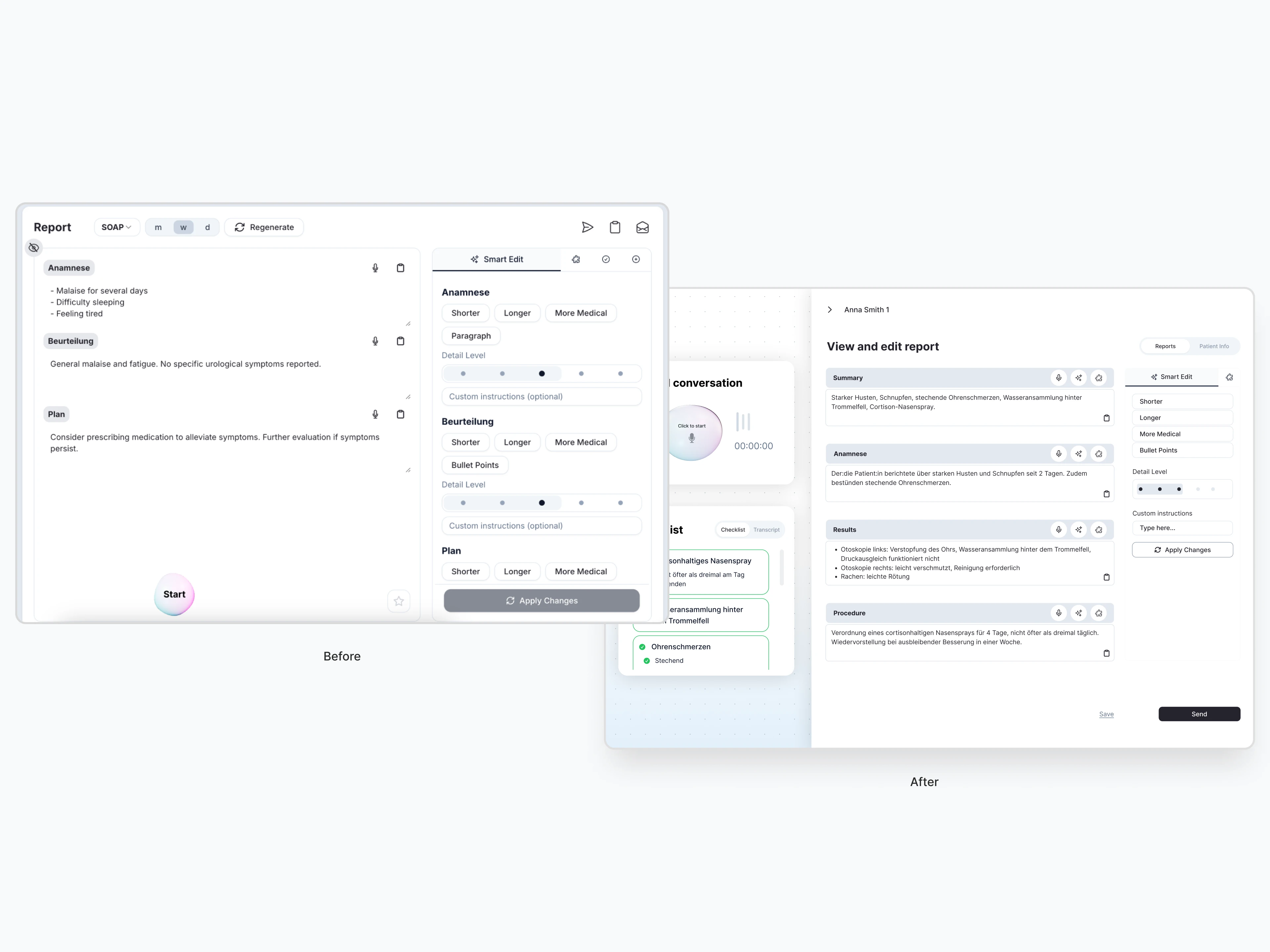
To address the usability issues we uncovered, I redesigned key parts of the reporting interface to be more intuitive, focused, and aligned with how doctors work
Structured report layout for clarity: I used clear section dividers to visually structure the report, making it easier for users to process information and move confidently through the workflow.
Smart Edit feature made intuitive: I repositioned the Smart Edit panel to a more expected location and minimized its width to reduce visual noise and keep focus on the report.
Clear finalization flow: I replaced icon-only Save/Send actions with visible CTA buttons and moved them to the bottom of the workflow to match user expectations.
Business values
While the design wasn’t implemented during our engagement, the redesign laid a solid foundation for stronger adoption, faster onboarding, and a more confident user experience
Onboarding feels simpler: Reorganized navigation helps new users quickly understand the workflow.
Workflow becomes faster: A streamlined layout, clearer input/output structure, and reduced cognitive load allow doctors to complete documentation more efficiently.
Actions feel more trustworthy: Visible CTA buttons and repositioned Smart Edit controls increase user confidence and reduce uncertainty.
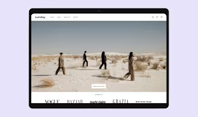
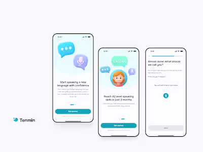
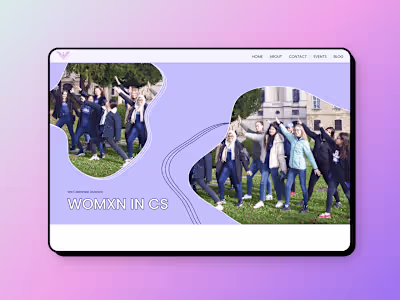
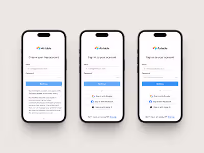
Like this project
Posted Mar 30, 2025
Redesigning a med-tech web application to streamline medical documentation workflows, reduce cognitive load for doctors, and improve onboarding for new users
Likes
0
Views
4
Timeline
Oct 15, 2024 - Jan 10, 2025