Branding Concept Visual for Spice Creative
Samuel O
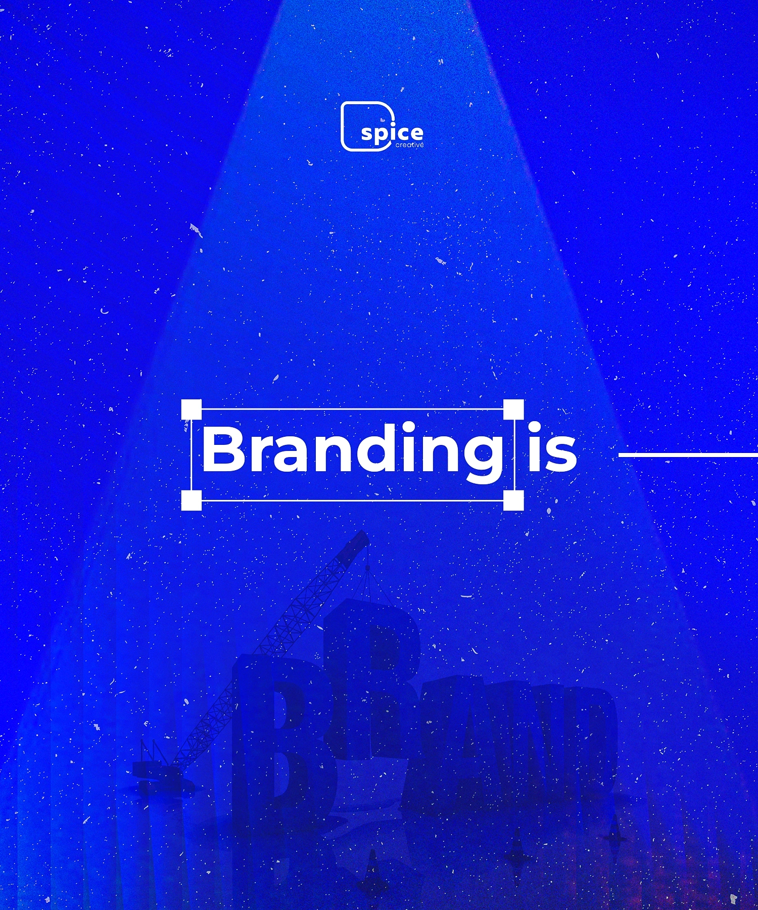
“Branding Is…” — Concept Visual for Spice Creative
A bold visual metaphor that frames branding as something built—not just designed.
The Idea
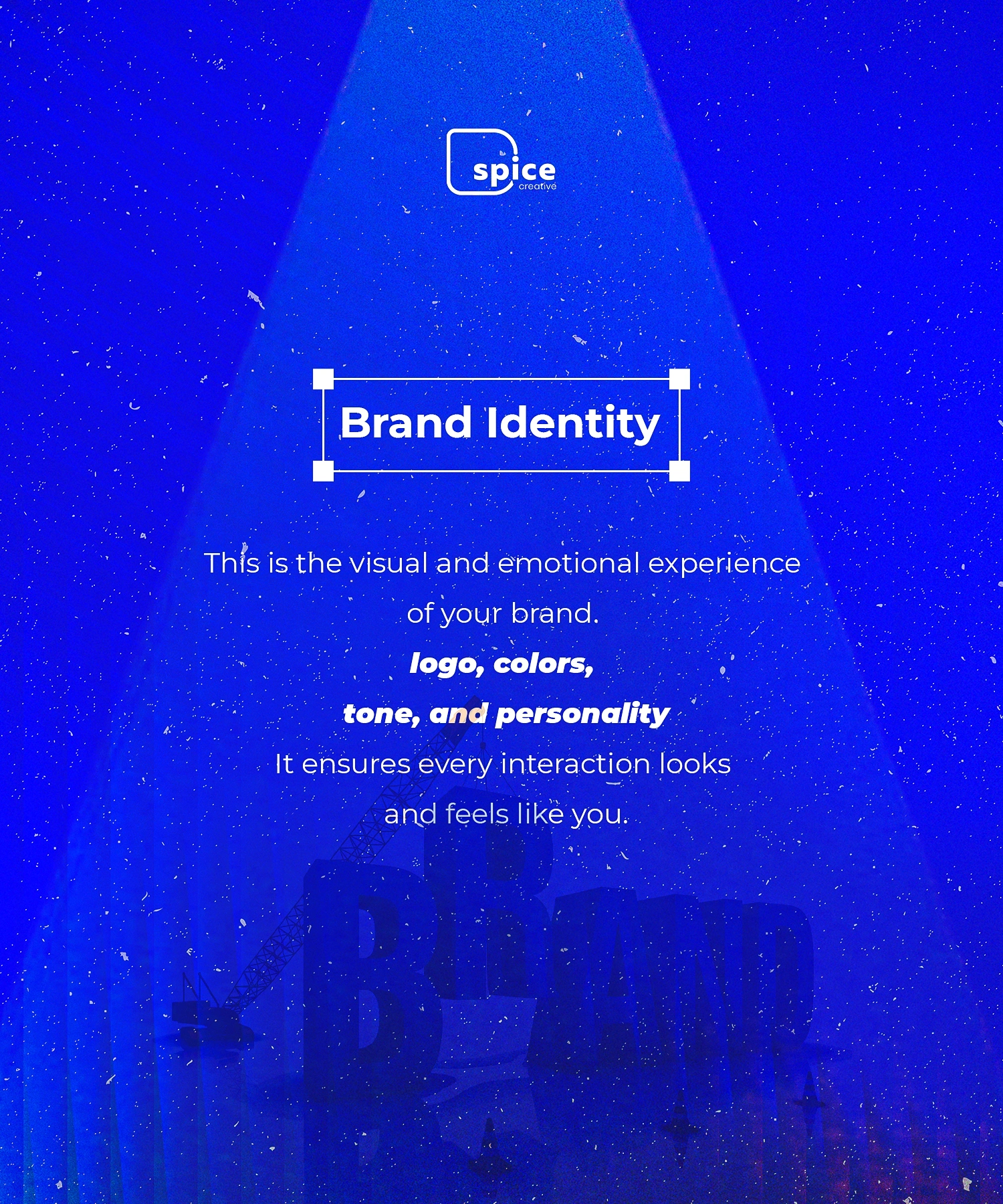
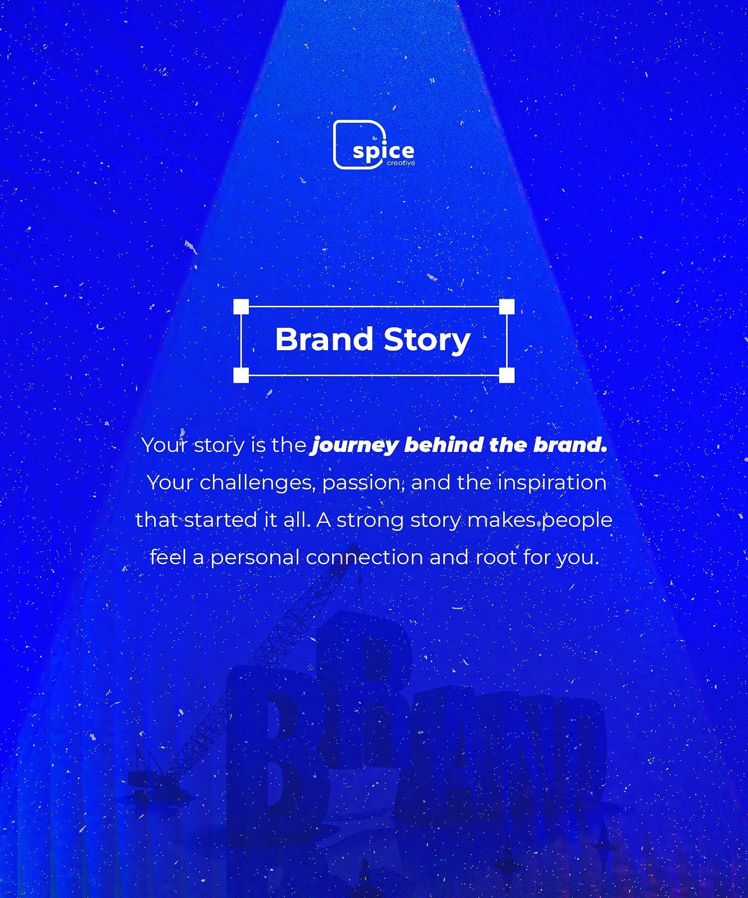
Branding isn’t just logos and colors—it’s a process of construction.
This concept visual was created to communicate that branding is something strategically built from the ground up, not randomly assembled.
The Challenge
Most content around branding feels repetitive and surface-level.
The goal was to create a scroll-stopping visual that:
Sparks curiosity
Communicates depth in a simple way
Positions branding as a structured, intentional process
The Approach
I used a construction metaphor to visually represent how brands are created.
Instead of explaining branding with text, the design shows it:
A crane lifting the letter “B”
Large-scale typography forming the word “BRAND”
A spotlight effect to emphasize importance and focus
Design Breakdown
Concept Execution
The crane symbolizes strategy and effort behind brand building
The incomplete structure suggests work in progress / evolution
The scale of the letters emphasizes impact and presence
Typography
Bold sans-serif type → strength, clarity, authority
Framed “Branding is” text → creates anticipation and hierarchy
Color & Mood
Deep blue palette → trust, intelligence, professionalism
Light beams → focus, clarity, direction
Subtle grain texture → adds depth and a tactile feel
Composition
Strong central alignment keeps attention focused
Foreground text + background concept creates layered storytelling
Why It Works
This piece is designed to make people think before they scroll:
Turns an abstract idea into a visual story
Balances minimal text with strong concept
Creates curiosity (“Branding is… what?”) → encourages engagement
Potential Use Cases
Social media campaigns for creative agencies
Branding awareness posts
Portfolio hero section
Marketing visuals for design studios
What I’d Expand Next
Turn this into a series (“Branding is Strategy”, “Branding is Experience”, etc.)
Animate the crane for motion content
Develop it into a full campaign system
Tools Used
Photoshop / Illustrator
Let’s Work
If you want visuals that don’t just look good but communicate ideas clearly, let’s collaborate.
Like this project
Posted May 5, 2026
Spec/concept work: A bold visual metaphor exploring how branding is strategically built from the ground up, created for Dspicecreative's own brand content.
Likes
1
Views
2
Timeline
Apr 20, 2026 - Ongoing