Pristine Wave Cleaning Brand Identity Design
Samuel O
Pristine Wave Cleaning — Brand Identity Case Study
The Pristine Wave Cleaning project focused on creating a fresh, modern, and trustworthy visual identity for a professional cleaning service brand. The client required a logo system that communicates cleanliness, freshness, movement, reliability, and premium service quality while maintaining simplicity and strong market recognition.
The final identity combines fluid visual motion, modern typography, and symbolic cleanliness cues to establish a professional brand presence that feels both approachable and premium.
Project Objectives
Create a memorable and scalable cleaning brand identity
Communicate freshness and professionalism instantly
Build a logo system adaptable across digital and physical branding
Differentiate the business from generic cleaning competitors
Develop a modern and visually clean aesthetic
Brand Strategy
1. Brand Positioning
The brand was positioned around:
Premium cleaning experience
Reliability and consistency
Freshness and purity
Customer trust and satisfaction
The visual identity needed to feel:
Clean but not sterile
Modern but approachable
Professional but energetic
Concept Development
Core Idea
The creative concept was inspired by:
“The smooth flow of cleanliness and transformation.”
The design combines:
Wave symbolism
Sparkle/shine indicators
Clean geometric typography
This creates a visual language that represents:
Surface renewal
Freshness
Motion and efficiency
Hygienic excellence
Logo Symbolism
1. Wave Element
The curved wave surrounding the typography symbolizes:
Flowing cleanliness
Water movement
Transformation and renewal
Smooth customer experience
The sweeping motion introduces energy and creates a sense of continuous care and service delivery.
2. Sparkle Details
Small sparkle accents were incorporated to reinforce:
Shine
Spotless surfaces
Attention to detail
High-quality finishing
These subtle elements communicate cleanliness without overcrowding the logo.
3. Typography Structure
The bold rounded typeface was intentionally selected to create:
Strong visibility
Friendliness
Professional confidence
Brand memorability
The custom integration between the icon and typography creates a unified identity system rather than disconnected elements.
Color Psychology
Primary Palette
Deep Blue
Represents:
Trust
Dependability
Professionalism
Stability
Light Aqua Blue
Symbolizes:
Freshness
Water
Cleanliness
Renewal
The dual-blue system creates both:
Corporate credibility
Refreshing visual energy
Design Principles Applied
1. Simplicity
The logo avoids unnecessary complexity to ensure:
Quick recognition
Strong scalability
Easy reproduction across materials
2. Motion & Fluidity
Curved forms and wave movement create a sense of:
Service flow
Smooth operation
Active transformation
This prevents the identity from feeling static or overly corporate.
3. Versatility
The identity was designed to function effectively across:
Uniforms and towels
Product packaging
Social media branding
Business cards
Vehicle wraps
Website headers
Cleaning equipment branding
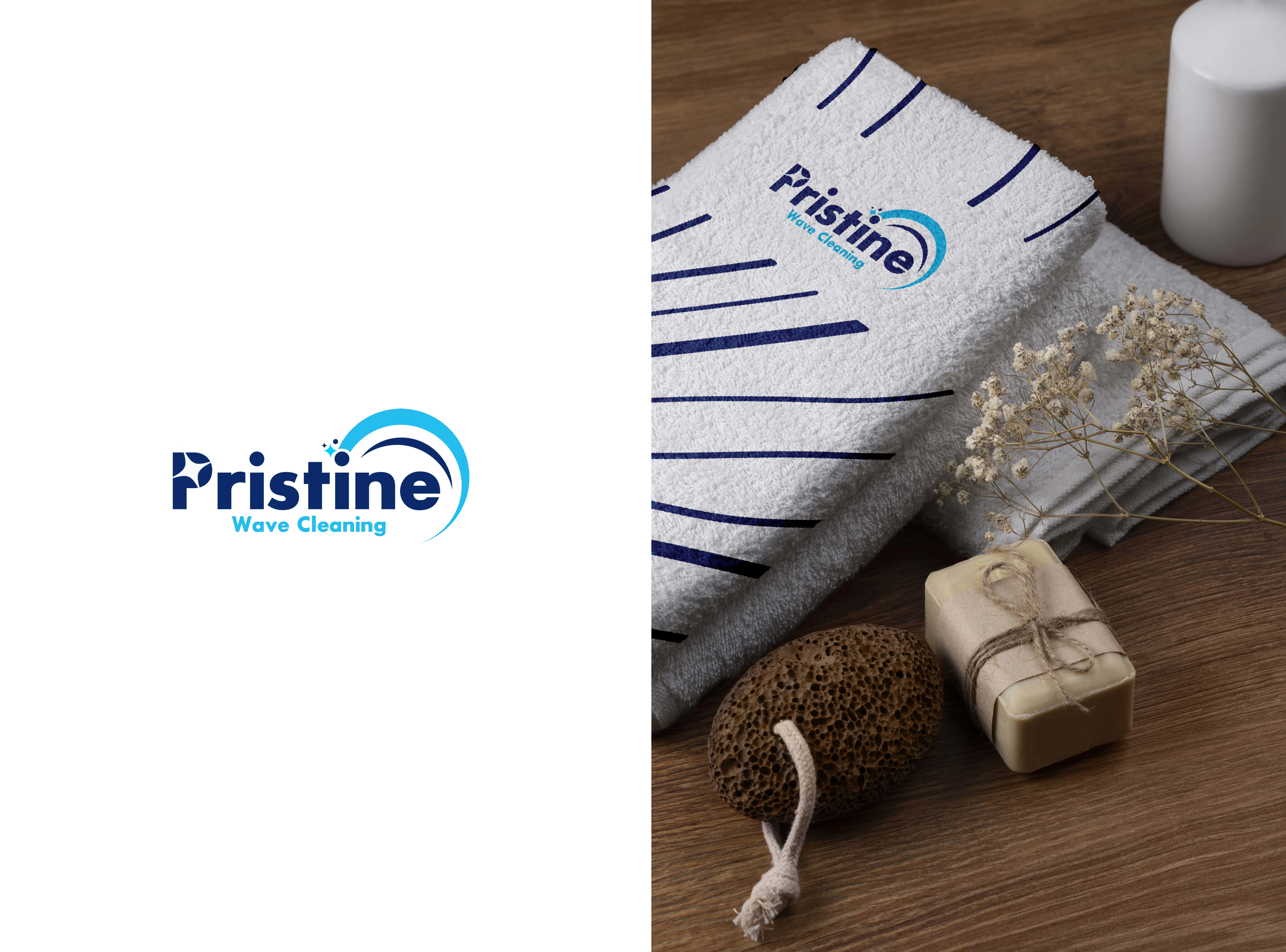
Mockup Presentation Strategy
The towel mockup presentation was intentionally selected to:
Reinforce hygiene and cleanliness visually
Demonstrate real-world brand application
Create emotional association with freshness and care
The natural spa-like environment enhances the brand perception by introducing:
Comfort
Calmness
Quality service experience
Challenges & Solutions
Challenge 1: Making the brand feel premium
Solution:
Used minimal visual clutter, refined curves, and controlled color harmony to elevate the brand appearance.
Challenge 2: Avoiding generic cleaning industry visuals
Solution:
Focused on modern abstraction and fluid motion instead of overused cleaning icons.
Challenge 3: Balancing professionalism with approachability
Solution:
Combined bold typography with soft wave elements and friendly color tones.
Results & Impact
Created a visually memorable and scalable brand identity
Established a strong professional image for the cleaning business
Enhanced customer trust through clean visual communication
Developed a flexible branding system ready for long-term expansion
Potential Brand Applications
Staff uniforms
Towels and cleaning materials
Packaging and labels
Vehicle branding
Website and mobile platforms
Social media marketing
Service brochures and flyers
Tools Used
Adobe Illustrator
Adobe Photoshop
Like this project
Posted May 11, 2026
The Pristine Wave Cleaning project focused on creating a fresh, modern, and trustworthy visual identity for a professional cleaning service brand.