Complete Brand Identity & Logo Design for Charm City
Samuel O
Charm City Senior Care Alliance — Brand Identity Case Study
Project Overview
This project involved the creation of a complete visual identity for Charm City Senior Care Alliance, a brand focused on providing compassionate, reliable, and professional care for seniors. The objective was to develop a brand system that communicates trust, warmth, and modern healthcare professionalism while remaining visually distinctive and scalable across multiple touchpoints.
Project Goals
Build a memorable and trustworthy brand identity
Reflect care, compassion, and community support
Ensure versatility across print, digital, and merchandise
Create a modern yet approachable healthcare aesthetic
Brand Strategy
1. Brand Positioning
The brand sits at the intersection of:
Healthcare professionalism
Emotional reassurance
Community-driven care
It was important to avoid overly clinical visuals and instead strike a balance between human connection and institutional trust.
Brand Strategy
1. Brand Positioning
The brand sits at the intersection of:
Healthcare professionalism
Emotional reassurance
Community-driven care
It was important to avoid overly clinical visuals and instead strike a balance between human connection and institutional trust.
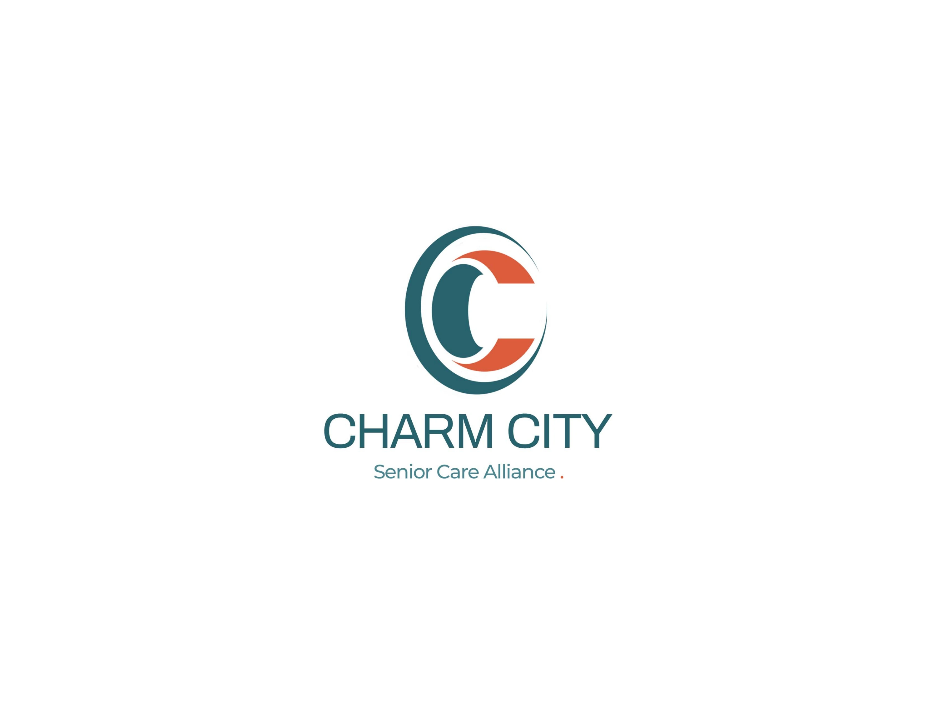
Logo Development
Concept Exploration
The logo is built around a stylized “C” monogram, representing:
Charm City
Care & Compassion
Continuity and support
The circular form suggests:
Protection and safety
Unity and inclusiveness
Ongoing care
Design Characteristics
Smooth curves to evoke warmth and empathy
Clean geometry for a modern, professional feel
Subtle negative space for visual interest and memorability
Color System
Primary Palette
Teal Green: Represents health, calmness, and stability
Soft White: Communicates cleanliness and simplicity
Accent Coral: Adds warmth, humanity, and emotional connection
Color Psychology
The palette was intentionally selected to:
Reduce anxiety often associated with healthcare brands
Promote a sense of trust and comfort
Stand out from generic blue-heavy medical branding
Typography
Clean, modern sans-serif typeface
High readability across all mediums
Balanced spacing to maintain clarity and elegance
Typography reinforces:
Professionalism
Accessibility
Clear communication
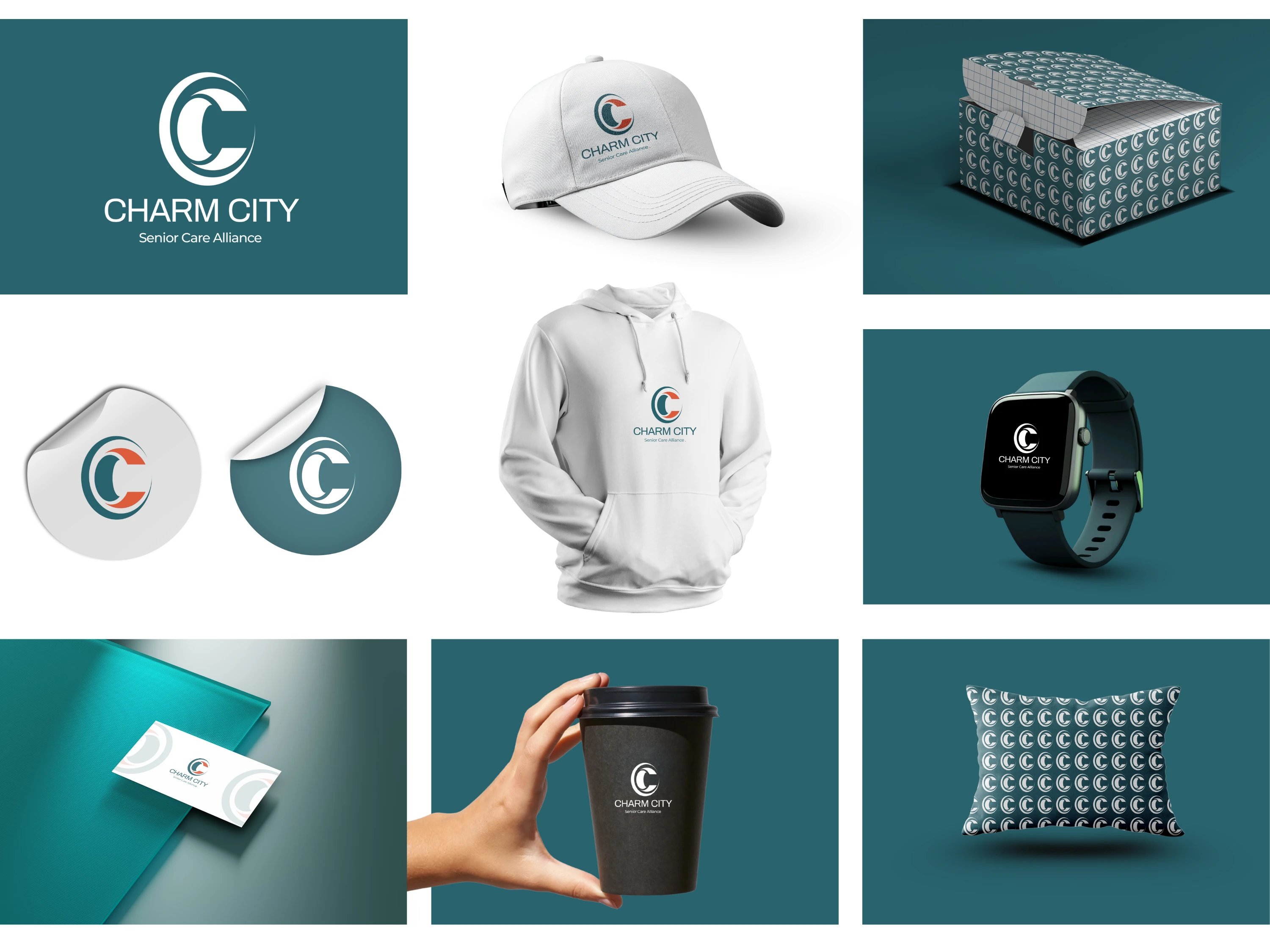
Brand Application System
A major focus of this project was real-world usability, ensuring the brand performs consistently across multiple touchpoints:
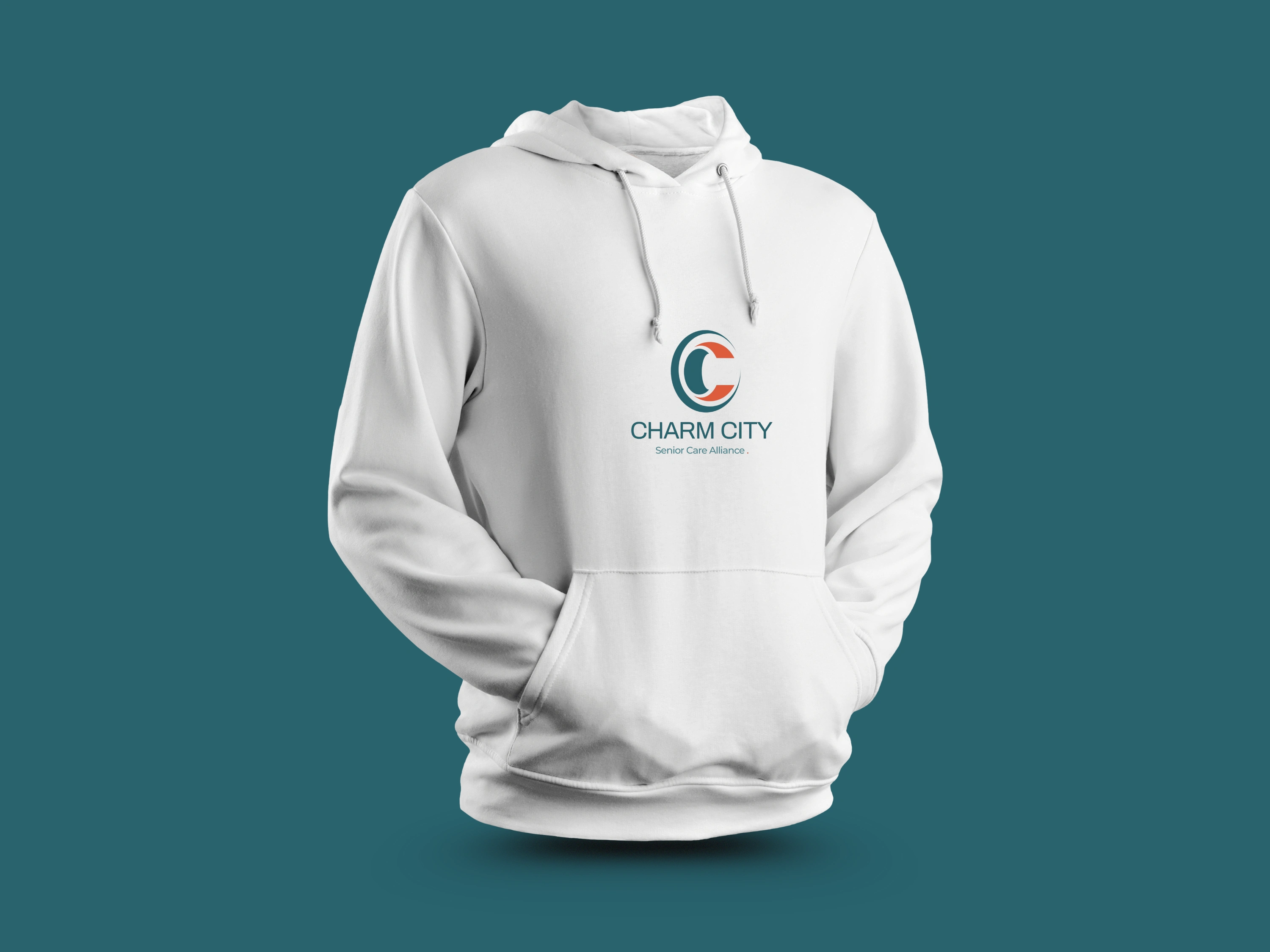
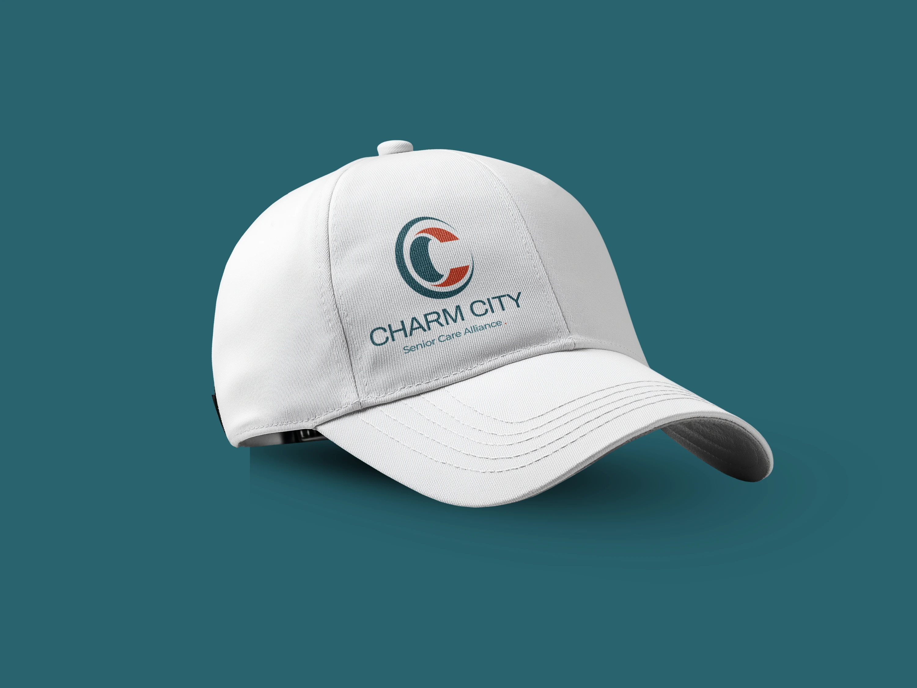
1. Apparel
Branded hoodie and cap for staff identity
Reinforces unity and professionalism
2. Packaging
Custom patterned box design using logo repetition
Creates a cohesive and premium unboxing experience
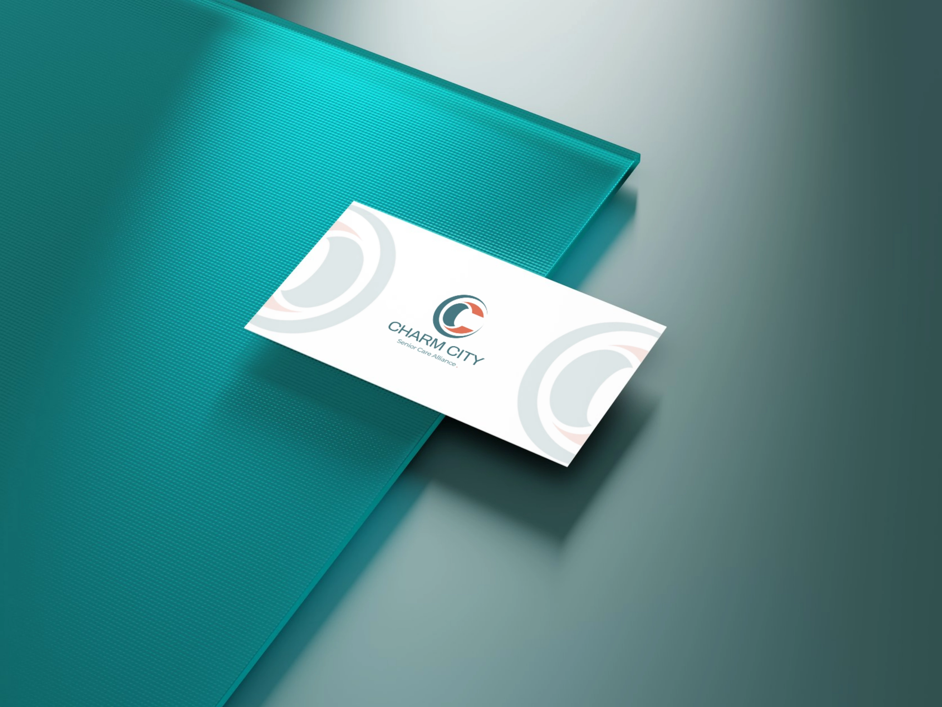
3. Stationery
Business cards and envelopes maintain minimal, clean layout
Ensures strong first impressions
4. Merchandise
Coffee cups, pillows, and wearable items
Extends brand visibility into everyday environments
5. Digital Integration
Smartwatch interface mockup demonstrates adaptability to tech platforms
Pattern & Visual Language
A repeating logo pattern was developed to:
Strengthen brand recognition
Provide flexible background options
Maintain consistency across surfaces
Design System Strengths
Highly scalable identity system
Strong visual consistency across all applications
Memorable yet simple logo mark
Balanced emotional and professional appeal
Challenges & Solutions
Challenge 1: Avoiding generic healthcare branding
Solution: Introduced a unique color palette and modern monogram approach
Challenge 2: Balancing warmth with professionalism
Solution: Combined soft curves with structured typography
Challenge 3: Ensuring cross-platform adaptability
Solution: Designed a flexible identity system tested on multiple mockups
Results & Impact
A cohesive brand identity ready for real-world deployment
Strong visual differentiation in the senior care space
Increased perceived trust and professionalism
Versatile system suitable for long-term brand growth
Tools Used
Adobe Illustrator (logo design & vector work)
Adobe Photoshop (mockups & presentation)
Like this project
Posted Mar 31, 2026
This project involved the creation of a complete visual identity for Charm City Senior , a brand focused on providing compassionate and reliable.