Creative family engagement center
Samuel O
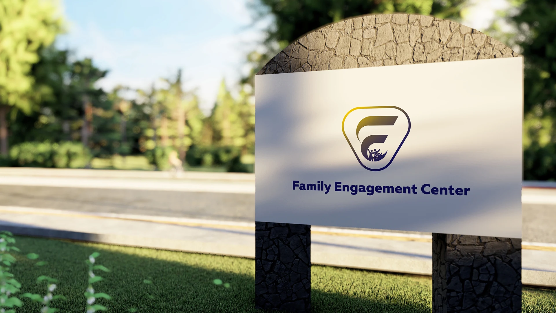
Family Engagement Center — Brand Identity Case Study
Project Overview
The Family Engagement Center branding project focused on developing a meaningful and community-driven visual identity for an organization dedicated to family support, empowerment, connection, and social development. The objective was to create a logo system that visually communicates unity, care, inclusion, growth, and trust while maintaining a modern and professional appearance.
The final identity combines symbolic storytelling, clean geometry, and human-centered design to create a brand that feels both approachable and impactful.
Project Goals
Create a warm and trustworthy brand identity
Reflect community, family connection, and inclusiveness
Develop a versatile logo suitable for digital and print applications
Balance professionalism with emotional relatability
Build a recognizable visual identity for long-term growth
Brand Strategy
1. Brand Positioning
The brand was positioned around three key values:
Connection
Support
Empowerment
The visual identity needed to resonate with:
Families
Parents
Children
Community organizations
Social support initiatives
The challenge was creating a design that feels welcoming without losing credibility or professionalism.
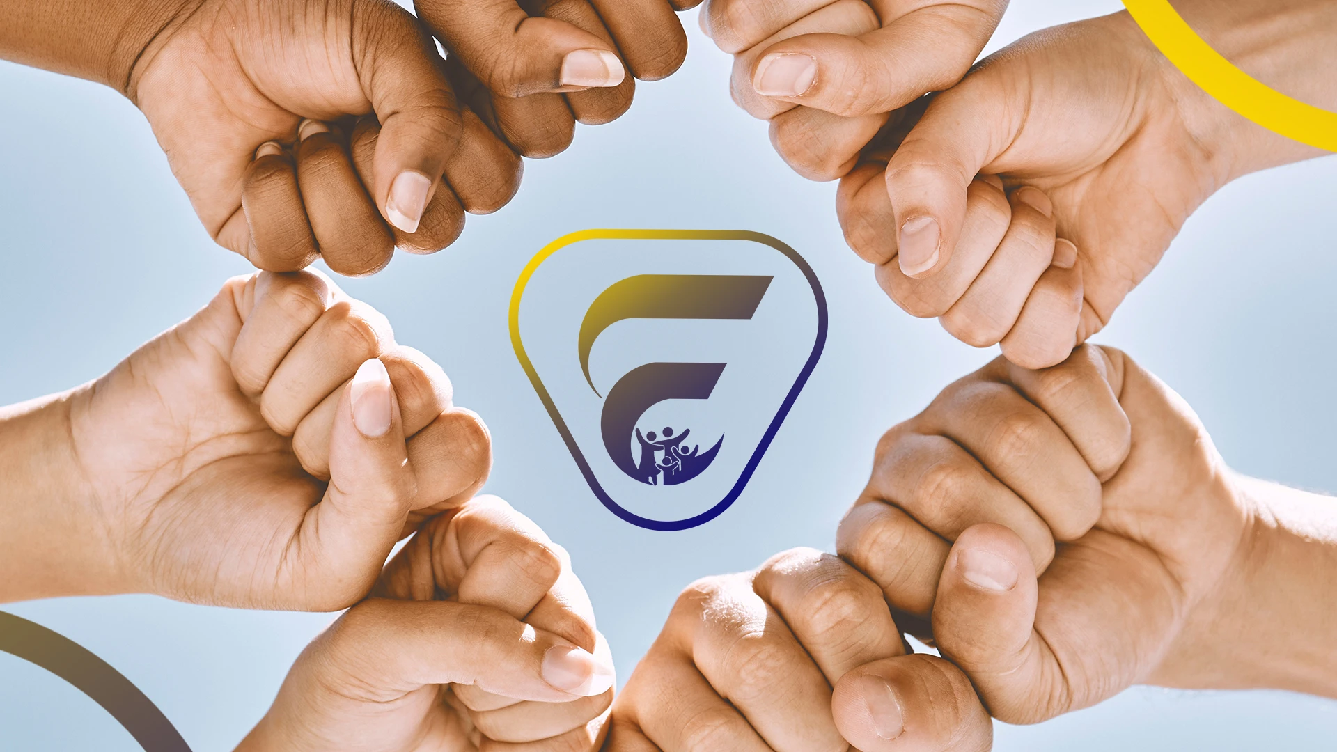
Concept Development
Core Concept
The logo concept centers around:
“Strength through unity and engagement.”
The design integrates:
A stylized letterform
Human figures
Protective enclosure shapes
These elements collectively symbolize:
Family bonding
Community participation
Safe and supportive environments
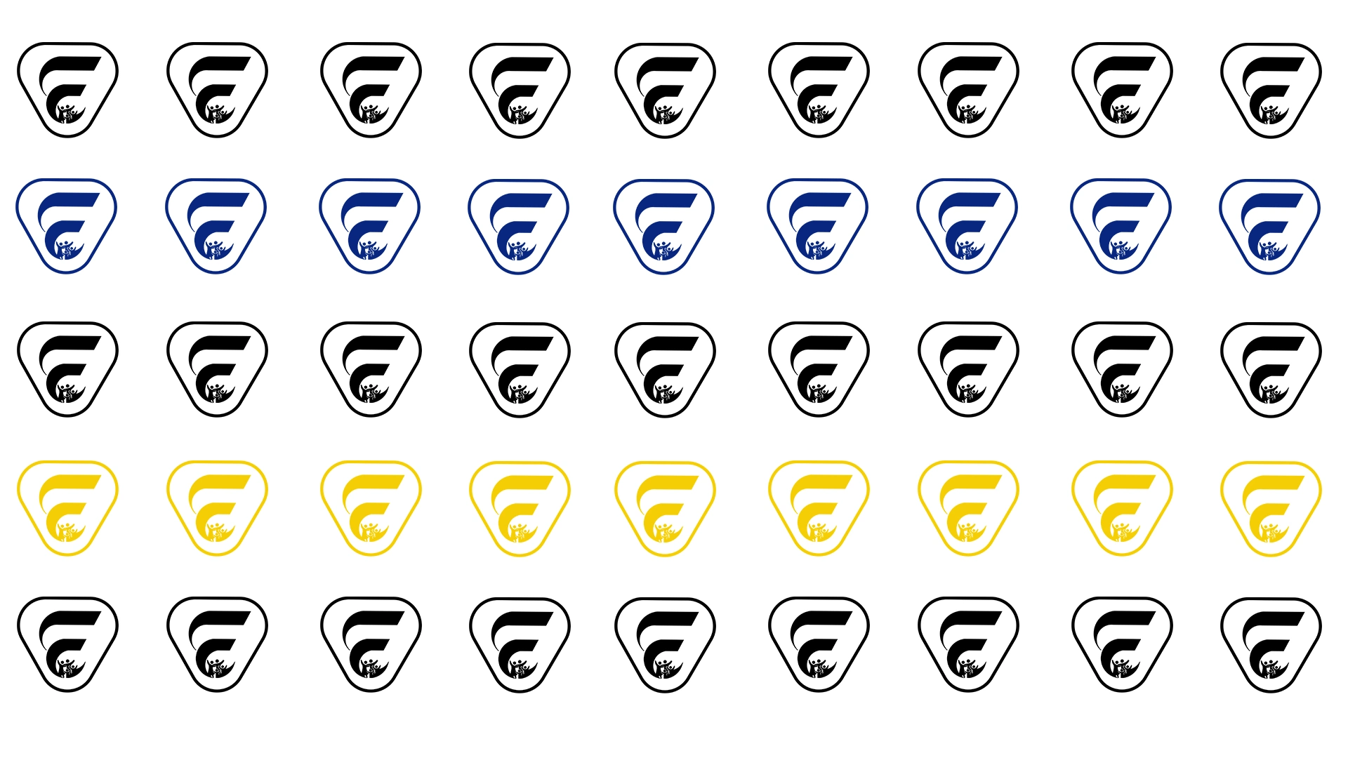
Logo Symbolism
1. Abstract Letterform
The primary icon structure forms a stylized “F”, representing:
Family
Foundation
Forward movement
The curved construction softens the identity and creates a more approachable visual tone.
2. Human-Centered Elements
At the lower section of the symbol, abstract human figures are integrated into the logo system.
These figures represent:
Family interaction
Inclusion and togetherness
Community support and engagement
The raised-arm gesture introduces feelings of:
Joy
Celebration
Empowerment
Hope
3. Protective Shape Structure
The outer enclosing shape creates a sense of:
Safety
Stability
Guidance
Organizational structure
This subtle containment approach reinforces the center’s supportive role within the community.
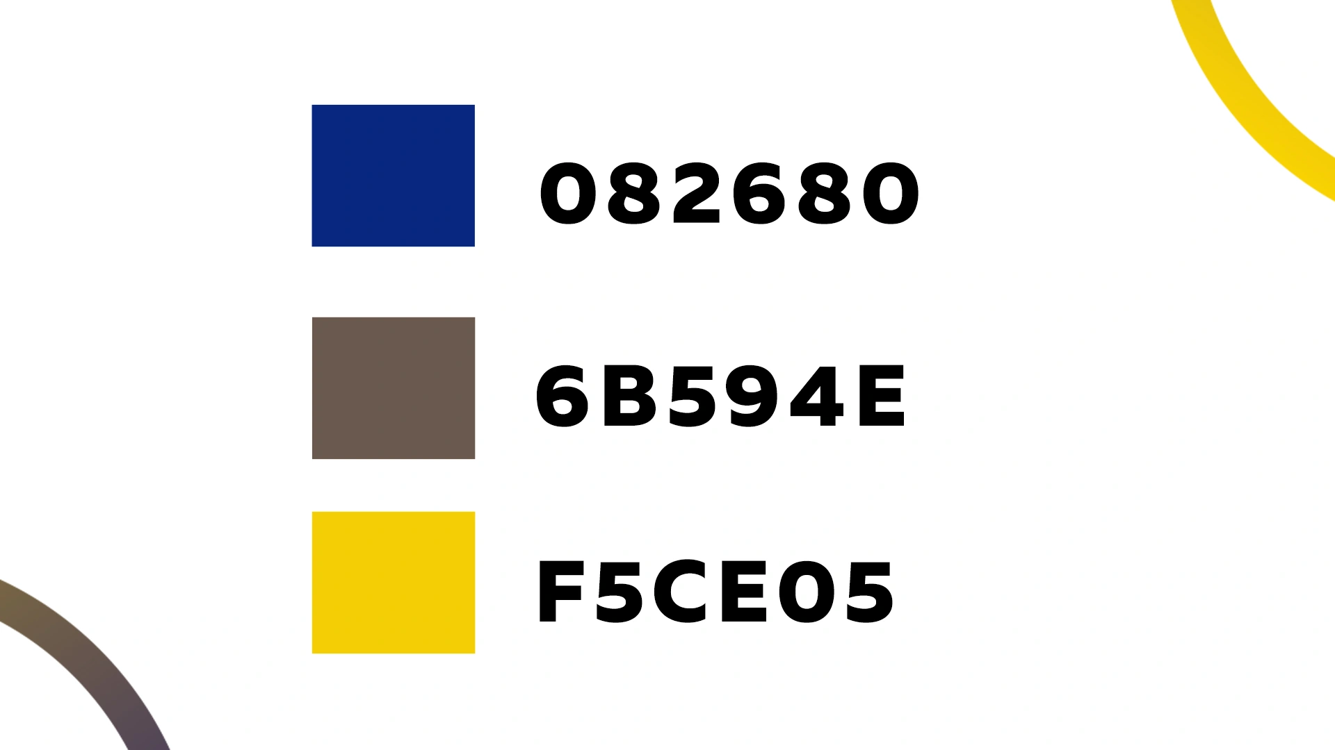
Color Psychology
Primary Color Palette
Deep Blue
Used to communicate:
Trust
Dependability
Stability
Professionalism
Gold Gradient
Represents:
Growth
Hope
Positivity
Transformation
The combination of blue and gold creates a balance between:
Institutional credibility
Human warmth and inspiration
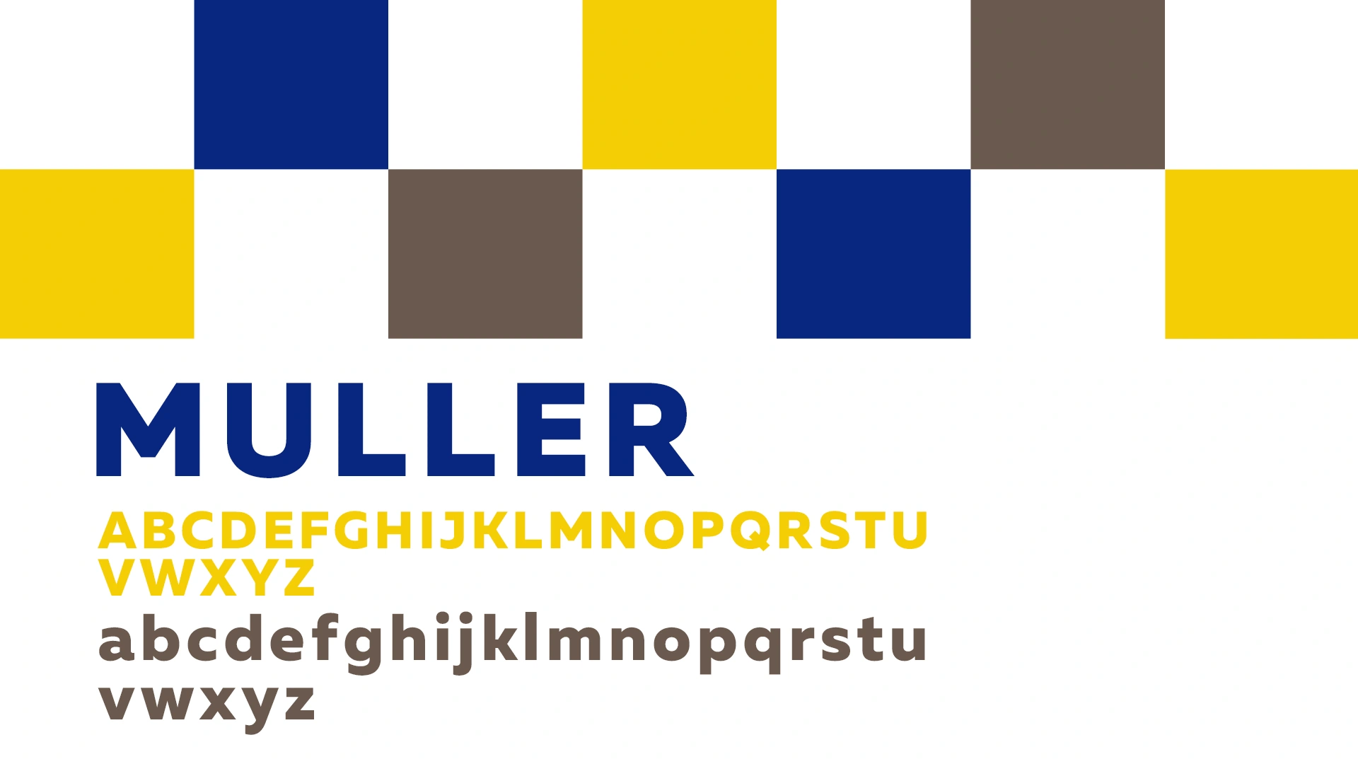
Typography System
Typeface Selection
A bold modern sans-serif typeface was selected for:
High readability
Strong visual presence
Accessibility across all age groups
Typography Characteristics
Rounded edges maintain friendliness
Bold weight reinforces confidence and reliability
Clean spacing improves clarity across platforms
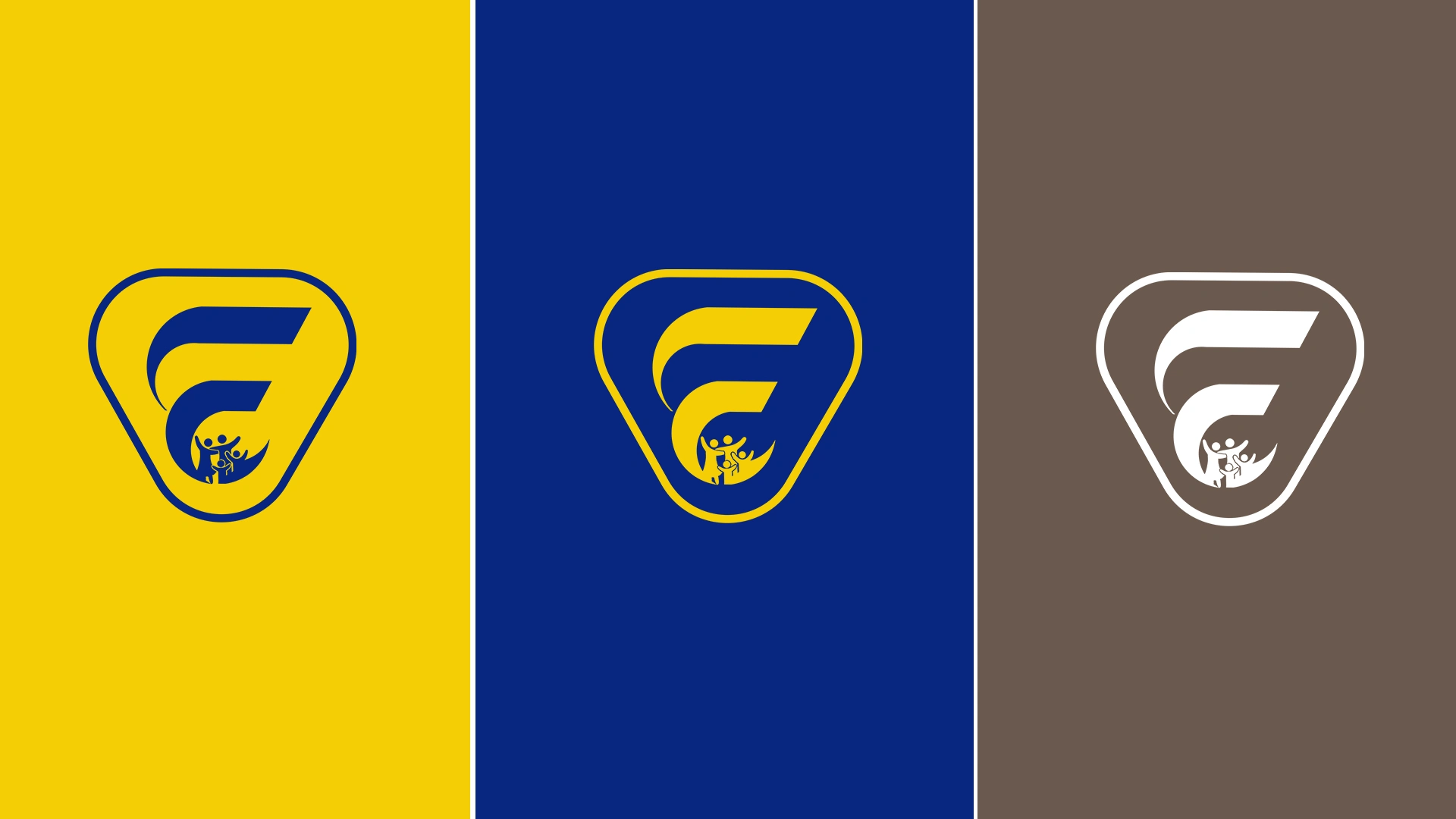
Design Principles Applied
1. Simplicity & Recognition
The logo uses clean geometry and controlled detailing to ensure:
Easy recognition
Strong memorability
Cross-platform adaptability
2. Emotional Branding
The identity was intentionally designed to evoke:
Belonging
Support
Positivity
Human connection
3. Scalability
The mark remains effective across:
Social media icons
Website headers
Event banners
T-shirts and merchandise
Stationery
Community outreach materials
Challenges & Solutions
Challenge 1: Combining professionalism with emotional warmth
Solution:
Balanced bold typography with soft curves and human-centered symbolism.
Challenge 2: Avoiding overly complex symbolism
Solution:
Used minimal abstraction to communicate multiple ideas within one clean icon system.
Challenge 3: Creating inclusiveness visually
Solution:
Integrated universal human figures and open shapes to communicate accessibility and unity.
Results & Impact
Developed a recognizable and emotionally resonant identity
Created a scalable brand system for community engagement initiatives
Enhanced the organization’s professional image while maintaining warmth
Delivered a versatile logo adaptable across both digital and physical applications
Potential Brand Applications
Community outreach campaigns
Event signage and banners
Educational materials
Staff uniforms
Website and social platforms
Flyers and brochures
Partnership presentations
Tools Used
Adobe Illustrator
Adobe Photoshop
Brand Identity Design, Community Branding, Family Organization Logo, Nonprofit Branding, Modern Logo Design, Visual Identity, Social Impact Branding, Community Center Branding, Graphic Design, Human-Centered Design, Corporate Identity, Logo Design
#LogoDesign #BrandIdentity #GraphicDesign #CommunityBranding #NonprofitBranding #VisualIdentity #ModernLogo #CreativeDesign #BrandStrategy #SocialImpactDesign #FamilySupport #ProfessionalBranding #DesignPortfolio #FreelanceDesigner #MinimalDesign
Like this project
Posted May 9, 2026
The Family Engagement Center branding project focused on developing a meaningful and community-driven visual identity for an organization.