Cre8 – Strategic Visual Design for Gen-Z Media
Alma Aurelia
Overview
Cre8 is an organization that helps creators build long-term businesses through blockchain, specifically tailored for a Gen-Z audience.
As the Graphic Designer, my role went beyond creating aesthetically pleasing visuals.
My core responsibility was to translate complex, fast-moving information into compelling visual assets that stop the scroll, spark curiosity, and maintain brand credibility.
The Problem
Creator Economy and blockchain topics can feel technical and overwhelming
Twitter/X is a high-speed platform with extremely short attention spans
Gen-Z audiences scroll fast — visuals must capture attention within 1–2 seconds
The brand must feel modern, credible, and future-facing
My Approach
Instead of focusing purely on aesthetics, I structured my approach around three key objectives:
1. Attention
How can the visual stop users mid-scroll?
2. Clarity
How can complex information feel digestible?
3. Consistency
How can every touchpoint reinforce a strong brand identity?
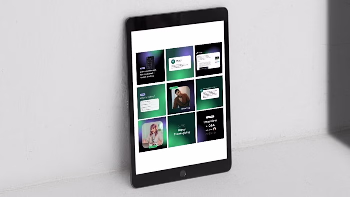
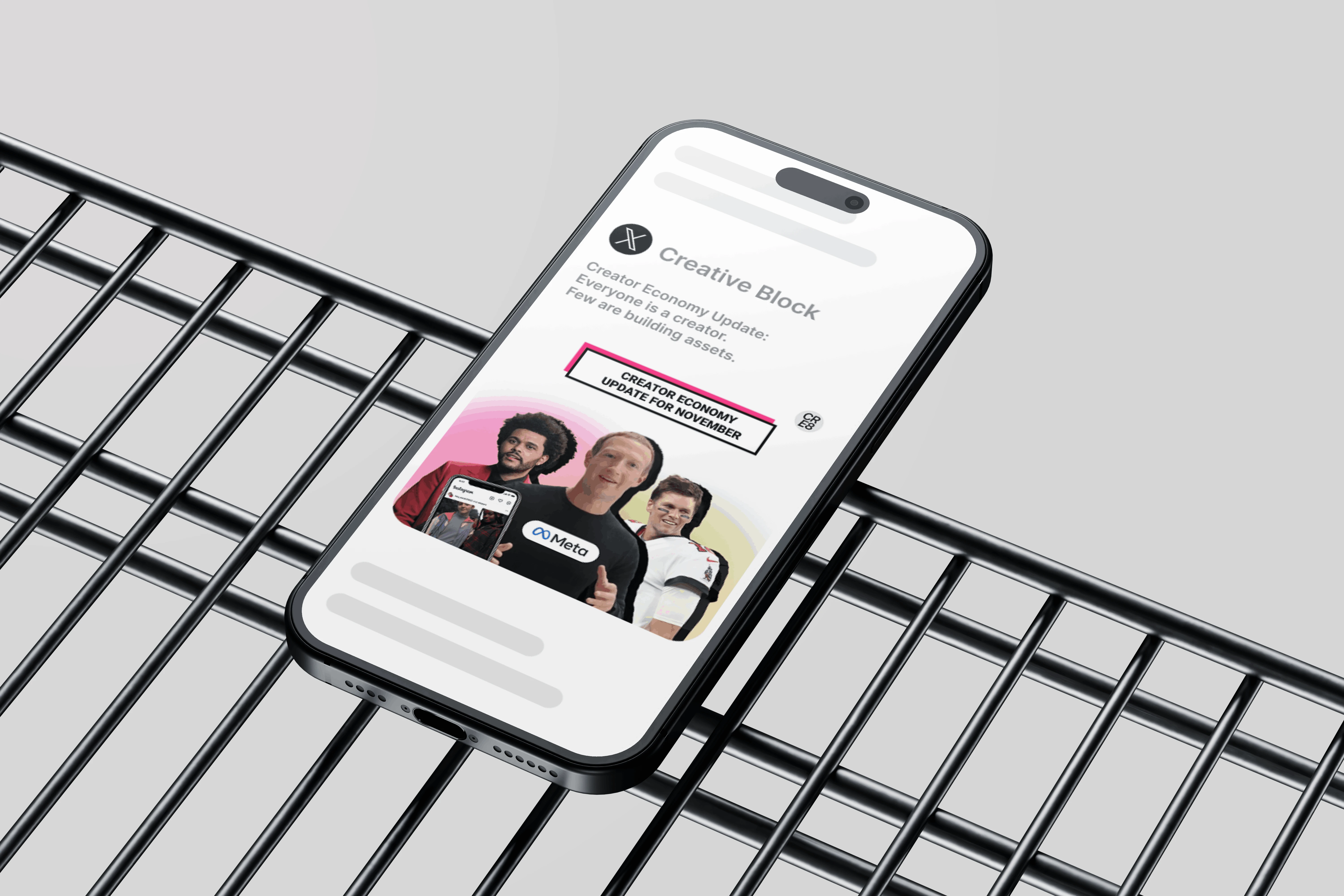
1. Twitter/X Thumbnail Design
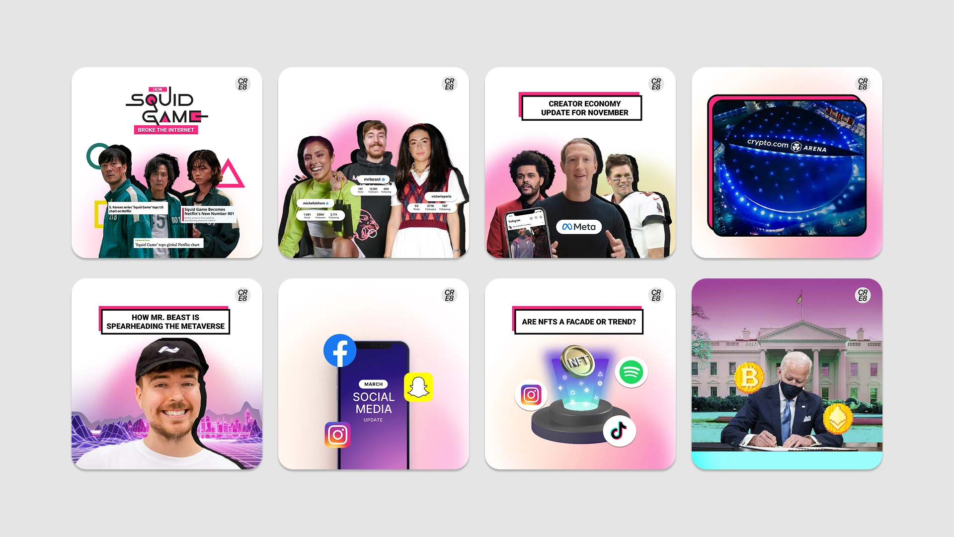
Twitter/X Thumbnail Design
Objective: Increase click-through rate and engagement on update threads
Bold Headline Hierarchy, the most important message is visually dominant within seconds.
Pink–Peach Gradient for Visual Impact
The pink–peach gradient was intentionally selected to:
Stand out in a crowded timeline
Align with Gen-Z visual culture
Maintain a clean and modern aesthetic
One Core Message Per Thumbnail
No information overload. Each design focuses on one central idea to maximize clarity.
Impact:
The thumbnails function as attention triggers, transforming informational posts into clickable visual hooks.
2. Newsletter Card Design
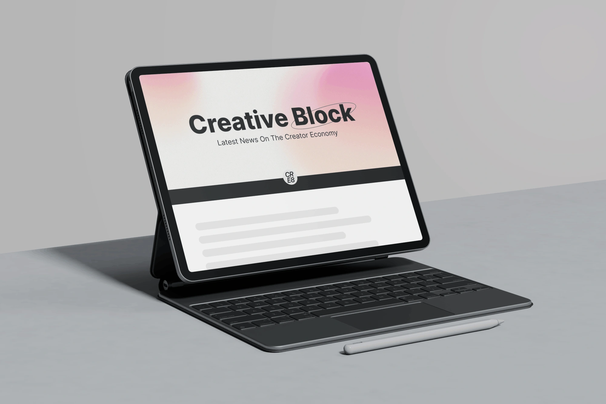
Newsletter Card
Objective: Make the monthly newsletter feel premium and worth opening
Clean Editorial Layout
Generous white space enhances readability and creates a premium feel.
Consistent Gradient Identity
The pink–peach gradient serves as a recognizable brand signature across all assets.
Impact:
The newsletter feels curated and valuable, increasing perceived credibility and brand consistency.
3. Twitter/X Header Design
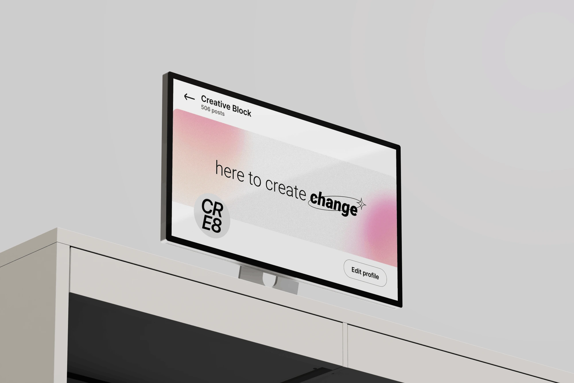
Twitter/X Header Design
Objective: Strengthen brand positioning at first glance
Clear Brand Positioning
A strong, concise tagline communicates Cre8’s focus on Creator Economy & blockchain.
Modern, Soft Gradient Background
The gradient maintains brand continuity while keeping the visual clean and forward-thinking.
Impact:
The header reinforces authority and immediately communicates what Cre8 stands for.
Overall Design Direction
The pink–peach gradient system was intentionally chosen to:
Appeal to Gen-Z aesthetics
Differentiate Cre8 from traditional finance/crypto media (which often rely on dark, blue, or aggressive tones)
Balance playfulness with credibility
Create a strong and recognizable brand identity across platforms
Key Takeaway
This project demonstrates my ability to:
Translate complex topics into engaging visual communication
Design strategically for attention-driven platforms
Maintain brand consistency across multiple touchpoints
Think beyond aesthetics and design with intent
Cre8’s visual system was built not just to look modern — but to perform in a fast-moving digital ecosystem.
Like this project
Posted Mar 3, 2026
Developed engaging visuals for Cre8's platforms to boost engagement.