
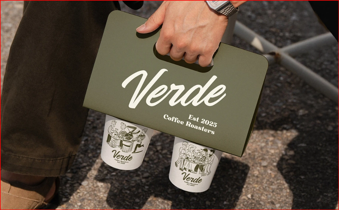
VERDE — Brand Identity Case Study
Overview
VERDE is a modern brand identity created for an eco-conscious business focused on sustainability, wellness, and natural living. The objective was to develop a visual identity that communicates trust, freshness, and premium quality while maintaining a clean and timeless aesthetic. The project balances contemporary minimalism with organic design elements, creating a brand that feels approachable, memorable, and environmentally responsible.
The Challenge
The primary challenge was creating a distinctive identity in a highly competitive market where many sustainable brands rely on predictable visual styles. The goal was to avoid generic "green" branding while still reinforcing values such as nature, transparency, and quality.
The identity needed to:
Build instant trust with customers.
Reflect sustainability without feeling cliché.
Scale across packaging, digital platforms, and marketing materials.
Maintain a premium appearance while remaining warm and approachable.
Research & Strategy
The design process began with researching modern sustainable brands, consumer expectations, and visual trends within the wellness and lifestyle industries.
Key strategic goals included:
Positioning VERDE as a premium yet accessible brand.
Creating a timeless identity rather than following short-lived design trends.
Building a flexible visual system that performs consistently across physical and digital touchpoints.
Using typography and color psychology to reinforce feelings of calm, growth, and authenticity.
Design Process
The identity was developed around simplicity and clarity.
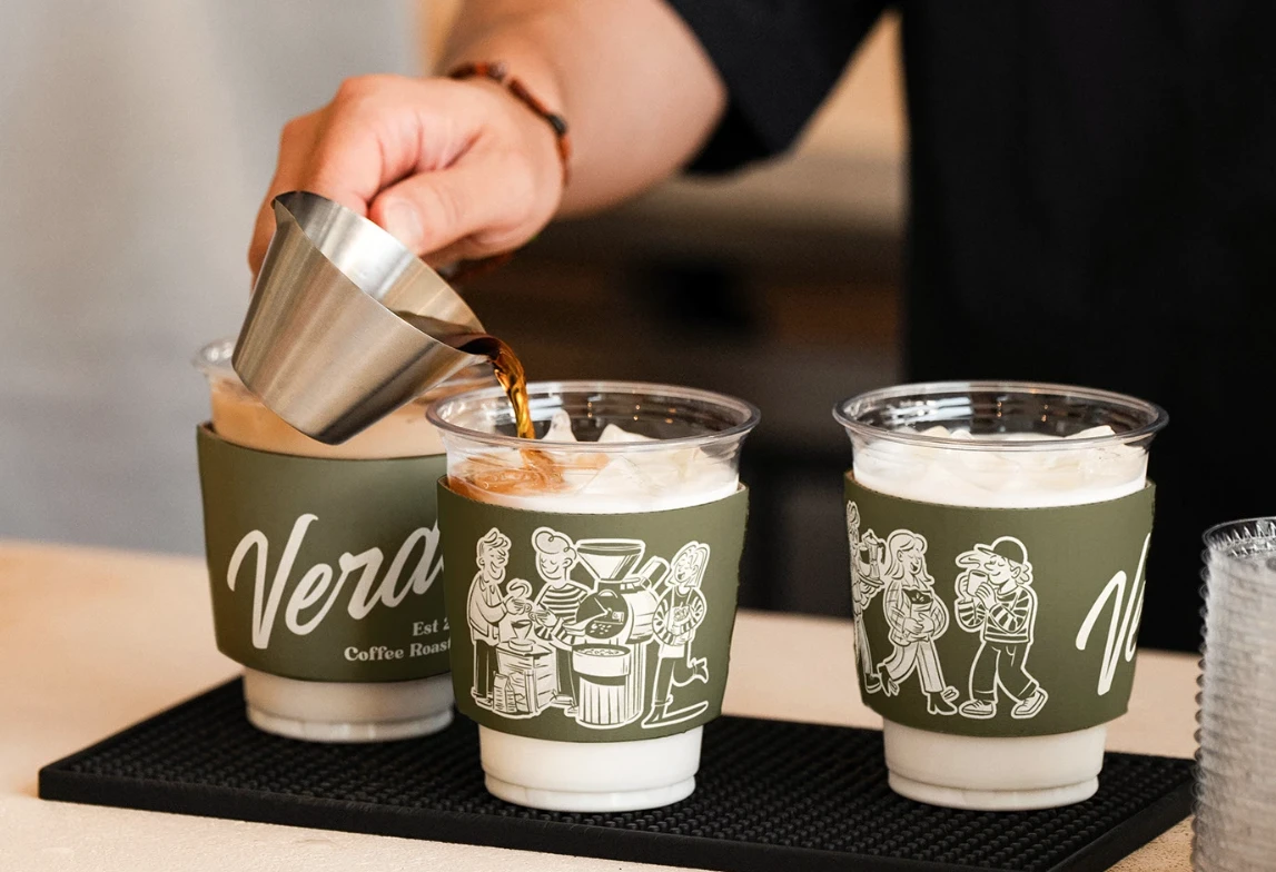
A carefully selected color palette inspired by nature communicates freshness and sustainability while maintaining a sophisticated look. Clean typography creates excellent readability and reinforces the brand's modern personality.
Supporting graphic elements and layouts were designed using generous white space, balanced compositions, and subtle organic forms, allowing the products and messaging to remain the primary focus.
The result is a cohesive identity system that feels confident, refined, and instantly recognizable.
Brand Applications
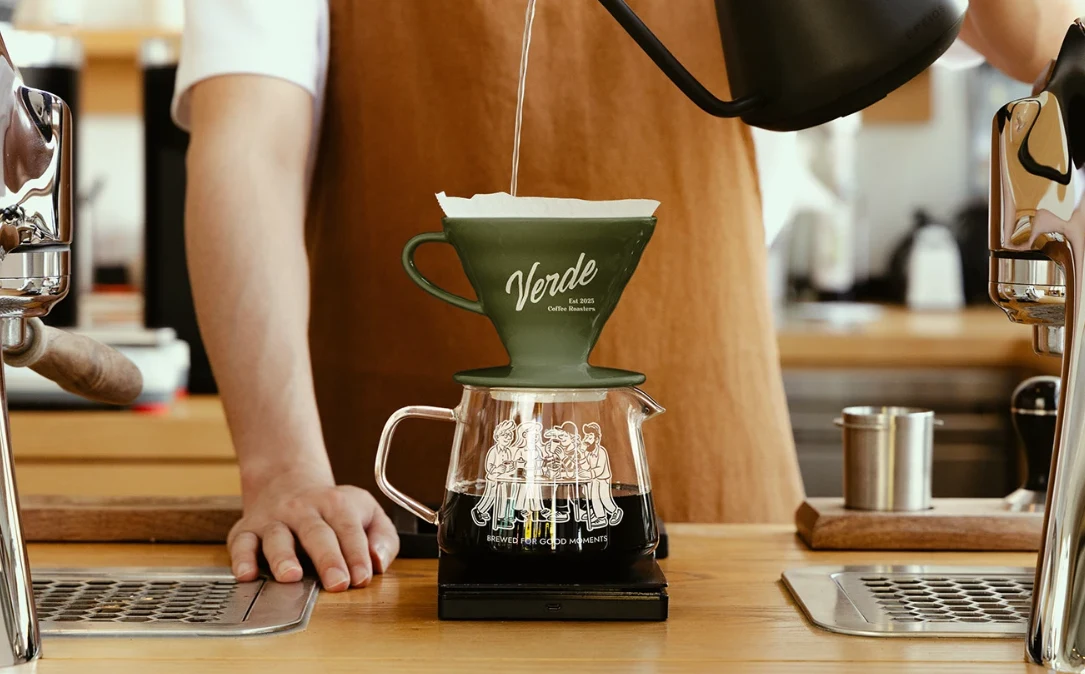
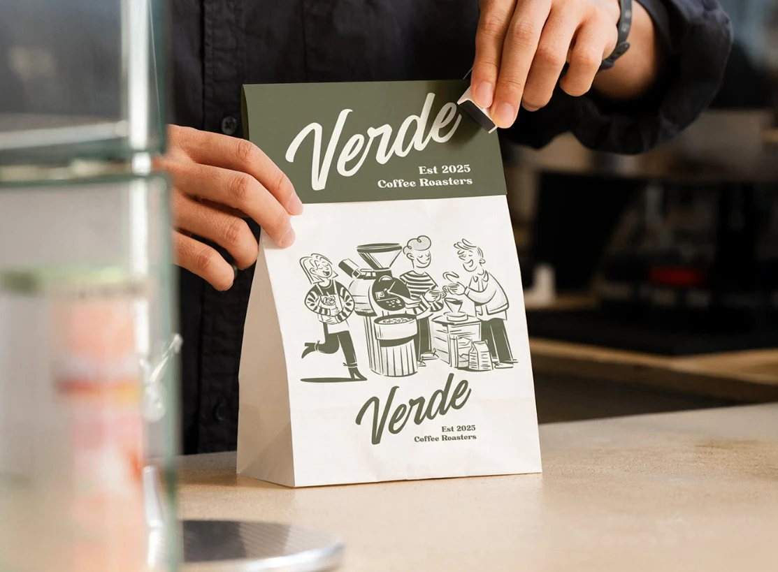
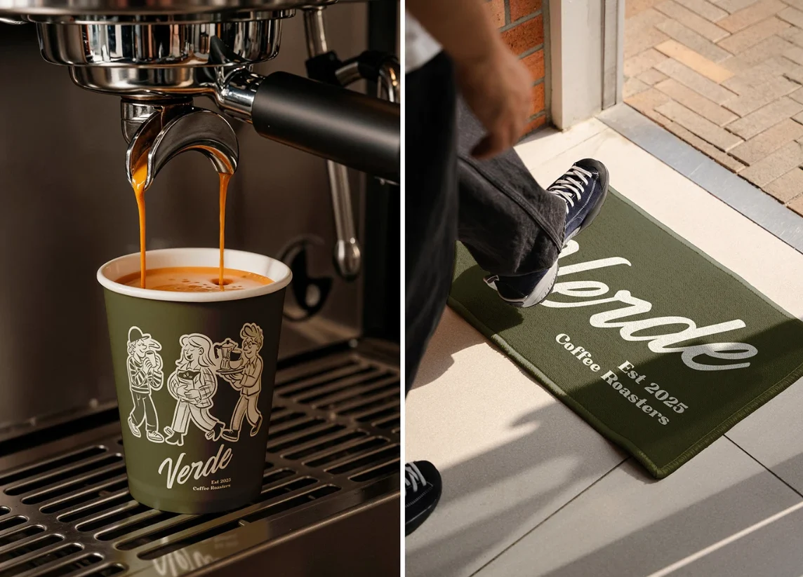
The visual identity was designed to adapt seamlessly across multiple brand touchpoints, including:
Logo system
Color palette
Typography
Brand guidelines
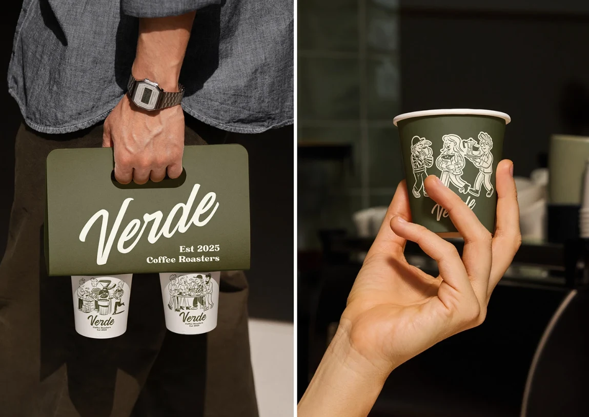
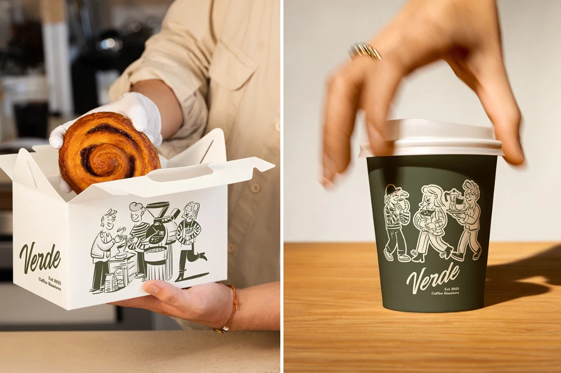
Product packaging
Stationery
Marketing collateral
Social media assets
Website visuals
Promotional materials
Every application maintains visual consistency while strengthening overall brand recognition.
Results
The final identity successfully positions VERDE as a premium sustainable brand with a clear visual language that communicates professionalism and authenticity.
The branding system provides:
Strong market differentiation
Consistent customer experience
Increased brand recognition
Flexible implementation across print and digital media
A scalable foundation for future business growth
Tools Used
Figma
Adobe Illustrator
Adobe Photoshop
Key Takeaways
VERDE demonstrates how thoughtful branding extends beyond a logo. By combining strategic thinking with clean visual execution, the project creates a memorable identity that reflects sustainability, quality, and modern design principles. The final result is a versatile branding system capable of growing alongside the business while maintaining a consistent and premium customer experience
0 likes · 5 views · Jul 19, 2026
Crafted a clean, nature-inspired brand identity for VERDE, blending modern minimalism with sustainable aesthetics to create a memorable and premium presence


