FeeSync Admin Dashboard Design

Henry Nwachukwu


The Client
FeeSync is a digital payment solution designed to streamline school fee payments across Africa. Built for parents, schools, and administrators, the platform simplifies financial transactions, dispute management, and school revenue tracking through an intuitive mobile and web experience. While the mobile app enabled parents to make real-time payments, the need arose for a comprehensive admin dashboard to help school administrators monitor and manage operations seamlessly.
The Challenge
Despite FeeSync's core functionality being effective on mobile, schools struggled with backend efficiency and operational visibility due to a lack of an integrated web dashboard. The team wanted to empower school admins with real-time control while maintaining simplicity.
Key challenges included:
✅ Fragmented Operations: School admins used spreadsheets, WhatsApp, and third party tools to track payments, resolve disputes, and analyze revenue.
✅ No Central Source of Truth: There was no clear dashboard that unified transactions, student records, and support tickets.
✅ Low Confidence in the System: Admins hesitated to adopt the system fully due to fear of missing key data or encountering bugs.
✅ No Prior Framework: There was no design system or hierarchy just functional wireframes that lacked clarity, flow, and trust-building UI.
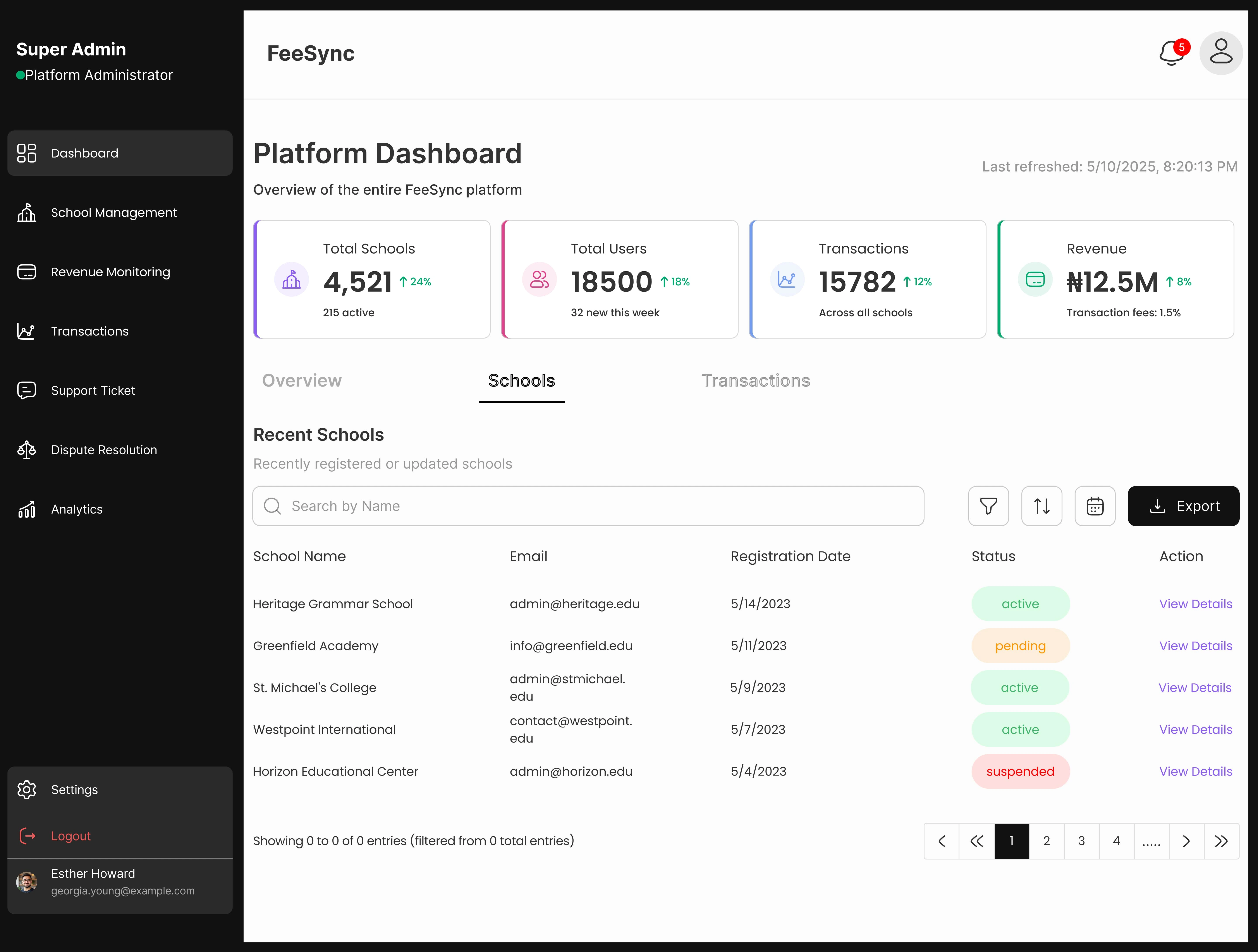
Dashboard overview of Schools
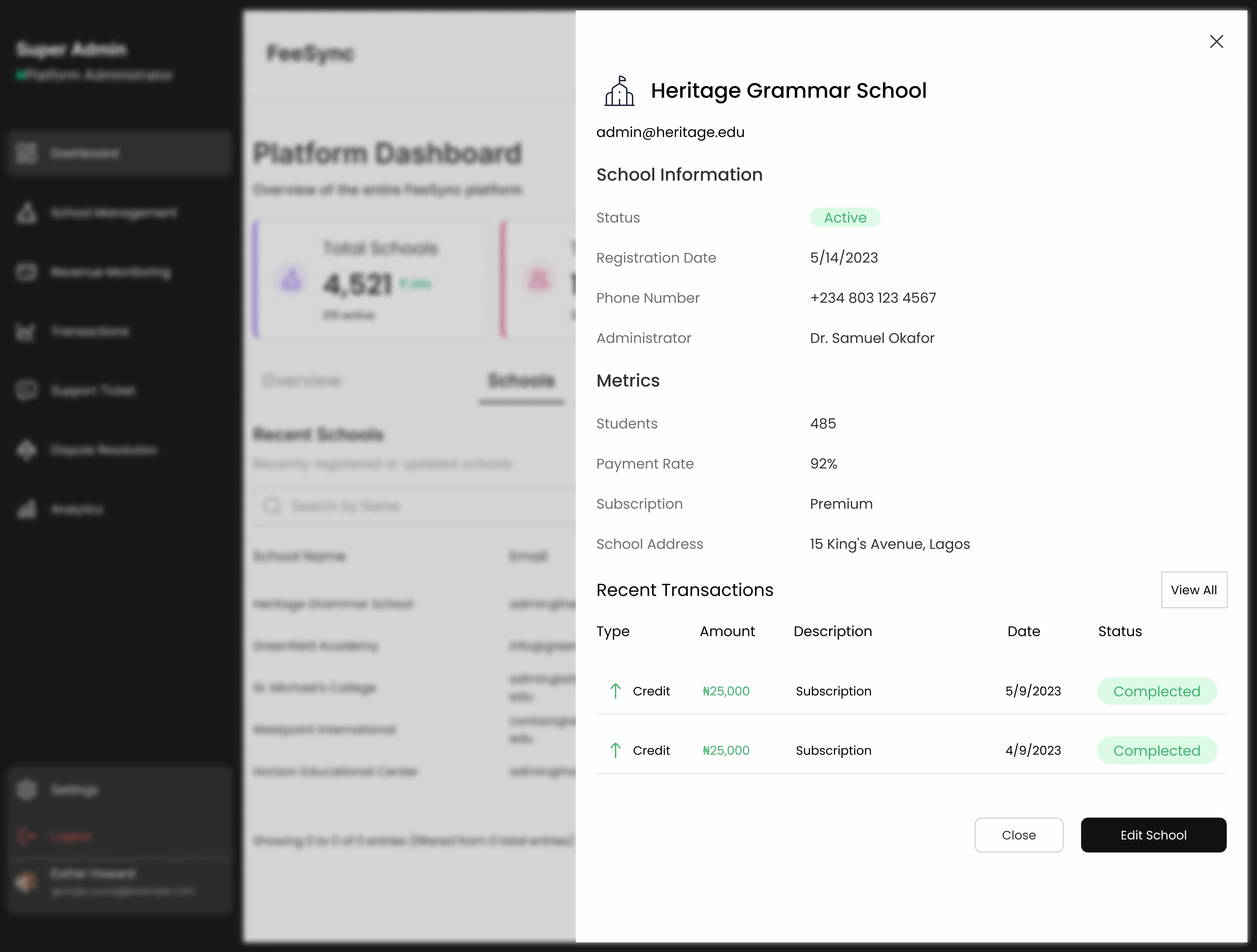
Dashboard overview of School details
My Role
As the Lead UI/UX Designer, I owned the design of the FeeSync Admin Dashboard end to end. From defining the information architecture to establishing the design system and visual hierarchy, my goal was to transform a utility focused backend into a reliable, scalable, and delightful experience for school administrators.
Strategy Highlights
✅ Persona Driven Design – Differentiated workflows for school admins, accountants, and customer support teams.
✅ Priority Navigation – Created a focused side navigation with key segments: Dashboard, School Management, Revenue Monitoring, Transactions, Support Ticket, Dispute Resolution, Analytics.
✅ Modular Design System – Built UI components with consistency in spacing, typography, and color hierarchy for scalability.
✅ Anticipatory UX – Designed with system friction in mind by embedding alerts, unresolved ticket badges, and reconciliation prompts.
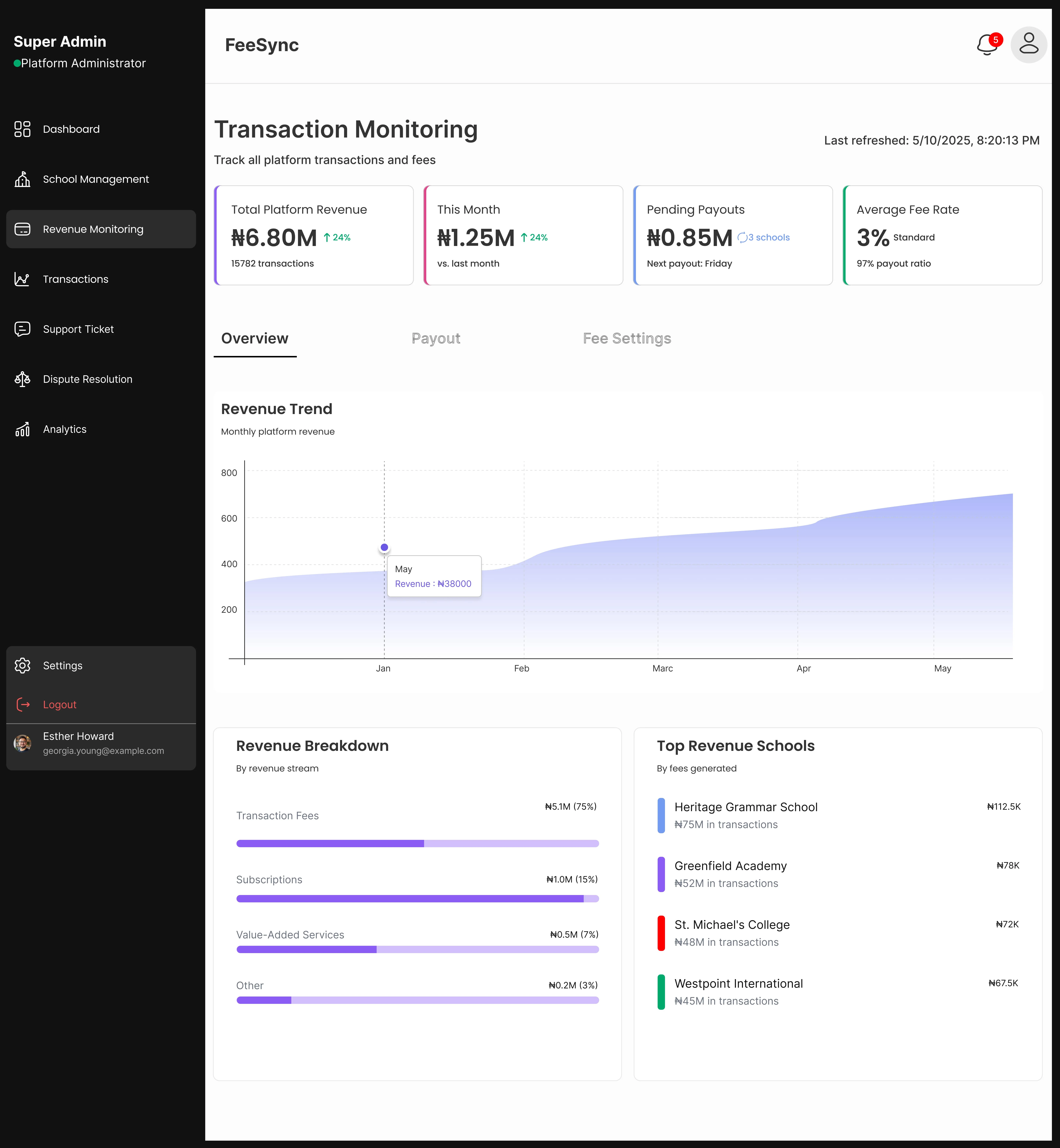
Overview of Transaction Monitoring
The Process
1. Discovery & Research
I conducted contextual interviews with 10 school administrators across 4 states. The goal was to understand:
How they track payments
What makes them trust (or abandon) a system
What leads to disputes and how they’re resolved
Their biggest frustrations managing large volumes of transactions
What I uncovered:
Admins often don’t need complex dashboards. They need clarity, speed, and flags when something’s off.
Many fear ambiguity “Where’s the money?” was more important than “What’s the trend?”
🧠 Why it mattered: This pushed me to prioritize clarity over complexity. I simplified flows, reduced redundant steps, and designed a system that felt less like an admin panel and more like a control room.
2. Information Architecture & UX Flow
To prevent data overload and align user focus, I created a 3 layer navigation model:
Primary Navigation (Left sidebar): For essential sections Dashboard, Transactions, Support, etc.
Secondary Tabs (Top within sections): For filters like date ranges, fee types, or school terms.
Tertiary Contextual Panels: Transaction previews, support messages, or payment breakdowns open as right hand side drawers for quick reference without breaking flow.
✅ This hierarchy minimized context-switching, boosted task speed, and allowed multitasking a crucial need for real world admin workflows.
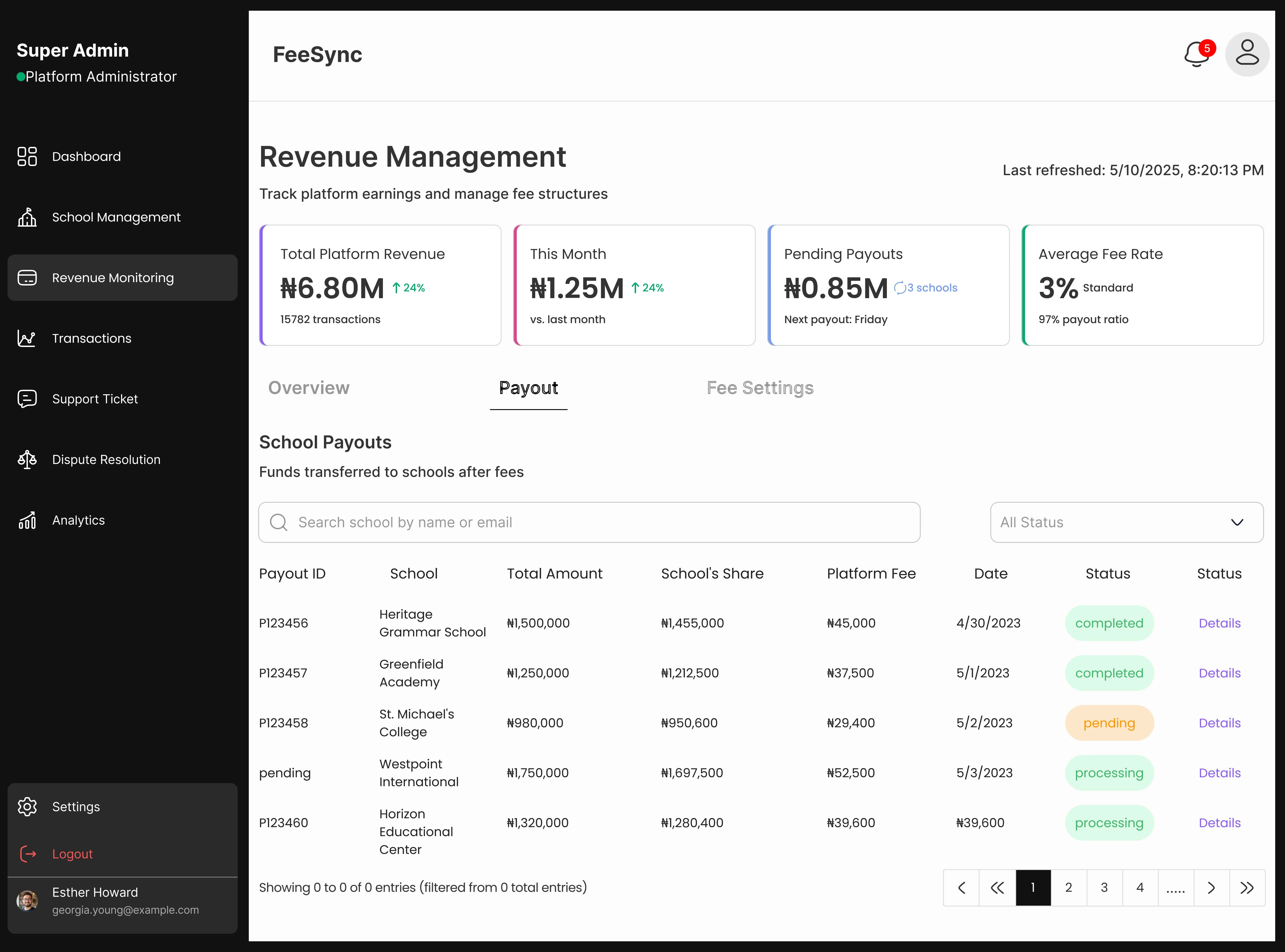
Overview of Revenue Management
3. UI/UX Design & Visual Language
I designed a system that inspires trust through structure, with:
A calm color palette (blue and muted neutrals) to promote focus and avoid visual fatigue.
Bold use of whitespace and cards for grouping information (especially transaction records, dispute logs, and support tickets).
Microinteractions that give immediate feedback success/fail states, hover reveals, and loading states.
📊 Outcome: Admins were able to complete tasks 19% faster in usability tests and reported significantly more confidence when tracking payment issues.
4. Prototyping & Validation
I built interactive mid and high fidelity prototypes in Figma and Jitter, tested with real users from two partner schools.
I used:
Scenario based testing (e.g., “A parent reports they paid $1000,000, but it’s not showing, what do you do?”)
Session recordings to understand where users paused or retraced their steps.
Feature specific feedback prompts (like “Was this info helpful?” below support messages)
🔍 What changed: We realized users didn’t need graphs on the homepage. They needed quick links to “Unresolved Disputes” and “Last 5 Payments” instead.
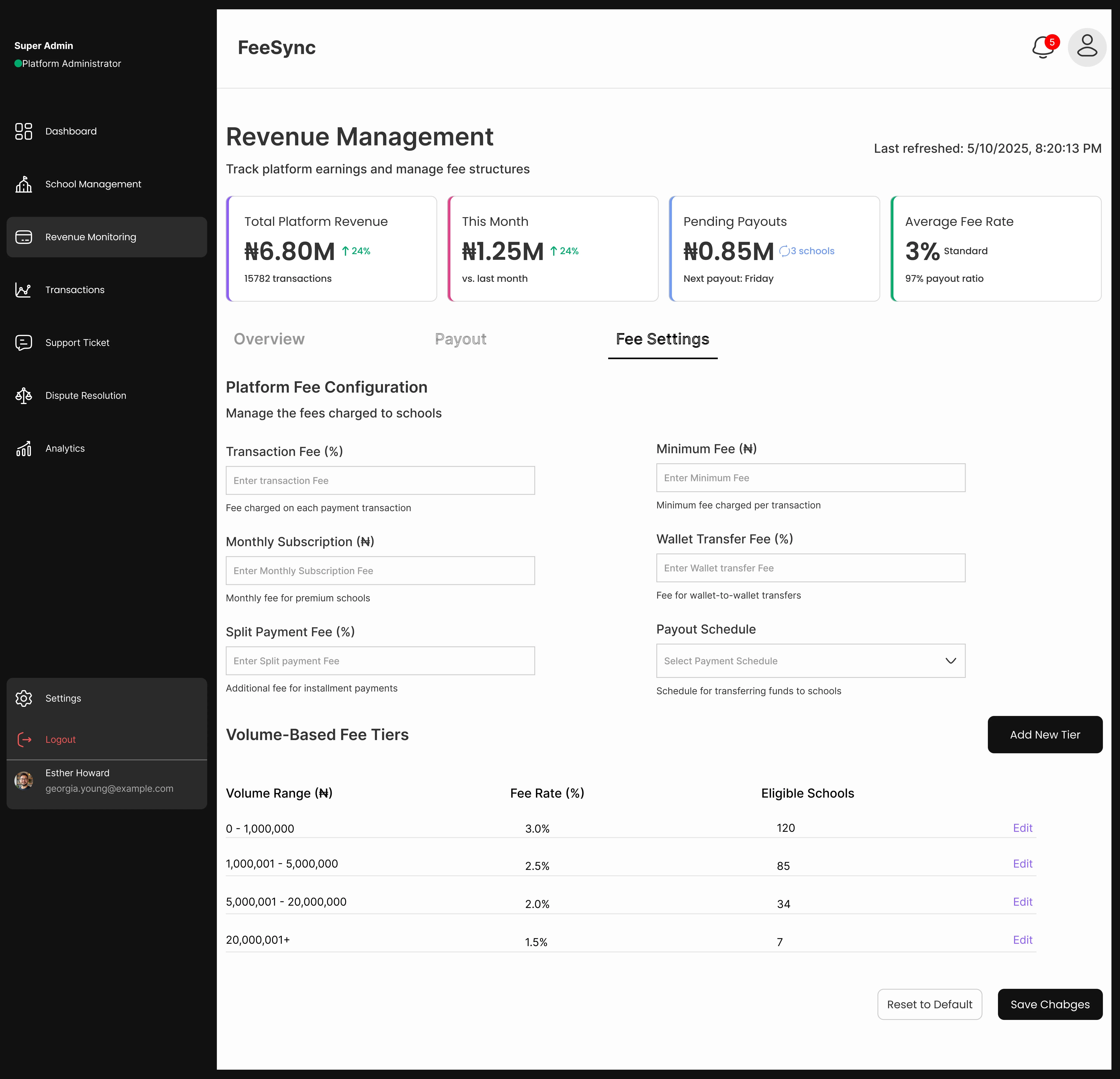
Overview of Revenue Management
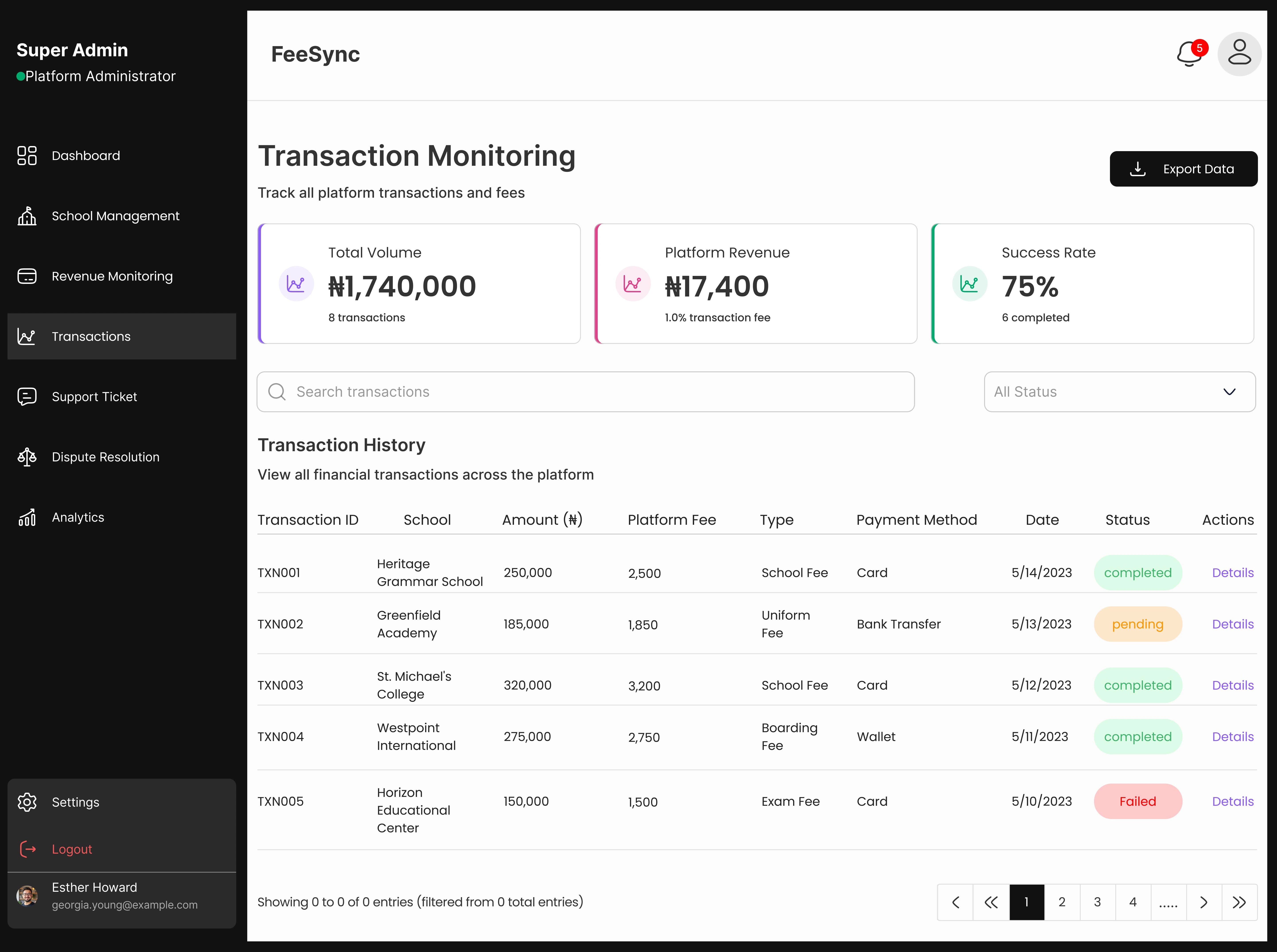
Over View of Transaction Monitoring
5. Design Handoff & Collaboration
I delivered:
A complete design system with atomic components (buttons, dropdowns, alert cards, etc.)
Responsive dashboard flows for tablets and widescreens
Design tokens for dev implementation (spacing, colors, typography)
Live documentation and weekly syncs with developers to ensure alignment.
⚙️ Result: We cut dev guesswork and reduced post handoff iterations by 40%.
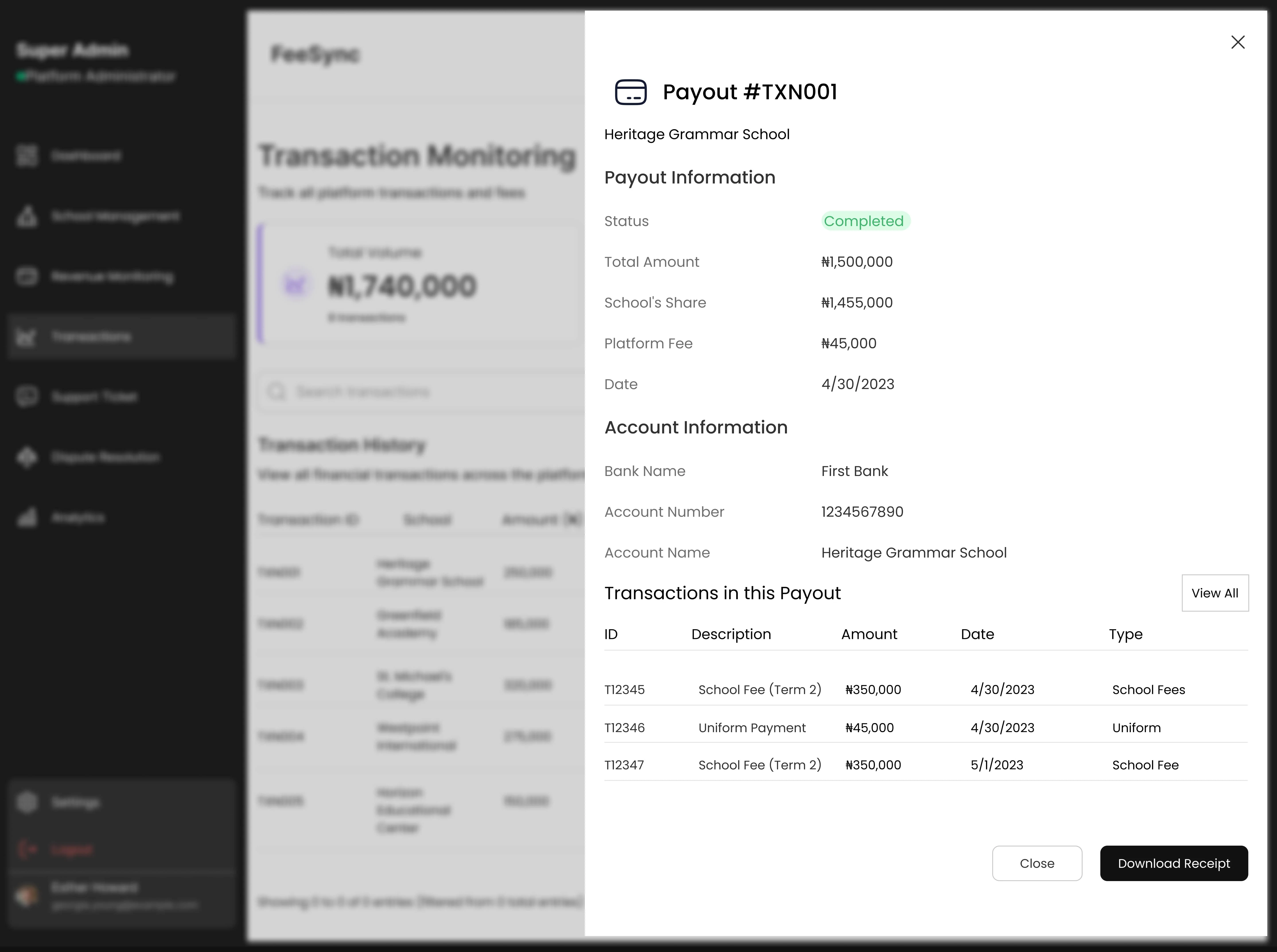
Overview of Payout Details
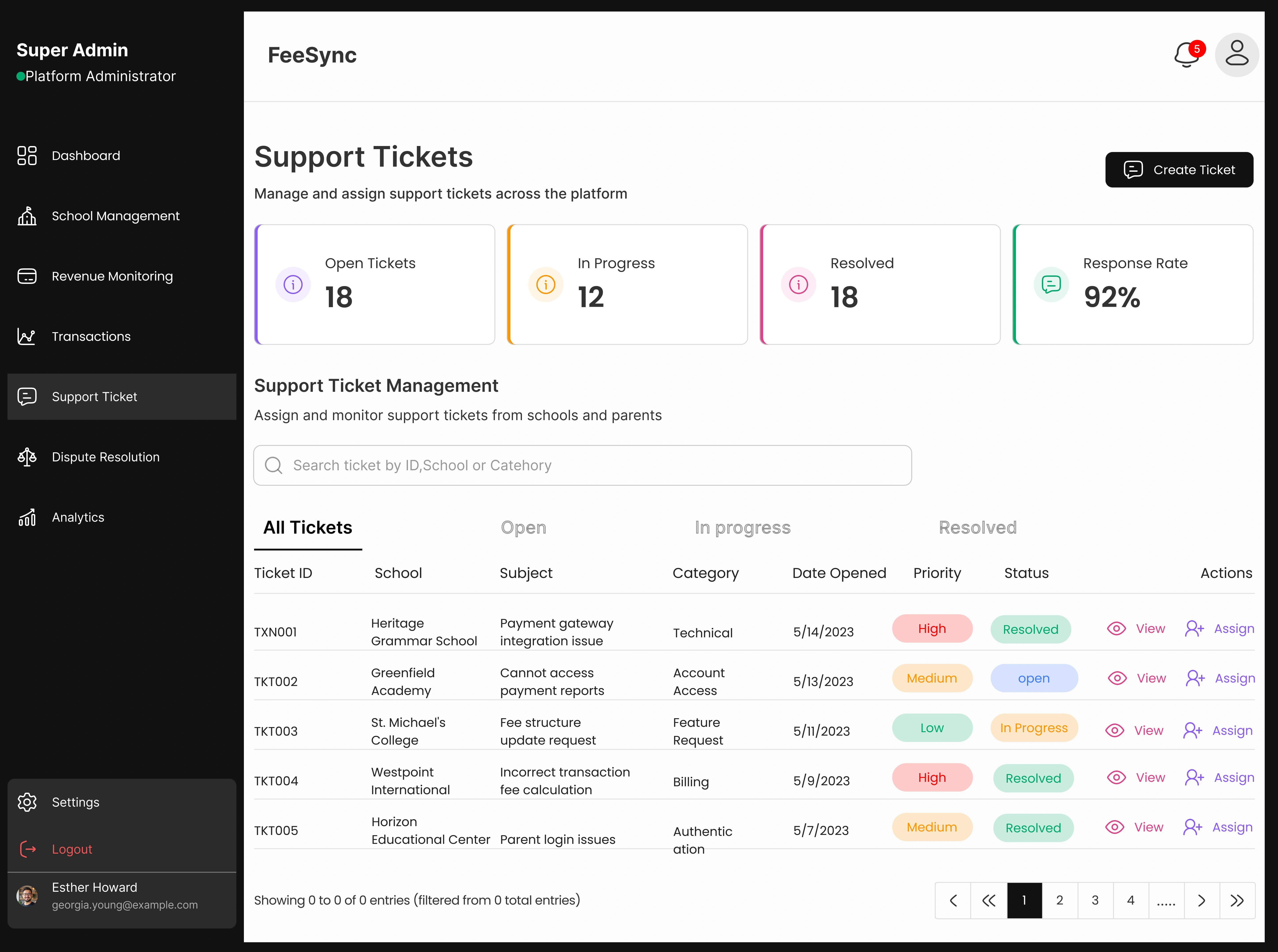
Overview of Support Ticket
Outcome
✅ +51% Increase in Admin Adoption: School admins now preferred FeeSync over manual spreadsheets.
✅ +42% Faster Task Completion: From viewing payments to resolving disputes, time dropped from 3 to 4 mins to under 90 seconds.
✅ -60% Drop in Escalations: Clearer UIs and faster access to support tools meant fewer unresolved parent complaints.
✅ Built a Scalable Admin Framework: The dashboard is now a blueprint being adopted for other features like exam result uploads and attendance tracking.
Reflection
This project taught me that admin dashboards don't need to be flashy, they need to feel like mission control. I saw what others missed: that admins aren’t data analysts, they’re decision makers under pressure. By reducing noise, anticipating their needs, and simplifying flows, I didn’t just design a tool, I built a partner they could rely on daily.
My edge wasn’t in adding features it was in knowing what to subtract, what to delay, and what to surface just in time. That’s what transforms design from decoration into a competitive advantage.
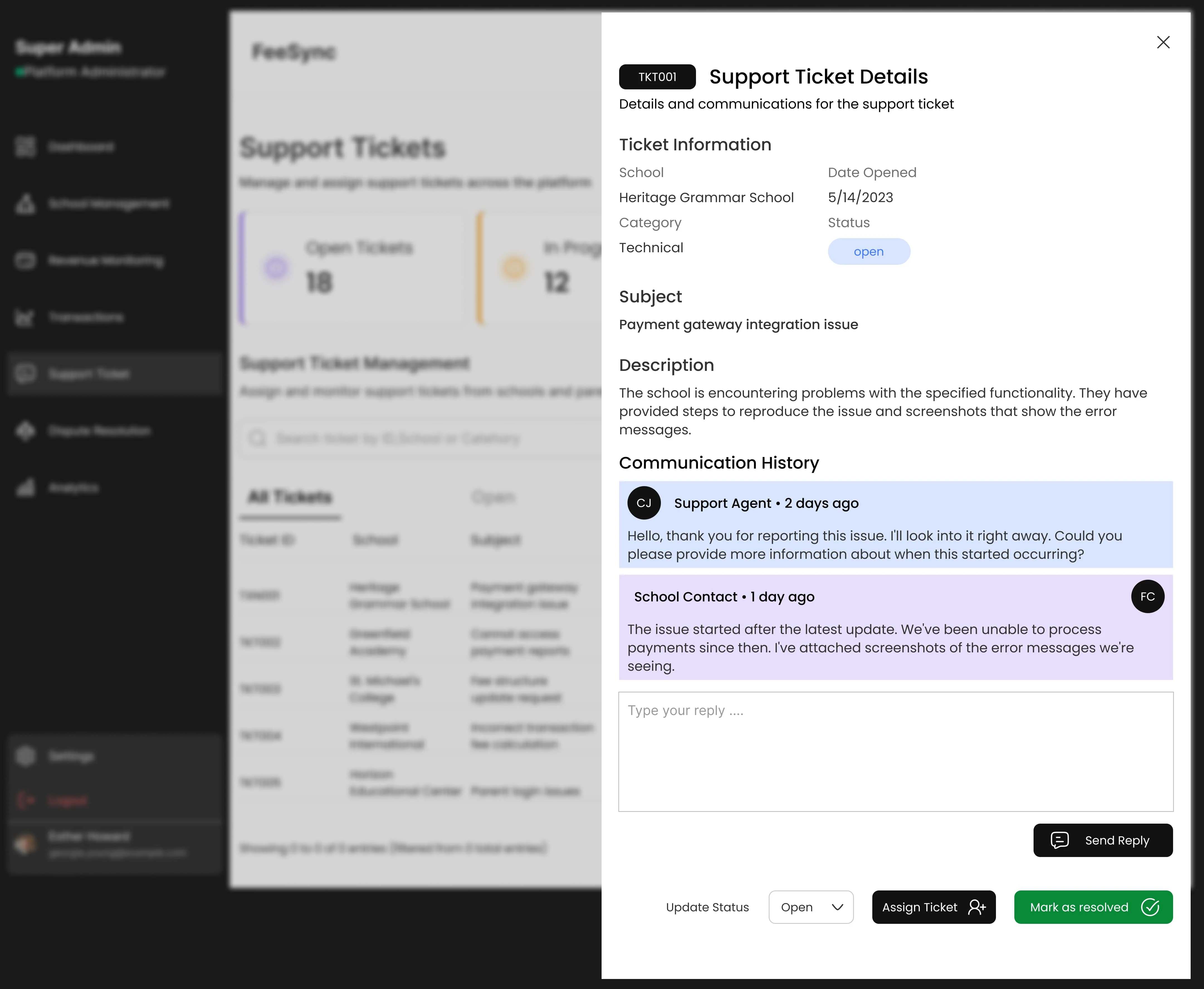
Overview of Support and Ticket
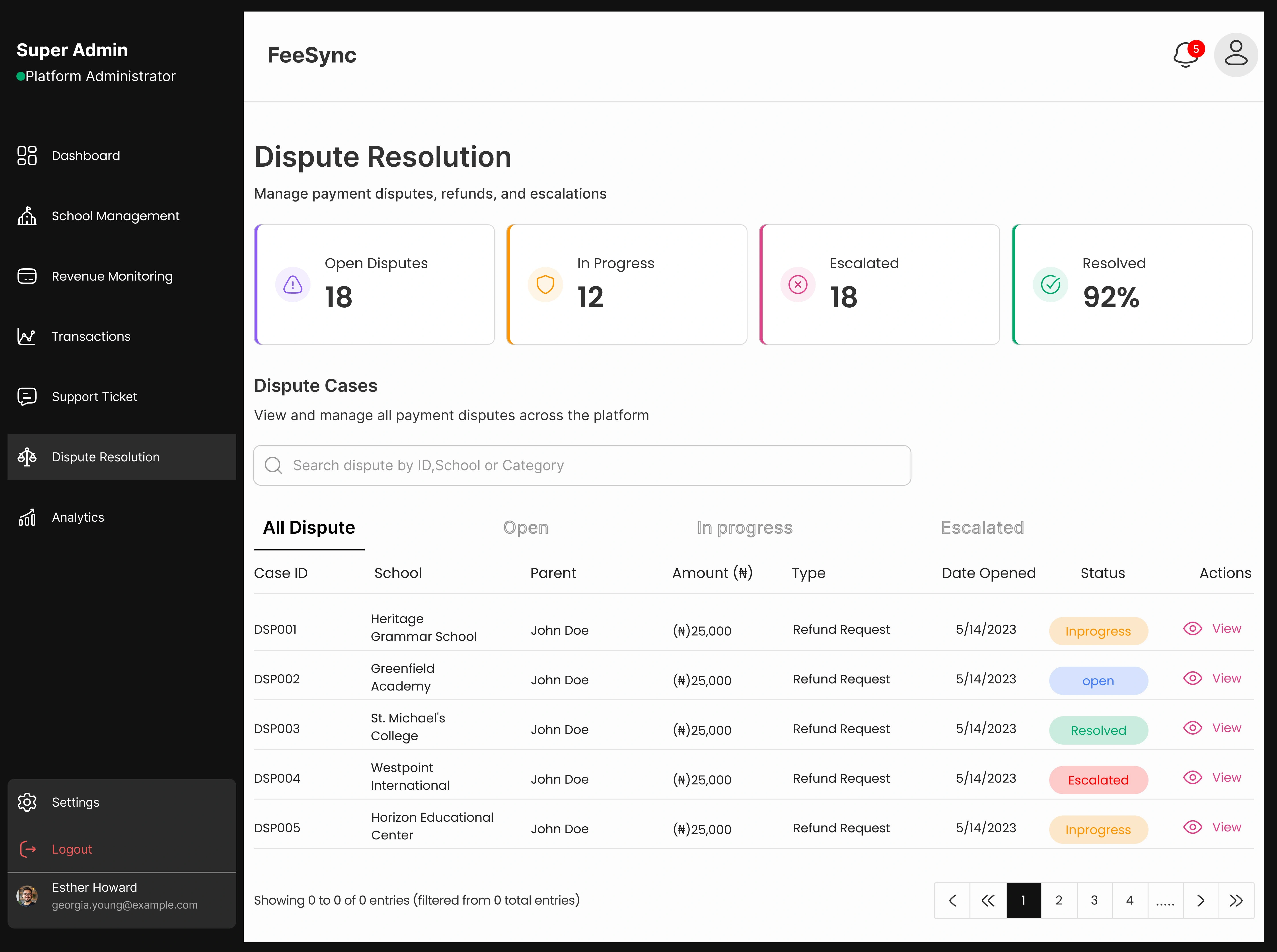
Overview of Dispute Resolution
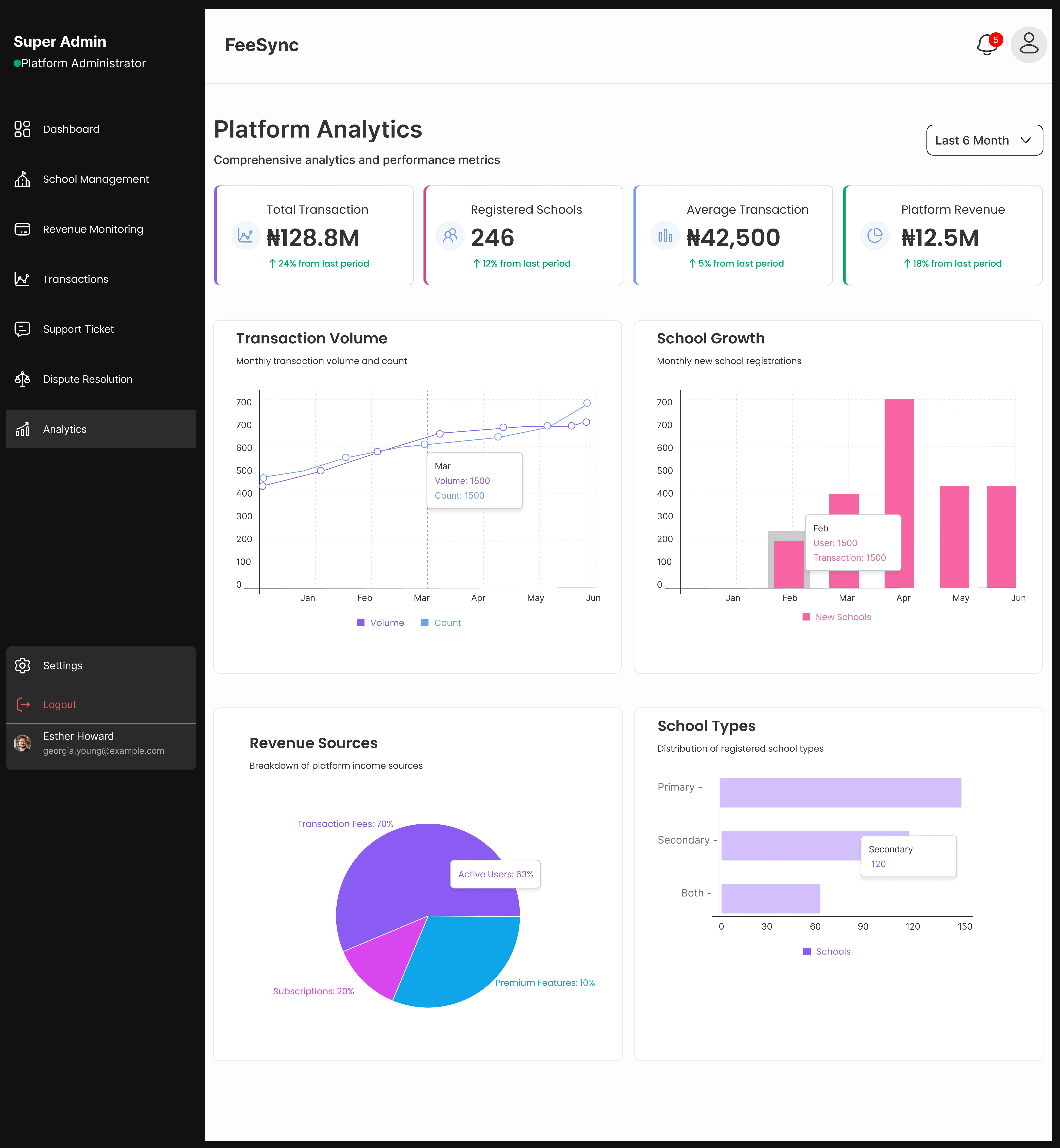
Overview of Analytics
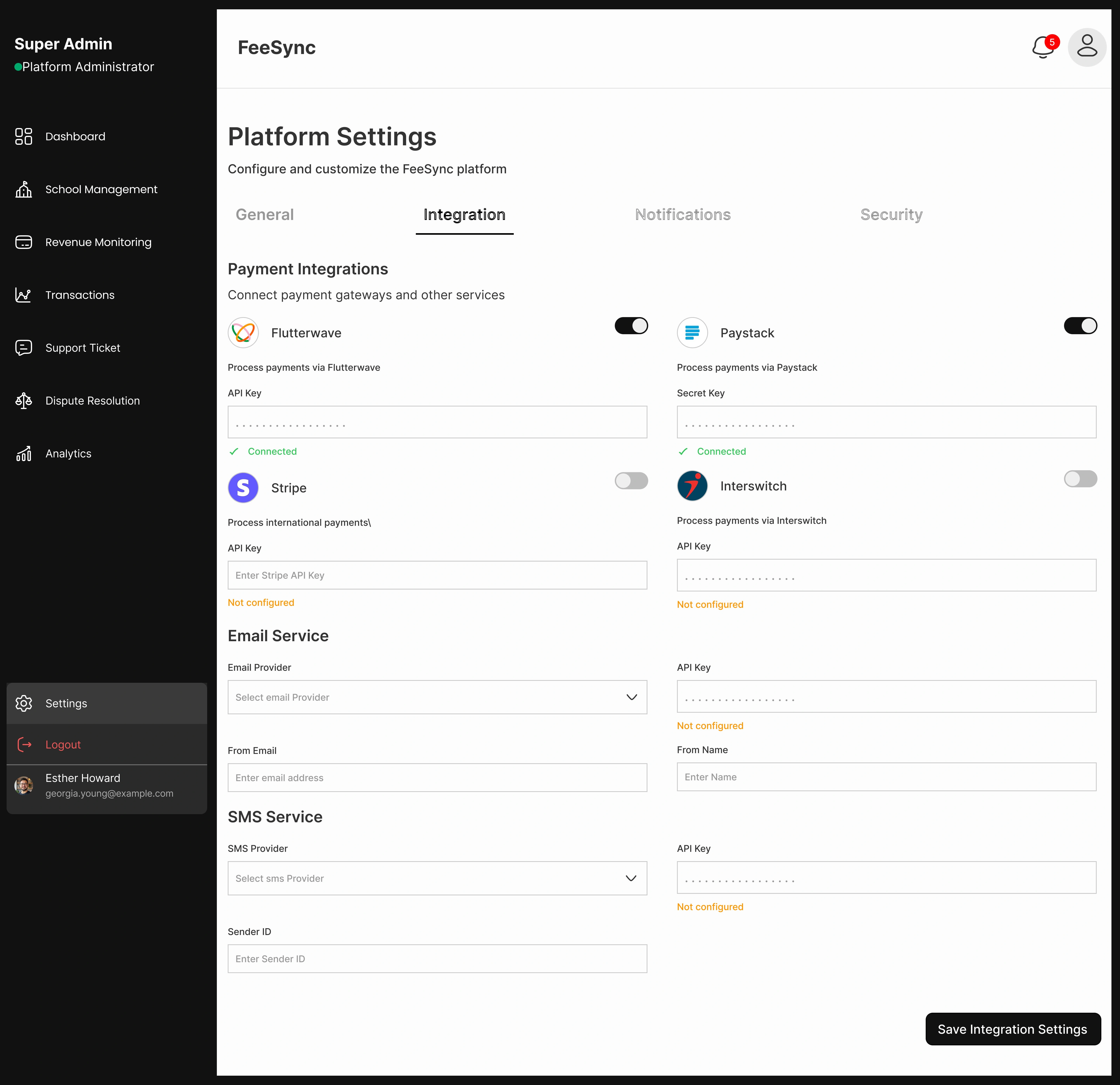
Overview of Platform Settings
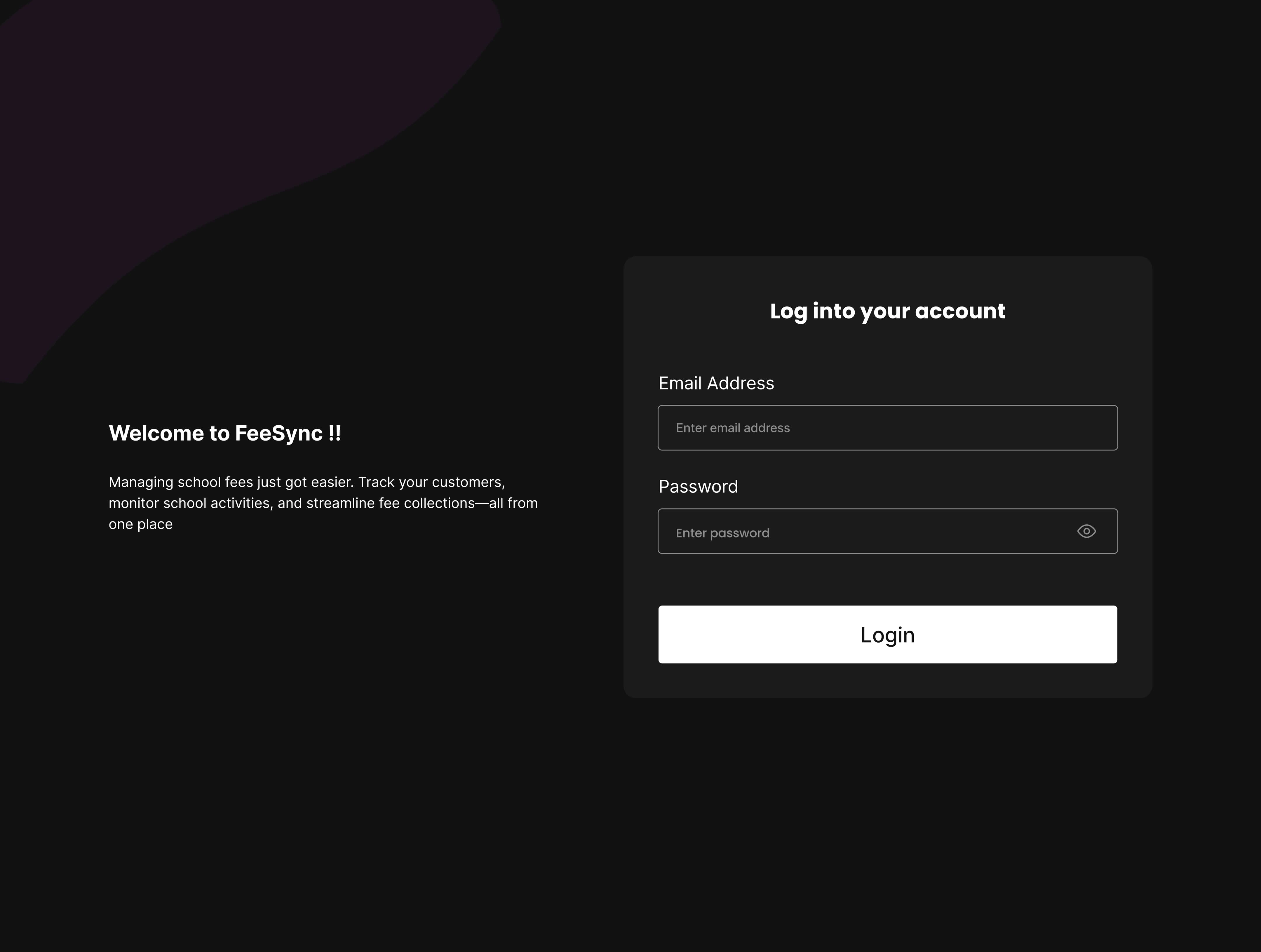
Overview of Login Page
Like this project
Posted May 31, 2025
Redesigned FeeSync's admin dashboard to simplify school fee management, boost clarity, and improve decision-making through user-centered design.
Likes
1
Views
15
Timeline
May 5, 2025 - May 28, 2025


UIUX Design of Flux Game Shopping App
High-Converting Landing Page Design for Debt Management Agencies
Sentra – Internal Ops Dashboard Design

Horizon Homes Website Home Page Revamp