

Book your airport security screening, then get guided to check-in. Leeway helps travelers plan their arrival at Ben Gurion Airport by booking a security screening time slot and following their progress through the airport.
Role: Solo: research, UX/UI design, design system, front-end prototype
Context: Final project, UX/UI & Product Design course, John Bryce
Tools: Figma, FigJam, HTML/CSS/JS, AI coding assistant
Delivered: Research package, Figma design system, 12-screen prototype in 4 languages
A concept project. The prototype runs in any browser but is not connected to the airport’s booking or security systems.
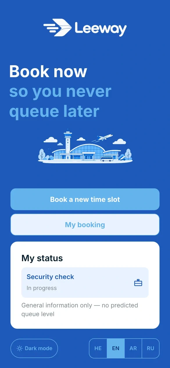
Home screen with an active booking.
01 · THE CHALLENGE
Nobody knows how long the airport will take
At Ben Gurion, departing travelers pass a short security interview at the terminal entrance, before check-in. Its length is hard to predict, so most people simply arrive three hours early. Leeway replaces that guess with a booked window.
“I always get to the airport about three hours before the flight.” — Interviewee 4 (translated from Hebrew)
02 · RESEARCH & DIRECTION
A planning problem, not a queue problem
Four interviews pointed to the same thing: travelers couldn’t tell how long the airport would take, so they arrived early just in case.
Arrive at a fixed time, regardless of load
3 of 4 interviewees · 2.5–3.5 hours before departure, every trip.
Design response: Windows are generated from the flight’s departure time.
The slowest stage keeps moving
3 of 4 interviewees · Security on one trip, check-in on the next.
Design response: Only security is booked. Check-in is shown, never promised.
Identified by physical documents
3 of 4 interviewees · Passport and boarding pass at the desk.
Design response: The QR works alongside the documents, not instead of them.
Counts are from four real interviews. Four simulated scenarios were used only to flag assumptions (see Appendix).
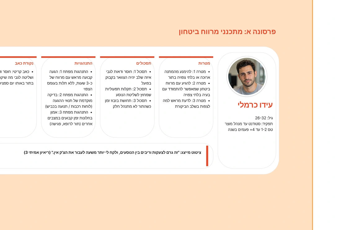
Primary persona · Ido Carmeli. Once lost over an hour when a desk closed. Now he always arrives three hours early. He lacks control, not patience.
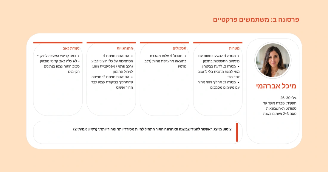
Secondary persona · Michal Avrahami. Plans with her own tools. Her longest wait was at check-in, so Leeway serves her least.
The airport journey, stage by stage
Ido, first trip (1 = frustration, 5 = motivation):
Deciding to book — 3
Identifying the traveler — 3.5
Choosing a window — 3
Booking confirmed — 3.5
Security screening — 1.5 (lowest point)
Check-in — 4
The low point is the screening itself. The booking is already done, so the app’s job there is to show where he stands.
Scores (1 = frustration, 5 = motivation) are my scenario-based estimates from the journey-mapping exercise, built on the persona research. They were not measured with participants.
Book one stage. Guide the rest.
Leeway books the security screening and follows the traveler until check-in ends. Check-in appears as the next stage without a reserved time, because its length depends on things nobody can book.
03 · DESIGNING LEEWAY
Three decisions shape the product
One booking choice, a home screen that follows the trip, and a confirmation that works under pressure.
A · Book: One clear booking decision
Early wireframes asked for a security window and a check-in window. I removed the second: after an unpredictable screening, a check-in slot would be a guess dressed as a reservation.
The screen now offers nine 20-minute windows built from the departure time. The last ends two hours before take-off.
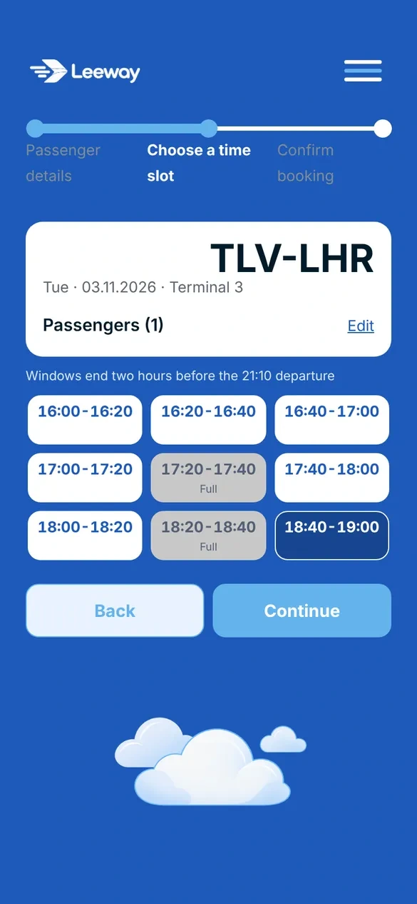
For a 21:10 departure, the windows run from 16:00 to 19:00.
B · Track: A status-first home screen
The home screen keeps one layout, but its status card changes with the traveler’s state, so the next useful action is always the obvious one.
No booking. Next action: book a window. The status card is empty and leads into the booking flow. Tapping it never opens a status screen with nothing on it.
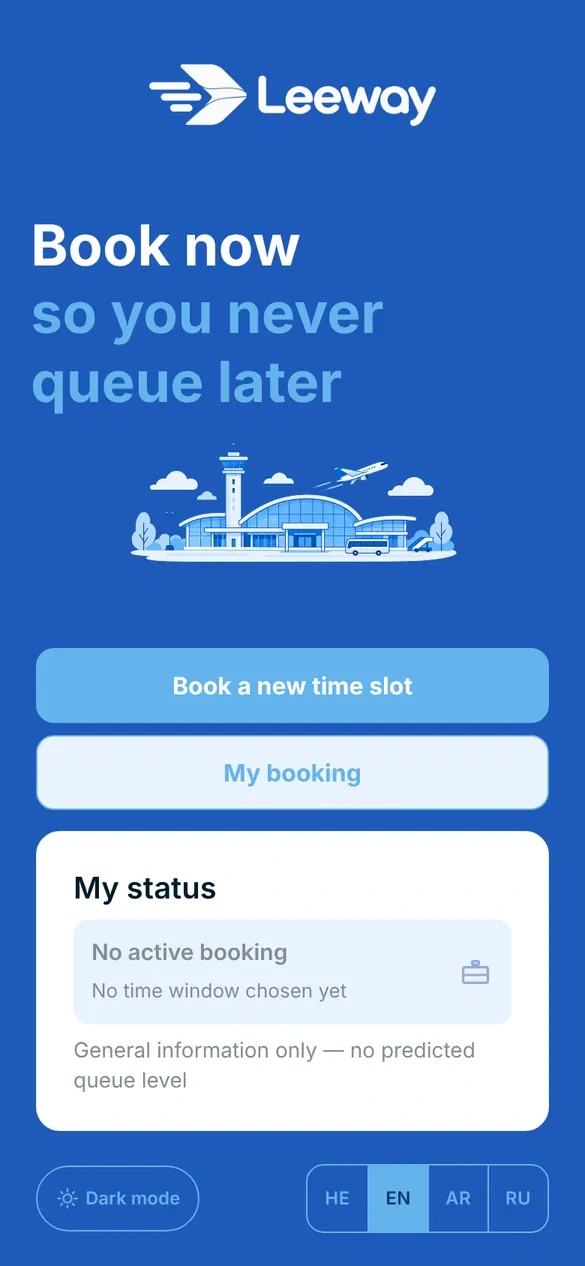
Home with no booking: the status card leads straight into booking.
The cycle: new booking → flight day → back to new booking (designed, not in the prototype).
C · Access: A confirmation that works under pressure
At the desk, the QR opens full screen in one tap, and the app shell is cached so it loads without a signal.
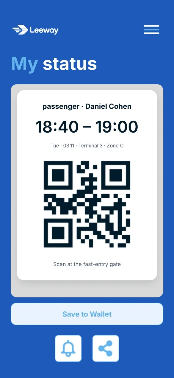
Full-screen QR, available offline.
Many travelers don’t read Hebrew, so the interface runs in Hebrew, English, Arabic and Russian, with right-to-left layouts where needed. The language switch sits on the home screen, where someone who can’t read the interface will find it.
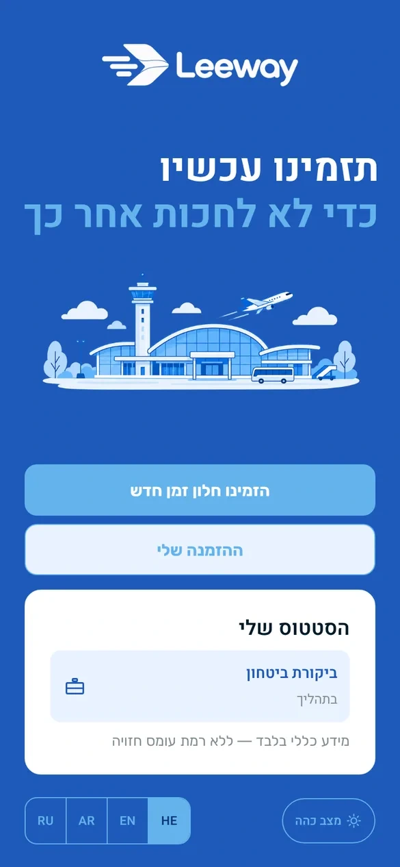
Hebrew (עברית)
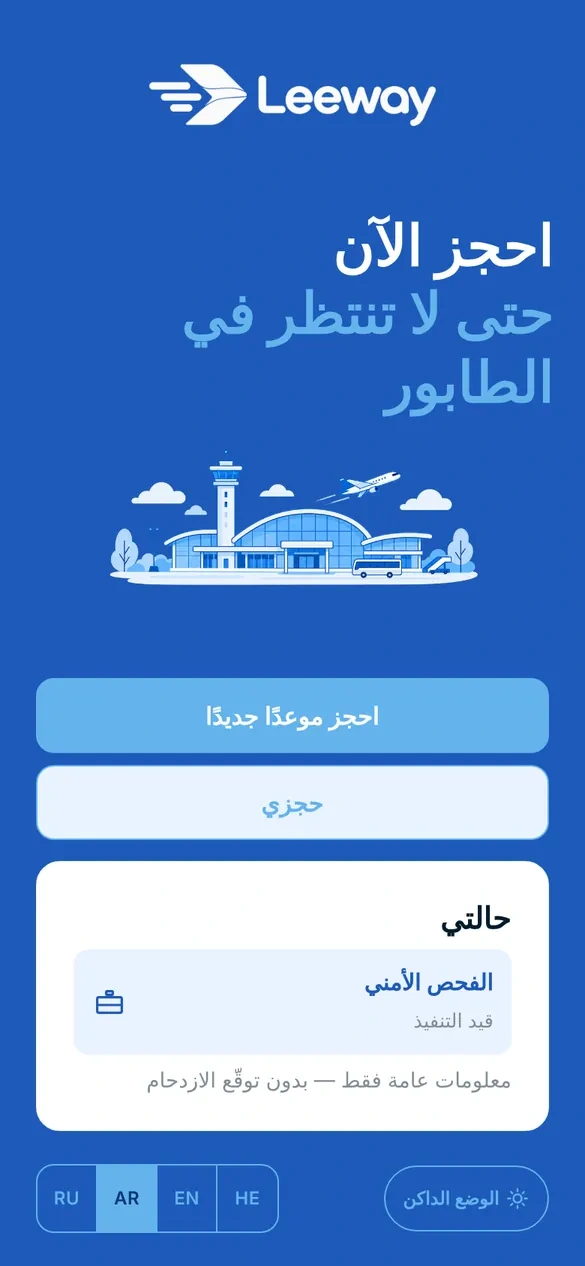
Arabic (العربية)
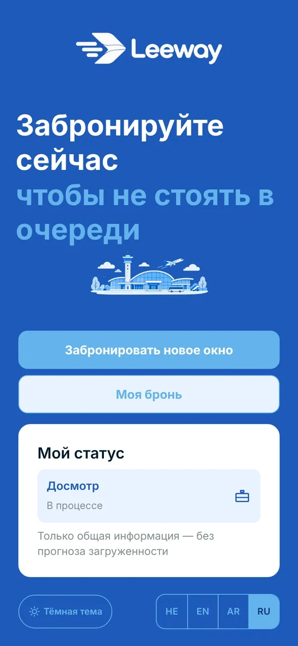
Russian (Русский)
Visual language: Calm and practical, for time-sensitive moments
One primary action per screen. Only the windows that fit the flight.
Status in plain words. “In progress”, “Waiting”, “Completed”.
Restrained color. One blue, red only for problems; light and dark tokens at AA contrast.
Of four explored directions, I set aside the most playful: a cheerful tone didn’t fit the journey’s most stressful moment.
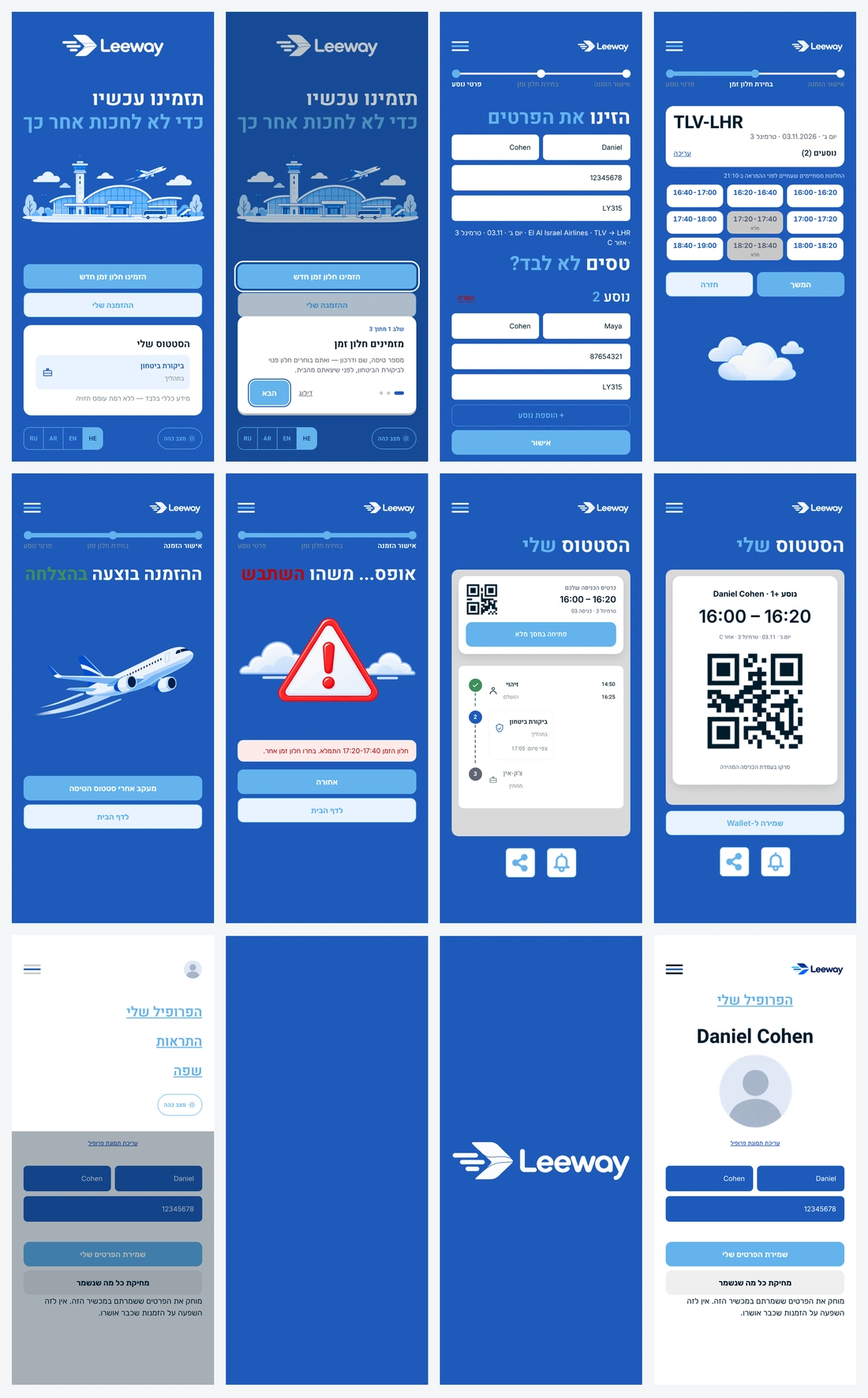
The twelve built screens, including loading, success and failure states.
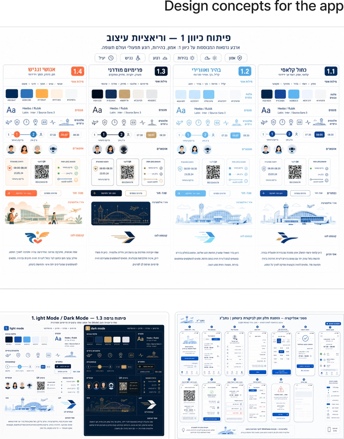
Four explored directions: classic blue (chosen), light and airy, modern premium, human and friendly.
04 · INTERACTION & PROTOTYPE
How the booking behaves
A working HTML, CSS and JavaScript prototype. Step through the main flow, then try it.
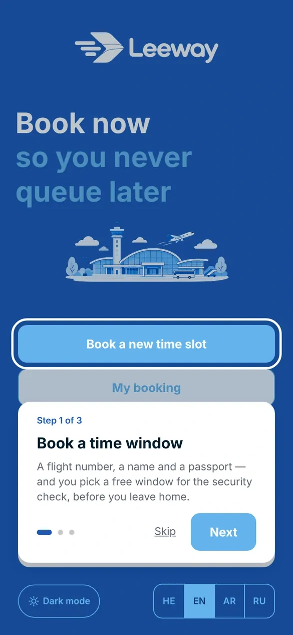
First visit. A three-step walkthrough points at the real controls: the booking button, the status card, and where the pass is shown.
Captured from the prototype. The flight card uses a sample departure record; window availability is simulated.
Try the prototype
Enter a real flight leaving Ben Gurion in the next few days, and the windows are calculated from its departure. Open the prototype
Implemented
Windows generated from departure time
Inline validation and error states
Status, pass and full-screen QR
Offline app shell, 4 languages, light and dark
Public data
Flight date, time and terminal from the airport’s open departures feed (data.gov.il)
Simulated
Window availability and “Full” states
The booking itself (kept in memory, no server)
Stage times on the status screen
Needs airport integration
Real capacity and reservations
Live progress through screening and check-in
05 · OUTCOMES & REFLECTION
What changed after people used it
I watched up to seven people try the prototype, informally. Their reactions led to these changes.
Change 1 · Errors that explain themselves
An empty field used to open a full error screen, and people froze. Now the form marks what’s missing in place.
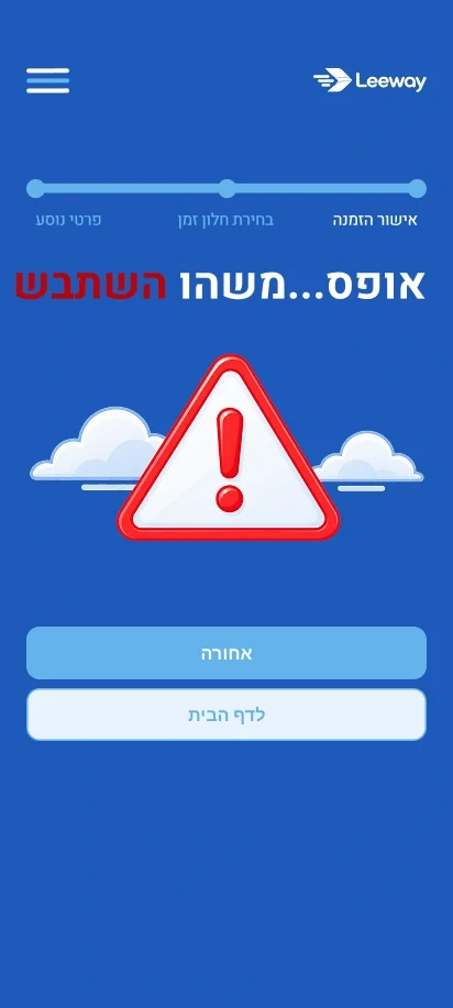
Before: an empty field opened a full error screen.
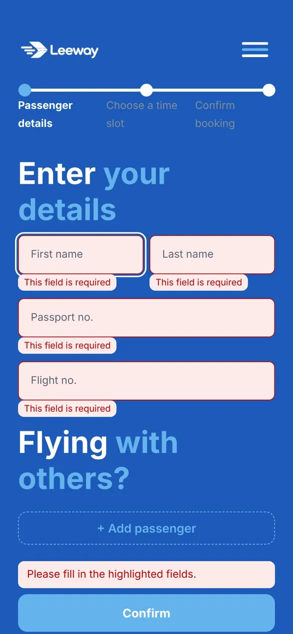
After: the fields to fix are marked in place.
Change 2 · From a full day to nine windows
The first round offered a date strip and windows across the morning. The final grid shows only the nine that fit the flight.
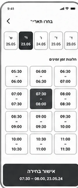
Before: a date strip and windows across the whole morning. After: only windows derived from the departure time (see the booking screen above).
Change 3 · A three-step walkthrough
People asked what they were booking. A first-visit walkthrough now points at the real controls.
Change 4 · Four languages
Several testers didn’t read Hebrew. This had the largest effect of any change.
Change 5 · International passports
The field now accepts non-Israeli passport formats.
Change 6 · Scheduling logic
The first build froze Figma’s example windows; a 21:10 flight got a 6:40 slot. The rule now lives in one place in code.
What worked
One bookable stage kept the flow short and made it easy to cut screens.
What I learned
A value in a design file can be an example or a rule. I now mark which before anything is built.
Next steps
Task-based usability tests with recordings
More interviews, including check-in-heavy travelers
Changing a booked window (wireframed, not built)
Scanning the boarding pass instead of typing
APPENDIX
Process material
Full research boards, methodology and implementation notes, for anyone who wants to go deeper.
Research methodology: 4 real interviews, 4 simulated scenarios
I interviewed four people. In parallel, I wrote four simulated interviews to test assumptions I had no one to ask about: a frequent business traveler, a parent of small children, a retiree who avoids new apps, and an airport operations worker. They are labeled as simulated in every document, were not used to form the personas, and are not quoted as evidence.
Fixed early arrival, regardless of load: real 3/4 · Evidence
The bottleneck shifts between security and check-in: real 3/4, simulated 2/4 · Evidence
Identification runs on physical documents: real 3/4, simulated 1/4 · Evidence
Name and flight number may not be enough to identify someone: real 0/4, simulated 1/4 · Hypothesis
Low-tech travelers may abandon digital pre-registration: real 0/4, simulated 1/4 · Hypothesis
The passport field came from the first hypothesis. I added it anyway because the costs weren’t symmetric: one more field against a traveler who can’t be identified at the desk. It is also consistent with the real finding that the passport is the first document staff ask for.
Testing was informal observation of up to seven people, with no recordings and no defined tasks. Analytics were installed but did not record visits reliably, so there is no quantitative data.
One real interviewee said the line had become faster on its own over the past year. People still arrived three hours early, which pointed to uncertainty, rather than line length, as the problem.
Journey maps: original FigJam boards
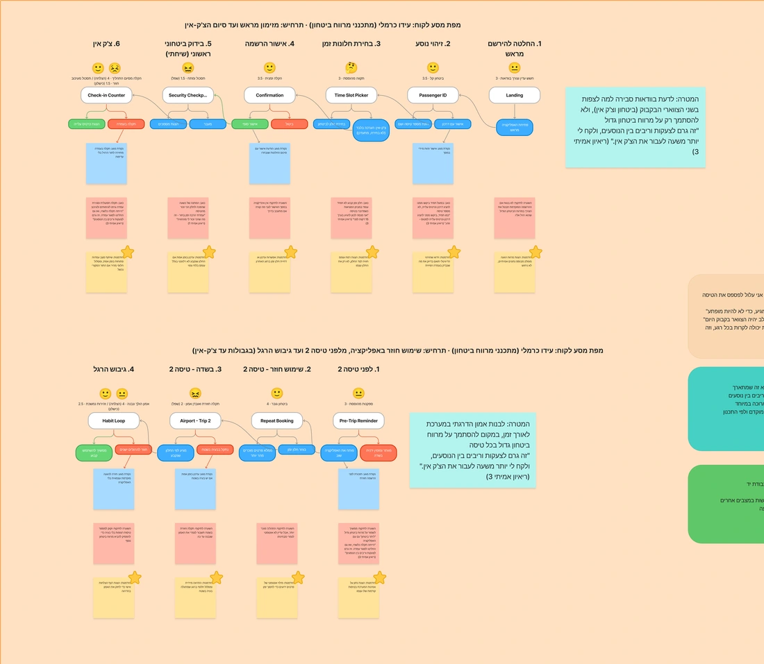
Journey map · Ido
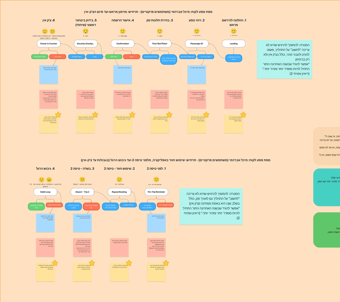
Journey map · Michal
Information architecture: sitemap after two reviews
I checked every journey-map stage against the sitemap twice. Screens with no stage in the journey (FAQ, Contact us, flight history) were removed, and so was the check-in window at registration. The final structure has two states with automatic transitions between them. The primary persona’s acceptance test is marked on the board as partially met: the app can’t yet predict check-in load.
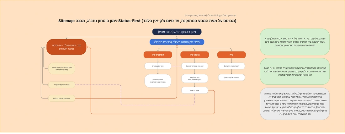
Sitemap
Design exploration: wireframes, directions, first-round screens
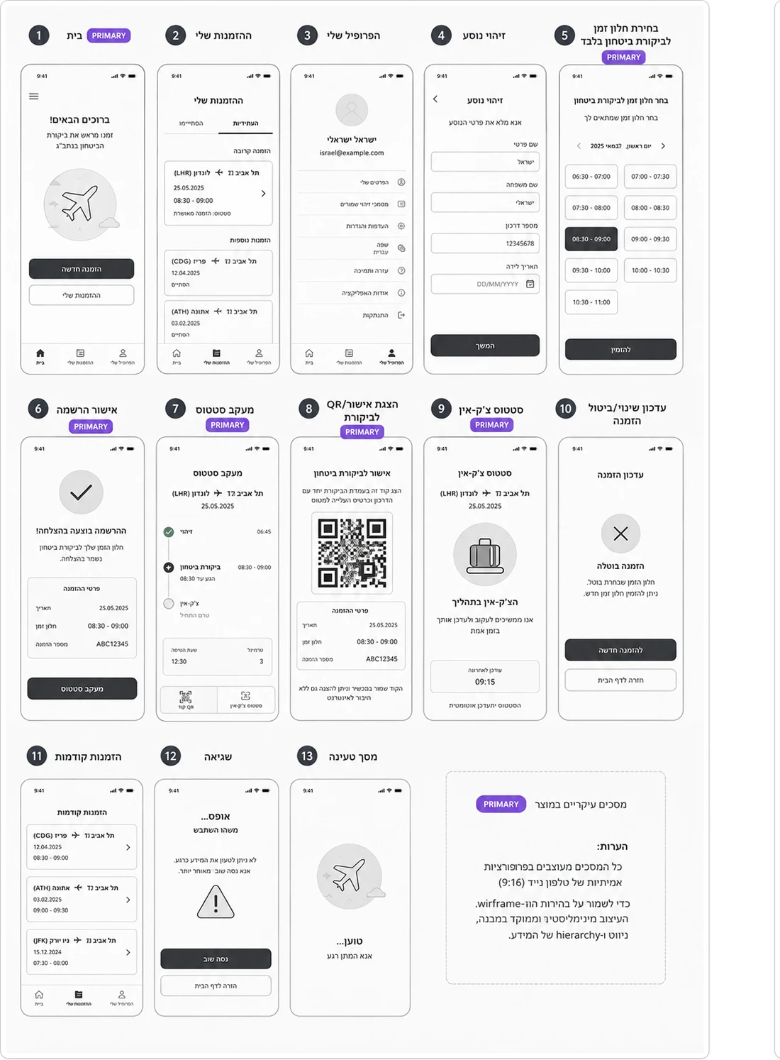
Wireframes
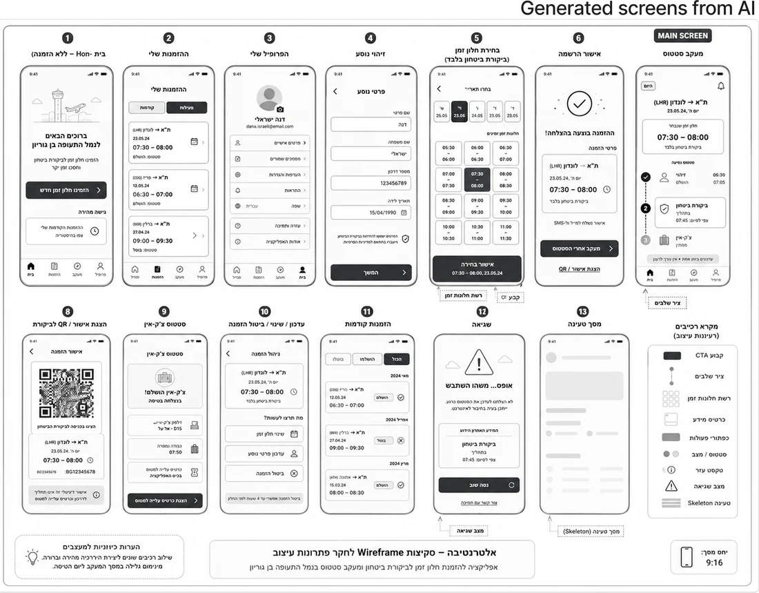
First-round screens
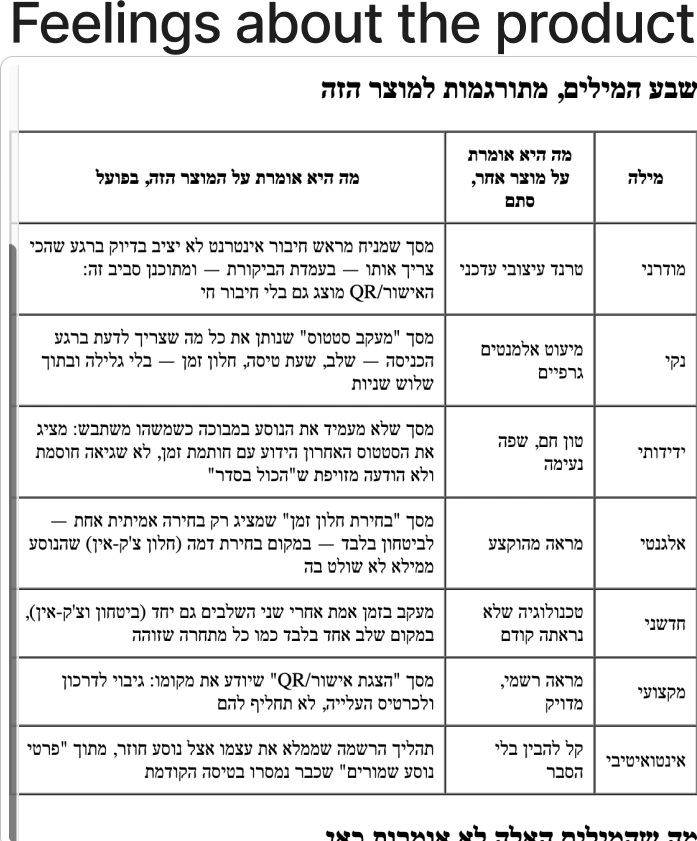
Mood words to behavior
Implementation notes: how the prototype was built
The prototype is plain HTML, CSS and JavaScript, hosted on GitHub Pages. I built it with an AI coding assistant, working from my Figma file and reviewing the result screen by screen. The flight lookup uses keyless public sources: the Israel Airports Authority’s open departures feed for date, time and terminal, and a route database as a fallback. No name or passport number leaves the device.
Time windows: first build copied example values from the Figma frame; refined to nine 20-minute windows built backward from departure, defined in one place.
Unknown flight: first build fell back to the demo route; refined to show the number actually typed, with a neutral card.
Extra passengers: first build could add but not remove; refined with a remove action and renumbering.
The question that most changed the design came during the build: if the check-in window depends entirely on an unpredictable screening, why offer it as a choice at all? It removed a whole selector from registration.
Known limitations: scope of the concept
No integration with the airport: availability, bookings and stage progress are simulated.
The status screen doesn’t predict check-in load. This is the main open question for the primary persona.
The return to “new booking” after check-in is defined in the IA but not implemented in the prototype.
Evidence is qualitative: four interviews and informal observation.
0 likes · 0 views · Nov 5, 2026
Concept and functional browser prototype that lets travelers book airport security time slots and track their progress; delivered research, design system and 12

