
Case study · Interaction design · 2026
DeciBuy
Designing a calmer moment before a purchase.
A phone app that looks at a price, your spare money and your payday, and answers before you pay: Buy, Wait for payday, or Not now. Every list in it is a stack of folders you can open, flick and pull.
Role
Solo product designer
Scope
Research, UX, UI and a coded prototype
Platform
iPhone first, 6 languages, light and dark
Status
A working prototype, not a launched product
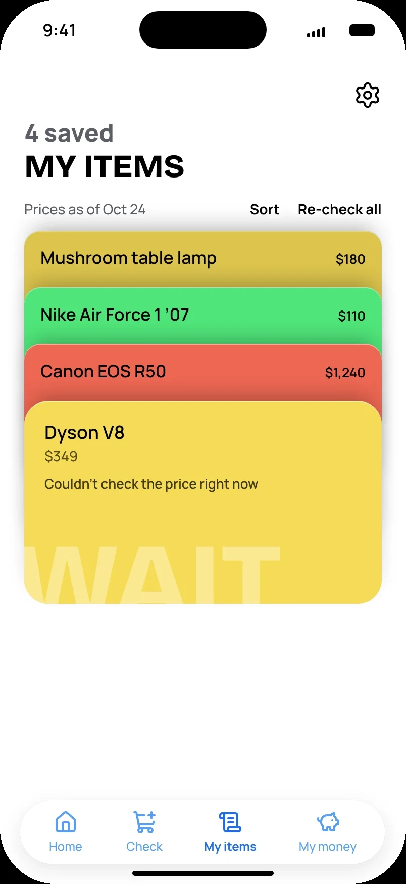
Mushroom table lamp$180 Nike Air Force 1 ’07$110 Canon EOS R50$1,240 Dyson V8$349
Savings companion appKirill Blik
Savings companion appKirill Blik
Savings companion appKirill Blik
Drag to switch · click to flip
My role. Solo product designer. I used Claude as a production and critique partner, and as a research engine: working through the research, stress tests, synthetic studies and possible usage scenarios. Every output checked by me.
01The idea
02Understanding the moment
03Finding the interaction
04The product in motion
05Testing and iteration
06Reflection
01 · The idea
Where did all that money go?
Many people I talk to don’t track their spending, or can’t keep it up for long. Sales, discounts and online stores make the monthly total very big, and then comes the question: where did I spend so much?
Before I buy a thing or tickets, I ask myself the same questions. How much can I afford it? How many hours of work is it? How will it hit me next month? How much further away does it push the goal I’m saving for? How often will I really use it? Few people will sit down and do that math before every purchase.
The principle
A product,and three answers.
The app doesn’t limit you, and the final call is always yours. This one line decided the visuals, the way the app talks to you, and the savings goal.
BuyWait for paydayNot now
02
Understanding the moment
What I knew, what I only simulated, and what each one changed.
Most of my research was simulated. I used AI to explore the problem quickly and to write hypotheses. None of it counts as evidence about real people, so every decision below is a hypothesis until it’s tested.
My own
Observation and conversations with people at work, friends and relatives. Informal, not recorded.
Real
Desk research and a competitor scan: Skip or Buy, CartPause, price trackers, budgeting apps.
Real
5 survey responses in Google Forms. Too few to count; I don’t show them as numbers.
AI-simulated
15 survey responses built from buyer types known in marketing and sales, and 5 interviews (P01 to P05). The personas, empathy maps and journey maps were built from these.
AI-simulated
A card sort with 18 synthetic participants: an exploration of navigation options, not proof.
Three hypotheses, and what each one changed
Own observation · simulated
Nobody wants another budget tracker.
Observation
People around me stop tracking spending after a while. In the simulated sample, the reasons were effort, guilt, and income that changes every month.
So
Ask for as little as possible, and only once.
Decision
Setup asks for ranges once: income, rent, bills, payday. No spending log, no bank connection.
Simulated interviews
The decision is fast. The regret comes later.
Observation
In the simulated interviews, buying took minutes, often late at night, and regret came with the package or with overlapping installments.
So
The answer has to arrive in seconds, and come back later.
Decision
A verdict right after adding an item. Wait for payday comes with a date, a reminder and a fresh check on payday.
My principle · simulated
A yes matters as much as a no.
Observation
The app shouldn’t judge or pressure. In the simulated interviews, people wanted to hear “yes, buy it” too.
So
The same rules for every answer.
Decision
Buy is a real answer. I dropped a “be strict with me” mode: a verdict that changes with what you want to hear isn’t a verdict.
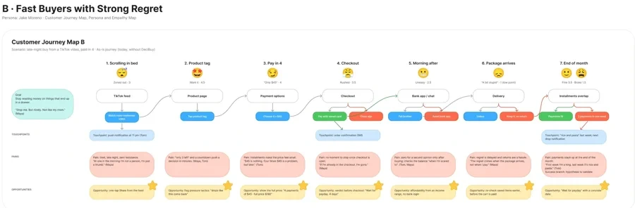
The journey maps
Where would the journey break?
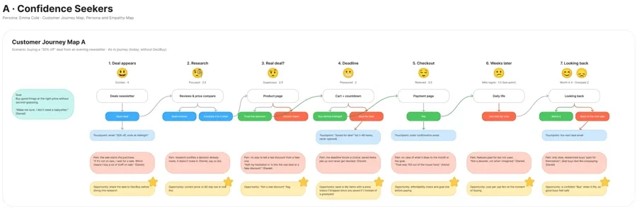
Two journey maps, one per persona, both “as is”: how buying works today, without the app. They come from the simulated interviews, so they are maps of a hypothesis. What they gave me was a question to design for: what happens after the purchase? 5 is motivation, 1 is frustration, and the red point is the lowest.
Emma · confidence seeker Jake · fast buyer
135413.522.53243.551.56
Journey A · Emma, confidence seeker · a 30% off deal from an evening email
5 motivation 1 frustration
1Deal appearsExcited · 4
2ResearchFocused · 3.5
3Real deal?Suspicious · 2.5
4DeadlinePressured · 2
5CheckoutRelieved · 3.5
6Weeks laterMild regret · 1.5
The dip sits after checkout: the deal felt good, the use didn't. Last stage forks: worth it 4, overpaid 2.
EvidenceThe original boardScreens, actions, pains and opportunities behind the chart, each pain traced to an interview quote.
135314.52433.542.5516
Journey B · Jake, fast buyer · a late night TikTok buy, paid in 4
5 motivation 1 frustration
1Scrolling in bedZoned out · 3
2Product tagWant it · 4.5
3Pay in 4Only $45 · 4
4CheckoutRushed · 3.5
5Morning afterUneasy · 2.5
6Package arrivesA bit stupid · 1
Highest at the product tag, lowest when the package arrives. End of month forks: fine 3.5, broke 1.5.
EvidenceThe original boardScreens, actions, pains and opportunities behind the chart, each pain traced to an interview quote.
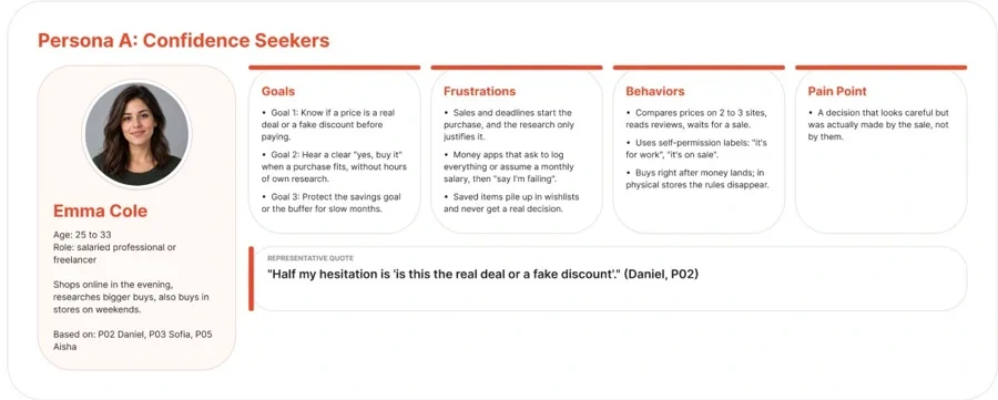
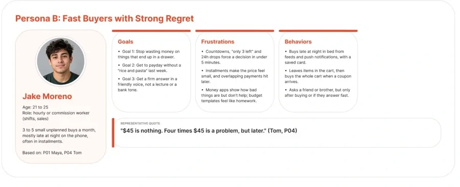
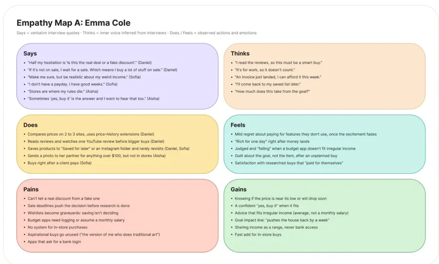
Personas and empathy maps (from the simulated interviews)
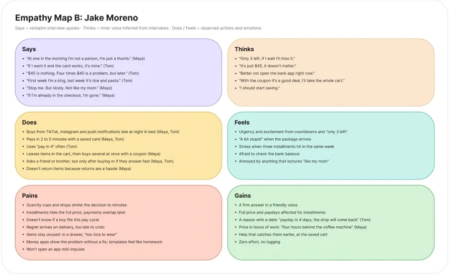
Emma and Jake are composite names. Every line on the boards traces to a simulated participant, not to a real person.
ExtensionPersona A · Emma ColeGoals, frustrations, behaviors and the critical pain. ExtensionPersona B · Jake MorenoLate night buys, installments, wants a firm answer in a friendly voice.
ExtensionEmpathy map ASays, thinks, does, feels, pains and gains. ExtensionEmpathy map BSays, thinks, does, feels, pains and gains.
The name
It started as Impulse Check.
The old name said that purchases are only impulsive. But not all purchases, and not all people, are about impulse. Some want to weigh how much a buy is worth. So the app was named from Decision and Buy, and clearer answers came from that: buy, wait, or not now. It won’t judge you, won’t pressure you, won’t tell you you’re deciding wrong.
03
Finding the interaction
From rows to folders: where the idea came from, what I rejected, and why it stayed.
Step 1Exploration
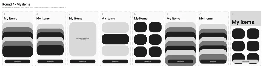
In my Crazy 8’s for My items, most sketches stack the items. The folder idea started here, before any screen existed.
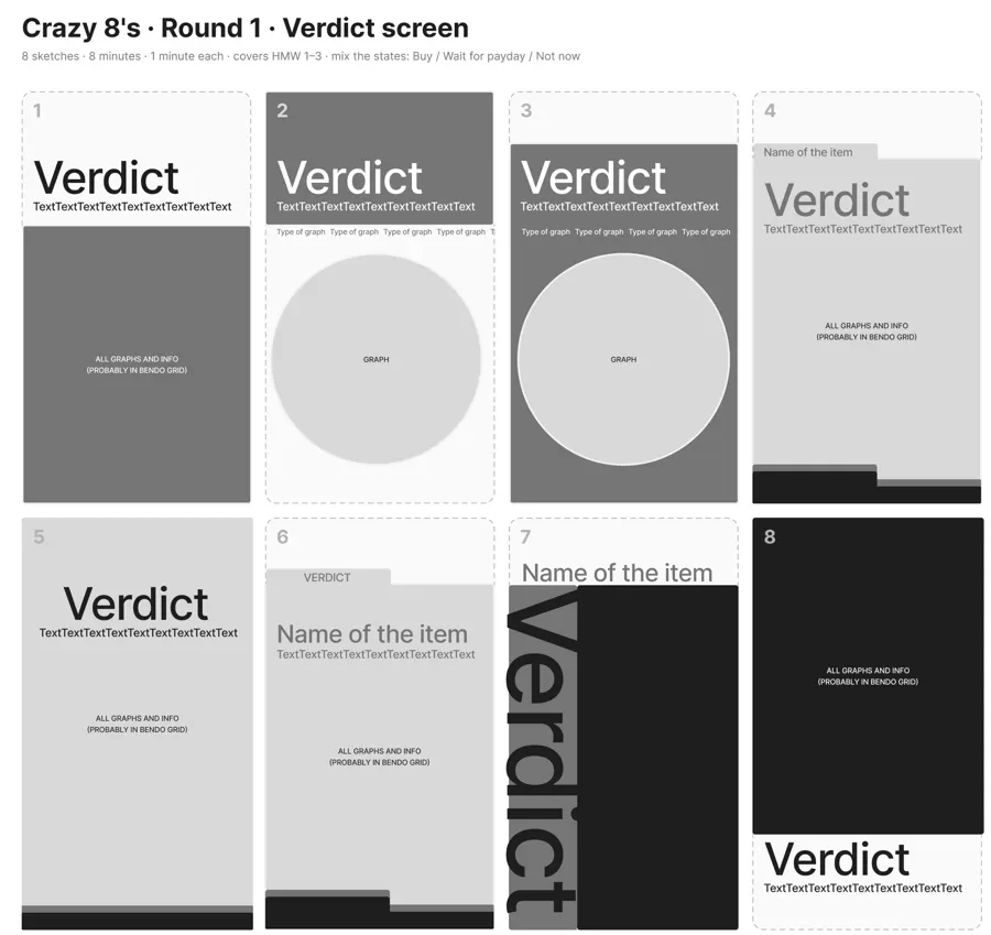
EvidenceCrazy 8’s · round 4 · My itemsEight sketches, one minute each. Sketches 1, 2, 6 and 7 stack the items like folders. EvidenceCrazy 8’s · round 1 · VerdictThe verdict word owns the screen. Sketches 4 and 6 already put the item on a folder tab.
How Might We, and the graph detail round
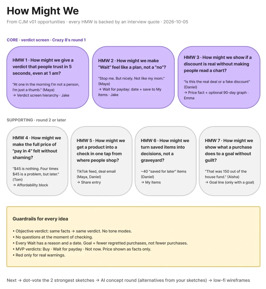
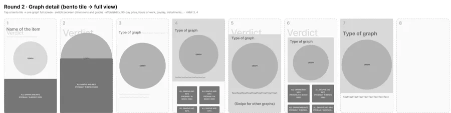
ExtensionHow Might WeSeven questions from the journey maps, and the guardrails for every idea. ExtensionCrazy 8’s · round 2 · Graph detailFrom a fact tile to one full graph you can swipe through.
Step 2Selection
Low-fi v1 Low-fi v2 Final
Evidence
A template list
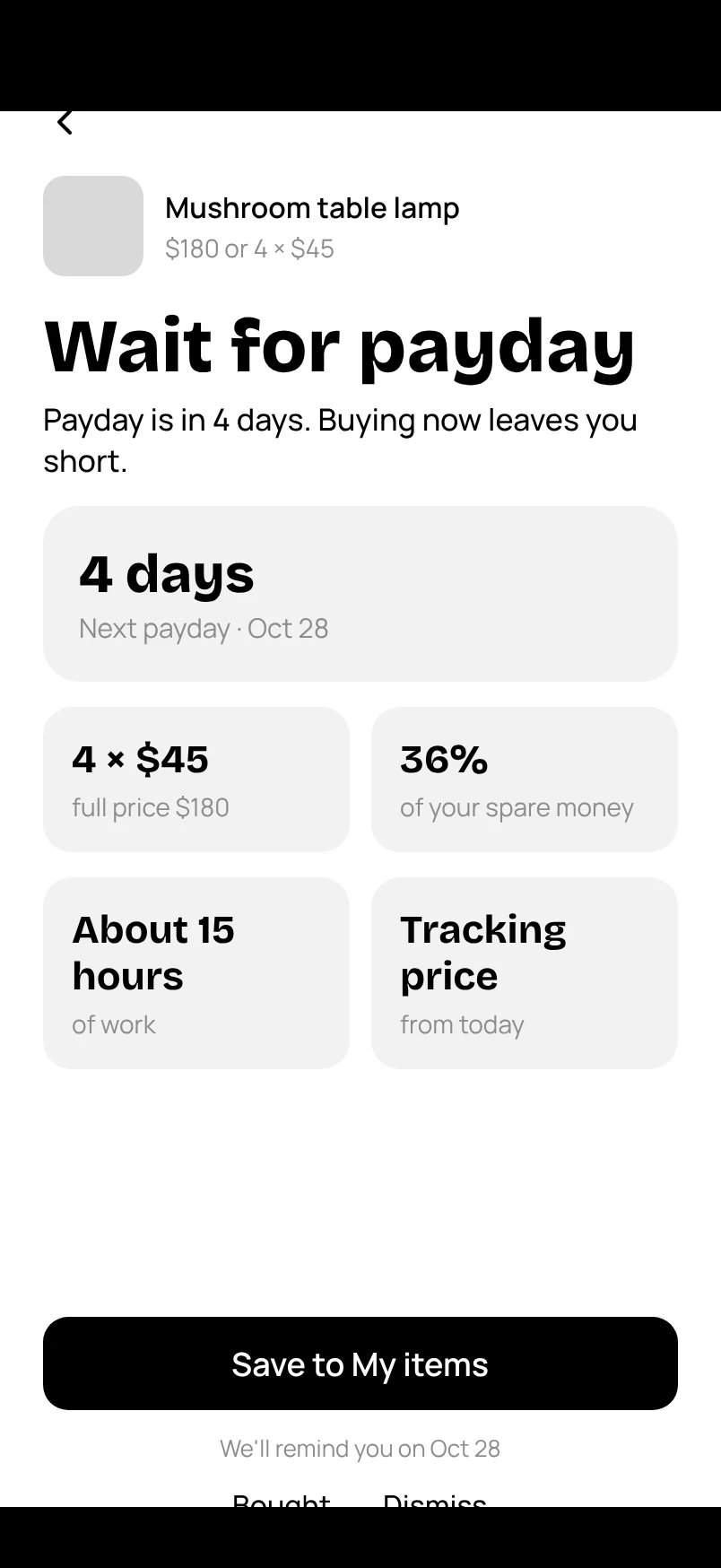
Low-fi v1 was made with AI in Figma: lists, item rows with a square thumbnail, boxed fields. Nothing says this is one item you opened.
Evidence
My folders
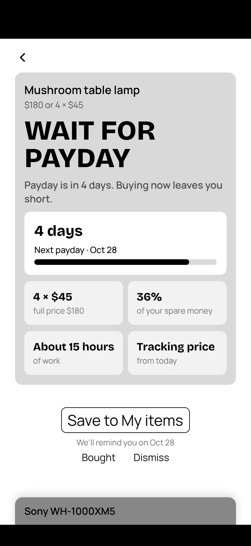
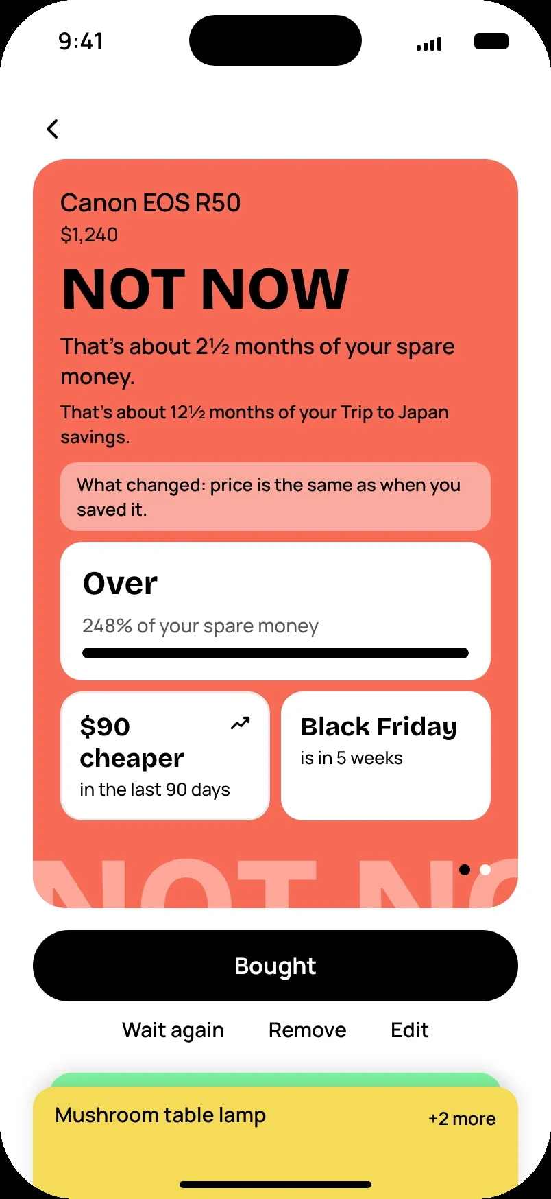
For v2 I redesigned onboarding and Home myself and set one graphic language for the whole app. The verdict is an open folder, and the next item waits below it.
Product
Color is the verdict
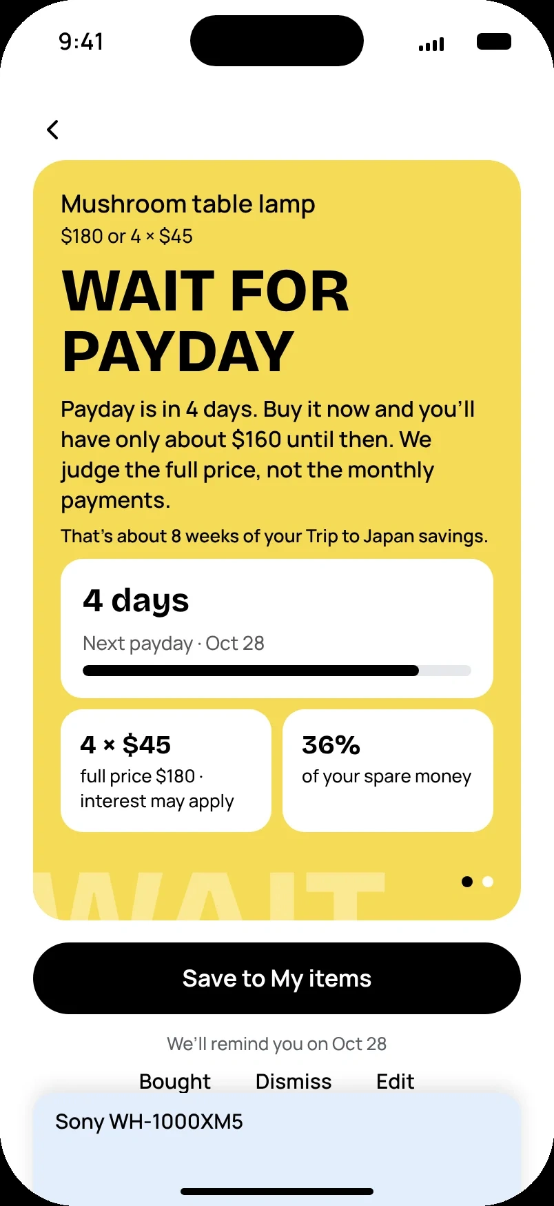
The folder takes the color of its answer, the reason line gives a date and what you’d have left, and the facts sit below in the same order for every answer.
Why folders, not rows. An item opens like a folder and the rest slide down, so you never lose the list. The color is the verdict, so a stack reads without words. The tab shows the price, so you never guess what something costs.
Who did what at this stage
I designed
Onboarding and Home in low-fi v2, the visual language, the palette and app icon, the logo.
Claude produced
Low-fi v1, then v2 applied to the other screens, the hi-fi screens and the design system, through the Figma connection.
I rejected and changed
Its first pass drew plain lists with thumbnails. I pointed to Recent checks on Home: every list became a folder stack, the item page an open folder. I removed the “+” on Check and the verdict word on folder tabs.
“Look at my updated design. It’s low-fi, don’t nitpick colors. Build the remaining screens according to this design.”
My prompt in Figma, 2026-10-18. Paraphrased: I dictated it by voice in Russian, and the exact wording wasn’t saved.
An image model tried too, and lost the folders
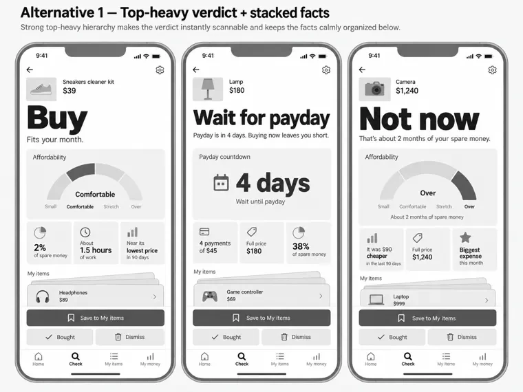
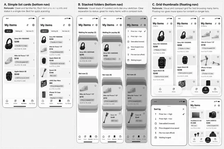
I asked ChatGPT for three grayscale alternatives per screen, based on my Crazy 8’s. It came back with a generic fintech look: lists, grey boxes, the verdict in a box instead of owning the screen. Its “stacked folders” version lost the folder idea. I kept a few details: the Check empty state that explains the rules, the “as of” date on saved prices, sort as a bottom sheet.
EvidenceChatGPT: verdict screensRejected: the verdict is a big word above a pile of boxes. EvidenceChatGPT: My itemsRejected: lists with product photos; variant B lost the folder metaphor.
Step 3The language around it
Product
A companion, not a judge. Even its red shouldn’t cause anxiety.
“Not now” doesn’t say “don’t buy”. It doesn’t forbid you. It says lightly: some day you can, keep saving, but not now. The rounded corners soften the tone, so nothing feels sharp or fixed.
Removed
Product photos. A photo pulls you to the “want”; the screen is about what this price means for you.
Removed
The verdict word on folder tabs. With several folders you saw “Buy” repeated and no price. Now every tab shows the price.
Removed
A light grey background. A contrast check showed the light verdict folders would blend into it.
Removed
The hamburger menu. It would hold only Settings, so a gear is one step shorter.
Brand#569EF6 · #206AEDNever touches a verdict color
Buy#56F683Fits your money now
Wait#F6DB56Fits after payday
Not now#F66B56Doesn’t fit yet
Bricolage Grotesque ExtraBold for titles and the verdict word, Manrope for everything you read. Text on verdict colors is always black: white fails on green, yellow and red (1.4 to 2.9:1), black passes (7 to 15:1).
Step 4Structure
I didn’t drop the wishlist. I moved it into Check and limited it to 5 items for 3 days.
On purpose, so it doesn’t turn into one more cart you never finish. The hamburger went too. Everything else fits in four tabs: Home, Check, My items, My money.
Sitemap v01 v02 v03
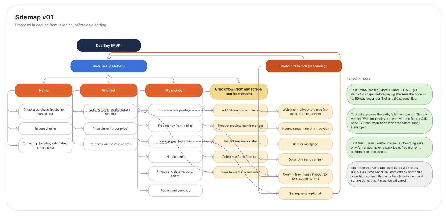
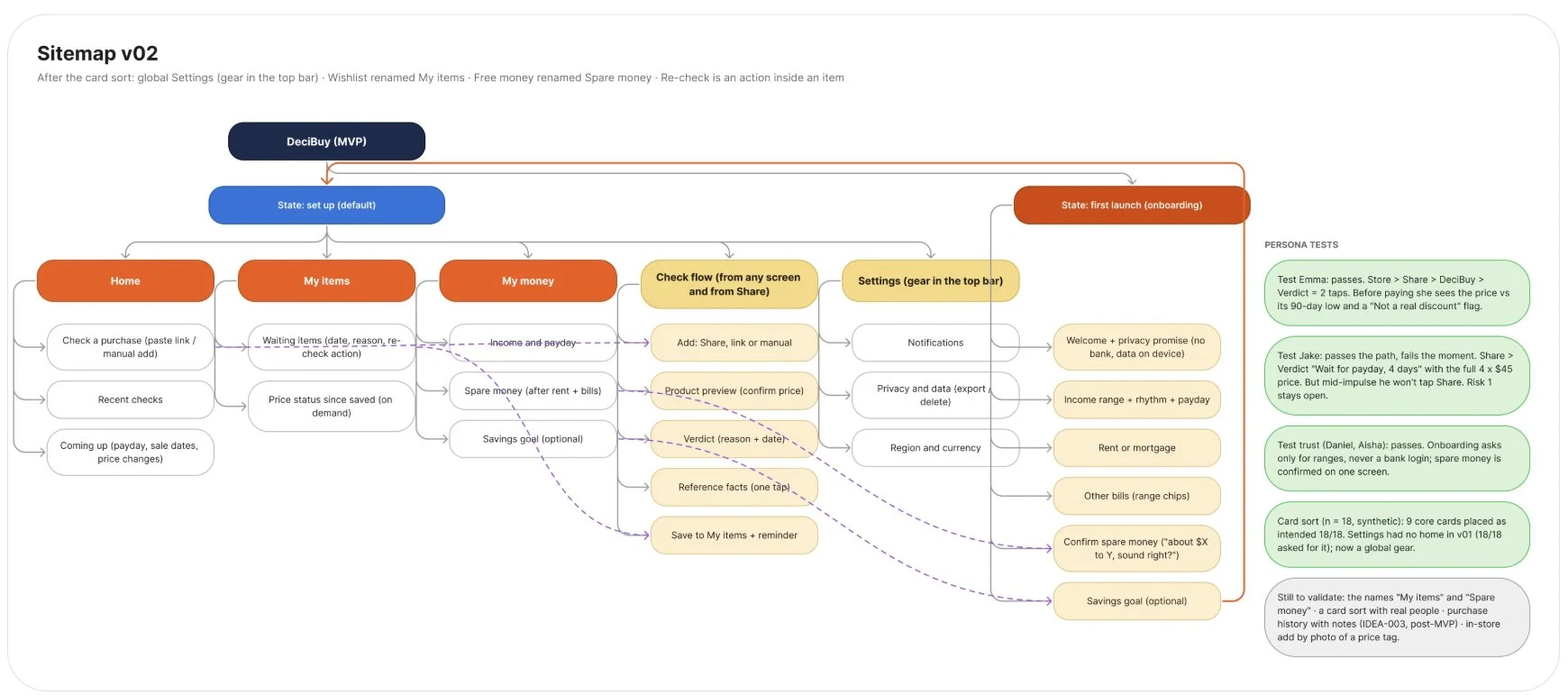
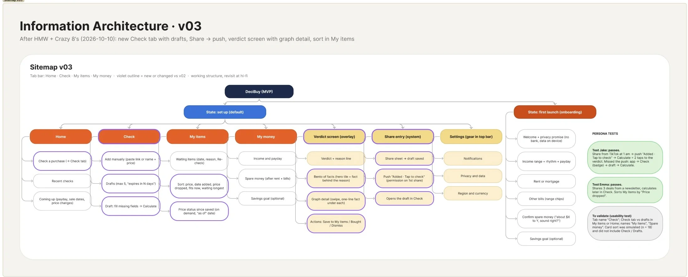
Evidencev03, after the Crazy 8’s: Check becomes its own tab with drafts; the four tabs that shipped.
Between v01 and v02 I ran a simulated card sort (18 synthetic participants). I read it as an exploration of options, not as proof that the structure works.
04
The product in motion
I wanted control over continuous motion, gesture speed and springs you can interrupt, so I prototyped in code instead of in Figma. I described each motion with references, and it went straight into code.
Gesture lab
Try the folders yourself.
On a phone this is a preview: switch screens with the buttons. Open the full prototype to try the gestures.
Tap a folderIt opens, and the others slide down below it.
Grab it while it movesThe spring follows your finger from wherever it is.
Flick or drag itThe spring keeps the speed of your finger.
Pull up the stack under an open folderThe rest rise so you can see and switch.
The real prototype on its demo data; nothing is saved. The buttons are a way in without gestures. Screen reader support for the gestures is still open.
Start the gesture lab Loads only now. Use it like a phone.
Verdict explorer
Three outcomes, one rule.
Same layout, same facts, same rules. Only the color, the word and the reason line change. Examples from the prototype’s demo data.
Buy Wait for payday Not now
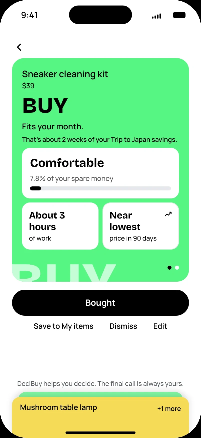
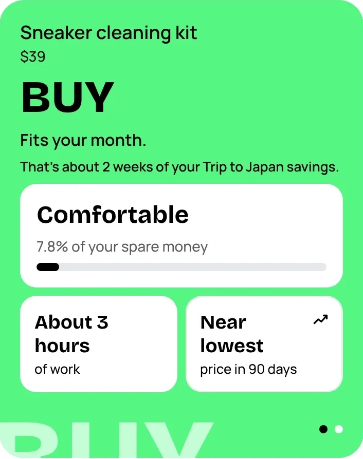
Buy
A $39 sneaker cleaning kit. “Fits your month.” The first tile says how comfortable it is: 7.8% of your spare money.
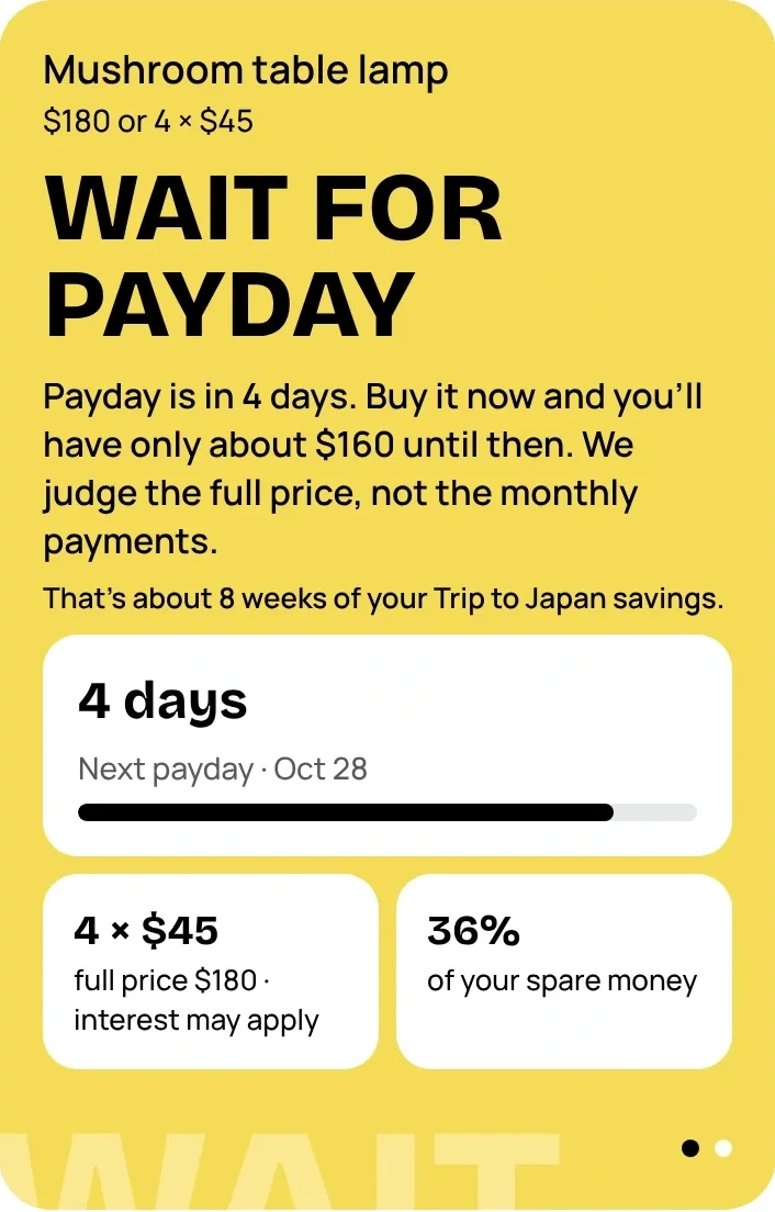
Wait for payday
A $180 lamp, or 4 × $45. “Payday is in 4 days. Buy it now and you’ll have only about $160 until then.” The app judges the full price, not the monthly payments.
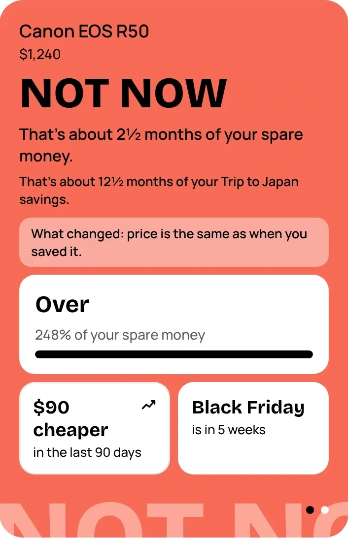
Not now
A $1,240 camera. “That’s about 2½ months of your spare money.” It doesn’t forbid; it says some day you can.
What never changes: the item on top, the reason line, the fact tiles in the same order, and the same actions under the folder. Behind each tile there’s one graph and one plain sentence, one swipe away.
Every key screen
One decision per screen.
31 screens in Figma, light and dark. These six carry the system; under each one, the decision behind it.
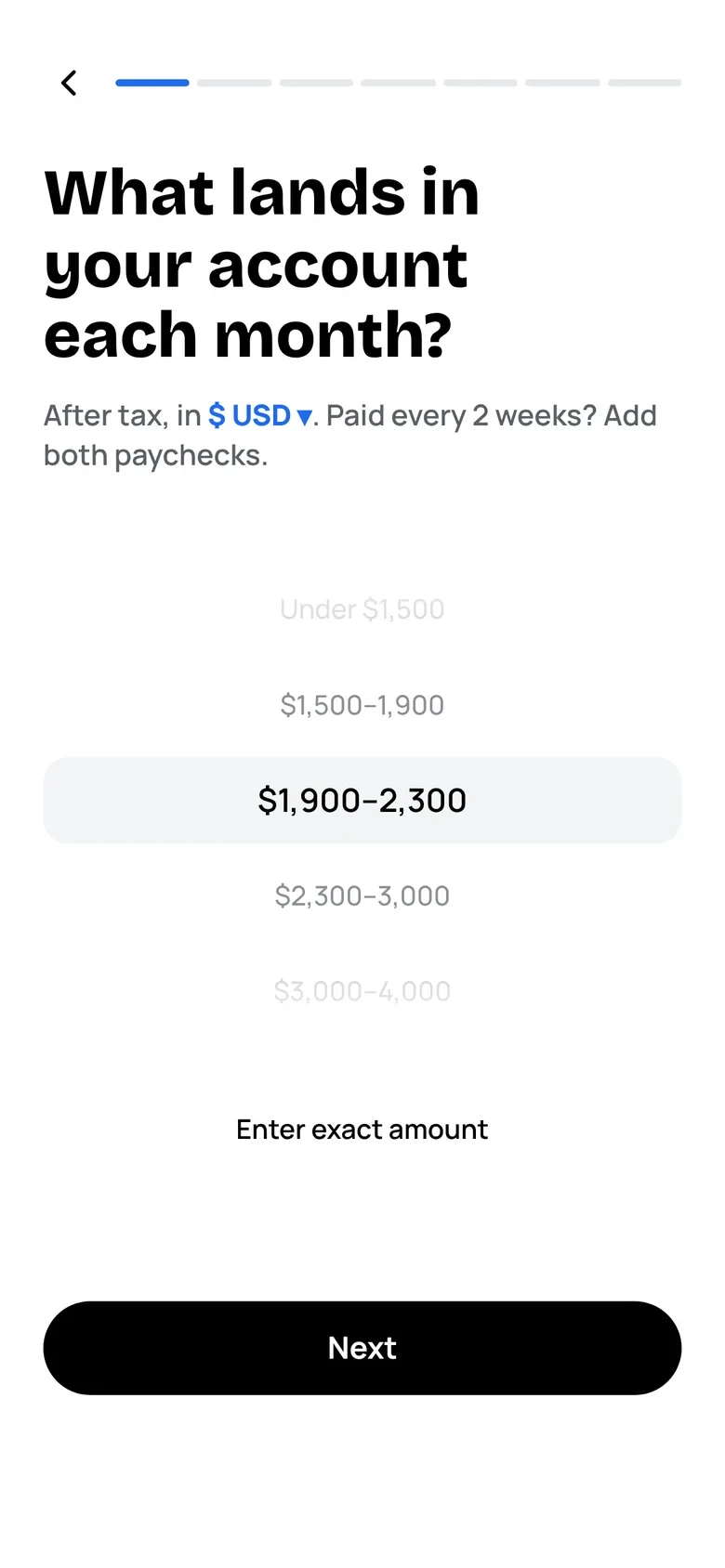
ProductOnboardingOnly what you know by heart, in ranges: income, rent, bills, payday. An exact amount is optional. Your name comes at the very end.
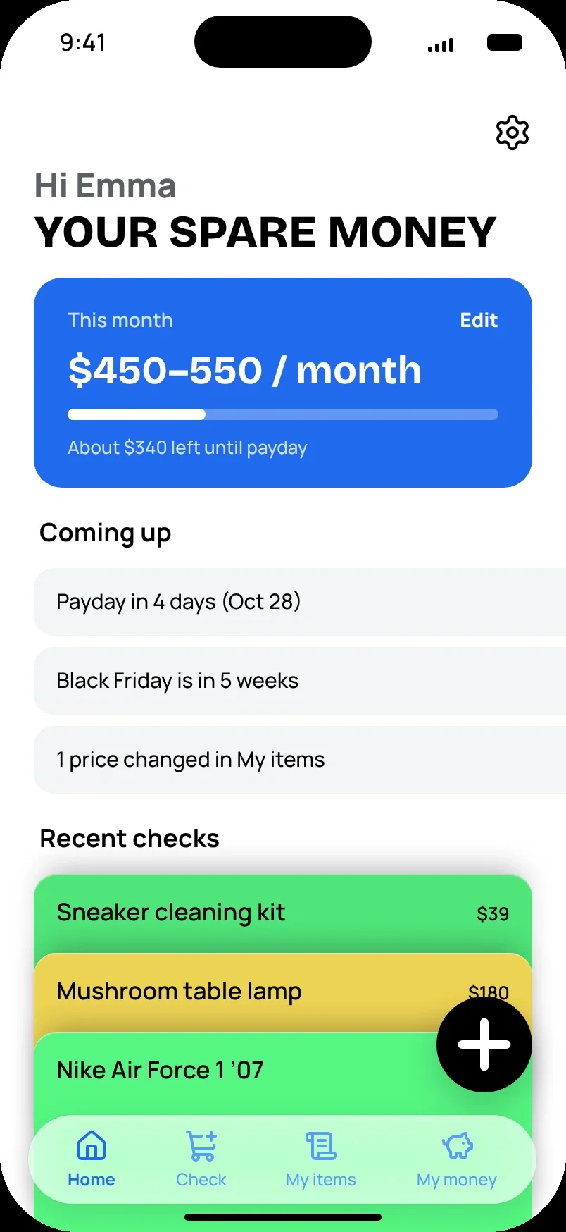
ProductHomeSpare money until payday, not a balance. Items you mark Bought lower it: the one exception to no expense tracking.
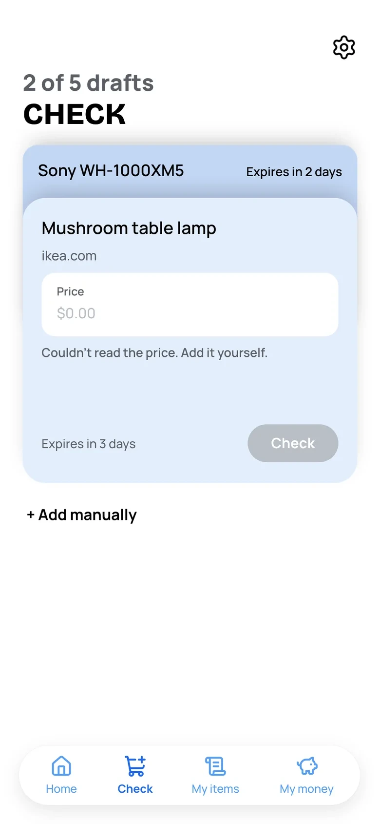
ProductCheckDrafts: up to 5, each kept for 3 days. Adding an item checks it right away.
ProductVerdictOne layout for all three answers, only the color changes. The reason line on top, fact tiles below.
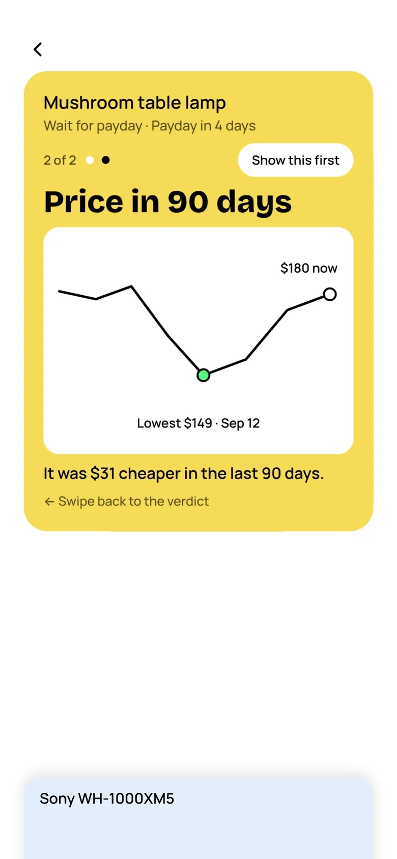
ExtensionBehind a factEach fact tile opens one graph and one plain sentence, for people who want the why. Swipe back to the verdict.
ProductMy itemsWait for payday comes with a date and a reminder. On payday the item is checked again.
What the code taught me: the keyboard covering a field on a small iPhone, scrolling cut short on iOS, and action links that did nothing in German were all invisible in a desktop browser.
05
Testing and iteration
Three kinds of checks, kept apart, because they are worth different things.
Real people
Two friends, informally. F1 tested over chat, sending screenshots and questions as she went: 11 points. F2 asked about currencies (recalled, not written down). No tasks, no recordings.
My own
A 9-minute walk-through on my iPhone, recorded and reviewed: 9 fixes, including the biggest one below.
AI-simulated
20 AI testers, each with a persona and a focus, drove the prototype in a browser. They found bugs, not opinions: names rendered as code, $7.99 becoming $799, double taps creating duplicates. All fixed.
“Can I see the digits while I type them?”F1“You don’t believe in my expenses enough 😂”F1“Can I really do this, or do I type it in by hand?”F1“What’s the point of drafts?”F1“What if I want to change the price or the name?”F1“How do I make the progress move?”F1“Where is the money kept?”F1“What if it’s not in dollars?”F2
F1 and F2, translated from Russian. Real people, real questions.
Four changes that came from testing
The verdict forgot what I had bought
My iPhone walk-through
Before
After I had spent all my spare money, a $50 T-shirt still said Buy. The verdict looked at the monthly budget.
After
Verdicts follow the money left until payday, and show how far over budget you are, in red.
Why
A verdict that ignores what you already did can’t be trusted twice.
“You don’t believe in my expenses enough”
F1
Before
Bills topped out at “$700+”, so $720 and $3,000 were the same. Only income had an exact amount.
After
An exact amount for bills too. It opens by itself on “$700+”.
Why
I hadn’t carried a pattern to the step that needed it. Ranges stay the default.
Dollars only
F1 · F2
Before
A global product tested on a US example. F1 mixed shekels and dollars in one setup.
After
The currency comes from the phone’s region; each item can have its own, converted with “≈”.
Why
Wrong money in means a wrong verdict out.
“Can I really do this?”
F1
Before
The prototype showed Share from a store and Paste link, which don’t work yet. Every link failed and read as broken.
After
“Coming soon” on Share, Paste link and the onboarding step, with no change to the layout.
Why
I had shown the planned product, not what works today.
What happened to F1’s 11 points
Accepted and built
Exact amount for bills
Edit a name or a price
Currencies
Coming soon on Share and Paste link
Decided, not built yet
Goal progress: at payday the app asks you to confirm what you saved
Where the money is kept: a copy question, still open
Kept as designed, still open
Drafts. Only a real person asked what they are for; I kept them, and the wording needs a real test
Not reproduced
Digits hidden while typing: not seen on my phone. I added a keyboard guard; not yet retested on a small iPhone
06
Reflection
Limitations
The interviews and 15 of 20 survey responses were simulated, so the personas and journey maps are hypotheses.
Real users so far: two friends, informally.
Screen reader support for the gestures is open.
Sharing from a store isn’t built.
Needs real-world validation
Whether people find that the stack can be pulled, without being told.
Whether a verdict feels fair, and people come back on payday.
Whether drafts make sense to someone who didn’t design them.
What I’d do differently
Test with real people earlier. Hi-fi was ready on Oct 19; real people came later and informally.
Test on a real iPhone and in other languages from the first coded version.
What I learned
The designer stays the author.
This is my second project as a product designer, and I feel more confident with every decision. A designer won’t do everything by hand, but will direct the whole process: see the app as a user, a developer, a designer and a marketer, keep all of it in mind, check which decisions work, and run stress tests.
AI is becoming a key tool for the whole product, not only the design. In this project it built screens from my direction, simulated research I then had to treat as hypotheses, and ran stress tests. The design decisions, and what I rejected, were mine.
A scripted test with 4 to 5 real people on the current version, with the same tasks for everyone.
The payday goal check-in.
Share from stores in the native app, started in Expo.
0 likes · 0 views · Nov 3, 2026
Designed a savings companion app prototype to guide purchasing decisions.

