Inclusive Brand Identity Design for Inclusively UX
Florencia Ezcurra
Verified
Inclusively UX
Overview
Inclusively UX is a design studio founded by Zoey, a UX professional advocating for accessibility and inclusion in digital products. The brand needed an identity that could balance expertise and empathy, and create a visual system that would speak to both tech organizations and individuals seeking to create more inclusive user experiences.

The Challenge
When we think of accessibility, most brands default to the same visual language: muted tones, overly technical messaging, and safe, predictable layouts. But Inclusively UX was built to challenge that perception.
The challenge was to balance two worlds:
Bold visual expression that attracts forward-thinking design teams.
Functional accessibility that meets contrast standards and readability needs.
The result needed to prove that accessibility can be both compliant and creative. A visual system that speaks to inclusivity not through restraint, but through confident design choices.

The Approach
We explored how to merge professional UX structure with soft human tone.
We approached the project with one guiding question:
What does inclusion look like when it’s bold, not quiet?
From the start, the design process focused on visual accessibility as a creative opportunity, not a limitation. The goal was to build a system that felt distinctly digital and human, while passing accessibility contrast standards.
The process involved iterative testing of color contrast and typography legibility, balancing Manrope’s geometric precision with fluid spacing and warmth. The resulting system felt structured yet approachable, confident enough to stand out, and considerate enough to invite everyone in.


Typography for Inclusively UX
The Solution
The final identity embodies clarity, confidence, and inclusivity.
Logo: The logo centers around the idea of collective connection. a circular form built from six unique, open-armed shapes that simultaneously evoke people in motion and a shared table.
The circle reinforces equity and non-hierarchy, where no single point is dominant. It reflects UX principles that honor every user’s journey and create systems where participation is seamless.
Typography: The entire system is built on Manrope, chosen for its geometric precision and accessible readability.
Color Palette: A bold, high-contrast combination of deep indigo, royal violet, bright lilac, chartreuse, and off-white. Each hue is WCAG-tested for AA–AAA contrast compliance, proving that accessibility and aesthetics can coexist. The palette intentionally feels vibrant and visible, representing diversity, advocacy, and optimism.

Custom shapes for Inclusively UX

Billboard application
Like this project
What the client had to say
Florencia was great to work with. She was extremely responsive and easy to work with. She was great with creating something that captured the vision I had for my design agency and it really feels like my brand has been brought to life.
Zoey Marroquin, Inclusively UX
Aug 7, 2025, Client
Posted Oct 21, 2025
Designed an inclusive brand identity for Inclusively UX, balancing bold visuals with accessibility.
Likes
14
Views
236
Timeline
Aug 1, 2025 - Aug 7, 2025
Clients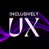
Inclusively UX