Trive District | Visual Identity Design

Amarachi Nwauwa


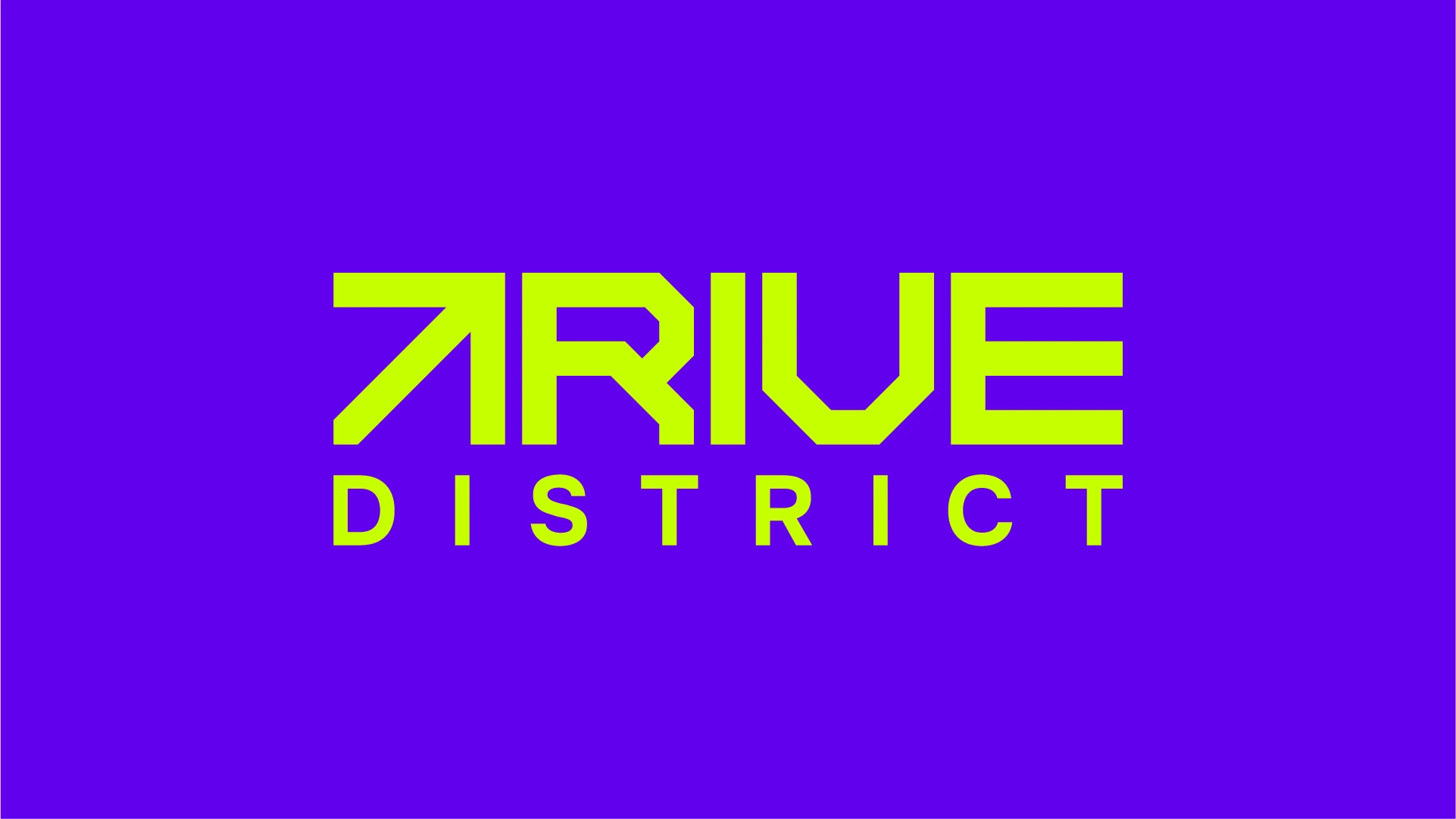
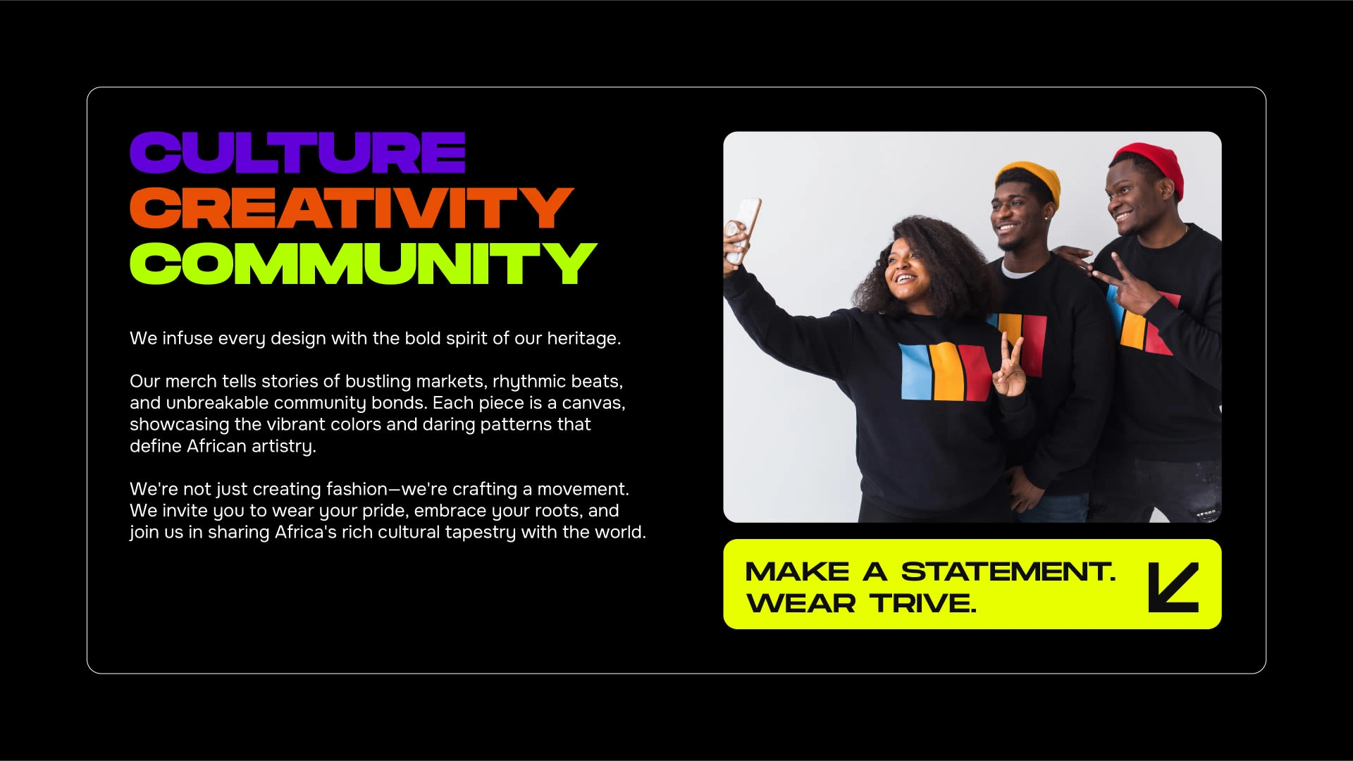
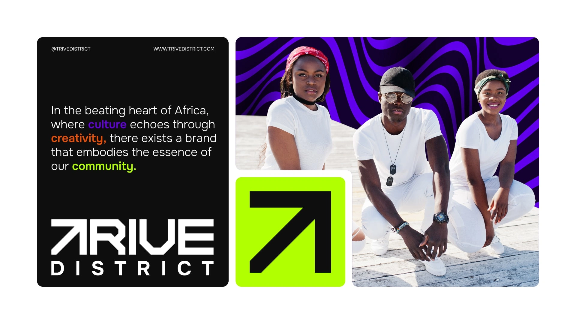
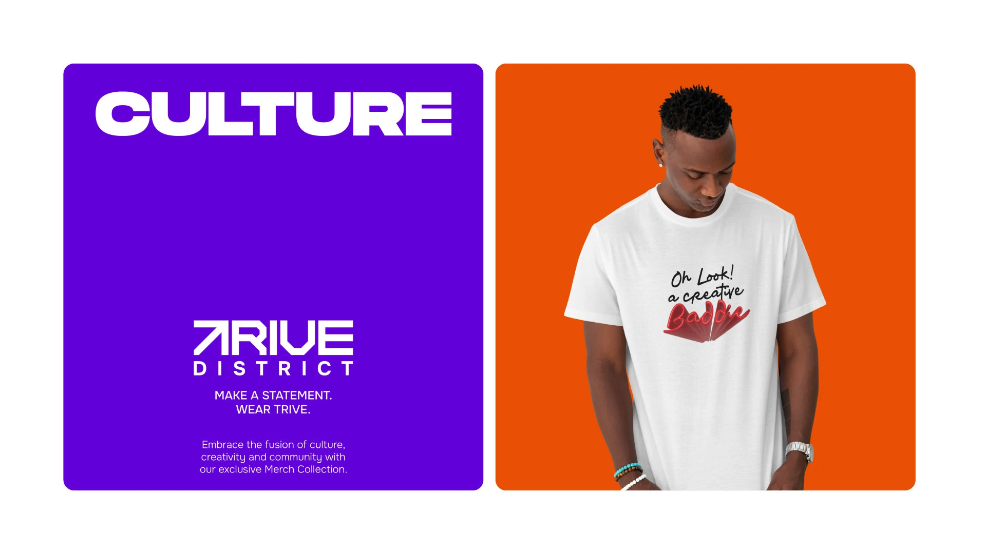
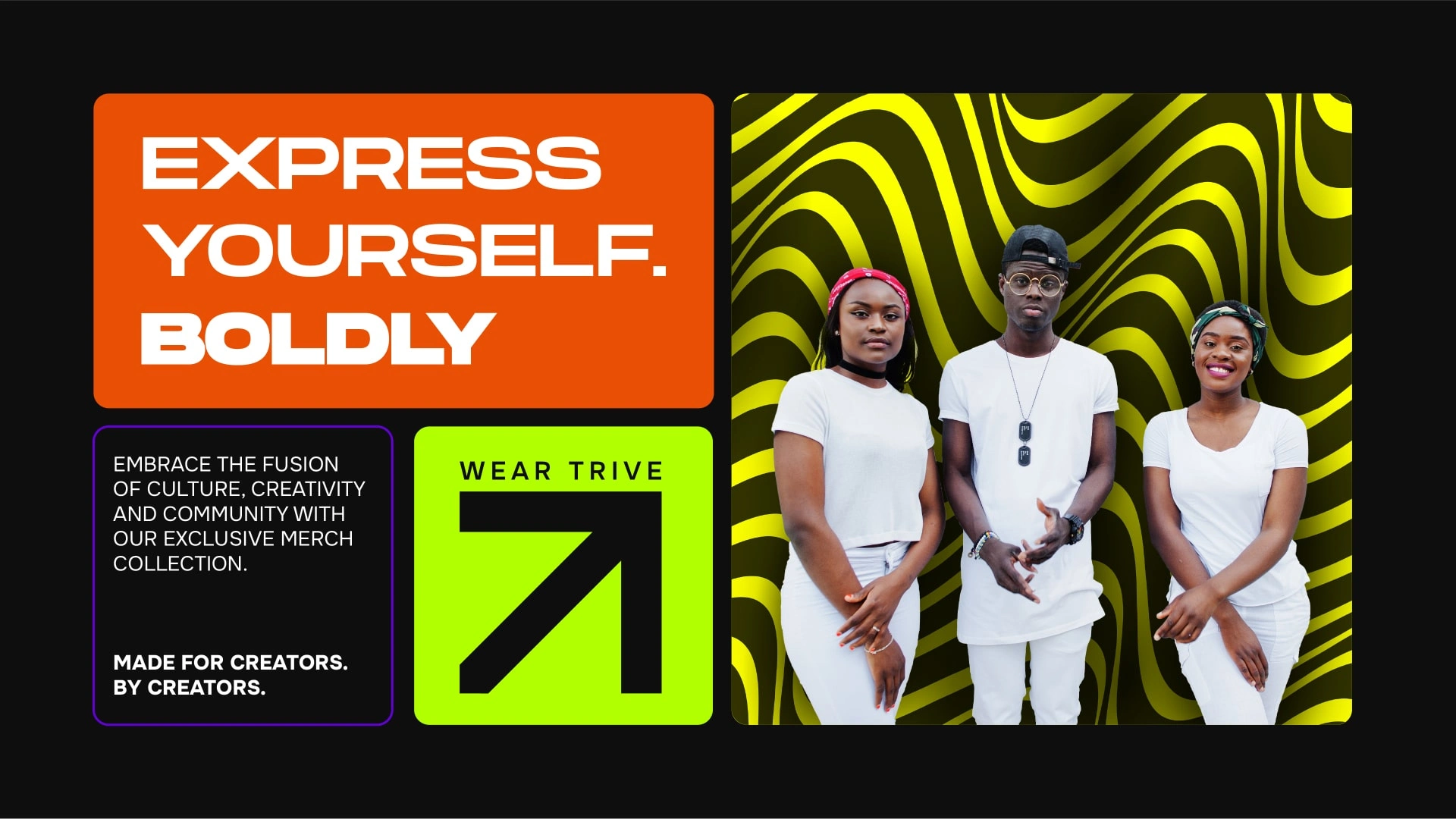
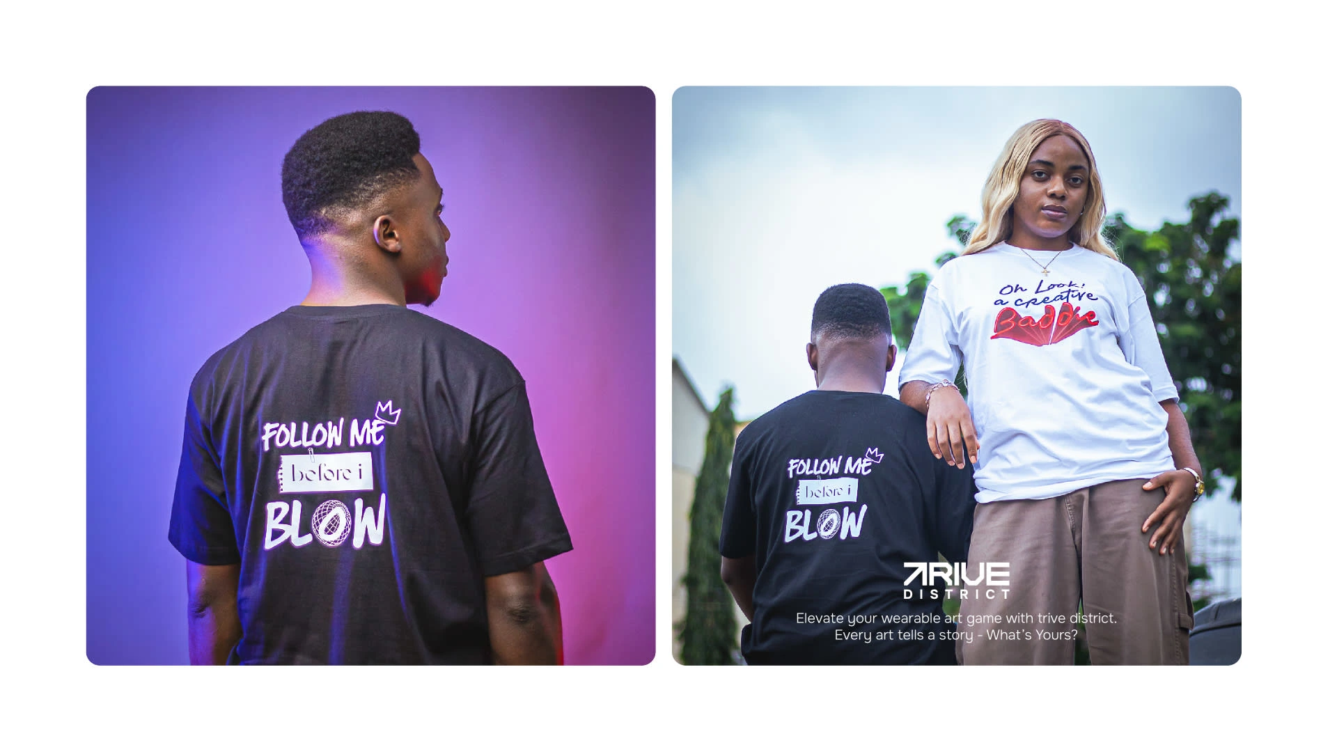
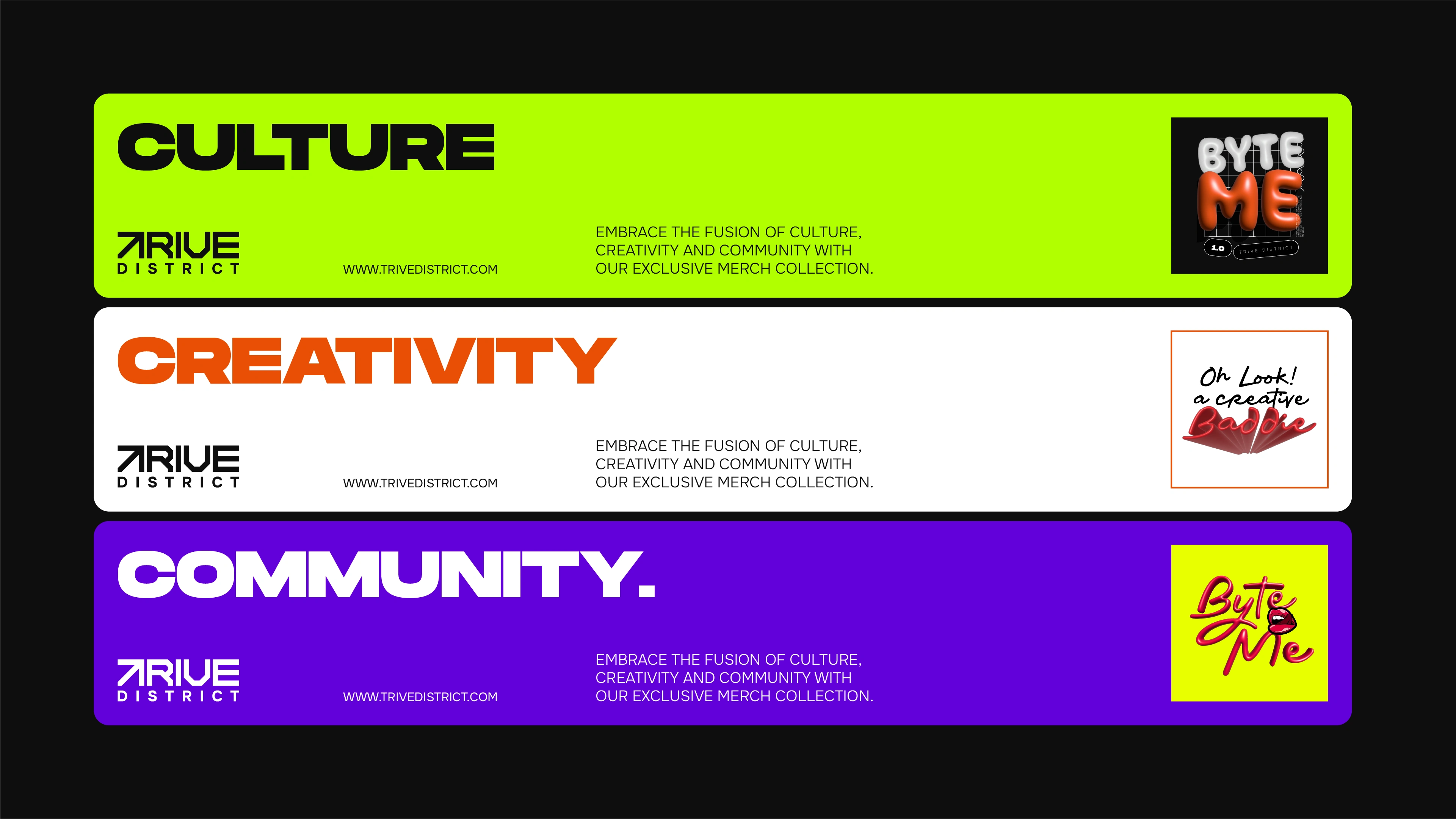
Trive District is an Africa-inspired streetwear brand crafted for thriving African creatives. Bold, fun, and youthful, Trive embodies the spirit and power of African creators, exuding 100% swag.
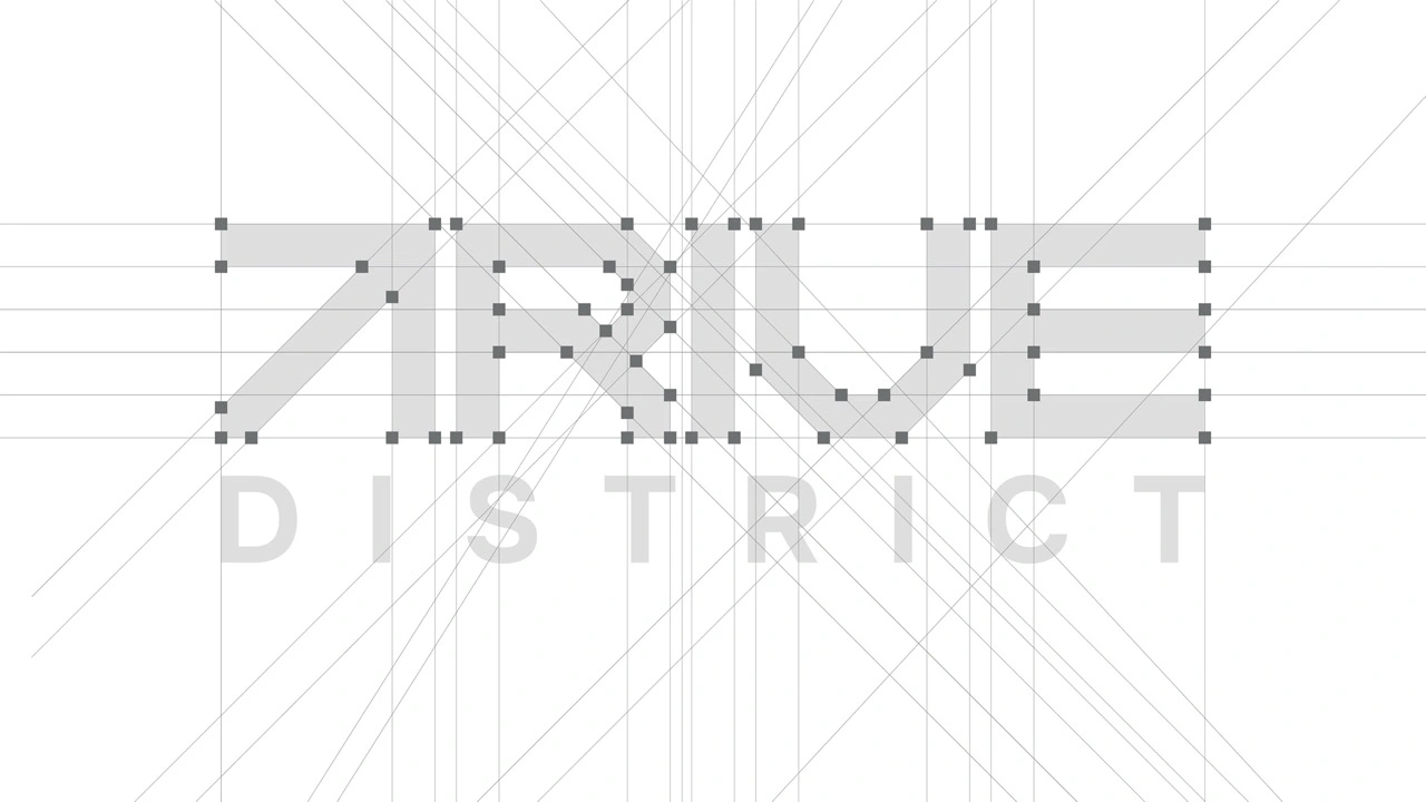
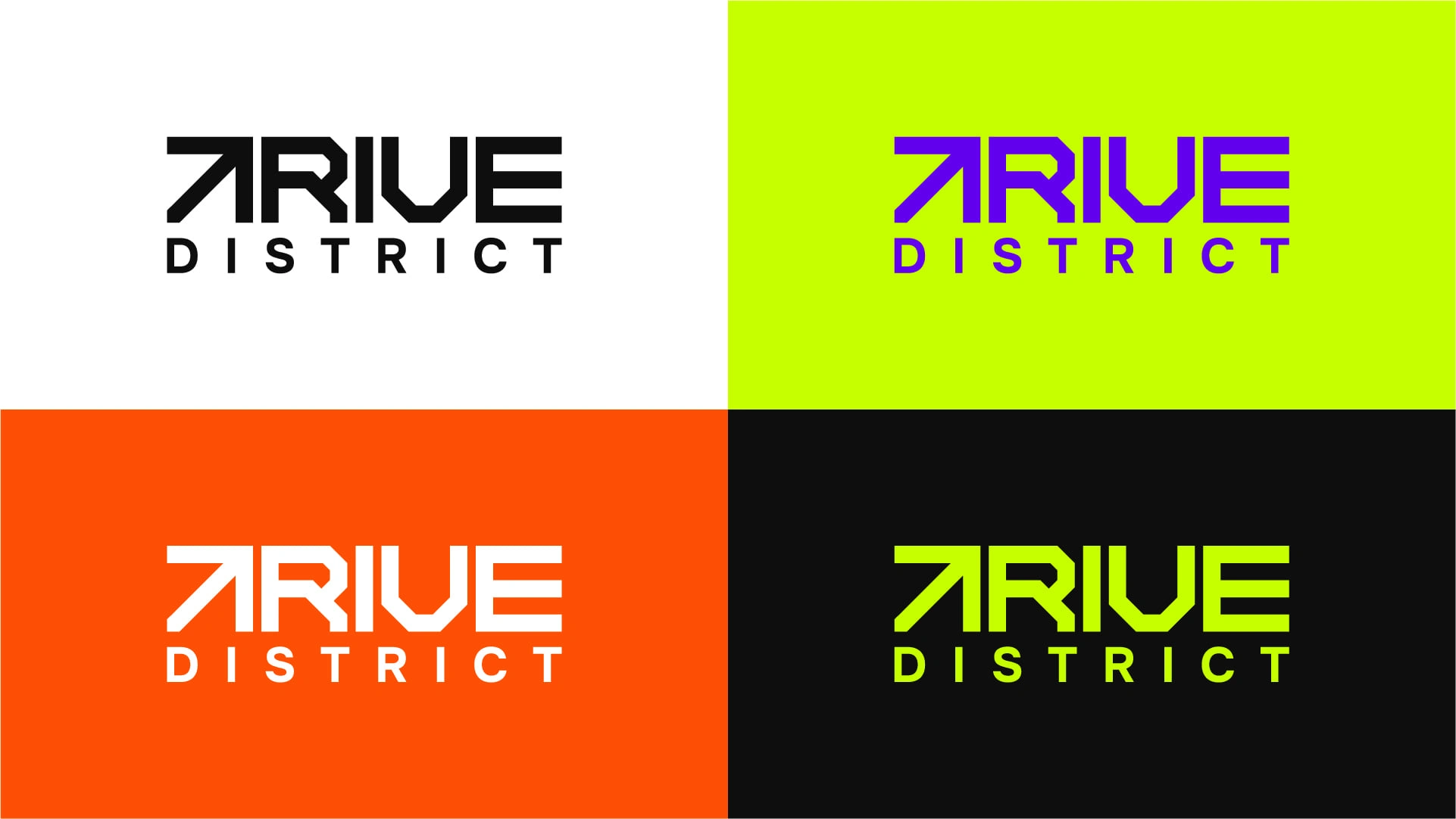
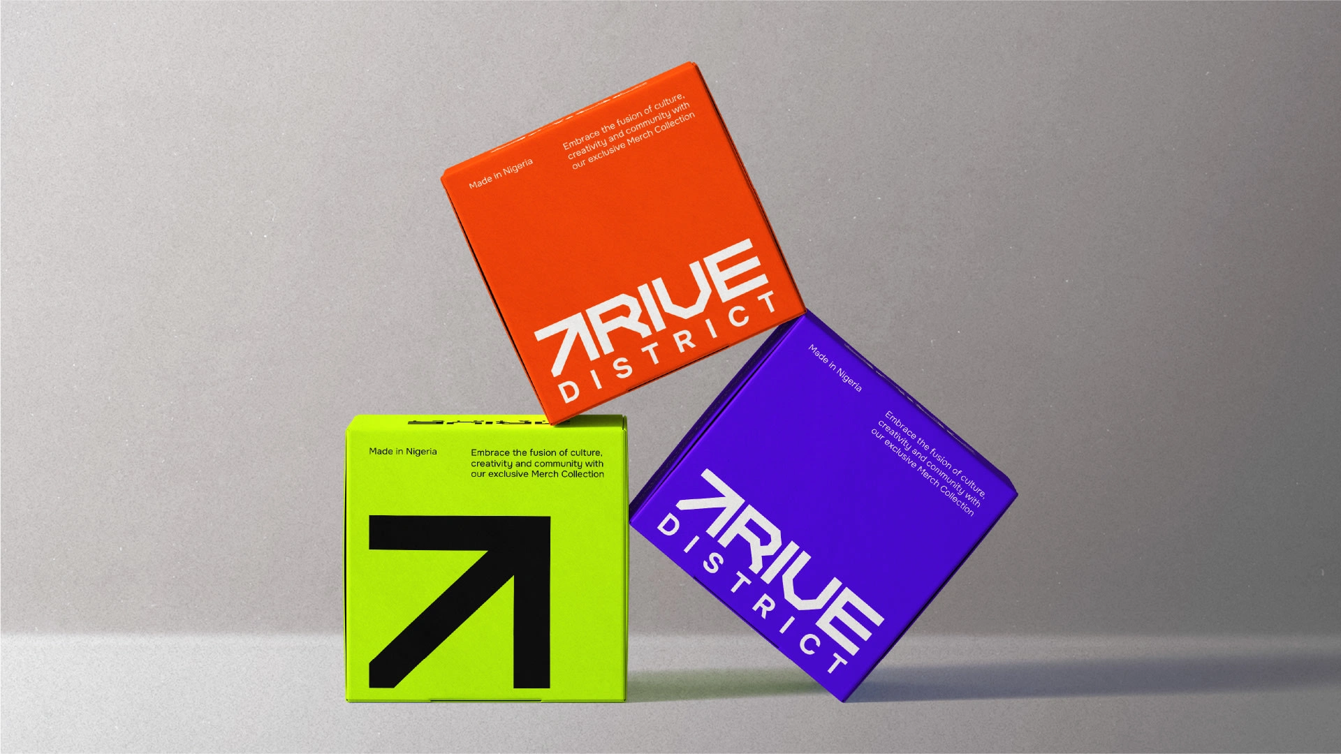
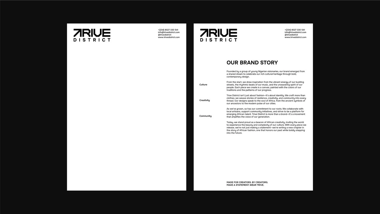
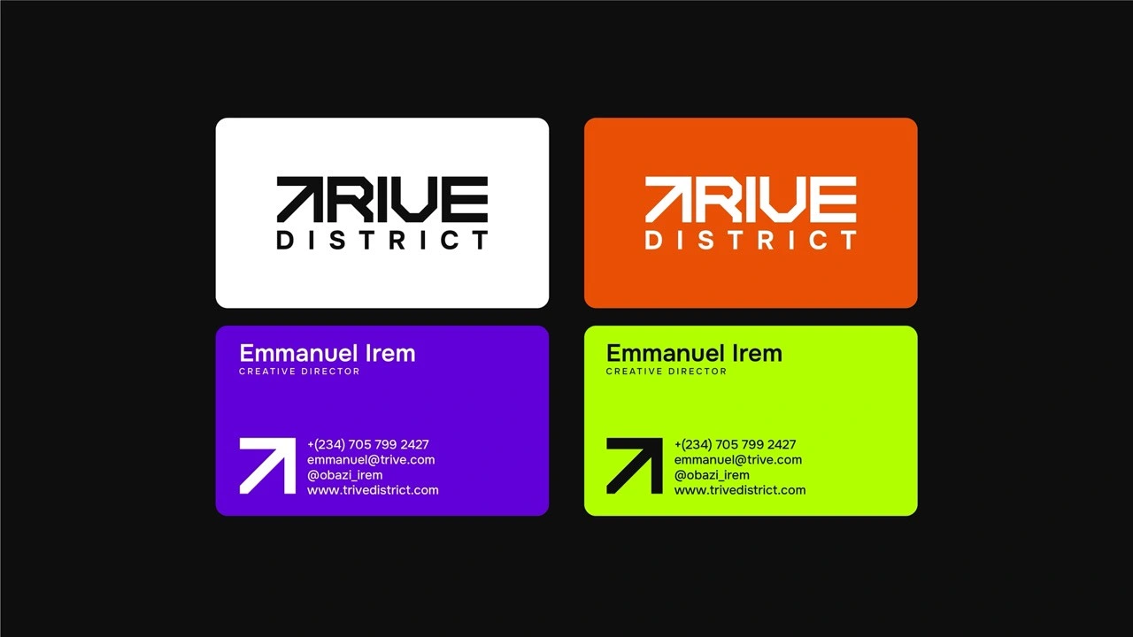
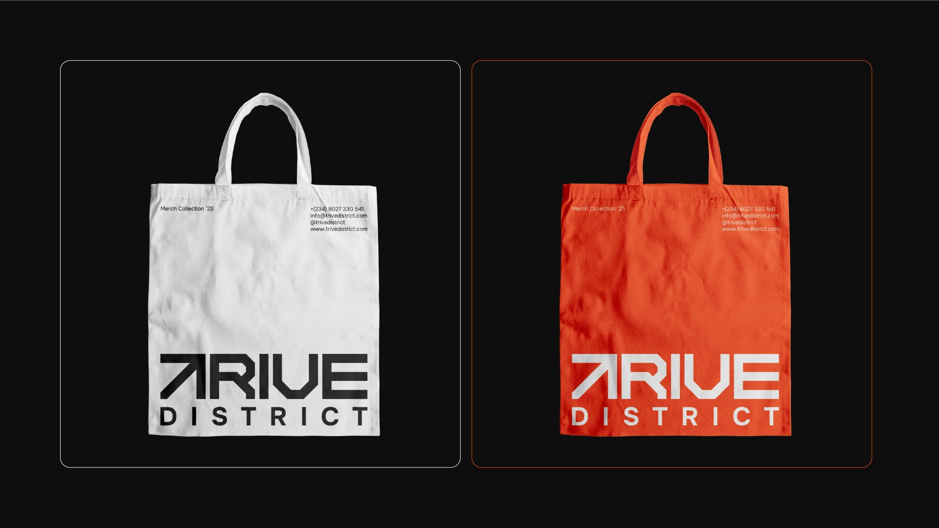
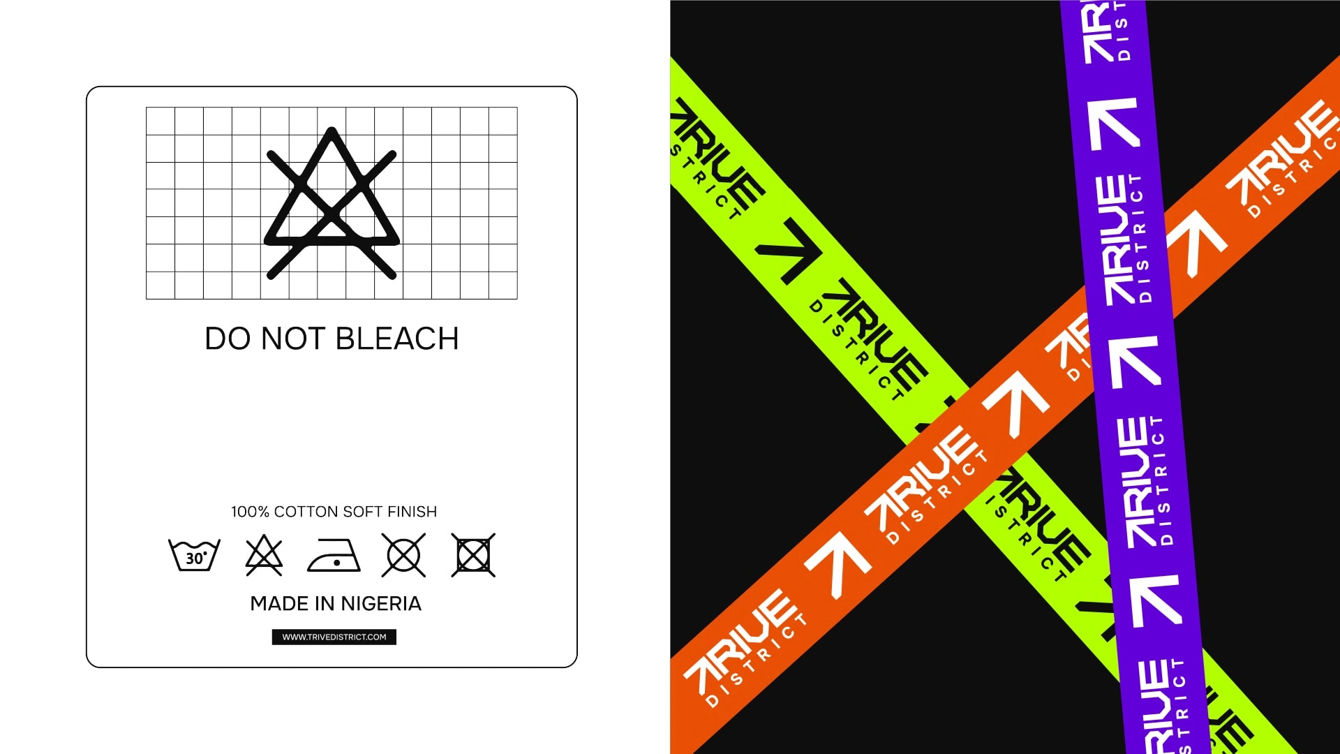
Trive District wanted to capture their dynamic essence in a striking visual identity. To achieve this, we incorporated a diagonal arrow pointing forward and upward to form the letter "T" in Trive, paired with a bold, expanded typeface. This arrow symbolizes progress and elevation, aligning perfectly with the brand’s name and mission. The logo encapsulates the concept of "we full ground," a Nigerian expression of dominance and confidence.
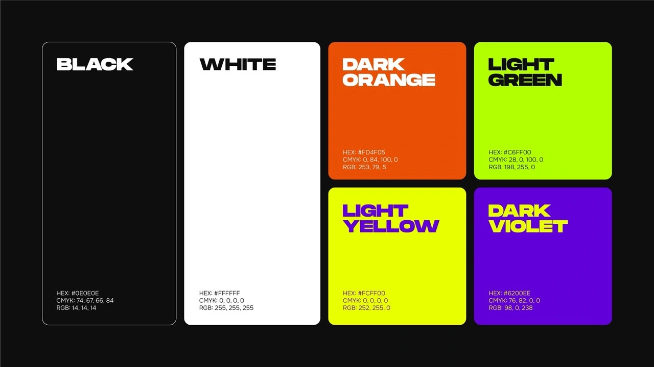
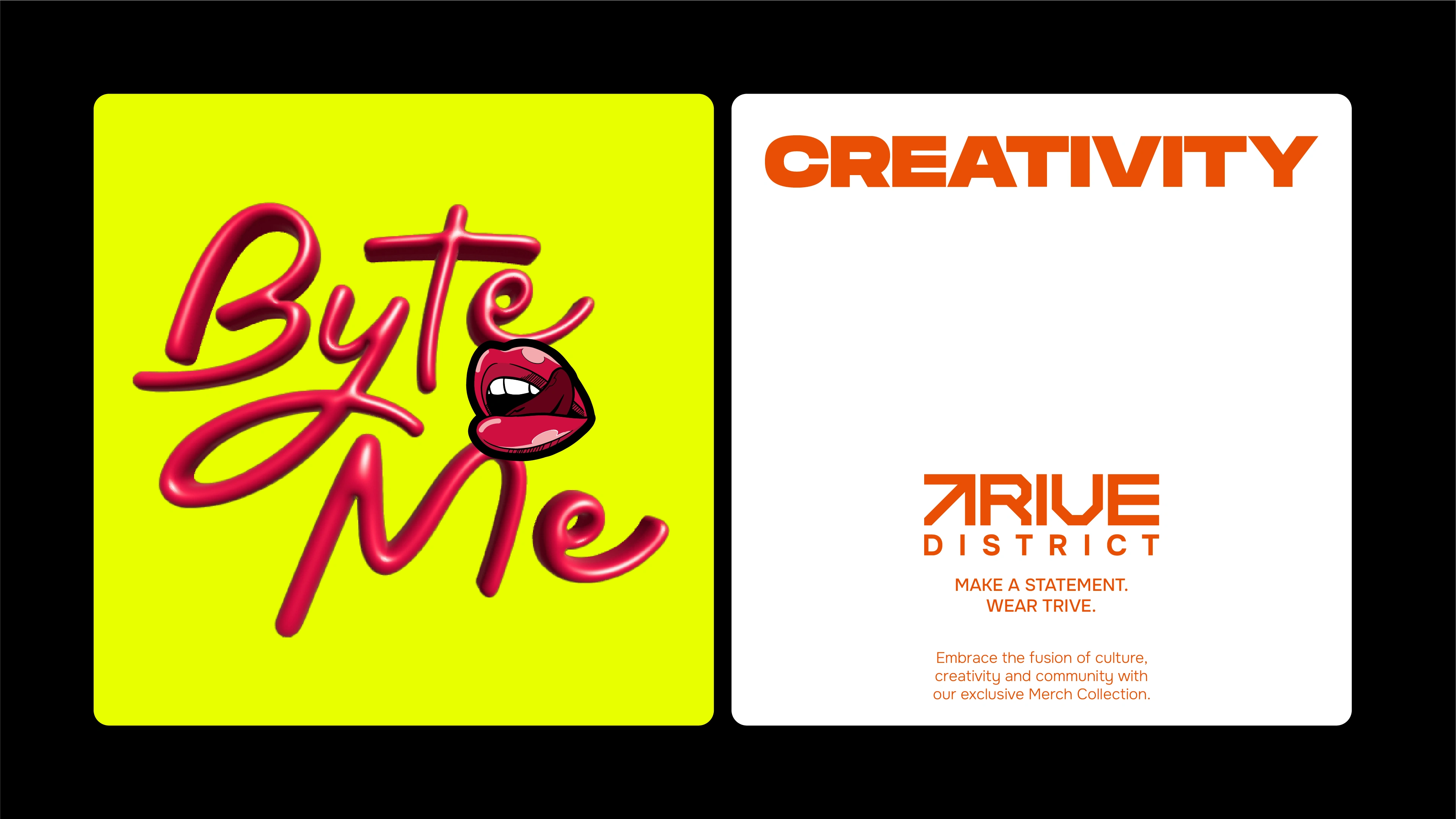
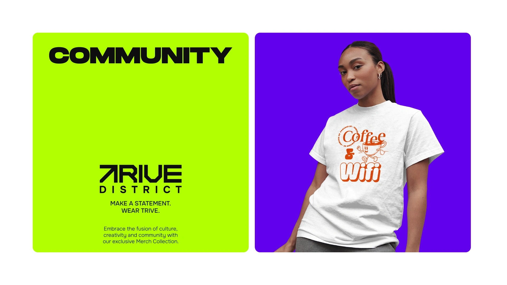
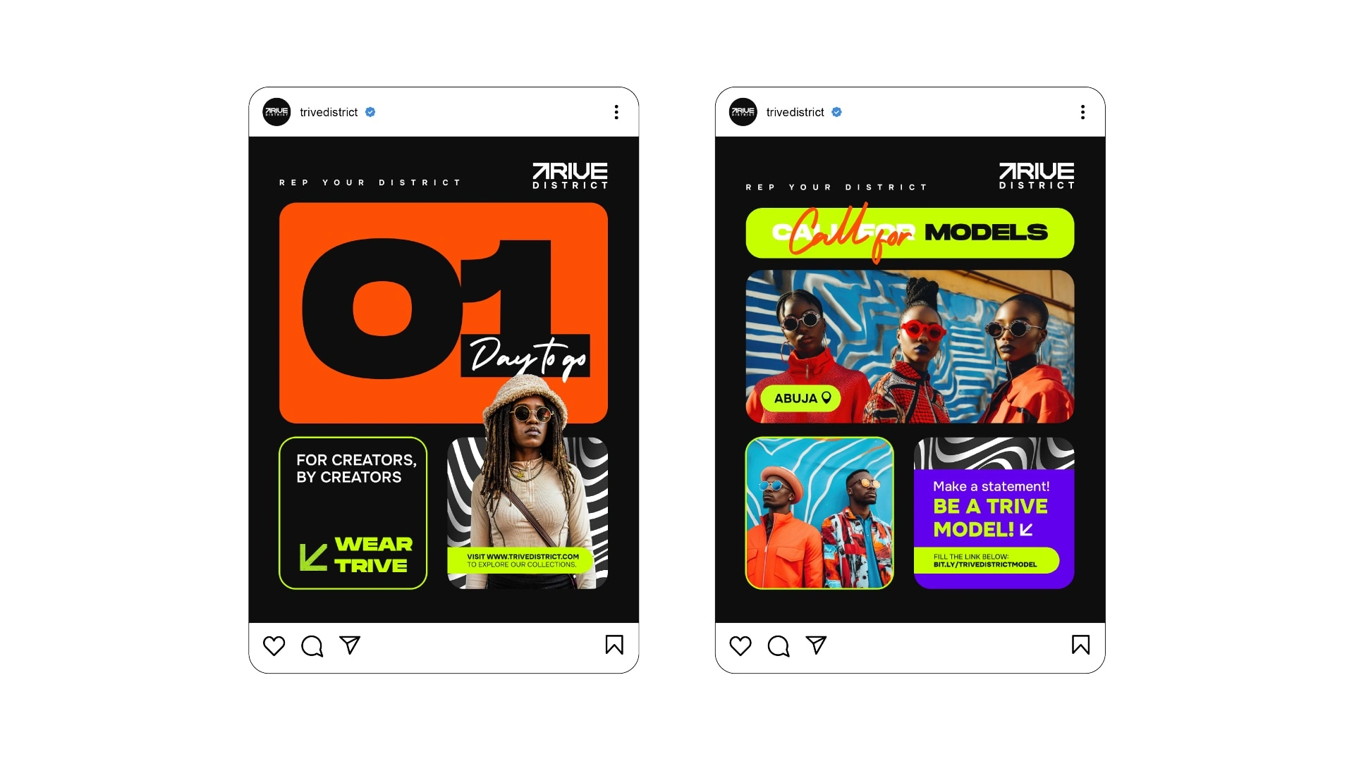
Our visual language for Trive District is as vibrant and loud as African culture itself. The bold and energetic design elements reflect the brand’s ethos, celebrating the creativity and strength of African creators. This powerful visual identity ensures Trive District stands out in the streetwear scene, just as its wearers stand out in their creative pursuits.
Client: Trive District
Project Year: 2024
Industry: Fashion
Like this project
Posted Oct 18, 2025
Developed a bold visual identity for Trive District, an Africa-inspired streetwear brand.
Likes
1
Views
0
Timeline
Jun 18, 2024 - Jul 29, 2024