Donna Club: Brand Identity for a Women's Archery Club

Alia Sidorskaya ✷


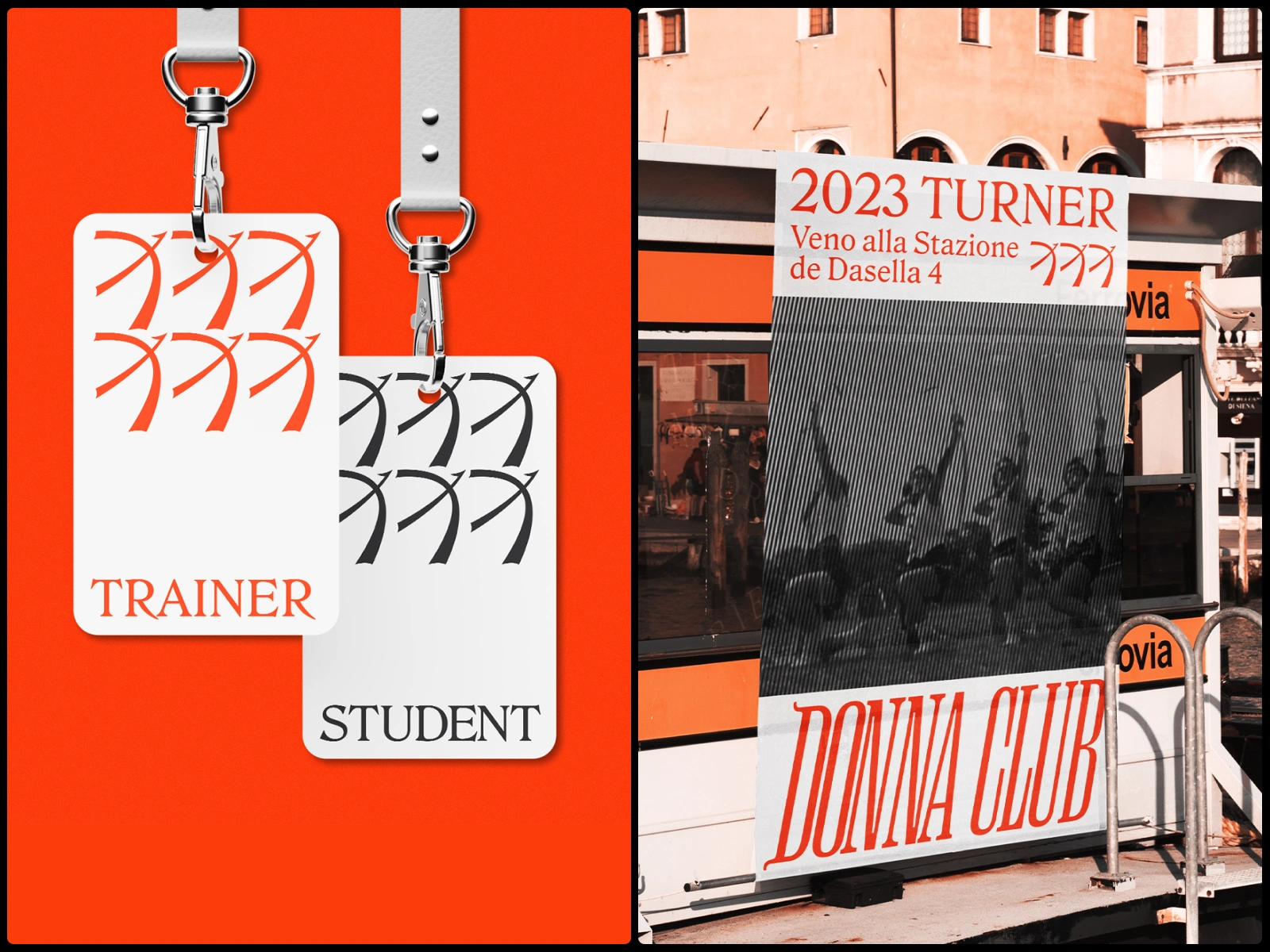
Donna Club is an archery club for women of any age. People join to learn technique, meet other women and spend their weekends outdoors. The club wanted to say that a bow belongs in a woman's hand, without looking like a charity campaign or a pink copy of a men's club.
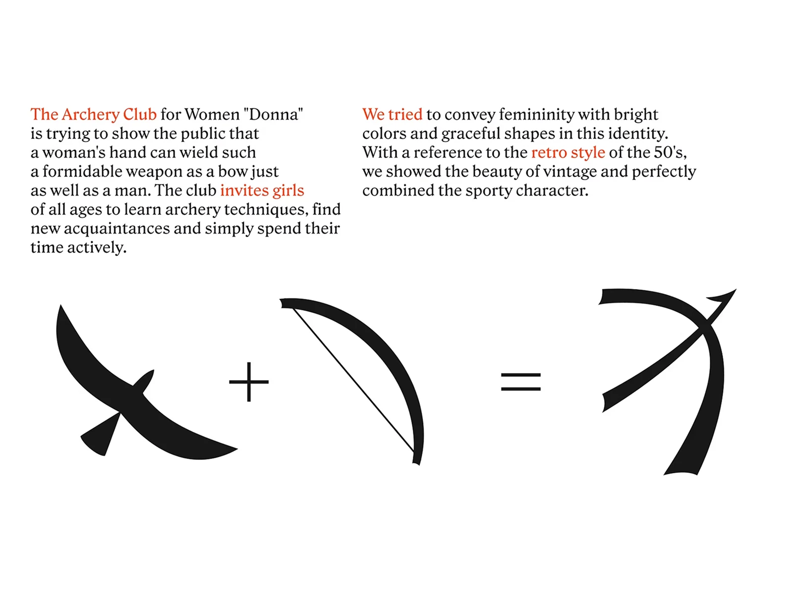
A bird in flight plus a drawn bow. The mark reads as both, and it works as well on a glove label as it does on a poster.
We took the direction from the 1950s, when women’s archery teams were photographed in pleated skirts on open fields. That period gave us the photography, the high-contrast serif and a confidence that needs no explaining. The whole system runs on three colours: vermilion, off-white and black.

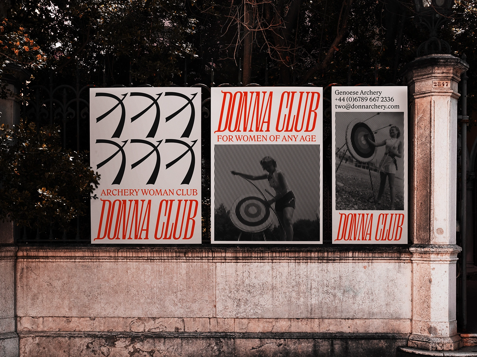
Launch posters. The mark repeats as a pattern, the wordmark carries the name, and archive photographs do the rest.

Our club history, a hardcover edition for the club’s archive.
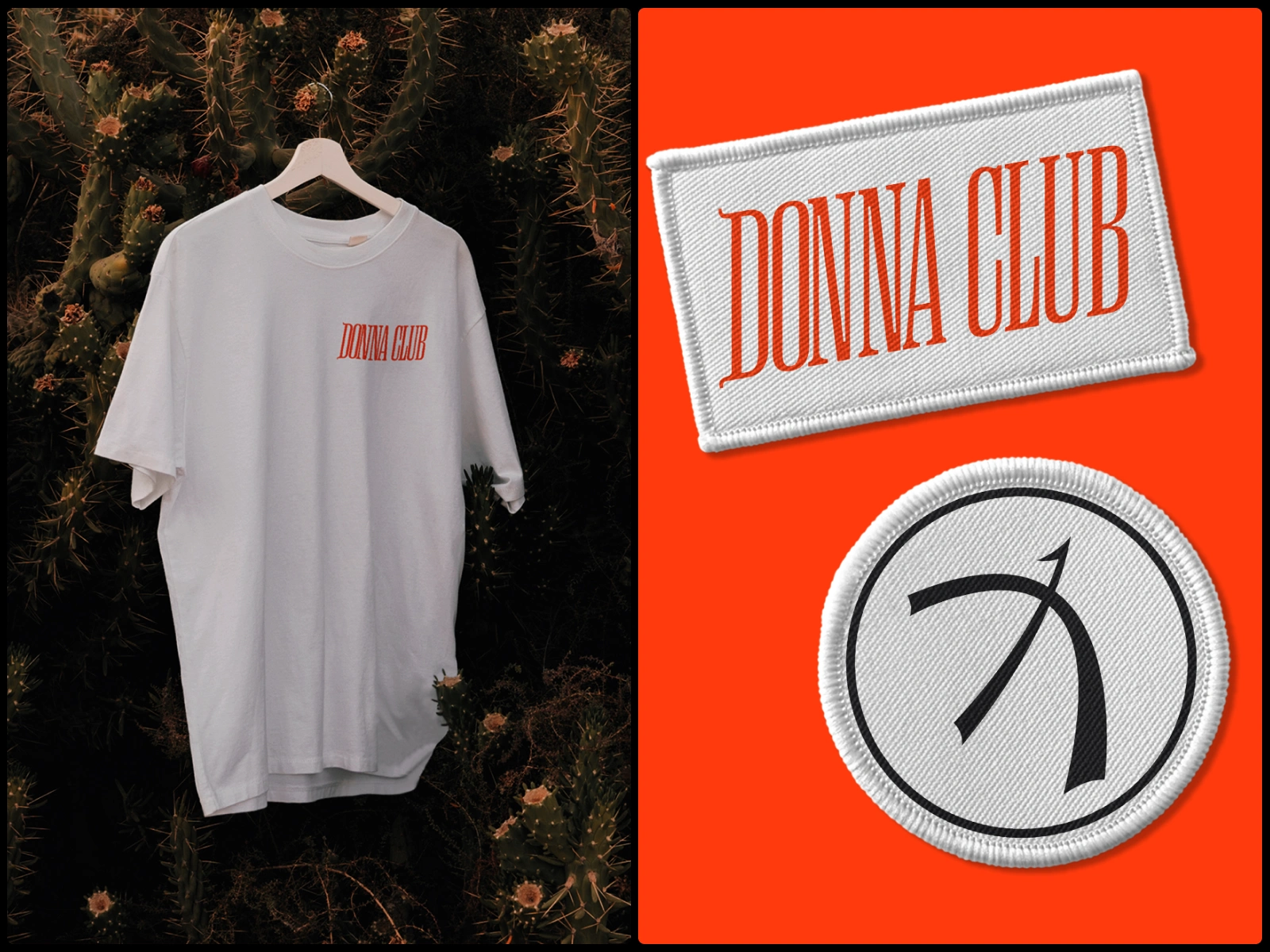
Things members actually use: embroidered patches, a club T-shirt.
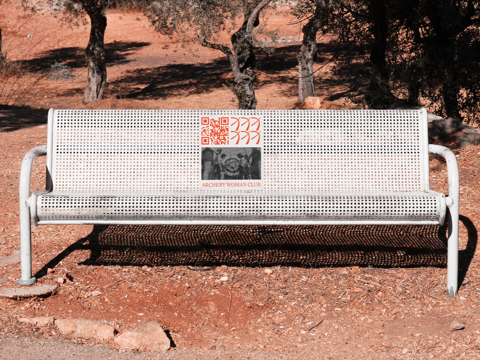
The bench plate carries a QR code to the club.

A leather shooting glove with a woven label, and a canvas tote.

Social templates alternate archive photographs with type-only posts. One line runs through the campaign: “We’ll show you how archery is a woman’s business.”

Street banners for the tournament, using the same photograph-and-wordmark layout at street scale.
Thank you for watching!
You want to collaborate?
Send us an email: alia@slickprjct.com
Like this project
Posted Sep 28, 2026
Brand strategy and identity for Donna Club, a women's archery club: a vibrant system blending athletic precision with femininity, from logo to merch and ads.