Branding of Sequence Health Clinic

Alia Sidorskaya ✷



About the Company
Sequence is a precision health clinic built on genomics and advanced diagnostics. It reads a client’s genetics and bloodwork, then decides which interventions come first and which can wait, based on what the body is ready for.
Its clients already track their health closely: sleep, training, supplements, lab tests. They arrive with plenty of data and advice that contradicts itself. What they want from the clinic is the order.
The clinic came to us as BioAge. We worked with the founder from the first discovery session through strategy, naming, identity and the brand book.
The Problem
Longevity brands compete on how much they can tell you: bigger panels, biological clocks, more dashboards. Next to them, BioAge sounded like one more test, a name that described something any lab can run.
Nothing in the name or the look said what the clinic actually does differently. It needed a brand that sells the method, not the measurement, and one a small team could run without a studio on call.
60% of consumers across the US, UK, Germany and China call healthy aging a top or very important priority.
The demand is there. The category speaks to it in the wrong words.
McKinsey, The Future of Wellness 2025, 9,000+ respondents
Identity Concept
The identity is built on one rule: one thing before the next.
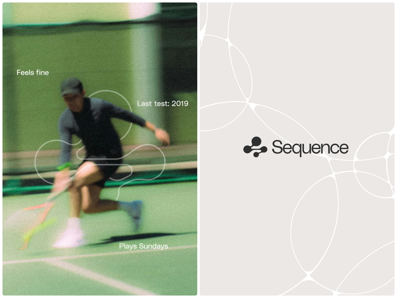
We renamed the clinic Sequence, a name that says the method out loud: the right step, at the right time, before the next one. The mark follows the same idea. Four shapes rise in one direction. They sit unevenly, because biology is uneven, and they move in order, because the method does.
Graphics System
A graphic system is a set of practical tools for a brand, not a decorative element. It follows the same logic as a logo: the graphics adapt, always in a consistent flow, transforming chaos into order.
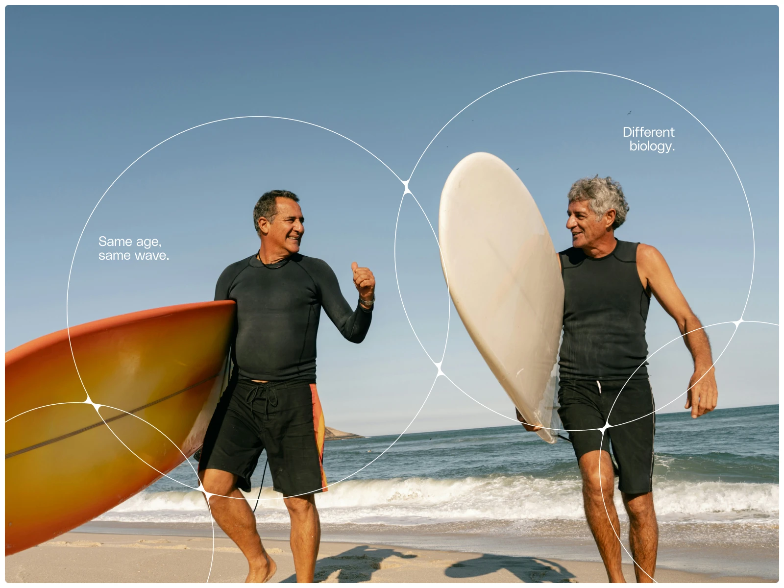
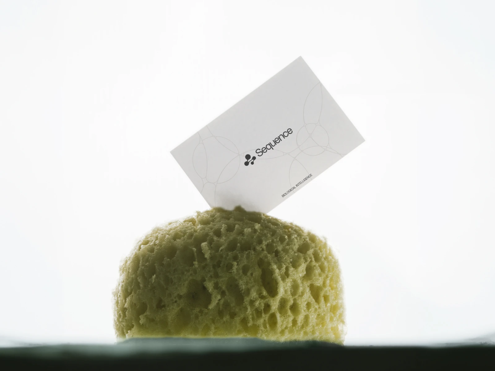
It operates in two modes. Like a cellular structure, the lines intersect at common points and fill the brand’s surfaces, always cropped at the edges so they are perceived as part of something larger. And a system of custom shapes that extend the brand’s conceptual idea, expanding functionality and creative freedom across all design dimensions.
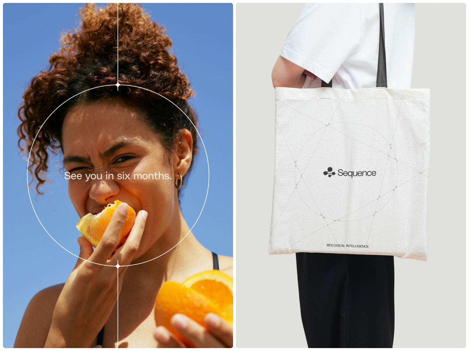
The rules remain simple so that the clinic’s team can apply them: a single line thickness throughout, white in photographs and black on a beige background, nodes only where data exists, and one mode per image. In motion, the pattern forms in the same order in which the clinic operates, one node at a time.
Brand Materials
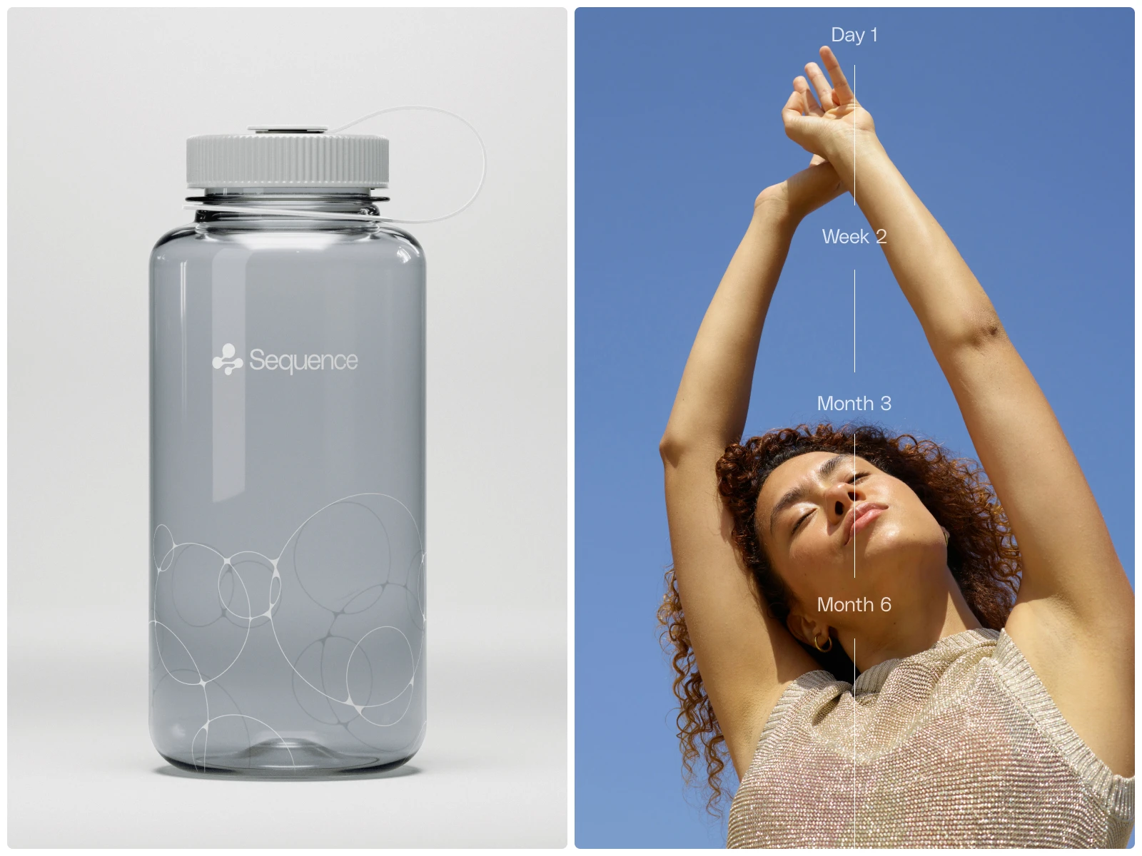
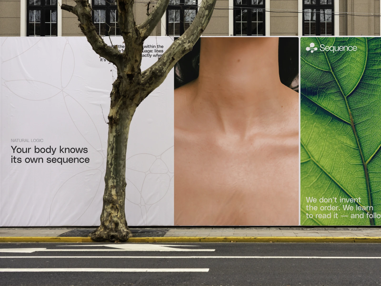
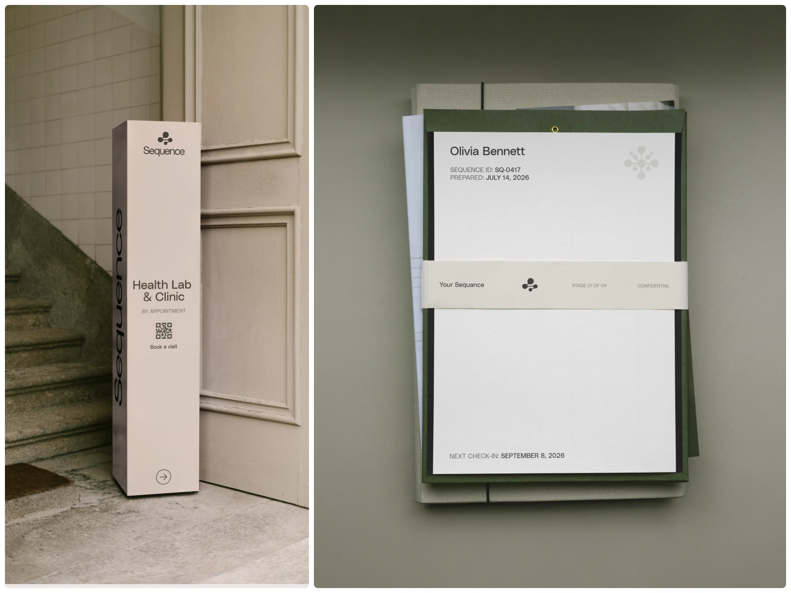
A clinic is judged on the small things a patient holds: the card with their next appointment, the bottle they carry to training, the sign that tells them they’re in the right place.
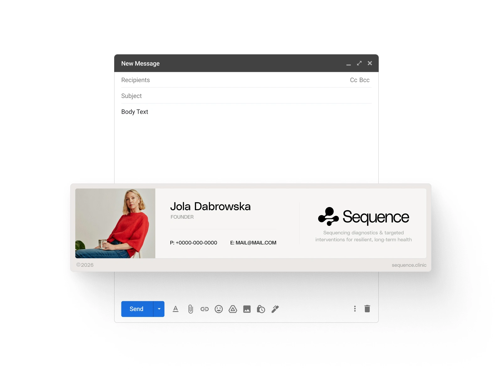
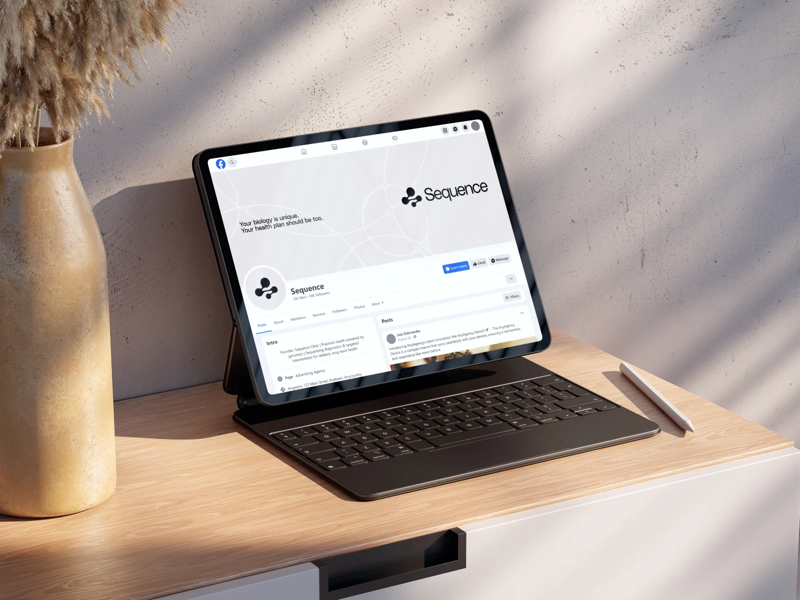
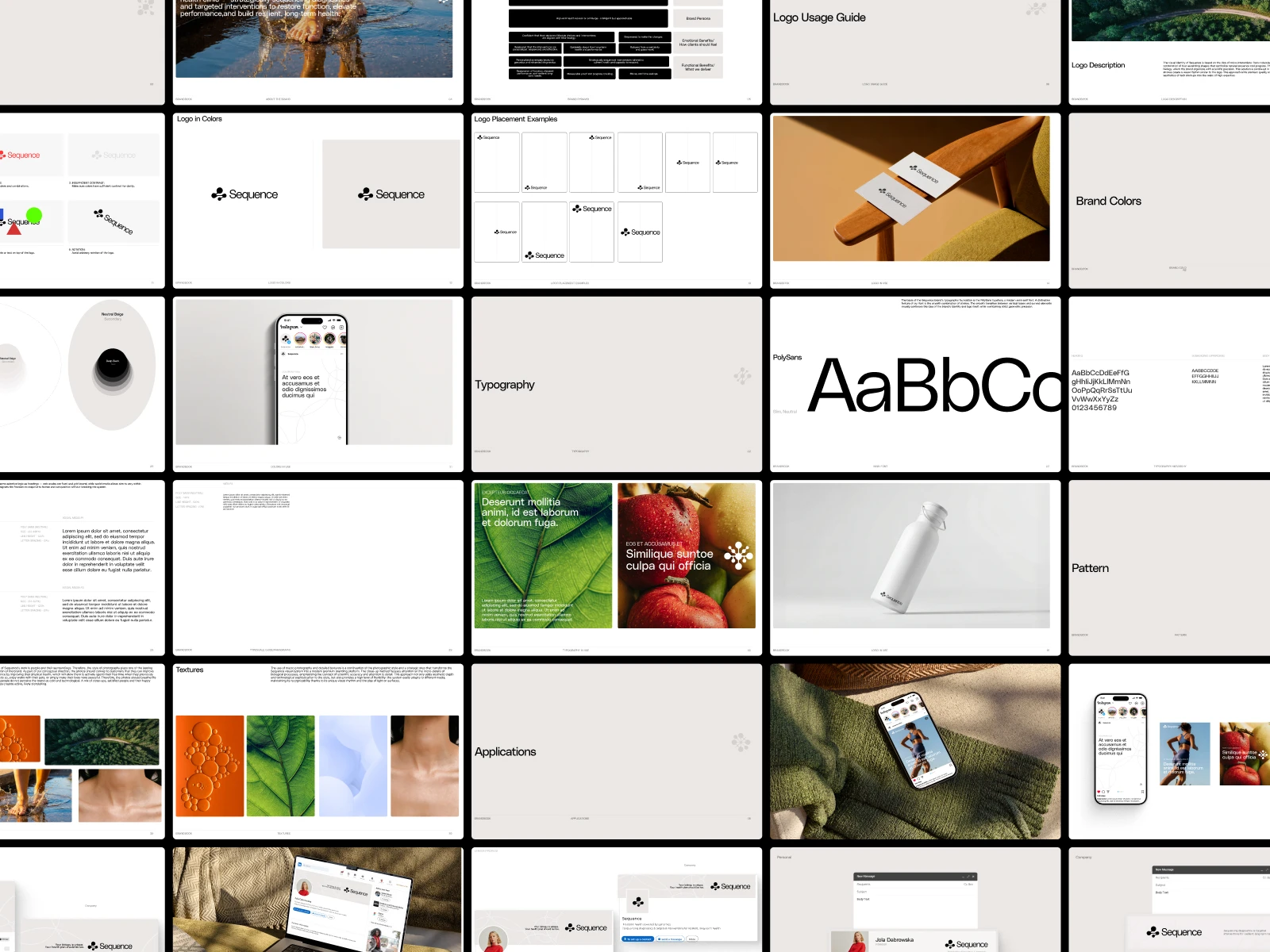
We designed the full set of brand materials so every touchpoint follows the same order as the visit itself: stationery and appointment cards, signage and wayfinding, merchandise, digital templates, and outdoor for the launch.
Each piece is built from the same few elements, the nodes, the hairline and the numbers, so the clinic’s team can produce new materials from the brandbook without starting from scratch.
Like this project
Posted Sep 29, 2026
Brand Identity for Sequence, a genomics-based precision health clinic. A new name, a visual identity and a brand book the clinic can run on its own.
Likes
1
Views
6
Clients
Sequence